On the road again. New York’s Citi Bike, you’ll recall, proposes its bi-pedalled alternative to those other moving objects rolling between the lanes, and the bikes -the auto. And when autos collide – sometimes with people, and things other than cars – information about those events is important and needs to be understood; and New York’s open data set (download it here and click the export button; note the data are continually updated) is there for the understanding. (See also www. nyc.crashmapper.com for some visualizations of the data.)
It’s a big data set for a big city, and it slices a big cut of time – July 2012 through March 2014, begging a first presentational question: namely, what the presenter is to do with 21 months’ worth of data, pulling across sections of three different years – hardly a standardized unit. On the other hand, work with % of Row and Column totals instead and the data achieve a kind of normalization, speaking in time-independent comparative and not absolute terms, as it were. Still, one can, for example, simply bang together some pivot tables with 2013 data only, if it’s year-wide data in with which you’re concerned.
Now consider an additional stricture: the 46,000 or so cells – about 13% of the set – for which pertinent information, e.g, borough and zip codes – just aren’t there, for whatever reason. A large portion of these are associated with accidents that befell drivers on highways, interstitial venues for which zip code data at least might be wobbly, but explanations aside the shortfalls need to be remembered. I’d sort these empties to the bottom of the data set (click in Zip Code, for example, and sort A to Z), because as we’ll momentarily see they’ll have some sporadic utility nevertheless, and as such you’ll want to reserve the right to cast them into temporary exile via the blank-row-insertion route and reconnect them to the data set them when needed, by deleting that row.
And one other preliminary caution, a plain truth: accident figures need to be pro-rated against traffic volume, and we can’t meter those ebbs and flows here. Still, the absolute numbers mean something.
We can start with that accident distribution by hour, noting by the way that all 339,000 incidents do report their times of occurrence. You’ll also be struck by the apparently rounded-off character of many of the times, in which last-digit zeros and fives seem to predominate. That’s an analytical trifle, though, as the loss of precision should little impact any material findings. So let’s try this simple scheme:
Row Labels: Time (grouped by Hours only)
Values: Time (Count)
Time (again, as % of Row Total)
I get:
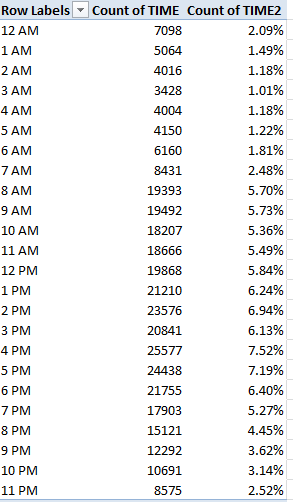
Incidents incline in fairly straight-line fashion from 3 AM peaking during the 60 minutes commencing at 4 PM, perhaps an early inception point of the end-of-day rush hour (remember of course that the tranche records accidents slotting the 4:00 to 4:59 duration) and the fall-off in school pick-ups. Yet the7 and 8 AM figures, somewhere within which the morning rush hour and school dispatches commence, don’t mirror the later totals. A mere function of vehicular volume? Very likely at least in part, though a searching correlation of volume with incidents would be in point here.
Now if you want to associate incidents with location – operationalized by zip and borough (or county) and say, calendar 2013, I’d first sort the blank zip code cells to the bottom of the data set (click in Zip Code and sort A to Z) loose them from the usable records for the time being via the inserted blank row.
Next, I’d roll the Time field into Row Labels, group its entries by Year, and then lift these into the Report Filter area and clic 2013:
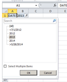
That circumlocution need be launched because you can’t group data directly in Report Filter mode.
Then try:
Row Labels: Zip Code
Borough
Values: Time (Count; really a numbering of incidents)
Number of Persons Injured
Click on the Tabular Report Layout. I get, in excerpt:
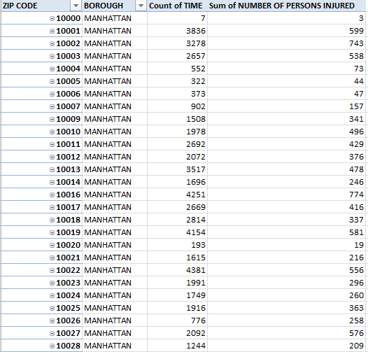
You’re seeing Manhattan data only simply because their zip codes, generally prefixed 100, appear first (remember these data reflect 2013 incidents only. (That 10000 zip code heading the data is, so far as I can tell, erroneous and probably owes more to entry error than geography. Wikipedia allows:
“Although there is no ZIP Code 10000 in the US, if there were, it would be in New York City…” )
And do remember that we’re not tabulating all incidents – there’s that 13% for which the pertinent identifiers of zip code and borough aren’t there. In addition, clarity would also be done a favor by renaming Count of TIME something like Number of Incidents (just type the caption directly into the field heading; you may want to wrap the text as well).
In any case, remove Zip Code and you should see:
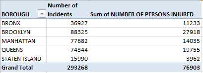
Reorganize the Persons Injured data by % of Column Total and…
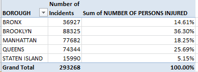
It is Brooklyn, owning New York’s largest county residential population, which reports the plurality of injuries; Queens, whose 2,300,000 denizens considerably outnumber Manhattan’s, is next. And that latter borough, with a weekday effective population verging on 4,000,000, aggregates an injury total but half that of Brooklyn’s.
And if you calculate a simple percent of injuries-to-incidents quotient by dividing injuries by incidents:
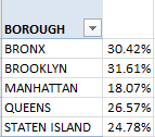
You’ll note Manhattan’s relatively depressed injury rate – a felicitous resultant of that congested borough’s slower traveling speeds?
Could be – but whether you’re navigating the data or the city’s streets, drive safely.

Leave a comment