When a New York Times story sports a headline with the word “spreadsheet” in its banner, it’s nothing less than man bites dog, I tell you; and so when that electrifying, once-in-an-eon comet streaked across my disbelieving screen…well, I just had to read on.
And so I did. True enough, the text beneath reported the diversity-driven recruitment strivings of the Speed Art Museum in Louisville, Kentucky spearheaded by its director Ghislain d’Humières. In that connection the museum has fashioned a spreadsheet-driven matrix for check-listing board of governor and trustees candidates; and a couple of emails later the museum kindly dispatched the sheet to me, and thus to you, here:
(Needless to say, candidate names have been displaced from their niches in the E and F columns.) I should that the accompanying note authored by museum Executive Assistant Lauren Baldwin allows that “Many of you have asked if we can share the matrix…”, a numerical aside that surprised me. I suspect that demand emanates chiefly from museum officials interested in how the Speed paddles across its application pool, and not from spreadsheet fanciers like your correspondent.
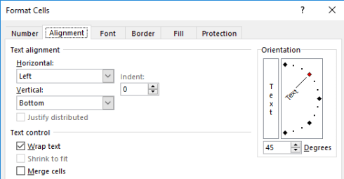
Be that as it may, I was given more than a little pause by a first sighting of the sheet, particularly the wide berth of white spread to the left of the A column. How, I wondered, does white space get behind the sheet’s leftmost edge – until I at last understood that the workbook opens to us in Print Layout view; click View > Normal in the Workbook Views button group and convention is restored. As for the precipitously-angled headers in row 1, they’ve been subject to the Format > Cells > Alignment treatment:
You’ll also perhaps note that cells E1:AR1 have been told to wrap their text, even as that instruction really only impacts E1:F1.
Moving along with matters presentational, the category headings atop the sheet – e.g., AGE, ETHNICITY, GENDER, are text-bearing shapes that have simply superimpose themselves upon the cells beneath them. One assumes in addition that the burgundy header color codes in M1, N1, AJ1, and AK1 communicate some special standing imputed to those fields, but my conjecture has to wind down right there. And the extension of the all-borders cell motif to row 1048576 seems to overstate the case. I’m also not sure what the OLE_LINKS range name ascribed to F94 is presently doing.
But what is the workbook meaning to teach us about these board of governor candidates? The matrix appears to simply record a 1 for any attribute an aspirant possesses, continue to leave any inapplicable qualities blank; but if you think that the follow-up intent, then, is to simply add the candidate numbers and compile a highest-total-wins table I’m not so sure. The answer depends in part on the plans the Museum have for the data.
For one thing, you’d be right to be struck by the absence of SUM calculations in the empty AS columns that would or could have drummed up a candidate’s aggregate score, and by the presence of SUMs in row 70 that realize column field totals (e.g., numbers of women and Hispanic Americans in the pool. Row 106 sums a second bracket of applicants, those placing themselves in consideration for board of trustee positions. Row 107 sum the columns in their entirety). So what are the 1’s doing?
For one thing, every position seeker must receive a 1 somewhere among each of the demographically basic parameters of Age, Ethnicity, and Gender, and so that ineluctably constant sum of 3 could be disregarded. At the same time, however, that very constancy does the vetting process no harm – again, because everyone scores 3. But if the Speed Museum wants to differentiate the attractiveness of men and women, for example (legal considerations aside), the undifferentiated gender 1 teaches the Museum nothing – be you an M or a W, you get one point either way.
That’s one issue. But I’m also bothered by the fission of gender codes in columns P and Q into Female and Male, a data-organizational issue we’ve taken up many times previously. Had Mr. d’Humières asked me – and he most assuredly didn’t – I’d have made room for M and W in the same, unitary Gender field, the better to pivot table the distribution of the two items. And I’d have done the same for ethnicity, e.g.

And as for Age, I don’t see why its four fields couldn’t have likewise been concentrated into but one, and ready to receive a candidate’s actual age. Why not enter 37 instead of a 1 beneath Age 36 to 50? Better pivot tabling awaits.
A different suggestion, this too decidedly unsolicited. The fields could be weighted, in the event some of them are deemed more contributory to hiring decisions than others. A new row could be jammed between the current rows 1 and 2 and, assuming we cling to the sheet’s existing field structure, we could assign a weighted value to each of the matrix fields in what is now G2:AR2 (and we’ll call that range Weight).
For example – if the Museum is in fact keen to amplify women’s board representation a 3 could be socked into P2 in the Female field of the Weight range, even as Q2 – the men’s parameter – could inherit a 1. In other words, enter the generic 1 in the Female candidate’s field and she gets 3 points. That device sounds politically crude, and while an organization might not want to commit that sort of maldistribution to document form, it’ll work operationally. By the same token, a 1 in a particular candidate’s Philanthropist field (in column AG) might evaluate to a 5 in AG1, with other relatively more or less desirable qualities weighted accordingly.
Each candidate’s score would then be entrusted to a SUMPRODUCT tabulation. Thus the candidate in row 3 would be portrayed in AS3 (the next available column) in these terms:
=SUMPRODUCT(G3:AG3,Weight)
Copy the formula down AS and each candidate’s field evaluation is multiplied by that field’s weighted score in row 2 (the weight range), and then totaled (of course the blank candidate cells multiply the respective Weight cells by 0). That’s what SUMPRODUCT does (yes, it’s an array formula, albeit an off-the-shelf one), promoting a finer-grained portrait of each hopeful.
But remain with the matrix as it stands now and the sheet doesn’t do that much heavy lifting for the decision makers, because they’ll still need to winnow candidates with the same number of 1’s. But of course, that may be precisely what the decision makers want to do.
Either way, I’ll suggest another field for the Experience area – how about Spreadsheet Guy?

Leave a comment