Not every sick day is a sick day, a definitional caution to which every employee – and employer – will doubtless assent. People take days off for all sorts of reasons, and even when they feel perfectly fine. The Fit for Work Scotland service, a UK National Health Service initiative, avers that “Most [worker] absence is for genuine reasons and is likely to end within 7 days”, but apart from thresholding the word “most”, any significant inter-industry variation in sick-day rates begs an interesting question – namely, why. And an NHS workbook downloadable here (click the 12/15 link, and save as an Excel workbook) recording 35,000 monthly-rate figures across various care institutions in England (that is, England the country, not the United Kingdom writ large) and across parts of seven years doesn’t answer it, but does cast a beam or two of enlightenment on the matter just the same (and note this look at what appear to be more or less the same data; some nice “interactive” charts plot them, too, but I don’t seem to be getting precisely the same results as it does).
First, you may want to do something about the date field, whose contents beat back my attempts to impute a usable date format to them. I had wanted to assume that its entries, e.g.
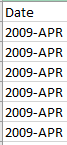
reflected a European regional syntax that had duped my American-formatted system into regarding them as merely textual; but when I tried the data on a PC in a London library, of all places, nothing changed.
So if you’re getting what I’m getting, and you want the dates to behave like actual dates, poke a new column alongside Date, name it Date2 or some such, and enter in what is now B2:
=DATEVALUE(RIGHT(A2,3)&”-“&LEFT(A2,4))
DATEVALUE takes date-appearing text and recycles it into the real thing. The expression above in effect reverses the cell constituents into something like APR-2009, through a couple of concatenations. Copy it down B, format as you like and the dates are yours, though I’m still not sure why that British computer didn’t understand the originals.
Now we can perform a series of practicable breakouts that should say some instructive things about the sick/absence-rate phenomenon, and its supporting numbers in the FTE [Full Time Equivalent) Days Sick and FTE Days Available fields. Both the HEE_region_name and Org Type fields seem particularly apt here, e.g. as per this pivot table:
Row Labels: Org Type
Values: SA Rate (%) (Average, formatted to two decimals)
I get:
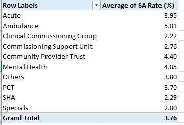
We see the notable rate spread across the health-care entities; at the far, high end are Ambulance services and its daily absence rate of 5.81%, more than two-and-a-half times the figure for practitioners in Clinical Commissioning Groups. The variations are telling and doubtless significant, given the millions of FTE worker days accumulated across the 35,000 records. (Note that according to this Wikipedia entry SHA’s, or Strategic Health Authorities, were abolished in March 2013, but the worksheet contains SHA data through March, 2014).
Note that these averages in effect average the records’ numbers; that is, they simply pursue the mean of the SA Rates as they present themselves, regarding each as equally contributory to the breakouts above. But one might want of course to weight the rates by each record’s actual FTE days, and doing so would bid us to extemporize a calculated field, which I’ll call WeightedAvg:
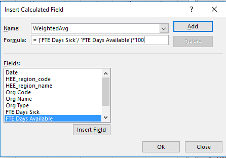
Here we simply divide FTE Sick by FTE Available; and the Org Type row labels sift and combine those records to be respectively averaged. But why are we multiplying the calculated fraction by 100? We need to do so for a presentational reason. Since the SA Rate (%) data really aren’t percentages, but rather workaday numbers that feign a percentage status – e.g. a rate of 4.59 is 4.59, not 4.59%, and 4.59 is really 459%, after all – we want the WeightedAvg results to lift themselves to the same magnitude as the SA Rates, for the sake of consistency.
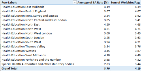
And once the field is calculated and shown its place in the pivot table alongside the SA Rate (%) figures, I get

(Note that the very parsing by Org Type offers itself as a kind of diffused simple average; the various Org FTE totals incline the Org comparisons toward a manner of parity, as if each average were erected atop the same FTE total.)
A few appreciable disparities point to themselves across the averages, e.g., the comparisons for PCT (Primary Care Trusts), Clinical Commissioning Group, and Specials; and the weighted composite average exceeds the simple average by 11.4%.
We could also organize the sick-rate averages by HEE (Health Education England) Region, by simply substituting the HEE_Region_Name field in the existing table for Org Type:
Noteworthy here – at least to me – are the relatively small rates for the London regions. One could have allowed that the giant city’s urban, stress-stoking fray might have had its effect on its health caregivers, but the numbers suggest quite the opposite. It is in the North West and North East regions – centered around Manchester and Newcastle, respectively – that the rates ascend.
Now back to those dates. The Quality Watch site linked above line-charts SA rates along an axis comprising months:

It means to describe seasonal variation in the rates, with summers associated with fewer absences. It occurred to mean that an alternative graphical tack could chart seasonality by aggregated months, that is, SAs by all Januarys, all Februarys, etc. This pivot table:
Row Labels: Date2 (our new, date-formatting field)
Values: WeightedAvg (the calculated field again)

Underwrites this pivot table chart (which I’ve realized in comparable Y-axis intervals):
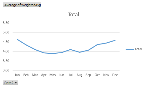
Here too the summer trough sinks below the average, but slopes more gently slope than the Quality Watch graph, and that’s because the latter has pushed its Y-axis points farther apart, pronouncing the monthly divergences.
Of course we still haven’t answered the question I begged at the top of the post – that is, the why of SA variation. It’s possible of course that ailment-inducing winters account in part for some of the seasonality. But why ambulance-organization staffers should absent themselves from work in higher numbers than the other cohorts, for example, is a good and fair question, but one that can’t be directly broached by the workbook.
But isn’t that where you come in?

Leave a comment