Archive | July, 2016

The Global Terrorism Database, Part 2: Surmises and Surprises

28 Jul

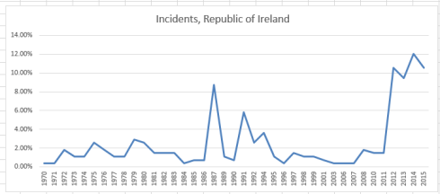
Last week’s post on the fecund Global Terrorism Database wound down with a selective look at some countries toward which popular scrutiny might be expected to be drawn, e.g., Iraq, Ireland, and Israel. But a more extensive set of drill-downs across all the data might impart some educative breadth and depth to an understanding of the terrorism phenomenon – or phenomena.
For example, by isolating five-year tranches of incident frequency we should be able to learn something about the tectonic movement of terrorist activity. We could look to this pivot table:

Rows: country_txt

Columns: iyear (grouped by units of five years)

Values: country_txt (in effect we’re really interested in the number of times a country’s name appears in the dataset; each mention of course identifies an incident).
We could then filter by tranche, e.g.:

start1

And for presentation purposes we could right-click anywhere among the Rows data and click in turn Filter > Top 10, calling up the default top 10 items (you’ll still need to sort these results though, here Largest to Smallest. Top 10 doesn’t sort automatically, though it should).

For 1970-74, then, I get (remember to sort):

start2

I suspect you’re surprised. Would you have imagined the United States the world’s most incident-ridden country during the above years, and the United Kingdom in second position – and with totals far greater than any other country?

But then filter for 1975-79 (again remember to sort):

start3

The picture is sharply redrawn. We see Italy experiencing a more than twenty-fold incident spike in these five later years, and with Spain incurring ten times as many acts as in the earlier tranche. The United Kingdom remains the second most terrorized country, and the aggregate, all-nation incident total of 7,169 overwhelms the 1970-74 count of 2,668.

The outcomes take a decidedly Latin American turn in the following tranche:

start4

Vast national changes roil this table, along with the disappearance of the United States from the top 10. Proceed with the five-year breakouts and the incident distributions swing manifestly, and here not surprisingly, to the Middle East (remember though that the absent 1993 data depress the 1990-94 counts artificially).

Now if you want to learn to whom the GTD imputes responsibility for the acts, while continuing to image the results by year and country, I’d dislocate country_txt from Rows and restore it to a Slicer. I’d next introduce gname (comprising identities of apparent perpetrators) into Rows (but you can leave Count of iyear in place in the Values area; each gname entry is associated with a year, and so counting gnames communicates nothing we can’t learn from counting iyears, which are posted to every entry).

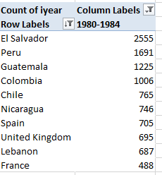
Click Italy in the slicer for the 1975-79 tranche and observe an extraordinary diffuse 120 groups implicated in at least one act, in addition to a perhaps nearly-as-startling 470 acts – 48% of all – ascribable to unknown parties, itself a researchable theme, it seems to me. Tick United Kingdom for the same period and discover that 541 of its 866 incidents, or 62.47%, are laid to the Irish Republican Army; the country’s Unknown proportion, however, amounts to a slight 1.73%. Filter for 1980-84 and tick the Slicer for El Salvador, the modal country for that parcel of time with 2,555 events, and again behold the enormous Unknown attribution, accounting for 49.08% of all incidents. Not far behind are the 1,166 attacks launched by the Farabundo Marti National Liberation Front, or FMLN, a pastiche of left-wing insurgencies that was legalized in 1992. Indeed, its incident total swelled to 1,485 in the 1985-89 tranche, then fell back to 678 in 1990-94 and recorded no acts in the 1995-1999 phase. In fact, no terrorist records appear for El Salvador after 1997.

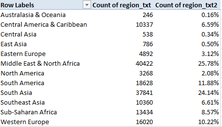
Apropos the above, the GTD’s Region field lets us drill up to findings such as this one, for starters:

Rows: Region

Values: Region

Region (again, by % of Column Total)

I get:

start5

But those are coarse 45-year aggregates. Add iyear to Columns and subtract the first region column data from Values for neatness’ sake. Grouping again by five-year bundles I get:

start6

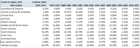
The shifts are massive and evident (and remember the percentages read downward). The early, relative vulnerabilities of North America and Western Europe’s have supplanted by the latter-day terrorist effusions of in South Asia and the Middle East, with South America’s peak in activity in the 1980-1994 swath shrinking remarkably, along with comparable abatements in North America and Western Europe. Anyone seeking a cogent charting of the political winds gusting across the globe in the past 45 years would do well to start here.

Now for a technical consideration. I’ve alluded a number of times to the missing 1993 data which, among other things, obviously undercount the 1990-94 values (and even so, the Middle East totals for the four available years in the that demaraction more than double the 1985-89 figure). One means for adjusting for the shortfall is to recalibrate the years into effective five-year partitions, e.g. 1980-84, 1985-89, 1990-95, 1996-2000, etc, an intention which should also succeed in trimming the curious, six-year 2010-15 interval back to five years; but because a given pivot table can’t (so far as I know) group values irregularly – that is, by variable intervals – we need to crack the wrapper open for Plan B, one driven by the FREQUENCY array formula, and that should allow us to break out incident totals both by years and country.

It works something like this: enter the first free column in the dataset sheet (it should be EH) and name it ccount (for country count) or something like it. Slip in a new worksheet and enter this range of year intervals down a column (I’m working in G6:G15):

start7

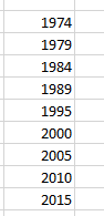
Note the six-years distancing 1995 from 1989, again a compensation of sorts for the missing 1993 data. Then enter a country name in I7 in the new sheet (I’ve started with the United Kingdom), name that mono-cellular range ctry, and enter back in the source data sheet, in EH2:

=IF(I2=ctry,B2,””)

That formula tests the country names in the I-column, country_txt field for a match with the name you’ve entered in the ctry cell. If the match avails, a 1 is posted; otherwise, nothing, as it were, is emplaced. Copy the formula all the way down EH and name the just-formed range ccount. Then return to the new sheet and select H6:H15, the cells alongside the year references. With the selection in force enter in H6:

=FREQUENCY(ccount,G6:G5)

And conclude the process with the trademark Ctrl-Shift-Enter triad befitting array formulas. The grouped incident totals for the United Kingdom should write themselves down H6:H15, commensurate with the years G6:G15. Again, note that FREQUENCY can support intervals of fluctuating width, thus enabling the counting of the five data-available years between 1990 and 1995, with each year in the G column standing for the maximum allowable year in each bin. Enter any other country in I7, and its totals should likewise break out in the respective bins.

And there’s still more to say about the GTD.

The Global Terrorism Database, Part 1: Surmises and Surprises

20 Jul

Anyone with an investigative concern with terrorism – and that complement is regrettably large – would do well to point itself at the Global Terrorism Database (GTD), the self-described “most comprehensive unclassified data base on terrorist events in the world” tended by the University of Maryland’s National Consortium for the Study of Terrorism and Responses to Terrorism, or START. Dating from 1970 and comprising over 156,000 records of incidents world-wide, the database in spreadsheet form is available to interested parties for download, provided the requestor complete a simple requisition form.

The database, then, is vast (75MB) and instructive, though you’ll need to read the very real qualifying cautions in the GTD FAQ page, particularly accountings of the missing data for 1993, shifts in incident counting methodologies beginning in 1998, and the Database’s definitions of terrorism. You’ll also probably need to download the GTD Codebook for a resume of the database’s 111 fields.

But while not faultless, you’ll want to consult this resource, even as some questions about its spreadsheet incarnation remain to be asked as you work with its holdings. For example, note the zeros in the imonth and iday fields (columns C and D) that proxy for unknown incident months and days. However only 23 month cells here go answer to the “unknown” description, while a more measurable 894 days are currently lost to the compilers. These relatively small lacunae will necessarily impinge event breakouts by chronology, of course, but again, their compromising effect is small, calculating to about .6% of all records.

Less clear are the entries informing the approxdate field in E; the codebook (page 12) allows that approxdate archives those incident dates whose ascertainment is unclear, but in most of the approxdate cases the same information already populates the contiguous iyear, imonth, and iday fields. Moreover, the approxdate data are textual, and as such aren’t immediately ready for analytic use with some formulaic backs and forths.

I’m also not sure what the country and region codes in H and J respectively bring to the data, in view of the actual country and region names that sidle these fields. But that’s a quibble; if the fields prove unneeded they can simply be ignored, after all.

But once you’ve oriented yourself to the database-cum-workbook, some obvious but most interesting pivot tables beg our consideration, for example, terrorist incidents by country and year:

Row: country_txt

Columns: iyear

Values: iyear (Count, Show Values as % of Row Total)

(For presentation’s sake you may want to beat back the fusillade of zeros invading the above table cells. Try File > Options > and click off the “Show a zero in cells that have zero value” box beneath the Display options for this workbook heading.)

Now if you bring a 2016 sensibility to the data you’ll be surprised, at least some of the time. Terrorist acts in the United States peaked in 1970, with 17.38% of all acts – 468 in absolute numeric terms – across the 46-year span ending in 2015 having been perpetrated in that year. Double-click that 17.38% and a new table springs from that figure, and onto a new sheet. Pivot table those 1970-specific data:

Rows: provstate (bears US state names)

Values: provstate (Count)

And you discover that 98 terrorist acts – as defined here – were incurred by California, with another 86 having been inflicted in New York. Substitute gname (g for group, presumably, in column BG) for provstate in Rows and find 108 acts mounted by generic Left-Wing Militants, 69 undertaken by what the GTD calls Black Nationalists, 54 wrought by Student Radicals, and so on. Compare that outpouring with the grand total of 38 incidents tracked in the US last year – that sum lifting a curve that has pulled upward since 2011, to be sure, but certainly far flatter than the Vietnam-era total registered 46 years ago (the implication, then, by the way, is that the immediately pre-1970 counts were perhaps comparably numerous, but the GTD doesn’t have those data. On the other hand, 1970 seems to stand as a towering apex among the years, even the ones that immediately follow it).

Subjected to a simple pivot table line chart, enabled by referring the country_txt field to a Slicer within which one can isolate one country at a time, and stationing iyear in Rows, the American (United States) incident totals read thusly (recall the missing 1993 data, though):

GTD1

The charts for some other countries not unacquainted with terrorist attacks:

GTD2

There I would have supposed the spikes would have bolted upwards earlier, during the throes of the Troubles.

GTD3

Again, I would have surmised an earlier peak, but note the welcome trough in acts in 2015.

GTD4

More expectable, perhaps, though note the 1975 year-inception point and the remarkably sparse incident count through 2003.

Note at the same time, however, that the charts reckon percentage distributions of incidents, and don’t size up absolute incident counts for the countries. Those read as follows:

US – 2693

Ireland – 274

Israel – 2085

Iraq – 18770

Iraq’s enormous total is thus very much a recent vintage.

Of course any surprise at any of the charted histories above may have more than a little to do with one’s definitional investments in the term terrorism. It may be easy not to liken the Weather Underground and its 45 attacks from 1970 through 1975 to the latter-day insurgencies of Al Qaeda (I854 attacks under variant names), but that aversion needs to be thought through, and the QTD did – though of course you’re welcome to contest and/or refine the understandings.

For a worldwide incident count, click the Clear Filter icon on the Slicer, in effect selecting all countries simultaneously:

GTD5

The chart result:

GTD6

10.74% of all the recorded attacks were conducted in 2014, with a small but appreciable decrement to 9.41% characterizing the following year. Still, an extraordinary 39.6% of all attacks crowded the six years spanning 2010 through 2015 (note that by imposing a five-year grouping interval on the iyear data, the pivot table nevertheless casts the most recent data into a six-year tranche, 2010-2015).

In any case, with 111 fields and in spite of its lengthy blocks of blank cells, the GTD’s massive trove of data has a lot of permutations in there.

Drug Overdoses: The Data From Connecticut

11 Jul

The broadened availability of data is potently arming the multi-theater war on drug abuse in America. Open-data concern Socrata – the firm whose interface front-ends a great many US governmental open data sites – describes its role the opioid epidemic here, for example. And the data.gov site has called up the sobering Accidental Drug Related Deaths 2012-2015 site from data.ct.gov, the Connecticut open data venue. You can download it here. Click the CSV link for Accident Drug Related Deaths 2012-2015.

Without substantiating the accidental, as opposed to the willed, character of the fatalities (that information is presumably sourced elsewhere), the Connecticut workbook details instances of lethal overdosing in the state for precisely four years, January 1, 2012 to December 31, 2015; and once some basic spreadsheet rough spots are smoothed, the data have much to reveal.

First, of course, the Date field need be auto-fit, as do a few other columns. Second, I cannot explain the intermittency of the CT references in the Death State field; on the other hand, since all the data emanate from Connecticut in any event the field can be overlooked or deleted.

But a somewhat more provocative complication besets the CaseNumber field in column A. It is clear that the cells’ two-digit prefixes insinuate the incident year; but because the final four digits of some of the entries – e.g. the one A3 – happen to resemble standard year references they are treated as such (particularly for 2012 incidents), as per one of Excel’s standard date formats. Had the field been prospectively formatted into text mode the ambiguity would have been forestalled; but faced with a mixed-format fait accompli the journalist will need to decide first of all if the field will make an analytical difference, and it probably won’t. Reliable and usable date data feature alongside the problem codes in column B, after all; but if you do insist on some unity of appearances in A perhaps the simplest tack would be to select column A, format the field in Short Date terms, and left-align the entries; thus the actual date in A3 will now read 12/1/1989 – still a date, but one that seems more-or-less of a piece with the other, labelled codes, which of course remain impervious to the new format. They’re labels.

You’ll also want to look closely at the Residence Field. The city name Waterbruy in F133 is almost surely Waterbury, and so needs to be emended; go ahead and run all the names through this single-field pivot table:

Row Labels: Residence City

And you’ll find No Haven, likely a truncated North Haven, and other suspect localities: Port Chester and Portchester, Stafford Spgs and Stafford Springs, West Haven and West Haven (the former revealing two interpolated spaces), and possibly a few others. If it’s your intention to break out the data by Residence City, then, these discrepancies must be researched, and repaired if necessary.

With that caution in mind we can nevertheless proceed to some meaningful pivot tabling, beginning with perhaps the most obvious:

Row Labels: Date (group by Year, if necessary; remember that the 2016 version of Excel will execute that grouping automatically, though you’ll need to filter out the <1/1/2012 and >12/31/2016 lines if necessary):

Values: Date (Count)

Date (again, by Show Values as % of Column Total).

I get

d1

The overdose toll is grimly ascendant, with the 2015 totals more than doubling the 2012 figure.

Ethnicity, here identified as Race, would likewise compel the investigator:

Row Labels: Race

Values: Race (Count)

Race (again, % of Column Total)

I get:

d2

If nothing else, the figures commit instructive violence to “minority” stereotypes about heavy drug use. As per the 2010 census Connecticut’s African-American population stood at 10.34%, even as overdose deaths across the four-year period among that group register 7.30%. And while estimates for 2012 put the state’s Hispanic/Latino representation at 14.2%, the merged 10.64% thus falls well beneath that proportion.

Other, standard scrutinies are available as well, for example age, grouped here in five-year intervals:

Row Labels: Age (grouped by five years)

Values: Age (Count)

Age (again, by % of Column Total)

(note two records lack age data. These can be filtered from the table without impairing the grouping.)

I get

d3

I was surprised by the 44-48 and 49-53 modal intervals, my having assumed that the overdoses would have clustered further down the age range. But that’s why look at data.
Gender by year might also prove informative:

Row Labels: Date (again grouped by year and appropriately filtered)

Column Labels: Sex (the two blanks can likewise be filtered)

Values: Sex (Count, as the data are textual)

I get:

d4

Refigure these as % of Row Total and withhold Grand Totals for rows:

d5

No striking inter-year gender differential obtains, though of course we see that overdose deaths befall an overwhelmingly male population.

For location of incident:

Row Labels: Location

Values: Location (Count)

Location (% of Column total)

d6

(Note the 17 blank records were filtered.)

As the dataset reports apparent accidental overdoses, the fact that over half of the deaths occurred in a residence, though not necessarily that of the victim, is unsurprising.

For a final consideration here – though plenty of other permutations are there across the data – it occurred to me that some relation between overdoses and day of the week might obtain. If that inquiry is redolent of a non sequitur, so be it – why would anyone impute a relation between the two, you may wonder? Still, I thought a look might be worth the taking. And it was.

Because the incident dates command column B, the standard means for developing the answer would be to head into the first free column abutting the data – column AF – and enter, starting in AF2:

=WEEKDAY(B2)

After replicating that formula down the column, you’d typically move to learn the distribution of overdose events by day via a series of COUNTIFs, or a pivot table tally; but a more parsimonious approach, one that would look past that column replete with 2100 WEEKDAY formulas, comprises seven array formulas instead.

Those formulas would ask you first to stream numbers 1 through 7 down a column – let’s say in cells AH5:AH11. I’d then write in AI5:

=SUM(IF(WEEKDAY(B$2:B$2129)=AH5,1,0))

And because the above is an array formula the entry process concludes with the storied Ctrl-Shift-Enter triumvirate. I’d then copy the formula down through AI11.

What the formula is doing is assessing each cell in the B2:B2129 range – the dates – for their weekday number (Sunday defaults to 1, and so on, through Saturday’s 7). The formulas then ascribe 1 to each cell whose weekday matches the neighboring entry in the AH column, and finally sums them. The routine yields these outcomes:

d7

You’ll observe that the totals for days 6 and 7 – Saturday and Sunday – are notably higher than those for the other five days of the week. The finding then: that, for whatever reason, more lethal overdoses in Connecticut are perpetrated on the weekend. A consequence of heightened recreational drug on those days? It’s possible, but that conjecture needs to be researched.

But there’s a catch: add the totals above and they sum to 2128, or the number of records in the dataset. But two of the dates in the B column are in fact missing, and so the above array routine is somehow admitting the blank cells to its count. And why? It’s because the WEEKDAY function treats a blank cell‘s reference as a Sunday, and thus evaluates it as a 7. I’m not sure why – it may have something to do with how WEEKDAY divides a date’s numeric equivalent – but whatever the reason, that’s what does. As a result, the weekday counts above errantly ascribe two Sundays to the tally that aren’t there.

It took me a while to realize a workaround, but I came up with this, entered in AI5 (again concluding with Ctrl-Shift-Enter):

=SUM(IF(LEN(B$2:B$2129)>0,IF(WEEKDAY(B$2:B$2129)=AH5,1),0))

It looks a bit fearsome, but what’s happening is that the formula determines if the entry in B exhibits a character length greater than 0 – that is, it asks in effect if the cell is blank, by looking for non-blanks. If that logical test is passed, then the array formula proceeds per its original remit. The effect, then, is to exclude the blank cells, delivering a total of 339 Sundays. But the weekend effect remains in force.

Double Formats and Double Counts: UK Voter Data

3 Jul

It was somewhere – I think it was here, for example – that I filed my brief for the two-spreadsheet thesis, a meek bit of iconoclasm about the variable intentions by which the sheets could be guided, and how the sheets might look as a consequence.

You’re requesting a translation. What I strove to say then is that some spreadsheets are meant to be merely read and considered, while others – again, in virtue of their construction – place themselves in the service of those who would analyze the data before them. And a prescriptive follow-on recommends that data gatherers should, if the inconvenience to them isn’t prohibitive, make their spreadsheet available in two versions, one for the readers, another for the analysts – because the two could look very different.

Well it turns out that the United Kingdom’s Office of National Statistics (ONS) has commendably done just that, at least for one of its myriad of spreadsheets: a count of UK voters eligible to apply their franchise to local-government and/or parliamentary elections, broken out by what the sheet calls local government areas and counties/boroughs. If nothing else the data daubs a bit of deep background to the Brexit referendum that’s roiled the country.

Two separate ONS workbooks iterate and reiterate the data, one in a book described as formatted, the other unformatted:

PIVOT TABLES-electoralstatistics2015uk Formatted

PIVOT TABLES – electoralstatisticsuk2015 Unformatted

(As always, you’ll want to consider the clarificatory footnotes attaching to both workbooks.)

What then, is “Formatted” about the formatted workbook? That, as it turns out, is a question that lends itself to both literal and slightly more figurative understandings. The bold-facing of principal headings on the sheets epitomizes the most text-bookish of formatting highlights, of course, but I think more is meant by the term here. Note for starters the blank C, E, G, I, and K columns that interrupt the data and, left as is, would almost literally stand in the way of a fruitful manipulation of the numbers (small exception: I see the value 0 in I45, and I’m not sure what it’s doing there).

No less evident of course are the blank rows that stream between key regional areas on the sheet, the classic data-entry no-no that could perhaps be deemed forgivable here because again, this sheet is made for reading, and not number-crunching. But at the same time, and as a matter of definition, it could be asked if blank columns and rows implement format changes; it seems to me that these devices are better appreciated as substantive design elements, if that quibble matters.

But there’s another data quirk which could, one supposes, fitly enwrap itself in the format banner. In the Formatted rendition, Table 1 layers its data in a kind of stepped fashion, with smaller political demarcations recessed further the to the right of the sheet, as per bullet sub-points. But look at Cell B23, for example, and the cells beneath it:

format1

The entry for Gateshead exhibits an indent, one brought about simply – and questionably – by two taps of the space bar:

format2

That vertical line is the cursor, flickering in its favored habitat, the formula bar; and if you subject B23 to some LEN-formula scrutiny you’ll get 10, even as the city name comprises eight characters.

Now again one could retort that since we’re studying the Formatted sheet, the one cast in effect into read-only status, the space-padding doesn’t matter much, and that’s probably technically true. But superfluous spaces are superfluous, and in view of the fact that they were apparently imposed upon the names in numerous rows down the sheet, the designers committed themselves to a fairly painstaking and ultimately unnecessary space-bar-tapping chore. Unnecessary, because much the same effect can be attained more productively and elegantly via an option I’m not sure I’ve ever used in a real spreadsheet – the Increase Indent button:

format3

It’s right there in the Alignment button group, but I’ve barely said a word to it (and vice versa). But Increase Indent does something interesting: click it on a text-bearing cell and the text pushes rightward, as if you’ve typed a few superfluous spaces. But type the word “hello”, say in A3, return to the cell and click Increase Indent, and then write

=LEN(A3)

somewhere else, and the formula returns 5, because Excel regards the indents as character-free.

Thus Increase Indent does a pair of useful things: it drags its text deeper into its cell, befitting an outlined sub-point, but at the same time does nothing to impair its actual length. And I think it could have been used here to particularly to good effect, for example in cells A10 and A12 in which the entries ENGLAND and NORTH EAST are meant to subordinate themselves to the subsuming UNITED KINGDOM, and yet are made to appear as equivalently aligned co-equals.

And what of the unformatted version? For one thing, and I’m looking at Table 1, it properly piles its data into contiguous rows sans any blanks; but by top-loading the data set with voter aggregates – e.g., the figures for United Kingdom, England, Wales, etc. – the data set capitulates to the double-count error, by seating national, aggregated data at the same table as individually itemized rows. If you want to pivot table the data, then, you’ll need to identify and then disaffiliate the double-counting rows from the set, a mandate whose fulfillment I found surprisingly challenging – because the codes keying each row’s regional/demographic level attest those levels begrudgingly.

In other words: it’s clear that the data’s first 16 rows – 2 through 16 – communicate aggregated data, and as such need to be sent on their way, even as we want to remember the numbers in row 2, which after all total the UK’s registered electorate for 2014 and 2015 (see the definitions of Attainers on the sheet). We thus want to work with non-aggregating rows whose voters ultimately total 46,828,163 in column C, for example – that representing the UK overall voter total.

But delete rows 2-16 and add the remainers (no Brexit pun, there) in C and I get 70,544,681, or about 24,000,000 voters too many. That means there’s a whole lot of double-counting still going on, driving me in turn to the Table 1 Metadata tab and its code legend. You’ll note that the codes through row 24 denote the 16 rows we’ve already deleted; I then pursued an educated guess and deleted all rows bearing codes commencing with the E 1 preifx, these standing for County data that I presumed to contribute to the double-count as well. My new total for column C, which now comprises 391 rows: 46,045,889, close to but surely not coterminous with the national United Kingdom figure in C we’ve since deleted. But copying the sum formula in C onto D yields 46,204,725, precisely the United Kingdom total for 2015 voters, and a further copy to columns E and F gets the F (Attainers) number exactly right, and with another near-miss for column E. That is, the 2015 data seem to have now been properly adjusted for data-doubling, while the 2014 remain a wee bit discrepant. I’m open to suggestions about it all.

Also, you’ll note the numbers in the 2015 columns feature commas, and the 2014 data don’t. But that’s a formatting matter.