It’s homely, to be sure, but if you want to go somewhere you gotta have one. And no – I’m not talking about your passport photo but your college transcript, an obstinately prosaic but indispensable means of entrée to your next academic or career step.
The transcript – an enumeration of a student’s courses and performances gathering into what we Yanks call the Grade Point Average (GPA) – has undergone a rethink of late. A piece in insidehighered.com this past February trained its lens on a number of initiatives aiming to drill qualitative depth into the transcript’s tale, sinking some analytic teeth into its default, alphabetically-driven narrative by linking its grades to students’ work and detailed progress toward a degree.
And that got me to thinking: if it’s depth we’re seeking, why not endeavour to learn something more from the numbers and the letters by re-presenting the transcript as a…spreadsheet?
It makes perfect sense to me, though you’d expect me to say that. But after all: submit a transcript to some standard tweaks and you wind up with a dataset, one suitable for sorting, pivot tabling, formulaic manipulation, and charting, too. And once the tweaking stops, the transcript can treat its readers to a round of different, edifying looks at the data – and that’s what I call depth, too.
Transcripts aren’t things of beauty, but they sport no small amount of variation just the same. So to understand what we’re working with, more or less, take a look at this one – the transcript of Mr. Ron Nelson, who made his academic record available here:
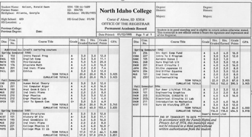
In the interests of exposition, I’ve subjected the baseline transcript above to a round of fictional retakes that of course don’t represent Mr. Nelson’s actual attainments (for one thing, his record dates back nearly 25 years). A few of the points that call for renovative scrutiny, then: First, note the blank column coming between the Course No. and Course Title columns, an excess which must, for spreadsheet purposes, be curtailed. Second, the multi-columned iterations of Course Titles and associated grades need be cinched into a single field. Third, the academic term headings (e.g. Spring Semester 1991), and TERM TOTALS and CUMULATIVE TOTALS lines have to be sent elsewhere; they report information that simply aren’t of a piece with the grade/grade point records that the dataset should comprise.
Second, if you’re new to the GPA you need to know how that defining metric is figured. While of course variation again abounds, the textbook illustration looks something like this: Class grades are typically assigned along an A-to-D continuum along with a failing F, in what are in effect quantified decrements of a third of a point, e.g., A, A-, B+, B, etc. In the typical system an A earns 4 points, an A- 3.67, a B+ 3.33, and so on (the D- grade is rarely offered, by the way). An F naturally awards no points.
Each grade-point achievement is in turn multiplied by the number of credits any given course grants, resulting in what are usually called quality points. Thus a B- grade in a three-credit class yields 8 quality points – 2.67 times 3. An A in a four-credit course evaluates to 16 quality points, or 4 times 4. The GPA, then, divides the sum of quality points by the sum of credits achieved. Thus this set of grades:
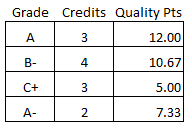
Works out to a GPA of 2.92.
It’s pretty intelligible, but with a proviso. The GPA must incorporate the number of credits associated with a failing grade into its denominator, and so these performances:
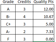
Calculate to a GPA of 2.33. But the 15 credits recorded above really only bestow 12 usable credits upon the student, and that dual count needs to be remembered.
With that extended preamble noted, my spreadsheet-engineered transcript demo (spreadscript?) presents itself for your consideration here:
In excerpt, the sheet looks like this:

Note the paired Term and Date columns; though one might be moved to declare the former field superfluous, it seems to me that its textual Spr/Fall entries could enable a pivot table broken out by seasonalty, i.e., GPAs by all Spring and Fall courses across the student’s academic career. The Date field, on the other hand, is duly numeric, thus lending itself to chronological resorting should the current sequence of records be ordered by some other field. And the grades have been visually differentiated via a conditional formats.
The Credits total in the upper right of the screen shot reflects a necessary bypassing of the F grade for Music 101 per our earlier discussion (the grades are stored in the H column), and realized by this formula:
=SUMIF(F:F,”<>F”,G:G)
The SUMIF here is instructed to ignore any F in the F column via the “not” operator bound to the formula’s criterion. Note the quotes required by SUMIF for operators clarifying the criterion. The GPA, on the other hand, divides the quality point total by all 112 credits (you will have noted that the spreadsheet outputs the quality points in H via a lookup array range-named gr in Q1:R10. And in the interests of simplicity I’ve let subsidiary course events and their codes, e.g., class withdrawals and incompetes, go unattended).
Now the data become amenable to pivot tabling and other assessments. For example, if we want to break out GPAs by term we can try:
Rows: Date (You’ll want to ungroup these, if you’re working in release 2016)
Values: Hours/Credits (Sum)
Quality/Points (Sum, rounded to two decimals)
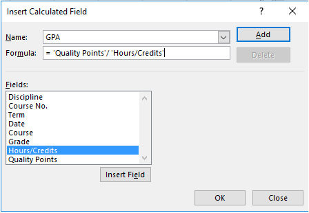
Because we need to total the date-specific quality points and divide these by the respective-date credit totals, a calculated field must be implemented, e.g.
Click OK, again round off to two decimals, and you should see:

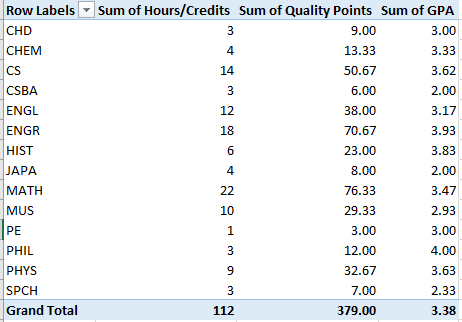
Once the GPA field is put in place you can, for example, break out credit accumulations by Discipline, or subject, by replacing Date with Discipline:
Or try a frequency analysis of credit totals by grade:
Row: Grade
Values: Hours/Credits (Sum)
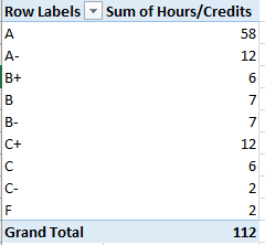
(Note: because of the priorities with which Excel sorts text characters, grades accompanied by the + symbol initially appear at the bottom of any letter sort, e.g., you’ll initially see B, B-, and B+. You’ll need to right-click the B+ and select Move > Move “B+” up twice. And of course the same adjustment should be applied to C+.)
Of course these outcomes could be charted, e.g.

And if you are interested in seasonality:
Rows: Term
Values: Hours/Credits
Quality Points (Both Sum, and both rounded to two decimals)
GPA

(By the way, you’re not duty-bound to earmark Hours/Credits and Quality Points for the table if you want to display GPA at the same time. Once constructed, GPA becomes available in its own right, and need not be accompanied by its contributory fields.)
And all these and other reads on the data could be assigned to a dashboard, too.
Thus the transcript-as-spreadsheet could break new presentational ground, supplementing the row-by-row recitation of subjects and scores that students and recipient institutions currently face, with a suppler way around the data. They could even be made unofficially available to students themselves via download, empowering the spreadsheet-savvy among them to map and understand their grades in novel ways (one trusts that no one’s accepting a transcript bearing a student’s email address).
But is it a thing of beauty? Maybe not, but don’t you like the colors?

Leave a comment