Archive | October, 2017

Girls, Boys, and NYC Math Scores: An Addendum

31 Oct

Sloth has its limits. I had, if you must know, entertained a couple of questions about the way in which I managed the New York City math test data in my previous post, but place momentum in the service of lassitude and I decided  that for the time being I couldn’t be bothered. Now I’m bothered.

What’s bothering me, at last, is a concern we’ve certainly voiced before in other posts – namely, the fact that my score analyses to date have ascribed equal weight to each record in the data set, irrespective of the number of students populating the listed schools. That forced parity thus imparts disproportionate influence to smaller schools. But because the data set is so sizable, I had originally assumed that a proper weighting of the student populations would exert only a small corrective effect on the test averages.

That assumption isn’t terribly untoward; but because the girls’ test averages evince only slight – if tenacious – superiorities over the boys’, a second, suitably weighted look at the scores might the responsible view to take via a calculated field, in the interests of learning if the results might materially change as a consequence.

To start, then, I visited next-available column S, titled it RealScores (of course the name is your call), and entered, in S2:

=IF(H2=”s”,””,F2*G2)

 The formula simply multiplies every school’s mean score in G by the number of its students posted to F, returning the total number of score points, as it were, to be divided by the total number of students identified by a pivot table breakout (e.g, Borough).

 The IF statement in which the formula is couched replaces each “s” entry (see the previous post below for explication) with a textual cipher (“”), and not 0. That latter numeric would have been processed by any average, thus artificially depressing the results. And the absence of a test result assuredly does not strike an equivalent to zero, as any student will tell you.  

And those “s” rows release an interesting subtlety into the equation. The calculated field, which I’ve I advanced above (I’ve called it actscore) is written thusly:

math1a

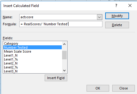
That is, the field simply divides the RealScores field we instituted earlier by the total number of students tested (the Number Tested field). The “s” records contain no scores – but they continue to cite student numbers in Number Tested. Unaccompanied as they are by no scores, those numbers thus add ballast to the denominator in our calculated field, and in turn artificially drag down the averages.

The way out – one way out – is to sort the Mean Scale Score (in G) Smallest to Largest, if you’ve clicked on a number in the field. The s entries should fall to the bottom of the field, the first s landing in row 36045. Hang a left to F36045, enter a 0 there, and copy it down the remainder of the column. Now the calculated field will add nothing from the s records – literally – to the Number Tested denominator, obviating the downward pull of the averages to emerge.

Got all that? In any case, now we can go on to construct the same pivot tables that featured in the preceding post, and compare the new recalculated results here with those in that post.

Averages by Gender and Year:

math2a

Averages by Borough and Gender:

math3a

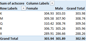
One we didn’t directly bring to the previous posts, Averages by Grade and Gender (we had added Year to the mix there):

math4a

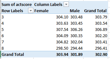
The signal conclusion here is the preservation, per all permutations, of the girls’ edge. The averages are all a touch higher this time around, however, a concomitant of higher scores that appear to obtain in the larger schools – the ones contributing larger numbers to the averages.

Now I’m not so bothered. But I’m still missing a sock.

Girls, Boys, and NY City Math Scores: No Mean Feat

27 Oct

Are boys better at math than girls? The question is hard-wired for controversy of course, but stammer a first response by trotting out SAT (Scholastic Aptitude Test) scores and the answer is yes. Boys consistently outscore girls by roughly 30 points a year on the nationally-administered exam (national in the US, that is), an extraordinarily dogged interval that bucks the ebb and flows of SAT score aggregates:

math1

(Screen shot source: the above-linked web site, reproducing the chart in turn from the College Board that conducts the SAT.)

And, as the linked site above continues, the advantage enforces itself even as high school girls outperform boys academically overall. (None of this suggests that conclusions are necessary or unitary; see this demurral, for example.)

Is that the last word on the subject? Of course it isn’t, and for additional testimony we can swing our protractors over to the New York City Open Data site and its compilation of New York State Math Test results by gender for city schools, reported for the years 2013-17 (the test is described here). Click the Data Dictionary link to call up a workbook offering the data and supplementary worksheet tabs clarifying their fields.

Next click the Master tab and 47,000 rows worth of score data are yours for the analyzing, including at least three parameters just begging for your attention: student grade, year of exam, and gender, which the sheet curiously entitles Category. The test scores themselves – scaled to enable cross-grade comparisons – fill column G, a normalization that would thus appear to support some rather global aggregations, e.g. average score for all students by year or gender, or even borough (that parameter is in fact concealed in the DBN field in A and must be dredged from the school code entries, a chore we’ve performed in a previous post).

You’ll note, however, that 485 records, a touch more than 1% of them all, substitute an “s” code in lieu of actual test scores, a replacement impelled by privacy considerations (see the discussion in cell B12 of the DatasetInfo tab). In fact, we’ve encountered this stricture before in a different demographic context; see this post, for example. But in any case, those alpha proxies will simply be ignored by any computation, thus freeing the 99% of the number-bearing entries for any closer, quantifying look.

But there’s another perturbation roiling the data that the formulas won’t automatically overlook: the All Grades posts in the Grade field that, in effect, subtotal schools’ math averages by year and gender, e.g., the scores for all girls at P.S. 015 in 2013 across all grades. There are more than 11,000 such records among the data and I’d allow they could, and probably should, be deleted, because they perpetrate the old double-count snag that must be cleared. Again, any and all aggregating tasks performed upon the score data could be made to emerge from a pivot table, and the promise of eliminating 187,000 cells from the worksheet should prove irresistibly appealing.

But I am mustering a show of resistance, or ambivalence, to any plan for expurgating some of the Level fields in columns H through Q. These count the number of students per school per year and per class, whose testing outcomes position them atop one of four levels of accomplishment defined by New York State, and as detailed in the ColumnInfo sheet (the higher the number the greater the proficiency). The Level % fields – for example, could have, under other spreadsheet-organizational circumstances, been easily derived from the N-field data via a standard pivot-table sited % of Column/Row Total – had all the level scores been assigned their own record beneath the same, circumscribing field. But the data don’t behave that way, and so perhaps the sheet is doing us a favor by folding the % fields into the data set (in fact, had all the Level_N numbers been assembled beneath a single field heading, the Number Tested field could have likewise been bid a farewell, because a pivot table would return numbers tested as a sub or grand total). So in light of the prevailing realities, leaving all those fields alone might be a prudent thing.

But I think the time has come for us to actually do something with the data. For a broad-stroked inaugural look, we could average all test scores by gender and year, via this pivot table:

Rows: Year

Columns: Category

Values: Mean Scale Score (Average, figured to two decimal points)

I get:

math2

No female shortfall here. On the contrary, girls’ average scores top boys for each of the available years, by more than a point each year. (On the other hand, we also need to inspect a nuance dotting the large student numbers here: the obvious fact that many of the scores issue from the same students. After all, a third-grade student in school A in 2013 likely reappeared as a fourth-grade student in school A in 2014.)

But is there any evidence of a progressive slimming of the girls’ edge with age? SAT scores, after all, chart a significantly older demographic: the cohort of university-eligible students, the one that affirms that insistent 30-point male differential. Our data, on the other hand, emanate from test-takers hailing from grades three through eight, bidding us to wonder: Does a male margin begin to pull away any time within our data? An answer calls for an introduction of the Grade parameter to the table, but because a three-variable output (Year, Category, and Grade) will begin to clutter the table, I’d opt to cast Grade into a Slicer and successively tick the six grades for which the numbers are available:

math3

Click through the grades and the girl score superiority prevails throughout, indeed broadening unevenly across the older grades and cresting with a 3.07-point average excess in grade 6.

We could also examine borough-wide variation in the numbers, by extracting the respective borough codes from the DBN data in column A. The codes occupy the third position in each code entry, and so if we wend our way to the-next-free-column R and name it Borough, we can enter in R2:

=MID(A2,3,1)

Copy down R, and the borough indicators are isolated:

K- Brooklyn (for Kings County)
M-Manhattan
Q-Queens
R-Richmond (Staten Island)
X-The Bronx

Then draw up this pivot table:

Rows: Borough

Columns: Category

Values: Mean Scale Score (Average, to two decimals)

I get:

math4

Here both gender and borough disparities mark the data, the former most conspicuous in the Bronx. Among the boroughs Queens rises to the top, its average score separating itself from fifth-place the Bronx by more than 20 points. Indeed, the Queens boy average exceeds every other girl’s mean, save that of Queens, of course.

These findings contribute but a sprinkling of pixels to the larger picture, but contributory they are. Accounting for the relative male math predominance at later phases of the educational process serves up a famous analytical challenge; winners of the near-impossible William Lowell Putnam Mathematical Competition, for example – 120-point university-level exam on which the median score is often 0 – are nearly all male, but I don’t know what that means, either.

All of which begs the next question: I’m a guy – so why is it when I divide my number of socks by 2 I always get a remainder of 1?

US Visa Data, Part 2: An Excel Application

16 Oct

Promenade down the wage_rate_of_pay_from field lining the H-1B visa data set (the visas have rather newsworthy of late; see, for example this New York Times piece) and you’ll likely saunter away with the impression that the jobs attaching to the H-1Bs are impressively compensated (the partner wage_rate_of_pay_to field that reports the apparent upper ranges among the proposed salaries is more spottily filled). These sound like pretty good, if impermanent gigs, and as such there might be something to learn by say, breaking out wages by state – once you try your hand at cinching a loose end or two that, bad metaphor notwithstanding, poses a knotty problem demanding your expert attention. (You’ll also learn that a very small proportion of visa applications – around 2% – aren’t seeking H-1Bs at all, but rather variant visas tied to country agreements with Chile, Australia, and Singapore.)

You’ll discover that the wage_unit_of_pay field in fact stocks a number of units, or demarcations of time, by which pay is calculated, e.g., Bi-Weekly, Year, etc. The problem points to a banal but integral data-quality matter. The pay figures in wage_rate_of_pay overwhelmingly key themselves to the Year unit – more than 93%, in fact – but more than 32,000 visas stipulate an hourly compensation, and some of these report wage units of pay that clearly can’t be clocked against 1/24th of day. Auto-filter wage_unit_of_pay for Hour, and you’ll bare 55 pay figures equalling or exceeding $48,000 – and if those rates are hourly, only one question remains to be asked: where can I download an application form? And the far smaller Bi-Weekly tranche likewise hands up a little cache of implausible compensations, as do the few Month position (can we definitively say that the $265,000 slot entertained by the Texas IPS PLLC firm in San Antonio is truly monthly? That application was withdrawn, by the way.) The Week pay data seem at least imaginable, however).

It would appear that these sore thumbs really mean to convey yearly salaries, and I know of no graceful means for redressing, apart from substituting Year in the suspect cells, and that isn’t graceful. Ok; I suppose some field-wide IF statement, e.g. if the number in wage_unit_of_pay exceeds 10000 AND the unit reads Bi-Weekly OR Hour, then enter Year in lieu of Hour with an accompanying Copy>Paste Values atop wage_unit_of_pay might placate the purists, but I’m not sure practicality would be best served that way.

In reality, of course, we can’t know if even the plausible compensation figures are right, and in view of the enormousness of the data set a press toward simplicity might bid us to merely work with the Year item, with a pivot table that goes something like this:

Row: employer_state

Values: wage_rate_of_pay_from (Average)

wage_rate_of_pay_from (again, this time Count)

Slicer: wage_unit_of_pay (select Year)

Sort the averages largest to smallest, and I get in excerpt:

visas1

Nice work, if you can get it. That’s Alaska heading the average salary hierarchy, though its visa-owning workforce is diminutive. Among the heavy hitters, Washington state (WA) – home of Microsoft, for one thing – checks in with an average emolument of $113,139; and indeed, an auto-filter tells me that over 4,000 of the Washington visas were requested by that very firm (you may happen to note, by the way, that one Microsoft-attesting record spells its headquarters city Redmnond, another data-quality eyebrow raiser. And there’s those 14 state blanks, too, though they sure pay well, if anonymously). The overall Year salary offer – and remember we’re working with the wage_rate_of_pay_from, the lower of the two salary tiers: over $87,000.

But inspection of the averages will affirm considerable interstate variation – e.g. major employer Texas, whose $79,823.51 mean thrusts it down to 46th place, though largest hirer California looks good with an average over $102,000. Accounting for the dispersions across the salary band might make for a story worth writing.
And if you’re interested in principal employers, try this table:

Rows: employer_name (Filter, Top 10)

Values: employer_name (Count). Sort largest to smallest.

I get:

v2

Tech consultant giant Infosys and Tata rank first and second among the visa-sponsoring firms; Microsoft barely makes the top 10. But pad the table with the wage_rate_of_pay_from field, and again deploy a Slicer and tick its Year item, and we see:

v3Big bucks emanating from Redmond, no matter how you spell it.

And since I’ve lazed past the discrepant-time-unit problem by confining my pivot tabling to Year figures only, let me at least consider a workaround that would more-or-less reconcile the Year, Bi-Weekly, etc. units, provided all their salary data were in working order, so to speak. In order to say, map all the salary proposals to the Year baseline, I’d draw up this lookup table:

visas2

The idea here calls for looking up the wage_unit_of_pay for all cells, and multiplying the associated pay figure by the appropriate looked-up value. These, of course, are standardized educated guesses, assuming for example that a 2000-hour annual work investment is to be multiplied by the hourly rate and that a bi-weekly term comprises 25 paydays.

Those suppositions could, for any given visa case, be way off, but absent meaningful supplementary information, they’d have to do.

But for the reasons detailed above we didn’t go that route anyway. I don’t know about you, but I’m happy enough with 494,672 records.

US Visa Data, Part 1: An Excel Application

4 Oct

If you want to be a legal alien in the United States you’ll need a visa. If you’re technically skilled the visa of choice is the H-1B, described by the Public Enigma open data site as”…a non-immigrant visa that allows U.S. companies and organizations to temporarily employ foreign workers in specialty occupations.”

If you want to learn more about the speciality cadre join Enigma for free, carry out the requisite click-throughs (the H-1B data are advertised on their home page) and you’ll find yourself here:

visa1

Opt for the 2017 edition, click the ensuing Open in Data Viewer button, and then click in turn the Export Dataset button centered of the trio of links below (though you can’t get this far unless you join Enigma and sign in):

visa2

Then break for tea time while the data mows a swath through your RAM and as last overtakes your screen; and with 528,000 visa application records amassing 154 MB, that’s a lot of Liptons.

Yes, you’ll have to perform the usual column auto-fit necessities, and you may want to think about which fields could be safely sheared from the data set, in the interests of a healthful file downsizing. (You may also want to rename the character-ridden worksheet tab.) It seems to me we could do quite nicely -at least – without employer_phone, employer_phone_ext, agent_attorney_name, agent_attorney_city, agent_attorney_state, and the wholly desolate pw_wage_source_year. These truncations have the effect of scaling my workbook down to a svelte 86 MB. (You may want to retain employer_country, though; several nations other than the United States are listed therein.)

Once having thinned the file we can go to work, starting with a simple resume of number of visa requests by state. My pivot table looks like this:

Rows: Employer_state

Values: total_workers (sum; sort largest to smallest)

total_workers (again, here % of Column Total)

You may also want to filter out the very small number (25) of blank records.

Note, by the way, that total_workers doesn’t always register one worker per visa request; a great many of the applications record multiple applicants.

My pivot table looks like this, in excerpt:

visa3

High-population, hi-tech California submits nearly a quarter of all of the H1B applications, with the top three states, including Pennsylvania and Texas, handing in 52% of them all.  Grand total of H1Bs: over a million.

(Note that the output comprises 57 rows, because the application data counts the District of Columbia (DC) the nation’s capital, not accorded state status), and US territories: Puerto Rico (PR), the Virgin Islands (VI), Guam (GU), Micronesia (FM), the Northern Mariana Islands (MP), and American Samoa (AS).)

And what proportion of application requests were approved? The pivot table should furnish the answer:

Rows:  case_status

Values: case_status (count, % of Column Totals).

total_workers (sum, % of Column Totals)

I get:

visa4

We find nearly 89% of the applications win governmental approval, with another 7% or so securing the okay even as the submission was withdrawn, for whatever reason. The certifications in turn accredit an even larger set of actual applicants; including the certified withdrawals, over 96% of the individuals seeking the H1B visa acquired it, at least for the time frame within which we’re working. Thus we see, latter-day controversy and clamor over immigration notwithstanding, that these visa applicants, ones in possession of specialist skill sets, are almost always shown the open door – remembering at the same time, however, that by definition they aren’t long-term immigrants.

We can next quickly recapitulate the average wait time distancing an H1B visa application from its decision date, via a pretty straightforward array formula asking us in effect to simply subtract all submission from decision dates, stored in the case_submitted and decision_date fields respectively. In the interests of key-stroke economy I named the fields sub and dec, and entered, somewhere:

{=AVERAGE(dec-sub}

That pert expression subtracts each submission from its corresponding decision date and averages them all. I get an average wait of 31.21 days per application, though a scan of individual waits discloses very substantial variation.

I then wondered about the comparative handful of application denials. Do they evince notably different wait times, in view of the fact that these entries culminate in rejection? For an answer I named the case_status field stat and entered this array formula, again somewhere:

{=AVERAGE(IF(stat=”DENIED”,dec-sub))}

The formula nests an IF statement into the mix, figuring the application wait times for those entries in case_status that read DENIED. In any case, I get a denial average wait of 4.06 days, a far swifter set of judgments. Perhaps those applications triggering denials are so egregiously ill-suited that the decision becomes easy – though that’s merely plausible speculation.

In the meantime, I’m getting excited about filing my own visa request. After all, my specialist skill set is formidable – how many left-handed spreadsheet devotees have so few Twitter followers? I’m stoked.

But I just remembered. I’m ineligible for a visa; I’m a US citizen.