London’s straphangers don’t want to be taken for a ride, at least not one of the nasty, metaphorical variety. The city’s underground system costs a touch more than your model train set, and you’re probably not charging the neighbors £3.80 to hop on your Lionel O-Gague either – even if it’s powered by Bluetooth, no less.
Londoners who want to know what their system is spending on their rough and ready commute, then, can turn to this ledger of Transport for London’s expenses (including payments for buses and other means of getting about) for the fiscal year April 2016-March 2017 (there’s a curious measure of bean-counting ambiguity at work here; the above link announces a restriction of the data to expenses exceeding £500, even as the web page on which it’s situated declares a floor of £250. Yet the data themselves divulge sums falling beneath even the latter stratum). Once you save the native-CSV workbook and its 250,000 records into Excel mode, you’ll be charged 10 MB (and not the 26.5 MB the link declares) for the acquisition – a not unreasonable expense.
And as usual, a public dataset of this size isn’t issue-free, even over and above the standard column auto-fit chore you’ll need to perform (you may want to want to reel in the width on the Expenditure Account field in C if you want to see all the columns onscreen simultaneously, though). The expenses themselves come sorted largest to smallest, but cells E251874:F251874 shouldn’t be there. The former cell hard-codes a count – that is, a COUNT – of the date entries in E and comes away with 251873, corroborating the genuine date-value (as opposed to textual) standing of all the cells in the field. That’s a very good thing to know, but once that finding is disseminated it needs to be deleted, or else E251874 will be treated as an item in another, next record, along with the sum of all expenditures in the adjoining cell – and that number needs to go, too. Moreover, the Merchant Account category in G is so occasionally populated with unexplained codes that it descends into purposelessness.
There’s more, but in the interests of making a start we could break out payments by what the workbook calls Entity, presumably the agency doing the paying:
Rows: Entity
Values: Entity (Count)
Amount (£) (Sum, taken to two decimals with commas)
Amount (£) (Average, identical formatting)
I get:

Note that London Bus Services accounts for nearly a third of all expenses, even as the London Underground writes almost ten times more checks – or cheques, if you’re the one signing them.
But look again, in the table’s lower reaches. TUBELINES LTD seems to have imposed two variant spellings in the Row Labels, and that’s the data equivalent of fare beating. The restitution: select the Entity column and engineer a Find and Replace:

But substitute Vendor Name for Entity in the pivot table in order to commence a dissection of expenses by supplier instead, and the problem multiplies. Apart from the 8,000 traders with whom Transport for London did business last year, a flickering scan of the names turns up what could be much more of the same, e.g.:

The first entry is surely mistaken, and the last has incurred a superfluous trailing space. Or

Don’t know about those, or these:

And that’s only the W’s, proceeding upward. Thus a responsible and sober breakout of vendor income would bid (pun slightly intended) the investigator to comb the entire gallery of names, should that prove practicable. If it isn’t, don’t try this one at home.
More promising, however, are the prospects for a breakout of the expenses by say, month (remember, the data pull across one fiscal year). Just replace Vendor Name with Clearing Date and group by Months and Years:
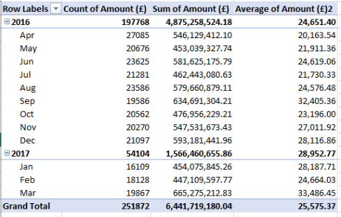
Note the modal month – the final one, March, running through the 31st of 2017. Perhaps an accumulation of unspent, budgeted monies at the year’s close spurred the outlays, but only perhaps. Note on the other hand that the number of purchases then are comparatively few – but that very understated figure pumps the average expenditure to a month-leading 33,486.45. It is April, the financial year’s inaugural month, that surpassingly records the most expenses – perhaps because budgetary allotments may have been in place by then and immediate-need purchases were transacted sooner rather than later – but at the same time with the lowest per-expense average. I sense a story angle there, but reasonable people may choose to disagree.
Because the expense amounts have been sorted highest to lowest, you’ve also likely noticed the cluster of negative expenses gathering at the foot of the sort. Presumably these quantify overpayments, or perhaps late fees and/or other penalties. In any event, if you want to sum the negatives two formulaic approaches come to mind. First, I named the expense range F2:F251873 amnt and played this by-the-book strategy:
=SUMIF(amnt,”<“&0)
But I also kicked out this dedicated array formula:
{=SUM(IF(amnt<0,amnt))}
Either way, I get £-44,928,905.53, and that calls for an awfully large petty cash drawer. Call me the iconoclast, but the array formula actually seems to me to make a bit more “sense”, in spite of its resort to the fabled Ctrl-Shift-Enter keystroke triad; it’s that text-based “<”&0 concatenation in SUMIF that gets me. How the function reads numeric value into a text-concatenated operator – something the array formula manages to avoid – is just one of those things, I suppose. But it isn’t “intuitive” to me, whatever that means.
And for one more journey through the data, might there be an association between disbursements and day of the week? You may impugn the question as silly or trifling, but I prefer to view it in blue-sky research terms. If you’re still with me one (but not the only) route toward an answer is to careen into the next-free column H, name it Weekday or something like it, and enter in H2:
=WEEKDAY(D2)
And copy down (remember that Sunday returns a default value of 1). Next, try
Rows: Weekday
Values: Weekday (Count)
Weekday (again, this time % of Column Total; note that here too you’ll need to define the field in Count terms first)
I get:
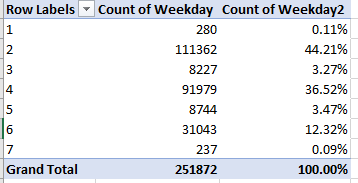
Those numbers are more odd than silly, or at least notable. Monday accounts for 44% of all expenses issued to vendors, with the following days exhibiting a strangely alternating up-down jitter.
Now those outcomes count the number of expenses administered, not their aggregate value. Drop Amount (£) into Values too and cast it into to % of Column Total terms and:

That’s pretty notable too. The Monday – and Friday – expense counts are by no means proportioned to their monetary outgoings (that 0.00% sum for day 7, or Saturday, is an illusory, two-decimal round-off).
Why the Monday-Friday inversions? Fare question.

Thanks for this link. I download and play with government, including UK GOV data too. You have found the kind of things that all such files exhibit: our money is in the hands of people with few standards. In my days as an accountant, we used to have procedures manuals, charts of accounts, supplier lists and so on … and they were kept up to date. It cannot be possible for two and more [similar] names to appear on the list when only one of them is correct. can it?
Anyway, they are where they are!
Do you use Flash Fill?
Do you use Get & Transform?
Loved the link to Lionel O’Gauge!
Duncan