It’s alarmingly philistine of me to say so, but I know what I like; and I like the heat maps that track the vaccine-driven advances in the United States wrought against infectious diseases, schematized by graphics boffins Tynan DeBold and Dov Friedman and featured in the Wall Street Journal in 2015. One of them looks like this:
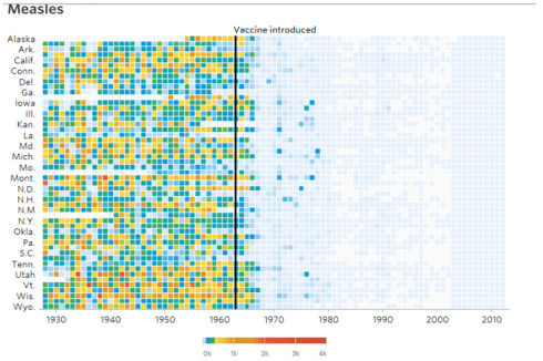
These are of course heat maps in the broadened sense, plotting epidemiological movement across time instead of territory, and tiling their data into tightly-bound mosaics, whose colors blanche as the diseases recede. In short, a well-told story of stirring medical progress, the data for which is contributed by Project Tycho of the University of Pittsburgh and available for download there (you can sign into it for free if you’re affiliated with an educational institution). By contrast, think what a line chart bearing 50 data series would look like.
It should be added that the Tycho site itself hardwires a heat-mapping utility into its pages, in what could be construed as an ancestral precursor of the DeBold-Friedman outputs, e.g.

It is worth asking, then, about the refinements DeBold and Friedman commended to the Tycho charts, and the respective reasons why.
But in any event the map designers don’t need my everyman’s encomium; their depictions have won at least two awards – one conferred by the Global Editor’s Network (GEN), the other by the Kantar Information is Beautiful judges. The former’s site declares the maps were “…wildly popular on social media as well as with statisticians and graphics editors weighing in on how they would’ve approached this project”.
Sounds good to me, but note for the record that the Y axis above records 26 state names, pulling up 24 (really 25; the District of Columbia – the nation’s capital that possesses extra-state status – is likewise counted) short of the full American complement. Those names – at least as they’re represented above – have been invested with a font size that misaligns them with the 51 rows of data; the names are simply too large for the row heights that capture the data, a mismatch that conduces toward the follow-on question as to why the particular states above were earmarked for display, to the exclusion of the others.
You’ll also observe that the maps’ cell widths vary. Contrast the DeBold-Friedman above with this one:
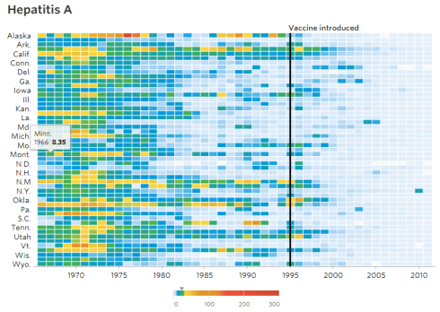
Because the above map – and its 26 states – time-stamps its data from a later point of inception its cells are dilated, a refit that widens it equivalently to the other maps. Do these discrepancies matter (along with the ten-year intervals marked in the first map that have been halved in the second)? I’m not sure.
And something else about the maps provoked a thought or two. On his website Dov Friedman tells us that he used Excel “to aggregate over 100,000 data points. The data was then plotted on heatmaps using Highcharts. All sections were templatized with handlebars [sic].”
Now Highcharts and Handlebars are two applications with which I am not familiar (I told you I was a philistine); But in the course of perusing and admiring the maps a renegade idea gatecrashed my cerebellum: could the maps be emulated – at least more or less – with Excel alone?
I think the answer is yes, at least more or less; it seems to me that, with the disease data dropped into the Values area, the heat maps could be made to emerge from a pivot table that would crosstab state names and years against the data, whose numbers could be comparatively scaled through a series of conditional formats.
In receipt of that self-issued marching order, I proceeded to download the measles data for five states to see how the heat maps might be framed in Excel-only mode. The numbers were redirected into a pivot table (not a straightforward program; the download assigned each state’s figures to an independent field, and as such had to be harnessed inside a single State parameter via the Get & Transform utility. In addition the “-“ cell entries marking absent data had to be quantified, but I’ll spare you the particulars).
Once the above reconstructive work was carried out the resulting pivot table proceeded pretty straightforwardly, something like (depending on how you’d name the fields):
Rows: States
Columns: Year
Values: Incidence
And once the table was put in place, the cells would be subjected to the color-graded conditional formats described above (in tandem with white borders), and while I didn’t do a primo job of replicating the DeBold-Friedman scheme it’s all about the concept, after all.
Now of course the pivot table will line its upper border with the year (Column area) entries, even as the maps in question underscore the values with those data. The simplest route toward emulation would call for a blue-on-blue formatting of the years above, or a simple hiding of their row, after which the years could be typed below. The Vaccine introduced line was almost surely drawn, and that’s what I did. The color legend

Is a tricky one; it could perhaps be rendered though an equally simple coloring of consecutive cells per the conditional formats, though it appears that the DeBold-Friedman band comprises tints of varying width. By way of resolution, four cells or so could be allotted per 1k, to support multiple colors spanning the same interval (note that the data for the states I selected don’t report numbers in the 2-4k range.)
In light of the preceding, I’ve gotten this, by way of a demo:
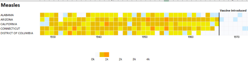
The larger point has been made, one hopes. Proper equivocations aside, the map approximates the representations of the DeBold-Friedman efforts, but again without recourse to applications beyond Excel. Indeed – for me the phase of the task that threw up the most resistance was the foundational pivot table itself. But once you toss off that gauntlet, the map beckons – because the map is the pivot table (and there’s no need by the way to resize the numbers in values for visibility’s sake, because the conditional formats will obscure them anyway).
Thus it seems to me that my infographical proposal works, albeit on a slight lower end from the DeBold-Friedman portrayals. And while I’m not claiming it’s the stuff for which awards are bestowed, I’m working on my acceptance speech anyway.

Leave a comment