We haven’t met, but I can say with a jot of confidence that I’ve likely done something you haven’t – taken a Regents exam. Exams.
I’m not clipping the achievement to my lapel as a badge of honor, you understand, just stating a biographical matter of fact. The Regents – a staple of the New York State educational system in which I spent more than a little time – comprise a series of what are termed exit exams; pass enough of them and you walk away with a high school diploma of the same name. Your correspondent took his share of Regents, his scores emobdying the “scatter” in scattergram, but no matter; I took them, and I’m a better person for having done so.
But before you file a Freedom of Information Act request to verify those abnormally-curved results you may want to review a larger, ultimately more interesting record of Regents attainments, the dataset supplied by the New York City open data site that summarizes in grand form the Regents scores of students statewide for the years 2014-17. It’s a big file, needless to say – so big you’ll need to download it yourself – and its 212,000 or so records have a lot to say about the testing profile of New York’s high schoolers.
It also has a lot to say about spreadsheet organization, more particularly the juxtaposition of column G, Demographic Category, to H, Demographic Variable. Those columns/fields in fact identify a series of putative fields and field items respectively; and as such, G’s contents could, at least in theory, have been more conventionally structured into discrete parameters, each owning a column all its own.
But that prescription calls for an elaboration. Consider this fledgling pivot table drawn from the Regents data:
Rows: Demographic Category
Demographic Variable
Values: Total Tested
I get:

Note that that all the Total Tested subtotals are equivalent, intimating that the five Demographic Categories cleave the same population into an assortment of cross-cutting attributes, and thus summing the same student count five times. The by-the-book alternative, again, would have assigned each Category to an independent field, such that an interest in test achievements by Gender, for example, would require the user to simply drag Gender into Rows. As it stands, however, a Slicer (or filter) would have to grease the process, e.g.:
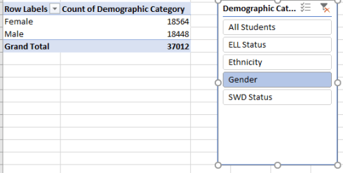
Moreover, casting the potential field-bearers into mere item status beneath that singular Demographic Category banner appears to obviate a good many cross-tabulating possibilities, e.g.: a breakout of tests by both Ethnicity and Gender. How, for example, are we to learn how black female students score on the Regents when both attributes are lodged in the same field, and so must occupy the same label area?
But at the same time, the spreadsheet designers had to contend with a supplementary problem that overrides my challenges – namely, that the upgrading of say, Ethnicity and Gender to field standing would appear to require that data present themselves in individual record form, e.g. each student’s performance on each test; and those 2,000,000 scores/records would burgeon beyond Excel’s data-accommodation space.
In any case, there is indeed lots to learn structural complications notwithstanding, and we could begin by starting coarsely – by calculating the average overall Regents scores by year:
Row: Year
Values: Mean Score (Average, formatted to two decimal points)
I get:

(Note that one record, attaching to the Island School in Manhattan, exhibits a nonsensical entry for its year. By filtering and comparing the Island School data, it appears that the record belongs to 2017.)
The averages are remarkably similar, though I’d venture that, given the 2,000,000-pupil universe, the one-point differential distancing the 2015 and 2017 scores is significant. Remember that the Regents passing score is pegged at 65, suggesting that the test designers got their threshold right.
But those averages aren’t quite definitive, and for a couple of connected reasons, one subtler than the other. The first recognizes that the student double-count pinpointed above proceeds in effect to compute the average scores multiple times, because the records operate under the steam of different demographic categories and numbers per record. Thus the mean average for the Gender category alone – which nevertheless contains all students – is likely to depart at least slightly from the mean average for Ethnicity, which likewise contains all students. If, for example, we reintroduce the Slicer for Demographic Category for the current pivot table and tick All Students, we’ll get:

The differences from the initial pivot table are very small but evident, again because the Total Tested numbers per the All Students records don’t perfectly line up with the Total Tested per-record numbers for Ethnicity, for example – because each record receives an equal weight, irrespective of its Total Tested value.
And it is the matter of weighting that points its arrow directly at the second question, one we’ve seen elsewhere (here, for example). The per-record mean averages ascribe an identical mean score input to each record, even as the test taker numbers vary. And that bit of record democratization vests greater, relative influence to the smaller numbers. The result, again: a possible skewing of the averages.
But because Column I enlightens us about the actual test taker numbers, we should be able to derive a simple calculated field to impart a corrective to the weighting problem – once we deal with the very large number of records – about 75,000 – that just don’t report their score results. These are the entries dotted with the “s” code, and our formula needs to ignore them as well as their test taker numbers, which are stated, after all.
So here’s what I did. I headed next-available column S TotalPts and entered, in S2:
=IF(J2=”s”,0,I2*J2)
That expression means to assign 0 for any “s” datum, and otherwise multiply the record’s mean score by its number of students. (Important note: absent Means Scores almost always associate themselves either with a Total Tested number of five or less, or with entries possessing the SWD or Non-SWD values. (SWD stands for Students With Disabilities.) One assumes that both types exclusions are justified by reasons of confidentiality; but remember that the five-way count of students in the data set should subsume most of the SWD takers anyway, via their inclusion in the All Students item.)
After copying the formula down I titled the T column CountedStu and dropped down a row, wherein I entered:
=IF(J2=”s”,0,I2)
The formula asks if the relevant row in J contains an s. If so, a zero is returned; otherwise, the number of test takers cited in I is returned.
I next devised a simple calculated field, ActAvg (for actual):
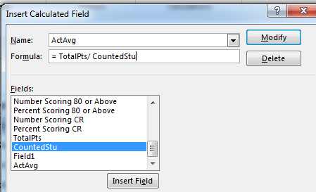
That field can now be made to work with any other field whose items are banked in Row Labels, e.g. by substituting ActAvg for Mean Score in Values (and leaving the All Students Slicer selection in place). I get:

It’s clear that our weighting refinements have uncovered a “true” higher set of averages, and that continue to sustain the near-point improvement from 2015 to 2017.
But again, there’s quite a bit more to learn from the scores. But I’m asking now to recess for lunch – and yes, I raised my hand.

Leave a comment