This just in: The newspaper of record is rebranding itself into the newspaper of records. The Times – the one from New York, that is – has moved to evangelize the data-journalistic thing among its staff, and towards that admirable end has crafted an extended in-house workshop, syllabus and practice files/exercises made available to all the rest of us in Google Sheets here and here, respectively (ok, ok, call me the Luddite; I’m downloading the files into Excel).
The latter link above points to a sheaf of workbooks classed Advanced, Intermediate and Beginner (these rubrics sorted alphabetically, thus interpolating Beginner between the two ostensibly more challenging data collections. And note the Times cautions that even as the data sets have been mined from real-world repositories they’ve been alloyed, the better to serve their instructional purposes), and it occurred to me that a look some of the course contents might prove instructive in its own right.
We can begin with the Beginner Census_Characteristics of Older Americans (2016, 2019) workbook, whose associated Census: Worksheet exercise document asks us to unhide all its sequestered columns (about 65 of them in fact, most of which are massed at the far end of the data, something I missed repeatedly). Remember I’m downloading the data to Excel, an improvised recourse that bunches the field headers into ill-fitting Wrap Text mode. But by directing the download in Open Document mode instead the book nevertheless returns to Excel, but with the headers properly, visibly wrapped, though the columns could do with a bit of resizing (I don’t know if these little disjunctions bear traces of Google-Microsoft woofing).
The exercise text proceeds to let us know “We roughly color the group of categories. For example, the race and Hispanic stats are in light orange, and green columns are about marital status”. But no; these tinted ranges aren’t conditionally formatted, and to be fair can’t really lend themselves to those cellular ornamentations. What shared textual/numeric datum, for example, could encourage all the ethnic data cells in columns K through V to turn orange? On the other hand, the columns brandish their colors all the way down to row 999, Google Sheet’s default row allotment maximum, though the data come to a halt at row 52.
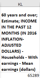
Next, among other questions the exercise puts to us, we’re asked to “Take the average of the state mean earnings [presumably for Americans age 60 and over] and then look up the mean average for the US. Why do these numbers differ? “ Again, devoting ourselves to the 60-and-older data in the “states, 2016” sheet, and more particularly the 60+Pop; mean earnings field in column BB, that average is realized easily enough. But what mean average for the US does the Times want us to look up, and how? Of course, that very requisition may contribute to the exercise; and so after a bracing scroll-through across the 419 fields bulking up the “2016, US” sheet I stepped atop its cell K2, the one reporting mean household earnings for the 60+ plus demographic of $65,289 (sans curency format). But my lookup was eyeball-driven, and certainly not under the steam of any maneuver typically entrusted to the redoutable V, or HLOOKUP function. Those instruments, after all, assume we know the identity of the pertinent lookup value – and we can’t know that the value reads “60 years and over; Estimate; INCOME IN THE PAST 12 MONTHS (IN 2016 INFLATION-ADJUSTED DOLLARS) – Households – With earnings – Mean earnings (dollars)”, the header entry in cell KL1:
And so by “look up” I’m constrained to assume that the Times is asking of us a simple, unmediated, visual hunt for that information. In other words: look up, not LOOKUP.
And with the respective means – the national average recorded unitarily in the “2016, US” sheet and the state-by-state average figured in “states, 2016” – in hand, we can propose an answer to the question the exercise puts to us: namely why the two averages differ. The answer, I hope: that the state average accords equivalent weight to each of the 51 (Washington DC appears in the list) income figures irrespective of population size, while the single national figure in effect tabulates the earnings of every American, thus flattening out any skew.
And speaking as a mere auditor of the Times workshop, I’d pose the same strategic conjecture about the exercise question “Which 3 states have had the largest percentage increase in their residents who are above 60 over that time?” That is, I’d wonder if the Times expects its tutees to simply do the basic math and literally look for the three most prominent state increases – or rather, filter out a top three, a la Excel’s filter option.
But the filtering alternatives in Google Sheets can pull users in two very directions. One pathway transports them to a filter view resembling the standard Excel dropdown-menu mechanism – but I can’t find a Top 10 (or 3) possibility registered among its capabilities here. The other byway to a top 3 drops us off at the most cool FILTER function, a de facto progenitor of the yet-to-be-released Excel dynamic array function of the same name; but its workings demand an intricacy not likely to be broached in a beginner class. Thus, I suspect that the Times again wants its learners to resort to simple visual inspection in order for them to glean that top 3.
As for the actual line-item math here, should you or a Times staffer choose to proceed with the exercise, I’d hammer in a new column somewhere in the “states, 2016” sheet and slot this formula in for the District of Columbia, the first “state” in row 2:
=D2/C2-J2/I2
The column references – D,C, J, and I – offer up the base and 60+ population data for 2016 and 2009. (And yes, the formula can make do without parentheses: The order of operations take care of themselves.)
Copy down the ad hoc column, and the trio of states divulging the largest increments in the 60+ cohort will be in there, somewhere.
And if the filter isn’t working for you, why not sort the numbers largest to smallest, and check out rows 2 through 4?

One Response to “The Grey Lady Learns Pivot Tables: NY Times J-Course Data, Part 1”