Birth Months and Budding Ballplayers: The Little League Thesis Revisited

24 Aug

It’s August – dog days, the vamp-til-ready for the fall, the months in which the school year that impends begins to fill children across the land with unnameable dread.

But August brings with it a perquisite, too: if your next career move points you toward a stint in baseball’s major leagues, August is the month for you.

By that bit of vocational counsel I’m directing you to a truth – which can hardly be held to be self-evident – disclosed by studies that corroborate a small but palpable disproportion among major leaguers born in August (along with a Freakonomics post citing birth-month advantages turning up in an array of sports).

The standard accounting for the August baseball edge goes something like this: Little League teams enforce a July 31 birthdate cut-off for any season’s eligibility, and so boys (and girls nowadays) born in August – the oldest and likely the more physically prepossessing of their peers – continually dominate, and through the experience are thus better positioned to ultimately win that call-up to the majors.

Truth to be told, my contrarian self resisted the claim. As the Rabbis say, it appeared to my impoverished mind that the performance differential stoked by so scant a datum as birth month couldn’t materially pump up, or by extension depress, a player’s employment prospects. But what do I know? It seems as if the numbers respectfully disagree with me; so let’s then see what they might mean, and where else we might take them.

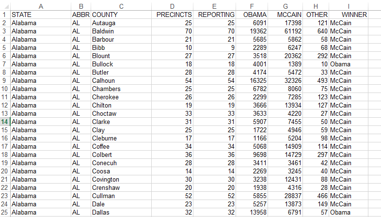
My data spring from an Excel workbook I’ve adapted from the storied, freely-downloadable baseball player database managed by Sean Lahman (who won’t turn away contributions, by the way), one of the go-to sites out there if you’re into these kinds of things (it purports to contain, after all, statistics for every season played by every major leaguer since 1871).

The workbook about to unfurl on your screen reports basic demographic information about the players, and Lahman was kind enough to jam in a birthMonth field into the mix, exempting us from the chore of wheedling months from birthYear (not necessarily a big deal, in any event via the MONTH function, similar to the WEEKDAY we encountered in a previous post). You can get the workbook here:

Ballpayer demographics

But before we fashion the pivot table that’ll help us replicate the birth-month claims, time first to put some spreadsheet into spreadsheet journalism. Some of the records before you are missing birth month data (primarily from pre-1900 players); and as these can’t help us here, I sorted the worksheet by birth month,  having the effect of consigning the vacant birth month cells to the very bottom of the ream of records (this should happen whether you sort by smallest to largest or in the other direction). I then inserted a new row in 17454, thus severing the blank birth month records from the usable remainder. So why not simply delete these inert records, then? Because I may want to recover them for some different analytical purpose later, and should that eventuality present itself I need only delete row 17454, and restore the records below it to the larger body of data.

In any case, now we can insert a pivot table and slide in these fields:

Drag birthMonth to the Row Labels area.

Drag birthMonth again to the Values area (we’re in effect breaking out birthMonth by itself). Change the Sum operation to Count if necessary (click anywhere in Sum of birthMonth, and then click PivotTable Tools tab at the top of the screen, click Options> Summarize Values By> Count.

Drag birthCountry to the Report Filter, and why? It’s because we want to confine our scrutiny to American-born players (at least initially) – the ones most likely to have played in Little League. Click the Filter arrow, and select USA (tip: you can accelerate that trip to the lower reaches of the alphabet by typing U). You should see:

Note the quite discernible August margin (month 8). To concretize this outcome, click anywhere in Count of birthMonth, Show Values As (assuming haven’t strayed from the Options button group) > % of Column Total. Now you’ll see:

That’s fairly definitive (remember our universe comprises 17,000+ records, so questions about statistical significance should be safely pre-empted). Note in addition that the next largest birth cohorts populate September and October, findings which would appear to comport with the theory, too, as would the shortfalls in April-June (even the diminutive February tops May and June). Only the uptick in July seems anomalous, its offspring the youngest per the Little League’s July 31 threshold. One wonders if some Little League affiliates hold to a June 31 demarcation instead – something to research.

In any case it all seems pretty confirmatory, particularly if for comparison’s sake you apply the filter to a different country – say the Dominican Republic, a nascent demographic power in baseball’s workforce. Replace USA with D.R. in the filter (that’s how the country is represented here) and you’ll see:

(Universe size here, by the way – 542 players).

Not terribly much pattern in this case, but what we do see is that August doesn’t own the modal representation here – October does, and by a lot (a predominance in its own right that might justify investigation). August’s 8.86% here doesn’t distance itself very far from the chance expectation of 8.49% peculiar to any 31-day month. (Of course you can now filter for any country, and if you want to assess birth months against the actual number of players contributed by that country, drag birthMonth a second time into the Values area and do the Summarize Values By > Count thing. Note then that both Value fields will sport the Count of birthMonth rubric, but the first of these will have been subjected to that special % of Column Total tweak. I’m sure, by the way, that my co-residents in London will be pleased to learn about the 34 major leaguers born in the UK.)

OK – this is all interesting and instructive, but something tells me we’ve withheld a term from the larger equation. After all, explanations of the August syndrome invest in the Little League eligibility rule, as it were – that July 31 cut-off. But the Little League didn’t debut until 1939, and hadn’t widened its ambit beyond the state of Pennsylvania until 1947. And it wasn’t until around 1949 that the Little League idea went viral, at last affording countless parents nationwide the opportunity to live the American dream – the chance to act like a lunatic in public without reprisal.

The corollary point then, is that large numbers of major league players never joined a Little League, and never even had the chance to; and given that proviso, we need to reassemble the percentages along Little League/pre-Little League lines, and then see how the numbers break.

So let’s proceed. First, click back on USA in the filter and drag the birthYear field into the Row Labels area, stacking it atop the birthMonth field already in place, because we want Year to serve as the superordinate breakout field as it were, such that years break out into months, as you’ll see:

(By the way – the Compact Form Report Layout is perhaps the most legible one at this point. To introduce it to the pivot table click PivotTable Tools > Design tab > Report Layout > Compact Form.)

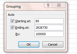
Then click on any year and click PivotTable Tools (if necessary) > Options > Group Selection. In the resulting window type

OK – I sense a need to explain myself here. In order to demarcate pre and post-Little League major league players, we need to identify the start year from which boys (they would be boys, here) began to have a fighting chance to sign on to a Little League team. If the League went big-time around 1949, I’m estimating (at least for starters) that 12-year-olds – that is, those kids born in 1937 – could have plausibly made themselves available to suit up. That’s an educated guess, of course, but it’ll do for now. In light of that conjecture, I’m thus interested in grouping players born before 1937 – hence the two years entered above. The 117 counts the number of years spanning 1820 and 1936, entered here because we want the ensuing pivot table results to bundle all 117 years into a  unitary total (you’ll see what that means momentarily).

Click OK, and you should see:

No, that’s not what we want to see, because Excel continues to aggregate data for all the years, bunching the post-1936 birth years into a residual category that completely confounds the outcome we’re seeking. But by clicking the filter down arrow hard by the Row Labels title and ticking >1937 off, we get

Well, that’s interesting too – because an August birth-month differential persists, not as pronouncedly as for the post-1936 years, to be sure, but it’s there.

Of course you can fool around with different Ending At years in the Grouping window to varied effect. When I group for birth years between 1820 (the oldest recorded birth year in the Lahman database) and 1900, the aggregates break rather differently and incline toward birth month parity:

But if I establish the upper year limit at 1920 – and virtually no boy born that year or earlier played in Little League – August still pulls into second place behind October, at 9.18% (the continuing prominence of October in these snapshots might be worth pursuing as well). Explanations anyone?

Well, you can think about all this over the weekend. As for me, I’m thinking about my brother – pretty decent Little Leaguer, and born in…August. He became a neurologist, heads a division at the FDA, gets his name in the Times now and then. But yo, bro’ – maybe you should get back into the batting cage and starting taking your hacks – your next career move awaits.

Bibliofile: Tracking the Bestsellers

20 Aug

You can’t get blood from a stone, but can you get a story from a list? Presumably the answer verges encouragingly near the affirmative, else I’d never have posed the question and risked the worldwide derision sure to accompany a “no”. But still, the answer depends in large measure on what the list is about, and a recent spreadsheet posting by the Guardian enumerating the 100 all-time best-selling books in the UK might be harboring a story or two beneath its descending sort order, provided we’re prepared to pull back the palimpsest and sharpen the lenses. You can download the list here in Excel form:

 Top UK book sales of all time

The data as we see them are rather straightforward, and perhaps already have their stories to tell, albeit unsurprising ones. You’re not astonished by Harry Potter having imperialized six of the top eight positions; and neither are you thunderstruck by E. L. James’ latter-day incursion into the list (I count 150 shades so far, but check my math).

Still we could do well to ask more of the data. I am reminded of the theme sounded by devotees of digital humanities (I am thinking of Stanley Fish’s Times Opinionator piece posted earlier this year), to the effect that if you spin the data through sufficient permutations something interesting is bound to emerge sooner or later; and while that premise recalls the monkey-in-front-of-the-typewriter secretarial pool, there’s probably something to the notion. So what sort of permutations are available here for the spinning?

Let’s see. For one thing you could break out the data by publishers and tabulate their respective title counts, along with the aggregate sales for each. Turn the ignition on a pivot table and

Drag Publisher to the Row Labels area

Drag Publisher to the Values area

Drag Volume Sales to Values. You should see:

We see Random House tops the hierarchy with 19 titles (that in addition to the solitary Childrens Books entry under another imprint), followed by Penguin, Transworld and Bloomsbury in their respective silver and bronze positions. Yet Bloomsbury – owner of the Harry Potter franchise – rules the volume parameter.

Next click anywhere in the Sum of Volume Sales field (fields can be renamed, by the way;  just click in the field title cell and type something else, an emendation which will not rename the data source field, however) and click PivotTable Tools >Options>Summarize Values By >Average, and you’ll get:

If you’re not happy with the prevailing formatting – and you probably aren’t – you can right-click anywhere in the Volume Sales field, click Value Field Settings, click the Number Format button and choose your refinements. You can then right click anywhere in Count of Publisher, click Sort > Largest to Smallest (yes – as usual, there are other ways of making this happen), bringing you here, depending on your formatting decisions:

Note Bloomsbury’s superior average sales-per-title, additional evidence of the Potter effect. Now how about list appearance by year of publication?

Assuming you’re working with the same pivot table as above, drag Volume Sales away from the Values area, but leave the Publisher field in place. Drag Publication Date to the Row Labels area.  Click PivotTable Tools>Options>Group Selection. In the ensuing dialog box click Months off if it’s been selected, and click Years. You should see:

We see 2004 and 2005 accounting for 24% of all titles, at least suggesting that a sustained stretch of book availability need be paved before a book acquires the legs to command top-100 status (note that all three of the 2012 entrants issue from the excitable hand of E.L. James).

But we’re not finished yet. It occurred to me that one could correlate a book’s sales with its interval of availability, namely the number of days having elapsed between its date of publication and August 9, the date in which the Guardian report beached up onto its Datablog. One could reasonably surmise that, all other things being equal, the longer a book’s availability the greater its sales (beholden of course to the understanding that our data are severely skewed – comprising the universe of best-sellers).  Verification of my little conjecture requires that we fashion a days-elapsed calculation, which draws us in turn into a slightly more searching look at how spreadsheets regard dates.

The first – and pre-eminent – thing you have to understand about dates is that they are numbers, however garbed and prettified in their cells. A date is a number that registers the number of days separating it from January 1, 1900. Thus

8/19/2012

is in actuality 41140 (keep in mind that any date entered in the current calendar year is understood by default to reference that year. Thus one could have entered 8/19 above, to the same quantitative effect). By clicking on any number-bearing cell along with the Number drop-down menu in the Home tab, a diverse (but not comprehensive) array of formatting possibilities descends for your inspection and selection:

The publication dates exhibited in our best-seller spreadsheet embody what Excel terms its Long Date format, which garnishes the cells with the day-of-the-week information, though I fail to see the expository benefit attaching to the data. But that cavil is in a sense irrelevant;  all we really need to remember is that the varied number formats in no way impair or adulterate the values of the numbers so formatted. Thus

Sunday, August 19, 2012=8/19/2012=41140

Now back to the correlation question. If we want to associate book sales with their durability – that is, their extent of availability across time – we want then to correlate the data in Publication Date with those in Volume Sales, something we can do pretty easily with the CORREL function.

Before actually going ahead, I’ll reiterate my hypothesis: that sales should be inversely correlated with publication date. In operational terms that means that the earlier the date – i.e., the smaller the date value (as per the above discussion) – the larger the volume sales.

Next select a blank cell and enter

=CORREL(D2:D101,H2:H101)

CORREL asks you to enter two ranges (here called arrays, but we’ll look past that technicality here. The ranges can be entered in either order) of identical lengths, whereupon it compares each pair of same-row values (e.g., H2 with D2, H3 with D3, etc.) and synthesizes the correlation. The higher the correlation in either direction, negative or positive, the greater the association between the values in the columns (though none of this would demonstrate causal association). Recall that I’m predicting a negative correlation here – earlier (smaller) dates, higher sales. Again, bear in mind that the ornate formatting imposed upon the Publication Dates doesn’t matter because the dates really are numbers, and will be treated as such.

Complete the expression above and you should realize a value of

.077799

And that, my friends, is a decisively low correlation, avowing a minimal association between publication date and sales; and for many analytical purposes a correlation in the .078 range would end the tale then and there. No correlation, no story. But here, given a pairing of variables that could have reasonably been supposed to augur a significant association as a kind of null hypothesis, I would submit that absence of association qualifies as a bit of a pause-giver. Why shouldn’t older titles – older best-sellers – line up with more voluminous sales? Good question, I think.

In any case, what we could really use here are week-by-week sales data, the sort that would empower us to build trajectories and sight trends, the better to bulk up the analysis. Doubtless Nielsen has such data, and just as doubtless they’ll ask you for big bucks in order to get it. So whaddya say we all chip in? You can put me down for a tenner; and maybe we can get J.K. Rowling and E.L. James to drop a few pounds in the kitty, too.

Cell Breakout: Crime Data and Dates

14 Aug

Time for a bit of review. Spreadsheetjournalism is in the first instance about how spreadsheets might be placed in the service of story-seeking, a marching order coupled to a corollary remit – namely, to attempt, through a judicious tweaking of the data as they currently stand, to synergize some novel, reportable take on the information that wasn’t there before, or at least that had been hiding-and-seeking coyly in the brush. I’m not necessarily in love with the term, but we could call this sort of enterprise value-added journalism, an instance of which we saw it in the post on the 2008 election. Here’s instance number two.

Crime, like it or not, is a reporter’s staple, and crime data abound on the net, variously guised and variously usable. One notable stockpile of data occupies the shelves at data.dc.gov, a site devoted to informational bits and pieces on the nation’s capital; and I’ve adapted their Crime Incidents 2011 workbook for download here:

WashDC crime data 2011

(The data in their original form had to be taken back to the shop for some retooling; had I asked you to call up the workbook directly from the data.dc site the attendant issues would have pushed us off message).

Look around, and begin to think about what’s up with the data. (Click here for an explanation of some the more recondite fields on the sheet; thanks to Christopher Marshall of dc.gov for the heads-up.)

Of course you could begin unprepossessingly, by simply aggregating all crimes by their categories (needless to say, our view is confined to reported crimes) by running them through a pivot table, or by subjecting them to the DSUM function or even, if you insist, trotting out the hoary and ungainly Subtotal option, a feature I never use. You could do any of these things, to be sure, but your findings won’t quite qualify as stop-the-presses material; we’re entitled to assume that somewhere in DC that story has already been filed. But wait – I think I’ve experienced a low-grade epiphany: what if we were to analyze the distribution of crimes by day of the week? That might stake us to a less-than-obvious angle on the matter, particularly if we could bare day-specific variations in crime types. There’s just one problem with all that: even as the workbook before us indeed sports a REPORTDATETIME field in the C column, actual days of the week are nowhere recorded. So that’s where we come in; we need to somehow pluck days from the dates streaming down C.

You’ll be pleased to know that the means for doing this is rather simple.  Make your way to the K column, rewrite its heading to WEEKDAY or something kindred, and enter in K2:

=WEEKDAY(C2)

(You’re doubtless wondering why I elected the K column. It’s because the data there are completely redundant, consisting exclusively of the word WASHINGTON, thus adding nothing to the narrative. Rather than advancing to the next empty column – W – I’ve opted for a column far closer to the data with which we’re working.)

You should return a number somewhere between 1 and 7. I get 1 (but if you’ve sorted the dates you may see a different value), standing for the first day of the week – i.e., Sunday, day one in Excel’s calendrical view. (And don’t be fooled, by the way – WEEKDAY gives back any day of the week, not just Monday through Friday.) Copy that formula down the column, and you should get something like this:

You see what WEEKDAY does, and does easily – it extracts the day, in numerical terms, from a date entry. But I know what you’re thinking: wouldn’t readability be served by replacing the numerical day entry with its associated name, e.g., Sunday in lieu of 1? Agreed; and here’s what I’d do: in a blank area, say starting in cell Z1, enter the values 1 through 7 down the Z column. In the adjoining column AA enter the days of the week beginning with Sunday (you may know that you need only actually type Sunday in AA1; return to that cell, click on its fill handle and drag down, and the other day names appear in sequence, a consequence of one of Excel’s built-in fill routines). Then select cells Z1:AA7 and name the range DAYS (by clicking in the Name box and typing DAYS and tapping enter:

There’s a very good reason to name a range, as we’ll see.  Now return to K2 – the first of the day-identifying cells – and now type and follow with Enter:

=VLOOKUP(WEEKDAY(C2),DAYS,2)

What’s happening here? We’ve deployed a VLOOKUP function, a near-indispensable tool in the box that consists, in its default mode, of three elements or arguments, as they’re officially termed. The first alludes to that which is being looked up – in our case the numbered day realized by WEEKDAY, which has now been nested in the lookup. The second argument – the reference to DAYS – names the lookup range in which the numerical value we’ve just returned with WEEKDAY is to be looked up; and the final argument, here the number 2 – pinpoints the column in which the “answer” – that is, the day name – is stored.

In other words, and assuming the day in cell C2 is Sunday, the lookup returns the number 1 via the nested WEEKDAY formula, then reckons that number against the DAYS range (in that range’s first column), and then “looks” in turn to the second column – the 2 in the VLOOKUP formula – for the day name, in this case Sunday. In other words, 1=Sunday. And naming Z1:AA7 liberates you from the chore of having to deal with all those nasty absolute-reference dollar signs that beg your attention when you copy the range down a column. Naming Z1:AA7 as DAYS means that those coordinates always remain Z1:AA7, irrespective of any new, copied location.

And once the weekday names have been engineered in K, it’s but a short commute to a revealing pivot table (note: you should first click the Refresh All button in the Data ribbon before you proceed, so as to incorporate that amended WEEKDAY K-column heading into the table-to-be). Then once you’ve inserted the pivot table

Drag WEEKDAY to the Row Labels area.

Drag OFFENSE to the Column Labels area.

Drag OFFENSE (yes, the selfsame field – see the quick note-in-passing on this issue in my August 7 post) to the Values area.

You should see:

(ADW stands for assault with a dangerous weapon. THEFT F/AUTO signifies theft from an auto.)

OK – that looks moderately cool, but before we scan the data you probably want to know why Monday is instated first among the days, particularly after we observed that the WEEKDAY function nominates Sunday as day 1. Good question, the answer to which seems to turn on the day listing in Excel’s Custom Lists area (reachable via the File tab>Options>Advanced>General drill-down), in which Monday indeed is assigned the first position.

In any event, if you’re happy with the alignment above, fine. If, however, you do want Sunday to head the day list, right click on Sunday and maneuver here:

and click accordingly.

Now for the data. It’s notable that far fewer thefts are committed on Sunday; whether that ties in to a day-of-rest mindset I don’t know. Note in addition the homicide and ADW totals for Saturday, for example. There’s a good deal to think about here, as some crimes don’t appear to be distributed randomly – and the sample size of over 32,000 offenses is pretty formidable.

Now watch this. Click in any cell in the pivot table and click Pivot Table Tools>Options>Show Values As>% of Column Total:

34% of all arsons committed on Tuesdays? Hmmm. 44% of all homicides perpetrated on the two weekend days? The next step might be to contact a criminologist at a local university, or some police bigwig for some learned explication. In any case, one trusts you see the possibilities.

Of course, this is Washington DC, and you probably don’t live there. But I’d suggest it’s likely that your local police keep day-sensitive crime data; whether they’ll release it to you is another matter. If they won’t, get back to me: I’ll write you a supporting letter on my stationery.

My Pivot Tables Chapter: Coming to a Hard Drive Near You

13 Aug

With thanks to my publisher Apress, the chapter on pivot tables from my Excel 2010 Made Simple (soon to be a major motion picture) is now freely downloadable in PDF format via the following link:

http://www.apress.com/9781430235453

When you get there, click the Source Code/Downloads tab and the resulting Download Now link. I think you’ll find the chapter a pretty intelligible, and fairly far-reasching, treatment of the feature. I’d take a particularly considered look at Table 7-1, which synopsizes some central pivot table concerns.

2008 election: The Spreadsheet Version

10 Aug

Apropos my previous post, here’s a link to that spreadsheet:


Election by counties 2008

So Who Won the Election in 2008?

7 Aug

My sources tell me it was Barack Obama – but I’m perfectly prepared to believe you knew that already.

So what then, is the story behind that bathetic blurt of the obvious? Looking vainly for the there, there?

But put the bewilderment on hold and consider this: There are wins, and then there are wins. Ground the granularities to taste, redraw the units of analysis, and the data can break differently, and to different analytical effect.

To wit: the current Mr. President won 52.9% of the popular vote – even as he glommed 67.8% of the Electoral College, that vulgar, vestigial appendage on the body politic. Al Gore topped (President) George Bush 48.38-47.87 in the popular aggregate, but you know what happened. The 1960 splits? John Kennedy 49.72%, Richard Nixon, 49.55%. And the College? It gave Kennedy 58.05%.

The point is that various takes on the same numbers can yield discrepant, instructive, and even provocative conclusions. A robust cottage industry among sports statheads labors to manufacture alternative measures of teams’ effectiveness, promoting the guerrilla suspicion that victory need not invariably devolve upon the “really” better team (e.g., Bill James’ Pythagorean metric, which purports, to quote Wikipedia, “to estimate how many games a team ‘should’ have won based on the number of runs they scored and allowed”).

Returning to things presidential then, the story-seeker would do well to think about the unit thing. What, for example, about candidate wins by county, a unit that wedges itself somewhere between molecular-sized individual voters and those hulking aggregates called states?

There are 3114 counties in the US; I know that because I requisitioned the county-vote-breakout spreadsheet holed up at: http://www-personal.umich.edu/~mejn/election/2008/. Unroll the data, and it looks something like this (note – for reasons of space and resolution, the screen shots here merely excerpt the data):

Image

(You’ll note an infinitesimal shortfall in some counties reporting their results, but that’s a secondary matter here). The data read clearly enough, recording the respective totals of the contestants (including the existentially ominous Other), but that admirable lucidity won’t suffice to answer our question – namely, how many counties did each candidate actually win? Eyeballing the data clearly won’t do here, not when you have to fire your retinas at 3114 rows times eight columns’ worth of entries. What we need is an insurgent column, one that will simply proceed to name the victor by county, something like this:

Image

Once that emendation is put into place we can swiftly route the data to a pivot table, whereupon we can tally county victories and break them out by state, and even by size of county turnout.

To achieve that end we need to turn to the redoubtable IF statement, and no fancy trimmings required in this case. First I’ve typed Winner in I1 to impart a header to the column. Then click in cell I2 and enter:

=IF(F2>G2,”Obama”,”McCain”).

(Your homework assignment: ask yourself which result would obtain were Obama and McCain to receive identical vote totals in a given county.)

Once composed, just copy the formula down the I column. A most handy means for making this happen, if you don’t already know it:  click on I1, the cell bearing the new IF statement. Guide the Excel pointer to I1’s lower-right corner, where Excel’s default corpulent white cross reverts to a slender black one, called the fill handle. Double-click, and the formula copies itself down the I column, sidling every cell in H carrying data. This works whether the adjoining data inhabits the column to the left or the right of the copiedformulas. You can also accelerate the copy process by reconstituting the data as a table first, and then entering the prototypical formula in I2. The formula immediately copies itself down the column.

And if you want to streamline the data a bit you can now select the I column, click Copy, and execute the Paste > Paste Values option, thereby deposing each of the 3114 formulas with their numerical, hard-coded (that’s what they call it) result.

Once that deed is done the data can be redirected to a pivot table, where the answers for which you’re hankering begin to emerge. For example, you can construct a state-by-state breakout of county-victory totals – but first, you should delete the contents of row 3116, containing a cache of SUM formulas which don’t possess the same data character as the other rows.

Put programmatically, then do this:

To the Row Labels area, drag the State field

Drag Winner to the Column Labels area

Drag County to the Values area (note County is a text field, which we’re about to subject to a mathematical operation in virtue of directing it to the Values area. That operation is of necessity Count).

You’ll get:

Image

Now scroll to the Grand Totals row at the foot of the columns. The results, as they say, may surprise you. Senator McCain – whom we agree lost the election, wins 72% of America’s counties. Incroyable mais vrai.

And scan those state breakouts. McCain wins Kansas’ counties 102 to 3, even as he pulls 56.82% of the popular vote. And he wins 100%of Oklahoma’s 77 counties, juxtaposed to his 65.64% of the actual vote.

Of course these are optical illusions, born of the compacting of popular votes into winner-take-all county units. Nevertheless the read is instructive. After all, the Electoral College is an optical illusion too.

I earlier alluded to an additional pivot table prospect – a breakout of county wins by county size, as operationalized by county turnout. That sort of permutation would correlate candidate wins roughly along urban-rural lines, assuming that smaller counties are the less citified.

In order to chase this we need to tack on another column, which I’m simply heading Turnout. In cell J2 inscribe this simple formula:

=SUM(F2:H2)

thus totalling the three vote-recording columns for each county. Copy the formula down the J column and inaugurate a new pivot table. Then

Drag Turnout to Row Labels. Then click PivotTables>Options>Group Selection in the Group button group. You’ll see

Image

Note that Excel proposes to group the hugely varying county sizes by tranches of 100000. Let’s go with that default and click OK.

Then drag Winner to the Column labels area.

Drag County to the Values area. You’ll see:

Image

Interesting. McCain overruns Obama in the smaller counties, which account for the great preponderance of all counties. And if you don’t like the skew of that distribution click anywhere the row labels area in the pivot table itself and return to the Group Selection button. If you downsize the default 100000 to 25000 in the resulting By field you’ll get

It’s the units thing again. Resize them, conceive them anew, and new, potentially iconoclastic story angles await. Bet you can’t wait until November.

The Case of the Superfluous Space

30 Jul

Welcome back. Before we cut to the chase, a few words of orientation need be entered into the record here. As this blog is about the business of espousing Excel and the journalistic uses to which it might be put, mission accomplishment will be pinned in large measure to the aggregate savvy of its readership, something that can’t be presently known. Much of the exposition here assumes, for example, some understanding of pivot tables on your part, an assumption I can’t take to the bank, however. There are book-length treatments of the feature by Deborah Dalgleish and Tim Hill, and a host of web-based explications which I suspect are of variable quality. I’m about to dicker with my publisher for permission to link to my chapter on the topic in my Excel 2010 Made Simple volume, but that disposition awaits. In any event, your feedback about where you’re at is most valuable.

Another preliminary note: I’m using Excel 2010 (and spending some additional time with the 2013 beta iteration, freely downloadable at http://www.microsoft.com/en-gb/office365/free-office365-trial.aspx). 2007 users won’t experience vertigo. But if you’re standardized on a pre-2003 release, you’ve been singing the interface blues for some time now, alas – try to bear with me.

In any event, it’s time to say a few words about data entry – that irremediably prosaic but downright integral concomitant of the spreadsheet enterprise. Remember that the spreadsheet journalist will very often make recurrent use of someone else’s data – data likely instated somewhere on the net and comprising data organized around someone else’s purposes, which may or not sweetly dovetail with yours. Thus your mission – should you choose to accept it – may oblige you to tweak those data and incline them toward your reportorial intent; and that intent in turn carries with it a mandate to see to it that the data work.

Let’s begin to see what I mean by downloading the University Tables 2012 workbook from the Guardian’s (UK) Datastore page. Among other holdings, the page warehouses a wildly ecumenical catalogue of spreadsheets drawn from a welter of sources and saved to Google docs format, but downloadable easily enough into Excel motif (click its File menu command and you’ll figure out how).

Turning to the workbook, you’ll find that the curiously-named 6 Ranking worksheet arrays British institutions along a variety of parameters, including their ranking across three years and what’s called Uni(versity) Group. These are consortia of universities that lobby for their respective interests, the most of tony of which appears to be the Russell Group (numbering Oxbridge, etc.)

You’ll see that the analytical and story possibilities abound, but for starters, I merely wanted to census the Uni groups by membership size. Tossing the pertinent variables into a pivot table, I came up with this count:

All of which raises the musical question: What’s wrong with this picture? Apart from the blanks, which seem to simply suggest that some universities have elected to remain ungrouped, a larger conundrum spooks the data. There is, after all, a near-cosmologic assumption about pivot tables: that items assigned to the row/column label areas appear once, the better to foster the aggregating activity that pivot tables mean to perform. Here, though, we see the 1994 Group cited twice, and the Million + association thrice. Why?

Now the latter discrepancy is partially explained right away: we see that some for 18 institutions the Million + name has been inscribed in contiguous characters, i.e., no space separates the Million from the +. And in data entry terms Million + is completely different from Million+, and regarded as such by the pivot table.

But what of the 1994 Group? In fact, a similar blemish defaces the data here. It turns out that the entry for Loughborough (don’t try to pronounce it) was typed 1994 Group[space], accounting for the one instance of that uni group that’s been estranged from the other 16. Check it out; click cell F11, tap the standard F2 edit key, and you’ll see:


Trust me – there’s an extra space right there


Note how the cursor distances itself from the plus sign. You’re looking at a superfluous space, an invisible, confounding character that can cause big problems for data organization – because again, 1994 Group is simply nowhere equivalent to 1994 Group[space]. They’re treated as different data, and can’t be grouped as a result And the same issue besets the Million + disparities as well. Five of these were entered Million +[space], and five sans space.

The simple remedy – even if large numbers of records were so affected – is to execute a standard search-and-replace operation. Turning to the Million + inconsistency, click the F column header, thus selecting the entire column, and click Ctrl-H. In the Find what: field type Million +[space], and enter Million + in Replace with: . Click Replace all and the deed is done. As the dialog box remains open, now type Million+ (that is, set the + hard against the text) in Find what:, and post Million + in Replace with:. Again click Replace all (you should have executed 18 replacements here), and you’ve instituted a felicitous, workable uniformity to the data. Refresh the pivot table and you’ll see:

That’s more like it

Note I’ve also eliminated the truant space from that solitary 1994 Group[space] entry.

Now you can start to rock and roll with confidence.

I’ve seen this needless-space complication more than once, which, if undetected, can be the cause of no small operational vexation. The moral of the story: if your pivot table is seeing double, the chances are that the data aren’t really duplicative – rather, they’re probably really different. That’s what an extra, unseen space can do.

The lede

25 Jul

What if they gave a blog and nobody came? I’ve thought about it, looked into the abyss, and truth to be told, I’ve blanched.

But don’t fret about me. A dose of rejection, judiciously applied, is good for a body – character-builder, and all that, not to mention the aerobic surplus sure to be realized by stacking all those fallen trees in the forest which you may, or may not, have heard.

So I’m not worried. And I know you’re out there – I can hear you breathing.

Now that digital journalism has been ratcheted to next-big-thing status, the time may be right to wheel in a blog devoted to what, if I’m reading the auguries correctly, has come to serve as the journalist’s first analytical resort – Excel. The spreadsheet, that homely, back-officed, bean-counter’s staple, now stands as a nearly-cool, journo’s gotta-know; and the posts that follow hope to hone your chops and flash some directionals to the stories crouching behind someone else’s data. Stay tuned, and be there – aloha.