Archive | August, 2016

Team USA Stats, Part 1: Some Data Gymnastics

26 Aug

Now that Super Mario has bored his way back to Tokyo, let us praise Great Britain’s mighty Olympic team, and its world’s best 67 medals, followed by the United States and its 121.

Don’t read that twice – just say hello to the New Math. Here in England, where the media put the mallets to their collective tympani for all-Team GB all the time, one’s ear had to be pressed very close to the radio for news about any athletic glory redounding to anyone else.

But ok. Two weeks of harmless sporting jingoism does wonders for the commonweal, one supposes, and so now I can tell my co-residents here that, glory aside, United States Olympic team has something the British contingent doesn’t: a spreadsheet about its members, available worldwide here:

http://www.teamusa.org/road-to-rio-2016/team-usa/athletes

Just click the Sortable Roster link.

The workbook’s name could be asked about for starters, because properly structured, any data set should be agreeable to sorting. You’ll also take note of the cell borders sectioning off respective sport (team) rosters, demarcations that no longer demarcate once one takes the workbook up on its offer and actually sorts the data by say, Last Name or Height. Because the borders will remain exactly where they were drawn – even when the sorts reorder the records – they’ll now be bordering near-random assortments of athletes.

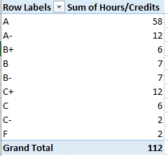
But now to the data. The Team USA site lets us know that 124 of the team’s 558 members, about 22%, are California-born, an impressive disproportion over and above the state’s 12% contribution to the American demographic whole. If we want to break team representation out by all states, then, a pretty straightforward pivot table should be up to that task:

Rows: Birth State

Values: Birth State (count)

Straightforward, but problematic, e.g. this excerpt:

oly1

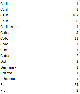
We’ve seen this before, and now we’re seeing it again. The Olympics may encourage diversity, but promoting disparate spellings of the same state name is grounds for a DQ, at least in this event. Note the pairs of Calif., Colo. and Fla. in the screen shot, a spate of duplications (and there are others in there) inundated by superfluous spaces. Note as well the misspelled Cailf., and it seems that full attention hasn’t been paid to the business of getting the data in shape.

But that’s where we come in. First we can sprint over to column R, the free column alongside the SCHOOL/COLLEGE. The rows in R seem to have been formatted as Text, and so I clicked the R heading and redefined the column in Number terms. Then in R2 I entered, simply:

=TRIM(L2)

And copied it down R, selected and copied those results, and pasted their values atop the L entries. (Having discharged that remit you could then go ahead and delete the contents of R.)

That standard corrective works, so far as it goes, but it won’t respell Cailf. That kind of repair might require a record-by-record edit that could make washing your socks seem exciting by comparison, though I for one would opt for the former activity (and discrepancies notwithstanding, I also get just 113 Californians, 111 if you break the residences out by the Current State field instead. I’m also not really sure what distinguishes Hometown State from either the Birth or Current State identifiers). But if you do need to know about team-member state origins (and non-American birthplaces as well), this kind of work just has to be done. Sorry.

And what about athlete weights, a numeric metric that could be productively associated with sport, height, and gender, and perhaps even date of birth? Don’t be disconcerted by the left alignments, but here too we meet up with an issue – namely the more than 50 weights that sport (ok – pun intended) their values in text format, tending to cluster among the Rugby, Gold, and Equestrian members, by the way. But this gremlin is easily sent on its way, however; sort the field by largest to smallest, thus packing all the text data at the very top of the field. Select the problem data in I2:I56 and click the attendant exclamation-pointed notification:

oly2

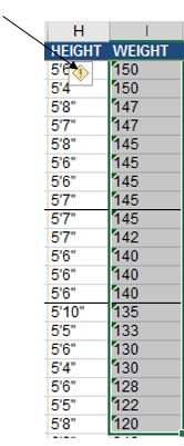
Click Convert to Number, and the weights acquire real, measurable poundage (note the weight and height for gold-medal swimmer Ryan Held are missing).

But what about the Height data? The metaphor may grate, but the entries here are squarely interstitial, purporting quantitative information in wholly textual mode. As expressed here, 5’11” is nothing but text; if you want that datum to assume a useably numeric form this recommendation asks you to convey the above height in its cell as 511 instead, and impose a custom format upon it that interposes those apostrophes between the “feet” and “inch” parameters. Either way the entry is really 511, and that value may not work with your aggregating intentions. Another tip would have you enter a height in inches – in our case 71 – and formulaically dice the number into a foot/inch appearance, which again nevertheless ships the data in text status.

In any case, we need to deal with the data as we have them, and I’d allow the simplest intention is to get these labels into numeric mode, i.e. inch readings. In that connection, I’d return to column R, title it Height in Inches or some such, and enter in R2:

=VALUE(LEFT(H2,1)*12+VALUE(MID(H15,3,LEN(H2)-3))

To translate: the formula commences its work by detaching the first character in H2 – a 5 (I’m working with the default arraying of athlete records here, the first of which posts a height of 5’11”), and ascribes a numeric value to it via VALUE, supported by the given that all foot-heights should comprise one digit. That result is next multiplied by 12, yielding 60 inches thus far. I then isolate the 11 in 5’11” by applying a MID function to the task. The LEN(H2)-3 argument that registers the number of characters MID is to extract from the entry in H2 reflects the fact that any entry in the H column should consist of either 4 or 5 characters, e.g., 5’11” or 5’6”. Subtract 3 from either count and you come away with either 1 or 2 – the number of characters MID needs to pull from the entry in order to capture its inch value. Thus in our case we can add 60 and 11, culminating in 71 inches for the archer Brady Ellison. Copy the formula down R and eliminate the decimals, and our heights should be ready for the next round of analytical moves.

Almost. It seems my post-copy vetting of the height-in-inches data in R reports more than a dozen #VALUE! notifications – because some of the heights in the H column look like gymnast Kiana Eide’s 5’3, or indoor volleyballer Thomas Jaeschke’s 6-6. Neither reveal an inches punctuation, and Jaeschke’s height buys into a different notation altogether; and my formula can’t handle those discrepancies.

So it’s time for a Plan B. First run this find-and-replace on the heights in H:

oly3

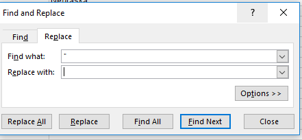
(That is, replace the inch quotes with nothing.) That pre-formulaic fix should eliminate all the inch punctuations, directly exposing the inch numbers to the right of the cell. Then in R2 write:

=VALUE(LEFT(H2,1)*12+VALUE(RIGHT(H2,LEN(H2)-2)))

What’s changed here is the latter half of the expression, which now splits 1 or 2 inch characters from the right of the cell, depending on the single or two-character length of the inch totals. Copy this one down R and we should be in business.

Not. Two utterly obstinate athletes, field hockey aspirant Jill Witmer and soccer teammate Lindsey Horan, feature a single apostrophe beside their inch figure, a miniscule disparity that defeats my best efforts at a global formula rewrite – along with the data-less Ryan Held. Here discretion trumps valor – I’d just delete the incorrigible apostrophes and Held’s #VALUE! message, and take it from there. Now I have real heights.

Ms. Witmer – or whoever entered her data – sure is playing hockey with my fields.

The College Transcript: Downloading an Upgrade

19 Aug

It’s homely, to be sure, but if you want to go somewhere you gotta have one. And no – I’m not talking about your passport photo but your college transcript, an obstinately prosaic but indispensable means of entrée to your next academic or career step.

The transcript – an enumeration of a student’s courses and performances gathering into what we Yanks call the Grade Point Average (GPA) – has undergone a rethink of late. A piece in insidehighered.com this past February trained its lens on a number of initiatives aiming to drill qualitative depth into the transcript’s tale, sinking some analytic teeth into its default, alphabetically-driven narrative by linking its grades to students’ work and detailed progress toward a degree.

And that got me to thinking: if it’s depth we’re seeking, why not endeavour to learn something more from the numbers and the letters by re-presenting the transcript as a…spreadsheet?

It makes perfect sense to me, though you’d expect me to say that. But after all: submit a transcript to some standard tweaks and you wind up with a dataset, one suitable for sorting, pivot tabling, formulaic manipulation, and charting, too. And once the tweaking stops, the transcript can treat its readers to a round of different, edifying looks at the data – and that’s what I call depth, too.

Transcripts aren’t things of beauty, but they sport no small amount of variation just the same. So to understand what we’re working with, more or less, take a look at this one – the transcript of Mr. Ron Nelson, who made his academic record available here:

trans1.jpg

In the interests of exposition, I’ve subjected the baseline transcript above to a round of fictional retakes that of course don’t represent Mr. Nelson’s actual attainments (for one thing, his record dates back nearly 25 years). A few of the points that call for renovative scrutiny, then: First, note the blank column coming between the Course No. and Course Title columns, an excess which must, for spreadsheet purposes, be curtailed. Second, the multi-columned iterations of Course Titles and associated grades need be cinched into a single field. Third, the academic term headings (e.g. Spring Semester 1991), and TERM TOTALS and CUMULATIVE TOTALS lines have to be sent elsewhere; they report information that simply aren’t of a piece with the grade/grade point records that the dataset should comprise.

Second, if you’re new to the GPA you need to know how that defining metric is figured. While of course variation again abounds, the textbook illustration looks something like this: Class grades are typically assigned along an A-to-D continuum along with a failing F, in what are in effect quantified decrements of a third of a point, e.g., A, A-, B+, B, etc. In the typical system an A earns 4 points, an A- 3.67, a B+ 3.33, and so on (the D- grade is rarely offered, by the way). An F naturally awards no points.

Each grade-point achievement is in turn multiplied by the number of credits any given course grants, resulting in what are usually called quality points. Thus a B- grade in a three-credit class yields 8 quality points – 2.67 times 3. An A in a four-credit course evaluates to 16 quality points, or 4 times 4. The GPA, then, divides the sum of quality points by the sum of credits achieved. Thus this set of grades:

trans2

Works out to a GPA of 2.92.

It’s pretty intelligible, but with a proviso. The GPA must incorporate the number of credits associated with a failing grade into its denominator, and so these performances:

trans3

Calculate to a GPA of 2.33. But the 15 credits recorded above really only bestow 12 usable credits upon the student, and that dual count needs to be remembered.

With that extended preamble noted, my spreadsheet-engineered transcript demo (spreadscript?) presents itself for your consideration here:

Transcript demo

In excerpt, the sheet looks like this:

trans4

Note the paired Term and Date columns; though one might be moved to declare the former field superfluous, it seems to me that its textual Spr/Fall entries could enable a pivot table broken out by seasonalty, i.e., GPAs by all Spring and Fall courses across the student’s academic career. The Date field, on the other hand, is duly numeric, thus lending itself to chronological resorting should the current sequence of records be ordered by some other field. And the grades have been visually differentiated via a conditional formats.

The Credits total in the upper right of the screen shot reflects a necessary bypassing of the F grade for Music 101 per our earlier discussion (the grades are stored in the H column), and realized by this formula:

=SUMIF(F:F,”<>F”,G:G)

The SUMIF here is instructed to ignore any F in the F column via the “not” operator bound to the formula’s criterion. Note the quotes required by SUMIF for operators clarifying the criterion. The GPA, on the other hand, divides the quality point total by all 112 credits (you will have noted that the spreadsheet outputs the quality points in H via a lookup array range-named gr in Q1:R10. And in the interests of simplicity I’ve let subsidiary course events and their codes, e.g., class withdrawals and incompetes, go unattended).

Now the data become amenable to pivot tabling and other assessments. For example, if we want to break out GPAs by term we can try:

Rows: Date (You’ll want to ungroup these, if you’re working in release 2016)

Values: Hours/Credits (Sum)

Quality/Points (Sum, rounded to two decimals)

Because we need to total the date-specific quality points and divide these by the respective-date credit totals, a calculated field must be implemented, e.g.

trans5

Click OK, again round off to two decimals, and you should see:

trans6

Once the GPA field is put in place you can, for example, break out credit accumulations by Discipline, or subject, by replacing Date with Discipline:

trans7

Or try a frequency analysis of credit totals by grade:

Row: Grade

Values: Hours/Credits (Sum)

trans8

(Note: because of the priorities with which Excel sorts text characters, grades accompanied by the + symbol initially appear at the bottom of any letter sort, e.g., you’ll initially see B, B-, and B+. You’ll need to right-click the B+ and select Move > Move “B+” up twice. And of course the same adjustment should be applied to C+.)

Of course these outcomes could be charted, e.g.

trans9

And if you are interested in seasonality:

Rows: Term

Values: Hours/Credits

Quality Points (Both Sum, and both rounded to two decimals)

GPA

trans10

(By the way, you’re not duty-bound to earmark Hours/Credits and Quality Points for the table if you want to display GPA at the same time. Once constructed, GPA becomes available in its own right, and need not be accompanied by its contributory fields.)
And all these and other reads on the data could be assigned to a dashboard, too.

Thus the transcript-as-spreadsheet could break new presentational ground, supplementing the row-by-row recitation of subjects and scores that students and recipient institutions currently face, with a suppler way around the data. They could even be made unofficially available to students themselves via download, empowering the spreadsheet-savvy among them to map and understand their grades in novel ways (one trusts that no one’s accepting a transcript bearing a student’s email address).

But is it a thing of beauty? Maybe not, but don’t you like the colors?

Notes on a Continuing Saga: More Trump Tweets

12 Aug

It has been a tumultuous three months for Donald Trump, his party, and his country, and probably not in that order. His nomination at the Republican convention, his wife’s sounds-familiar speech there (truth to be told, with two lifted passages in toto her rhetorical trespasses probably wouldn’t even get her thrown out of school), and his barrage of subsequent, incendiary pronouncements, have made for an interesting campaign, no?

I’m counting those three months’ worth of controversy here, because we last paid a visit to Mr. Trump’s tweet account about that long ago, and you doubtless want to know what communicative mischief he’s been up to in the interim.

So I retraced my steps back to the trusty twdocs.com site for yet one more take-out order of Trump’s latest dispatches from the hustings – and he has been dispatching, to be sure. (Note: not knowing twdocs’ distribution policy on its downloads, I have again not made the workbook available here. If you can filch $7.80 from petty cash you’re in business, though. Note in addition there may be some issues with opening the downloads in Excel 2016. Contact twdocs if events warrant.)

Since May 10, the date of his final tweet considered in my May 12 post, the man who put the candid in candidate has pumped out an additional 983 tweets, broken out thusly:

t1

While his output was never neatly curved, Trump’s tweet numbers have been patently tempered of late, notably down from his January-February distributions of 481, 471, and 418. One might be moved to explain the July spike with a guess about a tweet frenzy stoked by the Republican nominating convention July 18-21, but the nominee signed off on 37 tweets in the course of that four-day event – in keeping with the remainder of his July activity, though his 18 tweets on the 21st do jostle the average.

Now in the interests of historical compare-and-contrasting, I applied same the key-word search (whose mechanics are detailed here; again, the percentages denote the fraction of tweets containing the word or phrase) I had conducted in May to the same terms here, more specifically to the 983 post-May 10 tweets. The results in May:

t2

And now:

t3

Of course the citations of erstwhile rivals have all but disappeared from the current distributions, but a few surprises have been sprung upon the latter list, not the least of which perhaps is the halving of mentions of the tweeter himself. I’m not sure how this newfound diffidence is to be explained, and by this most unshrinking of candidates, other than to allow that the press of his nascent campaign has redirected Trump’s fingers to other keys and targets. I would not have predicted the relative boom in references to Bernie Sanders, either, many of which malign his failed campaign and capitulation to Democratic nominee Hillary Clinton.

But of course no surprises attend the steep escalation in tweets aimed at Hillary Clinton, his now-official opponent. Indeed – of the 270 post-convention tweets Trump has filed (remember the screen shot above dates from May 11), the Clinton/Hillary-bearing tweets have moved up to 15.56% and 28.89% respectively, with the Bernie/Sanders splits bouncing to 11.11%/5.56%. Moreover, tweets sporting the name Trump have retrenched again, down now to just 14.07%. One assumes again this is a manner of zero-summing at work; given the choice between self-puffery or the chance to assail his opponent, the latter takes the day. One has to make the most of his 140 characters, after all.

Thus the adjective “crooked”, the modifier Trump dependably pairs with Hillary Clinton’s name (in fact he calls her Crooked once in a while in stand-alone capacity, as if it’s her first name) finds its way into 16.28% of all the post-May 10 tweets, with the sobriquet “Crooked Hillary” informing 13.84%.

In sum, the tweets make for interesting reading, and on a variety of levels; apart from their vituperative cast, they mint the impression of a problem-free campaign on a roll, poised to smash a hapless opponent in November.

You may also want to decide if a measure of revisionism seasons the tweets. If you’re downloading, scan Trump’s tweets of August 1, the day he averred in an ABC television interview that Vladimir Putin is “…not going into Ukraine, OK, just so you understand. He’s not going to go into Ukraine, all right? You can mark it down. You can put it down. You can take it anywhere you want”. It was rather immediately pointed out to Trump that Russian troops have held down parts of the Ukraine for some time, and his tweet replies: “When I said in an interview that Putin is ‘not going into Ukraine, you can mark it down,’ I am saying if I am President. Already in Crimea!” It’s your call, seasoned journalist.

Now for another one of those spreadsheet points that, in the interests of staving off allegations of revisionism of my own, I had hadn’t previously understood. When I attempted to filter, or group, tweets for the July 18-21 span during which the Republican convention was convened, I entered these values in the Grouping dialog box:

t4

That seemed like the thing to do, but a click of OK brought about:

t5

That is, the Grouping instructions, phrased Starting and Ending at, in fact seem to merely identify the first and last dates in the greater grouping scheme, including the greater and more than residual categories. In order to admit the 21st into the actual data mix, then, I needed to enter 7/22/2016 into the Ending at: field, yielding

t6

That’s a pretty quirky take on grouping; but neither Mr. Gates, nor Mr. Trump, take my calls.

The Global Terrorism Database, Part 3: Surmises and Surprises

5 Aug

Among its definitional essentials, of course, is the idea that terrorism is aimed at someone, and/or on occasions somethings; and the Global Terrorism Database’s densely-fielded and sub-fielded data set has a great deal to report on the terrorist toll.

In the interests of first exposition consider three superordinate fields: the 22-category Target Type, (targtype1_txt, column AJ), Number Killed (nkill, CW), and Number Wounded (nwound, CZ), all of whose particulars are itemized in the GTD coding book available for download.

Again, the permutations are plenteous, and so only a few can be proposed here. We could start with a breakout of target types by five-year groupings (once again note the absent 1993 data):

Rows: targtype1_txt

Columns: iyear

Values: targtype1_txt (by % of Column Total) Click PivotTable Tools > Grand Totals > On for Rows Only. The column totals must of necessarily yield 100%; as such we don’t need them.

I get:

Smart1

(Remember again that the percentages read downwards.)

I was struck by the decline in Private Citizens and Property targets, that cohort’s percentage having peaked in the 2005-2009 tranche, following a steeply-sloped ascending curve. Note as well the downturn in what the GTD calls Business targets, a likely pointer to Vietnam-era sorties against corporate sites, and the severe fluctuations in Military targets across the 1970-1984 span call for some considered drill-downs into country and/or region. Again, we need to recall that the percentages record intra-tranche distributions; in absolute-numeric terms, the 2010-15 interval (and yes, it’s six years) was by far the most terror-ridden.

Apropos the above conjecture, if we confine the target data to the United States by electing a Slicer (for country_txt) and ticking that country, I get:

Smart2

My guess about Business needs to be rephrased, in view of the leap in such targets in the 2000-2004 tranche. But if we turn off the % of Column Total enhancement (by replacing that selection with No Calculation) and restore the table’s absolute numbers I get:

Smart3

We see here that the pullback in actual event counts across the tranches complicates the analysis. 273 business targets incurred a terrorist act in the 1970-1974, nearly five times the 58 between 2004-2009.

But of course the human toll of terrorism transcends the target counts, and the GTD brings those numbers to light. We could begin by viewing fatality totals by region and tranche:

Rows: region_txt

Columns: iyear

Values: nkill

I get:

Smart4

The monumental spikes in terrorist-inflicted deaths in the Middle East, South Asia, and Sub-Saharan Africa are declared with chilling clarity, along with the striking recession in victims in Western Europe. The aberrant total for North America in the 2000-2004 tranche is a consequence of 9/11, of course.

We could then look at fatalities by country and tranche. Reintroduce country_txt to a Slicer, and in the interests of presentability transport the grouped year data into rows. Summarize the nkill values by average (rounded to two decimals), and bring back nkill into values again, this time by sum. Click Slicer for United States, for example, and I get:

Smart5

Thus even as US led the world in incidents from 1970-1974 with 931, those attacks were predominantly non-lethal. Again the tragically high total and average for 2000-2004 are explained by 9/11.

The data for the United Kingdom:

Smart6

Apart from the 9/11 cataclysm (which ultimately can’t be ignored, of course), average attacks in UK, particularly in the earlier tranches, were substantially more deadly than those in the United States.

For Iraq:

Smart7

The enormous lethality of the country’s terrorist carnage, both in absolute and average terms, is unambiguous, though the drop in the per-incident average for the latest tranche is notable and probably worth investigative scrutiny. Needless to say, clicking through a series of countries should be both sobering and instructive, and can alert us to the wealth of information the GTD has garnered on the terrorist phenomenon, including a multitude of parameters we haven’t explored here – but it’s all there. There’s obviously much to learn here.

Now for a not-terribly-well-known spreadsheet advisory that could, given the formidable size of the GTD data source, greatly slim its file size and perhaps accelerate its processing speeds (and no, I didn’t always know this tip either). When a user inaugurates a pivot table, a hidden copy of its data source, called a cache, installs itself out of view; and it is the cache that the tables query, not the native source that appears before us as a matter of course in the workbook. And that means that the user can actually delete the data source, but continue to query and pivot table its clandestine twin.

I know; the prospect of querying an invisible data set sounds slightly fearsome, but if you’ve been pivot tabling that’s exactly what you’ve been doing along anyway. And by deleting the up-front data source, the one you actually see, you may thus end up halving the size of the workbook – and with a data set as imposing as the GTD the savings can be measurable.

There are of course a few downsides to the practice. For one thing, if the data set is active – that is, if your intention is to continue to add records to its complement – you’ll obviously need the data on hand, and you’ll likewise want them in place if you simply want to inspect them. And if you need to cell-reference the data in formulas – as we did last week with the FREQUENCY alternative – I know of no way you can make that happen without the data set out there, duly committed to a standard worksheet tab.

And that also means that, if you have in fact deleted the original data and want them back, you can double-click the Grand Totals cell on any pivot table. Boom – the data return, in an Excel table, no less.
And that sure beats getting them back by closing the workbook without saving it, right?