A worksheet is a big thing. If Excel savant Francis Hayes has read his surveyor’s map properly, he’s discovered that a sheet’s 17 billion cells (give or take a few hundred million) marks out a square mile’s worth of territory, and that’s an awful lot of lawn to mow. And while your dataset isn’t likely to push its lot of fields into the three-lettered column nether (column AAA is a sheet’s 703rd), it’s nice, as they used to say about the Sunday New York Times, to know it’s all there.
But that gigantic tract of cells means there’s enormous room for a spreadsheet’s design to assume this or that conformation, a reflection that’s cued by a look at a Statista workbook that lists and details the corporate skinny for planet Earth’s top 100 toy and game companies. It’s here:
Top_100_Toys&Games – Statista
We can agree that the Toplist sheet is iconoclastically organized; it has assigned five discreet datasets to its space, each reporting on a different corporate parameter and extending its overall reach to column AX. By itself, course, that layout program is perfectly legal, but it controverts the conventional wisdom that would commend each dataset to a sheet all its own.
On other hand, one would be entitled to ask exactly what’s ultimately “wrong” with the all-to-one-sheet scheme. One answer could point to a compromising of navigational ease across the sheet; we’re accustomed to finding our data waiting for us somewhere in the upper reaches of the A column, and only one among our quintet can answer to that description, of course. Here, you’ll need to do your share of scrolling if you want to view the other four. (Another note: appearances to the contrary, the datasets are just that, and not the tables a first look at the set might suggest. The banded-row effects – a default staple of tables – were here hued by a series of conditional formats that assign contrasting colors to odd and even-numbered rows respectively.)
But I’d agree, on the other hand, the navigational objection could be quashed as less-than-substantive, and merely presentational. But there are other demurrals could be aimed at the datasets that might prove a jot more incriminating.
For example, you’ll note that the actual names of the 100 firms appear only in column B in the first dataset along with their rankings in A. Yet the actual ranking determinant – presumably the revenue-declaring “latest value” field in the AG column – finds itself in the fourth dataset only.
Moreover, you’ve probably also observed the filter buttons wedged between the datasets in the empty columns that separate them, buttons that of course have nothing to filter and thus provoke the necessary follow-on question: why are they there at all?

The answer, it seems to me, insinuates a likely pre-history of the datasets: that the five were originally one, and that in the interests of thematic reorganization the designer chose to chip the data into the fractionated wholes we’re viewing now. By way of proof, try drawing up a primitive dataset comprising three fields. Turn on the filter buttons (Data ribbon > Filter in the Sort & Filter button group) and proceed to interpolate a new column between any two of the existing columns. You should find yet another filter button topping the new, completely empty column/field, even as you leave it untitled.
So that’s what Excel does, affirming an operational reality that goes some way toward proving my point – that the data in the Toplist tab were originally of a piece, split only later into the five sets about which Statista wants us to know. And indeed – the very placement of all five in the same sheet corroborates the point.
What advantage, then, redounds to the breakup of the data? As intimated above, I suspect Statista wanted to sharpen the data’s readability and focus by subdividing them into the headings featuring in each set’s upper-left-corner cell (e.g. Rank, End of Fiscal Year, etc. And by the way, those headings – in row 4 – will not obstruct a sorting of the data, which will rather, and properly, draw their upper boundary at row 5. We met up with a similar curiosity in one of my posts on the American Sociological Association data. And pivot tables will likewise recruit their field names from the entries in row 5, which means that something will have to be done about A1, in which the name is represented by a dash.)
But the presentational gains realized by the data partitions cloud before the losses in functionality. If, for example, one wanted to group employee counts by manufacturer ranking you’d be stopped at the door, because those counts, in the third dataset, aren’t accompanied by the rankings there. That information is exclusive to the first set, and the two sets can’t be subjected to a relational query – even should they be converted into bona fide, prerequisite tables – because datasets one and three share no field.
Such is the problem, but the way out seems simple – delete the corridors of empty columns and reunite all the data into one grand, overarching monolith of a set. Remember that you’re an analyst here, not an aesthetician; you want the data to behave themselves and cooperate with your investigative intentions; looks come in a distinct second.
But that consolidative act doesn’t conclude the remake. You’ll likely want to attend to the fields topped by year figures – there are four 2017s, for example, renamed successively by Excel 20171, 20172,20173, and 20174 in the interests of differentiation. I’m also not sure why the fields reserved for 2018 data are in place here at all, as they’re unpopulated and could be deleted. While we’re at, we could ask what analytical utility devolves upon what was the fifth dataset, Revenue: Reported Currency (in millions); its income figures, expressed in country-specific denominations, thwarts a like-for-like comparison. Thus one could tempt oneself to delete that erstwhile fifth set, save for the fact that Reported Currency imposes time-sensitive currency dollar equivalences to the dollar. Thus, for example, tenth-ranked Bandai Namco Holdings, a Japanese concern, reported a 2017-2016 earnings ratio in dollars of1.19. The proportion for the same years expressed in dollars comes to 1.08. Is that discrepancy worth pursuing? Maybe.
In any event, once you’ve fused the datasets into the greater whole you’ll be able to assess employee force size as grouped by the ranks of firms, say in bins of 5, e.g.
Rows: Rank (grouped by the interval 5)
Values: latest value (the one in column u, that is. Column AD bears the identical similar heading, at least by default. Average, formatted to two decimals with commas. And true, latest value here might not edify a reader.)
I get:
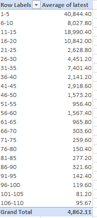
Among other things, we learn that employee complements don’t correlate neatly with ranks (which are derived from revenue), and surprise – the list descends to number 108.
But maybe that’s a top 100, accounting for an inflationary quarter.

Leave a comment