Left-Handed Complement: A Look at Data on Handedness, Part 2

13 Mar

Before I screw up the temerity to forward a new and different set of handedness data in your direction, a few residual thoughts on the data under our current consideration might be worth thinking through.

The Lefthander Birthdates Analysis sheet charts a number of data series in the interests of promoting birth-total comparisons, including therein a Flat series that presumably draws a baseline of birth-month expectations defaulting to a “chance”-driven birth distribution. That series simply divides 100% by 12, thus granting an 8.3% birth share to each month; but of course the variable day allotment of the months should manufacture a set of variable fractions instead. Each month should have submitted its days to a divisor of 365.25, the approximate average duration of each year (there’s that leap year in there); and so the 31-day months would chance-predict an 8.49% birth proportion, 30-day entries would figure to 8.21%, and the 28.25-day February predicts 7.73%. It thus seems to me, then, that the baseline is a wavy one. (Note also that the chart’s country birth percentages emanate from governmentally-compiled, not Lefthanders Club survey data).

Moreover, I would allow that the Daily Analysis sheet – a breakout of respondent birth dates by each of a year’s potential 366 days (below, in excerpt)–

0101

7

0102

6

0103

11

0104

9

0105

14

0106

7

0107

14

0108

8

0109

13

0110

11

0111

13

0112

8

0113

13

0114

9

0115

11

0116

7

0117

6

0118

9

0119

7

0120

15

0121

6

0122

7

0123

8


could have, and probably should have, been entrusted to a pivot table:

Row Labels:  Date (Grouped by days only)

Values: Date (count)

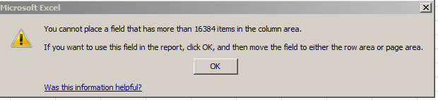
Because these Daily Analysis dates seemed to have been appropriated from the text-populated MonthDay field in the birthday-dates master sheet, the days can’t be grouped, for example.

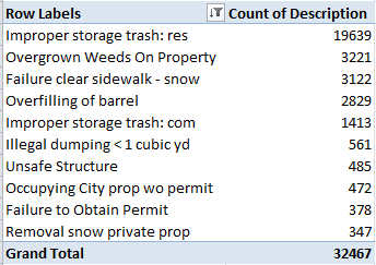
In any case, the Left Hander numbers declare an August plurality, though consecutive months plot a rather jittery trajectory (this is my pivot table):

hand21

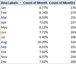
And what could all of the above mean? Remember the survey’s raison d’etre: to associate the incidence of left-handedness (however that trait might be denoted) with certain birth months.  Granted, I’m not a neurologist, but if handedness is in fact month-bound I’m at a bit of a loss as to how to reconcile the oscillation in handedness percentages across adjacent months, and on the face of it the notion that manual preferences should somehow exhibit seasonality sounds like something of a reach – with either hand. Do we want to run with the proposition that children born in late August experience a stepped-up gestational likelihood they’ll emerge lefthanded relative, say, to a babies born in the first week of September? And if so, why?

But there are additional considerations. Is the Lefthander Club survey sample skewed? Probably. After all, its respondents were self-selectees, the sort of volunteer-led cohort that bodes badly for samples. But why, on the other hand, should self-selection even matter here? Why should a lefthanded respondent’s decision to respond somehow tie itself to the month in which she or he was born? Skewed samples can cause all kinds of problems, but only when the skew pushes directly at the theme with which the survey is concerned. Asking a readership to complete a questionnaire on political party affiliation might inspire the members of one party to tick those boxes more eagerliy than the other. Indeed, a given readership itself might very well be skewed (think of the Literary Digest 1936 presidential survey debacle) to begin with. But what selection contaminants could befoul a handedness-by-month survey? Why should the August-born be prepared to assert their birth month with a conspicuous, invidious ardor? What’s in it for them?

The point is that not every variable impacts every equation, and the default premise grounding the lefthander survey – that respondents have no particular reason to extol this or that birth month, along with other conceivable sources of skewedness – for example, a greater willingness of women to participate – shouldn’t alloy the birth-month numbers.

And so we might be ready to declare the survey sample functionally random. But there is a complication, apart from the necessary considerations of sample size (and it does appear as if the monthly variations are statistically significant, at least at first glance), one that was brought to my attention by Chris McManus, an authority on handedness who teaches at the University College of the University of London (he’s also cited by the Lefthander’s newsletter).

If you return to the Daily Analysis sheet, row 226 looms large:

That’s August 13th – which happens to be International Left Handers Day, the day appearing on the birth certificates of 1.04% of the American respondents and .94% of the British submitters. This, then, appears to exemplify a case of self-selection that does contribute to a meaningful skew, and Professor McManus adds that once the August effect is chased from the data the remaining months fail to comport significantly with handedness.

But I still haven’t said anything about that alternative data set. I think we need a third installment.

Left-Handed Complement: A Look at Data on Handedness, Part 1

6 Mar

I’m left-handed, sort of, predilection enough to qualify myself for a subscription to the Left-Handers Club newsletter, a miscellany of products and disquisitions about the minority group whose members belong to all the other ones, too. (OK; I’m an in-betweener – writes, eats, and dribbles a basketball with his left hand, throws, bowls, and actually shoots a basketball with his right.)

It was a recent piece in the newsletter that raised at least one of my eyebrows (can’t recall if it was the left or right one), and got me to thinking about possible rejoinders to its central claim – namely, that  handedness somehow associates itself with birth month. A survey of its left-leaning readers, respondents gathered via self-selection, measured notable left-handed disproportions for August and July, with smaller precipitates stacking in January and February. Moreover, the survey has nicely packaged its data in spreadsheet form, complete with none other than a pivot table to season the analysis. Let’s devote this installment to the workbook itself, after which we hope to think about the results and position a supplementary data alternative to the thesis.  You can take grab the workbook with either hand here:

 Lefthander Birthdates

Note first, and for what it’s worth, the Line field numbering the 3000+ survey records in apparent chronological sequence of submission as counted off in neighboring Entry field. Again for what it’s worth note that the sequence is not unrelievedly consecutive; dozens of gaps poke at it throughout, and so the 3148 records top out in the Line field at number 3348. Does any of this matter? Probably not here but it could, depending on where you’d want to take the data. If, for example, you wanted to group the records by Line number in bins of 100 each, you’d pull up short of 100 in nearly every bin. (I’m not sure what you’d do with the Entry data themselves and their five survey submission days flanked by the 9th and 13th of January, but that’s a quibble.)

More than a quibble, though, could be registered over the piecing together of the DATEVALUE expressions in the Date field. We spent some time on DATEVALUE in my February 21, 2013 post, but that introductory note doesn’t speak to the data contingencies placed before us here.

DATEVALUE remixes a collection of (basically) text data into actual, quantity-bearing dates, but it’s quirkier than I would have supposed. For example(s):

=DATEVALUE(“6/8/2013”)

And

=DATEVALUE(“6/Aug/2013”)  (as per European date syntax)

Will both yield 41492, the numeric identity of August 6, 2013. Format the container cell in Date mode and the date obtains (one of those aforementioned quirks allows you even to enter Augu and the like in the expression without impairment, so long as the month name invokes at least its first three characters. The names whip up date values even If the attending year and day data are numeric, and not text. See the discussion immediately below in that regard. I told you it was quirky).

The birthdate workbook, however, concatenates, or combines, three cell references instead, e.g. cell H9:

=DATEVALUE(+E9&”-“&F9&”-“&G9)

 The references signifying Day, Month, and Year respectively (as per the Left Handed organization’s UK-based  time protocol). The ampersands concatenate, or join, all the references into a single expression, along with the hyphens sidled by quotes in our case. The result is captured in H9.


But the formula raises some syntactical  questions. For one thing, the + sign grazing E9 is superfluous – and so, for that matter, are the quote-surrounded hyphens. Had the formula read

=DATEVALUE(E9&F9&G9)

7/25/1958 would have worked itself out just the same. Edit the formula that way if you want to see what I mean. (Note by the way that the hyphens turn into slashes, because the H-column cells had received this format:

  hand1

in which the slashes rule.)

Now check out the formulas in the J and K columns, each directing a VLOOKUP to a table in the Countries tab. The plan here is to additionally locate each respondent’s country of birth inside what are labelled the Zone and Hemisphere rubrics, and deliver these to the J and K column. Note the interjection in all cases of the FALSE term (or argument, as it’s officially called), e.g. cell J9:

=VLOOKUP(D9,Countries!$A$2:$B$238,2,FALSE)

FALSE is a compensatory means for negotiating a lookup table whose first column – the one comprising the values to be looked up (be they text or numeric) – isn’t sorted ascendingly. FALSE means that the lookup is to confine itself precisely to the contents of that first column, and not entertain any value that squeezes between two rungs in the column. Thus you need FALSE in order to work with this lookup table of students and their grades:


Mary

87

Alice

64

Jack

82

Jill

91

Carol

73

Once you sort column one, though, you can drop FALSE from the formula – truly.

Thus if we sort the first column in the data set on the Countries sheet – and then, in the service of additional formulaic understatement name the range there (let’s call it Regions), our lookup statement slims down to something like this (in J9, for instance):

=VLOOKUP(D9,Regions,2)


The expressions in the Hemisphere field imitate the above formula, save one departure – the 2 is replaced by a 3, the column number in which Hemisphere info awaits looking up. But are the lookups as we found them “wrong”, then? Not quite – they all issue irreproachably correct results, after all. But formula efficiency is better served by the rewrite.

Next, push over to cell M9:

=IF(LEN(I9)=1,”0″&I9,I9)&IF(LEN(E9)=1,”0″&E9,E9)


What’s this formula striving to do? This: reap four-character yields down the M column by concatenating the respective contents of any given row’s I and E cells (in that order). Thus M9 returns 0725 – ultimately =I9&E9 – but because I9 offers but one character, a 7, the formula tacks on a zero (remember that the result is textual and possesses no direct quantitative standing) in order to pad the yield to four characters; and should the day value in E likewise be single-digited, the formula rolls in a zero there, too.

But again, the formula could be pared, first by formatting both the E and I column thusly:


 hand2

As advertised, you’re looking at a custom number format comprising a two-digit 00 code. That code supplies a 0 alongside any single-digit number, but if the number already features two digits, the format simply leaves the value alone.

Once the E and I values are so formatted the data will take on this appearance:

Then get back to M9 and enter:

=I9&E9

And copy down the column. I get, in excerpt:

But that isn’t working, is it – not if we demand four-digit entries in each and every cell. It isn’t working because the & sign, which concatenates values in specified cells, demotes the values into text, and the 00 format only attaches to bona fide values (keep in mind that combining a 7 and a 25 here isn’t an act of addition; rather, it’s stringing the 7 and 25 together). The way out? Try this:

=VALUE(I9&E9)

And the 725 acquires numeric status. Then format the M column:

hand3


Four zeros this time, because you’re aiming for four-digit numbers.

Got all that? This stuff is likely to be on the mid-term.

Lights, Camera, Data: Paris Movie Locations, Part 2

27 Feb

It’s called a teaser in the business, though my nail-biter of an allusion in last week’s post to a conceptual problem with the pivot table sourced by the Paris movie-shot data isn’t the stuff of big-time buzz and box office frenzy.  But the show must go on, to wit:

We wrapped up last week’s post by counting and grouping Paris film scene shots by their arrondissements, after which I dropped some dark hint about a conceptual problem spooking the data crunched in the pivot table that was doing the counting and grouping.  Now the problem can be told: My interest in these data – an interest in which you may or may not want a share – is to build a census of film locations at which any given movie unpacked its cameras, counting each such intersection of film and location once each.  And what that means is this: if 20 films prevailed upon the Eiffel Tower to sit still for a shot or two, I want that activity to total 20 – and nothing more. The problem with our data is that if film A shot the Tower (or Tour, to the natives) on June 16, for example, and then returned for another take on June 28, our worksheet will have recorded each visit, thus inflating the overall sum to 21. Speaking merely for myself again, I’m looking in effect for the number of movies that trained their lenses on a particular site – and not the number of individual times a given movie adopted that site. I’d then want to gather all these data under their respective arrondissements; and again, the pivot table with which we capped last week’s post counts a site each and every time it was filmed, thus including multiple shoots by the same film.

In order to get what I what, then, I – or we- need to nit-pick the data for their redundant film/site entries, and that’s a job for the Remove Duplicates feature, which premiered here in the July 4, 2013, post (also Paris-themed, as it turns out. Check it out for the necessary Remove Duplicate steps). But the first thing you want to do, before obliterating all those excess records, is make a copy of the original data and paste it somewhere – because by the very nature of the deed we’re looking to disabuse the data of its duplicates (as we want to define them), leaving us with a leaner set of records – even as we reserve the right to work with the primordial data set, redundancies and all.

In any case, once you’ve reacquainted yourself with Remove Duplicates, click Unselect All and tick back on Titre (movie title) and addresse_complete, thus priming the search-and-destroy mission for all those records notating the same film and the same site more than once, but conserving one representative of each, of course.

And once you’ve rid the data of those 1300 or so unwanted doubles you can retry that pivot table, complete with a sort:

Row Labels: Arrondissment

Values: Count of Arrondissment

This time I get, in excerpt:

locat1


(N.B.: If you’re clicking along with me your results may vary, as they say. That’s because I took some pains to edit the data in the addresse_complete field, which suffer from more than a little inconsistency. Many addresses appear by turns with and without dashes, for example, e.g.

locat2

And that’s just one; again be advised that, absent a stiff dose of quality control Excel will regard the above as separate addresses, all because of that silly little dash.)

Note the regime change in our results. Where location honors belonged last week to the 8th Arrondissment, the revised, trimmer data with which we’re working now have resituated Paris’ movie-location epicentre to the 18th, by the city’s northern edge. It depends, then, on what you’re looking for, and how.

Now for another look and a different read of sorts on arrondissement popularity, how about toting up shooting days, and breaking these out by arrondissement? That is, why not add all the durations in days of all shoots (i.e. all date_fin_evenements minus all the data’s date_debut_evenement, where “evenement” means event), and align these to the arrondissements in which these were filmed?

Once we’re happy with that question we need to recall the original, duplicate-ridden data set (I told you to make a copy), because now we want to factor in all the shoots at all the locations, including revisits to once-filmed sites (understand as well that some films may have set their tripods down at a plurality of locations on the same day, with each and all of those days to be counted).

Step one toward that end seems simple enough – make room for a new column and call it Days, within which we want to conduct a record-by-record subtraction of shoot start (debut) dates from their finish (fin), e.g.

=D2-C2+1

 The +1 above will admit the day of shooting inception itself into the total; otherwise, if you subject a shoot that begins and ends on the same day to this formulation, for example:

=D2-C2

you’ll get zero; hence the necessary + 1.

But step one is in need of a step one-and-a-half, as it were, because a wayward promenade through the data took me past about 60 records in which the fin happened later than the debut, and in the standard order of things ends usually precede beginnings. There’s a programmatic way out of that this chronological snare, though (I’m assuming by the way that the fins and debuts were simply transposed); enter in the first row of your Days field

=ABS(D2-C2)+1


And copy all the way down. ABS is an agile means for shaving any plus and minus signs sprouting from a number and returning its absolute value only – in effect, the plus equivalent. Thus, for example,    =ABS(3-7) and =ABS(7-3) will both settle on the value  4.

And once all the days have been absolutized, this pivot table beckons:

Row Labels: Arrondissement

Column Labels: Cadre (just for good measure)

Values: Days (Sum)


I get, in excerpt:

locat3

Interesting, n’est-ce pas? It’s the 16th Arrondissement on which the auteurs seem to have actually spent the most time filming (in days), although I can’t tell you why. Note too that the relatively banal 11th grabs the silver medal here, even as it slouches into 15th place in the first table table pictured earlier (Domaine Publics, by the way, seem to comprise venues of the park/forest/square ilk, and note their strikingly variable ratio, by arrondissement, to Exterieurs.) And on a summatory note, consider that the grand total of all film days comes to 29,030 – or nearly 80 years’ worth of day-time spent shooting Paris scenes. Formidable.

Time for one more data-quality issue, if I may. Take a look at this data excerpt:

locat4

Parvis denotes a square fronting a church; but observe the assortment of postal codes above, all appearing to convene at precisely the same latitude and longitude. Moreover, those coordinates don’t even seem to be Paris-based; Google place that city here:

48.8567(latitude)

2.3508 (longitude)

And given that each degree of longitude takes in about 60 miles at this global pinpoint, it seems that at 4.371231 the data have traveled some way out of Paris – and again, according to Google, they have; the lats/longs in the above screen shot put all those churches in the Gare (station) de Braine-l’Alleud – in Belgium.

I knew there was something wrong with that sat-nav.


Lights, Camera, Data: Paris Movie Locations, Part 1

20 Feb

You won’t be learning anything you didn’t already know when you’re told Paris is a first rank cinematic – or Seine-ematic – go-to site for hundreds of filmmakers.

But hundreds is but a number, and so once the discussion turns quantitative a turn to our favorite application might help us texturize the clichés with a sprinkling of data-based somethings we didn’t already know about the Paris big-screened experience. The Lieux de Tournage de films (long métrage) – (very freely translated, Locations for Feature Films, these dating back to 2002) –a spreadsheet on the bill at the  Paris Open Data Site that names and counts the Paris streets and allées backdropping all those movies – is playing here:

http://parisdata.opendatasoft.com/explore/dataset/tournagesdefilmsparis2011/?tab=table

Download the sheet by clicking the Export button and deciding next between the Télécharger en CSV or Excel links, stationed immediately beneath those respective headings.  Experience would point me to the CSV alternative, because I’ve met with occasional file-truncation issues in the Excel mode and portlier file sizes besides. Start by whisking both into your system – but make sure to save both varieties to XLSX format (after you’d swerved past roadblocks like the one pictured below), and you’ll be advised that the dedicated Excel offering checks in at 612 KB, about 30% weightier than the CSV 477 KB – but either way, your hard drive will find itself swallowing an eminently digestible byte count.

                       loca1

 Now, while I’ll ultimately want to migrate to the Excel version in this case – its data have already tucked themselves into their appointed columns, for one thing – there is an attention-getting contingency in the CSV that you may want to think about.

First open the CSV take and you’ll see (in excerpt):

 loca2

As often seems to be the case with Paris’ open-data workbooks, we’re brought midway into the plot and asked to supply its denouement – by separating the data above into suitable columns, via the Text to Columns feature (click on cell A2, for example, to sample its semi-colon-separated, imminent fields); launch Text to Columns (again, return to the January 13, 2013 post for a procedural review), holding to the Delimited default and ticking the semi-colon box in Step 2 of the Convert Text to Columns wizard). Answer OK to the Do you want to replace the contents of the destination cells? question, as I did initially, and you’ll get here, in excerpt:

 loca3

 Don’t worry about the shortfalls in column width here; look instead at the geo_coordinates field, comprising location latitudes – and only latitudes, the cartographic equivalent of a stick with one end. This is literally a case of you can’t get there from here – because, after all, spreadsheet mapping of any species is adamantly two-dimensional; got no longitudes, got no map. So wither the longitudes? I tweeted this question to Open Data Paris and received a couple of kind replies (one from a private Tweeter), neither of which quite relieved my curiosity, perhaps because I hadn’t specified I was looking at the CSV variation on the theme.

But when I reloaded the CSV offering and eyed the data anew I actually beheld those fugitive longitudes, presenting their credentials right there in column B. And where did had these data gone, then? They had, in fact, been dispossessed by the Text to Columns routine, at the point when we chose to click OK to the “Do you want to replace the contents of the destination cells?” request, an inquiry which means exactly what it says – namely, that Text to Columns proceeds to overrun and overwrite all the entries in the columns into which it parses and empties its data. Bottom line: indulge your itchy trigger finger on Text to Columns, and you wipe out the longitudes in column B.

The way out? I’d copy the longitudes first, paste them somewhere far away (onto a new sheet, perhaps), step through Text to Columns, and copy and paste the longitudes alongside what should now be the latitudes field (that is, the next available column).

But that episode was a trailer of sorts. Let’s get back to the main attraction – the Excel-versioned download – for some close-up shots of the data.

First, I’d click away the Wrap Text effect, which seems to have been played upon each and every cell in the sheet (note the fractionated text in the F, G, and I columns, a time-honored Wrap Text correlate) For an en-masse Wrap Text turn-off click the Select All button, that empty rectangle minding its own business in the sheet’s upper-left corner:

 loca4

Click Wrap Text, double-click of couple column autofits, and all the data will begin to squint in the daylight. Next, we see that the geo-coordinates field embraces both site latitude and longitudes (in that order), and so a necessary separation need be effected with Text to Columns (the data are Delimited, and check the comma delimiter in Step 2). Label the new independent columns Latitude and Longitude (and you’d probably want to autofit Latitude in column J).

Now those pesky green error indicators roofed in the upper-left of all the cells in the H, arrondissement (district), column signal the storied Numbers Stored as Text message, a warning we’ve confronted several times before, first in my August 14, 2012 post. I’d allow that we can let that “error” stand here, simply because we’re dealing with what are in effect Paris zip codes, and as such they’re not likely to play an authentic quantitative role in any later analysis and can remain textual. If you want to suppress the indicators, though, the protocol for doing so is actually slightly tricky. Once you select all the affected cells you need only click that exclamation-marked error flag and select Ignore Error, whereupon all the green meanies will get the heave-ho. But you can’t take the easy way out, by selecting all the H cells by clicking the H column heading; for whatever reason that simply won’t work. What you can do, though, is implement a little-known but elementary selection tool by clicking in the Name Box, the white strip just atop the Select All button:

loca5

Enter

H2:H8618

in the box, the range down which all data-laden cells happen to stretch (there are some blanks in the range, by the way), and press Enter. Once that cell-specific deed is done, click the error marker and select Ignore Error.

Now for some analysis. We could start by breaking out the numbers of scene shoots by their arrondissements, thus drawing up a kind of directors’ site popularity index. An easy pivot table suggests itself here:

Row Labels: Arrondissement

Values: Arrondissement (Count, even if you’ve retooled these into numeric values)

The results could be then sorted (in excerpt):

loca6

We see that the 8th Arrondissement (arrondissements are prefixed 750), subsuming the Champs Elyseés among other venues, ranks as number one scene stealer, with the 18th (think Montmatre) and the posh 16th holding down positions two and three (observe that the Eiffel Tower, standing bestride the 7th Arrondissement, finishes out of the medal running in a far away 9th place; but the stirring sightings of the structure obtain from the 8th, just across the river). It’s also more than a little noteworthy that all 20 of Paris’ arrondissements were deemed scene-worthy, each attracting at least 185 shootings.

But scale down the list and some problems – numerically few, to be sure – compromise the data. The arrondissements are coded in five digits, and so one should be right to assume that the outlaw 750008 entry has been overloaded with an excess zero, a defect easily repaired by conducting a search 750008/replace 75008 mission. By the same token, I’d almost bet the house that the 7502, 7518, and 7009 abridgements are really 75002, 75018, and 75009 entries, but I’d keep my money in my wallet if you’re asking odds on  750052, which could be 75005 or 75002. Faced with that kind of geographic indeterminacy I’d run the address in question – Pont (Bridge) de l’Archevêch – through Google, and come away with 75005, which is just what I did. And here it is:

loca7

Nothing if not scenic –but that explains why the 743 different movies in our data decided to plunk their cameras there. (Click here for a photo source attribution.)

And the 750O7 record is surely a well-intentioned 75007, with a capital O monkey-wrenching the code. (But the 92 and 93 prefixes aren’t misplaced, by the way; they reference Paris suburbs.)

But there’s another problem with our pivot table, a conceptual one. But this post has gone on long enough; do we need to cut 20 minutes from it?

Hope to a have a sequel soon. In the meantime, here’s some popcorn.

Multiple Revisions: DC Crime Data, 2013

13 Feb

Change may be good, but sometimes when the change substitutes apples for oranges, the surprises on the menu can be hard to digest.

Don’t worry – I won’t push that fruity metaphor much further, but when more-or-less similar datasets beg comparison to one another you do need to decide what you’re going to do with the “less”.  Case in point, last year’s crime data for Washington DC, downloadable here:

http://data.dc.gov/Main_DataCatalog.aspx

If the data sound – or look – familiar, it’s because we spent some time with the 2011 DC numbers on August 12, 2012, brought back here:

 washdc-crime-data-2011

You’ll note that 2011 is more-or-less similar to the 2013 rendition.

And there’s the rub, that more-or-less. Look closely at the two sheets, and, as if they’re were entwined in puzzle form, try to see what’s different about them.  For one thing, 2011 matches crime incidents to their latitudes and longitudes – a useful thing to be sure, but 2013 doesn’t.  And that’s for starters. With a bit of fooling around (and kudos to Excel’s Copy>Paste>Transpose feature, and the ever-perennial Sort command), your correspondent lined up the 2011 and 2013 fields respectively, conditionally formatting the 2011 names that reappear in 2013 (by dint of the MATCH function):

                       dc1

(And for a most enlightening explication of the above field names, look here.)

Apart from 2011’s larger field complement, we see as well that only 13 of its fields recur in the  DC crime data two years later. Needless to say, that malocclusion could cause problems.

Maybe. Some equivocation is in order because the analyst may simply not care about at least some of those unrequited fields. I don’t think the 2011’s HOTSPOT fields will be missed, for example, and indeed, they’re nowhere to be found in 2013. And some omissions in the latter sheet are probably a good thing, in any case.  2011’s CITY field does nothing but avow the name Washington 32,000 times – a most dispensable redundancy, you’ll agree, and ditto for STATE, which iterates DC (it’s the nation’s capital and as such not quite a state, but it’s close enough) almost as monotonously, syncopated only by the occasional blank cell.

But discontinuities in the METHOD field, which does inform both sheets and presumably codes the manner and means by which reported crimes were committed, are more material.  20,000 cells in METHOD, circa 2011, were assigned an unvarnished 1 or 2, the import of which presently escapes me (again, return to this page for some clarification of these puzzlements. I’m not sure, however, that the 1 and 2 identified there comports with those numbers populating the 2011 sheet); and nowhere does METHOD in 2013 resort to these notations. There’s nothing but text in there, although to its own discredit 2013 fills more than 31,000 of its METHODS cells with the unilluminating OTHERS entry (note in addition that 2011 deploys the singular OTHER, but far less often).

And as far as these things go, then,  the coding disconnect between the two years is something of a big deal. An investigator might very well want to compare crime-commission-method frequencies across years, and given the discrepant coding schemes brought to bear on the METHODS data for 2011 and 2013 that intent is hereby foiled, unless you’re prepard to mount some wholesale effort at reconciliation which might or might not be worth the bother.

Here’s another issue. Unlike the 2011 version, the 2013 REPORTDATETIME field contributes time, in addition to date, information to the parameter (time data were actually introduced in the 2012 sheet, whose data-organization maps onto 2013’s. We haven’t looked at 2012, a simple consequence of the times at which these posts have been written). That should thus enable us to pivot table crimes by hour of the day i.e.

Row Labels:  Offense

Column Labels: ReportDateTime (group solely by hour)

Values:  Offense

dc4

(The screen shot excerpts the whole for reasons of space and legibility.) There’s a lot to note there, among other things the swell in motor vehicle thefts in broad daylight (Theft F/Auto stands for Theft from Auto, that is, items thieved from autos).

But in addition you’ve probably noted a curiosity on your own – namely, the unvarying time-stamp of all homicides of 12:00 AM. That can’t be right, of course, and an answer to my inquiring emails to DC Data about that impossible consistency awaits.

HOWEVER – make room if you will for a revisionist epilogue, borne of a late-breaking discovery.  I’m not alone, after all; the folks at DC Data have likewise made themselves well aware of the 2011-13 field incongruities expounded above, and now offer a revised edition of the 2011 data here, whose fields, time stamps, and codings line up most fittingly with their yearly successors. And that means you can copy and paste the 2011 through 2013 records onto one grand workbook and have some ringing longitudinal looks at it all. Any downsides? Well, we lose latitudes and longitudes, if you’re among the map-minded. And the 2011 homicide data are also time-stamped at 12:00 AM.

London Police Stats, Part 3: Somethings to Think About

6 Feb

Now that we’ve fought the good fight to make the wards data usable – and won, more or less – let’s take stock of our victory – no gloating, please – and actually proceed to do something with those 14,000 rows worth of booty.

In fact, once the dust settles much of the analysis comes easily. Most evidently, perhaps (and remember the call I issued in the last post to rename all those Total columns), one could pivot table the aggregate of the Total Notifiable Offences column against London borough, and perhaps sort them largest to smallest:

Row Labels: Borough Name

Values:  Total Notifiable Offences

blogstats1

Note Westminster’s surpassing figure, a more than six-fold multiple over the bucolic and quaintly-named Kingston upon Thames in the city’s western sector. Of course you’d need to pitch these numbers to the boroughs’ respective populations, including their daytime counts, in order to fairly understand them. Westminster, after all, is the meeting ground for Parliament and a tourist cynosure, and as such likely boasts an effective demographic  a couple of orders of magnitude beyond its residential cohort  (see these 2011 UK census data, particularly page 8, which put Westminster somewhere in the middle of the London pack; note too the absence of the City of London here, the teeming financial district that stands in a quasi-independent relation to the rest of the boroughs).

And there’s room for an additional “of course” here. Of course, an undifferentiated total of all notifiable offenses (I’m American –excuse that first ‘s’) can’t engineer the drill-down you’d really need in order to press the analysis meaningfully. Because the pivot table assigns a value of 1 both to murders and the handling of stolen goods, for example, the incidence of each crime type need be isolated and counted discretely in order to enable the necessary perspective on borough-specific crime. Indeed – exchange Murder for Total Notifiable Offences in the pivot table, for instance, and you’ll find four other boroughs with higher homicide counts than Westminster.

What we’d want the pivot table to do, then, is agglomerate and banner all the crime types by borough across their columns, much as our source data presently do for each ward, and then subject all these to the Show Values As > % of Row Total feature, thus properly sizing each offense’s “contribution”  to the borough’s crime whole.

But you can’t do that here, at least not without mounting a mega-reconstruction of the data – and that’s because each crime type tends its own field, and Show Values As will only return its percentages for data all of which occupy the same field (again, see last week’s post and its first screen shot for a fleet restatement of the field-item problem). And so by granting a false independence to its crime fields, the workbook stiffens its receptivity to important extensions of the data.

Nevertheless, other more plausible breakouts await, e.g.

Row Labels: Borough Name

Column Labels: Month-Year (D_Offences)

Values: Total Notifiable Offences

And here, you can apply Show Values As > % of Row and % of Column Total(s) – because Total Notifiable Offences comprises but one, self-containing field.

By working with Show Values As > % of Row you’ll discover a down-sloping of reported crimes; the Grand Total for Columns row pinpoints February 2013 as the first of the 24 months in which its total registers less than 4% of all crimes; and if you’re quick to discount that figure as an artifact of a 28-day month, the Grand Totals let you know that eight of the next ten months likewise duck beneath the 4% crossbar (and for a streamlined look at the totals only, you can pull Borough away from the table).

Note by the way that a redo of the above table by importing the Month, as opposed to Month-Year (D_Offences) field, won’t deliver an equivalent finding, because Month merely ticks off its data in a stream of month-denoting numbers 1 through 12, foreswearing any yearly references. And along those lines – though it may be a touch high-sounding to say so – I’d offer that the workbook could’ve done without both the Month and Year fields altogether, as these bits of chronology could be siphoned from Month-Year (D_Offences) via the pivot table’s Grouping feature (and through some as-needed formulas, too).

And there’s a concluding point to me made, this perhaps more sociological than technical. Crime statistics suffer from a storied methodological impairment – the relative willingness of victims to come forth and prefer charges against presumptive perpetrators. Change the extent of willingness, then, and ceteris paribus the crime rate rises. And the skew potential is redoubled once the agents of law enforcement get in (or out) of the act too, and perpetrate interest-driven understatements of the data. To be sure, most of the cognoscenti seem to acknowledge that some of the numbers have been cooked at least some of the time, but my point is this: even given a level of untoward statistical coyness, have these fast ones been pulled on the ground (i.e., the police station) level, or in the offices of some global assembler of the totals? If the former, then perhaps we still need to account for the relatively orderly movement across the reported rates. And if the latter, the newspapers will be happy to name names if you know them.

Try this pivot table out:

Row Labels: Borough Name

Column Labels: Year

Values: Total Notifiable Offenses (Show Values As > % of Row Total)

blogstats2

That table reckons the respective percentages of all reported crimes committed in each borough, distributed across the two reported years. In every case the 2013 data fall beneath their companion 2012 figures; and if these cross-borough contractions red-flag some conspiratorial revisionism, we’re well within our rights to request some manner of proof to that effect. Who’s doctoring the numbers, and on what level of authority, and how?

Just thought I’d ask.

London Police Stats, Part 2: A Second Look at the Evidence

30 Jan

I trust the suspense has been bearable in the intervening seven days, and that your nails have remained immaculately unbitten during the wait for my explanation of the

=COUNTIF(B$7:B7,B7)

formula with which I closed last week’s post.

I commended that expression as a means of easing the unsettlements wrought by our attempts last week simply to title a set of fields in the Wards workbook with which we’re working. If my WordPress search engine is to be trusted, I don’t seem to have brought COUNTIF to your attention before, so if you’re new to the function, your attention, please.

COUNTIF counts the number of entries in a range that satisfy an identified criterion (for the record, COUNTIFS, a kindred function which works with multiple criteria, is also out there, but let’s work with the original. COUNTIFS didn’t get nailed into the function list  until the 2007 release, by the way.)

In our case, we’re concerned to count the number of different London wards tracked during each month of the crime report before us, operationalized as the number of times each month reference informs the B column – one reference per ward. When a month gives way in that column to the next month, the ward count is thus supposed to start anew.

COUNTIF comprises two elements, or arguments: the range of values to be counted, and the criterion any value in the range needs to meet before it in fact gets counted. The above formula, strapped into cell E7, counts all instances of Jan-2012 in the accompanying range – right here, nothing but the uni-celled B7:B7. But in virtue of the anchored, absolute-referenced B$7, a formula copied all the way down E will, for example read

=COUNTIF(B$7:B112,B112)

in E112, and so on. And because the B column is sorted, and so brings all the Jan-2012, etc., entries together, the idea is to count the number of cells meeting the B, or month, criterion up to that point. Thus the above formula yields 116, or 116 different wards counted for Jan-2012 so far. The next row’s formula will evaluate to 117, and so on (remember that the actual data commence in row 7). And when you skid down to row 631 – the first of the Feb-2012 data – its attendant expression in E:

=COUNTIF(B$7:B631,B631)

hands over the number 1, because again, a new month debuts among the data.

It seems to me that the COUNTIF alternative delivers, if I may resort to a phrase I don’t like very much, something like best practice here, because among others things, and as opposed to the formulas we’ve encountered, it’s purely cell-referenced, and as such is better sensitized to the data it’s been asked to count. The original formulas I’m proposing to replace with COUNTIF – e.g.,

=IF(F6=624,1,F6+1)

hard-code the number 624 among other things, and what that means is that should you sort the data by the Borough Ward field, for example, you’ll continue to realize a 624 at the accumulation of every 624 rows – but those rows won’t be continuing unique wards, since each ward has been sorted with its namesakes. And if that explication leaves you bleary-eyed, try the sort out (before you label those troublesome fields, thus keeping those error messages at arm’s length).

Moreover, and as a matter of standard operating procedure, impressing a fixed 624 into the formulas won’t resonate to any change in the number of wards. If London were to suddenly redraw a new ward, and the workbook were to receive its crime data, the formula would disavow all knowledge of ward 625 – and contrariwise, if for whatever reason one ward’s data were carted away from the workbook, our formula would continue to cling to the superannuated total of 624.

Now in the matter of field organization…first, the several Total columns/fields need to renamed, else Excel will insist on its own crude differentiations, Total, Total1, Total2, etc. But something else needs to be said about all those totals.

In previous posts (January 24, 2013, for example), I sounded the alert on rows that whose data comprise subtotals of the rows immediately above them, with the deleterious, potential effect of summing the same numbers twice, once they’re pivot tabled. And here, the Total columns, which after all compute subtotals, might appear to bode the same kinds of redundancy. But they don’t; they don’t because the totals here stand their ground discretely as fields, not data rows, and as a result, in fact, do an admirable thing; they spare us the chore of dreaming up the calculated fields that would achieve what our total fields are already achieving; that is, for example, totalling all Violence Against the Person offenses for the Barking and Dagenham borough ward of Abbey.

This issue – and it’s a most significant one, banging its spade atop one of the foundational elements of pivot tables – is one I’ve already taken up in my August 22 post, one that inquires into the relation of fields to items in the fields, and how these might be properly structured.

As per that tricky August excursus, our data should ideally have been promulgated along these lines:

    met1

such that each offense type and offense category would have been documented in record, and not field terms (again, you may want to review the August 22 discussion), a visioning of the data that would have facilitated pivot table summing far more fluently. But because we have the data as we have them, the multiple total – again, really, sub-total – fields have in effect done the calculated field work for us, and as such can’t truly be called redundant. In other words, let’s leave them be, albeit with new names.

Just note, by way of a concluding observation here, that the wards data as we received them overarch the records with supercategories, e.g., Violence Against the Person, Sexual Offenses, Robbery, etc.; but at the very outset we segregated these from the rest of the data precisely because they overarched them, in merged cells that would have, had they remained “in” the data, layered what in effect would have a second set of field headings upon the data, e.g.

 met2

And even if the merges were to be disassembled, and the Violence heading landed atop each column:

  met3


That revision would redefine all the current, actual, field headings (now in the second row above) as records – and that doesn’t sound right, does it?

Whew – and we haven’t even done anything with the data yet. A Part 3, anyone?

London Police Stats, Part 1: A Look at the Evidence

23 Jan


If the way in which the official crime rate is compiled is dodgy, too, then you have a problem; and something like that, at least in allegation form, is what’s happening in the UK nowadays. The country’s Statistics Authority has recalled its “national statistics” accreditation of police-issued crime data, pending an Office of National Statistics-led inquiry into the manner in which the numbers are put together, and its methodological rectitude.

Serious business, to be sure, serving up a helping of scepticism upon the spreadsheets banked in the (London) Metropolitan Police web site from which this 2012-2013 report is featured:

 wards

Of course a spreadsheet can’t body-scan the ethical innards undergirding its data, but there may be some things to be said on that count. But in the first instance, there are enough spreadsheet-qua-spreadsheet goings-on here to keep us busy for a while.

The spreadsheet interestingly breaks out London crime reports by borough as well as the 624 city electoral wards (remember that number), these averaging about 20 per borough. As I said, there’s a lot to do here. First – and we’ve certainly seen some of these oddments before – I’d muscle a blank row between 4 and 5. Row 4 contains merged global titles which could only complicate any pivot tabling endeavour with faux field headings, and we don’t need that, do we? Second, note the portico of hidden columns locked behind B and G, but I want to hold off on these for the moment. Now check out the field headings in B6, G6, and H6. The ones in the B and H columns have been colored white, for reasons to which I’m not privy; I’d color them black in the interests of simple visibility. But B6 is wrongly identifies its data Borough Name, when in fact the contents that issue below are wards; I’d thus rename the field Borough Ward. G6, on the other hand, has no title at all, and I can’t explain that either. I’d call the field Borough Name, because that’s where that heading belongs. I’d also select row 6 and free its columns of their Wrap Text shackles, which are snapping field names in odd places, and follow up with a global column autofit. And because column B is thus unnecessarily extruded in virtue of that marquee-length title in B2, I’d either delete the title or move it to the nearly-abandoned A column and autofit B anew.

And note – and this is something I admit I’d never considered – the autofit straightaway uncovers the hidden columns in C:F, too (there seems to be a Visual Basic workaround here if you want the columns to resist exposure; see this discussion It is also fair to ask why these were hidden to begin with, a question that does not mean to allege spreadsheet foul play; after all, the columns were merely and always a double-click away from revelation. It’s possible that these behind-the-scenes data were meant to serve the analytical intents of police only, and were deemed to offer little edification to the public. Still, the question remains.)

But now that those columns are in fact in view, you’ll observe that none of these are titled, either. But before we do the renaming thing, take a look at the formula in C7:

=D17&”/”&E7

That expression means to string together the Month data in the D column – properly realized via the MONTH function – with the slash symbol “/”, and the year, reported in E (i.e., =YEAR(B7) – but we need to return to this field). But what is this formula doing? The formulas’ yields – e.g. 1/2012 – are pure, inanimate text, and I’m at a loss to understand what quantum of additional understanding these outcomes bring to the narrative, though as always, I am happy to be re-educated.

In any event, if you decide to leave the column in place you need to title it; I’ll call it Date (though were I broaching the sheet in earnest I’d probably delete the column altogether). You’ll then need to title columns D, E, and F. I’ll go with Month, Year, and Ward Count, respectively – which has the bewildering effect of releasing a cascade of #VALUE! error messages down the better part of three columns and which, needless to say, need to be explained. So let’s repeal those headings and proceed to something less unnerving – like putting the scissors to all those decimals in C:E, none of which seem to be needed (I think you’ll need to turn to the Format Cells command here in order to do this; clicks of the Decrease Decimal button on the Home ribbon won’t do the job here).

But it gets much curioser, and we haven’t even gotten to ask what the Ward Count field is doing there at all. Look at the formulas in D8 and E8:

D8: =IF(F8=624,IF(D7=12,1,D7+1),D7)

E8: =IF(AND(D8=1,F8=1),E7+1,E7)

In view of the completely unimaginative but wholly satisfactory formulas in the preceding row, I have no eureka-emitting idea why the above pair and their copied minions beneath them were interjected into the sheet, not when =MONTH and =YEAR are available, and again, these were actually written to row 7. (The first, a nested IF statement, turns out month numbers after seeing to it whether any given Ward Count exceeds the maximum 624 (there’s that number again) and the entry immediately above it in the D column equals 12, or December. If both conditions are met the IF statement returns 1 for January, restarting the year-month sequence for the next year, in our case 2013 (the data after all only capture two years’ worth of records).

The slightly more self-evident formula in E8 (bearing the year data), a multiplex IF/AND formulation, stipulates that if the accompanying month and Ward Count data in the D and F columns both compute to the number 1 – hence declaring a January month and the very first ward of the 624 – the expression culminates in the year-value 2013, that is, the value in the preceding E cell plus one. Thus E7495 – the first of the 2013-sporting cells – canvasses a 1 in both D7495 and F7495, and so having met both IF/AND conditions, adds 1 to the value in E7494, which happens to be 2012.

But none of this accounts for the placement of these formulas themselves to begin with – not when =MONTH and =YEAR could have been copied down the relevant columns.

All of which takes us to the field previously known as Ward Column and those #VALUE! exclamations. What seems to be happening here is a simple numbering, and renumbering, of all 624 London wards by each monthly mention, a kind of de facto internal check seeing to it that each ward is reliably present and accounted for throughout the data.  It’s not inconceivable that the field was dedicated to that very end by the spreadsheet designers, but if that were the case it seems to me its utility has since obsolesced.

But what about those #VALUE!s? They’re a gruesome resultant of a wholly honorable intention – my decision to enter the heading Year (or any other textual posting, for that matter) at the top of the E column. Yet entering Year in E6 wrought its share of havoc because the formula in F7 reads

=IF(E6=624,1,E6+1)

thus referencing none other than the title-bearing E6, which, in view of its textual content, discombobulates the formula with unreadable material; and the error message that ensues unleashes a knock-on effect on all the other, dependent formulas.

That’s one problem. Now look at the formula in F8, the next row down:

=IF(F7=624,1,F7+1)

Same column, and yet the Es have shifted to Fs.

And I can’t explain that discrepancy either. But if you’re looking for fixes, try this in F7 and copy it down the column:

=COUNTIF(B$7:B7,B7)

That should work, but I get paid by the word and my editor is getting nervous. Let me aim for an explanation in the next post. But at least now you can title columns D, E, and F.

Zip and Property Codes, Part 2: Trash Talk about Boston Housing Data

16 Jan

Bostoners are an imaginative bunch, having mass-produced dozens of ways of running afoul of their city’s housing code. And iIf you doubt me, run this singular field through a pivot table:

Row Labels: Description

Values:  Description (Count, of course – the field is text-formatted)

154 different alleged violation types proceed to alphabetize themselves down the column, and hereby an elementary presentational problem is posed – along with some less-than-self-evident collateral issues.

The problem asks after the advisability of keeping all 154 in view, and its challenge to legibility, and/or reader stamina.  Of course the actual numbers could be sorted, Largest to Smallest (just right-click atop the numbers and look for Sort), but whether the eyeballs you hope to divert your way are prepared to scroll all the way down the 68 offenses cited exactly once remains a good editorial question – so if you’re looking for a crisper take on the data, try the Top 10 filter option.

Top 10 grants the user an easily-realized means for identifying the top, or bottom, 10 – or any number you designate, in fact – values punctuating the data. Here you need only right-click anywhere among the Row Labels (and not in the Values area itself; yes, I’ve messed this up, too), and click Filter> Top 10…

 boston21

 When you wind up here

boston22

You can probably figure out where to take the dialog box next; and in fact, if you do want to mark off the 10 commonest violations (and by clicking the down arrow attending the third field now showing Items you can also harness a specified top or bottom percent of the records, and sum the selected records as well) – and as you’ll see, there’s very good reason to do so – just leave all the above defaults as you see them above, and click OK. You’ll then discover that Top 10 won’t sort the remaining values, though; you’ll have to do that all your own:

boston23

No clairvoyant am I, but a confining of the violations to just their top 10, which account for 93% of all complaints, seems a rather sage and efficient strategem – and it reads better, too. We see that the citywide scourge, the Improper store trash: res trespass, contributes 56% of all citations alone. (Note here that any Save As calculation, e.g., % of Column Total, will slide the 32467 top-10 grand total into the denominator’s space, and not all the 34881 violations. Note too that when and if you want to override the top 10 mode and restore all the data, right-click on the Row Label/Description area again and click Filter > Clear Filter…).

Now here’s an important tip, expandable beyond Boston’s borders. One might, for example, take in interest in tabling the violation case closure rate by month – that is, the percentage of complaints reaching some resolution, however that status might be conferred. The plan seems simple enough: introduce Status_DTTM (the date-time-bearing field) say, to Column Labels, and group these by month, roll Status into Row Labels, and sock in Status again, this time in the Values field, in order to count the respective Open and Closed outcomes.  The problem is in the very fineness of the Status_DTTM data, whose entries drill down to both time of day and day of month. If you lift Status_DTTM into Column Labels you’ll be told:

boston24

The proscription is clear; you can’t string more than 16,384 data points across a pivot table’s Column span, and our data comprises more than that. But there is a workaround, though:  repatriate Status_DTTM into Row Labels, group it by month there, and then sneak it back into Column Labels and show the values as % of Columns Total. Twelve data points will fit (and I’d also turn Grand Totals on for Rows Only).

In any case, when the hurly burly’s done I get

boston25

 Complaints filed later in the year unsurprisingly exhibit the lower closure rates, the rate spiking in October; but the August figures run curiously against the grain. Moreover, if you deactivate % of Rows and resort to the default No Calculation (that is, PivotTable Tools > Options > Show Values As > No Calculation, you’ll see

boston26

Anyone care to explain why August’s closing rate falls beneath September’s, positioned later in the year and reporting far larger violations besides? Put simply, I don’t know; but those in search of a story angle have just found one, I think.

Now what if we break out violation types by time of day (again, as per last week’s post, I’m assuming these are times at which the apparent violation actually came under enforcement agent scrutiny)? Click in the Column Labels area, get back to Group Selection, and click Hours while deselecting Months. Exchange Description for Status in Row Labels, and filter the top 10 again and sort these:

boston27

Note each Column’s hourly totals (the above shot excerpts the entire table). So whatever you do, don’t store your trash improperly at 10 AM; that’s when the long arm of the law is most likely to get you in a headlock.

Zip and Property Codes, Part 1: Boston Housing Violations

9 Jan

Let’s keep an exciting thing going, and in line with our leitmotif de semaine that means extending our look at North American Municipal Services by tip-toeing across the Canada-US border to the great city of Boston, home of the world champion Red Sox (that’s a xenophopic baseball reference, if you’re reading this in Croatia), and its scintillating log of property code violations for calendar 2013.

And true – if you are reading this in Croatia, keeping yourself current with Boston’s city’s improper trash storage infractions and the like isn’t bulking large on your to-do list; but the spreadsheet’s the thing, and all that poking for patterns among the trash and overfilled barrels means to speak to some larger analytical truths – we hope.

The data in question are archived on Boston’s open data site, with its now-familiar interface (e.g., it nearly reproduces the New York open data environment; see my April 18 and 15, 2013 posts), under the name Code Enforcement _-_Building_and_Property_Violations (the underscores suggest the data derive from some pre-spreadsheet native source). The on-site original packs about 27 megabytes of low-grade urban misbehavior into its rows, is continually updated (the January 8, 2014 violations have already been duly filed), and it dates its recording activity back to 2003; but in the interests of concision I’ve squeezed the tweezers on only the 2013 data right here:

Code_Enforcement_-_Building_and_Property_Violations 2013

Even with all that abridging, the sheet rams 4.65 MB into your RAM – not quite asphyxiating, to be sure, but in matters of file size, smaller is always better. And in fact you’re almost sure to find a good many of the data’s 16 fields expendable and hence amenable to deletion, although you’re perfectly free to simply leave those fields alone and ignore them. If you ask me I’d show the door to Ticket_ No, St No, StHigh (presumably a consecutive number for sites with shared addresses, e.g., 45-47 Broadway), Street, Suffix, State (all the data are MA or Massachusetts-centric, after all), and Location. That last-named parameter warrants the sack simply because it implodes a location’s latitude and longitude into a single text-stamped field, even as the two columns to its left split lats and longs into far more usable states. (I haven’t made my mind up about Code and Value, as the former presumably dusts off some statutory entry that might ultimately prove material. I don’t yet know what the codes and values mean, though). These cutbacks relieve the file of about 1.5 MB, and the following treatment assumes you’ve implemented these field austerity measures (and yes, you’ll also want to conduct the usual column auto-fit upon the remaining fields).

But before we actually step through the data you’ll also want and need to do something about another, classic formatting puzzlement that badgers the Zip field. Zip stands for Zip Code (Postal Code to you, if you get your mail in the UK), a five-digit locational identifier that homes in on your home for precision’s sake (Zip codes nowadays have also been stretched by an additional four-digit extensions, but I do digress). That’s right, I said five digits – but you’re viewing only four of them per entry (though eleven records are entirely code-less), and in order to understand that deficit you need to know something about zip coding protocols and, more to the point, how Excel treats leading zeros.

American zip codes ascend numerically from their starting point in the country’s northeast region, in seeming obeisance to the country’s historical, transcontinental unfolding. Massachusetts, the state of which Boston is the capitol, maps itself in that very region (called New England, in fact), and as a result Massachusetts zip codes begin with the number 0 – the number that is nowhere to be found among the codes.

The problem is that any default-governed attempt to enter, say

02128

will be repackaged by Excel as 2128, because the leading 0 adds no substantive value to the entry, and as such will be disregarded by the cell (see also my January 14, 2013 post).  The same fate would befall an ID number such as 001, for example, being distilled back to 1.

But help is available, via a variety of benefactions. The programmatic, textbook remedy asks you to select the Zip column and right-click any cell therein (or turn to the Format Cells button on the Home ribbon). Next click the Number tab > Special Zip Code, and OK:

boston1

Each and every Boston zip code now assumes its leading zero. The Zip Code routine has clearly foretold the 0 problem, and readied its digit(s) for just the kind of data exemplified by the Boston codes.

But keep in mind that the Zip Code format is very much off-the-shelf, and thus isn’t up to any and all data entry challenges you may have to confront. If you enter the number 1 in the hopes that Zip Code will pad the entry into your ID 001, you’re going to get 0001 instead, because Zip Code always forces five-digit solutions on existing cell contents, and achieves that length by shipping insurgent zeros – and only zeroes – into the expressions. If the value already possesses at least five digits, Zip Code simply leaves the number alone.

But ok – exactly how do you get that coveted 001, in the event you merely type 1? It goes something like this: enter 1 in the desired cell. Right click back into Format Cells but here click Custom, and enter in the Type field

000

boston2

Here, however, the zeros play a role slightly less literal than the one with which they’re charged in their Zip Code capacity. The zeros above stand for a general place-holding code, and not an absolutely-valued zero. Each zero here is assigned a column, such that if I enter, say, 23 in any cell and subject it to the above triple-zero Custom format, I’ll realize 023. If I want 0023, I’ll have to enter 0000 in the Type field.

And I hope to actually get to those violations in the next post.