London Borough Data, Part 1: A Look At Some LOOKUPs

25 Aug

When the back end gets moved to the front things start getting interesting. One needn’t look too far into the London-borough-profiles workbook inlaid into the London Data Store site before you wind up shaking hands with the contributory data that primes the crisply-drawn map of the boroughs and their demographic traits in the Chart-Map sheet, as well as the ingredients batching the Profiles sheet into something comestible.

The data, featuring around 70 fields’ worth of borough-specific breakouts, are transparent to a fault, their formulas unpaved by hard-coded values and most available for the viewing and emending, and with their two hidden worksheets exposable at the touch of an Unhide command.

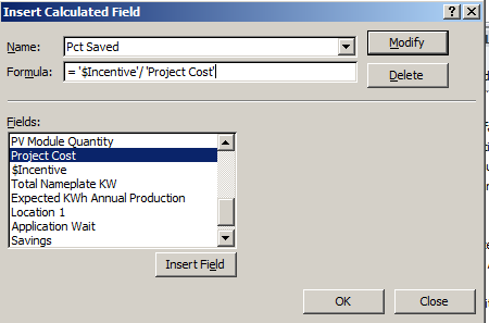
As a result, there’s a lot going on in this book. Start with Profiles, a collection of takes on a selected borough’s facts and figures, set into motion by a Data Validation drop-down selection menu (enabled by the List option) that reaps its list entries from the borough names fitted in the Data sheet’s column C (and range-named Boroughs). Click on the borough of Barnet for example and click again, this time on C7, and stare discreetly at this most curious formula:

=VLOOKUP(C$6,Data!$C:BW,lookup!$A1,FALSE)

The formula, meaning (and succeeding, after all) to convey Barnet’s population total, presses its lookup across three different sheets, and I think we need to ask if all that looking is necessary. The formula grabs the drop-down item in C6, which submits itself to a lookup table (or lookup array, in Excel-speak) awaiting in the Data sheet (and note the row-less C:BW reference, which in effect introduces every cell between those columns into the lookup array, and I’m not sure why that overreach was necessary). But it learns its column number – VLOOKUP’s third argument – from a cell A1 that’s been farmed out to yet a third sheet you need to Unhide, and entitled lookup (again, you can reveal the sheet without any obstruction).
In excerpt, lookup’s column A starts out looking like this:

bor1

Then scroll down Barnet’s borough attributes in Profile’s C column and observe the VLOOKUP column number references stationed in their formulas, each upped by an increment of one from the previous formula one row up, and each receiving that value from the lookup’s A as above – a column that has no concerted role to play in the workbook apart from its 76 numbers, sorted highest to lowest.

Thus the VLOOKUPs in Profiles sight their column, or index, number in a vertically stacked tower of consecutive values that names the horizontal columnar position of the field in which the formula is interested. Barnet’s population of 380,000, then, emanates from the third column in the data!C:BW table array:

bor2

But our formula is ordering up that 3 not from data!C:BW – the actual data source – but from a improvised list of numbers quite external to the VLOOKUP fray, in the sheet called lookup.

It’s a rather inorganic and makeshift route to that 380,800, particularly when a known, standard means toward that end avails, something like this:

 =VLOOKUP(C$6,Data!$C:BW,MATCH(Profiles!B7,Data!C1:BW1,0))

Here the VLOOKUP index number writes itself after having solicited the good offices of a neighbour in row 7, none other than GLA Population Estimate 2015 caption in B7 of the Profiles sheet. We can use MATCH to scout the position of that header in the selfsame Data!C:BW table array – or 3, where Barnet’s 380,800 awaits.

The point is that as a veritable matter of definition a lookup’s table array should be self-sufficient; that is, any VLOOKUP’s intent should be anticipated by the array, without any need to look elsewhere for the enabling data. The spire of values in lookup’s A3:A74 is an extra-table array artifice, whose placement suggests that the sheet designer didn’t quite know how to apply MATCH to the task.

Ok, so that’s not a federal offense, and of course the formulas in Profiles do work; but we need to call attention to the ultimately dispensable outside assistance furnished by that range in lookup’s A3:A74. There’s no need for it.
Now there’s at least one other remarkable feature of the Profiles sheet, this time of the formatting kind. I had advanced the guess to myself that the variously colored, merged header cells in the A column had been treated to some manner of conditional formatting, but it turns out they hadn’t been. By way of verification, tap F5 and click Special… on the resulting Go To dialog box and you’re admitted to its Go To Special box, wherein if you click Conditional formats:

bor3

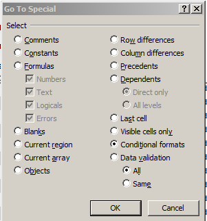
Click OK and all sheet cells subject to such any conditional format (by default) will be simultaneously highlighted for your visual inspection. And to my surprise, it was rather cells C7:G77 that had received the formats, one of which looks like this:

bor4

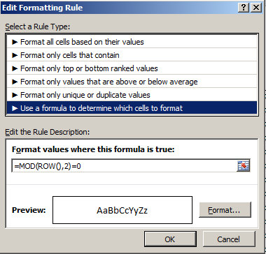
That formula tells us that any cell whose row number yields a remainder of 1 when it’s divided by 2 as per the MOD function should be formatted in the above gray. The other condition:

bor5

requires that any cell situated in a row number divisible by 2 without a remainder turn white. In short, the formats team to paint a row-banding effect across the impacted range, in fact a default feature of any data set that decides to turn itself into a table. But it doesn’t seem possible to have recast C7:G77 into table mode, because when I tried it I was told:

bor6

And C6 in the data set’s header row comprises a reference to D3, the cell in which the Borough-selection drop-down menu holds court. So the banding-format idea is a smart one.
But then I had a thought. It appears as if the conditional format that daubs even-numbered rows – the white cell fill color – looks an awful lot like Excel’s default cell format, which, after all, offers a black font color atop a white cell. So do we really need this conditional format?

With my lips pursed with that semi-rhetorical question I deleted that format – and saw

bor7

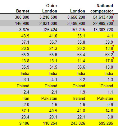
And I have no idea what that yellow’s doing there.
I told you there’s a lot going on in this workbook. I didn’t say I could explain it all.

Getting There: Australian Politician Housing Expense Data, Part 2

18 Aug

We’re following the money down under, via the conduit of expenses-plotting spreadsheets flowing our way via the Guardian‘s and its piece on the spending activity of Australian politicians. Having spent last week counting the beans doled out for politicians’ flight outlays, we’ve disembarked and booked a look at the hotels at which they’ve pulled in for the night, or nights. In short, time to take a look at quarters for quarters, in the Travel Allowance 2014 workbook wrapped up in the zip file we downloaded last week.

You’ll recall that last week’s encounter with the Australia data flew into a cloud cover of data quality issues, conspicuous among these spending figures suited up in textual format. That turbulence has cleared here; all the rate amounts in column G and all but 24 of the amount entries in J are properly numerated. Those 24 appear to be simultaneously encumbered by footnoting asterisks and HTML-code snippets, e.g.

$1,072.00 <i>**</i>

It seems the following value-restorative tack works, which I’ve penned in U8888 (note that before broaching the formula below I sorted the amounts Smallest to Largest, a directionality that ground-floors text entries to the bottom of the stack, crowding them into the J8888:J8910 range. Thus my first formula writes

=VALUE(LEFT(J8888,FIND(“<“,J8888)-1))

That expression flags the position of the first instance of the “<” via FIND and comes away with all the characters in J8888 stationed to the left of that symbol, less 1. It finally metamorphoses J8888’s textual tenant into an upstanding value, while interestingly spurning the $ currency sign in its course. Once done, a standard Copy > Paste Values addressed to J8888:J8910 and a deletion of the formulas from U will complete the repair.

I can’t explain, however, the values’ several formatting incarnations, e.g. -85, -$104.00, and the reddened -$328.00 (the latter not hued by any conditional format, but rather by a Format Cells option). As a functional proposition the diversity is meaningless; as Ms. Stein put it, a number is a number is a number, particularly if the plan is to feed them all to a pivot table in which a new, all-of-a-piece format is made to devolve upon them. But the inconsistencies stoke questions about the data quality that shouldn’t have to be asked.

And a question or two could likewise be asked about the yes/no data marking the withinelectorate field T column. Its header, I’m assuming, wants you to know which lodgings were contracted within and without the office-holder’s district. But a question need be entered about the spate of blanks washing across the field. Since the respective answers to the within/without question should be irrefutably binary, it becomes fair to say that an absence of answer means nothing but an absence of information. But blanks aren’t pivot-table friendly; break out the yes/nos this way:

Row Labels: withinelectorate

Values: withinelectorate (necessarily by Count)

and you get

book1

That is, the blanks remain uncounted, and given their unmissable prevalence I think you’d want the associated number of blanks right in there. The standard workaround: just select T2:T8911 and run a Find and Replace through the cells: Find (leave blank) and Replace with NA, or something like it. But that routine flung my laptop into something like an infinite loop, however, and after having put the Esc to its endless fulminations I bowed to Plan B, whereupon I wrote

=IF(ISBLANK(T2),”NA”,T2)

to U2, copied down the column, and plugged a Copy > Paste Values of the results back into the T column and deleted the U formulas. Something about discretion and the better part of valor.

Then refresh the pivot table and jigger the Values into % of Column Total mode and:

book2

I think all those NAs matter, standing in the way of a definitive understanding of these home-and-away travels.

Now back to those amounts, 24 of which are negative. We learned last week that these two dozen sub-zero totals attest reimbursements, presumably for trips not taken or ones errantly billed to the reimburser – that is, the Australian government. Reasons aside, their numbers are indeed few, but they need to be dealt with just the same. I’d allow that they be sorted to the bottom of the field and pushed away from the operative data set via our storied blank-row interpolation, because these negatives report what in are effect non-bookings, for which the politician can be neither credited – or blamed, for that matter.

Hewing to my own advice, I’m left with 8885 records worth of expenses, which we can, for example, pivot table by party, number of bookings, and amount:

Row Labels: party

Values: party (Count; in effect, any field all of whose cells are occupied could be counted)

Amount (Sum, formatted with commas and to two decimals). I get

 book3

Jogging both sets of values into % of Column Totals we see:

book4

(You don’t need the redundant 100% Grand Totals here,) The party-amount proportions line up, more or less, but they need to be proportioned in turn to the numbers of sectarians per party. We’ve discussed this problem elsewhere (trust me, because I can’t yet track down the post) – in which politician names and their parties visit the data set repeatedly, even as we want to count the records of each party member and his/her party uniquely. Again, the most limpid instruction set would advise us to construct this pivot table:

Row Labels: poliitican

Party (Tabular design without subtotals and grand totals)

That understated table could be selected (via , PivotTable Tools > Options > Select > Entire PivotTable in the Options button group) copied, and subjected to a Paste Values (and a and it could be pasted atop itself, in effect replacing the pivot table), thus in effect carving a new, lean data set which in turn could itself be pivot tabled:

Row Labels: party

Values: party (Count, along with % of Column Total)

 book5

Thus we see that with 43.70% of the recorded politicians and 47.00% of the declared expenses the Liberals seem slightly more indulgent than their contingent size would project, while Labor’s 37.39%/31.80% enrollment/expenditure split speaks to their apparent frugality. But of course neither inference can serve as anything resembling the last word on the subject. Any impugning of legislator or party intents would require a far finer sifting of the nature and geographical plotting of the work to be done. But it’s a start.

A raft of other analytical permutations are in there to be spun, of course, but here’s just one more:

Row Labels: details

Values: details (Count)

amount (Sum)

I get, in excerpt:

book6

Scroll down and you’ll see 3760 charges totalling over $4,000,000 for Sittings of Parliament – whatever that might mean, though it likely refers for housing costs accumulated during the body’s sessions – or about 60% of all expenses. But don’t get excited over the Abbott Government’s Budget Cuts and Commission of Audit; they mean Prime Minister Tony Abbott – not me.

Getting There: Australian Politician Flight Expense Data, Part 1

11 Aug

Citizen journalism or free lunch? Admirable voluntarism or crowdfunded advantage-taking? It’s your call, but the Guardian wants you to donate your – and your, and your – analytical smarts to the data on nine spreadsheets itemizing Australian politicos’ expenses, in a collective scanfest to see what sort of discrepancies and pause-givers might be worthy of investigative pursuit.

The sheets, which can be downloaded en masse in zipped form by clicking here on the page linked above:

au1

report travel allowance information, the locations of and costs attending politicians’ sorties away from their district, and data about trips taken by tandems of elected officials who happened to belong to the same party, that latter compendium edging towards the question as to whether they all had to come along for the ride.

The two largest workbooks uncover flight and associate cost data for 2012-2013 (combined) and 2014; and the nearly 45,000 trips filling the two books pump out enough raw materials to perhaps substantiate a story by themselves. After all, the earlier sheet’s 22,044 flights (770 of which predate 2012, by the way) stand atop a tottering denominator of only 244 discrete office-holders, beating out an average of 91.47 flights per politician – or one flight every four days. That’s 90 movies, too. And the 2014 average of 88.63 is also very much up in the air.

Because the data across the two workbooks in effect mean to tell us the same sorts of things, a consolidation might be in order, in the interests of treating the data all of a piece. I’ve used the verb “consolidation” irresponsibly, though, because it implies a turning toward Excel’s long-standing Consolidate feature, which doesn’t seem to be the tool of choice here; Consolidate acts mathematically upon the data to be consolidated (i.e., by adding like items), but all we want to do is effect a merger of sorts, such that the 45,000 records in the two files line up obediently in their appointed fields in a unified workbook. It seems to me that a workaday copy-and-paste of the flight data from one book (probably from 2012-2013 to 2014) to the other will work, once you understand – and you will – two disparities: First, that the first five fields comprise comparable information that nevertheless find themselves in different columns, because the Date field waves at us from columns B and D in the 2012-13 and 2014 books respectively. And second, the electorate, state, party, partygroup, and house fields are quite peculiar to the latter file. There’s nothing there in 2012-2013.

Moreover, the 2012-13 workbook enrolls names that don’t appear in the 2014 edition, e.g. Patrick Secker, and as such no state/party/partygroup information about these one-timers could avail at all. That means of course that assorted blanks and fellow-traveling error messages will sully any attempt to composit cross-workbook breakouts along party and state lines and the like. My first assessment of the discrepancies, worked out after redeploying the 2014 data as a de facto lookup table, turns up about 6% worth of unusables, or about 11.5% of the 2012-13 records – again, meaning that these names just can’t be looked up in 2014, because they’re not in that workbook. That disconnect might be prohibitive, particularly because party expense correlations call so much reportorial attention to themselves. The simple, if only partially satisfactory way out, then, would be to confine some analyses to the 2013-14 information.

What are universally available across the sheets are the date data. You’ll be pleased to know that every one of the 44,911 two-workbook records is in fact a date; but you’ll be a little less pleased to discover that the amount data a) aren’t numeric at all, but rather have been straitened into text mode, and b) about 9,000 of the amounts shed any pretence to numeracy at all, substituting hyphens or absolutely nothing for the impostor values. And that is quite beside the 16 entries whose incipient values are freighted with asterisks, e.g. 528.81**.

Now, ok – the asterisks, and all the other text-presenting values in the field, could be righted by couching the data in the VALUE function, e.g.

=VALUE(E2)

Or, in the case of the asterisk-ridden:

=VALUE(LEFT(E39326,LEN(E39326)-2))

That expression imparts value to its referenced cell after shearing its pair of asterisks and rescuing the numeric remainder via a LEFT. (Note by the way the dollar signs, reflective of the indigenous Australian currency. And note as well the negative amount entries, apparent reimbursement figures. Thanks to the Guardian’s Nick Evershed for that clarification.)

But with 20% of its flight-charge amount records calling in absent, confident conclusions about who’s done what won’t scamper in your direction, though of course, some findings do remain to be plausibly plumbed, e.g. this pivot-table matrix (I’ve assumed you’ve combined the two workbooks to the extent possible):

Row Labels: Location-from

Column Labels: Location-to (in fact there are 792 blanks in there, and two in Location-From. I’ve renamed the Row and Column Label headers To and From respectively.)

Values: Date (Count; the field was chosen because it is accounted for in every record)

Slicer: politician

You’ll also note this Location-from misfit:

aust2

 Thus Australian Prime Minister Tony Abbott’s itinerary looks like this:

 au3

 That sort of tableau may prove instructive, but with so much important data simply not there the limitations here are real.

But we have seven other zipped spreadsheets to look at.

Daunting Date Data: UK Unemployment Claims

4 Aug

Here’s a droplet from the torrent of spreadsheets loosed weekly by the UK Office of National Statistics, one that embodies an interesting, if messy, set of problems for the analyst:

Claimant count data

The data historicize British monthly unemployment claims data from a June 1881 point of inception, and drill down to May of this year, across two different sheets.

There are, first of all, significant comparability issues across the years and the sheets, some of which are expounded in the linked document on the Historic Data sheet as referenced in cell A5. If your intentions here are investigatory, those assuredly beg your attention. Indeed, the qualifier in cell A7 of that sheet warns against a melding of the UK and Historic Data – the latter only counting claims from 1881 through 1970 – a recommendation that presumably justifies the very fact of two sheets.

That’s one issue and a real one, albeit of the extra-spreadsheet kind. But there yet might something to learn from each sheet regarded singly – namely, something about unemployment claims by year.

And to advance that prospect, all good pivot tablers will doubtless move to group the Historic Data (let’s start there) by year(s) and proceed to average their claim rates (which may roughly proxy for unemployment percentages).

And it’s right there where you have to start paying attention. The dates tumbling down the curiously untitled field (we’ll call it Date) in A don’t seem to be dates at all, but rather indolent text; but for once, as we hope to see, these impersonators will serve the analysis well – because Excel can’t evaluate putative dates that were calendared before its baseline day of January 1, 1900. That day receives the date number 1, with every succeeding day counting off its relation to the foundational January 1 by an increment of 1. Thus December 17, 1983 quantifies itself as 30667, for example, the number of days distancing itself from the January 1, 1900 touchstone.

Thus Excel can’t ratify Jun 1881 in native date mode (though a VBA-macro –driven workaround is described here) – and indeed, even if all the entries in the Historic Data sheet postdated January 1, 1900 they’d still resist grouping, because they’re text.

But for our purposes, that insufficiency shouldn’t matter. To commence what could be billed as faux date grouping, all we do is check into the D column, head it Year, and enter, in D12:

=VALUE(RIGHT(A12,4))

That expression drags the 1899 out of the A12’s Jun 1899 and upgrades it to full-fledged quantitative standing. Copy it down D and you’re in business, priming this sort of pivot table

Row Labels: Year

Values: Rate (%) (Average, honed to two decimal points. But note that 31 months report NA in lieu of an actual rate).

Because the Years are duly numeric, we can group these into say, five-year bins, yielding:

 torrent1

You’ll note the Depression-driven 19.10% in the 1931-1935 bin.

Now there is, apropos the discussion above, a formatting curiosity that’s wormed its way into the dates. You’ll see that the A12:A234 range bears the General format, befitting a non-committal receptivity to any and all date/numeric types, and these precisely dovetail the pre-1900, text data. But A235 – entertaining the Jan 1900 date –asserts a Custom format, consonant with a numeric entry – even as we’ve allowed that all the field’s cells are text. And sure enough – click A235 and jab at the Number Format drop-down menu in the Home > Number button group:

torrent2

You’ll see that every formatting variant therein fails to vary, each one reporting the same Jan 1900 expression; and that very constancy, Custom format notwithstanding, means – text.

But ok – again, that discovery does nothing but rubber-stamp our earlier averral, to the effect that all of the entries set down in the Date field are merely, and only, text. But what’s interesting about Jan 1900 – and by that I mean ‘Jan 1900 – is that, some wordplay intended, it isn’t completely valueless.

To explain: given the overweening centrality of numbers to the spreadsheet remit, Excel accords certain quantitative properties to apparent numbers costumed as text. Enter ’17 in A3, for example (and the apostrophe textualizes the entry) and go on to enter =A3*2 in A4, and you’ll get…34, a really, truly, usable number. And less obviously, enter ‘Jan 1900 in A3 and type =A3*2 in A4, and you’ll get 2 – and that’s because Excel takes the liberty of treating ‘Jan 1900 as January 1,1900 – numerical value 1. Multiply it by 2, then, and you get 2.

Thus even as ‘Jan 1900 owns up to its text-label lineage – and as such, can’t be grouped by a pivot table, for example – it’s happy to consort with numeric operators, and pass itself off as a number when asked to assent to the deception.

And if you want to work with the presumptive years in the UK sheet, you’ll want

=VALUE(LEFT(A6,4)

because the years in the sheet’s A column position themselves before the month in the UK date cells. And because they do, they won’t return the same kind of de facto numeric values that surprised me in the Historic Data sheet. If you want those, you’ll have to restructure the data thusly, e.g., the 1971 Jan entry in A6:

=DATEVALUE(RIGHT(A6,3)&” “&LEFT(A6))

The RIGHT/LEFT extraction reverses the placements of the 1971 and the Jan, after which an authentic date/number should emerge.

Should. But scroll A column downwards, and you’ll drive past entries such as this one, in A230:

 1989 Sep#

That footnoting pound sign, or hashmark (its name depends on the side of the Atlantic on which you’re reading this), inflicts one more dollop of complication into the mix, requiring this formulaic rewrite:

=DATEVALUE(MID(A230,6,3)&LEFT(A230,4))

The nested MID rescues the Sep from its entanglement with that sign,as that month name begins in character position 6 in A230.

Ho hum; all in a date’s work.

ATP Tennis Rankings, Part 2: Some Baseline Data

27 Jul

Now that we’ve established the fact of the relative French hegemony over the men’s rankings a breakout of said parameter would appear to be in order, that is, something like this:

Row Labels: Rank (Grouped in bins of 100; needless to say you can demarcate these as you wish)

Values: Rank (Count)

Slicer (or Report Filter): Country

Slicing for France I get:

atp1

It must be the wine. With 40 players in the top 400 – and the US has 30, by way of comparison – France is doing something right, and by turning the values over into Show Values As > Running Total mode (Rank serves as the Base Field) you’ll see

atp2

That is, the top-ranked half reaching through 1100 counts 96 Frenchmen, or 69% of their total, a favorably top-heavy distribution. The equivalent US proportion stands at 53%.

Now of course there’s another variable we’ve neglected till now – Age, which should have some notable things to say about who’s ranked where. First, I’d calculate age by posting the TODAY() function in some unoccupied cell, say L1, and range-name it, with all due sparseness, t. Then name E1 Age and enter, in E2, =(t-d2)/365.25.

That expression, which we’ve seen before, subtracts the player’s birthdate – a number, after all, when all the formatting is said and done – from today’s date, whenever that day may fall, and divides the difference by 365.25, or the near-average length of a year.

But note that 17 players report no birthdate, and so by sorting the ages Oldest to Newest we’ll drop those empty readings to the bottom of the dataset, wherein we can ask our perennial blank row to shove the vacancies from the date-bearing records.

Rounding the results to two decimals, we can begin by pivot-tabling a breakout of average age by grouped rankings, here with the presently usable range (through row 2150) e.g.:

Row Labels: Rank (again, Grouped by 100)

Values: Age (Average). I get

atp3

And that, I would contend, is interesting. Top 100 rankers are the oldest, their 28.79 years exceeding by 1.6 years the penultimate average of 27.19, which happens figure in the very next tranche of 101-200. Indeed, that 28.79 betters the overall men’s average by 4.74 years, not a trifling disparity, and doubtless a meaningful one.

Next, a simple frequency distribution of ages across the rankings would be correlatively valuable, but it isn’t that simple. Start here:

Row Labels: Age

Values: Age (Count)

It’s when we try to group the ages – and I want to organize them in units of one year – that the problems fly off our racket:

atp4

Now we ran into the extended-decimal problem some time ago, having alleviated that unsightly tableau courtesy of a consultation with Debra Dalgleish (sorry for misspelling your name last week, Debra). All we need do is delete the number’s decimal portion

atp5

and proceed, or so we’d like to think. But when we click OK we see

atp6

That is, the “By 1” entry in the above dialog box is all-too literal, squeezing the ages into tufts of two years, describing an interval of one year. But I want each year stand-alone, and decoupled from any companion age. And that is a perfectly standard stratagem, one in fact that could be engineered quite swimmingly without any grouping at all under “normal” circumstances – that is, were the data-set ages decimal-free at the outset. But because our field’s ages are now precise to a fault, we need to rewrite E2 thusly:

=ROUND((t-D2)/365.25,0))

thereby flattening Novak Djokovic’s 28.18 years into an uncomplicated, but real 28.00 (i.e., that is a meaningful 28, not a format-tinctured 28.18). Copy down the column, and refresh the table. Now I get (ages sorted youngest to oldest):

Flip the numbers over into % of Column Total and throw in Rank (Average, two decimals) in Values and

atp7

21 is the modal age, but with an average ranking of 1265.73 that cohort has yet to hit its stride. Note 28’s 719.32, but check out the even lower rankings for 30 and 31, numbering 68 and 40 players respectively. And the 34 34s score even better.

You may also be intrigued by the one 48-year-old urging himself upon the rankings, instated at 1716. That demographic belongs to the Israeli/American Oren Montevassel, who as of this writing sits at 1727 (remember our data take us back to December of last year). His Twitter account states its owner is “…considered best player in the world for 40+”, and that judgment may be wholly justified.

In fact, 125 players shared the 1716 ranking, presumably because it amounts to just a few tournament rating points. And to that stratum also belongs the rankings’ youngest entrant, the Italian Nicolas Merzetti, who with a birth certificate (it’s been translated for me) dated October 29, 1999 is less than a third of Montevassel’s age.

Hey ATP – where’s your publicity department? Why aren’t these two guys paired in a doubles team?

ATP Tennis Rankings, Part 1: Some Baseline Data

20 Jul

DalYou may not need or want to know that you’re the world’s 1572nd best plyer of your favorite trade, but tennis plyers, er, players, can’t help but be reminded of precisely where they stand among their peers, and all the time at that. It’s the rankings, those invidious markers of professional worth that want you to know just how many of your fellow practitioners out there do your job better than you do; and the Tennis Abstracts site ranks 2100+ male players on the Association of Tennis Professionals (ATP) tour for your interest, consideration, and analysis (I don’t see an equivalent compendium for the woman’s tour, by the way, though other sorts of listings for them are on the site). You can check it out in standard spreadsheet form courtesy of yours truly here:

 ATP Men’s Tennis Rankings

The data set comprises exactly four fields, one of which – the player names – doesn’t really have that much to add to the inquiry, though I wouldn’t I delete it. But those three other fields nevertheless suffice to speak instructively about the rankings.

First, a necessary qualification: we need to recognize that, with its December, 2014 timestamp, the rankings – which naturally oscillate with every tournament – aren’t absolutely to-the-minute, an imperfection that is real and should be rued. You’ll happen upon a timelier arraying here at the ATP web site, but its currency is frittered away by the site’s poorer data organization: the players come to screen in blocks of only 100 at a time, and their country codes have been supplanted by text-less national flag icons, which don’t copy-and-paste very well at all, if at all. And that means you have to know your flags.

Shortcomings duly recorded, we can return to our data and attempt a breakout of ranked players by country, an obvious but need-to-know kind of metric. And here too another problem of sorts sprays molasses into the gears: those aren’t flags in there, but I can’t always tell which country is referenced by which three-letter code. It took me a round of Googling, for example, before I persuaded myself that MNE means Montenegro, BIH stands for Bosnia-Herzegovina, and MAR is, naturally, Morocco (ok – it’s Maroc in French; look here for some global clarifications). And CHI is Chile, not China; that latter country is signified by CHN.

But once you get past that international complication this straightforward pivot table beckons:

Row Labels: Country

Values: Country (Count)

Country (again, here % of Column Total). Sort by either Count of Country values, largest to smallest. I get in excerpt:

 rank1

Quelle surprise. I would not have anticipated France’s superior representation, or Italy’s third-place showing but I’m a duffer; followers in the know may find their expectations wholly fulfilled.

But what about the countries’ numbers and their players’ average rankings (whereby lower is better)? Let’s slide Country into Values, summarizing by Average and formatting to two decimals, e.g.:

rank2

Leaving existing sort order in place, we again find the French among the higher achievers. Remember that with 2166 players populating the ratings, the average across that total comes to 1033.5; and so an evaluation of 844.46 – 189 places above the average – spread across 139 Frenchmen, is no small attainment (note that some players with equivalent, overall tournament point totals will share a ranking. Thus if two players are ranked 83, the next player down the pecking order receives an 85).

The problem of course is that the average reported above won’t directly reconcile absolute country totals with the calculation. We see, for example, that Czechoslovokia ‘s average 799.78 rank outpaces France’s appreciably, but it’s gotten there with but 40 players – and that disparity seems to shortchange the latter country. Thus it seems to me that dividing a country’s number of ranked players by its average rating – again, in which lower is better – would realize a truer measure of the national standings. Not perfectly true, perhaps, but truer.

That alternative would appear to call for a calculated pivot table field, something like this:

rank3

But that won’t work at all, in part because, to quote Excel boffin Debra Dalgliesh:

“A calculated field always uses the SUM of other values, even if those values are displayed with another function, such as COUNT.”

You may want to think about that caution – I know I need to –but either way, you can’t build a calculated field atop a set of counted values – and country names can only be counted. The way in to a solution then, would return us to the data set itself, to which we need to strap in another field, which I’ll call Country Count, presumably in column E. I’d then select all the country data in C2:C2167, name that range country, and in E2 enter:

=COUNTIF(country,C2)

and copy down E, even as you blunt the values’ two decimals if you see them. As advertised, the COUNTIF totals respective incidences of each country name, and don’t be bothered by the fact that the total won’t vary among countrymen down the column. For example, the appropriate E cell for each French player will return 139, but that redundancy will be attended to by the ensuing pivot table, which should assume this shape:

Row Labels: Country

And it’s here where we devise the calculated field, which I’m calling AdjustedRank, e.g.:

rank4

Click OK and sort by AdjustedRank, Largest to Smallest (here I’ve formatted the results to six decimals):

rank5

That’s a bit more like it, I think. Compare France’s adjusted rank with Czechoslovakia’s; now, in spite of the latter’s more impressive average rank, France’s greater player numbers overwhelm that advantage commensurately, at least more or less.

I’m hedging because, taken to its limiting case, my new field begins to cause itself problems. 21 countries contributed exactly one player to the rankings; if one of those players, for illustration’s sake, were rated number one, my little equation:

=Country count/Average ranking

Would yield 1, and so would embarrass France’s real-world, table-topping .164602. That scenario isn’t unimaginable, either, and so the above fraction might have to be returned to the shop for a rethink, the better to properly mathematize all contingencies.

OK, so my calculated field isn’t irreproachable. But I ask you: can 139 Frenchmen be wrong?

Watt’s Up With New York State’s Solar Power Program

13 Jul

Don’t confuse New York State with New York City; the former subsumes the latter, though imperious residents of the latter will probably tell you the subsuming goes the other way. But either way, don’t confuse the New York City’s open data site – to which we’ve travelled any number of times – with the State’s site, a novel stop-over for us, in which I scrolled my way into the euphonious

Statewide_200W_or_less_Residential_Non-Residential_Solar_Photovoltaic_Incentive_Program_Map_Beginning_2000 workbook, whose title balloons my word count by exactly one (blame the underscores).

All of which you can get here.

(You’ll note by the way that the site brings the data to our attention in the first instance in map form; nevertheless, a click of the blue Export button will repackage these into what the site call a static spreadsheet.)

The workbook tracks installations for solar energy-saving equipment, or photovoltaic (PV) systems, (detailed here, I think), but learning more about the data and the activity they detail will require some extra-worksheet due diligence. Click the unassumingly small right-pointing arrow beneath the data’s title on the open data site and you’ll bring out;

watt1

That legend is a mite clearer on the site itself, but only a mite.  If you’re looking for more, and click the right-of-the-screen’s About link, this legend emerges:

watt2

That is, it’s the same content we saw in the first screen shot (trust me). I also had to look elsewhere to learn something about PV inverters, modules, and nameplates, elements that figure in data set fields, and which aren’t denoted in the workbook.

In any case, the data themselves look pretty good, a reliable virtue of US-based open data sets. Once you perform the customary column auto-fits you’ll probably want to rid the workbook of the undifferentiating State field in the D column, whose 32,670 rows contain 32,670 entries for NY. (I’d also loosen the wrapped text in the Location 1 field). Once you’ve gotten that far the data should be in line for some – ahem – illuminating, if not electrifying, finds.

Start simply enough, for example, with a pivot-table breakout of installations by sector types:

Row Labels: Sector

Values: Sector (Count, befitting Sector’s text data)

Sector (again, by % of Column Total).

I get

watt3

The numbers are clear, though I don’t know what ultimately distinguishes a Commercial from an Industrial site. In any case residential installations dominate the mix, not terribly surprisingly.

Next, an enumeration of installations by year could inform us as well:

Row Labels: Date Install (grouped by Year)

Values: Date Install (Count)

Date Install (again by % of Column Total; and you won’t need Grand Totals here)

watt4

Remember that the 2015 data extend only through May 31 (effectively the 29th, the date of the last recorded installation) and thus augur a record year, one much in keeping with the definitive upward installation arc drawn across the data. On the other hand, one needs to key those 32,000 installations to a statewide population of nearly 20 million; some inter-state comparisons might be in point here.

We could also ask about the average waiting time separating an application for a system and its date  of installation. Here we could easily enough poke our mouse into the next available column, head it Application Wait or something like it, format it in Number mode (sans decimals) and enter, in what should be T2,

=J2-I2+1

(If you’ve in fact deleted the D column and its endless NYs the above would read =I2-H2+1.)That 1 plays its part in quantifying an installation rolled out on the very day of its request, and there are (apparently) a few such models of promptitude in there. Absent the 1, these swiftly-appointed rounds would return a zero.

This pivot table then awaits:

Row Labels:  Date Install (again grouped by Year)

Values: Application Wait (Average, two decimals)

Application Wait (Count).

I get:

watt5

It seems clear that the one-day averages declared for all the installations effected in the program’s first five years serve a placeholder role, perhaps paving over absent or defective wait data. But note as well the ragged course of wait-time averages, strung below across a rudimentary pivot chart:

watt6

The spike in average waits in 2011 also dovetails with that year’s singular, backtracking installation totals. A story line, in there, perhaps? But note on the other hand the impressively speedy average for 2015 thus far, that for a year that foretells record installation demand.

And there’s at least one other interesting relationship to explore – the interaction between what the workbook calls Project Cost and $Incentive. I suspect – but cannot yet prove – that the installation savings signified by $Incentive sits atop the Project Cost denominator, so that an incentive of $1,190.00 on a Cost of $2,496.00 yields an effective installation charge of $1,306.00, or a 48% economy. The alternative understanding – whereby the $2,496.00 stands as the resultant of a savings of $1,190.00 applied to a $3,686.00 project – could be entertained, but I suspect the data mean to communicate the former.

Assuming for the next five minutes I’m correct, we could move to break out average incentive savings by year, once we do some thinking about the Cost numbers. If you sort Project Cost by Smallest to Largest the numbers bottom out in row 32,497, after which the next 174 rows set down no cost as all. And the cost figure in 32,497 – $9,532,080,102.00, for an installation in the town of Calverton in Suffolk county in Long Island – can’t be right, can it?  Its speck-like $4,144.90 incentive doesn’t remotely cohere with that monumental outlay, and because it doesn’t I’m imposing a blank row atop 32,497, thus beating back that big number along with all the missing project cost records.

Now we can pivot table the remaindered 32,495 data-bearing rows:

Row Labels: Date Install (again, grouped by Year)

Values: Project Cost (Sum)

$Incentive (Sum)

And in the interests of dividing summed Incentives by summed Project Costs to realize percentages, I’d piece together a simple calculated field:

 watt7

I get, once all our numbers get the formats they deserve:

 watt8

(Remember that you can retitle any and all the field headers.)

Now that, I would submit, is interesting. From 2002, when the numbers start getting big, incentive percentages slip every single year, and the slippage is big, too. Have these yearly contractions been itemized in some New York State agenda for the PV program, or is some other, less planful market vector tightening the screw?

I don’t know, but hey, story-seekers: are – ahem – any light bulbs going off?

A Tree Grows in Paris: Les Arbes d’Alignement, Part 2

6 Jul

Our nature walk through Paris’ 100,000 trees is about to get us somewhere, now that we seem to have completed the formulaic fix that should let us distill the arrondissement numbers from the locales in the Adresse field and free us to break out the tree totals by arrondissement:

=VALUE(MID(C2,FIND(” “,C2)+1,FIND(“E”,C2)-FIND(” “,C2)-1))

That expression is still good as far as it goes, but it has occurred to me since I last went to press that we might want to invite back the 10,000 bits of flora sown in the Bois de Boulogne and Bois de Vincennes, the ones we had separated from the greater pack of tree data because they had no arrondissements to report. Upon reflection, I’d allow we still could and probably should count them, and so by deleting the interposing row separating the forests from the tree we could amend the above formula thusly:

=IF(LEFT(C2,1)=”B”,LEFT(C2,FIND(“-“,C2)-2),VALUE(MID(C2,FIND(” “,C2)+1,FIND(“E”,C2)-FIND(” “,C2)-1)))

This extension to the existing formula poses a condition that asks: If an Adresse starts with the letter B -confirming a Bois adresse – then find the sequential position of its dash somewhere in its cell and subtract 2 from it, thus ordering the LEFT function to retrieve all the text segment exhibiting that length. For example – the “-” appears in the 18th position of cells featuring the Bois de Boulogne; thus we know that a 16-character LEFT extraction will return that name.

Once this new edition is copied down the now-enlarged Arr field we improvised last week our pivot table is duly posed for action:

Row Labels: Arr

Values: Arr (Count)

Arr (again, this time % of Column Total; dispense with Grand Totals)

I get:

Paristrees21

Again, I don’t know what pretensions to completeness the census entertains, but we see the Left Bank’s 13th and the posh 16th have set aside the largest spaces for their trees. The smallish totals for the two Bois entries may be wholly complete, but they furnish cause for us to wonder just the same. The figures also need to be calibrated to arrondissement size, or course; the inconsiderable totals for the 1st and 2nd do in fact scale to their pinched areas, for example. And a correlation is available, thanks to Wikipedia’s square-kilometer enumerations of the arrondissements:

paristrees22

Throwing Excel’s CORREL function at all the numbers, I get .927, a massive association suggesting that Paris’ urban designers strove ardently to smooth their tree distributions across the districts as per their size. (Note, however, that the Wikipedia listings pair two area figures for the 12th and 16th, the larger incorporating the Bois de Boulognes and Bois de Vincennes respectively. The above table displays the former, smaller area totals.)

And some causes for wonder abound in the Date Plantation field, too. We’ve already taken stock of the two-thirds of all putative date stamps in there that are in fact inactive text, nullities that I assume mean to tell the analyst that these are trees for which no planting dates are available, though they may also want to let us know that some of these in fact took root prior to 1900, the year before which Excel just can’t compute. The great bulk of these dormancies show the 1700-01-01 pseudo-date, but some others insist on some curious variations, e.g., 1700-03-06. Either way, these are text. There are in addition exactly 100 trees submitting a 1/1/1900 planting date, a real date this time but one that, given the understanding that January 1 1900 is the earliest date with which Excel can work, one needs to ask what these are trying to tell us. We also are told about a tree with a circumference of 165 centimeters ostensibly planted on May 27, 2015, about a month-and-a-half ago. Some potent fertilizer’s in that turf.

But if, in spite of all, you do want to learn something about the planting dates, you first need to do something about all the text entries before you dare to group the dates by year, for example. I’d take over the column to the right of Date Plantation, call it Date or whatever, and enter in what should be I2 (remember our Arr field is in there):

=IF(ISTEXT(H2),1,H2)

And what is this formula doing? It’s telling its cell: if the entry in H2 is indeed text, replace it with a numeric 1. Otherwise, if the H2 is a truly dated, return that number). And why 1?  Because 1 is really January 1, 1900, the first date in Excel’s chronology, the one naturally receiving the very first number in the date/number sequence. Thus every 1700-01-01 will be treated as January 1, 1900, a date we’ll then decide to filter away from any grouping.

Once you’ve copied the formula down. A pivot table along these lines can take shape:

Row Labels: Date

Values: Date (Count, and group by Years alone; filter out the year 1900 and the residual-category <1/1/1900).

You’ll see a bounce in plantings starting with 1987; but given my caveat above I ‘m not sure what that means. The dates require a second – and perhaps even a third – look.

And what about tree heights and their averages, say crosstabbed (remember that term?) by arrondissement?  Here the data are all quantitative (remember that last week I split off all the  ,0 decimals that can’t be read by those insular US regional settings), but about half of them record a tree height of 0 meters – and that can’t be, particularly since many of these possess measurable circumference data. Moreover, one particularly strapping stripling in the Bois de Vincennes stands 881,818 meters tall, which puts the tree’s upper branches somewhere in the Van Allen belt. Ten others register heights in the four-figured meter range, turning the Eiffel Tower into a Lego knock-off by comparison. Verdict, then: these data don’t seem terribly usable.

And the circumference (Circonference) data aren’t much better. I’m thinking of the Platanus orientalis in the 18th arrondissement, and its 120,170 centimeter girth; at more than 12,000 meters around it could fence off the whole district, and tempt the 18th’s residents into declaring their independence from Paris. And about 16,000 trees state no circumference at all. (By the way, if you rest your mouse atop any Geo point in the source data on the Paris Open Data site, the tree associated with that point is promptly reckoned on a pop-up map.)

All of which may compel me to rewrite the brief I filed on behalf of trees in my previous post.  They’re not quite as cooperative as I might have thought. After all, even the most  vain of humans wouldn’t have the nerve to declare a waistline of 0 inches.

A Tree Grows in Paris: Les Arbes d’Alignement, Part 1

28 Jun

Faced with the choice between counting trees or humans I’d professionally recommend that you opt for the former. Humans, after all, are mobile and moody; they’ve been known to spurn or even flee from the ones doing the counting, or slam the door in counters’ faces, or lie to their honorably-intended questions.

Trees, on the other hand, have nothing to hide, and couldn’t hide even if they did. A wondrously compliant and agreeable life form, those trees; and the Paris’ factotums charged with counting them have put together a census of their findings in the Open Data Paris site here. (Tip:  click the Export button in order to start up the download, and follow on with a click on the Télécharger en Excel link.)

Now if you think you’ve heard the tree theme before in this space you’d be right; we’ve already foraged through the count of New York’s trees in our December 14 post of last year; and after having refreshed my own recollection I see that the Apple’s dataset, at least as of that writing, comprised 623,000 or so entries, give or take a sapling. We see that the Paris itemization, on the other hand, returns 104,000 trees, a perfectly plausible proportion in view of the fact that the city’s square-mile area measures about one-seventh of New York’s. At the same time, however, I can’t say if the data are comprehensive, or presume to be.

In any case, a first look at the data exposes an Open Data Paris commonplace: a spreadsheet-wide application of the Wrap Text option and its nettling consequent, an obscuring of much of the text in a whole lot of the sheet’s cells. I’d thus hasten to click through a global Wrap Text turn-off, and an ensuing standard but necessary column auto-fit.

And about the numbers themselves:  I don’t know about yours, but my download aggrandizes the Circonference (tree circumference) and Hauter (height) values with a comma – the French representation of a decimal point – and a meaningless trailing zero, neither of which appear in the data as framed on the Open Data site:

 paris trees1

I suspect these elements are implicit in the web data and as such are being suppressed by some preemptive formatting scheme, but explanations aside I for one don’t need them, in part because my obstinate American regional settings can’t compute the comma, and so casts all the numbers into fallback text mode.

The way out, aside from handing my regionals over into French hands: do a find and replace on columns B and D, in which a find for ,0 is to be replaced by nothing. That works – kind of – because while my version indeed restores the entries to their honorable numeric standing the find and replace also somehow performs a hyper-substitution, in which the comma has been made to give way to a decimal point and three zeros for which I haven’t asked.  Ok – the zeros will respond to three decrease-decimal clicks, but I don’t quite know why they showed up to begin with.

And the Date Plantation (planting) numbers in G are no less curious. First, of course, there are all those 1 janvier 1700 entries that the download rewrites into 1700-01-01 text form, text in part because Excel can’t deal with a date preceding January 1 1900. But either way I suspect 1 janvier 1700 stands as a placeholder for a tree sans birth certificate. The other dates, however, have remarkably rewritten themselves, guarding their true quantitative character – or at least they’ve done so on my system, e.g., 19 avril 1998 to 4/19/1998, even negotiating my American regional month-first syntax with panache. But those 1700s – of which more than 68,000 are sprouting among the records – are a formidable cluster, and will stand in the way of your attempts to group the data by date.

But the tweaks keep coming. It seems to me that, among other objectives, a simple breakout of tree totals by arrondissement (or district, of which there are 20 in Paris) would be of service, but the Adresse data in which the arrondissements are sealed aren’t yet up to the task (as per the above screen shot).

The pivot tabler would want record 1, for example, to release its 15 alone to the analysis, with the item shedding its redundant Paris and Arrdt identifiers and address. To get there, I’d first conduct a Z to A sort on the Adresse field, because around 10,000 of the tree records bear the provenance of either the Bois de Boulogne or Bois de Vincennes, large parks flanking Paris’ western and eastern edges, respectively. These carry no arrondissement information; and so the sort jams these to the bottom of the data set, from which they can (at least temporarily) be parted from the other, usable records via the faithful blank row.

Next I’d open a new column to the right of Adresse, call it Arrond or some such, and immediately format this upstart field in General terms – because Arron has inherited the text format of the neighboring Adresse field, and left to those default devices will deactivate your formulas into impressive but useless inscriptions.

And here’s my formula, entered in what is now D2:

=VALUE(MID(C2,FIND(” “,C2)+1,FIND(“E”,C2)-FIND(” “,C2)-1))

Remember that we’re looking to extract the arrondissement numbers peppering the Adresses in C, a search issuing a call for the MID function’s search-and-pluck routine. Here MID identifies its operational starting point by finding the position of every entry’s (first) space – invariably 6 here, by the way – and adding 1, because the arrondissement number itself need start at the next position, 7. It then figures the length of the MID character extraction by subtracting the position number of the ” ” from that of the E that invariably shadows the right end of the arrondissement number, and subtracting 1 in turn – because both the space and the E sit outside the arrondissement number and would thus overstate the extraction total by 1. (The E abbreviates a French numbering prefix, by the way, the equivalents of “st” or “th”. Thus onzième means 11th, deuxième 2nd, and so on. And the ER that attaches to the 1st arrondissement stands for première.) If you’re happy with all that, copy the formula down D.

And why the VALUE? Because absent that revisionist touch, the results would assume text form, by itself not dire; we’re not interested in adding arrondissements, after all. But reel text-formatted arrondissements into the Row Labels area of a pivot table and they’ll sort like this:

 paris trees2.jpg

 That’s how text/numerics sort, regarding each of their columns distinctly, and sorting these left to right.

Now we have to figure out what we can learn from all this.

UK Election Poll Data: A Vote for Change(s)

21 Jun

It was Emerson who had little time for a foolish consistency, but Emerson never designed a spreadsheet; and had that 21st Century chore been thrust upon him he might well have backed away from the adage.

Because consistency – it all its unthrilling, small-minded, philistine tenacity – is part of the deal. Nothing foolish here; datasets, and databases (I’m not equating the two, but humor me), won’t work until each of their fields treat their records with the evenest of hands. After all, we’ve more than once time observed and experienced the oily slicks a subtotal row can spill upon a pivot table, and the havoc wrought by a column of dates, half of whose entrants are text frauds, flashing their bogus IDs at the bouncer. There’s such a thing as a foolish inconsistency, too.

Bad metaphor, but get your data on the same page, then, if you want them to work properly. And the UK election poll data lined up by the Guardian and the market researcher ICM  that’s tugging at your sleeve in this spreadsheet

 Copy of All Guardian_ICM poll results

may have a lesson or two to teach about the consistency thing.

The sheet, founded in Google Docs mode (and you can get that iteration here), has an interesting story to tell, hammering in place an extended track of UK national-election poll data proceeding from June 1984, with the actual election numbers booking passage en route. First things first: I would rule the Fieldwork dates field disposable by themselves (you’ll see what that means shortly); its holdings merely submit text-formatted corroborations of the more-or-less (we’ll see) genuine dates holding down the other side of the data set in A  – and so I’d drop a blank row between G and H, thus distancing – but not obliterating – the field.

But you’ll also note the sudden capitulation of the data in A to the text format picking up in row 390, and worsened in 400 by those campaign poll entries, which harbor no date pretensions whatsoever (something about consistency). You can’t use these as they stand, of course, and I don’t know how they found their way into the field at all. In any case, rather than stepping through a gauntlet of formulaic repairs, I’d simply latch on to A389 – owning up to a date-worthy format, click the Format Painter button on it, copy its format through A391-A496, and enter the first date in the corresponding Fieldwork date hyphenated spans (e.g., entering 13 June 2014 in A390), and thus properly dating all the items in A. (Note: if you’re trying this in the US, be vigilant about the regional date format disparities.)

Next, the informational rows 407-409 must be furloughed from the principal data; again, a simple deletion or an intervening blank row will make that happen. O, the other hand the field colorings of the party-specific poll percentages hueing columns B through E are, for the investigator, neither here nor there; they bear no conditionally-formatted utility, and rather do what they purport to do – simply differentiate the parties by color.

Slightly more eyebrow-furrowing, though, is the sudden reversion in row 320 to the two decimal points now puffing all the percentages, in addition to the actual election-day rows in which the points have already been vested – except for the election report in row 405, which shows up in but one decimal:

poll1

I should add that the native Google Docs sheet doesn’t give way to the two decimals in mid-sheet. It seems the document has undergone some loss in the translation to Excel that I can’t yet explain, though the data as such are of course none the worse for the experience. 37.00% is one and the same with 37%, but the reader is left to wonder about the intermittency of those decimals as a result, particularly as their zeroes bring no material clarification of the numbers. A little more consistency would seem in order here.

And the same could be said about the most variable row heights oscillating across the records, a consequence of the Wrap Text enforcement meant to rein in the extended GENERAL ELECTION RESULT postings in the Sample field in Column. G. The simplest palliative: sizing an unvarying, maximized row height that by definition makes room for every entry.

Of course these contrarieties only beset the formatting properties of the workbook, and as such don’t adulterate the data whose values ultimately matter most. But a book’s patchwork presentational mien gives pause about the fitness of the data as well, a perception to which no spreadsheet designer wants to give succor.

Still another presentational curiosity lands itself in the CON LEAD OVER LABOUR field, wherein Labour poll margins over the Conservatives appear in reddened characters and Tory advantages effect a blue tint. These could and should have been conditionally formatted, and I see no evidence that they were so treated, neither here nor in the first-instance Google Doc (I’m prepared to be corrected here, however). Moreover, I cannot account for the surprise insurgency of a formula in F322 in lieu of the hard codes evidenced in the field till then; and after a two-row reset the formulas resume in earnest in F325 and don’t let up for the remainder of the sheet. Again, that little shock doesn’t contaminate the numbers – but why start writing formulas in F322?

And finally, perhaps, we need to take note and stock of the seven actual General Election result cells mingling with the other records. By definition of course these aren’t poll-sampled results, and as such perhaps don’t belong here at all, though they do not inflict the same double-count contortions of a subtotal. If you decide they need to be disinvited, you could conduct a seat-of-the-pants find and replace, finding the word General in the Sample column and replacing it with ZZ, sorting these new entries to the bottom of the data set, and severing them from the pack with a blank row (you need that ZZ replacement to begin with because many of the other cells in the field report an n/a, which would sort beneath the original General Election Result legends).

Now you could, for example, do some poll result grouping by date, provided you have in fact reformatted those text scammers in the End of fieldwork/election data field in A.

But we need to ask: had you or I had designed this sheet, wouldn’t you have proceeded with a bit more consistency?