Travelin’ Man: David Cameron Trip Stats, Part 2

24 Mar

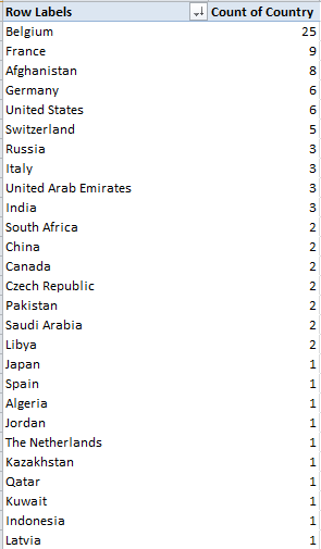
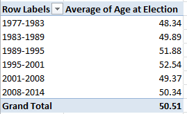
It was somewhere in the closing miles of the first leg of our own journey – a skein of uncertain steps shuffling across the David Cameron overseas trip data – that I red-flagged my hardy companions – that’s you – about a bump in the road, a set of roadblocks blockading what, under other data-design circumstances, could have been a direct route toward calculating the Prime Minister’s trip durations. To wit: had the designer been so minded, a Start and Finish Date field would have been made to come along for the ride on the sheet at the outset, these posting embarkation and return dates for each of the PM’s 116 trips. Subtract Start from Finish (plus one; see last week’s post), then, and trip duration is right there for all to see.

But the data don’t break that way, not with 91 of the trip dates read into the manifest in label terms, e.g.

3-5 July 2011

Question, then: can we get there from here? Can we wrest three days from that miserly text construction above, and its 90 fellow travellers?

Good question, though transparency impels me to confess I ‘m the one who asked it. For one thing, and as previewed by the previous post, it seems to me that the Finish Dates pose the far easier ask – because the text on the other side of the date-offsetting dash own the month and year information, and the specifying properties attaching to both.

That incentive took me to cell E5, the first cell in the Finish Date field we had mapped in the last post. And there I wrote:

=IF(ISNUMBER(A5),A5,(DATEVALUE(RIGHT(A5,LEN(A5)-FIND(“-“,A5)))))

Ok – so what’s this one all about? I goes something like this: if the entry in A5 (in the Date of Trip field) is a number – and again (previous post, again), all the Cameron trips comprising exactly one day assume numeric form, then simply return that number/date in A5. If, on the other hand, A5 holds one of those pertinacious labels with a forged date passport, we need to isolate all the text to the right of its dash, which, if nothing else, looks like a date; then, appearances notwithstanding, we’d brace the isolate with a DATEVALUE, which in fact turns a label imposter into a real live, measurable date.

This formula works in E5; and because it does, I entitled myself to copy it to all other the Finish Date cells, wherein they work, too – until E57, where David Cameron’s trip to Strasbourg hits the runway and comes to rest right by the #VALUE! message – and he was expecting “Bienvenue, Monsieur Prime Minister”.

What happened in E57, and about a dozen other Finish Date cells that resound with the same error message? My standard suspicion – that these faltering cells had been saddled with superfluous spaces in ruinous places that were jamming the formulas – proved wrong.

But what proved right was a small – a very small – difference that typified, and beset, the errant formulas. It’s in the dash, of all things; if you look closer, you’ll note that the problem cells inscribe a dash just a touch lengthier than the one nestled in the formulas that do work. My nested FIND up there asks for this

 =FIND(“-“,A5)

 And the delinquent cells don’t have that; they have this:

 And that isn’t the same dash – trust me.

And because it isn’t you can select the Date of Trip range and drive this Find and Replace through it:

 trav21

(You can actually select the respective dashes in any cells in which they featured, and copy-and-paste them into the appropriate Find and Replace fields.)

And that works, too. Every Finish Date cell now boasts a finish date.

But then there is the matter of the Start Date(s).  Extracting whatever is there from the left of every dash in the Date of Trip entries and turning these out in numeric terms is conceivable, e.g. for A5:

=VALUE(LEFT(A5,FIND(“-“,A5)-1))

 That is, find the dash (after the makeover endorsed above), grasp all the characters to its left, and reintroduce them to their numeric provenance via VALUE. For A5 we’d get 20. Moving into the Trip Duration field in F, you could press ahead with

=DAY(E5)-D5+1

That is, use DAY to skim the day value from the full-fledged data in Finish Date (and that’s 21 in E5), subtract 20 from it, and add 1 to account for both the 20th and 21st in the duration (again, 21-20=1).

Now rewrite the expression in D5 to read:

=IF(ISNUMBER(A5),A5,VALUE(LEFT(A5,FIND(“-“,A5)-1)))

 Again, that IF statement leaves the actual, native dates in the A column as they are; they require no retooling. And remember that the real dates always return 1 as their trip duration (see above), requiring in turn this amendment to the expressions in the Trip Duration field:

=IF(ISNUMBER(A5),1,DAY(E5)-D5+1)

If you’re still with me, let’s understand that this all works – most of the time. But it won’t work for the Date of Trip plunked down in A19 – 30 November- 2 December 2010. In fact, on the one hand, none of the formulaic activity on that row concedes an error message. On the other, what we get for Trip Duration in F19 is -42335 – because the Start Date formula in D19 treats 30 November as an authentic date – from 2015, because that’s precisely what happens when you actually enter 30 November in a cell. Absent a concerted year reference, Excel defaults the year to the one during which you’ve entered it. And the same thing happens in A88-A90. (What’s remarkable here is that the VALUE –not DATEVALUE – function is prepared to turn 30 November into a number – and it does).

Question, then: given the determined inconsistency of the data, is it possible to write a formula that could contend with them all, and succeed in realizing Trip Duration in every case? I’m not exactly sure; but if it is, you’d have to do battle with a rather variegated – and long – set of nested IF contingencies before you could walk away from it with head held high. What, for example, are we do with

31 December 2013-2 January 2014 ?

And if you want to reply that in fact none of the Prime Minister’s trips overarched two years, is that quite the point? You want a formula that handles all comers – actual or potential.  Can it be written?

Over to you, learned colleague.

Travelin’ Man: David Cameron’s Trip Stats, Part 1

17 Mar

Does David Cameron have to take off his shoes when he passes through a scanner? I don’t know; but the answer to that question, you’ll agree, rather depends on whether the Prime Minister has to pass through a scanner at all.

They don’t take my calls at 10 Downing anymore, so I am left to speculate. But his international itinerary is a bit more confirmable, having in fact been committed to the public record, at least for his trips through March 2014 by the Guardian’s Data Blog in tabular form, its current iteration (that’s to be explained) duly copied-and-pasted and slightly reorganized by yours truly into this worksheet:

David Cameron’s international trips

(And if you can get that right-clicked Export to Microsoft Excel menu command to work here on the Guardian site – or anywhere else- identify yourself and report here immediately to claim your reward.)

Three columns and but 116 rows worth of official trips should prove eminently workable, but let’s see. As intimated above, the data underwent a change or two from after their coming out some days ago. The companion Guardian story reports 47 countries among the Prime Minister’s line-of-duty destinations, but if you had run this pivot table on the original data (though if you hadn’t see those you’ll have to trust me here):

Row Labels: Country

the table would have draped a directory of 50 countries down the Row Label column. The reason for the discrepancy: the duplicative spellings United States/USA and United Arab Emirates/UAE. Excel doesn’t know any better, or course, and as such treated those four usages as four countries, an impermissibly misleading redundancy. In the interests of deep background, I brought these excesses to the attention of article author Ami Sedghi via a Tweet, and the repairs were made (I never received a reply from Ms. Sedghi for my citizen-journalistic contributions, though we could wonder if the Guardian had made the discoveries independently).

But even with all that vetting I still get 48 countries, and haven’t found any third instance of a same-country-entry inconsistency  – not the biggest deal to be sure, but 48 isn’t 47.

In any event, now that the one country/one name ratio has been restored, a country count follows pretty straightforwardly:

Row Labels: Country

Values: Country (Count, and sort Largest to Smallest)

I get, in excerpt:

trav1

As the Guardian explains, the Belgian predominance has everything to do with European Union-seat Brussels, and Cameron’s recurring need to deal with and justify his coolness toward that organization to its other members.

But the real fun happens over in the Date of Trip field, particularly if you’re keen to calculate trip durations. First note the this-way-and-that alignments of its entries, e.g.

 trav2

The scattershot left-rightness of the data isn’t borne of some random indecision; rather, it attests a pair of data types asserting themselves in the field’s cells. 20-21 May 2010 is clearly a label, for example, and in its present balky state thus resistant to any numeric services we might ask it to perform. The right-aligned 11-Mar-11, on the other hand, is just as clearly a date/number; click its cell and observe the Custom (as in custom date format) legend registered in the Number format field in the Home > Number button group for verification .

Be that as it may, if I do want to get to those trip durations (even without thinking about whether to regard the very first pair of trips, the ones to Berlin and Paris and their identical dates, as one or two visits), I’d first want to insert three columns somewhere, these to be respectively titled Start Date, Finish Date, and Trip Duration, or something like that, the first two formatted in date terms, the third in numeric, no-decimal mode. I’ve chosen columns D through F for those remits.

But we’re not having fun yet, are we? Ok; so let’s start with the actual date-formatted trip data (understanding as a first, or last, principle that any encompassing, formulaic workaround must be ultimately be IF-driven, so that all data-type contingencies could be enabled to yield a trip duration). By apparent definition these dates comprise one-day journeys – because a longer trip would have expressed themselves in label terms, e.g. 20-21 May 2010.

Thus for starters, and for example’s sake, I’d click in D29 – because A29 stores the 11-Mar-11 date, and because I assigned the Start Date field to the D column  – and enter

=IF(ISNUMBER($A29),$A29,””)

Here we’re testing the entry in A29 for its numerical pretensions. If a number it is – that is, an authentic number formatted in date terms – the formula simply returns that date/number. If A29 is a non-number, then “”  moves into the cell – although we need to understand that the double-quotes are nothing but a holding action, mounted in anticipation of a more substantive riposte to any label that might have laid its claim to A29 or any other cell in the data set.

I’d then copy precisely the above formula to E29, wherein the End Dates have set up shop. Why? Because again, any truly date-formatted entry stands for a one-day trip, and so Start and End Dates must of necessity converge. And in F29 – next door, in the Trip Duration field – I’d offer

=E29-D29+1

a formula that simply subtracts the End Date from the Start Date, adding a 1 because we want a trip beginning and concluding on the same day to evaluate to one day, and not no days. The formula’s universal, sure – but only if and once the other trip entries – right now inactive labels – could somehow be made to free their inner, usable numeric status.  And that’s what I’m working on. (Hint: I think the Start Date is a lot harder to nail down than the End Date.)

And unlike the Prime Minister, I’m working in economy class; and the guy in front of me is leaning back into my coffee, my laptop has 12 minutes worth of charge left, and we’re still only halfway over the Atlantic.  And I still can’t figure out to play that bowling game onscreen.

Tracking Crime: British Transport Police Data, Part 2

9 Mar

Striving for cheap dramatic effect is my expository stock in trade, and I did myself proud last post. I had closed the first installment of our survey of British Transport Police crime data with a boffo teaser of a homework assignment, of sorts: namely, what needs to be done about the aggregate station passenger numbers (when available) which restate themselves in every station-specific record. Again, for example, Abbey Wood’s 1515106 passenger figure – an overall tally for the station – stakes all the Abbey Wood entries, even as these count individual crime totals for a particular month in a particular year (I should add that I’m still not unassailably sure if the passenger numbers have rolled up the traffic across the entire February 2011-Jauary 2013 interval with which the data work, but I assume they do. I have emailed data.og.uk about this).

So we’re left with a confusion of strata, as it were; month-specific crime totals always accounted against what appear to be 24 months’ worth of passenger traffic. We seem buying an apple mixed among the oranges, then, when in fact we’re looking for a given month’s crime figure packaged with that month’s – and only that month’s – ridership total. And that doesn’t seem to be there.

Still, there is a bit of useful work to be done here, I’d submit. You could divide each record’s Crime Count by its passenger number, churning out a miniscule but meaningful percentage that could be added to all the other same-station percentages. Because each crime count would divide itself by the same, unvarying station passenger number, the combined percentages should build a supervening percentage of all station crimes, as a fraction of its passenger traffic.

And so those marching orders would direct me to name a new field in the M column, say Percent of Passenger Traffic (again, I’m assuming, as per the previous post, that the All Crime and ASB records have been shown the door), and step down into M2 and enter, with all due mindfulness of the fact that some stations have no passenger numbers:

=IF(J2=”NULL”,””,E2/J2)

Then copy down the column. Because of their smallness, a good many of the numbers evaluate to apparent zeros or scientifically-notated cocoons; and while all of these could be reformatted into legible, multi-decimal-pointed values we’re really interested in their combined effect, once they’ve been channelled into this pivot table:

Row Labels: Station_Name

Values: Percent of Passenger Traffic (sum, formatted in Percentage terms, say to five decimal points. Remove the Grand Totals).

Once you’ve gotten this far you could, for example, right click among the station names and conduct a Filter > Top 10 run-through, opting for say the top 20 (you’ll have to  go ahead and sort these descendingly by yourself, though). I get:

btp1

Confession: I don’t think I’ve heard of any of these stations, even if Google and Wikipedia have. The Ardwick outpost is somewhere in or near Manchester, and it won’t be pleased to know that in purely percentage terms its 6 reported crimes – reckoned against a reported passenger traffic total of only 334 – puts it atop the list. Do those numbers sound right? No, but they apparently are; Wikipedia tells us the station is unstaffed, adding that “In [the] 2004-2005 financial year only 285 passengers used the station, or fewer than one per day, increasing to 358 in 2005-2006“. Interesting place, and yet Ardwick rocks with activity when sized against number two New Clee, in Northeast Lincolnshire (I don’t know where that is, either), and its 149 straphangers, though at 149 no one is hanging onto any straps in its cars.

On the other hand, Mr. Wikipedia counts 616 commuters for Ardwick across the 2012-2013 financial year, and 334 for New Clee’s for 2011-12, and those departures from the BTP data are bothersome, begging the question about other under or overcounted stations.  That claim on our investigatory attentions is in the first instance to be put to the data gatherers; but whether the question is at the same time slightly political is for the powers that be, and those who write about them.

In any case if you add Crime Count (Sum, and formatted to decimal-free Number mode) to the Values area and rerun a top 20 (by Sum of Crime Count), you’ll get:

 btp2

I’ve heard of most of these. In purely literal, quantitative terms the Victoria station (excluding its underground stop, which ranks 18th above) heads the enumeration, even as its ranking here by percent – 13th – does not. Note as well the unrelieved zeros lining up by the St. Pancras International (that is, Eurostar) station, a consequence of its unreported passenger figures.

We can begin to wind this discussion up with this small, quick table:

Row Labels: Location_Type

Values: Location_Type(Count)

I get:

btp3

A subtle measure, the figures perhaps reflect the crime-“facilitating” properties of duration and place. Train journeys typically extend longer than the waits for them to commence, and so in theory avail more time for wrongdoing; but stations afford swifter egress from the scene. We see that 64% of the crimes were station-bound, a proportion that needs to be thought about with some due diligence.

Then reset the table thusly:

Row Labels: Crime_Type

Column Labels: Location_Type (moved here for presentational reasons)

Values: Location_Type (Count, Show Values As > % of Column Total (and retract Grand Totals):

btp4

Note the likenesses and the disparities. Public Disorder and Weapons (however defined) account for about the same distributions across the two sites, but Other Thefts (again we need a definition) proliferate on trains (drug activity, on the other hand, is by far the more likely in stations, where perhaps rapid transactions can be consummated, followed by rapid disappearances).

And now I don’t know about you, but I’m tempted to book my ticket to New Clees. Good seats still available.

Tracking Crime: British Transport Police Data, Part 1

1 Mar

It’s a big country, the UK, but not so big that a unitary police force can’t stand watch over the nation’s railways, from London to Aberdeen and the still higher latitudes. The British Transport Police has 2600 stations to patrol, and it’s made its crime data a matter of public knowledge on the data.gov.uk website, more specifically here:

http://data.gov.uk/dataset/btp-crimes-recorded-february-2012

Don’t be fooled by the link’s name; you’ll see that the relevant download bears the date 2013, and indeed – the data themselves are end-pointed by February 2011 and January 2013, an ungainly, but precisely two-year, interval that needs to be dealt with one way or another. And at 15MB it’s a big file; but it’s a big country.

And once you’ve stationed yourself in front of the data you’ll find their 106,000 records read pretty crisply, and exhibit the right type of organization , more or less (e.g., the three reported years themselves a pack single field, rather than fare-beating their way into separate columns). But those records have been made to shoulder a weighty, onerous excess. About 40,000 of the 106,000 are of the All Crime and ASB (Anti-social Behaviour, as they spell it in the UK) stripe, and in my view these are simply dispensable – because each one realizes the aggregate crime total for each station – for each reported month and year. The upshot: a massive potential double-count of the numbers.

For example: The data for the first-alphabetized station, Abbey Road (no, not that one; this Road is way over in London’s east, near Canary Wharf), comprises 13 records – seven of which report a specific crime-type incidence for a specific month of a specific year, with the other six  tabulating all crimes  for each month/year. (Because two crime types – Robbery and Pubic Disorder and Weapons – were committed in May of 2012, both fold into the May 2012 Abbey Road All Crime and ASB record.)

Thus if you pivot table the data thusly:

Row Labels: Station_Name

Column Labels: Crime_Type

Values: Crime Count

You’ll discover that the 14 Grand-Totalled crimes ascribed to the station really enumerate seven crimes, because the seven offenses counted by All Crime and ASB item merely duplicate the actual total – and that’s a problem.

We’ve gone toe-to-toe with double-counts before (see here, for example), but those earlier confrontations brandished avowed, self-described sub/grand totals rows that presented themselves as such, but wormed into the larger data set just the same. Here, the All Crime and ASB records are unmarked cars, as it were – they simply back themselves into their appointed rows like any other record, with no subtotal pretensions whatsoever. (Note: the March station in Cambridgeshire is oddly sorted atop the station list because Excel reads the name as a month, which in fact and in effect possesses numeric standing. If March’s peculiar positioning bothers you, the fix is surprisingly begrudging; the classic label-casting strategies, e.g., prefacing the text with an apostrophe or tapping a space after the “h”, just won’t work. I’d simply sort the field, aim a Find command at the first instance of March, add the word” Station” to it and copy down. Refresh the pivot table and now you’ll find March where it belongs.)

What do to about this supererogation? Something simple, I think. Because it turns out that the All Crime and ASB rubric happens to appear earliest in the alphabet in its field, I’d run a Z to A sort, race down to row 66045, the present lodging of the first All Crime and ASB, and insert our tried-and-true blank row. While as always I’m happy to be persuaded otherwise, I don’t think the remaining data and the analyses they encourage will be in any way impaired. And had the All Crime and ASB designation not cooperated and sorted itself somewhere in the middle of the pack instead, I’d have introduced a new, temporary column somewhere and loaded its first row with something like this:

=IF(A2=”All Crime and ASB”,”zzz”,A2)

I’d have then sorted all the zzzs to the bottom, and deleted accordingly.

But because neurosis must be served, I’d leave those 40,000 outcasts in the sheet, one row away – just in case someone decides they’re needed after all.

Now think about another issue, this one likewise raising a double-count concern, albeit bearing a slightly distinct provenance. Most stations report a passenger number, what I take to be an aggregate station traffic estimate (and estimates some of them clearly are, what with their zeroes-laden totals, e.g., the Acton Town and Aldershot stations). Have these numbers gathered themselves across all 24 of the recorded months? I don’t know, but the larger point is that each station number appears to be invariant, featuring in each and every station record. Thus the 84 rows of Abbey Wood (not Road, and my count assumes you’ve sorted out and shelved the All Crime and ASB records) data all disclose the same 1515106 passenger number, and therein lays the complication. Because even as each record marks out a subset of all Abbey Wood crime, each passenger number upholds the same overall figure, record after record. This granular disconnect needs to be refit too, because, for example, this pivot table

Row Labels: Station_Name

Values: Crime Count (Sum)

Passenger numbers (Sum)

won’t work, because a station’s constant Passenger Number will, by default, be added again and again, along with the crime counts. And that’s not a double-count there – it could be a 100-count.

So let’s all think about that one.

Re-counting the Conseil de Paris Election Data

22 Feb

With its Gallic titular panache Les Conseillers de Paris could pass as a movie title, perhaps the sequel to the Umbrellas of Cherbourg; but alas, it’s only a spreadsheet, and the big screen on which it features is probably the one glassed inside your Samsung.

OK, so it isn’t coming to a theater near you, but the sheet has its moments, nevertheless, once you decide  you want to know something about the  “deliberative body responsible for the governing of Paris” and its 163 members, all of whom throw themselves at the mercies of the city’s voters every six years, including 2014.

With members apportioned from the city’s 20 arrondissements , or districts, in numbers reflective of  arrondissement size (the 15th is the largest), the Paris Open Data site lists each and every serving conseiller from 1977 through 2014, and I’ve sent it your way here:

Les Conseillers de Paris 1977-2014

Once you’ve smoothed all that wrapped text curled inside the worksheet you can proceed to a couple of first general-interest findings for starters. Try this pivot table:

Row Labels: Mandature (or Term)

Values: Mandature

conseil1

Thus we see that the 1977-1983 complement comprised only 120 conseillers, and nowhere does that defining 163 appear, even among the later mandates. The surplus figures are likely attributable to the deaths of conseillers (note the deces field in column J) and their replacements, all of whom are listed, and perhaps mid-term leavers and their successors (see the remplacement field in L). Note, on the other hand, that some deaths appear to have post-dated a conseiller’s tenure. For example, both Claude Avisse and Louis-Henri Baillot died in 2007, well after their service on the conseille had elapsed.  Moreover, because conseillers who served multiple terms (e.g., Baillot) appear in the data set for each of their mandatures, dates of death appear as many times. And I can’t explain why date-of-death entries are fashioned in text format, e.g., décédée le 25 mars 1998, when they could have been made available as actual dates – particularly when dates of birth are expressed in bona fide numeric terms.

Note as well the curiously extended seven-year mandature 2001-2008,a governmental workaround “designed to avoid an overloading of the electoral calendar in 2007“, a presumable concession to the presidential and parliamentary contests of 2007.

And if you want to learn something about the Conseil’s gender representation, try this:

Row Labels: mandature

Column Labels: conseiller

Values: conseiller (Count, and % of Row Total) (and turn off Grand Totals for Rows)

conseil2

A most interesting and emphatic incline toward gender-count parity informs the table.  Remember, however, that the above accords multiple counts to the same conseillers serving across multiple mandatures; if you want to break out discrete, actual conseillers by gender, then, the process gets trickier, because if you go with:

Row Labels: Nom

Row Labels: Prenom (to disambiguate conseiller’s with the same last name)

Column Labels: conseiller

Values: conseiller (Count)

You’ll pile up multiple counts for the multiple-term servers (some conseillers in fact have served in all 6 cited mandatures), and thus do little more than restate the outcomes of the screen shot right above. There are several resolutions to this pivot-table-peculiar search for unique field constituents that appear repeatedly, and here’s but one: Return to the data set, and conduct a Data > Remove Duplicates, by ticking prenom and nom as the duplicate-bearing columns. Then pivot table the 532 prevailing, definitively unique  records (i.e., any and all conseillers now receive exactly one entry) again, precisely as per the instructions immediately above; and down by the Grand Totals role you’ll find 348 Conseillers – men – totalled along with the 184 Conseillères. Gender percentage breakdown: 65.4%-34.6%.

(Keep in mind of course that a removal of duplicates imposes would could be a permanent decrement in the dataset count, depending how you play it. You could of course save multiple versions of the data, pre and post-paring.)

You’ll also want to think about the dataset’s 57 fields, and wonder why the last six of them – out there in columns AZ through BE- aren’t merely entitled empty, but are empty.  There’s no evident reason not to delete them,  and I suspect for purely operational reasons you might well throw a good many of the other fields overboard too, as they’re only occasionally populated (and I’m still working on what their headers actually mean, truth be told. J’ai besoin a native French speaker), and the fields often have been distended to enormous column widths besides.

Still, the more self-evident data do have something to say. What if, for example, we wanted to calculate the average conseiller age of at the point of election, i.e., date of election minus date of birth? That’s a most practicable task – begin by parting the fields with a new column, say between A and B, call it Age at Election or something like it, and, in what is now B2, enter

=(J2-AT2)/365.25

That is, subtract the number of days separating a conseiller’s birthdate from the day on which he/she was elected, and divide the total by the average day-length of a year. Then head towards this pivot table:

Row Labels: mandature

Values: Age at Election (Average, round to two decimals).

I get:

conseil3

The consistency is notable, though the average age ascent – about four years, between 1977-2001 and 1995-2001 – may reflect large numbers of triumphing  incumbents, all of whom of course aged about six years between elections.

Then swing conseiller into Column Values:

conseil4

We see women members are the consistently younger, perhaps comporting with their relative, aggregated newcomer statuses.

So check it all out; vive la feuille de calcul. That’s spreadsheet to the rest of us.

Snow in the Forecast, and in the Data: Winnipeg 311 Calls

14 Feb

Call it a disciplinary tilt, or just another blurt of dime-store iconoclasm, but I’m prepared to label much of this thing we call data journalism as nothing more – or less – than a take on sociology writ digital, and with fewer  prepossessions. Ok -I’ll own up to a graduate credential or two in the field if my view needs defending or explaining, but tilt aside, the case is there to be made.

I can’t help noting that the early University of Chicago sociologist Robert Park – whose first job description actually read “journalist” before he turned into the academy  – famously made a go (with colleague Ernest Burgess) at mapping  the city’s sectors into differentiated, concentric  zones of activity, and with nary an Android in hand or satellite above.

The quest for pattern directs much of what passes for sociological exploration, but that what’s what data journalists often do, too; and their tools for aggregating and plotting the data mean to paint the big pictures affording the step-backs that let us see what’s really going on, we hope. Sounds pretty sociological.

Either way, if it’s pattern you want, albeit of a fairly obvious sort, download the 2014 311 Service call records for the Canadian city of Winnipeg here:

 311 Service Requests Winnipeg 2014

Drawn from its open data site, the resulting workbook most neatly archives the 64,000 calls put to the service that year in nine nicely laconic fields.  A few very small design carps could be placed in the record (these should sound familiar, too), namely the redundant Year field, streaming its 64,000 2014-only entries down its column, and the fact that for parsimony’s sake the Month and Day fields could have been left aside as well, because these could be coaxed from Date as needed. But that’s a very small carp indeed. A slightly larger one: if you want to do something about the latitudes and longitudes pressed together in text format in the Location 1 field  you’ll have to detach these into usable readings, via something like a Find and Replace to rid the open and closed parentheses (replaced in both cases with nothing), and followed up with a Text to Columns (the comma’s your delimiter).

In any event, it snows in Winnipeg, about 45 inches a year (including 4.2 inches last April), and as such you’ll want to find something out about the 311 dialers having something to say about that meteorological shakeout. Start with this time-sensitive pivot table:

Row Labels: Service Request

Column Labels: Date

Values: Service Request (Count)

In fact, snow-relevant requests come in two varieties, Snow Removal Roads and Snow Removal Sidewalks, the former engaging far more callers. Pattern? Clear, if pretty obvious; the calls predominate in the January-March quarter, time-stamping more than 92% of all such requests on both matters.

Note that you can group the data by quarter, provided you’re prepared for a small detour in the step-through. If you wheel Date into Column Labels to prime your quarter-grouping intention, you’ll find you can’t get there from here:

win1

While it’s true that 2014 had only 365 days, the dates here micro-refine themselves by time of call as well, and the count of unique entries top the no-go 16,384 as a result. The means for stanching the overflow is recommended in the above prompt: drag Dates into Row Labels first, click PivotTable Tools > Options > Group Selection > Quarters, and then drag the grouping back into Column Labels.

You, could, on the other hand, dust off a Plan B quarter breakout by positioning Month in Column Labels instead and grouping those thusly:

win2

Because the Month data comprises nothing but numbers landing between 1 and 12, you won’t come anywhere near the 16,384 item limit.

Quartering aside, next try showing the data as % of Column Total (we’re back to the Month breakout). Here you can click Design > Grand Totals > On for Rows Only, because the column totals all necessarily return 100% and there’s nothing to learn there. You’ll see:

win3

Pattern, or something like “systematic” variation at least, surely guides the Snow Removal calls, these cresting predictably in the January-March interval (note the December numbers, though which really poke into the following winter); but variation bobs up and down through the quarter nevertheless. OK, you may suppose that the February peak in calls probably square with a precipitation uptick in the month, but let us see.  The Winnipeg Weather Stats site throws out these respective precipitation overalls:

Jan 2014 16.30 mm

Feb 2014 8.40 mm

Mar 2014 9.00 mm

There’s perhaps something noteworthy, then, in February’s most-calls/least-precipitation disjunction. Looking for a story? There might be one there. You might want to wonder as well about September and October’s top-outs in Garbage Collection calls, another type of removal of a more perennial sort.  In fact Collection and Recycling complaints are the most likely to bend the ears of Winnipeg’s 311 responders, comprising over 45% of all calls.

And for a final gaze at pattern, try:

Row Labels: Month

Values: Service Request (Count)

Service Request (again, this time by % of Column Total)

win4

Once charted (say by Month and one of the Values fields), the curious near-linearity of months and calls describes itself:

win5

So there’s some pattern. Now try and explain it, too.

The Skinny on UK Obesity Data: Work to Do

8 Feb

The reported levelling of the rates of childhood obesity in the UK has naturally been accounted a good thing (for the article that made the news in full, consult this URL), although for dieters who like their glass half empty the news should perhaps be imbibed with slow, deliberate slips.  After all, the study’s abstract prefigures its findings with this bit of curbed enthusiasm:

“More than a third of UK children are overweight or obese, but the prevalence of overweight and obesity may have stabilized between 2004 and 2013.”

It’s possible, then, that the discovered equilibration has more to do with some saturation effect that has already visited its full-on impact upon the cohort of obesity-vulnerable youngsters, but I take no credit for the worthiness of that conjecture, only blame for the conjecture itself.

Be that as it may, the National Child Measurement Programme (NCMP) has something to say about the development as well, here for the years 2007/8 through2012/13, in the form of this workbook available for download here:

http://www.noo.org.uk/visualisation

(Click the Download link for Child Obesity and excess weight prevalence by Clinical Commissioning Group.)

The book breaks out its populations by both “excess weight” and “obesity”  measures  (the former standing as a superset of the two) for two school-year age cohorts, what the UK calls Reception (ages 4-5) and Year 6 (10-11) (look here for the BMI formulas, both for kilograms and pounds; the workbook’s NOTES tab sketches additional methodological background. This study’s sample sizes also operate within the confidence interval limits limned in the Excess weight and Obese tabs. Remember again that our spreadsheet doesn’t invoke the same data compiled in the journal piece. Remember too to review the Notes tab’s explication of data cells marked “s”).

Now to those data, about which there is a good deal to say. Or orrection: now to the data organization.  First, and perhaps most prominent, are the fields. We’ve seen this before, and the question begs reiteration: why are data which, for all analytical intents and purposes, belong to the same parameter – e.g. Reception – stationed in a plurality of columns? The resulting barrier to analysis is formidable, though not insurmountable; but surmounting requires us to cut and paste kindred data to the same field, copy and properly align the CCG (Clinical Commissioning Group) identifiers down columns A and B via a duly-diligent copy and paste, and make room for a year field in which that differentiating datum needs to be copied down, too. And you’l probablyl need to cut-and-paste the Year 6 data, too, and presumably to a worksheet all its own the better to disentangle these from the Reception figure, though that larger positional issue needs to be thought through – because in fact the workbook draws itself around two pairs of variables – the Reception/Year 6 axis, and the Excess weight/Obese binary. (It could at the same time be possible to jam all of these into a single grand sheet, by introducing, say, new School Year and Weight Category fields, thus lending themselves to additional breakouts along those lines, but I’m holding my jury out on this unifying tack.) The larger point, though: if you’re serious about doing something serious with the data, you’ll need to think about all these prior somethings, too before your analysis proceeds.

But quite apart from those necessary considerations you’ll also have to do something about the superabundance of merged cell in rows 1 through 4. These can’t coexist with your pivot-tabling intentions, and neither can the blank row

obesity1

That prohibitively separates those potential field headers from the data. The simplest rejoinder, of course: move the putative field names above down a row, but only after you’ve made sure that the now-unwelcome text entries still higher above these perch at least one blank row away from what you’re envisioning as the finalized data set (and if you’re going this far you’ll find that, once unmerged, the cell now invested with the “Number measured” header, for example, has been bumped two rows above its eventual place atop the dataset). And, for crowningly good measure, you’ll likewise have to unmerge the sheet’s title wrapped across the A1 supercell. (I also don’t see the immediate pertinence to our data of the 32,000 LSOA-CCG lookup records in that so-named tab, apart from the “The analysis uses a best-fit 2001 LSOA to 2013 CCG lookup created by PHE” declaration in the Notes tab. LSOA abbreviates lower layer super output area; for more, look here.)

To repeat – if you’re not prepared to do the reconstitutive work schematized above I don’t think you’ll be able to take the data very far; and why the analysts and/or story-seekers should be made to steel themselves for a rough ride across this obstacle course makes for one very good rhetorical question, though of course we’ve asked it before.

In fact, though, the data look pretty interesting, if now untamed. Your mission – should you choose to accept it – is to domesticize it all.

But don’t worry – the workbook won’t self-destruct.

Some Q and A about A and E Waiting Times

31 Jan

We don’t think that way, but field headers are a species of first-line documentation. We need to know what fields mean before we work with them, and quite apart from the brute operational need for fields to be headed at all (and header-less worksheets are out there to be found; I can think of a couple).

That is a none-too-arresting truism to be sure (most truisms aren’t too arresting), but when headers put understanding on hold, the truism suddenly matters. I’m thinking about the UK’s National Health Service Accident and Emergency (A&E) data on waiting times entrants to the Service’s emergency facilities endure before they’re attended to. It’s a perennially newsworthy concern, and some pretty current data are here:

 2015.01.25-AE-Timeseries4w3Rl

But before we think about those aforementioned headers some other, more standard spreadsheet considerations require a look, too. Begin with the oldest-to-newest sort ordering the Week Ending data in the Period field, a curiosity you may or not find nettling depending on the intentions you’re bringing to the sheet. If you’re doing nothing but reading the records you’d likely have opted for a recency-driven sort, in which the latest entries top the field; but if, on the other hand, you’re keen to mortar and pestle the data with a pivot table or some other analytical instrument you shouldn’t care at all, because you’ll be sorting as and when you wish. Note as well, of course, that those W/Es have seen to it that the presumptive dates filling the Period column are labels, a substantive devaluation that could and should have been forestalled. If you run a Find for W/E[space] and Replace with nothing, you should be able to recover the data’s rightful quantitative standing (though be prepared for some issues if your Dates and Times honor the U.S. month-first protocol). And when that rework does its job you can rename the field Week Ending.

Moreover, if you are going to pivot table the data set, you need to do something about the blank row 18 – namely, by deleting it – and treat the grand-totalling row 17 to much the same. Again, you don’t want 17’s totals uncorking a double-count all over your tables. And the merged superordinate headings in 15 have to go the way of 17 and 18, or else your pivot tables won’t go at all (just delete the entries; the row can be left alone).

And now for my opening pronouncement. Perhaps it’s me, but I experienced more than a jot of difficulty in my strivings to understand whence the percentages in columns M and N came. You see how the two metrics are meant to be differentiated: one conveys the percentage of all A& E patients attended (that verb probably requires scrutiny) in four hours or less, the other the fraction of type 1 incidents seen within that time (Type 1 denotes  “A consultant led 24 hour service with full resuscitation facilities and designated accommodation for the reception of accident and emergency patients”, we’re informed here).

The problem – to which my obtuseness is probably central – is in the clarity of the headers’ implied instructions to divide this field by that field.  What field, that is, denominates the Percentage in 4 hours or less (type 1) data?  That datum in cell M18, for example, reports 95.6%, and after a round of head scratching I returned my fingers to the keyboard and at last prevailed with this triumphant formulation:

=1-I18/E18

Considered in field terms, I divided

Type 1 Departments – Major A&E/Type 1 Departments – Major A& E

Subtract that result from 1 and you do get 95.6%, in single-decimal terms. But you got it – I seem to have divided two fields by the same name, and in fact I have. Of course they’re topping different columns, but…I wouldn’t have done that, quite apart from my early inclination to think about dividing I18 by H18, or Total Attendances.  That 95.6% then needs to be understood as confining itself to Type 1 on both sides of the divisor, and not all attendances.

And now – now – that other percentage, the 96.9% in N18, reads more sensibly:

=1-L18/H18

Or,

1-Percentage in 4 hours or less (all)/Total attendances

(remember that L18 counts attendances that took longer than four hours, and so the division computers the greater-than-four-hour data, which need to be subtracted from 1, or 100%, in order to develop the less-than-four-hour percentage). But I might have also replaced Total with All, so that the adjective reads identically across those two fields. Why should we have to wonder about the difference between Total and All?

Another point: the merged-cell heading in I15, A&E attendances > 4 hours from arrival to admission, transfer or discharge, seems to point to patient receptions in excess of four hours; but the percentage recounted above computes attendances of four hours or less. But as I said, maybe it’s me.

A concluding recommendation, even as no one asked me for it: click anywhere in M and N and see 10-or-so decimal points congesting its column. Might not all confusion have been allayed if the actual formulas occasioning the M and N results have been left in their places, instead of the hard-coded replacements that we’re seeing? We’d then know exactly what was divided by what, to the relief of all those bloggers confessing their obtuseness in shameless public view.

Ebola Data: Worth Thinking About

22 Jan

If the subject is Ebola, you want the data to be equal to the epidemiological tasks to which they’re likely to be applied – that is, as timely and accurate as they can be. The Humanitarian Data Exchange (HDX) site, an outpost of the United Nations Office for the Coordination of Humanitarian Affairs (OCHA), has been tracking the disease’s incidence across nine countries (as of this writing) from which Ebola reports have issued, and in nearly to-the-minute fashion (my data posts records dated January 20). You can download it here (access the csv rendition; I couldn’t get the Excel offering to work).

Once inside, you’ll be able to get to work on the sheet’s 3200+ rows of time-stamped data (as of this writing), and a parameter – Indicator – that will force your attention span to… snap to attention. Indicator comprises 36 different items, a good many of them same-sounding; and if you’re program calls for a scrupulous run through the data, you’ll have to make sure you understand what each of these uniquely mean. For example, the eight discrete items headed by the phrase “Cumulative number of…” simply demand clarification, as do the 12 “Proportion of… ” rubrics. Put alternatively, each country receives 36 parameters worth of records about its Ebola status.

Moreover, keep in mind that the Proportion data are registered in whole-number terms, and as such would be more meaningfully comprehended by dividing each by 100 (and thanks to HDX’s email reply to this question).  Thus a proportion of 43 is to be quantitatively read 43%, for example.

That obligation to clarify might be illustratively served by pivot-tabling Ebola cases by Indicator and one country, say Sierra Leone:

Row Labels: Indicator

Values:  Value (Sum)

Slicer (or Report Filter): Sierra Leone

And here’s where I made my first mistake. I saw that the country had apparently incurred 257,286 confirmed cases of Ebola as of January 20th, but that figure isn’t remotely true-, and fortunately not. My pivot table had added each successive, as-of-the-specified date case total – a textbook case of double, triple, and quadruple counting – when in fact of course each figure tabulates the cumulative case total until just then.

And that makes for a rather cautionary item. After all, review an unassuming datset of sales recorded by say, salesperson, and Jane or Rob’s transactions are there for the summing. But adding successive cumulative totals makes for one very wrong answer.  It’s as if the data have already submitted to something like Excel’s Show Values As > Running Total In… option. It’s the records that are doing the aggregating for us, as the dates proceed.

And all that means that for certain reads the data should to be lined up one date at a time. For example, the Sierra Leone data for October 8, 2014 total 2455 cumulative, confirmed cases of Ebola. The number of confirmed cases in the previous 21 days as of that date at stood at 924, which indeed yields the 38 (really 38%) in the “Proportion of confirmed Ebola cases that are from the last 21 days” cell – that is, 924/2455.

Note at the same time the empty cells that, for whatever reason, have no data to report, and doubtless data collection in affected regions has its challenges. October 3 counts no confirmed cases of Ebola, even though it precedes the 8th by only five days and even as it follows Oct 1 and its 788 cases by but two. And because the dataset’s 51 dates aren’t identically spaced in time, one needs to reflect on the mathematics of those “…last 21 days” items. As with the cumulative data above, these numbers are rolling, but here they confine their locomotion to a moving 21-day band. That means of course that days in the data set fewer than 21 days apart share many of the same cases in their respective enumerations (as another HDX e-mail acknowledged), certainly not a bad thing by itself. After all, the recency and magnitude of Ebola case distribution is a perhaps literally a vital concern for researchers. But the journalist needs to appreciate the necessary resort to a kind of double-counting in the process. Still, the variable distancing of the 51 dates from one another does ask a question about how case counts should be properly interpreted.

And there’s something else. Cumulative figures should naturally increment across time, or at the very least remain unchanged; but the cumulative death totals (for all countries) for October 29 and 31 2014 appear as 9 for both days, following a total of 2990 for October 25. And November 5 presents a figure of 1739, still notably smaller than the October 25 report. It seems that only certain countries were considered for the 29th and 31st, a undercount that seriously disrupts the accumulating total. To see what I mean, try:

Row Labels: Indicator (Filter for Cumulative number of confirmed Ebola deaths only)

Column Labels: Date

Values: Value (Sum)

This one requires follow-up, I’d allow.

And at the risk of baring my medical ignorance I’ll put one more table on the table:

Row Labels:  Indicator (filtered for the four “Case Fatality rate” items

Values: Value (Average).

I get

 Eb1

Why should probable Ebola cases exhibit so markedly higher a fatality rate? Could the differential be ascribed at least in part to post-mortem assessments of individuals whose conditions went undiagnosed or to whom medical attention was delayed? I don’t know, but the rate differentials are notable and investigation-worthy.

Trumped Cards: Consumer Credit Card Complaint Data

15 Jan

The topical suggestions on the US www.data.gov home page flash across its master search field like a battery of rotating advertisements, and it was the Credit Card Complaints catchphrase that road-blocked my fleeting attention span, if you must know.

Ok – yours will likely resonate to a more exotic theme, but it must have been the cool alliteration that got me. Either way, if you’re looking for 22.5 megabytes and 334,000 records worth of consumer discontent about their plastic you’ve come to the right place:

http://catalog.data.gov/dataset/consumer-complaint-database

(You’ll also want to review the companion Data Dictionary in there, at its own linked destination for elucidations of and field references for the above workbook. I have a bit more to say about these later.) Click at the Comma Separated Values Download link, and when the hurly burly’s done save it all as an Excel sheet. (I’m now beginning to think that a workbook’s CSV derivation is what explains the un-fit columns that burrow their way into so many spreadsheets across the net; here too, our data call for the redoubtable autofit.)

Once you actually get to the data (which are rather current; beginning with December, 2011, my download called up complaints through January 8) you’ll be enraptured by their organization and fitness. The dates are actually dates (that is, they’re verifiably numeric), and their fields are awash in pivot-table friendliness – lots of meaningful permutations in there to be spun. Let’s start basic, with a state-by-state complaint count:

Row Labels: State

Values: State (Count, necessarily; then by Show Values As > % of Column Total)

Sort the numbers by largest to smallest and you won’t be struck by California’s petition to call itself the credit card complaint capital of the US. That soubriquet, of course, merely hooks adventitiously into the state’s largest population but still, my Wikipedia census (circa 2012) fractionates Californians into 12.1% of the country’s total – and they’re registering 15.16% of the complaints, doubtless a meaningful disparity. (And, blank identities aside, you’ve taken note of the 62 records spilled onto the pivot table, taking the data rather over and above America’s 50-state inventory. Those excess rows point to US territories, whose 2-character codes are deciphered here; and so California’s complaint quotient is in actuality a bit higher, if you filter out the territories.) They’re laid back out there, but unhappy.

And other state discrepancies break towards statistical significance, too. Florida’s second-place complaint count – 9.79% – doesn’t really square with its 6.2% of the US population, for example. Perhaps they’ve experienced an influx of Californians.

And how about the problems with Product, i.e., the kinds of credit card services most likely to put the pique in the public?

Row Labels: Product

Values: Product (again, Show As > % of Column Total). Never mind the Grand Totals.

 credit1

Mortgage complaints, however defined, trouble complainants most widely (though these evince considerable inter-state variation), with debt collection – presumably remonstrances against dunning tactics – running a few laps behind in the second position.  (It goes without saying, however, that the numbers here need can’t be confidently understood without sizing up the respective customer base for each product, though I just said it.)s  The few complaints about student and payday loans might surprise Britons accustomed to recurrent news coverage of both types of transactions.

Of course the data could also be broken out by time, e.g.

Row Labels: Date received (Grouped by Years and Months)

Values: Date received (Count, Show Values As > % of Parent Row Total)

I get (in excerpt)

credit2

That % of Parent Row Total command is new to this blog, and merits some detailing. It works something like this:  Because the Years/Month grouping naturally accords priority to years, that chronological unit is vested with a Parent status, with the kindred month rows sired as a kind of progeny. The above screen shot fits subtotals within subtotals, then; 2013’s 32.36% marks that year’s slice of all consumer complaints, but its monthly percentages proportion themselves not to all months in turn, but only those contributory to 2013’s totals. Thus January’s 9.07% is 2013-specific, even as the strikingly scant 4.50% for the previous January binds itself to 2012 alone. It’s what % of Parent Row Total does.

When it’s all unrolled before you onscreen you’ll observe the very substantial uptick in complaints for 2014, though it’s difficult, though not unimaginable, to suppose that service quality faltered so badly from but one year to the next. More plausible, though again not definitively so, it’s possible that more consumers were made aware, or perhaps made themselves aware, of the complaint filing process. This one might be worth researching as a result.

Now about that Data Dictionary. Jump down to the Field reference section and see that, most, but not all, of the text fields are termed categorical, what are elsewhere called nominal – that is, fields whose items can’t be meaningfully ordered or measured, e.g., gender, race, or nationality. What’s slightly odd is that the zip (or postal) code field is likewise understood here as plain text, even as each and every available code (there are some blanks as well) is a certifiable number. What the sheet wants us to presumably understand, then, is that these numbers aren’t for adding or otherwise manipulating. They’re “text” in the way that telephone and social security numbers are text.

But ok; those are quibbles, and does the worksheet really need a 334,565th complaint?