They may not be chewing this one over in your time zone, but Europe’s horsemeat scandal has frozen mouths in mid-mastication Continent-wide; and apart from the fusillade of equine-charged wisecracks riddling the Twittersphere, the scandal has tossed a bone of contention to consumers and politicians, two constituencies quick to register a beef with food purveyors.
Ok – now that I’ve gotten my jokes out of the way, let us redirect our pun-addled sensibilities to a most instructive and timely site, http://ratings.food.gov.uk/open-data/en-GB, a UK-based directory of findings that applies the national Food Hygiene Rating Scheme to thousands of food establishments (including pubs, hospitals, take outs, etc., in addition to restaurants) in England, Wales, and Northern Ireland organized by local governmental authority (Scotland works with its own scheme).
Scaling the establishments in ascending order of salubrity from 0 to 5, the Scheme site posts XML-rendered, oft-updated files which swing smoothly into Excel format. To download a file for a selected authority, right-click the English language link beneath the Download umbrella column and select Save Target As…Rename the file as you wish, but preserve the XML format. For illustration purposes, download the file for London’s Kensington and Chelsea authority, an area described in a local newspaper as Europe’s wealthiest (I can’t link it to you here, because WordPress can’t digest the XML format).
Once in Excel, you can open the file via the by-the-book route: Data tab > From Other Sources in the Get External Data button group > From XML Data Import. Go with the defaults greeting you in the ensuing dialog box, and your data are spreadsheet primed, in row-banded table form (an access alternative: simply initiate the standard Open command and approve the defaults begging your consideration in the radio-buttoned dialog box).
But before the data begin to comply with your analytical intentions you need to do some important preparatory work. First, the data in the linchpin L column in which the actual establishment ratings appear present themselves in the Number Stored as Text format, a most curious motif (see my January 17 post) that stands as the spreadsheet approximation to the wave-particle duality: sometimes the data behave like values, sometimes like text. But because pivot tables regard these quicksilver items as text, we need to redefine them decisively as numeric values, and we’ve done this or something like it before (note: in some Authority sheets I’ve seen the ratings are set down in columns other than L, and one sheet I’ve viewed defines its ratings in straightaway numeric terms – no manipulation required).
Select the L column and drag the vertical scroll button up to row 1, at which point you should be reunited with that cautionary exclamation mark we’ve seen elsewhere. Click it and select Convert to Number, thus quantifying the entries in the column.
Next we need to sort the column (Smallest to Largest), because a good many of the establishments either have yet to be rated or for whatever reason are exempt from any assessment, and as a result are characterized in actual text terms, e.g. Exempt. The sort should relegate the first textual item to row 1441, the position at which I usually thread a blank row, in order to detach the text data from the numerical values above. But we’re in the middle of a table, which for all its virtues sometimes outsmarts itself, to wit: insert a blank row at the 1441 position and it simply joins itself to the rest of the table, and brings along all those rows beneath it, the ones you thought you’d just unloaded. All the data in the worksheet remains in the table – with one blank row besides.
The way out of this near-Sisyphean regress is to first click the Table Tools tab > Convert to Range button in the Tools button group, and reply Yes to the prompt. Now you can interpose that blank row without repercussion.
Once you’ve burnished the data, you can do the pivot table and chart thing, e.g.
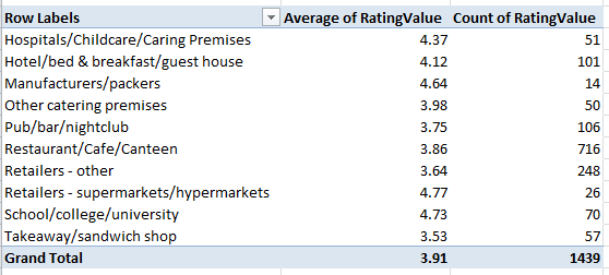
Row Labels: Business Type
Values: RatingValue (set to Average)
Rating Value a second time (set to Count)
And because it takes time to vet all those establishments, how about this breakout by last year of inspection:
Row Labels: RatingDate (grouped by years)
Values: Rating Value (set to Average)
Rating Value again (set to Count)
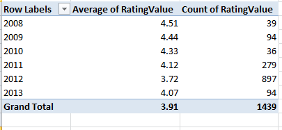
These data point to a putative slump in collective hygiene (remember, though, that we’re examining but one local authority here, albeit a posh one), a conjecture that nevertheless must be treated with some investigative care. Have official standards been stiffened, thus forcing the averages down “artificially”, or have the more suspect establishments been subject to the more recent scrutiny? It’s hard to say, though the 897 places inspected in 2012 – a rather large number, amounting to about 62% of the total – insinuates that the inspection sequence was merely randomized. But these conjectures need to be researched. I should also add that a scan of about half-dozen authority worksheets corroborates the lower score/recency-of-inspection correlation.
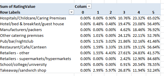
To view the distributions of ratings 0 through 5 by Business Type:
Row Labels: Business Type
Column Labels: RatingValue
Values: Sum of RatingValues (PivotTable Tools tab > Options > Show Values As > % of Row Total
And additional perusals of the data can serve up piquant, near-sociological findings. Four percent of Kensington/Chelsea’s inspected establishments fell under the Takeaway/sandwich shop rubric; the comparable figure for the Tower Hamlets authority in London’s storied East End, one of the city’s poorer districts, is 12.88%, perhaps comporting with the area’s more proletarian cast – perhaps. Yet the take away/sandwich figure for London’s City – the financial center of the country, if not the world – is 21.60%, presumably reflective here of the lunch hour, eat-and-run workday. And how about the Pub/bar/nightclub percentages of all inspected establishments?
Kensington/Chelsea – 7.18%
Tower Hamlets – 9.39%
City of London – 16.20%
The ruling class likes to party.
So lots of interesting stuff out there, no? Bon appetit.