Iowa’s Data on Bullying: Some Spreadsheet Mediation

12 Jun

School bullying is a serious business, of course, and data on this devastating social practice need be treated with all due sobriety. Some cheering, current information on the matter finds incidence down in US, at least, and for a state-specific look, the education department of the American state of Iowa makes its data on bullying available to you and me on its www.educateiowa.gov site. Its latest of its spreadsheets counts instances for 2011-12 and awaits here:

 2011-2012 Bullying Data

You’ll note the tabs detailing bullying allegations directed at both staff and students, and still a third sheet recalling a single, racially-motivated incident aimed at a Volunteer, whom I take to be an individual who had devoted some free time to a school in the Davenport Community School District. Clicking into the STUDENT sheet you’ll discover the incident data pulled apart into Public and Non-Public school tranches, a decision I would have overruled (you’ll be pleased that my name is nowhere to be found among the cards in Iowa’s official rolodex), consolidating instead all the records into a unitary dataset boosted by a School Status field, with institutions receiving the Public or Non-Public tag. That revamp of course would facilitate useful pivot-tabled breakouts along those lines, and in fact the deed can be done easily enough (though for purposes of exposition below I’m simply respecting Public and Non-Public’s separate spaces as they stand) ; dub H5 School Status, enter Public in H6 and copy down to row 1063 (just double-click the autofill button). Then delete rows 1063 to 1065 (that first-mentioned row offers grand totals, its retention subjecting any future pivot table to a double-count), enter Non-Public in what is now 1063, and again copy down, remembering again to delete the now-1192 and its Non-Public grand totals.

Note as well the cell-merged Public header leaning atop the data in row 4. That needs to be sent away,, either through deletion or by the interposition of the ever-reliable blank row.

And there’s something else: because we’ve taken over the H column we suddenly need to do something about the Total field in I. That field’s school-by-school, row-driven totals had been nicely distanced from their contributory data by the heretofore blank H, heading off yet another double-count prospect. The question is what to do about it.

I’m posing the question because the by-the-book counsel, the one in fact endorsed not three paragraphs ago, is to dismiss total rows and their odious double-count potential. The problem here, though, is that the types of bullying the data consider, e.g. Physical Attributes, etc., are each accorded a field all their own – and if you want for example to total all bullying instances for a school you can’t pivot table them into the very standard Summarize Values by Sum recourse. You can’t – again – because Summarize Values works upon the numbers in one field, and not the values across fields. We’ve sounded this concern many times (e.g. the August 29, 2013 post), in part because it does require repeating soundings.

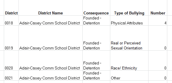
Thus the data set’s first record:

bully7

Would ideally have been properly dispersed thusly:

bully1

Again, by downgrading each bullying type from its independent field status to an item in a larger, subsuming field, standard totalling, and other, no-less-standard operations (e.g. % of Row), resolve into practicability. Thus in the case before us we might as well retain the existing totals, because we’d need to manufacture them anyway, through a  messy calculated field or…a Total column in the data set that’s already there.

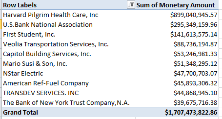
If, then, for illustration’s sake we do retain the services of Total, we can go on to at least break out all bullying (Public school) occurrences by district:

Row Labels: District Name

Values: Total (Sum, and sorted by Largest to Smallest).

District Name (Count)

In excerpt I get

bully2

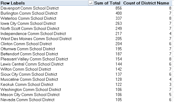
It was the Davenport (public) School District that suffered by far the largest number of reported – repeat, reported – bullying episodes, but absent any control for district size the analysis stalls here, though the numbers are instructive nevertheless. Doing the same to the Non-Public districts (and remember that if you’ve left the Public and Non-Public data as you found them you’ll of course require a header row for each) I get (again, the screen shot is fractional):

 bully3

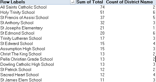
Far fewer reports visit the table, though I suspect the districts above are notably smaller. If they in fact aren’t, we’d then need to think about willingness to report and school decorum across institutions and districts. In short, the data don’t yet read definitively, but they supply the goad for additional researches.

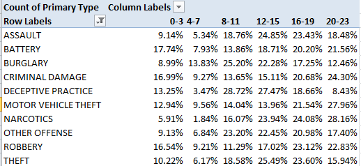
Then there is the matter of what the Iowa calls report Consequence.  The public school data set counts nine of these:

bully4

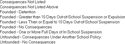
The consequences critically dichotomize the reports into Founded and Unfounded allegations, with a pair of residual Consequences items filling in some of the blanks. It thus seemed to me that a global breakout along Founded/Unfounded lines would do much to inform an understanding of the reports. I’d thus take over the next free column (probably I or J, depending on whether you’ve adopted the School Status field), call it Report Status, and enter in the next row down:

=IF(LEFT(C6,12)=”Consequences”,”Consequences”,LEFT(C6,FIND(“-“,C6)-2))

What is this expression saying? It’s propounding an IF statement that asks if the first 12 characters of any entry in C contain that very word – consequence. If so, the formula returns it. If not, the statement looks for the character position of the “-“, subtracts 2 (where the pre-hyphen text in such cells would terminate), and lifts those characters into the cell. In this latter case, either Founded or Unfounded should turn up.

Once we’re happy with its workings copy the formula down C. You can then pivot table, on the public school data:

Row Labels: Report Status

Values: Report Status (Count, Show Values As > % of Column Total.

(Again, you don’t want Grand Totals; of necessity they’ll return 100%.)

I get

bully5

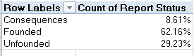
That’s informative. Executing the same routine for the non-public districts:

 bully6

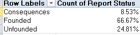
Far fewer cases here, to be sure, but when reported, the charges seem to exhibit slightly more traction. Note also the near-identical Consequences percentages.

As earlier conceded, our looks at the bullying reports may supply some of the necessary, but insufficient, conditions for any conclusive take on the problem.  But necessary.

Big Bucks in Boston: The Checkbook Explorer

5 Jun

Money-management issues, you say? Can’t stem that outflow, fettered debtor? I hear you, but you sure didn’t put your good name to 140,179 checks last year, the number of payments flowing from the pock-marked bank account of the city of Boston in 2014 alone. That’s 384 autographs a day, even more than David Beckham signs on his milk runs to his bodega; and you can read all about it here, and test your auditing smarts against the 556,104 checks disbursed by the city from July 1 2011 to April 28 of this year, all saved to the city’s Checkbook Explorer sheet.

Sorry, folks; you’ll need to actually go there  in order to download the 556,000; click the Checkbook Explorer link, follow with a subsequent click of the Export button, get the download going with a click on the CSV or CSV for Excel download option).

As with most US Open Data governmental sites the data are pretty good, albeit with a few curiosities. Rows 426220 through 426226 (at least in my download) restate redundant header data, as do a few other rows farther down, even as columns B through F and H and I remain unpopulated in those records. The quick fix is to sort the data by one of the blank cell columns (via A to Z), thus forcing these discrepancies to the bottom of the data set, after which the good old blank-row insert will send them into oblivion.

Note in addition the Year and Fiscal Year fields. The latter begins every July 1, and so July 17, 2013 belongs to fiscal 2014, for example. The conventional Year field could, in the interests of slimming down the file for the analyst, be deleted, because years can be derived as needed from the dates staking the Enter field, via the pivot table’s Grouping feature; and the same could be said about, and done with, the months in Months (Number), and Month, the latter supplying their names. Savings: about 1.5 million cells. And while you’re at it you could probably disengage Voucher and Voucher Line as well as Dept, those latter numeric IDs receiving their user-friendlier names in Department Name. And that greater total economy of 3 million cells would doubtless please the Boston accountants.

Once those sweeps have been conducted the data read and work pretty straightforwardly.  It occurred to me, then, that a monthly aggregate breakout of expenditures might prove of interest, given June’s end-of-fiscal year status. Might that month bear more than its share of outlays, with unspent budgetary remainders burning a hole in departmental coffers? Not a bad investigatory question, and answerable by this pivot table awaits:

Row Labels: Entered

Values: Monetary Amount (grouped by Month and formatted in currency mode):

check1

In fact the results stand my question on its head. We see a remarkable downturn in July spending, remarkable because the months flanking it – in different fiscal years, at that – register far higher numbers. It seems that the bean counters in Beantown are happy to spend their due allotments with time to spare, and their creditors aren’t complaining either.

But the above table also imparts a real-world pertinence to a point to which I call students’ attention in my Excel classes. Note the data span at least parts of four years, and because they do, a grouping by month alone quite overlooks the plurality of Januarys and the eleven other 30-or-so-day units the year comprises. Our table sums spending activity for all the Januarys, then, a level of abstraction normally too high for most data-analytical intents. But because we want to understand the role of months qua months in the spending calendar, the table makes sense. Indeed, if you retool the above numbers via % of Column Totals:

 check2

You’ll see just how understated the June expenses are, though at the same time I’m not sure what to make of April’s lion’s share.

And if you next substitute Department Name for Entered, turn off the % of Columns Total calculation, run a Top 10 filter for Departments (start by right-clicking somewhere in Row Labels, not the Values), and sort the numbers Largest to Smallest you’ll see

check3

Boston’s schools rise to the top of the expenditures class, and note $3.6 billion grand total. If you turn off the Top 10 and thus expose all the departments figuring in the dataset, you’ll count 76 of these, along with their $4.1 billion grand total. And that means the top 10 departments account for about 87% of all spending. The most frugal department?  The Office of Women’s Advancement, whose one and only $92.00 payment earmarked itself for printing expenses at a local Sir Speedy. The office is connected to the Boston Women’s Commission, whose none-too-profligate $6,145.34 places it in the austere 74th position.  Conclusion, then: we need more women in the Boston Public School Department.

And as for the receiving end, switch Vendor for Department and run another Top 10/sort:

check4

The health insurance provider Harvard Pilgrim Health Care accounts by itself for more than 21% of all of Boston’s outgoings. Indeed – the top 10 takes in 41%, and that’s out of 12,643 vendors.

And among other things that means Boston has a whole lot of potholes, Mario Susi & Son, you see, sell asphalt.

UK Election Data: Results May Vary

29 May

Now that the UK parliamentary election has come and gone it’s time; not for a recount, because even Labour isn’t going to the barricades on this one, but rather a recount-ing of what happened, and where it did. And if it’s detail about the votes you crave you’ve come to the right place, namely this workbook put together by the electionresources site (and you’ll find election data for quite a few countries here):

http://electionresources.org/uk/

(Click the May 7, 2015 link).

The outcomes of all 650 House of Commons contents and their 3971 contestants, some bearing party affiliations of which you’re likely to hear for the first time, come right at you, auguring some interesting analytical prospects, and some questions too.

Beginning with the prosaic but necessary housework, you’ll need to spruce up the field headings in columns B and G that just aren’t there. I think it’s clear that the Constituency header in A was really dedicated to B, and so I’ll move it there, and name the vacated A field Number. Column G clearly computes the percent of respective constituency turnouts, thus earning the name Pct. Turnout or something like it.

And it’s that Electorate/Turnout zone that throws an organizational – that is, spreadsheet-organizational question – at us.  You’ll note the redundant Electorate, Turnout, and Pct. Turnout numbers/percentages counted off for each candidate in his/her constituency, and the clear failures of these spare parts to teach us anything new beyond their first mention:

ukvote1

Nevertheless, leaner alternatives do not come easily.

What does that mean? Start with the Turnout data, recording the absolute numbers of constituency- eligible voters making their way to the polls. Apropos the first-listed Aberavon district in Wales, its row 1 turnout figure of 31,523 is obviously in no way enhanced or value-added by the eight additional recitations of the number attaching to each Aberavon candidate. But how else, then, could turnout be represented?

The answer to that quasi-rhetorical question depends – again – on who’s doing the asking. For seekers of novellae among the data it seems to me that this pivot table:

Row Labels: Constituency

Values:  Votes (Sum)

Does the work of Turnout, and because it does, it frees us to retire Turnout from the dataset altogether. If on the other hand, you’re merely inspecting the numbers, Turnout may have an edifying role to play in the presentational scheme – though even here I’d submit the percent of turnout is what most readers really want to know; and if that be the case, Turnout could still be responsibly evicted from the sheet.

But that fix remains partial, and doesn’t look the problem squarely in the eyes, i.e., how to integrate what are in effect aggregated data – overall turnouts – with individuated records made to dangle their toes on the same row. The problem is apples/oranges, or, if you’re a UK voter, chalk-and-cheese: i.e. specific, per-record candidate results having to live with what is in effect subtotal data in the Electorate and Turnout fields. It’s one thing to derive constituency turnout from the records, as the pivot table above succeeds in doing easily enough. But it’s quite another to calculate the numbers of eligible voters on the basis of the actual vote totals we have. I’d venture to say it’s impossible, and because those eligibility numbers have to be supplied exogenously electionresources.org obviously chose to simply post them in each and every record, bad form notwithstanding. I’m not making a citizen’s arrest, mind you; I’m simply alerting the authorities to the problem.

In any case, interesting conclusions from the data are nevertheless there to be drawn, once you begin to look at them. For example – we see that the Place field furnishes each candidate’s ordinal finishing position in his/her race, and so we could pivot table a party’s average race position, as it were:

Row Labels: Party

Values: Place (average, formatted to two decimals, sorted  Largest to Smallest)

I get in excerpt:

ukvote2

Lots to be learned here, not the least of which is something of the 129 parties wanting to stand up and being counted, including the World Peace Through Song and the Birthday parties, two entrants that might do well to consider coalition. And Plaid Cymru means the Party of Wales, intending no fashion commentary.  Note as well the top-ranked Speaker party comprising precisely one candidate, House Speaker John Bercow, a Conservative who assumed this singular affiliation in consequence of his role (and I know no more about this curiosity than what I’ve just told you).

But Speaker Bercow’s one-case universe won’t satisfy your inner pollster, and so by dragging Place into Values again in order to tally candidate numbers, and summarizing by average, you’ll see (again the screen shot is fractional):

ukvote3

Here the relationships get a bit more definitive. The Scottish National Party’s (SNP) near-perfect 1.05 builds itself on the back of its Scotland-specific candidate cohort of 59, 56 of whom actually won. And we see the fuller contingents of the Conservatives and Labour exhibit pretty comparable place averages, even as their respective MP numbers stand at 330 and 232.

Those misshapen place-average/MP fractions get all the more gnarled when you slip Votes into the Values area as well and show them as % of Column Total (you’ll need to format these to five decimal places in order to bring the percentages for small parties to light). The perennially controversial UKIP made much of its one-member victory, an isolated triumph emerging in spite of the party’s 12.6% of the nationwide vote. Its calls for proportional representation likely won’t be heard – though even Labour, with 83% of the overall Conservative vote and but 70% of the Tory’s MP total – might want to think twice about the idea, too.

But the on-top Conservatives, with 50.7% of all MPs and but 36.8% of the vote, won’t even think about it once. And the SNP, with 9% of the MPs and 4.7% of the UK electorate -and only 49.9% of the actual vote in Scotland itself, by the way – won’t either.

Making Up For Lost Time: London Tube Lateness Data

22 May

If you haven’t heard it before – and if you’re espying this post in Sydney or Sofia you probably haven’t – you’re hearing it here:  ride the London underground 15 minutes longer than the ride is supposed to take and you get your money back.

In fact, I’d allow that a sizeable crew of Londoners haven’t heard that before either, but it’s true, and if you doubt me look here. Indeed – your intrepid correspondent has collected twice, a pair of lucrative postscripts to some down time I experienced down under.

It’s all true; but how do the powers that be know you’re on the up-and-up when you press your cash-back claim? They know because they’re watching your Oyster card, your ticket through the transit system that means to record your every point of departure and disembarkation, and whether you really were stuck on that Northern Line idling at Tooting Bec on the 17th at 2:12 pm (yes, editor, there is such a stop).

And that means in turn that all the trips of all the descenders into the underground have to be summed and reckoned, with much of that tallying brought to us here:

 Copy of tfl-tube-performance

The dates in the Key Trends sheet kick off in cell A2 from the second reporting period of the 2011-12 financial year, and don’t be flummoxed by the 02 at the head of the cell. That isn’t February, but rather the second of the fiscal year’s 13 28-day reporting intervals, a curious baker’s dozen that I suspect has something to do with 364’s divisibility by 13, and the cooperative absence of any underground service at all on December 25. But the apportionments aren’t quite that neat. In fact the day total for 2012-13 comes to 365 (note the 29 in cell C26, probably a leap-year emendation), while C27 registers a 27-day interval, and C39 and C52 have inherited 30-days stretches.

In any case, Key Trends gives us more to think about than period day distributions – for one thing, that arpeggio of cascading comments, in striking but largely illegible array:

late1

Apart from bidding us to think about how extended textual reflections might fitly reconcile themselves to the data to which they’re annexed, clarity calls for a most simple remedial step – just click the Show All Comments button in the Comments button group (Review tab), and make the comments disappear. To recall any comment in particular, click on its cell and try Show/Hide Comment, in the singular. Why the sheet insisted on its in-your-face comment revelation is a matter to put before Transport for London.

But once you do get to the data you’ll need to run through a number of think-throughs in order to decide what exactly it is you want to learn from them. Consider for starters the Number of Lost Customer Hours entries. These could be divided by the corresponding Excess Journey Times, thus returning the apparent number of passengers experiencing a tardy ride (of course in view of the 15-minute rule most of these won’t be compensated in any event).  You’ll also need to multiply the Lost Hours by 60 so that you’ll be dividing minutes by minutes.  If we command the J column, then, and title it Number Late, we could enter in J2:

=F2*60/I2

(Note: no parentheses required here. Excel’s order of operations of will attend to the math.) That expression gives me 23,609,932.35 or so latecomers, a rather large number to be sure, but one of course that needs be juxtaposed to the total rider figure for any given 28-day period. And to proceed here we need to hazard an educated guess. Transport for London puts the annual tube traffic nowadays at around 1.265 billon riders a year. Giving leap years their due, divide that number by 364.25 (remember December 25 takes the day off) and a day’s worth of tube travel yields an average of 3,472,889.5 passengers, which in turn needs to be multiplied by the Days in Period numbers in C. Simplest tack: enter that average in a free cell and name it daily, then slide into the K column, call the prospective field Pct. Late, and post, in K2:

=J2/(daily*C2)

(This time you do need the parentheses. Note in addition the 3.4 million daily average is a current one, and as such may artificially, if slightly depress lateness percentages for earlier years. The determined researcher could doubtless recover the actual year-specific totals.)

Copy down K and observe the notable flux among the percentages, particularly the spikes in C38 and C41. Those quantum leaps owe their king-sizes to job actions, and here you would profit from consulting the attached explanatory comments.

How you’d choose to evaluate these lateness proportions, which tend to oscillate across the 20-30% band (though the variation is real – observe the 14.88% for the period ending October 13 2012 in row 20), is perhaps a matter for the glass half empty/full disputants. A rough-hewn null hypothesis might predict that as many rides would pull into their rider-intended stops late as early, by some margin. A minute-late ride is late, after all, and so a 25% aggregate lateness measure might not fairly serve as a full-on indictment of the underground service. Still, late is late, once the baseline, expected lengths of journeys are decided.

But another simple but trenchant measure of punctuality offers itself from the data. We could divide the number of customer hours lost by Operated Kilometres (as Transport for London would spell it)counted in the G column; that is, the accumulated distance travelled by all trains in the period. It stands to reason that all things being equal greater distances traveled associate with more lost hours, and because we have all the data we need here – unlike the Pct Late metric that works with the same daily passenger average throughout – this little fraction may be all the more incisive. We could title the L column something like Ratio of Hrs Lost to KM, simply divide the value in F by the one in G, and copy down.

You’ll also note the matrix of lost customer hours in its eponymous tab, an enhanced compilation of data pushing further back in time to the 2003-4 financial year and treated to an off-the-shelf conditional format. Just one question here: the matrix provides lost customer hours for the first reporting period of 2011-12 – even as the listings for that year in the Key Trends sheet only start at period 2.

Is that what they mean by lost customer hours?

US Railroad Accident Data: Getting Them On Track, Part 2

15 May

Well, give me this: I’ve been trying. I’ve put the data quality questions I put to you in last week’s railroad accidents post to the parties of the first part, the Federal Railway Association, and the rest has been silence – at least so far, apart from the auto-responses that, if nothing else, have persuaded me that I’ve indeed emailed the proper agency (and a pair of additional messages to Dr. Frank Raslear, the stated contact person for the accidents workbook, bounced back to me).

With silence comes ambiguity. Have my queries been remanded to some inert, serpentine queue, or have they rather cowed the Association’s best and brightest into a collective hush?

My self-flattery is not becoming.  Either way, and after the battery of amendatory spreadsheet moves I recommended in the last post, we’re left with a data set of 50,000-plus worth of records that are, and aren’t, completely usable. They are, because the data qua data are fit for pivot tabling purposes and the like; and they aren’t because we – or I – remain unsure about their validity and meaning.

But let us suspend disbelief in the interests of proceeding apace, and assume – at least for now – that the data do remember the work hours as they truly unfolded (e.g. we’ll assume someone actually plied that 23 1/2 –hour shift clocked in there). You’ll recall that I had called for a pasting of all the data into a single sheet, and then supplementing the set with a new field that figured work shift duration (and we can call it Shift Duration).  I remain bothered about the apparent 2003 vintage of the records, but again, that’s what they’re telling us.

In any case, it occurred to me that we might first want to construct a pivot table that would simply count and differentiate accident reports by Accident Type – that is, return the number of records citing non-human and human factors:

Row Labels: Accident Type

Values: Accident Type (Count)

But guess what – when I initiated the standard pivot table routine a decidedly non-routine message jutted its jaw in my path:

 blograil1

 I don’t recall having seen that alert before, but look behind the message to the Create Pivot Table window and note the dimming of the typically-defaulted New Worksheet radio button. Then return to the Review ribbon and view what I had failed to see during last week’s post: the illuminated Protect Workbook button. (It should be added here that the FRA’s instruction to unprotect the sheets – an effort that bore fruit last week – asks the user to “click on “Tools” from the top of your screen, then select “Protection” and click on “Unprotect”, all of which sound like a Excel 2003-specific command sequence. Perhaps the data really are that old.)  Protect Workbook – a preventive step I’d allow that few users actually take – seals off spreadsheets in ways that are wholly incomparable to the work performed by Protect Sheet. That latter command bats away attempts to enter data (among other things); Protect Workbook stymies what it calls structural changes to the entire file, e.g., the introduction of a new worksheet – and that’s why New Worksheet is grayed out; there’s no new worksheet to be had. And that’s the faulty destination reference (and as you see in the above shot Protect Workbook also resists pivot table construction on an existing sheet).

And while under default circumstances one can simply turn Protect Workbook on and off successively with alternating mouse clicks as per last week’s turn-off of Protect Sheet, the protection here is password-controlled:

blograiil2

And I can’t find the password, nor do I see an allusion to it in the FRA page. If I’m missing something you know where to reach me.

But not to worry. We can simply select the entire data set, paste it to a new, blank workbook, and do our thing as if nothing had happened.  I just can’t explain why this bump in the road decided to bump.

But obstacles aside, once we get there that pivot table looks like this:

blograil3

Shift the numbers into Show Values As > % of Column Total and Human Factors account for 26.98% of the reported accidents, an appreciable but smallish fraction of the whole.

Of course, the data’s ellipticality – that is, the relative dearth on FRA’s page of explanatory deep background on the data – throws a caution at any accounting of what the numbers really tell us, but this is what we have.

We could then pursue the surmise that human-factored accidents associate themselves with work shifts starting at the extremities of the day, that is very early or very late, and perhaps in different distributions from the non-human incidents . We could try something like this:

Row Labels: OnDutyTime

Column Labels: Accident Type

Labels: Count of OnDutyTime (again, as % of Column total. And because we’re compiling percentages that necessarily add to 100% we don’t need Grand Totals):

 blograil4

Recall that those are 50,000 cases tossed into the table, no small universe. Note the human factor percentage for shifts beginning at 6AM, which in absolute numeric terms comes to 1093 accidents. Of course, these data require a definitive set of denominators before salient disproportions in occurrence can be proclaimed; that is, we need to know the actual numbers of workers reporting to their job, and when.  After all, 6AM may simply be the start time that predominates.

And while we’re continuing to wonder about data quality, I’ve only lately come about across a record – in row 1300 to be exact, in the pre-merged Quarter 4 sheet. It archives a worker who commenced his/her day at 7:01AM on October 19, and punched-out at 1:01AM – on October 21, exactly 42 hours later. The accident on that shift befell the worker at 3:30AM on the 20th, the only day in the span that could have contained a 3:30AM. Among other things, it would appear that, accident notwithstanding, the worker remained on the job for another 21 or so hours. But you’ll have to ask the union about that one.

But I’m still waiting for an answer from the FRA to my questions. I’ve emailed them, after all – and that means they know where to reach me, too.

US Railroad Accident Data: Getting Them On Track, Part 1

7 May

Falling asleep on the job – literally – can be an occupational hazard – literally. Some evidence, for example: the incidences of fatigue-associated accidents among railroad staffers, tracked by the US Department of Transportation and compiled here:

 HF_Deidentified_FRA_Work_Histories

Encountered straight on, the data seem analyst-compliant and only too happy to offer their services to interested pivot tablers and other deep thinkers; all the reported dates and incident times, for example, sport verifiably numeric status. But there are some sticking points in there that need to blunted before they’re smoothed into talking points.

First, a data-organizational alert.  The records for the year have been sliced into quarter-specific sheets, thus placing your permit for pivot table construction on momentary hold; but by copying and pasting the four sheets’ worth of data into a solitary one you’ll be able to start building, and without bribing the inspector besides (the time-warped Alt-D, P-conjured PivotTable and PivotTable Chart Wizard consolidation routine we’ve discussed in an earlier post won’t work here, for reasons with which I won’t bore you).

And then we’re left to account for the 490 rows in Quarter 4 starting at 10024, all of whose 2,450 cells store data that, diverse formats notwithstanding, evaluate to zero. Speculation aside they should be deleted, and not merely separated from the substantive pack by our celebrated interpolated row. Rather, delete them simply because they’re effectively empty.

And for another curiosity – about which I may not have to inform you if you’ve already downloaded the workbook – note that the sheets are protected, a defensive mode I don’t recall having encountered in a net-available file before (and remember we’ve culled this one from an open data site).The fact of the protection is acknowledged in this supplementary page, that step taken “to prevent accidental data corruption”.  Given the workbook’s placement and public availability on the Data.gov site I’m not sure where that corruption might be perpetrated; but in any case a simple tapping of the Review > Unprotect Sheet button will release the cells to your beneficent custodianship.

I was also temporarily mystified by the two Accident Types sharing that eponymous column, until it occurred to me that HF almost surely initials some human factor contributory to the accidents, corroborating the sheets’ title; and by extension NHF points to non-human causatives. And I don’t know whether the matched entries in the Subject ID  field always denote the same railroad worker; we see, for example, that subject ID 051500.0101 in the Quarter 2 sheet records 17 incidents. Same person?

And what about that title, in the wrapped, merged A1? That composited address comprises worksheet titles and field headers, and that won’t do. The very simple workaround: click the Merge & Center button; that’ll restore the headers to their appointed cells in – and remember to either delete the title proper, or insert our redoubtable blank row between what are now rows 1 and 2. (But of course if you plan on carrying out that copy-and-paste multi-sheet consolidation, you need perform this  cell decoupling only once.)

The On and OffDuty times, on the other hand, seem unproblematic; they appear to mean what they say – that is, recall the start and end points of a worker’s daily stint, although I’m assuming – and not necessarily rightly – the associated accident in column E may have necessarily shortened any given day in the data set. But even here my confidence in that reading is not doubt-free..

To explain: in the prospective interest in correlating accident times with its point of occurrence during the given work shift, I’d move into the F column and enter, in F3:

=C3-B3

That simple subtraction should turn a workday length in hours and minutes, discernible as such if you Custom format the results this way:

h:mm

(Note that only one h will nevertheless properly capture a double-figured hourly duration.)

Copy the formula down the column and, among other things, (and provided you haven’t copied-and-pasted yet everything into a single sheet yet) you’ll find very many unaccountably lengthy shifts; in Quarter 2, for example, a 23:30 turn materializes in row 5989. Does that sound possible, or legal?

Moreover, the year references in the sheets appear to hark to 2003, and I’m not sure the data aren’t more current than that. The workbook was first made public in 2008, but we’re told here that an update was patched in this March 31. If in fact the years are anachronisms and as such nothing but a grand, aggregated mistake, they could perhaps at the same time be defensibly ignored, precisely in virtue of their constancy. If, after all, the data emanate from the same year, the intrepid pivot tabler will concentrate the analysis on months and days alone.

And for another discrepancy: look, turn for example, to Quarter 1’s row 650. It cites an accident at 12:30 am, even as the associated work shift outlined in B650 and C650 spanned 2:55 am to 9:55 am.

rail1

That can’t check out; 12:30 am fell outside that worker’s day, and quite apart from the 2/15 date (see below).

And while you’ve probably brought this one to your own attention already (and if you haven’t it’s been brought there right above), just for the record we note the unvarying dates accompanying the accident times. I think we can safely ignore these without much commentary or controversy; I suspect a format misfire explains them all.

But I’d appreciate some answers to the other questions. I hope to get back to you on them, if the Federal Railroad Administration gets back to me.

Word Counts Refined: Part 2

30 Apr

It was not a week ago that I put the matter before you, in our course of our stone-unturning, spreadsheet-pressed search for keywords:  In light of the methodology we’ve been touting, would it also be possible to uncover multi-word phrases, e.g. “tax relief”, in addition to the singletons “tax” and “relief” we’ve already learned to count?

It seems we can, and the means of choice toward that end is an array formula, a feature I’ve sedulously avoided until now because of its rep for conceptual obtuseness, a not entirely misdirected allegation. And while it’s true that array formulas have their moments –some of them rather hairy – and equally true that I’m not the industry’s go-to guy for array constructions, but you’ll nevertheless profit from making at least a passing acquaintance with them.

Array formulas do the work of multiple formulas, but muscle them into but one expression. In fact, you’ve probably used array formulas already without having been formally introduced to them, because a good many of Excel’s built-in functions buy into the array programme. By way of very good example, consider SUMPRODUCT, which multiplies pairs of values and then, befitting its name, add them all up. Thus if we subject these entries in A4:B8

text21

to SUMPRODUCT, written as follows:

=SUMPRODUCT(A4:A8,B4:B8)

Excel will multiply the pairs A4 by B4, A5 by B5, etc., and cap the process by totalling all those products, turning out in this case 1369. The by-the -book alternative, on the other hand, would of course require the user to compose five multiplication formulas, e.g. =A4*B4, =A5*B5 (positioned say in the C column), and so on, and bring these together with a =SUM(C4:C8); but SUMPRODUCT subsumes all that activity in its solitary expression (and imagine working with 500,000 pairs of values instead).

Thus SUMPRODUCT qualifies as an array formula because it scoots through all those multiplications, each one glancing off the same pair of parentheses and bounding into the same sum calculation. But some tasks call for user-inspired, customized array solutions, and the savvy to build them .

For example, compare these student answers to ten multiple-choice test questions with the correct ones:

text22

These data occupy H6:I16. To deliver an array-derived total of correct answers, I’d enter in a free cell

=SUM(IF(H6:H15,I6:I15,1,0))

Translation: let the formula compare the ten pairs of same-row responses, e.g. H6 with I6, H7 with I7, and so on. Each match delivers a 1, after which all the 1’s are summed (just for the record, the 0 in the expression –signifying the value-if-false contingency of the IF segment – could in fact be omitted, in contradistinction to its indispensability to a standard IF statement. But we’re speaking in Readers Digest terms here, so not to worry. And  note that the above expression was originally mistyped: thanks to Mark Serebriakoff for the error catch).

And when that formula is good to go, don’t put it into play with a reflexive press of the Enter key. At the point of completion, array formulas always require the spreadsheet equivalent of a musical triad instead – Ctrl-Shift-Enter. That chordal touch presumably instructs the formula to do its array thing, which here should return 5. And know that the hallmark squiggly brackets that attend every array formula can’t be merely typed; they properly appear only after Ctrl-Shift-Enter is struck. (For a relatively straightforward introduction to array formulas see this entry.)

Now that our crash course has collided with your medulla let’s reprise the keyword question with which we inaugurated the exercise. In the first instance, we’re looking for a way to count the appearances of a specified two-word phrase in our text.

For the sake of the illustration, I’ve conducted the text-preparation routine I described last week on about 620 words lifted from the Conservative Manifesto, which I’ve pasted them at B2. You can view the set-up here:

 manifesto excerpt

Suppose I’m looking to count incidences of the phrase “We will”, a phrase that seems to proliferate here, and probably not insignificantly; I’ll enter “We will” in D1. And in another free cell I’ll enter, after having remembered the Ctrl-Shift-Enter coda:

{=SUM(IF(B2:B624&” “&B3:B625=D1,1,0))}

Now what is the formula meaning to do? It’s string-concatenating consecutive words in the single-column text range, but doing so again and again, for each pair of words brocaded down the entire column. Note here that the two ranges, or arrays, as they’re officially called, are staggered – B2 is concatenated with B3, B3, concatenates with B4, and so on, thus capturing every stepped pair all the way down the column (the ” ” interposes a space that emulates the phrase as it’s written in D1). But note – and this is rather essential – the arrays are equivalently sized; each one here consists of 623 cells, and that parity is fundamental to the array process.

Thus if any contiguous word pair equals the “We will” in D1 it receives a 1; and once followed all the way through, the array formula brings 16 “We wills” to the surface, and I’d suggest that so broadly distributed and inclusionary a phrase is a hook on which the Conservatives want to hang their hat.  And you can copy the array formula, squiggles and all, the better to mint duplicates that can search for any other phrase(s); and you’ll be pleased to know that the dups will exhibit relative addressing, just like any another expression.

And by way of postscript to Part 1 we can also propose a friendly amendment to the COUNTIF usages we endorsed there. You’ll recall that we nailed together a most basic pivot table last week that would tally the occurrences of every word in the considered text:

Row Labels: Words

Values: Words (Count, of course; the data are textual)

But what had escaped my Starbucks-flooded attention was the most simple but powerful fact that the table itself performs a global COUNTIF; that is, it develops a count for every word in the corpus. And because the all the counts are already there, you need only substitute a simple VLOOKUP that’ll return any particular word count from the pivot table columns.

And you could even just sort the words alphabetically, or just bang out a Ctrl-F. That’s a Find as in Find and Replace; not FIND.

Word Counts Refined: Part 1

23 Apr

Last week’s keyword search of the Conservative Manifesto was happy to profit from a quirk of that quest: my apparently inadvertent success at finding a place for each of the words of the Manifesto’s copy-and-pasted text in their very own cells, e.g.

 text1

And once having got that far, we easily go about the task of piling keyword counts of Manifesto themes, by directing a series of COUNTIFs at the word isolates. But almost by definition quirks do not predominate, and the post allowed that most copies-and-pastes of text will, rather, assume this alignment:

text5

In which each line remands its text to a single cell; and if the keyword search is to find its quarry here a Plan B, such as the one I screen-shot last week:

{=SUM(LEN(SUBSTITUTE(TRIM(A2:A100),” “,”  “))-LEN(TRIM(A2:A100)))+COUNTA(A2:A100)}


might have to answer the call. But could there be a more economical, user-friendlier Plan C out there, one that would be happy to look no further than the COUNTIF that’s served us so reliably till now? There is, I think, though you’ll need to start the process with another reliable friend – none other than Word.

But, you may want to ask, why do we want to make resort to what is in effect an add-in, however familiar? After all, and as intimated last week, we could bring about the dicing of words we see in the first screen shot above by pumping the data through Excel’s Text to Columns parser, lodging Space as our delimiter. That suggestion is rightly posed, but let us see how the text breakout according to Word serves us better.

First, copy and paste the relevant text into Word. (Note by way of additional preliminary that if the text is PDF-sourced, as is the Conservative Manifesto, you can Save As the doc instead as a bare text file, an healthful austerity measure that should streamline the editing process – because if you’re working with an ornately-designed PDF you’ll probably want to vet the content for pull quotes, e.g.

 text2

and recurring, redundant headers (The Conservative Manifesto 2015) that pull at and skew the aggregate text totals.

Next, select all the text and click (remember, we’re in Word now) Insert > Table > Convert Text to Table. Once you check in, enter 1 in the ensuing dialog box:

 text3

But why?  We want a nice, minimalist 1 up there because we’ll soon want to cast the data into a pivot table, and a single Word table column translates into what is, after all, a single pivot table field. And if you want to know exactly why we’d want to pivot table the words, when we spent all of last week’s post doing nothing of the sort, I hope to establish relevance, as the lawyers say.

And before you take leave of Convert Text to Table click Other beneath the Separate text at heading and type a space in Other’s rectangular field – because the spaces in the document are to act as delimiters of the words on either side of them, chipping each into a table cell. Click OK and let the table pull the text into its unitary column (note: my laptop can’t distill the 30,000 Conservative Manifesto into a one-column table. For one thing, my Number of rows reports a negative number when I earmark but one column for the table, and that can’t happen. If were you determined to word-count the Manifesto or any other very large document via this means you might have to table the text in installments.)

Once the column drills down its pages, we then want to do something about the non-alpha accoutrements attaching like burrs to the words – that is, the sundry punctuations that deal a joker to COUNTIF wild-card searches. By way of review, if we’re counting instances of the word “tax” and we’re confronted with “tax,” a COUNTIF on the order of

=COUNT IF(A1:A100,”tax”)

won’t add “tax,” to its tally. And if you interject the perfectly legal “tax”&”*” instead, you’ll net “taxi,”, but also “taxation” and “taxi”; and that’s probably not what you had in mind either. Rid the text of commas, quotes, and the like, and a clean search for “tax” gets cleaner, and it’s here where Word’s far mightier Find and Replace feature justifies our recourse to that application (for an eye-watering treatment of its  herculean capabilities see Tibor Környei ‘s piece here).

Start up Find and Replace and enter:

text4

Note the Use wildcards ticked box; you need to click the More button (the one that presently shows <<Less, above) in order to find it.

And what’s this bit of cryptography doing? It’s Find and Replace’s way of searching for all non-alpha characters (the [!] signifies not; the [A-z] span looks for every alpha irrespective of case) and replacing them here with nothing; and what’s left are alphas only – the stuff of words. And it should work. Depending on the length of the excerpt with which you’re working, you may want to downsize its operative font substantially, thus manufacturing a smaller complement of pages (remember you’re not interested in reading the words here anyway; they’re to be pasted to Excel. And note also that I see that, for whatever reason, some non-alphas, e.g. [ and an underscore, don’t seem to capitulate to the Find and Replace routine. Because as we’ve seen, [ is a bit of Find and Replace code, it may be interpreted as such and left alone. You can still purge these recalcitrants, though, via a standard Find and Replace – that its, Find [ and replace it with nothing).

And once your column of words has completed its run down the pages, copy and paste the whole thing to a spreadsheet, say to B2 (reserve B1 for a field heading, say Words). Next, make way for an old trick: enter 1 in A2, 2 in A3, jot a field header in A1 (e.g. Number), and run an autofill down the column (though you’ll probably have to drag the fill handle in lieu of the standard double-click of the handle, because the latter fill mode will come to rest alongside any blank cell in B, and blanks there should be). We’re numbering here because we want to dispose of the empty cells in B (ones that have likely received the source text’s Enter/line break codes, transported to the spreadsheet as blanks). Sort B by A to Z and let the blanks drop to the floor of the column. Insert a blank row between the bottom word and first blank, and then sort by the numbers in A, in order to restore the primeaval word sequence of the text.

Now you’re ready to word count via the COUNTIF deployments we described next week. But again, apart from the non-alpha/punctuation sticking point we’ve unstuck here, COUNTIF had already begun to do this work last post. So what’s new? This: a pivot table, an elementary one:

Row Labels: Words

Values: Words

And that rudimentary construction delivers a global word frequency count of each and every word in the document, an as such widens an encompassing look at every potential keyword.  Of course you’ll have to look past the irrepressibly  populous “the”,” and”, “or”, “of”, and kindred gear teeth before you look any substantive keyword in the eye, but that’s part of the cost of doing business.

But there’s something else to consider. We’ve done a pretty good job of readying individual words for the counting. But what if we want to count a pair of them, conjoined in a phrase? We can count “budget” and count “deficit”now, but what about “budget deficit”? And no; it won’t do to count each of the two and simply sum the results, because that totalling won’t speak to instances of their adjacency. So what to do?

I think I have a workaround, so hold on.  I know you love a teaser.

The Conservative Manifesto: Word Counts of the World Unite

16 Apr

David Cameron wants your vote, but he can’t have mine; neither can Ed Milliband, Nick Clegg, Nigel Farage, or Natalie Bennett, if they and you must know. I’m a legal alien, you, see, and can’t exercise the franchise here in the UK, where they tell me there’s an election May 7, and I believe them (they – and they know who they are – are perfectly happy to take my taxes, though; complaint desk, please).

Apropos all of the above, if you’ve been waiting for the Conservative Manifesto it’s here at last, minted in all its PDF, ethnically-sautéed glory, and ready to head your way from the (curiously) small Read it here link bordering the accompanying video. And in this connection the Guardian has put its abacus to the manifesto and  keyword-counted the document:

 man1

(Don’t be misled by the “mentioned on speech” title clause. The Guardian states elsewhere in its story that the counts are in fact drawn from the actual manifesto.)

Question then: could you and I do the same? Answer,: yes, or something pretty much like it.  After copying and pasting the Manifesto into a spreadsheet, we might be able to throw a function or two – more particularly COUNTIF, or depending on the way in which the data break, a FIND, at the text and get an enumerative handle on the keyword counts.

And so in the interests of pre-testing I cracked upon the Manifesto and dragged, copied, and pasted a swatch of text into a sheet, looking something like this:

man2

Surprise. Surprise, because pasted text typically narrows itself into a single column, its row/lines protruding therefrom, e.g. this copy and paste:

 man3

That shot isn’t a paragon of lucidity but trust me; all these lines and all of their text are seated in the A column; and undifferentiated data of this stripe explains the need for a Text to Columns feature, the enabler of choice for parsing the lines into smaller, meaningful fields.

But our data are nothing of the sort. The Manifesto text has already done its parsing, breaking each and every word into a cell all its own, for reasons I can’t immediately explain.

And I can’t explain this either: when I later attempted a select-copy-paste replication on the Manifesto, it hemmed itself back into a single column, as per the screen shot directly above. What had I done right/wrong the first time? Or had the Conservatives shipped a reformat while I wasn’t looking? I really don’t know, at least not yet; but I do have the unlovely word-to-a-cell version for you, and it’s here:

Conservative manifesto

Mysteries aside, one might ask about the respective analytical potential inhering in the two motifs exemplified above. I would submit that the rendition before us – in which each Manifesto word owns an unshared cell address – is superior, because its discrete word segregation empowers us to make productive use of the relatively simple COUNTIF.

And for an understanding of that productivity think about how COUNTIF works, in its ultimately binary inclination. If you enter

Day after day it rained

in A10 and ask COUNTIF to look for instances of the word “day” (and let’s hold off on the syntactical issues for the moment) you’ll return 1, not the 2 for which you were hoping. COUNTIF merely tells you if the searched-for item is there at all: if it is, it’ll serve up a 1. If it isn’t, you’ll get a 0 (and not an error message, by the way).

Thus if the text data are conventionally organized, that is, if they’re massed into a single column, COUNTIF can’t accurately tell you how many times a word appears in the excerpt, telling you instead only whether or not the word appears in the line, frequency notwithstanding. But our data, for whatever reason, grant each word a cell; and so the 1 that COUNTIF can deliver will suffice (consider also that, unlike standard database features, COUNTIF can conduct cross-column/field counts).

And by way of further extended preamble let’s try and identify where in the sheet the Manifesto itself actually starts. It seems to me that the Manifesto proper inaugurates itself on row 114, and closes at 3741 (row 3742 features a personal attribution that is clearly extra-Manifesto). I thus named the range sprawling across A114:AD3741 (AD being the outermost text-bearing column) Man (and that name should accompany your download). Note as well that the copy-paste as we see it may have inflicted a measure of apparent text relocation here and there, but if we’re conducting individual word searches, that shouldn’t much matter.

In any case, if we want to count instances of the word “tax”, for example, we could repair to the out-of-range cell A3744, type tax therein, and enter, in B3744

=COUNTIF(MAN,A3744)

You should get 85; I do, at any rate. But we see above that the Guardian counts 132 occurrences of the term, a departure that one assumes could be explained at least in part if the newspaper admitted word variants – e.g. “taxes”, “taxation”, along with “taxes.” or “taxes,” etc. – into its equation. One way we could approximate toward that widened space:

=COUNTIF(MAN,A3744&”*”)

The above construction looks in effect for tax*, and so should assemble most of the kindred references to the central term (though it’ll also find and count “taxi”, and of course won’t find “levy” or “duty”. The science is inexact, though it’s still probably more science than art). And with that criterion in place, I get 146, a good deal closer to the Guardian total.

Note the syntax above calls for a string concatenation, even if the item to be counted turns out to be numeric. Thus, for example, counting every number exceeding 100 in cells A1:A100 would require

=COUNTIF(A1:A100,”>”&100)

And that string stipulation sets COUNTIF apart from the standard IF, which welds             operators to its truly numeric values, e.g.

=IF(A6>100, “Pass”,”Fail”)

In any case, you can try COUNTIF in its several flavors on the other Guardian search terms, and see how your counts compare with theirs (I don’t know how the paper realized its counts, by the way). Thus I get just 19 for “housing”, even as the Guardian comes up with 42. “hous” somehow gets me 37, though, and “home” 79. Did the Guardian simply add totals for incomparably-spelled synonyms? It surely did for deficit/debt, for example, and when I combined the two I got 32 to the paper’s 30 – not bad. Again, the Guardian gets 73 for Jobs/employment; I get 70, but I’m pretty far off on Europe (31, 44 with Euro) and immigration (my count: 26). But I get an in-the-neighborhood 52 for “economy”, near the Guardian’s 58 (though “econo” yields me 109).

Again, I don’t know just how the Guardian arrived at its counts, which in some cases put considerable distance between themselves and my totals. Maybe I’ll Tweet them about their methodology.

And by the way – would it be possible to roll up keyword counts even if the data hew to the one-column regimen? It is, but you might have to make recourse to a formula looking something like this:

{=SUM(LEN(SUBSTITUTE(TRIM(A2:A100),” “,”  “))-LEN(TRIM(A2:A100)))+COUNTA(A2:A100)}

And explaining that one here would blast my word count sky high.

Chicago Crime Stats: Two Ways of Apprehending The Data

1 Apr

When Big Data gets too big, crack the manual and page furiously to Plan B; and if someone’s put the scissors to Plan B, then hold your head high and beat a dignified retreat. What’s that song about knowing when to fold ’em?

For spreadsheet operatives, too big arrives at record number 1,048,576 (there’s that header row, after all), where the retreat begins its pullout, and the white flag starts waving. Plan B, then, might consist of keeping the data at arm’s length – in an Access table, for example, and querying it from afar. That task is certainly practicable: click Data > From Access, identify the database, and click its desired table e.g, this shot from Sean Lahman’s must-have baseball stats repository:

chi1

Decide in the dialog box that follows how you want the data to present themselves; if the record count overruns the sheet, click the Pivot Table Report radio button in answer to the Select how you want to view the data in your workbook prompt. You’ll get your pivot table and its Field List, all right, but it’ll be flying on automatic pilot; you won’t see the actual data, because you can’t.

This works; but when I read about data visualizer Joe Lieder’s charted considerations of the 5,700,000-record dataset of crimes perpetrated in Chicago between 2001 and 2015 I began to search for the data, along with the nearest white flag. I guessed right, and found the former in the city’s Data Portal. But what now?

With its familiar American open-data interface, the Portal does open a number of possible download routes (start exploring by clicking the blue Export button in the far right of the screen) including the ones taking us through Excel territory:

chi2

But 5,700,000 records just can’t be squeezed through those channels above. There’s also that OData possibility, up there, a data mode likewise affording at-a-distance access to Excel, provided you can download the free Power Query engine add-in; but it appears that my plebeian version of Excel doesn’t qualify for the utility (but don’t worry; I bought my copy).

In the interests of dignified retreat then, I asked the Chicago Data Portal to filter but two years’ worth of data, 2013 and 2014 instead – but at 577,000 records and nearly 100 MB, no small excerpt. Have your laptop take a deep breath before it attempts to force-feed it to your screen.

Now allow me to ask: what can a pure, un-charted spreadsheet bring to the analysis? How about, for starters, learning something about crime by hour of the day? Among other things, Lieder charts monthly crime fluctuations, but goes no farther. An hourly breakout, then, could be engendered by throwing the Date field data into a pivot table Row Labels area (but not into Column Labels; with around 228,000 unique date-times, they won’t fit in there); but a preliminary Oldest-to-Newest sort of the field turns up nearly 350,000 non-date – that is, text-formatted – entries, an apparent casualty of the AM/PM suffixes clinging to these.

I don’t know why some, and only some, entries should be so embellished (and note I’m asking after truly labelled AMs and PMs. Those time-of-day qualifiers can also associate themselves with certain actual, numeric date formats). After a good deal of dithering over the matter, I pried open a new column between C and D, called it Hour, formatted its cells to zero decimal points, and entered, in what was now D2:

=HOUR(C2)

And copy down the column, of course.

This works, but I don’t entirely know why. Again, there’s a whole lot of (apparent) labels in C, and yet HOUR manages to secure the number it’s seeking from each and every cell in the column format notwithstanding. Requires additional scrutiny, I think.

Then I’d step through this pivot table:

Row Labels: Primary Type (of crime, that is. I than continued with a Filter > Top 10, in view of the 33 types)

Column Labels: Hour

Values: Primary Type (Count; turn Grand Totals off)

And because the outcome reads densely, I went ahead and grouped the hours in bundles of four hours each:

chi3

(Deceptive Practice appears to denote crimes of business deception, by way. Look here, for example. And note that the grouped hours above are merely numbers, and not derivates from certified time-formatted values. Note in addition that HOUR retrieves just that – an hourly reading only – and as such will treat 7:58 as 7:00; and that means that the 8-11 really sections off 8:00 through 11:59, for example).

Among other things, the breakout totals almost exactly 40% of all narcotics offenses in the broad-daylight hours of 8:00 AM through3:00 PM (in effect), outnumbering the 35% it counts between 8:00 PM and 3:00 AM, when one might have stereotypically anticipated a spike in this kind of activity. Of course the greater daytime population and its widened customer base may offset the facilitating, clandestine ecologies of nocturnal settings.

No less surprising, perhaps is the 50% fraction of motor vehicle thefts reported between 8:00 AM and 7:00 PM, when cover of darkness would likewise have been expected to abet the illicit repossessions.

But of course it’s dark at 7:00 AM some of the year, so let’s try this: insert another column, this to the right of Hour, call it Month, and post in what is now E2:

=MONTH(C2)

And copy down. Next, engineer this pivot table:

Row Labels: Hour (in the interests of precision, group by bins of two hours each)

Column Labels: Month

Report Filter: Primary Type (select Motor Vehicle Theft)

Values:  Primary Type (Count, necessarily; the data are textual. Select % of Column Total; turn of Grand Totals)

 chi4

Do auto thefts mount in early morning and evening winter hours? Not decisively, but the percentages for the 16-17 (4:00 to 6:00 PM) tranche are slightly supportive. The winter month percentages (remember that we’ve called for intra-month hour/crime percentages, not proportions across the months for a given hourly frame). In fact the three highest theft rates for the 16-17 bin do emerge in November, December and January. Indeed, the 6-7 (6:00 to 8:00 AM) reading for January, when’s it’s still dark, stands notably higher than for any other month, but April and May discernibly top October and November here, and so the results aren’t emphatic.

And for a presentational talking point, it could be asked of this chart by Mr. Lieder:

chi5

In which in effect, three-variable are charted – Year, arrest percentage, and primary crime type – might be better captured by

Row Labels: Primary Type

Column Labels: Arrest (coded either True or False for an arrest or the failure to effectuate it)

Values: Arrest (% of Row Totals; Grand Totals turned off).

It’s just a thought.

And one more thought: the pivot table above turns up these labels:

chi6

And that means the same crime has been recorded with a pair of spellings, a classic no-no. While the absolute total of the two – 33 – isn’t enormous, you’d want to select just one of these entries for the authorized spelling and put the others through a Find and Replace.

Then refresh the pivot table.


And by the way, I have vacation next week. That’s the advantage of self-employment – you get to make your own hours.