Up For the Count: Key-Word Searches in Excel

28 Dec

Quick: what’s the first thing that comes to mind when someone asks you to name a classic, defining use for Excel?

OK, ok; the very first thing that’ll streak across your medulla upon hearing the question is: what sort of dweeb would snap my latte-laced reverie by even bothering to ask such a thing? Granted. But even after you settle yourself down, your second answer assuredly won’t read something like this: word counts.

You see, Excel doesn’t do word counts, or isn’t supposed to. That sort of task is properly, and obviously, delegated to Word’s formidable text-handling charge, and the whole silly matter should end right then and there.

But Excel can count words, if you’re prepared to go one-on-one with some prolix, Rube Goldberg-circumnavigational, parenthesis-lousy formulas. Still the prior question remains: why bother?

And it’s a good question. By itself one would indeed be hard-pressed to justify the enterprise, particularly when Word beams that very information to its status bar ubiquitously, for all to see all the time.

But when pressed into a supporting role in a kind of content analysis, spreadsheet word counts start to matter more. Publications such as the New York Times comb speeches for the incidence of key words (they pursued this kind of work during the 2012 presidential nominating conventions), and word incidence divided by all speech words can deliver some telling fractions. For example – Mitt Romney uttered the word America and its variants (American, etc.) 93 times in his acceptance speech, the President 85 times in his. Romney’s America amounted to 2.27% of all his acceptance words, Obama’s 1.92% – strikingly comparable numbers.

Those stats come right at you from my very own workbook, and which I’m making available to you at

word search and counts

The book lets you copy and paste any text entry (be it a speech or any other excerpt, of course) and enter up to twenty key search terms, whose frequency of appearance in the text are automatically calculated (I’m sparing you the formulaic technicalities here, which would require a dedicated and prolonged treatment). And as a rule it should be that simple, although I need to add a couple of provisos.

To use the book, which demos Romney’s convention speech, just click the A column heading to select the column, and press Delete. Then locate your text excerpt and run through a standard copy and paste routine, pasting the data to cell A3. Don’t by bothered by any blank rows streaking through the text – the formulas can deal with those. Then just replace the demo search terms with your own, and note the counts and percentages.

And here are the provisos. First, because the word searches hunt instances of contiguous text, a search for “American” will also tap “American” and “Americans”, for example, and that error on the side of inclusiveness is typically a good thing; it plays a de facto search wild card, gathering word variants into the larger count. If, however, you want to search for “American” exclusively, type American.

Note then that a search for the word “the” – something you’re not going to be doing, I’d wager – will likewise pinpoint “breathe” and “their”, for example, and puff the search total misleadingly. Here you’d want to search for [space]the[space], thus isolating the desired term. On the other hand, you’ll miss “the.” as a result, and that’s stands as a problem, albeit a minute one.

Some other points, subtler ones. Many text excerpts will exhibit dashed clauses, e.g.,

Guess what – it’s raining outside.

And because the search formulas here develop the word count by totaling the spaces between words (and adding one at the end of every pasted line in the A column), that dash above will be accorded word status, again distending the count, this time by just a bit. If you want to check for and zap any dashes the fastest tack is to
paste the text into Word, summon the Find and Replace feature (shortcut: Ctrl-H), and enter a dash in the Find what field, and nothing at all in Replace with:

count1

Just click Replace All, and then copy the excerpt into A3. (Note: if you suspect other, extended-width dashes are poking about as well, you may need to play with the Find what: specification, e.g., entering –.)

Another one. Some speech transcripts interpolate extra-textual asides between actual speech content, e.g.

(Applause).

You’ll want to repel these insurgent glosses, and once again Find and Replace can carry the day. In first click the More button holding down the window’s left corner and select Use Wildcards. Then enter this curiosity in Find what:

\(*\)

That patch of code canvasses every open and closed parenthesis (or bracket, as they term it in the UK) in the text, along with any text in between. Again, omit Replace with: and click Replace All. I should add that Word’s Find coding options are populous, and can get rather scary. See for starters

http://office.microsoft.com/en-gb/word-help/find-and-replace-text-or-other-items-HP005189433.aspx.

But it can get scarier than that. In any case, note that you may have to do some additional vetting and gives the bum’s rush to some other text intruders, too; some of these are probably best disposed of with a simple pat of the Delete key.

In any case, I’ll humbly submit that the word search workbook is swift, easy to use and has a role to play in various investigative tasks. Get back to me with any comments or questions – and the helpline is toll-free.

Coming to Their Census: The British 2011 Data

21 Dec

The British census has done its work for 2011 (their remit carried out in years ending with 1), and with it has bestowed upon us a rather grand favor, or favour, as they would have it. Its prodigious researches have in very large measure found their ways into Excel spreadsheets, and been parachuted into the public domain, headed right into our importunate hands:

http://www.ons.gov.uk/ons/datasets-and-tables/index.html

That domain is indeed public, and colossal – a mighty myriad of hyperlinks cascading down its endless directory (including pre-2011 data, too), massifying into one giant, irrefutable conclusion: for journos, and academics, there’s got to be something there.

And doubtless there is; one could imagine a moneyed news organization stationing a reporter on the Census beat alone, pressed with the mandate to liberate all those stories yearning to breathe free behind the rows and columns.

But with the plenitude comes the questions. I’ve skulked around some of the data – a neutrino-sized fraction of them to be sure – and can’t help entering what is at base perhaps an unfair demurral: that the spreadsheets I’ve brought to my attention on the Census site aren’t terribly suited for what I’m calling here the next move. That is, that data they present, as they are presented, often don’t easily facilitate the sorts of secondary analysis this blog promotes: the pivot tabling, the charting, the value-added tweaking, the movement from the data as we find them to a round of conclusions that originally weren’t quite there.

As indicated, that cavil could be ruled out of order, driving itself as it does from the assumption that the data are there to be put through a new set of investigatory paces. But that may not be the case. It is possible the Census had, or has, something else in mind: an interest in simply styling the data lucidly, to be read and learned from and reported on as the reader finds it, and nothing more.

Could be. But where does that put the journalist? In an earlier day, when popular access to data was either check-pointed or even proscribed, the journalist could play the part of messenger, bringing information to light that might otherwise be consigned to the shadows. But today, when we’ve all been entrusted with the keys, we might thus come to expect more of the journo, the data professional.

That’s not a novel desideratum, of course, but in any case if we do want to make more of the data they have to cooperate, or be made to cooperate; and if the trammels pull too tightly the job gets harder.

Just a few examples, none of which would necessarily bring the enterprise to a halt, but which points to the kind of work that needs in order to get data in shape for that next move:

Note this excerpt from a Census report on religious affiliation:

census1

Again, the numbers are, by themselves, intelligible, but the next move is more uncertain. The data break themselves out by regions (e.g. A NORTH EAST), but then undergo a second subdivision: the regions are parsed by localities (e.g., Hartlepool, Middlesbrough, etc.), subjecting the numbers to a classic, nettling redundancy. The same totals are gathered twice – really, more than twice; the All People total for the North East is accumulated again, through a summing of the localities, and again, by a summing of the Remainder and Urban areas subheads (these indented very curiously by a serial tapping of the space bar – a textbook no-no). Disentangling all those totals makes the job harder to be sure, if you want to do more with the data.

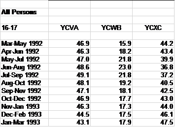
In addition, many of the workbooks I’ve seen suffer from another classic, if remediable, error – the laying down of blank rows and columns between data-bearing cells, e.g. this excerpt from a workbook on youth education and employment:

census2

And check out the dates. An expression such Mar-May 1992 isn’t a date – it’s text, and as such can’t be grouped in a pivot table, for example. A lethal miscue? No, but an impediment.

And how about this one, from a workbook categorizing crime in England and Wales:

census3

That category heading isn’t availing itself of the Wrap Text feature; rather, it comprises text that’s been entered in two different rows. Put simply, you shouldn’t do that – it instates the same record, or at least part of the same record, in two rows, and that’s just too problematic.

In his cite of my Wednesday post, in which I served up the Guardian’s Olympic athlete data, digital journalist savant Paul Bradshaw asked his readers to “Let us know if you do anything with it!”. That is indeed the point – as they presently stand, what can you do with the Census data?

In sum, I can’t help wondering if the Census and like concerns would stand to gain by some alternative thinking about their spreadsheet data and how they’re realized, in the interests of instilling a measure of analyst-friendliness to the files. Would it be too high-minded to recommend that the Census, et al, place the matter before consultants, who’d be deputized to perform the relevant makeovers? On the other hand, a reconsideration of a few thousand workbooks is no small gig, and with the government locked into austerity mode the expense would likely be deemed too discretionary to justify the outlay.

Maybe then it’s time for me to step up and offer my services. And I’d prepared to offer the government a break – I’ll bill them in dollars, and eat the exachange rate.

Addendum: Olympic Athlete Workbook

19 Dec


A bit of follow-up, if I may. My September 13 post (how quickly they forget) took up the matter of Olympic medal-winner birth-month distributions, and how these might compare with random, null-hypothesized percentages. The accompanying workbook was incomplete, and so I herewith make available an Excel adaptation of the Guardian’s current athlete census, appearing to number all Olympic competitors (10,384), along with medal attributions. I’ve also introduced my own birth month column to the mix, and you can get the workbook here:

 All London 2012 athletes Excel

Note that, as sorted here and as per my original Olympics piece, the last 37 Date of Birth records emobdy text, as opposed to numeric, format, and and had to be dealt with accordingly (see the relevant discussion in the September post). In any case, enjoy the data. I should add a preliminary thought-provoker or two: The August-born account for 11.6% of all medals, and I still can’t explain why 20.7% of the Chinese team members seem to have been born in January. Dodgy data? Hazy government agenda? Cohort cutoff point?

Get back to me – your guesses may be better than mine.

The Camera Tool, Part 2: Shaping the Data

13 Dec

Thumb back to my previous post and you’ll reacquaint yourself with my concededly makeshift, but eminently workable, rewrite of Excel’s camera tool job description. To review: the tool reproduces live pictures of cells, contents and formatting included, and as such keeps step with any changes made in the source cell. I suggested in turn that, in view of their picture-graphic status, these little data clones could be dragged across the worksheet into meaningful formations, lining up into what are in effect low-grade data vizzes, e.g., my representation of student grades plotted against the class seating plan:

dviz1

To be sure, the hows and whens of this kind of application need to be thought through. The camera tool can’t practicably spill large vats of data onto finely mapped turf, e.g., crime events pinned to latitudes and longitudes – the kind of thing that the Tableaus of the digital world are designed to handle. But it can find its place in more homely, user-framed settings with high manipulability, as per the faux classroom above, and can add trenchancy to the viz when a jot of interactivity sautés the mix. For example, additional test administrations introduce a measure of choice to the user (once all the formulaic fixes have been put in place, of course):

dviz2

Click on a different test, and the camera captures change. (Again, note the conditional formatting of scores equaling or topping 90.)

But in fact Excel’s formatting portfolio cites an alternative graphic data-point-capture option, one that likewise has been around for ages but is typically cold-shouldered from any data concerns – its catalogue of shapes. Draw any shape, select it, then click in the formula bar and enter any cell reference. The shape will return the cell’s numeric or text entry, e.g.:

dviz3

(Those entries can comprise formula results as well).

Needless to say, these objects can be swung anywhere on the worksheet too, and appear to boast these advantages over the camera tool:

  • Far greater shape possibilities (click the Insert tab Shapes button and you’ll see what I mean)
  • Fewer demands on pc processing speed, thus hastening the viz construction process. The worksheet simply moves faster when shapes stake the sheet, at least as per my experience.

Thus the test score/seating plan scenario could be redrawn:

dviz4

(Tip: by selecting a shape and clicking Ctrl-D you can reproduce it rapidly.) Labile and more processor-friendly, shapes would seem to carry the day, but for one pause-giver: absent a VBA-driven remedy (see, for example, http://www.tushar-mehta.com/publish_train/xl_vba_cases/0301-dashboard-conditional_shape_colors.htm), you can’t conditionally format a shape. Now that unticked box may not bother you, but if you want or need to colorize data that meet certain criteria, you’ll need to revert to the clunkier, and determinedly rectangular, camera tool capture – because this device duplicates the contents of cells, conditional formats included (e.g., head back to our initial take on the class test results).

At least that’s what I thought; and guess what – I was wrong. A couple of itinerant clicks brought me to the Crop to Shape feature:  Picture Tools > Crop > Crop to Shape in the Size button group. Select a camera tool capture and follow the above sequence through, and you’ll see:

dviz5

Pick a shape, and the camera tool capture clenches itself into that shape – even as it retains its cell capture properties, including any conditional format.

Thus if I click Ed’s original, blue-hued 99 and step through the Crop to Shape routine and go with say, the cube shape option, I’ll bring about:

dviz6

Let Ed score 89 instead and the cube will return to its native, unconditioned white. Remember too that if you select all the shapes simultaneously (either by holding the Ctrl or Shift key and clicking each shape, or turning to the Picture Tool > Selection Pane in the Arrange button group, a potentially more daunting resort) you can impose the same shape on all the selectees via Crop to Shape.

Crop to Shape – a feature about which I had heretofore pled ignorance – thus packs one more presentational virtue into the data-point capture programme.  Point the camera tool at a cell, set it down wherever you wish, and proceed to shape it too. I’ll leave the rest to your imagination. Again, though, prepare to pay a processor-slowing overhead.

P.S. For a sample of all of the above, you can download this viz of the AID data we discussed a few posts ago (drawn from the Guardian):

 UNAIDS data worldmap, 2012

 Just select a category and year from the dropdowns in W8 and X9 (map source:  www.freeworldmaps.net, one of several sources of outline maps you may want to use for data plotting).

The Camera Tool, Part 1: Picturing Free-Floating Data

6 Dec

Begin with a question belonging to the chicken-crossing-the-road genus: where are spreadsheet data typically placed? Answer: in cells.

You’re not amused. But it’s the follow-on that’s going to matter, so humor me for a bit longer.

OK – data are sealed in cells, and what could be called spreadsheet superstructures – e.g., charts, and the latter-day conjurations we call data vizzes – are almost always synergized from, and as it were balanced atop, those data. But you knew that too.

Now here’s where your patience gets rewarded.  The data – those above-mentioned, cell-sourced elementals – can be in fact be loosed from their boxy holds (and I‘m continually struck by how often beginning Excel students calls cells boxes) through a relic but little-heralded feature known as the camera tool. The camera, which has made itself available at least as far back as the 1997 release of Excel, snaps a screen shot of any range of cells – a live shot. And that means if the data in the cells you’ve camera-captured change, the screen shot changes too.

Camera screen outputs are often pasted to Excel dashboards –assemblages of data-bearing objects such as pivot tables and charts that resolove into a big financial picture, and the like :
viz1

(Source: http://blog.accountants.intuit.com/from-the-experts/excels-camera-tool-dont-leave-home-without-it/)

Those several objects above are probably camera shots of data compiled on other worksheets, and resized on the dashboard so as to accommodate one another in the design space. And again, any modification in any of the data sources will modify any camera shot correspondingly. And what this post seeks to espouse is a slightly variant application – a grafting of these camera tool cell captures to a kind of data viz – one which ushers the source data into the viz.

But before I explain what I mean, let’s retrieve the camera tool and nail it to the Quick Access Toolbar (again, I’m narrating the Excel 2010 command sequence). Click the File tab (2007 users need to click the Office button), and proceed with Options > Quick Access Toolbar (on the commands columned on the left of the window you see). Select All Commands from the Choose Command s drop-down menu and click on Camera (you can buzz there quickly by typing the letter C) and then Add.

viz2

(You can also double-click the Camera icon, thus catapulting it onto the QAT forthwith.)

And once put in place, the tool is easy to use. Select the range you want to snap, click the Camera icon (you’ll note the slender black cross replacing the default plump white indicator), and just click at the point on the worksheet where you want the photo to land. Once having alighted, you can of course drag the shot anywhere else and resize it, just as you would any graphic object. (Two cautions, of sorts:  if you’re snapping text-populated cells whose contents overflow into an adjoining cell you’ll want to autofit the cell before “shooting” it, because the snapshot will only capture the data straitened by the cell’s boundaries. In addition, a multitude of shots seems to decelerate sheet processing speed. You won’t want to splatter your sheet with dozens of captures. On the other hand, your machine is probably faster than mind)

Now let me wend my way back to the larger point. Once you place the camera tool in your virtual hands and take aim at a collection of data, you can reposition the resulting cell shots anywhere on the sheet, even as the source data – the photo’s subjects, so to speak – remain in place, in completely  usable, spreadsheet data form.

By way of a very simple introductory example, consider this assortment of test scores:

viz3

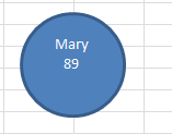
I’ll spare you the formulaic nuts and bolts here in the interests of descriptive expediency, but if you join, or concatenate, the student names and their respective scores and then camera-capture the results, you can map the students’ seating configuration as per the test day by dragging each student shot (realized from each cell in the column whose first entry is Mary 78, etc.) here and there, e.g.:

viz4

(Note as well the conditional format, imparting blue to any score equalling or exceeding 90. Again, I’m looking past those technicalities here.)

And if you’re suspecting a dodgy comradeship between Quentin and Ed you can remix the class seating for the next test and depict the updated assignments on the worksheet by dragging the above cell shots into their new positions. Continuing to keeping things simple here, you can enter the Test 2 grades in the Score column and calibrate these to your new seating alignments, casting a concerted eye at the scores for newly-distanced Quentin and Ed.

So let’s track back to that larger point. The camera shot deputizes data points – the data that typically inform data vizzes by submitting to some superordinating , front-ending graphical take on the information – into active players in the viz itself.  The data as originally posted steal their way into the viz, at the same time holding fast to their original positions, yet available for all the standard spreadsheet scrutinies – pivot tabling, filtering, lookups, etc.

And because the camera shots are in effect graphic bits, they can be superimposed atop other graphics, encouraging a different kind of mapping that needn’t call upon any additional software.

For example: for demo purposes I tracked down and pasted an outline map of the UK, and proceeded to grab some of today’s temperature and humidity data for selected cities (source: www.weatheronline.uk) and commit them to the usual row-and-column treatment. Then the user decides between the Temperature or Humidity selection in the mini-dropdown menu in cell E18, and the map then associates the pertinent reading with its city:

viz5

Select Humidity instead and you get:

viz6

You can access this demo at

UK weather demo

(Y0u may also want to take a look at the formulas in the D and E columns.)

One hopes the larger point, or points, have been made. The camera tool and its potential uses described here won’t serve to mothball the data viz tools in the contemporary journo’s box. The pictures won’t be as pretty, for one thing, but the tool

  1. Lets you drag the data points precisely where you want them, and
  2. With some formulaic savvy, can foster considerable user interactivity with the viz, e.g., the two-columns of Temperature vs. Humidity embodied in my demo. There’s no reason why you can’t select from 20 columns worth of data instead, any and each selection finding its way into the viz.

If this still isn’t wholly clear, I hope to add to it all in the next post. Don’t go away.

AIDS Data, Part 2: Sparklines Capture the Small Picture

29 Nov

The AIDs data with which we’ve been working and pivot tabling – that is, multi-region by multi-year breakouts of the epidemic, e.g.:

snuggly dovetails with Sparklines, Edward Tufte’s  mini-charting fillip that Excel enfolded into its 2010 release (for some deep background on all this, see Tufte’s discussion). Sparklines portray but one row’s worth of data each, locking a range-hugging stream of charts into standard, address-bearing cells:


You’ll note the Sparklines’ presentational gauntness – their label-free axes and Spartan décor, and no; you wouldn’t slap a Sparkline on your bosses desk, or give it pride of place in your firm’s annual report. But the Sparklines’ taciturnity supposes a method to their madness: the barebones isolation of data trajectories alone enforce a like-for-like serial scan down the column, a rhythm of perusal that frames a big comparative picture down the rows. Sparklines aren’t pretty, then, but their very banality sharpens the point they try to communicate. And they’re easy to construct.

By way of exemplification we can work with the UNAIDS workbook referenced in the previous post, and put together a pivot table as follows:

Row Labels area: Region

Column Labels area: Year

Values: Estimated number of Children newly infected (or however you’ve titled this field; see last week’s post).

(Note that you should filter the Western and Central Europe and North America row out of Row Labels, in view of its preponderance of empty data cells for the years 1990-2010.)

Now on to the Sparklines (remember that the feature debuted with the 2010 release).  Click the Insert tab and observe the three Sparklines options stocking its button group.  Click Line, thus triggering the Create Sparklines dialog box and its request for two bits of information:


Data range asks you to earmark the range of contributory data from which the Sparklines will be drawn. That range – really a set of mini-ranges – must comprise data only, and need exclude any data point or axis labels. In my pivot table that range blocks out B5:W14, each row of which is going to spur a Sparkline all its own. Thus I’m going to identify X5:X14, the range that immediately adjoins the data to their right. Click OK, and the Sparklines you see two screen shots back should fill the range.

Again the peculiar, albeit limited, virtues of Sparklines beg your attention. The serial iteration of the lines casts the data into an irresistibly comparative mode, reporting each region’s AIDS totals in a kind of visual arpeggiation. Note the near-straight-line ascent of the disease figures for the Middle East and North Africa region, held up against the curvilinear bend of Sub-Saharan Africa, and so on.

Those trajectories point up an important, but changeable, default setting of Sparklines. You’ll note the Sub-Saharan numbers far exceed those of Middle East-North Africa, but each Sparkline scales its curve against the data in its row alone, abjuring any global, range-wide absolute set of values. To see what I mean, click anywhere among the Sparklines. Note first of all that all the Sparklines are selected, because Excel assumes any formatting overhauls of the lines are to be implemented en masse. Note in turn that the Sparkline Tools tab bursts on screen; click its Design tab > Axis in the Group button group and you’ll see:


Note the Automatic for Each Sparkline default, sizing the vertical axis to each row’s values. That selection is plainly to be preferred here, because the pivot table’s Global totals will necessarily overwhelm those of the companion rows; clicking the Same for All Sparklines in the Vertical Axis Maximum Value Options area will run all the lines through an identical axis maximum, contorting the results:


In any case, you’ll want to play around with other Sparkline variations, e.g., particularly the Show button group and its point possibilities. For example, select the Sparklines and tick the High and Low point boxes:


Many other modifications are relatively self-evident, e.g, the style and color options.  The Ungroup command will disperse the Sparklines, allowing the user to impose formatting remakes upon particular lines, but given their presentational of-a-piece character, you’re not likely to invest in this strategy.

Note in addition that if you drag the current Data values entry away and replace it with any of the many other AIDs data parameters  the Sparklines will naturally, and immediately, redraw themselves, resonating to the insurgent values now place. (But note that if you instate a new set of values in the Data values area Excel may register these in Count, as opposed to Sum mode, something you’ll then have to change, along with their number formatting.)

And nothing stops you from resizing the Sparklines – only here you need to heighten a row or widen a column to do so, in lieu of dragging a typical chart’s borders.

There’s one final Sparkline capability worth expounding- the three Sparkline types, one of which – Line – we’ve reviewed here in some detail. The Column possibility emulates the garden-variety Column chart motif, in our case massing the data points into glacial monoliths:

The Win/Loss type is something else again, however, and can’t be properly directed to our data. Commensurate with its name, Win/Loss construes its data in brute binary terms, resting any positive value atop a virtual horizontal axis, and slipping any negatives beneath it.

To illustrate – if I chart a team’s wins and losses across a season and accompany the outcomes with a simple IF statement issuing 1 for a win, and -1 for a loss, e.g.:

The Win/Loss Sparkline will depict that second row of data thusly:

And if you click through the Sparkline Tools Design tab > Axis > Horizontal Axis Options > Show Axis sequence, you’ll get

That is, an actual horizontal axis centers itself across the Sparkline.

Thus if you need to subject your data to row-by-row scrutiny, Sparklines hold out a neat, practicable means for charting the numbers, adumbrating a big picture via a range of small ones. So start the picture-taking.


AIDS Data: Spreadsheet Epidemiology, Part 1

22 Nov

In a relatively cheery anticipation of World Aids Day on December 1 a United Nations report extols a range of heartening developments in the struggle against the epidemic, including a 43% plummet in the number of HIV infections incurred by children between 2003 and 2011. In this regard you can call up an accompanying workbook carried by the Guardian, recast into Excel form here:

UNAIDS data 2012

The workbook, in particular its Global and regional trend data sheet, comprises annual data compilations across the years 1999 and 2011 both for particular regions and worldwide, thus affording the analyst/journalist a means for corroborating, questioning, and refining the UN findings. So what is there to be done with the data?

We’ll start simply. You’ll note the data present themselves beneath a number of superordinate headings in row 4 (e.g., Number of people living with HIV) in a tripartite, estimate/low estimate/high estimate breakout – and the estimate does not comprise a simple average of the associated high and low.  Exactly how the estimate was figured, then, is a small but material discrepancy that could be placed before the report writers, particularly in view of the missing methodological discussion from which the report suffers.

In addition, the report finds “There were more than 700,000 fewer new HIV infections globally in 2011 than in 2001” (p. 2), the pertinent data for which appear to hold down cells F17 and F27 in the Global worksheet. Doing the math, I get 683,149, but a corresponding bit of subtraction for the Low estimate column (in cells G17 and G27) does yield 722,800, perhaps the number the report wants you to remember here, but one that doesn’t elect the mid-way estimate (and it should be added that the report doesn’t divulge the means by which the estimates were projected).

You have a few things to think about, then, but let’s get back to those headings in Row 4, which in fact top yet another collection of headings in row 5 (estimate, etc.). That two-header-row redundancy qualifies as a must-avoid, in part because the second of the rows will necessarily be regarded as a first row of data instead. Moreover, those upper header titles pull across merged cells, and that’s way too problematic for conventional data organization. The simple way out? Just insert a row between rows 4 and 5, and content yourself with the headings in what is now row 6.

Next problem. Our headings now appear to suffer from a different kind of redundancy – the recurring estimate/Low estimate/High estimate troika that replays itself across the worksheet. In fact, however, any pivot table cobbled from these data will sensitize itself to the problem, and will append distinguishing numbers to same-named fields:

But neither you nor any prospective readers will be satisfied with those identifiers – they are, after all, laconic in the extreme. What you may need to do is simply, and unglamorously, rewrite the headers, e.g., Low estimate, people living with HIV, High estimate, people living with HIV, etc. Not big fun, but it won’t take that long.

Then you can begin to think about pivot tabling. Note that the data already feature summatory, global totals by year in additional to the regional figures; and while these may (apparently) preempt your need to develop aggregated, worldwide yearly totals, you also need to exclude or filter these from many pivot table renderings in order to avoid totaling the same numbers twice. That is, if you put something like the following table into place:

Row Labels: Region

Column Labels: Year

Values:  Estimate, people living with HIV (my retitling)

your Grand Totals will be duplicative, adding the Global data to that of all the regions.

But don’t touch that dial. Execute the above pivot table. The grand total for 1990, for example, comes to 18,536,551.95. But look at the Global figure – 8,945,107.32. That total isn’t quite precisely one-half the Grand Total, and if you perform the same assay on the other years – that is, multiply each Global total by 2 – the products will always fall short of the respective Grand Totals. I can’t explain the disparities, and don’t find any reconciliation in the UN report. In any event, if you construct the sort of table I describe above, you may want to filter the Global item out of the mix, by clicking the Row Labels down arrow and deselecting Global:

(note: the data have been reformatted to exhibit two decimal points and commas when necessitated. In addition, the Row Label data here initially appeared in Wrap Text mode, which I deactivated by selecting the A column and clicking Wrap Text off, via Home tab > Wrap Text in the Alignment button group.)

The above table neatly right-angles regions and years for any particular column of data (try this for two columns simultaneously, e.g., low and high estimates for people living with HIV, and the table gets forbiddingly dense), but there are more views on the data to be opened here.

For example:  the UN report celebrates that 43% yearly diminution in new HIV infections in children from 2003 to 2011 (p. 27). By aiming Excel’s % Difference From command, squirreled behind the Show Values As button at the data (Pivot Table Tools > Show Values As in the Calculations button group; remember I’m working with the 2010 release), you can baseline the numbers for each region at 2003, and see how the subsequent HIV rates plot against that particular year.

To see what I mean, frame a pivot table and put these fields into play:

Row Labels: Region

(Here you may want to readmit the Global region by clicking the Select All. This inclusionary step will let you juxtapose and view the overall HIV reduction totals relative to particular regions. You may also want to deselect the Western and Central Europe and North America item because its data are missing for most years.)

Column Labels: Year

Values: What I’ve called Estimate New Child. HIV (that is, the field detailing the yearly estimate of new HIV infections in children)

Then click anywhere among the Values data and turn to Pivot Table Tools > Show Values As > % Difference From. In the resulting dialog box click Year in the Base Field field and 1993 as your Base Item. You should see (in excerpted form):

Note the vacant 1993 column, attesting to that year’s baseline status. Because the infection rates for all the other years – on either side of the baseline – are computed against the 1993 numbers, that year can’t be compared to itself.

What this means in turn is that the % Difference From tool can be applied to any year baseline.  Decide on a different year and all the comparative numbers above will change (pre-2010 users can right click anywhere among the values, select Value Field Settings and the Show Values tab, % Difference From, and the appropriate Base Field and Base Item).

That’s unnervingly efficient, and informative. The next bit of enlightenment is presentational – learning to how mini-chart those 22 years’ worth of data via Excel’s Sparklines – and yeah, sorry – you need Excel 2010 for this (but if you don’t, remember that free download beta of the 2013 release). Stay tuned.

Obama-Romney: The County Count

15 Nov

Those of you who  have either long memories or the irrepressible urge to ride herd on your scroll wheel will recall my early post on the breakout of the 2008 presidential election, the one in which John McCain won 72% of America’s counties. That ever-so-slightly counter-intuitive finding owes its piquancy of course to the immensely variable ranging of county sizes, the smaller of which massed in the McCain camp. All of which begs the immensely obvious follow on: so what happened this year?

The raw stuff of an answer is stocked in an Associated Press-compiled county data spreadsheet posted to the Guardian’s web site, at http://www.guardian.co.uk/news/datablog/2012/nov/07/us-2012-election-county-results-download#data

Be advised that if you’re forging that link the totals therein aren’t complete, presenting fractional totals for some counties and none at all for about 200 others; an update awaits, one trusts. And that’s just for starters; the AP broke out some states’ results by city instead of county, inciting an exhilarating round of hoop-jumping by yours truly in order to beat the data into shape (I’ll spare you the blow-by-blow, but I needed a smoke when it was done, and I don’t smoke). You can walk off with my adapted sheet here:

county-wide presidential results 2012

(The county codes in my sheet stand as proxies for their names, a consequence of those arduous shape-beating labors pointed to above.)

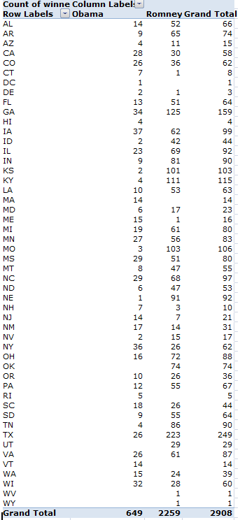
In any event, after having cleared the sweat from my brow and the keyboard, I determined that Mitt Romney won 77.7% of US counties, an expectable increment over his predecessor, given Romney’s superior vote percentage:

The larger inference, confirmed by the 2004 outcomes as well, is simply that Republicans own the county space –a minimal consolation to the losers, to be sure, but notable just the same, particularly in those states in which extreme lopsidedness prevails, e.g., Missouri, Nebraska, Kentucky, Kansas. Winning a state is one thing, but the kind of statewide partisan resolve exhibited by these states is striking. Indeed, Barack Obama posted an average of 60.5% of the vote in his winning counties; the corresponding figure for Romney is 66.9%. Moreover, the national average Romney vote for all counties stands at 60.8%; a mirage, of course, but a statement nonetheless.

Run the data through another permutation: of those counties in which the Obama/Romney vote aggregate came to 100,000 or less, Romney’s win percentage skies to .822. In the plus-100,000 districts – far fewer, but by definition the more populous – Obama wins them to the tune of .622.

One might finally ask if the Republican small-county hegemony dovetails with GOP sectarian states that simply happen to have relatively more, and hence, relatively smaller counties, or if county size itself attests some larger, more congenital Democratic/Republican differential. There’s some support for the latter thesis: the overwhelmingly Romney states of Nebraska, Kentucky, Kansas, and Oklahoma – all of which evince a 90-plus percent county GOP win rate (Romney won all of Oklahoma’s 74 counties) – do demonstrate negative correlations between total county vote and Romney percentages. That is, even these near-unanimous Romney states tend to register lower GOP win percentages as their county sizes enlarges. The correlations:

Nebraska  -.412

Kentucky -.336

Kansas -.431

Oklahoma  -.350

But ok; is the very concern with county granularity a concession to investigative caprice, a because-they’re-there cheap analytical thrill? Maybe – but for students of the electoral process, are they any more capricious than those units of analysis we call states?

P.S. And check out Mark Newman’s electoral cartograms; they map county data, too.

The Morning After: A Twitter Post-Election Analysis

7 Nov

Good day from the nation’s capital – London, that is. I don’t know about you, but because I’d exercised my franchise via the mails weeks ago, breaking off a rather deft end-run past all those madding crowds, your correspondent was left to spend the better part of his Election Day doing what you were really, secretly, hungering to do – track Obama and Romney tweets.

And that’s what I did. My methodology, faulty but dogged, comprised a sample-and-tally of tweets containing mentions of the respective candidates (again, the data source was www.twdocs.com) via the process I described a few posts ago. The intent: to learn how the tweet volumes stacked and tracked across the day. And so I conducted my own election count, launching 13 paired candidate name-search sorties into the tweetosphere, starting at around 6:30 am New York time (no, I didn’t get up that early; remember I live in London) and concluding around 6 pm – because citizen journalism is hard work and its practitioners need their beauty rest. (And remember again that the searches netted a maximum of 1,500 hits each; these were divided by the time elapsed between the first and the last of these, and then projected to an hourly estimate.)

On each of the 13 go-rounds I fired off a search for the term Obama, following that inquiry a couple of minutes later with a request for Romney in an attempt to synchronize search times; and while that routine was practicable enough, it begs the importantly prior question of what one could hope to learn by it.

The Twitter universe, after all, is nothing if not a self-selected cosmos – and an Obamacentric one. As of this writing, the once and future president had 22,000,000-plus followers; his erstwhile opponent had attracted 1,700,000 (and he had as many during the campaign, too). Endeavoring to draw definitive voter conclusions from tweet counts, then, is tantamount to wandering through Yankee Stadium and sampling major league team support across the country – you’re asking for an exceedingly nasty skew.

Moreover, additional, classic sampling caveats apply here as well. It’s impossible to know how many election-day tweeters were eligible to vote, eligible but not interested in voting, and/or citizens of some country other than the US.

And some tweet-specific cautions need be entered, too. It should go without saying that, unlike an election vote, a good many of the tweets vituperated against, rather than endorsed, this or that candidate, and in any event no shortage of tweets issued across the day from the same hand  – a cyber-riff on the storied, ancient, vote-early-and-often exhortation allegedly broadcast to the Chicago electorate. And let’s keep in mind too that many tweets recorded the names of both candidates, thus matting the analysis with a layer of redundancy that needs to be kept in mind.

So what was there to learn? Sheer volume, for one thing, and candidate tweet differentials, too.

The two tables below archive the time of last tweet transmitted among the 13 tranches, the projected per-hour tweet volume, and the percentage of retweets marking the tranche.

Obama


Romney

A few obvious conclusions beg to be drawn. First, and most obviously, Obama tweets outpaced Romney’s at every time-point, though by nothing like president’s follower advantage. Note as well, however, the undulant Obama-Romney tweet ratios woven across the day, and observe the nascent, mutual tweet spike in the last sampling. In addition, tweet volume was mightily correlated with retweet percentage – .753 for Obama, and .826 for Romney. The very top-heaviness of the retweet distribution is cause for rumination as well; that so many tweeters saw fit to forward someone else’s comment on the most politically charged day of the year bespeaks the kind of community so often imputed to “social networking” (rather redundant, that term; isn’t all networking social?).

But a subtle pause-giver haunts the 1,500-tweet samples. Practitioners of the polling arts will tell you that a sample so sized is acceptably large, fit to capture most of the variation criss-crossing a given population (provided the sample has been properly drawn). But a spate of say, 500,000 tweets per hour translates to about 139 tweets per second; put otherwise, a sample of 1,500 drawn at that velocity shakes out across about 11 seconds – and 11 seconds is a small sample size. (Imagine a department of highways installing a light at an intersection, on the basis of an 11-second scan of the traffic there.)  String a couple of contiguous 11-second stretches together and you might thresh very different tweet yields.

And that’s exactly what I did earlier today, executing three one-after-the-other searches for the name Obama and realizing these per-hour extrapolations: 91,843, 128,802, and 266,700. Plenty of variation there across a pinched time frame, hinting in turn that my data above could be riddled by considerable  plus-minus tolerance (even as the Obama tweet margin over Romney prevailed at each sample point – and that finding is likely significant). Additionally noteworthy, though, was the great dearth in repeat tweet contributors – 3041 unique tweeters to 3080 tweets (and only 3080, because the original 3×1500 sample contained many time-overlapping tweets, and thus had to be winnowed out). The bottom line, then: more research needed, and samples pulling across a broader periodicity.

And I hope to get to just these questions as soon as the…ahem – research grant – kicks in.

The World as Spreadsheet, Part 2: Heat-Mapping the Numbers

1 Nov

The Plot Thus Far

Now, let’s see, where was I…..oh yes, it’s over here. Our reconnoiter of Washington DC crime data developed the intelligence to stock a pivot table that pinned crimes to place as reckoned by their latitudes and longitudes, thus mapping the numbers with some geographic fidelity, e.g.:

But before we ascend to the next step – a conditional formatting of the numbers that’ll color-code crime incidence along an frequency continuum – we need to post a codicil to the pivot tabling activity we described in Part 1, one pointing to a potential disjuncture in the maps.

Pivot tables work with the data they have – meaning in our case that the grouped lats and longs derive from, and only from, the actual coordinates lodged in the contributory source data. Any missing coordinates – or put very simply, those lats or longs running somewhere down or across DC that went crime-free – will appear neither in the data nor their kindred pivot table; and that near-obvious truth drives the reality that pivot tables won’t fill in those lat/long gaps, and extrapolate them to the Row or Column Label areas. For example, if the grouped latitude 77.054–77.044you see above had experienced no crimes, the table would have suffered a corresponding absence of those numbers – with a correlative crimp in the “map’s” proportionality.

Needless to say, a city reporting over 32,000 incidents is likely to bring all its lats and longs to the table (to a given degree of precision, at least), but the problem could beset other, smaller data sets. (One remedy: add dummy records of the missing lats and longs.  They will convey no crime data, but because they’ll worm their way into the pivot table they’ll help pave over any lat/long dearths in the Row and/or Column areas.)

And Finally, Those Conditional Formats

And once your numbers crunch melodiously you can head toward the conditional formatting department. Remember that our intention is to plot a heat map of the crime data, whereby various crime magnitudes are variously colored, along some continuum of shades – and that’s exactly the sort of thing conditional formats do.

You’ve probably had some prior dealings with this valuable feature, through which data are colored, italicized, or otherwise reformatted, provided they satisfy one (or in theory even several) conditions. In fact most conditional formats are readily and simply on call, particularly the ones marqueed here:


(though the options can get increasingly opaque as you descend that menu. Experimentation here can both enlighten and frustrate; don’t say I didn’t warn you. The experience can be Kafkaesque). But in any case, because we’re working with a pivot table the contingencies are slightly different, and so we need to click anywhere inside the pivot table data area (you need to click here, on not in the Row or Label areas) and click Home tab > Conditional Formatting in the Styles button group > New Rule:  You should see this:


While the above menu won’t make any user friends I wasn’t consulted about it, and we’ll have to make do with it as is. And in fact, to give credit where’s it’s due, Excel has rightly noted its pivot table surroundings by asking us, in the menu’s upper third, exactly which segment of the table we want to conditionally format, though its three answers need explaining.

Selected cells, the default and least likely option, will conditionally format only those cell(s) on which you’ve happened to click in order to trigger the menu to begin with. The All cells showing “Count of Offense” values selection will consider every data cell in the pivot table, including those addressed in any Total rows or columns, should these be turned on. You’ll almost surely pass on this option too, because Totals data will by definition be freighted with the largest numbers, and as such will decisively skew the conditional format coloring. We’re thus left with option 3, All cells showing “Count of OFFENSE” values for “LAT” and “LONG” – a curious-sounding locution, because it simply enumerates all of the fields currently in force in the table, and doesn’t appear to tell you anything you don’t already know. But because it’s possible, for example, that the Row Labels area could receive two fields at the same time – in which a superordinate field would be breaking out a subordinate one (e.g., Ward breaking out LAT) – this third option would then require you to start the conditional format by clicking on a cell positioned at the intersection of two of the three fields installed in the labels areas – either Ward and LONG, or LAT and LONG. But all right; if that anodyne digression has left you reaching for your brew, not to worry. That eventuality isn’t happening here.

In any event, we’re going to adopt the most programmatic conditional format available to us on the menu – the one holding down its lower third, offering up that 2-color scale possibility. What we’re about to get is that continuum, the one that tints the pivot table data according to their respective size. All you need to do is select the colors you want – the ones that will anchor what Excel terms the data’s Lowest and Highest values. I’ll work with the defaults; and so after making sure I’ve clicked that third menu option I endorsed above, I’ll just go ahead and click OK. I see this, more or less:


Excel has brought some heat to the map, color-grading the data by their relation to their highest and lowest numbers dotting the pivot table. If you don’t like the gradation, return to the conditional format and pick two different colors (and you start the revision process by clicking Conditional Formatting > Manage Rules > Edit Rule, which you’ll find when the Conditional Formatting Rules Manager window opens). It’s mix and match – or, rather, mix and contrast.

That procedural part is easy, but it comes with a qualification. What I can’t identify yet are the intervals across the resulting color continuum at which one color gives way to the next. As we’ve indicated, our conditional format is bounded at the extremes by Highest and Lowest-number colors, but  the data in-betweens call up intermediate-value colors as well – and I just don’t know precisely where one such color elides into the next. I’ve consulted several Excel books on this little conundrum, and I’ve yet to turn up an answer. Even my books don’t discuss it.

Now how’s that for transparency?