The Trump Tweets, Part 1: 140 Characters in Search of a Candidate

11 Feb

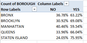
On this at least we can agree: that Donald Trump’s conversational style is not of a piece with say, that of Noel Coward or de la Rochefoucauld, not even the printable utterances. On the other hand, those latter epigrammarians were not able to run for the Presidency of the United States, and Mr. Trump is; and as he presses that Constitutional entitlement beyond what some might deem the breaking point it occurred to me the electorate might be productively served by a look at his Tweets, those on-the-record pronouncements issuing from the mind and the smart-phoning hand of the man who would be commander-in-chief (gulp).

And toward that end I returned to an old companion, the twdocs.com site and its Tweet-dredging apparatus, even as it now charges for its excavations. And so after shelling out $7.80 for the privilege, I was presented with a download of the candidate’s last 3106 tweets, those at least through February 11, two subsequent to his win in the New Hampshire primary. (I’m also not sure if I can present you in turn with my finished product for download, as I’ve paid for it. So until my legal department rules otherwise I suppose you’ll have to spend $7.80, too, understanding of course that, depending on the time and day on which you order your tweet collection, it’ll depart slightly from mine )

The first analytical order of business is to do something about the dates holding down the created_at field in the A column:

tweet1

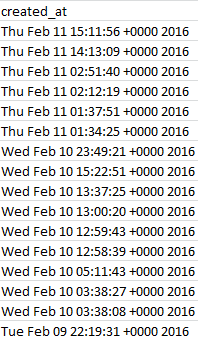
Surprise – they’re not dates yet, at least not by Excel’s formatting lights. All those +0000 2016s get in the way of proper date standing, as do the Wed, Tue etc. day-of-week qualifications that likewise can’t comport with the application’s date-reading defaults. But the task of repacking these now-textual data into usable dates is considerably trickier than I first thought, unless I’m missing something terribly elementary and decisive.
First break open a new column between A and B and call it Date. In what is now B4 enter:

=VALUE(MID(A4,5,15))

The MID puts the tweezer to the text label in A4, culling the 15 characters proceeding from position 5 in the cell. (We’re happy to take advantage of the fact that all the A-column data comprises 30 characters, freeing us to copy the above expression as it stands all the way down B.) And because that MID result remains textual, the VALUE supplement completes A4’s changeover to a duly accredited quantitative entry: 42410.56765. Reformat that handsome value to Short Date mode and the whole process culminates in an eminently usable 2/10/2016. So what’s tricky about that?

Not much, to be sure. The tricky bit doesn’t start playing up until cell B608, whose partner in the A column records the first of Trump’s 2015 tweets. B608 evaluates to 12/31/2016 – and that’s because considered alone, apart from some qualifying year reference, Dec 31 23:21:49 defaults to the current year (and it’s the two-year spread of the data here that works against approach to this problem I offered in this post). Enter 12/31 in any cell, after all, and Excel gives itself no choice but to assume that the implicit year in there is the self-same one in which the datum was entered. The 2015 in A608 won’t help, either, because the label Dec 31 2015 can’t be properly read by VALUE – but Dec 31, 2015 is automatically read as a date.

Thus if upon returning to B4 we try

=VALUE(MID(4,5,6)&”, “&RIGHT(A4,4)

That does seem to work.

That rewrite in effect string-concatenates “Dec 31, ” and “2015”, the latter having been made available through the RIGHT addendum, into Dec 31, 2015, and again Excel can re-evaluate that version into a bona fide date. (Note the “, ” interpolation, complete with the space that follows the comma.) You’ll observe, of course, that we’ve barred the time data from the expression, but we can still pull times out separately if we need them.

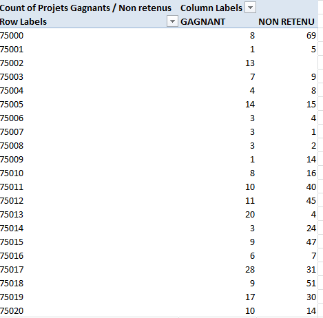
While you wait for the dust settles superimpose a Paste > Value from the B data back onto itself in B, and format the field in Short Date terms; now we can group the tweets by chronological units, as per this pivot table, for example:

Row Labels: Date (Group by Months and Years)

Values: Date (Count)
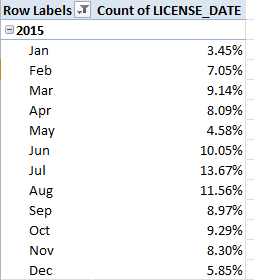
I get

tweet2

The spreadsheet picks up on August 25, thus accounting for that month’s small accumulation, and again the February 2016 numbers halt at the 11th. The large October complement appears to feature many tweets Trump has quoted from other tweeters (these are apparently not categorical retweets), but even so doesn’t that possibility doesn’t explain the extent of quoting activity that month. Note that, even interpreted pro-rata, Trump’s February tweets fall behind January’s velocity, a slowing perhaps a creature of his stepped-up primary campaigning this month.

Now if tweet times-of-day do interest you push through a new column after Date, call it Time, and in what is now cell C4 enter

=VALUE(MID(A4,12,8)

That is, we’re reprising VALUE and MID here, this time recalling the eight time characters starting at position 12 in each cell. Again copy down the column, and Paste > Value atop itself. Then this pivot table should tell you want you want to know:

Row Labels: Time (Group by Hours only; turn off the default Months selection by simply clicking it).

Values: Time (Count)

I get

tweet3

What I think is happening here – and I have to check with TWDocs on this – is that the tweet times have been transposed to my GMT zone, five hours ahead of the East Coast in the States. If I’m right, then the curiously high tweet total for 3AM really harks to 10PM Trump time.

But I’m not sure – let me tweet Mr. Trump and ask him.

Edmonton Pet Licenses: Un-leashing the Data

4 Feb

What makes a dataset interesting? A slightly dangerous question, to be sure, exposing as it does the respondent to charges of extreme geekiness and other personality shortcomings likely to result in relegation to the B party list. But enough about me; let us rise above the ad hominems and endeavor to actually answer the question.

Apart from data that is (eventually) ready to use, of course, an interesting set would likely comprise enough records to make pivot tabling and other pattern-seeking enterprises worth one’s while, and enough redundant field items to justify some manner of grouping (although remember that even unique time data can be grouped, too). What might not be required, however, is some compelling topical theme to which the analyst might be drawn. Rather, it may be that the very fact of the set’s manipulability and the prospects for novella it is poised to deliver, that’s interesting sui generis. In other words, play with any data that lends itself to the playing, and something of interest could well follow.

For an instructive see-what-I-mean, consider the Canadian city of Edmonton’s open data site and its stirringly-named Pet Licenses by Neighbourhood dataset (it’s there for the downloading via its blue export link; and at 8 megabytes it’s nothing you can’t handle. And the “u” in neighbourhood is where the Canadian part comes in). I’m not a pet lover, and that is part of the point – because a few step-throughs across the data should uncork some odd, interesting sociological truths nevertheless – even to an undomesticated type like me.

At least it should after the preliminaries are battened down. For openers, we don’t need the COUNT field and its unrelieved, undifferentiating spate of 101,472 1’s. We also could do without the LOCATION field, which unaccountably concatenates the adjoining Latitude and Longitude data into a redundant and conspicuously less serviceable set of text labels. And again (we’ve seen this before), the time-bearing format of the LICENSE_DATE items puts every time in every cell at 12:00:00 AM, and that means we don’t need any of those midnights, either.

I’m also not sure what interpretive gain is to be realized by the YEAR, MONTH, and MONTH_NUMBER fields, when all that information is effectively and already bundled into LICENSE_DATE; and if you charge me with hyper-criticizing the dataset, keep in mind that with 101,000 records no one is going scan, and then go on to mentally pivot table or filter, the data. If any aggregate sense is to be imparted to these records then some Excel mechanism will have to be brought to bear upon them; and if so – that is, if you’re pivot tabling and grouping years and months anyway – then the above fields can’t really add anything more to the analysis (it’s true that a pivot table grouping of LICENSE_DATE months will yield a 1, and not a January – but month names could be referenced by a simple VLOOKUP table). Strike off COUNT, YEAR, MONTH, MONTH_NUMBER, and LOCATION, then, and you’ve lightened the workbook by 500,000 cells . (I also don’t know why the data for 2014 is so scant (280 records), in view of the fact they report licenses for all 12 of the year’s months.)

But we haven’t gotten to the interesting part yet, and I didn’t come this far just to disappoint you. Try setting this pivot table for starters:

Row Labels: NEIGHBOURHOOD

Column Labels: PET_LABELS

Values: PET_LABELS (% of Row Total; turn of Grand Totals)

(Note that three records don’t identify a pet type.) Apart from the fact that according to Edmonton’s estimation it has 321 neighborhoods (excuse the contrarian spelling – I’m American), and that more than two-thirds of the licenses overall were issued to dog owners, it’s the variation by neighborhood that puzzles and intrigues. Why should 50.62% of Strathcona’s 815 pet licenses go to cats, even as that species accounts for but 25.1% of the 1210 certificates handed out in Summerside? Why, after all, should pet preference align with location? That, it seems to me, qualifies as an odd sociological truth – not necessarily an unexplainable one, but an odd one just the same.

Then try this simple but provocative table:

Row Labels: LICENSE_DATE (Group for months and years and filter for 2015, the year that contains the lion’s share of the data – pun slightly intended)
Values: LICENSE_DATE (Count, % of Column Total)

I get:

ed1

Some pretty broad disparities in there, and most notably for some monthly pairs. Is the spike in licences from May to June a concession to vacationing children clamouring for a Fido to call their own? What about the leap from January to Februrary, or the April-May slump? Remember that we’re considering 100,000 licenses, so the monthly breakouts seem reliable.

And for all your budding sociologists out there, know that according to this site Edmonton comprises 316,000 households – of which 93,000 garnered a pet license in 2015. That’s nearly 30% of all residential groupings in the city barking for a pet in one year (though the licenses have to be renewed annually)– and that’s a number to compare to other cities.

And in keeping with the spirit of all this creaturely activity, I’d also recommend that you position your pivot tables starting in cell K9.

Pun definitely intended.

Going Back To Your Routes: NYC Bus Data, Part 2

26 Jan

With its buzzing confusion of 1’s and 0’s, the spreadsheet ledger of the stops and starts of the Q44 looks for all the world like the leaked innards of some secret binary code, but the numbers are assuredly public; each 1 remembers the time and the place when and where a Q44 passed by or came to momentary rest at a scheduled stop.

And if you sum all the 1’s (add the 0’s too, if you like) your formula is going to report 507,218 back to you, rather a large total that counts the number of times the Q44 traversed a stop in September, 2015. And do the subsequent math; divide the sum by 138, the number of apparently operative stops on the route (remember that stop 103900, wherever it is, is empty and apparently isn’t serving riders) and you get the approximate number of Q44 runs (about 3,600) across the month. Divide that result in turn by September’s 720 hours and you’ll find a Q44 heading your way around five times an hour, and that sounds about right.

But companion analyses of the stops aren’t quite as forthcoming. Take note of the 1’s informing any particular row, for example 14959, a pinpointing of the 44’s daily (or nightly) round at 4:39:28 AM. A sideways scan along the row turns up several rivulets of consecutive 1’s staking contiguous stops, e.g.

bus21

Now even those among you who’ve never stepped aboard a 44 will reject the likelihood that four of them would find themselves queued along adjacent stops at 4:39 in the morning. Far more probable, of course, is a tracking of a very solitary bus sailing along its appointed round at that time with all due speed, rolling through the four stops in the two-or-so minutes culminating in the next interval – 4:41:36 (thanks to Open Bus contact Justin Tillman for corroborating the above). As a result of that sort of double and quadruple count, an unerring read of the number of different buses motoring through a particular interval’s row fails to resolve, at least not without a deep and lengthy think.

But there may be practicably more to learn by thinking vertically instead – that is, for example, by asking about the timing activity of buses pulling into, or past, any given stop (thanks again to Justin for commending the strategy); and those comings and goings are headed down the columns.

But if stop-specific activity is what you want to track you won’t want to pursue an average times-between-buses per metric; that’s because averages can’t do justice to the commuter’s daily scourge – the bunching of buses in maddening fraternity that should have been properly spaced apart (something I’ve actually seen today; I’m in New York and have witnessed several bunched 44s) . After all – think of 5 buses in a hour wheeling their way past stop A, each arrival lock-stepped precisely 12 minutes after the previous one. Then think of one bus traveling through A and succeeded 55 minutes later by four buses packed into the next 300 seconds. Either way you get 5 buses an hour, or one every 12 minutes – and that average isn’t telling your story.

The stat that you need, then, is a standard deviation, a measure that’ll say something about the variation in the bus spacing, and looks past the deceptive flattening that averages perpetrate upon the stop times. And indeed it’s standard deviations on which Open Bus relies in their Final Averages spreadsheets (click on the 2015/9 data link to see one. You’ll have to parse these data with a Text to Columns routine once you download them, by the way), and for two reasons, I think: the one I’ve just cited, and the scheduling realities of routes, on which some buses simply run more often, and the same routes run variously often per time of day. Again, then, an average can only mislead and fail to properly compare the numbers, both between and within different bus lines.

But the route toward standard deviation is paved with issues, not the least of which is the assignment of each bus stop to its own field, and not to the item status I’ve espoused many times in past posts. On the other hand, with 2,000,000 cells of data the sheet simply can’t reinvent itself into a like number of record rows, so we have to make do with what we have, and my hopeful suspicions notwithstanding I’ve been unable to set forth a single array formula that could be copied beneath the columns of each stop. So what I’m pushing now with all due diffidence is a pivot-table-fronted “solution”, one that imperfectly requires that only stop be considered at a time – and that’s imperfect to be sure. But it goes like this:

Row Labels: Any stop (I’ve selected the first, stop_503964; filter for its 1’s only)
Time

Values: Time (Show Values As > Difference From > Base Field: (time), Base Item: (previous)

bus22

In an occupied cell – I’ve chosen I1 – enter =STDEV.P(B5:B10000)/60
I get, for stop 503964, a standard deviation of 10.28 minutes between bus appearances.

Now to translate: I’ve selected the Time field – comprising the rawest of UNIX raw data counting the number of seconds elapsed between the values in the data and January 1, 1970 – because we’re concerned to figure times elapsed between buses sighted at the particular stop. We’re not now interested in the date of the events, but rather only their timings relative to all the other bus sightings. We need to filter for the 1’s populating a given stop simply because that value represents the appearance of a bus at the given time, and so we want to compare these and only these. The Time field is made to reappear in the Values area because we need to subject Time’s numbers to a mathematical operation – each time’s difference from the immediately previous time, and these won’t appear unless they’re called up, as it were, by the times in Row Labels. Thus each time at which a bus appears is subtracted from the next bus appearance, returning the intervals out of which the standard deviation is fashioned. The result is then divided by 60, because all the times are expressed in seconds. The standard deviation formula is itself external to the pivot table, because while you can ask a pivot table to perform standard deviations here it’ll calculate the SD for each item, and there’s no standard deviation for one value.

To learn the standard deviation for any other stop you need to drag the active stop field name off the table, substitute the next desired stop, and again filter for the 1’s. Imperfect indeed, because the process is necessarily sequential. But it works, more or less.

Got that? While you work on it, I’m trying to figure out how many rides I get on my Metro Card – now that’s a challenge.

Going Back to Your Routes: NYC Bus Data, Part 1

12 Jan

There are more expedient ways for getting around New York than on its buses, but if you like the slow, scenic route – provided you know what you’re looking at – the deal isn’t half bad. And nowadays the data miners are hopping on too, their sightseers’ oohs and aahs inspired by the buses themselves and their GPS-driven must-sees.

And now those attractions are even available to armchair flaneurs worldwide at  theopenbus.com, the depot into which trip data for New York’s buses are parked, and in felicitous spreadsheet spaces. Click the home-paged Raw Data link and again on the next-up Bus Data button for its bank of monthly numbers waiting at the next stop. I clicked Sept. 2015, drilled down into the q44 rawdata.csv  link, and downloaded away:

bus1

I’ve probably spent more time on the Q44 bus – its drunkard’s walk shambling there and here from its square one in deepest Queens and funnelling northward across the Whitestone Bridge until it comes to rest at various Bronx termini – than all the elite band of readers of this blog put together. A very long, money’s worth of a route, then, its 139 columns are each appointed to its like number of stops (though stop 103900 in column BV is utterly empty).

You’ll want to download the important three-page Methodology booklet from theopenbus site, a detailing of what the spreadsheets mean to tell us by their outpourings of 1’s and 0’s. For starters, though, we can agree that a 1 records the arrival of a bus at (or near) a route’s stop as coded in the respective stop columns, and at the approximate time reported in column A. But what do the 10-digits crowding A have to do with arrival times?

Appearances notwithstanding, quite a bit. The numbers in A mask durations expressed in UNIX time, a dating metric conveying the number of seconds elapsed from 12:00 AM, January 1, 1970 to any given date/time. Apart from the question of why the bus time-tracking here is so conducted (a question not taken up by the Methodology booklet), it’s clear that both presentational and analytical dictates call for a translation of the UNIX readings into something rather more recognizable to you and me.

And that’s something we can do. Here’s what I did: In readiness for some future pivot tabling of the data set I introduced two blank rows atop row 1, posting in A1 I the value 86400 – that is, the equivalent in a 24-hour day diced into seconds (in fact the astronomical cognoscenti have slipped an occasional leap second into the day reckoning, but UNIX ignores these). I then range-named A1 sec. The intent, then: to divide every entry in A by sec, thus returning the number of days separating the entries from the January 1, 1970 baseline. I then marked out a new column between A and B, named that incipient field datetime, and entered, in what is now B4:

=A4/sec

Copy down the column and you’ll have realized the number days distancing each A datum from the January 1, 1970 point of inception. B4, for example, evaluates to 16679.4163 – and if you divide B4 by 365.25, the approximate duration of the average year, you’ll get 45.66575, or the number of years counted off from the UNIX touchstone (and the decimalized half of that value represents B4’s time of day, and most certainly can’t be ignored or rounded away).

But 45.66575 years doesn’t deliver the actual date and time divulged in B4; again, our result keys itself to January 1, 1970, and not Excel’s January 1, 1900 date of embarkation against which all other dates are counted. As such, B4 requires a new additive – Excel’s numeric equivalent of January 1, 1970 itself. Combining that with B4, then, should yield the cell’s actual date and time, because all the days elapsed from January 1, 1900 through January 1, 1970 plus the original value in B4 should then be accounted for and return the actual, desired date (and time).

In that light I entered 1/1/1970 in B1 and called it yr. Remember that 1/1/1970 is merely a formatting guise; click the down arrow on the Number Format drop-down menu in the Number button group and observe the date’s numerical equivalent, 25569, what really matters. I then amended the expression in B4 to:

=A4/sec+yr

(Yes, the order of operations will take care of itself here.) I get 42248.42, and by applying this slightly customized format

bus2.png

 (I added the :ss to the off-the-shelf format catalogued above by Excel, because we may want to think about seconds here) to the cell, I wind up with

That looks good, and so I can copy it down B, after which you’ll probably have to autofit the now-constricted column. You’ll also note that, even as the Methodology booklet describes a typical three-minute gap between tracking observations, our data are overwhelmingly standardized on a 2:08 interval, with exceptions tending toward a doubled, 4:16 timing.

Now the bus route tracking intervals read intelligibly. Ok – there’s more to think about, but I know you have a bus to catch.

NY Dept of Buildings Permit Data: Constructing the Analysis

5 Jan

What goes up must go up, and for you basement dwellers (I’ve been there), what goes up sometimes goes down, too. For New York, the city of the majestic area-chart of a skyline, going up comes with the territory- marked out in part by the Open Data New York spreadsheet of Department of Building (DOB) data permits issued from the middle of July 2015 through the end of last year, and issued in turn to all here. (As per previous New York open data offerings, click the blue Export button, and follow with a click on CSV for Excel. Note that because the sheet is recurrently updated, your download will sprinkle some 2016 permit data as well into your mix).

It’s a big file, about 28.5 MB big, though we’ve seen them far bigger. In any case, though, my minimalist demiurge impels me to flap my scissors at any field that’s likely not to contribute to the analytical fray, starting with the extraordinary Oil Gas field in column W, which appears to consist of exactly one record – its header. But run a

=COUNTA(W1: W93814)

at the field and it reports back with a 93814, a bewilderingly insensible tally until you click any cell in W and click in turn in the Formula Bar:

dob1

That cursor is flickering one space too far to the right – and that means there’s some there there, according to my reckoning 93813 cells worth of a single tap of the space bar, give or take the 150 or so that seem to have tapped out two or three spaces. I’m not sure what happened here, but we don’t need to know. Our next move is less ambiguous – just delete the column.

But there’s more. Precisely the same data eccentricity seems to beset AH through AJ (that’s their original columnar positions prior to the deletion of W); their cells seem in nearly every case to comprise nothing but free-standing spaces, and as such these too could be safely deleted.

There’s little doubt that all of these abandoned cells once contained meaningful data, but for some reason presently unavailable to you and me they’ve been swept clean by some well-meaning individual or gnarled branch poking out from some decision tree. In any case, I’d also make short work of the DOBRunDate field anchoring the data set’s final column; one assumes this chronology simply time-stamps the permit’s entry into the set. You could also probably tear out the next-door Owner’s House Zip Code and Phone # fields, unless you have a project of your own you’d like to discuss with one of them.

I’m also moved to do something about the Residential field, whose YES affirmations stand alone. Any disposition other than YES is simply met by a blank cell in the field, and if we entitle ourselves to the surmise that the blanks mean a reciprocal NO, then a Find and Replace to that effect should be conducted.

(Note, by the way, that if you wiggle your mouse over the i accompanying each field header on the Open Data site’s page you’ll receive clarification about that field’s data codes.

dob9

And if you don’t see the i right away, wiggle your mouse over the header some more. Thanks to Karin Hellman for enlightening me.)

But there’s a deeper attribute of the data that’s angling for our attention. A look inside the Bin # number field uncovers a myriad of duplicates (Bin, by the way, stands for Building Identification Number). And that plurality appears to signify different phases of construction or types of work performed on the same property. The problem, then, is to decide how these data might be counted. One could, to be sure, commence a pivot table with this initiative:

Row Labels: Bin #

After which each Bin would surely be identified but once, befitting its placement in Row Labels. But substitute Borough for Bin #:

Row Labels: BOROUGH

Values: BOROUGH (Count, of necessity; the data are textual)

BOROUGH (again, here by % of Column total)

And you get:

dob2

(Of course you’d probably want to retitle the headings.)

And here’s the problem: what we learn from the above distribution is the number of permits the city issued across the mid-July end-of-year interim, not the number of distinct properties on which work was, or continues to be, done. Now while that finding may possess a utility all its own, it seems to me that a more instructive survey of permit activity would consist of a counting of the discrete properties requesting permits to proceed – and if you’re convinced by that prescription (and even if you aren’t), you then need to confine each bin number to a single incidence among the data, via the Remove Duplicates feature:

dob3

Take that step and you’re left with a precipitate of 32,383 unique Bin #s (again, your downloaded data set may have a few more records than mine. For a well-known array formula for counting unique entries in a range look here, for example). And that means that the number of actual properties for which permits were issued is a good deal fewer than we might have supposed. Of course, even 32,383 issuances stack up to about 200 different properties a day. It is New York, after all.

Now reproduce the BOROUGH distribution pivot table we see above with these unique Bin # identifiers:

dob4

We see that the intra-borough proportions have shifted strikingly. Here Brooklyn realizes virtual permit parity with Manhattan, even as the latter borough piles far more permits onto the DOB desks. Perhaps Manhattan’s non-residential building activity and those structures’ more various inspectional demands steps up the bureaucratic attentions.

Indeed – pull out that second BOROUGH set of values above and roll in the Residential field, complete with its emended NOs, into the Column Labels area, and:

dob7

Viewed in % of Row Total terms (and again you don’t want or need Grand Totals here that ineluctably return 100%):

dob6

We see Manhattan’s notable edge in the NO – that is, non-residential – permit seekers.

But it’s quitting time; now you can take off your hard hat.

Takes on Tax; Australian Coporate Data

29 Dec

If it’s legal it isn’t tax evasion. Play by the rules and then what you do is ruly; and that all-but-tautological bromide must be festooning the boardroom walls of multi, and singly, national corporations all over the marketplace.

The question about who pays how much tax is a rather large one, of course, and one efficient means of entrée to the question presents itself through the Australian government’s spreadsheet citations of the tax obligations of corporate entities that earned income in excess of $100,000,000 (those dollars are Australian, one assumes) in the 2013-14 fiscal year. And one can’t help but notice that for about 35% of these heavy hitters, the tax obligation amounts to zero (see the Guardian’s link to the data, and download the actual sheet here.

Of course the workbook can’t by itself derive the rights and wrongs about entities that pay more, less, or no tax (and six did owe more than a billion dollars, if that makes you feel better), but the data can point us to some auxiliary questions about the numbers just the same, provided we pay some attention to what needs to be done with them. (For more on the larger meaning of the numbers and possible accountings for the zero-payers, click on the link in cell A8 in the workbook’s Information tab.)

I’m thinking first of all about the blank cells that, in virtue of their vacant spaces, mean to report either no taxable income or no tax to be paid. Try to pivot table and group these unattended locations, though, and they’ll direct an unlovely (blank)-notated cell to your results; and while blank tiles may be a useful find if you’re playing Scrabble, they need to be exchanged here for something more substantive. The simple workaround: just select D3:E1541 and run a Find and Replace, finding nothing (that is, leave find blank) and replacing these with 0. (Note that you could have, under standard circumstances, have fearlessly selected all of columns D and E, because Find and Replace simply wouldn’t have bothered with the million or so wholly data-devoid rows idling beneath the records. But because two smaller, subsidiary data sets sit below row 1541 they’d have received the zeros as well, fusing them contiguously to the larger set. And that would incorporate them inadmissibly into any pivot table ).

Now of course if your one and only concern is to count the taxless entities without taking additional pains to contextualize that result, you could leave the zeros behind and simply write

=COUNTIF(E3:E1541,””)

That’ll deliver 579, or 37.6% of the 1539 enumerated firms. But if context is your game and you want to juxtapose those numbers to the remainder of the data set, you’ll want those zeros in there.

But if the zeros may be necessary they probably won’t be sufficient. For example: say you want to calculate and/or group the no-tax entities by their average income in order to see how they compare with the other 1,000 corporations who paid taxes, or at least paid something. Try pivot tabling the data, e.g. starting with

Row Labels: Tax Payable $

And you’ve already met up with a problem, because if you group the Tax Payable figures the 0 will be absorbed by a wider grouping interval – and you want to isolate the zeros, to the decisive exclusion of the remaining entities. And here we stub our toes on one of the subtle shortcomings of pivot tables – their immovable insistence on grouping data in obstinately equal intervals.

But there’s a plan B of sorts – a formulaic assortment themed around AVERAGE that seems to do what we want to do.

It goes something like this: First, I’d range-name the income data in C3:C1541 inc, and dub the corresponding tax payment range in E3:E1541 tax. Then enter somewhere in an open cell area (I’m starting at I8 in the Data sheet) the following tax-payment intervals:

austax1

Of course a measure of capriciousness laces those thresholds, and you can refit them to your liking (you’ll just have to get all those zeros under control; remember, you’re dealing with hundreds of millions, and billions).

In any case we first want to return the average income of those entities that paid exactly nada in taxes. I’d try in J8 (the cell alongside the 0 interval marker):

=AVERAGEIF(tax,0,inc)

This sidekick to COUNTIF identifies in its three arguments a range bearing the IF criterion, the criterion itself, and the range to be averaged. Here, then, we’re looking at the average income of all entities paying 0 tax; and appropriately formatted I get

700,007,786.02

But because the next five thresholds patrol a band of values, i.e. we want to roll out the average income of those firms having earned between 1,000,000 and 10,000,000 – we have two formulaic options at hand. One, AVERAGEIFS, the souped-up model of AVERAGEIF, drums up an average on the basis of multiple criteria. It works, of course, but exposes its downside of a relatively convoluted syntax (look it up and try it if you doubt me). The second possibility, an array formula, is actually easier to write. In J9, for example, I can enter

{=AVERAGE(IF(tax>=I9,IF(tax<=I10,inc)))}

And again, this being an array formula, the standard concluding tap of Enter must be replaced here by Ctrl-Shift-Enter. The formula identifies, via a pair of nested IF criteria, the outer bounds of the band of income criteria. The “inc” argument earmarks the range of values to be averaged, provided they meet the two criteria (note that, so far as I know, the IF(AND…) phrasing that works for so many multi-criteria non-array formulas doesn’t seem to fly here – hence the reversion to the nested iFs instead).

The above formula can be copied from J9 through J13, that is, down the range whose averaging requires two “between” criteria. The final calculation, however, performed in J14 can be worked one of two sparer ways – it’s your choice:

=AVERAGEIF(tax,”>=”&I14,inc)

{=AVERAGE(IF(tax>=I14,inc))}

The former, the mainstream AVERAGEIF option, demands a criterion submitted in string- concatenated terms, in virtue of its equal-to-or-greater-than condition (you’d need to write such a criterion the same way in COUNTIF, by the way). The second, array alternative enforces no such stricture, however; its equal-to-or-greater than condition is written straightforwardly, but again conclude the process must culminate in that Ctrl-Shift-Enter.

Either way, after it’s all been run past the folks in quality control I get

austtax2

We see, then, that entities that paid no tax in in 2013-14 averaged substantially higher earnings than those that earned somewhere between 1 and 10,000,000 dollars, though the payments advance upward in a straighter line after that across the upper thresholds.

Ok, I’m not sure what that means yet; but I’ll let you take it from here.

Barnet Library Data, Part 2: Not Always By the Book

22 Dec

Our poke through the stacks of the London borough of Barnet’s libraries and its data necessitates this bit of whispered repetition: If you’re duly pleased with its compendious workbook as it stands – with its week-driven worksheeting of the libraries’ visits and its attending monthly and yearly summations – then you can stop poking, and feel free to yank your favorite pot-boiler from the fiction shelves and have a seat (though you’ll have to use my card if you actually want to borrow the book).

But again, if you want to do something else with the data – something that isn’t already there and thus requires your expert intercession in order to bring it to light – then I repeat: all the visit data could have, and probably should have, been reined into a single data set, from which all the multitudinous sheets could have sprung, along with those something elses.

But you heard all of this last week, and anyway it’s hard to issue pronouncements from a soap box when you’re whispering, so let me step down, speak up, and move on.

First, for those of you worldwide who’ve been wondering – and I put this question to an actual Barnet librarian – the daily-visit numbers beam their way into the data from an electrified turnstile through which patrons pass, after which the number crunchers divide the total by two. And the MOB library “branches” cited in row 19 across the worksheets signify mobile, book-bearing units that regularly set up temporary shop at selected Barnet venues (thanks to my wife for that datum), while the Home entries in row 20 point to home delivery services available to residents unable to travel to dedicate branches.

Second, and before we get a little bit fancy, you’ll want to take note of a few oddities that seem to have worked their way into some Total visits calculations (in the P columns) in the monthly aggregate sheets. Note the July sheet arrives at its totals by subjecting the daily figures to a SUM function, but June opts for understatement, e.g.

barnet21

And June is right. SUM adds (no pun intended) nothing to these kinds of results, and should be earmarked for ranges of contiguous values only, e.g.

=SUM(A6:X6)

But because the total visit numbers are segregated in alternate columns, each contributing cell need be typed or clicked -the kind of work to which SUM can’t properly address itself.

But a set of more substantive and disturbing calculations have stolen into the Aug Total visit field, e.g. in P5:

barnet22

Apart from the dispensable SUM, two references – the ones that should be counting Monday and Friday visits – are missing for each library down the column, and I don’t know why. Reasons aside, the pertinent D and L-column figures need to be restored to the formulas, or their answers will remain unambiguously wrong.

Now given those every-other-column sums for the Total visits and Total hours open fields which require for their summing a whole lot of irksome clicks, I began to think about more graceful alternatives to those formulations as they stand – and it seemed to me that some array formulas might perform those addition tasks gracefully indeed.

You remember array formulas – those super-charged expressions that do the work of many formulas in but a single cell’s worth of syntax. We said something about them there and I’ll spare you the review here, but my first array, composed in a new column and seeking to add only a given branch’s hours, looks like this, assuming we direct our attentions to the Burnt Oak branch in row 5 (I’m looking at the August tab):

barnet23

So what’s this array formula doing? Put programmatically, it’s stipulating that, if any given column heading contains the word Hrs., then sum only those values in row 5 than find themselves beneath one of those headings. And what about the VALUE? It turns out that the Hour data in the monthly aggregate sheets possess textual status (about which there’s a bit more to say), and so the VALUE corrective makes these ersatz numbers real. All this again is being conjured in one formula, and once properly assembled it can be copied down the column. And be advised that array formulas (at least the kinds we’re offering up here) must be installed into their cells by a simultaneous tapping of CTRL, SHIFT, and ENTER (for another useful introductory look at array formulas, make your way here) .

What’s cool about this particular manipulation is that it scans columns for the textual handle it needs, in contradistinction to typical array operations (e.g. COUNTIF, which I’d allow is an array function) that search row data.

But now if you want to gather a seven-day visit total for any branch, in view of the like complication that each day is interpolated among the Hrs. fields and thus separated from its companions, we’re also faced with a small and new predicament – namely, that each visit field-to-be-added is uniquely identified by a day of the week, and hence can’t be addressed by a single search term such as Hrs. But we could write this:

barnet24

Now that looks pretty elegant. All we’re doing here is standing the Hrs. item on its head, as it were. We’re looking for all the field headers in the identified range that don’t comprise the term Hrs., and that Boolean back-door tack seems to work.

Now about the matter of the HYPERLINK(S), and the function bearing that name. As one might rightfully suppose, HYPERLINK stations an address or location (e.g. a web site link) between its parentheses, enabling the user to click its cell and travel to the location linked (for an overview of HYPERLINK and its syntactical requirements look here, and look closely at the examples). You’ve probably noted in turn that most of the monthly aggregate data has submitted themselves to hyperlink form; but it seems to me that they’ve gotten it wrong.

One assumes first of all that the hyperlinks here mean to enable the user to commute to the cell location(s) referenced in their expressions. But HYPERLINK formulas appear only to promote the movement to a singular location when clicked (see this discussion thread, for instance) – and the Barnet hyperlinks group multiple cell addresses, and I don’t think you can do that. Indeed, clicking any such cell uncorks an error message, or at least it does for me.

Note in addition, however, that the HYPERLINKS seem to be able to add the values denoted by their several addresses – even though if you visit any of the cells in question (to click and remain in the cell without firing the hyperlink you can, among other devices, click to the side of the value posted to the cell) and click the Number format drop-down menu in the Home tab, you’ll be told that the cell is in effect text-formatted. We thus seem to have met up with one of those data-type admixtures that seem, depending on the operation to which they’re subjected, to yield textual or numeric outcomes. Click, for example, on a blank cell in the July monthly tab and enter

=H5*3

and the Wednesday visit figure of 863 for the Burnt Oak branch will indeed multiply to 2589. But add the H column via a by-the-book SUM operation and you’ll get…0. Here, then, the HYPERLINK math doesn’t compute at all, the data falling back to text, and I don’t quite understand it all. But observe the ungainly, cell-by-cell summing of the H data in H21. That works, and again I’m not sure why.

But if you want to smartly add that H column, why not try:

barnet25

That pretty simple array formula seems to work too. But stop me before I start feeling proud of myself.

Barnet Library Data, Part 1: Not Always By the Book

15 Dec

So fledging that it’s still in beta, the European Data Portal sweeps across Continental government web sites, reaping gobs of data sets on all sorts of themes, and file formats, and languages (see this mini-directory of data sources, and from where I learned of the Portal).

It’s a vast bazaar of holdings, many of which hold a spreadsheet tag; and not a few seconds after launching my introductory stroll through its aisles was I brought face-to-screen with a workbook – the very first listing behind the Education, Culture, and Sport link, in fact – that details, of all things, patron visit data for the libraries of the London borough of Barnet, the part of the world in which your friendly blogster resides, and one of whose libraries from which some of these words have emanated:

Barnet1

And you can download it right there. (Don’t look for a link actually entitled Download, by the way; after clicking the above you’ll have to click the spreadsheet link on the page that follows, after which you’ll need to tap into the Go to resource link on yet the page after that.)

And once you’ve navigated that gauntlet you’ll have opened a nothing-if-not-remarkable workbook. More than 50 sheets, each one breaking down visitor data for each week of the British tax year (it starts on April 6) for each of Barnet’s libraries, proceeds to count the numbers, e.g.:

Barnet2.png

Remarkable, because staking a week’s worth of activity across a year of worksheets might – or might not – be the very last way one would aim to construct a workbook.

Now if you’ve probably found that equivocation pretty remarkable, allow me to explain, though be advised we’ve trod this terrain before. On the one hand, if you’re happy with the data just as they stand – and to give credit where it’s due the workbook agglomerates the weekly figures into monthly summaries, and moves to furnish the denouement as well – a set of yearly visit totals, all plotted in the April to Mar sheet – then there is nothing more to be done.

But if you want or need to teach the data a round of new tricks – say, a simple filtering of visit activity by month or an arraying the twelve months in one worksheet, or building a running total of visits by branch by month – you have a bit of a problem. The business of aggregating and re-aggregating the data in the service of these and like intentions – in other words, seeing to it that all the year’s data find themselves in one sheet, from which all break-out operations could proceed, including, but transcending, the results we already see in the workbook – could get rather messy.

Moreover, the sheets’ current field apportionments – in which hours of operation data are pinned to each of the week’s seven days, i.e. dispersing into seven fields information that should be concentrated into one – reads wrongly. Same data, one field, it seems to me; or else how can any subsequent analysis of that field press ahead?

And indeed – the Total Hours Open calculations run through in column Q, e.g.

=C5+E5+G5+I5+K5+M5+O5

require a leap-frogging of the non-hour (that is, the day-of-week fields) columns in order to properly reference the hour totals, as does, by extension, the Total visits calculations in P. It sounds messy and unnecessary (there may be more to be said about the hour sums, perhaps in a next installment).

And observe the manner in which the totals for Total Hours Open and Total Visits were realized, e.g.

=C21+E21+G21+I21+K21+M21+O21

Couldn’t all that alternate-column hoop-jumping, compelled by the summing of the hour totals for each day in row 21, have been bypassed with

=SUM(Q5:Q20) ?

I think so. And along similar if not identical lines this expression, in P21 of the Feb monthly aggregate sheet, for example:

=SUM(B21+D21+F21+H21+J21+L21+N21)

Could be written slightly more efficiently:

=B21+D21+F21+H21+J21+L21+N21

We haven’t completed this design survey, but in any event had the workbook’s organization been entrusted to me – and it surely wasn’t – I’d have committed all the data to but one data set, its fields looking something like this:

Barnet3

We’ve said this all before, but the above tack is the way to go, at least according to the experts. True, the data set would comprise about 6,000+ records – each week’s entries for each day for each of the 16 libraries enumerated – but if we’re starting from square one, the work is justified. Do it that way and in fact all of the findings we see before us in the Barnet sheet, and more – will be able to emerge all from one place, all from a series of pivot tables, or even just one.

On the other hand (again), these revisionisms of mine may be less than entirely fair. If the data as they stand in the Barnet workbook tell you everything you need, then sit back and enjoy a good read. But if you, the analyst, plan on learning something more than you’re already learning to date, then I’d put the pedal to Plan B.

Take it from a card-carrying Barnet library patron.

Paris’ Budget Participatif, 2015: Le Vote, Part 2

8 Dec

Put your mind to it, and you can learn a lot from 624 records, not coincidentally the number of urban development projects placed before the all-comers electorate (no age restrictions, you’ll remember) in Paris’ 2015 Budget Participatif referendum. 77 of the proposals opened a Paris-wide scope on their plans, while the remaining 547 drilled their intentions down to the arrondissement level (though some of these, however, subtended multiple arrondissements).

So what is there to learn? One simple but instructive peg upon which we could hang the data would have us break out winning and losing project proposals by their anticipated expenditures. This pivot table comes to mind:

Row Labels: Projets Gagnants / Non retenus (Winners/Losers)

Values: Montant (i.e., budgetary amount earmarked) (by Average).

I get:

budget1

We see, provided I’ve understand the numbers, that referendum winners averaged considerably lower apportionments than the ones voted down. That finding, on the other hand, would appear to amount to more – or less – than a collective press toward austerity. After, the project monies had been rolled into the arrondissement budgets, and so were already in place and available (the Participatif page’s Projet 2015 link opens to descriptions of the 624 proposals, translated or otherwise). Why , then, that the more frugal projects tended to prevail is a question that remains yet unanswered. A reflexive voter aversion to the cheaper rather than the dearer? I don’t know.

Another pivot table natural would urge a scan-through of winners by theme or project category (again the Project 2015 enumerates these in English, should you opt for Google Translate or your local bilingual French ami). We could try something like this:

Row Labels: Theme

Column Labels: Projets Gagnant /Non retenus

Values: Theme (Count)

I get:

budget2

We can now see how the numbers of proposed and approved projects align by theme. The undisputed ruler is Cadre de vie – Living Environment, contributing 41.5% off proposals, and 40.4% of the winners, a notable near-one-to-one association that holds across many, but not all, the themes. Note too the all-losing ten proposals under the Culture and Patrimonie (heritage). Want to read something into that? Check it out, intrepid reporter.

To instill more sense into the above, we could show the values as respective percentages of the Row totals (and again, you’ll want to withdraw the Grand Totals from the sheets; they all add to 100%):

budget3.png

We see Environnment-themed projects exuding a disproportionately winning appeal, but don’t be fooled by the Education et jeunesse (youths) numbers. There’s a clear typo in there, one misspelling Education six times with superfluous T’s, and all besetting Paris-wide (Localisation 7500) entries. You’ll need a Find and Replace here, too, and when you rerun the pivot table you’ll see:

budget4.png

And as for winners and losers broken out by arrondissement:

Row Labels: Localisation

Column Labels: Projet Gagnant /Non retenus

Values: Projet Gagnant /Non retenus

budget5

Here the win-loss fractions seem determinedly unpatterned. Only 10.7% of the city-wide proposals earned their keep, while voters in the 17th arrondissement were happy to approve 47.5% of their 59 ideas and the good people of the 5th arrondissement on the other side of town ratified 48.3% of theirs. The sentiment in the 2nd, however, was incontrovertibly unanimous; all 13 projects put before their denizens got the thumbs up, even as the folks in the 11th and 12th arrondissements liked but 20% and 19.6% of what they saw.

How these differences might be reconciled and understood is a next question that might merit a concerted follow up. It probably won’t do to write off these data with an explanatory plea to random variation, at least not without exploring the sentiments and project ideas attaching to each arrondissement. Remember that about 30% of all proposals won their remit, although that figure was presumably and in effect fixed by the monies made available in the referendum. If we confine our scrutiny to the arrondissement-specific proposals the win rate steps up to 32.7%, but in any case an assertive interpretation of all the victories and defeats would of take the analyst beyond our pivot tables, and there’s nothing wrong with that.

I’m just trying to be helpful; and if Paris’ mayor Anne Hidalgo wants my counsel on the matter, she knows where to reach me. I’ve told my people to let the call go through.

Paris’ Budget Participatif, 2015: Le Vote, Part 1

30 Nov

Can 40 million Frenchmen – and women – be wrong? I don’t know – but how about 66,687 of them? That not-nearly-as-memorable, indubitably less-than-round number counts the Parisians who voted their preferences in this September’s Budget Participatif, a referendum aiming to peel off about 70 million euros for a raft of projects in the city depending on the voters’ ouis or nons. And the spreadsheet ticking off the winners and losers and appearing on the Open Data Paris site, is right here:

resultats-des-votes-budget-participatif

(If you’re in Google Translate mode you can also download the sheet directly from the Participatif site, with approximate English renderings of project names. It’s pretty messy, though.)

Yes, we’ve been here before, having spent some time last year on a spreadsheet detailing the 2014 outcomes, and we’re back; and if my cognates-reliant French and/or Google Translate have done what they’re supposed to do – and neither bet is sure – the Participatif site is telling me that eight Paris-wide and 179 arrondissement-specific (that is, one of Paris’ 20 districts) projects won a designated outlay, and so will be readied for implementation (you can throw a Google Translate at this page for Budget FAQs and the like, and hope that it sticks).

Note that voters, who were not beholden to age eligibilities (a peculiarity to which we called some attention in our previous Participatif piece), were enfranchised to endorse ten city-wide as well as ten arrondissement projects; but our spreadsheet reports the aggregated vote sums for each proposal across its 625 rows, aggregating itself into a most petite 69,600 bytes, or about one per voter.

The worksheet presents some standard Open Data Paris identifiers, e.g. wrapped-text headers (and some field cell contents) that need smoothing, and more important, vote-total data in columns E through G that purport a numeric standing but resolve themselves, at least on my Yankee screen, as text. But the sheet can’t be faulted for that disjuncture, because it delimits decimal points by the Gallic comma in lieu of the Anglo period/full stop, and as such reads textually here, at least for me.

That’s a problem, of course, but one easily attended to. I’d run a Find and Replace on the disrupted fields, something like this:

bud1

Press this remedy forward and the numbers come back, albeit with a three-decimal escort that we really don’t need and that should be formatted away. Indeed, I can’t account for the single decimal that attaches itself to the original French-formatted values either; the votes are votes, and as such can’t be fractionated, at least not for this sort of election. And you’ll observe at the same time the decimal-free Montant (Budgeted sums) field, requiring no numeric restitution at all. And the Identifiant (proposed project ID) field in A is similarly beset, and should probably be likewise cleared of its textual, decimal-laded baggage. But on the other hand, they’re IDs, and so we’re not going to add or subtract them.

Note as well the 75000 entries in Localisation, the field that supplies the arrondissement postal codes that position the project proposals in their places. 75000 then marks a Paris-wide project, also corroborated by their blank longitude/latitude coordinates in column J (XY).

Once the data have been put through these paces, some simple but informative findings are out there to be found. For example, perform a simple SUM of the vote totals in G and you’ll register 733,381; divide that overall count by the referendum’s 66,687 voters and you’ll realize an average of almost exactly 11 selections per voter – around 10.99736, if you take the number that far. Remember that each participant was in effect granted 20 votes, as it were, per the 10/10 city-arrondissement split described above and so it would seem that voters either knew or cared too little about some of the projects. But it’s a free country.

Next note the VOTES PAR INTERNET and VOTES PHYSIQUES data, in line with the option afforded voters to cast their ballot either online or at an in-person venue. If we draw up a new field in K, which I’m calling Internet/Physique, and enter in K2:

=E2/F2

We will have thereby figured the ratio of cyber to land-based votes by project, once you copy down K, of course. We can then try this pivot table:
Row Labels: Projets Gagnant/Non retenus (that is, project winners and losers, respectively)

Values: Projets Gagnant/Non retenus (Count)
Internet/Physique (Average)

I get:

bud2

Decimals aside, we see that the Internet/Physical Place proportions for project winners and losers is nearly identical; that may merely substantiate a default, null hypothesis, but I would have suspected some disparity along winner-loser lines, for whatever reason, and it seems I’d have been wrong. On the other hand, I should have been wrong, because the multi-choice project vote option vested in each participant might have circulated sufficient variety among the per-voter selections to in effect swing us back to the default prediction. That is, given the pool of 600-plus projects from which to decide, the for/against distributions might well be expected to vary “randomly” by type of voter venue.

However, if you break out the ratio by arrondissement:

Row Labels: Localisation
Values: Internet/Physique (Average; here I’d format the numbers to two decimals)
Total (Sum)

The data give way to striking maldistributions:

bud3

This time the ratios careen all across the table, and I’m not entirely sure why (remember the large 75000 total reflects the vote for city-wide projects. In addition, it’s not entirely clear that the voters were required to live in the arrondissements for whose projects they voted. See the Participatif site, FAQs 31 and 32. And one more important in addition: note the above totals factor all 733,000 votes, and not the isolable individuals who cast them. Thus the numbers here could be roughly divided by 11, the average vote-per-voter, without any apparent impairment of the meaning of the results. But it’s also possible internet voters opted for more projects than those of the in-person cohort – or vice versa. That potential skew merits consideration, but it can’t be plotted directly from the spreadsheet data.)

It’s quite noteworthy that the voters in the posh 75007 and 75008 arrondissements favoured in-person balloting, as did participants in the more-or-less trendy 3rd and 4th. But the hip, Left-Banked 6th was most internet-partial, as was the 9th in the center of the city. Whether these skews are properly understood as attitudinal or logistical, i.e. a function of the accessibility of the on-the-ground polling places, is a matter for a round of research. We could add however, that the correlation between Internet/physique ratios and arrondissement participation sizes is an indifferent .12.

So at least that doesn’t matter.