Terrorist Demographics: US Data

23 Nov

Charles Kurzman studies terrorists. Among other things, to be sure; a professor of sociology at the University of North Carolina at Chapel Hill and a co-chair of the Carolina Center for the Study of the Middle East and Muslim Civilizations, Kurzman knows whereof he speaks about that deadly cadre; and among the pages on his Kurzman.unc.edu web site he’s filed a Muslim-American Terrorist Suspects and Perpetrators spreadsheet, a three-tab chronicle annotating the names and activities of that particular demographic and kindred organizations dating from the 9/11 inception point through January 29 of this year. It’s available for download here:

Muslim-American Terrorism

While of course the sheet’s contents are key, the medium is what it is, i.e. a spreadsheet , and as such calls for a consideration of its data in the terms appropriate to it, particularly if you want to take the analysis forward. First note the field header’s resolutely vertical alignments, those spires constructed via this perpendicular format:

ck1

You may find readability compromised as a result; I’d have tried a Wrap Text alternative, which, if nothing else, would grant you the zoning variance to lower all those towering row heights.

I’d also call some attention to the failure of the sheets to apply stand column autofits to the entries protruding into the cells to their immediate right. In addition, the Data as of February 1, 2012 header in A1 of the Support for Terrorism sheet doesn’t quiet square with Year of Indictment data in column D that extend through 2014. And I’d also left-align the sheet’s centered text-bearing cells, in the service of additional clarity.

Turning to more substantive possibilities, a breakout of the Violent Plots suspects by age (and with the exception of three Unkowns, each record uniquely identifies an accusee) should prove instructive; but the Under 18 entry in cell S219 for an unnamed minor suspect blocks the Group Selection process, should you be interested in bundling the ages. You could, then, replace that textual legend with a 0 and filter it out of the table, e.g.

Row Labels: Age at time of arrest/attack

Values: Age at time of arrest/attack (Show values as % of Column Total)

Group the Ages into bins of say 3 years each, tick away the <0 and 0-2 groupings, and you’ll see

ck2

That more than half of the suspects fall into the 26-or-under class should be little cause for surprise, but the reciprocal, pronounced fall-off in the post-32 cohort may tell us something about the swiftness by which the appeal of terrorist causes attenuates – perhaps. (The contrastingly spotty Age at time of indictment data in the Support for Terrorism, along with a similar data shortfall for other parameters on the sheet, is noteworthy.)

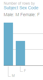
The Sex distribution of suspects,

Row Labels: Sex

Values: Sex (Count, of necessity; the field is textual)

with its sharp incline towards a 96% male representation, is again not arresting. But the breakout for the Engaged in Violent Act/joined fighting force field data, realized by dropping that field into both the Row Label and Values area, yields a 74% No reading that might be worth a rumination or two. Remember of course that the sheet notates the apprehensions for terrorist plots, which, as a matter of approximate definition, would appear to preempt those lethal designs that had in fact been carried out. Indeed, the large proportion of official charges set down in the E column that point to conspiracies or attempts validate that surmise.

And what of the targets of the plotters?

Row Labels: Target of plot/location of violence

Values: Target of plot/location of violence

I get:

ck3

Remember that the workbook devotes its scrutiny to American-based terrorist suspects, even as we see that about 40% of the plots targeted foreign sites. The substantial None figure needs to be researched, however, and a data-entry discrepancy appears to have beset the US & Abroad/US, Abroad items. I’d run a find and replace on one of the two, replacing it with the other.

As for case status, the pivot table deployment of the Status of Case field in both Row Labels and Values turns up some slightly idiosyncratic “Charged” results, e.g. “Charged in absentia; convicted in Yemen of separate terrorist act”. One could as a result move into the next available column (AS), call the imminent field Status, and enter in A2:

=IF(LEFT(F2,7)=”Charged”,”Charged”,F2)

And copy down. You’ll end up with 39 Charged entries now, which might mark out that category with both more and less precision, as it were.
The standard Convicted status shows but 66 such outcomes (plus two convicted in court martials and one in Yemen), or but 26.4% of the data set. However, an additional 112 suspects who pled guilty brings the overall incrimination total to over 70%.

In any case, with so many fields in the Violent Plot sheet, more interesting findings await.

Take That to the Bank: Travel Times to a Busy London Tube Stop

10 Nov

If you can get there from here you need to know the way, and the time it’ll take for you to connect the dots. And if you’re planning a trip to London’s Bank/Monument tube station in the City of London – though, true, if you’re reading this in Omaha or Milan you probably aren’t – the London Data Store (don’t be daunted by the name – the goods are free) is handing out a workbook that estimates the travel time via any one of four modalities – car, public transport, cycle (assumedly bicycles, that is), and foot, to that underground byway (the eighth-busiest in the system, at least according to Wikipedia) from any one of the city’s 25,000 Output Areas (OAs), very small parcels of turf (needless to say) that should enable us say something about the journey. You can download the workbook here; click the MyLondon_traveltime_to_Bank_Station_OA link, storing a CSV file that should open directly in Excel.

But before we get to say anything a prior question needs to be posed. Every from has a to, and the distance-time records in the data set start us off from a coded OA; and unless your London city smarts are frighteningly acute you won’t know the actual names of any of those minute “froms”. But we’re in luck; identifications are available in another Data Store workbook, the London Summary file (on the same page as the Bank Station workbook), which pleasingly lines up each OA with its London borough name, and in the same sequence as we have them in our travel log. Thus we can break open a new column alongside A, call it Borough, and copy and paste the names straight away therein. And for some additional orientation, the boroughs map this way (source: http://directory.londoncouncils.gov.uk/ The arrow points to the City of London, in which the Bank station disgorges its madding crowd.):

Tube1

But with that mission accomplished some prefatory words about the data need be spoken. The great majority of walking distance entries – about two-thirds of them – report a zero mileage, but with due cause. The workbook compilers determined that, because a walk to the Bank station is prohibitively long from so many OA starting points, no calculations from these places of embarkation were essayed at all. Indeed, sort the data set by walking_time_mins largest to smallest and you’ll boost the 120-minute figure to the top of the field – the data’s way of telling you that no estimated walk to the Bank stop exceeding two hours would be considered. (You’ve also noted that the public transport field has no distance_miles companion, perhaps because the traveller has no discretionary, optimized route to compute, and/or the line-transfer requirements for some rides to Bank Street skew the mileage accumulations.)

Note too that the driver/cyclist distance reckonings rolling out from the same OA often diverge strikingly. OA E00014858, for example, marked out in the west London borough of Kingston on Thames, reports driver miles of 42.48, even as the measure for cyclists comes to a trim 19.27. Data entry error, or a reflection of radically different directions toward the Bank? I suspect these disparities embody the latter, but we’d need first to take a harder look at how these respective routes have been plotted.
Moreover, the available real walk distance/walk times evince a near-perfect correlation – .99 to be more exact – simply because the workbook appears to assume a more-or-less constant stroll time across London streets (coming to around three miles per hour) after taking into account the standard, all-but-constant run of obstructions, e.g., traffic-light pauses and the like. Thus the walk data are rather…pedestrian. Sorry. (Note: for a discussion about building a conditional correlation, e.g., correlating rows containing values other than zero, look here.)

And while it’s a bit less clear for the cycling data, but because the maximum cycle time likewise tops out at 119 we can again assume that the 238 zero-distance cells there mark OAs that would require a travel exceeding the two-hour threshold. And because it again seems as if London assumes equivalent travel conditions enfold cyclists across the city, the distance/time OA correlation here checks in at around .98.

And that leaves us with transport of the four-wheeled kind. Because auto traffic is beholden to notably different driving environments – variously fluid highway and city-street pathways to the Bank stop, and modulating speed limits, for example – the distance/time correlation for cars could be projected to shrink, and it does, pulling back to a .83 association. That’s still very high by social-scientific expectations, for example, but .83 isn’t .98. And as such, we could seek an additional association – say between the length of the trips to Bank and their average velocities. Might a longer ride, heading out from an OA somewhere in the city’s outer region and availing itself of the relative alacrity of a light-free highway, proceed more speedily to its destination?

Let’s see. It seems to me that by totaling driving distance times by borough and dividing them by their total driving times, the resulting mile-per-hour readings should tell us something instructive about the comparative pains drivers need to take in order to get to Bank (and quite apart from the prior question as to why someone would actually want to drive smack-dab into the heart of Europe’s largest city). It stands to reason that boroughs bearing larger distance OA aggregates are farther away from the Bank, and so their mile-per-hour quotients could be interpreted in that context (I should add that the problem of weighting records by their relative size, e.g., equating per-capita incomes for countries of different populations, is properly treated as a non-starter here; I can’t image a cogent reason why on-the-ground OAs can’t be accorded mathematical parity. Each presents a literal, available point of departure for someone’s commute, after all).

We can begin, then, by commissioning this pivot table:

Row Labels: Borough

Values: Driving_distance_miles

Driving_time_mins (both summarized by Sum)

And where’s where you need to exercise your pivot-tabling savvy. Because we’re interested in reading the average trip speeds as miles per hour, and because the time data communicate themselves in minutes, we need to translate minutes to hours via a calculated field, which I’ll call MPH. It looks something like this:

Tube2

That 60 divisor expresses the driving minutes in hourly terms (45 minutes is .75 hours, for example). Click OK and format the results to say two decimals:

tube3

(You may want to rename Sum of MPH as MPH. Remember you can overwrite existing entries in pivot tables’ Labels areas.) Then sort by MPH, and you’ll find the boroughs of Havering and Hillingdon – both at quite a remove from the Bank stop – facilitating the swiftest trips to the station. It’s additionally noteworthy that the miles-per-hour for the City of London borough (again, not to be confused with London in its massive entirety) – the home of the Bank stop – is in actuality the slowest, nothing if not a little ironic. In fact the overall correlation between aggregate borough miles and miles per hour returns an impressive and revealing .76. That doesn’t mean of course that the OAs furthermost from Bank actually get you to Bank sooner; it just means the cars setting out from there move more quickly.

On the other hand, cities being what they are, what can we say about a vehicular means of getting about in which the paciest trip spins along at 22 miles per hour?

Anyone know where I can get a used hoverboard, cheap?
On the other hand, cities being what they are, what can we say about a vehicular means of getting about in which the paciest trip spins along at 22 miles per hour?
Anyone know where I can get a used hoverboard, cheap?

Race and Police Traffic Stops, Part 2: The Connecticut Data

3 Nov

You know what they say: it isn’t the number of records, it’s the number of parameters.

But ok – you’re not buying into my bid for aphoristic glory; it was I indeed who uttered that would-be maxim, and Bartlett’s isn’t stopping the presses to find a place for my putative quotable. But it’s still true. Show me a data set rife with fields and the analytical permutations multiply; and with 25 of them, most of them carrying some investigative promise, the Connecticut traffic-stop data justify a round of deep looks, and even had they comprised a good deal fewer than 841,000 records.

But the looks won’t help if you can’t understand what the data are trying to tell you, and as intimated by last week’s post I hadn’t yet wholly apprehended what some of those Intervention field codes actually meant to say. But a post-Part 1 publication discovery brought me here, to a supplementary page on the Connecticut data site that charts much of the traffic-stop data and sheds some necessary light on the codes as well (and we may have something to say about those charts a bit later).

Thus informed, we can start taking some of those looks, starting with pivot tabling intervention or traffic stop times, e.g. a basic datum that’s gone uncharted on the Connecticut page:

Row Labels: Intervention Time (grouped by Hours)

Values: Intervention Time (count)

Intervention Time (again, here by % of Column Total; and you don’t need Grand Totals here)

I sorted Largest to Smallest by the latter parameter:

ct21

Not shockingly, the six sparest stop hours step through the 2 AM – 7 AM band, but the two busiest slots – 5 PM and 12 AM – aren’t remotely contiguous. Of course the intervening variables need be considered – the table-leading 5 PM may be nothing more than an expectable artifact of rush-hour volume, but the midnight stops may have more to do with official suspicions of drunk driving.
And that’s where you may want to kick off the parameter mixes and matches, though you’ll need to prepare yourself for some wheel spinning as your processor braces for each 841,000-record refresh.

You could, for example, crosstab stops by hour with day of the week:

Row Labels: Intervention Time

Column Labels: Day of Week

Values: Day of Week (Count, % of Row Total)

I get:

ct22

You’ll note the far-from-evenly-distributed percentages, some of which accord with common sense more fitly than others. The diurnal triumvirate of Friday, Saturday, and Sunday account for but an iota less than half of the 12AM stops, an apparent, unsurprising obeisance to traditional party nights. Indeed, the single largest day-time split -23.41% – rears its modal head in the Saturday-2AM coordinate, a day and an hour when inebriation might top the law enforcement checklist for possible stop-search justifications (of course that percent holds a relative predominance for 2AM; remember that hour falls into the 4th-lowest stop rank).

And we could go on; the tabling permutations are vast, and if you’re so inspired you’d be happy to spend a productive day breaking out this field with that, and to productive effect, I’d allow. But a return to our leitmotif – the association of race with police-stop likelihoods – might be in order. Beginning with a premise-setting table:

Row Labels: Subject Race Code

Values: Subject Race Code (Count, % of Column Total)

we’ll find that all stops of black drivers contribute 14.08% of all detentions (A means Asian, and I signifies Indian American; these clarifications issue from the above-referenced Connecticut data site link), a significant if not enormous disparity for a state whose African-American proportion stands at around 11.5% . But break out race stoppages by Reporting Officer Identification ID (I’m not sure the word Identification there isn’t redundant):

Row Labels: Reporting Officer Identification ID

Column Labels: Subject Race Code

Values: Subject Race Code (and leave Grand Totals for Rows on, at least for the moment)

And the numbers turn up notable variability in the race/stop distributions (understanding that for some officers the numbers are small). Are these a matter of localized race demographics, concerted bias, or some other confounding input? That’s your reportorial cue, honored data journalist.

And now two generic final points. First, run the Intervention Location Name data through Row Labels, and you’ll see, in part:

ct26

You know what that means – a dam-breaking spate of discrepant place spellings, overwhelmingly – but not exclusively – beset by superfluous spaces. Those missteps can be set right with the TRIM function, but other inconsistencies may call for on-the-ground rewrites. Welcome to big data, folks.

The second matter is strategic, neither novel nor cleanly resolvable, at least not here. We’ve properly noted the Connecticut page laden with charts vouchsafing themselves to the traffic-stop data. Those graphical alternatives to our pivot tables pose the old, invidious question of preference: which object makes the sharper point, for example – this:

ct23

or this?

ct24

(I should add, before you answer that question, that some Connecticut charts stake their data to some rather doubtful realizations, even by the lights of exponents of the oeuvre. This chart of stop frequency by day of the week:

ct27

Orders its bars in effect by a largest-to-smallest sort and not its native day-of-the-week sequence, a most debatable realignment for points fixed in the chronological stream; and it does the same for stops by age.)

The blandishments of the visual – a bar chart’s expression of relative magnitude through the ancient expedient of bar length – is ancient, but communicative just the same. But If that encomium means to cast its vote for charts, then we’re left with the obvious need to defend pivot tables altogether, even though that remit smacks of reductio ad absurdum, and I don’t think anyone would find in the tables an infrastructural source of those very data to be charted, and nothing more. It sounds nearly silly to ask, but when then does the analyst opt for the pivot table?
I think that interrogative calls for a long answer, but my editor just gave me the “cut” sign. But at least I got the question in.

Race and Police Traffic Stops, Part 1: The Connecticut Data

26 Oct

Chance has nothing to do with it, according to the just-published New York Times scrutiny of the race-driven maldistribution of police traffic stops in Greensboro, North Carolina, the piece finding black drivers far more susceptible to stops than their white fellow travellers. That investigation had me describing a beeline to the nearest substantiating data, and I found something here that seemed to fulfill the requisition:

Conn1

Those data are enlightening and seem to prove the Times’ point (assuming controls for ethnic distributions and miles driven by race have been instituted) but at the same time they could be deemed limited, with apologies to the Greensboro Police; I had something less summatory, something more microscopic in mind, as it were, a grander data set sporting its record-by-record details and other, hitherto uncharted fields that could, when properly cultivated, take some analytical roads less traveled. And in fact I did find what I was looking for, more or less, but only after this post went to press in its (ahem) first edition: a collection of North Carolina-city spreadsheets recounting traffic-stop data, courtesy of Professor Frank Baumgartner, an expert on the matter.

Still, those data aggregate stops and searches by police officer IDs, and don’t drill down to the contributory incident records. But my pick axe did, however, clang against this huge trove of traffic stop data from the state of Connecticut here:

http://catalog.data.gov/dataset/racial-profiling-prohibition-project-traffic-stop-data

and here:

https://data.ct.gov/Public-Safety/Racial-Profiling-Prohibition-Project-Traffic-Stop-/g7s9-f7az

I said huge – as in 841,000 records huge, its accumulation of police interventions tracking back to October 1 2013. In other words, if there’s a lawn out there you’ve been waiting to cut, grab the mower now and get out there while the file oozes across your bedraggled RAM. (Be advised that the latter-cited link up there, having been trucked into a Connecticut state open data warehouse with its standard-issue US interface, supports a filtering option you may well want to exercise, should the data behemoth in the room set your walls bulging. In other words, you’ll want to save this workbook very occasionally.)

And because this data set just won’t quit you’ll probably look to push the byte count back where you can, by throwing the barricades around fields upon which you’ll likely never call. I’d start with the completely dilatory Organization Activity Text field, appearing to incant the phrase Racial Profile (presumably to name the thematic concern of the group conducting the study) ceaselessly down the column. I’m tempted to tell Phillip Glass about it. I’d also probably hang the Closed sign atop the Intervention Location Description Text, a parameter that adds little value to the superordinate Intervention Location Name.

The same dispensability could be stamped upon Statutary Citation; it’s overwhelmingly spiked with NAs and probably not advancing the plot any farther than the companion Statute Code Identification ID. Organization Identification ID appears to merely code the adjoining and more forthcoming Department Name field, and as such I’d debar it too. I’m also tempted to bid farewell to Day of Week, an inarguably valuable bit of information that could nevertheless be derived from a pivot table deployment via the Group option (albeit in day-of-the-week numeric as opposed to named, form). But because I don’t yet know what the three Intervention Code fields mean to tell us I’m leaving them be, at least for now. But even if we stop here, we’ve blown away 3.3 million cells worth of data, not a shabby day’s work.

Our next remit, one born of experience, is to do some stopping and searching of our own for any gremlins haunting the data. For example, a temporary pivot table comprising the following structure:

Row Labels: Subject Age

Values: Subject Age (Count)

Will apprise you of the 1237 zero-year-olds whose behind-the-wheel conduct forced the authorities to pull them over – and I don’t blame them. And the seven -28 year-old drivers on Connecticut roads surely had no complaint when they were waved to the shoulder by the local constabulary. Of course these unassailably mistaken entries amount to nothing but around two-tenths of a percent of the whole, and in any event I’m not sure they call for excision from the data set – because the information in their other fields may yet be intelligibly applied to other, non-age-driven analyses. And besides, one could, perhaps, write off a -28 as a wrongly-signed 28, and entitle oneself to treat the value as such – perhaps; and those zeros might portend nothing more than a Not Available indication. But the 55 one-year-olds whose dodgy driving beamed them across the radar need to be considered, along with the 1876-year-old motorist flagged down at 3:12PM on November 13, 2013 in the town of Derby.

On the other hand, the Subject Sex Code data are admirably binary, offering up nothing but Fs and Ms and no blanks, and the date and time data remain resolutely numeric throughout – no small attainment for 841,909 records. The inappropriately formatted dates, needlessly freighted by 0:00 times throughout, do no damage to their usability, and can be cosmetized by the Short Date format, for example.

All in all, then, the data quality isn’t bad. No excuses, then, if we can’t do anything interesting with them.

Chicago Story, Part 2: The Restaurant Inspections Episode

19 Oct

You’ve doubtless spent the past week chewing over the Chicago inspection data, and in the course of your mastication your molars may have crunched on one of those very things that, as per the close of last week’s post, I stated needed to be worked out.

That particular thing is this: The 110,000 or so inspection records before us in fact make known the results of 28,000 or so actual, discrete eateries, because they remember the data for multiple inspections of the same establishment. That hyper-inclusiveness is unusual; the UK restaurant inspections at which we looked some time ago, by contrast, confined their scrutiny to the establishments’ last inspection. And the Chicago insistence on plurality – the recitation of results across the data set’s chronology (beginning with 2010; I wrongly named 2012 as the start year in last week’s post) for the same restaurants – drops a question onto our napkined lap; Given the several inspections per eatery, what exactly do we want to look for? A wholly undifferentiating set of inspection averages – admitting any and every result, into a pivot table, for example- might inflict a debilitating coarseness upon the analysis, mixing apples, oranges, and a sprinkling of asparagus into the recipe. The effect might be tantamount to incorporating a set of baseball players’ batting averages from the same season into a table, but at different points in that year.

But we could perhaps start with a pivot-tabled count of inspection numbers and average risk ratings grooved by year and month. Here there may be nothing wrong with repeated same-restaurant numbers; the month-year axis should be able to snapshot overall restaurant standings as they proceed longitudinally (unless some inspection skews across the months have tilted restaurant samples by Facility Type, for example, a complication that could probably be researched); but you’ll also have to think about the apparent fact that some restaurants appear to have been inspected several times within the same month, conducing toward a species of double-counting that may or may not madden you. In any event, try:

Row Labels: Inspection Date (grouped by Months and Years)

Values: Rating (Average)

Inspection Date (Count; again just about any field could be counted here)

I get (in excerpt):

inspections1

Of course the incomplete 2015 inspection-number aggregate falls well beneath its preceding year, but the 2015 1.29 rating average (remember lower means a restaurant is health-riskier) places it notably behind the earlier figures. There’s a story line, folks: does that 1.29 follow upon less forgiving inspection standards, or some other methodological novelty?

Now we necessarily turn to another data consideration, this one meat-and-potatoes in its banality but make-or-break in its essentiality: any interest in engineering a results breakout by Facility Type – a natural investigatory intent – will have to deal with the data consistency problem – somehow. Just throw Facility Type into the Row Label sector of a new pivot table and view the entries (in excerpt we’re eyeing its upper tier):

inspections2

You see the problem(s). All those 1023s need equating, including the 1023 dining alone (note the misspelled “Childern’s” for example), and you’ll need to decide what’s meaningfully different about Banquet Dining, Banquet Facility, and Banquet Hall – along with Assissted Living, and all those Bakerys. Lots of work to be done in there, but if you want that a FacilityType breakout, you’ll have to get your hands dirty.

And once, or if, you’ve sorted out the above morass you may want to think about, say, viewing average inspection ratings by Facility Type, of which there are quite a few, even if you’ve actually performed the vetting and winnowing. And that breakout might seek to work with the most recent inspection for each restaurant – only.

Sounds good, but don’t expect a bump-free ride through the data here. For one thing, you’ll need to nail down a unique identifier for each place – and that singular datum appears to be License #, and not DBA Name (think about all those Subways franchisees in there). Then – and I’ll grant that other passes at the problem are probably out there – I’d execute a Custom Sort, first by DBA Name and then by Inspection (the latter Newest to Oldest). Next I’d roll out the Remove Duplicates utility (look here for a review of that most handy feature) select DBA Name only, and let it rip. What I think happens – and according to this discussion it should, because we’ve sorted earlier dates beneath later ones – is that the redundant DBA Names with earlier (that is, those records positioned lower down in the data set) inspection dates get blasted out of the set, leaving us, we hope, with only the last, latest inspection for each restaurant.

If that works then you can pivot table the remaining 28,000 records:

Row Labels: Facility Type

Values: Rating (Average)

Rating (again, Count)

That all sounds good too, but I won’t even bother screen-shooting my results here – because I haven’t carried out the Facility Type cleanup I urged upon you earlier. Also remember that by removing duplicates you’re left with a far trimmer data set, an austerity move that might call for an immediate Save As, the better to save all the original records in the original workbook.

Whew – they don’t pay me enough to do this kind of thing. As a matter of fact, they don’t pay me at all.

Chicago Story, Part 1: The Restaurant Inspection Episode

12 Oct

Hungry? Then here are about 28,000 dining suggestions aimed at your need to feed, courtesy of the Chicago Data Portal, and standing by for your download at the Food Inspections link on the Portal’s home page – as of this writing the eighth data set in the Portal directory.

(As the Chicago site sports what appears to be the standard American-city open data interface, you can click the blue export button in the result window’s upper right and select the CSV for Excel option. Tell your hard drive to prepare to be visited by about 39.5 megabytes, at least for starters.)

I’m assuming at least one eatery among the multitude is sure to slake your gustatory hankerings, provided you’re happy to add the travel expense to the Windy City to your tab, of course. And there’s another catch: while the long list will indeed supply a qualitative advisory about your the destination of your next meal, don’t expect a Michelin-like account of the likely dining experience there. These ratings, rather, are health inspections – which, upon reflection, may be the more important.
And something else, here: the 28,000 I counted out for you in the inaugural paragraph doesn’t square with the 111,000 records that actually bulk up the data set. And that’s because the set squirrels away multiple inspections for the cited restaurants, some dating back as far as 2012. Is that problematic? Could be.

But before we have a go at the data and its provocations some preliminaries need to be addressed first. 39.5 megs worth of data could stand a bit of slimming where possible, and I’d put the scissors to the Location field, a near- ubiquitous parameter in US open data sites that I’d suggest is near-redundant, too; its paired restaurant latitude and longitudes – reduced to text format precisely in virtue of the pairing – add nothing to the set, given the neighboring Latitude and Longitude fields which convey the same data, and in usable numeric mode. I’d also give the pink slip to the State field, comprising as it does nothing but the US state abbreviation IL (for Illinois) all the way down. With no differentiation comes no utility, even as that State field likewise seems to insist on making its presence felt across so many US open data sets. There’s a generic programming protocol in there that perhaps needs to be rethought. (I wouldn’t necessarily show the same disregard to the City field, though, because its complement features suburb names as well; in other words, localities other than “Chicago” have found their way in there.) And the AKA field – shoring up possible alternative names for the inspected establishments – could also probably be cast aside. You’re also likely to encounter some nasty text wraps in the Violations fields that shoot some row heights way above the Sears Building. You may want to thus flatten or unwrap these, though a meticulous vetting of 110,000 row heights could get a mite burdensome. On the other hand, those outsized verticals won’t in any way impact the data, qua data. (I’ve also had trouble scrolling up and down the sheet, and I don’t quite know why.)

But there are other, more substantive data claims on our attention that need attending, the loudest claimant bellowing at us from the Risk field, wherein the actual inspection assessments await. These are scaled on a simple 1-to-3 span (the British inspection ratings we considered here run from 1 to 5) , in ascending order of restaurant salubriousness (a 1 denotes the most problematic venues). The problem here – the obvious problem – is the puzzling, contaminative, explanatory text in the field that flanks the actual inspection values and subverts their serviceable quantitative standing. I’d respectfully submit that the clarifying text could have been productively confined to a single text box or legend somewhere else, leaving the data in the Risk field to their pure, usable numeric devices.

But that means we can’t do anything about that snarl, once a few additional complications are likewise brought to light. First of all a number of Risk-field cells are blank, with yet another cache of contrarian addresses reporting the “All” remark in lieu of a rating. Given those challenges, I’d invade the next available column (whose letter depends on how many fields you may have already deleted) and write, in row 2 (assuming the Risk field remains in E):
=IF(OR(E2=0,E2=”all”),0,VALUE(MID(E2,6,1)))

Attempting to be all things to all contingencies, the formula substitutes the value 0 for blank, or “all”-bearing cells, otherwise salvaging the inspection rating number via MID, and re-quantifying it through the good offices of VALUE. We’re helped here, in fact, by the constant, Risk[space] expression that fronts every cell – and formulas like constants. And once this deed is done you can work with your results in its own space (you’ll then need to the head the field too, of course), or you can even run a Copy > Paste Values atop the Risk field itself and replace the confounding text entries with gleaming numbers.

And now that the inspection ratings are duly countable, sum-able, and average-able, you can put those 110,000 values to work – once you’ve worked a few other things out.

How’s that for a teaser – or an appetizer?

Hacking the Hacks, Part 3: A Week’s Worth of New York Taxi Rides

27 Sep

Honk if you’re still with me, and watch as I capitulate in abject surrender to a data-manipulative chore that may, in view of my inconsiderable resources and like willingness, seems to be booming too much noise into my cost-benefit analysis. As you know, I’ve been spending the last 2300 words or so chasing after a universal fit, a formula that would return each and every ride duration in the New York green cab data set.

An honorable intent, but perhaps a prohibitive one. I’ve been spinning that task through a battery of permutations that could stand up to every data entry pothole opening beneath my tires, but the chassis is starting to rattle.
The problem can be synopsized here:

taxi32

It is clear that the first ride took all of five minutes (apart from the day discrepancy, which has been earlier addressed), but again, because the data set insists on dragging that 1:00 into the morning hours the ride computes to a 11:55 travel time. The third screen shot record, however, points to a straightforwardly plausible result; subtract one time from the other there (remembering the ABS emendation) and you get eight minutes. Both cases, however, describe a ride starting in the morning and dropping its customer off in the afternoon; and the formulaic stipulations that would unerringly deliver the right and proper number in each and every case might require a Part 4 and 5 here, and short of a contract from New York’s Taxi and Limousine Commission I’m not all the way gung-ho about the mission.

Ok, I’m a slacker, but I’m in the interests of exposition I’ll bare a cold shoulder to the task and look for other, more justifiable prospects among the data.

But before I move ahead the obvious question needs to be asked. Is there a larger point to be made about all this? Of course there is, albeit a wholly platitudinous one. Data need to be checked if they are to be used, because as a matter of effective definition that’s what data are about. One assumes that the Taxi Commission is entirely capable of putting the data aright, and if their open data is to be worth opening its accessors need to be able to make something of them, after all. It’s easy to be critical, of course, and 300,000 records are likely to incur a measure of slippage; but there are permissible and impermissible tolerances to be abided, it seems to me.

In any case we can, I think, breakout out rides by day of the week, as we have one of each among the data. Motor into the next available column, called it Weekday, and in the next cell down – mine is Y2 – write

=WEEKDAY(A2)

 (I’m working with pick-up dates, however warily.) Remember WEEKDAY numbers the day of the week, not the day of the month (that task has been assigned to DAY), with Sunday invested with the 1. Copy down the column and pivot table thusly:

Row Labels: Weekday

Values: Weekday (count)

Weekday (again, this time % of Column Total)

I get

taxi31

Keep in mind that January 1 – New Year’s Day – was a Thursday, or 5 in the Row Label census above. Note its clear modal predominance, a margin almost surely owing more to New Year’s than to Thursday. Thus in the interests of experimental control, as it were, I downloaded the ride data for January 8, the next available Thursday, one free of confounding holidays. There the ride count came to 47791, far more in keeping with the general shape of ride distribution, but still a touch high. Note then Saturday’s “real” ride edge, a potential concomitant of that day’s small pull-back in public transportation frequency and an uptick in late-night festive plans, if that’s not too stereotypical. Of course we can’t clinch that latter surmise, because the PM ride time-stamps have been overwhelmingly blunted.

And how about passenger count?

Row labels: Passenger_Count

Values: Passenger_Count (Count)

Passenger_Count (here % of Column Total)

taxi33

No particular surprises with the one-passenger hegemony, though one might be moved to inquire about the five-passenger fraction, far outpacing the three and four-rider fares (the zero readings for seven and nine-passenger pick-ups have everything to do with the two-decimal roundoffs, which need to be extended for presentational purposes). Data integrity, anyone? I don’t know if there’s a problem here, but when a flag waves in your face don’t blink – and that’s in addition to the 97 zero-passenger count.

There’s more in there, but in light of the demurrals sounded above what you’ll find when you enter needs to be considered with some care (e.g., the 500 or so negative fare amounts). Enjoy the journey.

And now it’s holiday time for me. I didn’t say I deserve it, but I’ve pencilled it in just the same. Hope to see you in about two weeks.

Hacking the Hacks, Part 2: A Week’s Worth of New York Taxi Rides

16 Sep

I said it before, and I’m going to have to say it again. I closed last week’s installment on the data for fare activity between January 1 and 7 of New York’s green cab armada with a reminder (largely to myself): that additional data vetting and cleansing needs to come along with the analytical ride. So here’s some more.
Because I had sorted the data by our manufactured Duration field guided by the intention to depose various unsuitable records from the serviceable data set, I found myself with the briefest durations at the bottom of set (if you’re not there right now you can just re-sort the newly-calculated durations Largest to Smallest). And there you’ll note some exceedingly brief putative rides, lasting a couple of seconds or so. But again plausibility takes a hit.
Consider, for example, the ride rolling out at 1:38:00 AM on January 3, and coming to a halt at 1:38:01 AM (remember a bit of rounding-off informs the durations) on January 3. Fare: $50, either giving new meaning to the term “rip-off”, or more intelligibly, flagging a mistake, as does a ride on the 6th commencing at 7:04:41 AM, pulling in to the curb at 7:04:43 AM, a two-or-so-second swing through the Apple that cost its passenger $150. The distances travelled by these quicksilver fares seem predominantly, but not invariably, plausible, though explaining a four-second cab ride does remain an expository challenge. In the interests of making a decision, one whose intention you may not share, I’d sever all less-than-a-minute durations from the data set, conceding again a loss of some bona fide data; but a record-by-record judgement of these fare discrepancies requires the scrutiny of someone who’s actually getting paid to the work.
And of course none of this means that still other hard-to-reconcile fare-to-duration relationships and the like don’t persist in the data set, e.g. the 1.58-minute ride on New Year’s day that exacted a toll charge of $869.88. Those six passengers must have crossed an awfully long bridge.
Still, we’re left with 278,675 records to play with, and the statistical gravitas of large numbers should enable some half-way meaningful yields. Start with a simple but integral pivot table, one breaking out numbers of rides by hours of the day:

Row Labels: lpep_pickup_datetime (grouped by hours only; remember our data confine themselves to the first week of January)

Values: lpep_pickup_datetime (Count, then by % of Column Total)

taxi21

But that’s not right at all. Can each one of the 278,675 rides have been hailed in the morning hours? That’s a rhetorical question, you’ve gathered.

What we’re witnessing again is a misconstruing of ride times, as perpetrated by the source data. Every time, excepting those that fit themselves between the noon-1 PM swath, is understood in AM terms by a failure of differentiation, by whatever time-reading system was put in place by the data, and I’m at a loss as to how the failure might be redressed. There appears no way of knowing which rides were in actuality booked in the afternoon, no handle around which to curl one’s grasp of the times.

Accountings aside, the error is remarkable in its sweep, rendering time-driven breakouts of the ride data all but pointless. But durations, which are after all times-independent – a five-minute ride counts itself off identically irrespective of the hour from which it proceeded – might continue to be available to us, once the error checks have run their way through the data.

And that takes us here: Last week’s data survey came across a spate of negative durations, which we treated per the understanding that the AM readings on some drop-off times wrongly submitted what in fact appeared to be a PM time-stamp, thus reporting drop-offs that preceded their pick-ups. Now we need to confront more than 2000 rides of doubtfully extended durations that seem to have started in one day and finished on the next day. While in principle that possibility is eminently real, of course, far too many of the trips are of the 11:58 start and 12:04 finish stripe that nevertheless have registered 1445-minutes.

But because it’s existentially possible to engage your driver for 1445 minutes there’s nothing “wrong” with the records – no negative values emergent, no formulas gone wrong. As such, no programmatic means comes to mind and hand that would conduce toward a decisive paring of the faulty records from the faultless, I think.

But let’s see if anything at all can be done. First, I’d isolate these two-day discrepancies by claiming the next free column (for me X), head it Days, and enter in X2:

=IF(TRUNC(B2,0)-TRUNC(A2,0)=1,2,1)

We’ve thus recalled TRUNC, the function we first aimed at the data set last week. Here TRUNC determines if in effect the drop-off day exceeds the pick-up day by one. If so, the cell in X receives a 2. We can copy the above formula down X and sort Smallest to Largest, gathering all two-day rides at the bottom of the data set. I get 2356 such trips, many of which exhibit a time in the drop-off field that exceeds, that is, occurs later, than its counterpart in the pick-up field, and many others of which disclose earlier times that its pick-up companion – a formidable discrepancy in its own right. It seems to me, then, that if we could simply subtract the earlier time from the later one – wherever those respective values fall – we’d come away with a pretty workable set of durations.

All of which inspires a rethink of our Duration formula of last week, which to date looks like this:

=IF(B2<A2,(B2-A2)*1440+720,(B2-A2)*1440)

That expression meant to deal with times that fell on the wrong side of the noon divide, but a simpler resolution suggests itself now. If in fact we’re happy with the subtraction tack described above, this formula might replace the one we’ve just reviewed:

=ABS(MOD(B2,1)-MOD(A2,1))*1440

Much simpler, and I think ultimately more effective. The formula subtracts the modulus – that is, the remainder of the numbers, both of which here are divided by one, then realizes their absolute result – the value that appears when the relevant – or + sign is ignored – and finally multiplies that by the 1440 we discussed last week. Thus both negative and positive subtraction results are treated here as positive, turning out what at first scan appears to be a set of usable durations.

That’s all pretty neat so far as it goes, but it doesn’t seem to go far enough. That’s because some of the durations we’ve just recast continue to give off large numbers. Sort the nascent durations largest to smallest and rides of 718 or so minutes rise to the top – because a previous issue, an afternoon time that presents itself as say 1:00 instead of 13:00 begs our attention anew. What do we do now?

I’m thinking about it.

Hacking the Hacks, Part 1: A Week’s Worth of New York Taxi Rides

8 Sep

Please tell me you understand the pun. If you don’t, you’ll have to indulge my word-playing nod at the slang for cab driver, apparently inspired by the Hackney horse, a London equine precursor to motorized livery.

Etymology aside, the New York Open Data site has parked a set of titanic data sets in its garage, each presuming to log the outcome of each and every taxi ride hailed during the first half of 2015. In fact, activity for two varieties of taxi have been committed to the record – the storied yellow cab of stage and screen, and the newer, less-celebrated green fleet, its myriad of cars rolled out in order, according to the city’s Taxi and Limousine Commission, “to improve access to street-hail transportation throughout [the city’s] five boroughs – especially for persons with disabilities and people who live or spend time in areas of New York City historically underserved by the yellow taxi industry”. Indeed – the green-cab ambit excludes the traditional New York taxi bailiwick south of Manhattan’s 110th Street. Our data, downloadable via the first link above after which you’ll click the 2015 Green Taxi Trip Data link (ignore the caption there insisting the data emanate from 2014), eyes ride data for but the first week of the year; its 284,390 records tells you why Excel won’t be able to accommodate all the year’s trips to date, and so no claim to representativeness can be advanced as a result. Still, 284,000 rides ought to be able to teach us something.

To snare just those first seven days, click the blue filter button and apply these conditions:

hack1

One there, we should be able pose some standard, but interesting questions of the data, turning in the first instance perhaps on trip duration and fare data. To learn something about the former I’d drop a column after B (Lpep_dropoff _datetime, call it Duration, and write, in C2:

=(B2-A2)*1440

1440, because Excel figures time data as an elapsed fraction of a day. Reformat B2 in Numeric terms, for example, and you’ll see 42077.24, with the .24 expressive of 5:41 AM – or 24%, as it were, of January 3. Multiply .24 by 1440 – the number of minutes in a day – and that restorative tack yields the number you want to see here – 345.6 minutes, or 5:41. And if you respectfully submit that 345.6 minutes really comes closer to 5:45 or thereabouts, you’d be right; we can lay the discrepancy to the fact that the workbook rounds off to .24 what is in actuality .236805555…. And the time in cell B2 is really 5:41:30, besides.

In any case, you can copy the expression in C2 down the rest of the column the requisite 284,000 times, and for starters perhaps you should. But our explanatory digression has whistled past a deeper problem. Look at the result in C159, for example. Here we learn of a fare that embarked on his/her appointed round at 12:32 in the afternoon on the 4th of January – and completed the sojourn at 1:02 AM on the same day, a cosmologically breathtaking -689.33 minutes.

But before we put the matter to the relativity theorists, some absolute common sense could be brought to bear first. It appears as if the workbook has made a mistake of sorts, by failing to negotiate the noon and midnight chronological breakpoints that reset times back to 1 o’clock – both AM and PM. It’s clear that the ride in row 159 means to describe a trip that disgorged its passenger at 1:02 PM, or a half-hour after the meter started to run; and if that be the case, the record’s stated drop-off time is obviously wrong, and don’t think the mathematical disconnect follows on some computer-based regional formatting loss in translation, either. The ride data present themselves just that way in their native web source.

Now look at the data for row 187, bearing the details of a run commencing at 11:51 AM on January 6 and pulling into its port of call at 12:00 PM on the 7th. Now while a ride of 24 hours and nine minutes isn’t quite unimaginable, its 2.5-mile (I’m assuming the Trip_distance field measures miles) locus across even the most traffic-jammed of city streets, and for a fare of 10 dollars, doesn’t quite add up. Far more likely, or course, is the ride’s end at 12:00 on the 6th, amounting to a sense-making nine-minute journey.

In the service of clarification, then, I copied our original formula down the Duration field and sorted the numbers Smallest to Largest. I found 5179 negative durations, along with 2496 trips checking in at 300 or more minutes, nearly all over 1000 minutes. Moreover, 182 trips clocked exactly 0 minutes, most but not all of these recording a trip distance of zero miles but yet in most instances assessing a fare charge. It’s possible these latter outliers signify idling cabs whose passengers never appeared or thought better about taking a ride, but a few do display distances allegedly traveled, including a 16.25-mile jaunt on January 4th costing $48.00 and yet taking zero minutes to complete. Now you can bring in the relativity folks. But time/space conundrums aside, my inclination is to delete these zeros; their unpredictable travel data suggest these entries are nothing but flat-out mistakes.

But because the extreme travel durations – both negative and triple-digited – seem to vary systematically, some formulaic ways out might avail here. Start with the negatives. I’d rework our primeval expression in C2 this way:

=IF(B2<A2,(B2-A2)*1440+720,(B2-A2)*1440)

The above rewrite asks if the ride’s drop-off time-stamp precedes the pick-up time. If so, a corrective of 720 – or 12 hours in minutes – has the effect of returning the drop-off time to its proper chronological standing, e.g., 1:05 AM becomes 1:05 PM, and the accompanying subtraction then seems to work. And now you can sort the durations Largest to Smallest, because the zero times now fall to the very bottom of the pack instead of somewhere above the negatives, and can be separated from the usable durations by our proverbial blank row.

That patch seems to do what it set out to do, leaving us now to attempt a salvage of those lengthy, two-day-spanning trips, a task textured by the very real possibility that some rides really do begin late into one day conclude early in the next. Remember that we’ve just sorted the durations from largest to smallest, lifting the long trips to the top of the column, and after a bit of consideration of these data miscreants, a bit of pattern began to resolve.

First, a good many rides feature a drop_off time of precisely 12:00:00. Most of these are surely errant, and probably deserving of deletion. But how can we properly, and swiftly, sight them among the 284,000? I’d try something like this: improvise a new, temporary column called Noon alongside Duration (or really, anywhere) and enter, in its first cell:

=IF(B2-TRUNC(B2)=0.5,2,1)

That’s TRUNC, as in truncate, a function that, according to Excel, “truncates a number to an integer by removing the decimal, or fractional, part of the number”. Thus our formula asks if the tested cell entry, minus its truncated value, equals precisely .5, or half of a day, or 12:00 noon. If it does, the expression returns 2, and otherwise, 1. Then sort the Noon column Smallest to Largest and jam another blank row, this one right above the 2s (of course this routine has the effect of triaging any real rides that happened to have come to rest at exactly noon, though that likelihood is dim).

Ok – there’s still more data cleansing to do, but I’m calling it a day. Will someone call me a cab?

London Borough Data, Part 2: Another Look At Some LOOKUPS

1 Sep

Last week’s run through the London borough data workbook directed its eponymous scrutiny at a fleet of VLOOKUP formulas in the book’s Profile sheet, ones that retrieved a trove of per-borough attributes, e.g. its migrant population and employment numbers. We proceeded to ask after the decision to draw the LOOKUPs’ index number (the function’s third argument, the one that returns the “answer” to the LOOKUP’s query) from a range wholly external to its table array. And here’s case in point number two on the problem.
The book’s Chart-Map sheet, chief among its elements a smartly responsive cartographing of the boroughs by its user-selected attributes, binds its color-coded breakout to the VLOOKUPs in the adjoining, borough-populated range A5:B42, its second column dialing into the data array set down in the heretofore-hidden sheet, the no-less-eponymous Sheet1. The problem – again – is with their index numbers, supplied in the sheet by the invisible gray-on-gray entries in Chart-Map’s Z5:Z42 (I’ve recolored the values below in a more forthcoming white):

boro1

(The inessential decimals, nowhere to be found in the referenced cells whence they came, likewise remain to be explained; but that isn’t make-or-break, we’ll agree.)

Again, precisely the same question could be asked of the formulas here that we asked last week; they’ve keyed their operation to a range of proxy index numbers that could have, and really should have, been drawn from the table array itself. The reasons why were recounted in last week’s post, in which I filed my brief for the array’s independent, self-capable knack for returning index numbers, provided you’re on speaking terms with MATCH and like functions. (In addition, the Chart-Map’s T5:Z61 region – all of whose cells wear the gray-on-gray mask -hides all kinds of referential data, much of which undergirds the workings of the map itself.)

All of which tilts the slope towards the next question. As with the Profiles sheet we tangoed with last week, Chart-Map hangs its mapped results atop a drop-down menu comprising the seventy-or-so borough attributes on which the user can click. But it’s pipelining its core data from the Sheet1 sheet; but Profiles quarried its numbers from the Data tab instead, and it may be proper to ask why.

I’m asking why because the Chart-Map VLOOKUP for Barnet, the borough that exemplified my formulaic review last week, reads

=VLOOKUP(A$3,Sheet1!$B:$AP,Z12,FALSE)

But why couldn’t it read

=VLOOKUP(A12,Data!C:BW,MATCH(A3,Data!C1:BW1,0)) ?

To be sure, the latter expression is the more distended, but it

a) Again closes off and bats away any recourse to an external source for those VLOOKUP index numbers, and
b) Returns to the Data sheet for its lookup array – the same array Profiles used, rather than the one offered up by newcomer Sheet 1.

The question, rephrased, then: why perform lookups upon two data distinct sources when only one – either one – could execute both jobs? And by corollary, we could dare to ask if two data sets – that is, Data (and we won’t make much here of its blank row 2) and Sheet 1 – are needed at all as a result.

Click back and forth between the two. I am, as ever, happy to be brought into line, but I would allow that the two data sets are in effect equivalent, their difference a matter of orientation, with the boroughs beamed horizontally in Sheet 1 and vertically in Data, and with the borough attributes by extension pulling along the respective perpendiculars in the two sheets.

In short, the data in the two sheets seem basically, if not completely, identical, and if so – even as I can’t claim a line-by-line vetting of all the numbers – then it’s clear that one is expendable. We’re left to wonder in turn why both have been allowed to maintain their position in the workbook. I’m just asking.

I’m also asking about the formulaic involutions in lookup that restate the same borough population totals elsewhere. The totals in column B have routed their data from the same-lettered column in the Chart-Map sheet, which in turn secured its numbers via the VLOOKUPs debated above. But lookup’s (probably an infelicitous tab name, at least for our purposes) D column taps into that B data but two fields to its left, deciding in addition to test the fittedness of those values with an IF statement, e.g. for Barnet:

=IF(B6=”.”,0,B6)

Because all the data appear to be in place, I’m not certain what misgiving provoked the above formula’s search for the problem “.” in lieu of a borough’s actual population, but the misgiving seems to have been expressed; and while I’m all for leaving a spreadsheet’s formulas intact for the next person, I don’t know the contingency for which these formulas are preparing. But perhaps more to the point, couldn’t have all the formulaic toing-and-froing been overruled by a simple hard-coded, typed, references to the borough population data in the Data sheet?

And another question, as long as I’m asking: what do we make of Sheet 1’s borough population totals in the in row 5, e.g. the expression for Barnet in E5?:

=E79+E$73

First, E79 points to a data set of which I was simply unaware: a near reproduction, starting in row 75, of the data in the upper half of the Sheet1. That upper half – the half I had assumed served as the one and only data set in the sheet – simply appears to apply its ubiquitous formulas to invoke parallel data below – plus a curiously diminutive value shadowing the data in row 73:

boro2

Those entries in the lowest row above are sequenced downwards, each succeeding borough in its column receiving a decrement of .0001 – and I don’t know why. Nor do I know what the formulas above in Sheet1 bring to the analysis that the hard-coded values below don’t.

But didn’t Mr. Dylan instruct us not to criticize what we can’t understand? I’m not criticizing.