Greensboro’s Fire Alarm Data – Time Sensitive

13 Nov

It’s Greensboro North Carolina’s turn to admit itself to the open-data fold, and it’s been stocking its shelves with a range of reports on the city’s efforts at civic betterment, all spread behind the familiar aegis of the Socrata interface.

One such report – a large one at 67-or-so megabytes and 211,000 records – posts call-response information from Greensboro’s fire department, dating the communications back to July 1, 2010, and made available here:

https://data.greensboro-nc.gov/browse?q=fire

If you encounter the “Datasets have a new look!” text box click OK, click the Download button, and proceed to CSV for Excel.

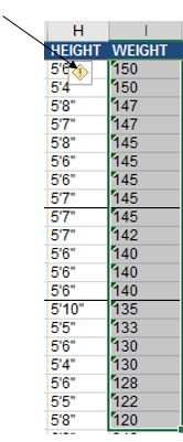
And as with all such weighty data sets one might first want to adjudge its 58 fields for parameters that one could properly deem analytically dispensable, e.g., fields not likely to contribute to your understanding of the call activity. But here I’d err on the side of inclusiveness; save the first two incident id and number fields and perhaps the incident address data at the set’s outer reaches (and the very last, incontrovertibly pointless Location field, whose information already features in the Latitude and Longitude columns), most of the fields appear to hold some reportorial potential, provided one learns how to interpret what they mean to say, and at the same time comes to terms with the fact that a great many of their cells are vacant. (By hovering over a field’s i icon you’ll learn something more about its informational remit.) In addition, several fields – Month, Day, and Week, for example – could have been formulaically derived as needed, but Greensboro has kindly brought those data to you without having been asked.

In any case, it’s the date/time data that bulk particularly large among the records and that could stand a bit of introductory elucidation. First, the CallProcessingTime data realize themselves via a simple subtraction of the corresponding 911CenterReceived time from the AlarmDate (and don’t be misled by that header; there’s time data in there, too)- Thus the call processing time of 15 seconds in K2 (its original columnar location, one preceding any field deletions you may have effected), simply derives from a taking of O2 from P2. That is, call processing paces off the interval spanning the receipt of a 911 call and the dispatching of an alarm. Subtract 7/2/2010 11:38:17 AM from 7/2/2010 11:38:32 AM, and you get 15 seconds.

Well, that’s obvious, but peer beneath the 00:15 result atop K2 and you’ll be met with a less-than-evident 12:00:15 AM. You’ve thereby exposed yourself to the dual identity of time data.

Subtract one time datum from another and you will indeed have calculated the desired duration, but that duration also counts itself against a midnight baseline. Thus Excel regards 15 seconds as both the elapsing of that period of time – as well as a 15-second passage from the day’s inception point of midnight (which could be alternatively expressed as 00:00). Examine the format of K2 and you’ll see:

green1

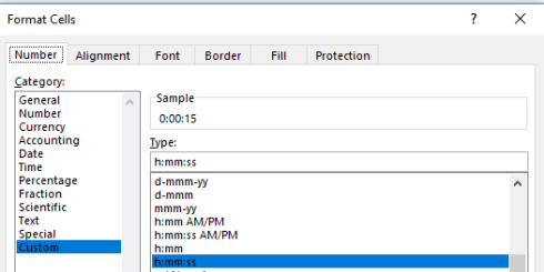
And that’s how Excel defaults this kind of data entry, even as an inspection of the Formula Bar’s turns up 12:00:15.

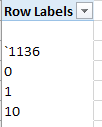
That feature, proceeds by Excel’s standard scheme of things, however ; a more problematic field concern besets AlarmHour, which presumably plucks its information from AlarmDate (an equivocally named field to be sure, as it formats its data in time terms as well). Hours can of course be returned via a standard recourse to the HOUR function, so that =HOUR(P2) would yield the 11 we see hard-coded in N2. But many of the hour references here are simply wrong, starting with the value in N3. An alarm time of 3:51 AM should naturally evaluate to an hour of 3, not the 12-hour-later 15 actually borne by the cell. Somehow the hourly “equivalents” of 3:00 AM and 3:00 PM, for example, underwent some manner of substitution, and often; and that’s where you come in. Commandeer the first unfilled column and enter in row 2:

=HOUR(P2)

Copy all the way down, drop a Copy > Paste Values on the AlarmDate column, and then delete the formula data.

And once in place a number of obvious but meaningful pivot tables commend themselves, leading off with a breakout of the number of alarms by hour of the day:

Rows: AlarmHour

Values: AlarmHour (count)

I get:

green2

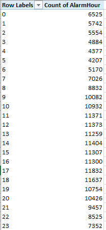
Note the striking, even curiously, flat distribution of calls.

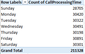
Next we could substitute day of week for hour, both for Rows and Values:

green3

(Truth to be told, leaving AlarmHour in Values would have occasioned precisely the same results; because we’re counting call instances here, in effect any field fit into Values, provided all its rows are populated, would perform identically.)

Again, the inter-day totals exhibit an almost unnerving sameness. Could it really be that alarm soundings distribute themselves so evenly across the week? That’s a downright journalistic question, and could be put to the Greensboro data compilers.

We could do the same for year (remember that the data for both 2010 and 2016 are incomplete, the numbers for the former year amounting to exactly half a year’s worth):

green4

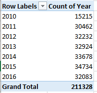
My data for this year take the calls through November 7; thus a linear projection for 2016 ups its sum to a new recorded high of 37,744.

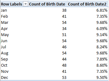
We could of course do much the same for month, understanding that those data transcend year boundaries, and as such promulgate a kind of measure of seasonality. We could back Month Name into the Values area twice, earmarking the second shipment for a Show Values As > % of Column Total:

green5

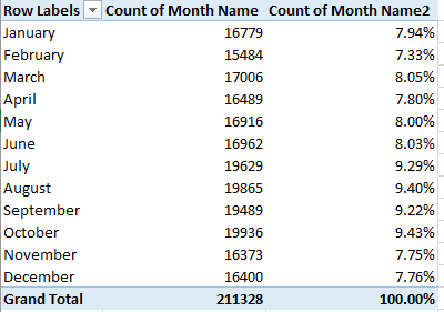
The fall-off in calls during the winter months is indisputable, but note the peak in October, when a pull-back in temperatures there is underway. There’s a research question somewhere in there.

Of course more permutations avail, but in the interests of drawing a line somewhere, how about associating TotalResponseTime (a composite of the CallProcessingTime and ResponseTime in K and L, respectively) with year?

Return Year to Rows and push TotalResponseTime into Values (by Average) and you get:

green6

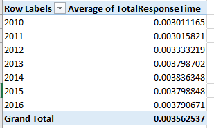
That’s not what you were looking for, but the pivot table defaults to the times’ actual numeric value, in which minutes are expressed as a decimalized portion of an 86,400-minute day. Right-click the averages, click Number format, and revisit the Custom h:mm:ss (or mm:ss, if you’re certain no response average exceeds an hour). I get

green7

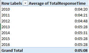
What we see is a general slowing of response times, though in fact the times have held remarkably constant across the last four years. But overall alarm responses now take 30 seconds longer than they did in 2012, and more than a minute from 2010. Does that matter? Probably, at least some of the time.

Note, on the other hand, the 1500 call processing times entered at 0 seconds and the 933 total response times set to the same zero figure. Those numbers await a journalist’s response.

U.S. Voter Turnout: A Sometime Thing

4 Nov

Looking for a vivid trademark of democracy? How about the right not to vote? Overturn the hard-won prerogative to stay at home, and a defining attribute of democracy gets overturned with it.

But Americans have long been accused of abusing the privilege. Election Day absenteeism is a veritable national folkway in the States, turnouts there comparing rather unfavorably with voter activity rates for other industrialized countries (though the matter isn’t quite that straightforward; see this cross-national survey for some comparative clarification). Per the above link, merely 53.6% of the American voter-age population made its way to the polls for the 2012 presidential election; and that means about 112 million citizens who could have failed to do the same.

The political implications of so massive a truancy are massive, apart from the civics-lesson remonstrances that could be aimed at the apathetic or disillusioned. If it could be demonstrated that the political gestalt of recalcitrant voters assumes a different shape from those who do make an appearance, some candidates are aren’t getting the most out of their constituency, e.g. this New York Times piece on an apparent shortfall of black voters in this year’s presidential contest.

For more detail on the problem we can turn to a raft of Census Bureau data on the turnout phenomenon, an assortment of spreadsheets that consider the demographics of voters in the 2008 presidential election (I can’t find equivalent numbers for 2012; note that the files are dated February of this year). This book plots turnout by state:

table-04a

But when politics come to spreadsheets the latter need be squared away before we can learn anything new about the former, and the latter is slightly messy. First, the Registered and Total Voted headers in row 5 occupy merged cells, and merged cells have no place in the pivot tabling enterprise. But moreover, a set of supplementary headers banner row 6, and two header rows have no more of an analytical place in the process than merged cells:

turnout1

By selecting A5:M6 and subjecting the range to the Unmerge Cells command we’ve made a start; then delete the Registered and Total Voted entries (that excision is both necessary and harmless; the headers in row 6 continue to distinguish registration from vote data in any case). But the unmerge has also floated the headers in columns A:C to row 5; and as such they need to be pulled down to 6 if they’re to share header that row with all the other field identifiers. You’ve also likely concluded that the header for column A doesn’t really mean what it says: the data beneath it bears state names only (along with that of the nation’s capital, the District of Columbia), and as such the field should probably be renamed.

And if you’re planning to do anything more with the worksheet than read it, you’ll eventually need to delete the United States entry in row 7. That summative record behaves as a grand total, and as such will inflict a double-count of the values upon any pivot table. But before you send that record on its way you may want to think about the data it aggregates. Understand first that the sheet’s numbers are expressed in thousands, i.e. the Total Population of 225,499 in B7 shorthands an estimated 225,499,000; remember that the data report survey results, and as such are subject to the margins of error conveyed in the H and K columns that correlate negatively with state population; the larger the state, the slimmer the error margin. (Let the record also show that the state totals don’t precisely equate with those aggregate US figures in row 7, presumably a bit of fallout from the rounding activity imposed upon what are, after all, survey estimates.)

And do consider the denominators; that is, atop which demographic baseline is turnout data to be mounted? It seems to me that Total Citizen Population – apparently counting those Americans eligible to vote – serves as one, but only one such floor, along with an important alternative, Total Registered. Thus the Percent registered (Citizen +18) for the country in its entirety divides D7 by C7, or the number of estimated registrants by the entire voter-eligible population; and by extension the Percent voted (Citizen 18+) proportion of 63.6 derives from I7/C7. I will confess a laymen’s ignorance about the utility of the Total Population numbers, because they subsume residents who are presumably barred from voting in the first place.

Once those understandings are put in place another metric – which I’ll call Pct of registrants voting – offers itself, via a dividing of the Total Voted figures by Total Registered. To be sure, the measure is curiously subsidiary and self-selected, calculating as it does a subset of voters from among the subset of all potential voters who’ve actually registered. Nevertheless, I’d allow the parameter is worth plumbing, and I’d title column N the aforementioned Pct of registrants voting, and enter in N7, while formatting the field in percentage terms to two decimals:

=I7/D7

(Remember that these percentages possess a different order of magnitude than the native percent figures accompanying the worksheet. The latter are communicated in integer terms e.g. 60.8, not 60.8%.) After copying the formula down N, you’ll note that a very substantial segment of the registered population voted in 2008, a finding not quite as truistic as it sounds. On the one hand, of course, a citizen bothering to register could at the same time be expected to bother to vote, and no state has a Pct of registrants voting falling beneath 80%. Indeed – 22 states (including Washington DC) boast a percent of registrants topping 90%. On the other hand – and here I allude back to the Pew Research link referenced above – relative to other countries the US overall registration percentage vs. voter turnout disparity is high, suggesting a peculiar bifurcated enthusiasm among the electorate. Those taking the pains to register will overwhelmingly go on to vote (at least for presidential contests), but millions of their countrypersons simply don’t take those pains to begin with.

Now about pivot tabling…well, what is there to pivot table? We’ve encountered this mild puzzlement before; because the textual data – here state names – don’t recur, there’s nothing in the State field to aggregate. If we impose a set of coarse, recurring categories upon a new field, e.g. we assign each state a geographical region name, you will have contrived something to pivot, and I’m not sure that’s such a bad idea. An alternative could be to group the values of a selected numeric field, for example Total Population, and have it break out Pct of registrants voting, by way of additional example:

Rows: Total Population (grouped into bins of 1000, which again signify millions)

Values: Pct of registrants voting (formatted in percentages to two decimals)

turnout2

But one doesn’t discover much variation therein. On the other hand, isn’t the absence of variation a finding?

Campaign Contribution Data, Part 3: More New York and National Numbers

11 Oct

Just one, or perhaps 390,000, more things about the New York Presidential contribution data: might not the analysis be buoyed by a counting of monies apportioned by contributors’ occupations? It might; start with

Row: contbr_occupation

But stop there and you’ll already understand. Prepare to gaze upon 12,355 uniquely labelled vocation descriptions – but it isn’t their formidable heft that’s the rub. What’s adulterating the mix – again – is the manner(s) of inconsistencies among the labels, and how they impede the prospects for any follow-through across the data. What, for example, are we to do with these cognate employments:

campa1

Of course we’ve beheld this complication before, but the problem set here is perhaps slightly different. For one thing, the occupations have in all likely been furnished by the position holders themselves, and so we should properly withhold “blame” from the spreadsheet compiler. And with self-description comes classificatory idiosyncrasy, the bane of the grouping enterprise. Thus what editorial decisions are we to make about these kindred callings?

campa2

Does the analyst subject all of the above to a unifying, equivalent proxy occupation? There are 12,000 of those determinations to make here, and you’ll have to determine in turn if you have the time and/or money to devote to the challenge. The answer might be no.

In any event, if you’re enjoying the confusion and the complexity and want to go national, pop open the sheet detailing overall top fundraising periods in election years (it’s the very last Excel link on the page). The compendium, recording candidate receipts and contributions (the former is a superset of all monies including public funding, and hence are very often the greater sum. In 29 cases, however, contributions exceed receipts, often by a very small differential. See the notes on rows 3664-5) for presidential contests tracking back to 1980 and including the current tilt, comprises an assortment of parameters that seemed designed to inspire unease. Again, throw the Presidential Candidate field in a pivot table rows area and survey the ensuing list. How about

campa3

(Yes, the two are one and the same.)

Or more famously:

campa4

The point won’t be belaboured further (note, on the other hand, that the Bush, George and Bush, George W entries indeed signify father and son, and are meaningfully distinct).
Then replace Presidential Candidate with Report Type:

campa5

First, I don’t know what all those markers mean – e.g. 10P and 12C. Second, you do know what the redundant M6, M7, and M8s mean – uninvited spaces that have to go (the M data’s less-than-fully-numerical sort order follows from the fact, of course that they aren’t numeric at all; the M demotes these to label status, and if you want M10-12 to
Note as well that the M, or month, items advance their chronological references by an increment of one. That is, M3 reports contributions for February, and M12 counts monies for November. December data, then, are anomalously assigned YE, which I take to denote year end – but in fact if you filter all the data set entries for the YE’s, numerous pre-December 1 Coverage Start Dates loom, along with some Coverage End Dates that pull into January. Anyone have the FEC phone number?

Third, I’m disquieted by the potential apples-and-oranges mishmash of monthly and quarterly contributions that spill across the entries. Turn to the data and autofilter the receipt data for say William Jefferson Clinton (you remember him). You’ll see in excerpt:

campa6

On the other hand, you’ll learn that the above receipts emanate from different Clinton election committees, and so if the quarterly and monthly numbers properly and strictly line up with different organizational entities – that is, the totals can be deemed mutually exclusive, and we’re likewise satisfied that we alleviated any name discrepancies – then we should at least be able to aggregate a candidate’s intake by year:

Rows: Report Year

Slicer: Presidential Candidate

Thus Hillary Clinton’s numbers read:

campa7

Remember of course the 2016 totals come to rest at August 31.
If you want to play safe, you could at least globally array receipts by election year:

Rows: Report Year

Values: Total Receipts

I get:

campa8

(It appears that all dates are authentically numeric, by the way.) Remember that the 2016 total tops at August 31 (really September 20 for one failed candidate, Lindsey Graham); thus with two-thirds of the compiled year having elapsed, the current total projects linearly to around 1.044 billion dollars, a small downsizing from the two previous presidential years; but it may be reasonable to suppose that a late-in-the-game contribution rush could hoist the final numbers above and beyond. The significant contraction of the 2012 sum from 2008’s aggregate warrants study, however. In any case that latter year seems to have incited a quantum leap in campaign inflow. And as for those small non-Presidential-year 1990 and 1998 totals, they were earmarked to hopefuls Willie Carter (something of a perennial candidate, apparently) and Frank Starr, respectively, and about them I know nothing more – nor am I certain about the reasons for those years’ inclusion. A sidebar awaits.

And if you were wondering, Santa Claus raised $180.00 in 2012.

And I’m on vacation now; I just can’t find Word Press’ out-of-office reply.


Campaign Contribution Data, Part 2: More New York Numbers

30 Sep

So far, the NY Election contribution data have been pleasingly mild-mannered: no scruffy labels gate-crashing the contribution and date numbers, and a candidate name field in which each and every hopeful is decorously spelled the same way.

Yet I don’t mean to sound ungrateful, but I’m bothered by those enormous unitemized receipts reported to the worksheet by the Clinton campaign. That’s not an ethical cavil, mind you, but a data-management reservation. You’ll recall that about half of all of the Democrat’s take in the state (as of July 31) has been crowded into nine massive coffers, each of course comprising one record; and those composites enter the worksheet as what are in effect subtotals (though they’re not, of course, subtotaling the other records in the set; they’re adding contributions quite external to the worksheet) – and for pivot tabling and other purposes, subtotals and individuated records in a data set don’t mix.

As suggested in the previous post, I’m not sure that any worksheet-derivable patch for the problem looms. There’s no immediate way of knowing how many Clinton sectaries have collectively added to the unitemized millions; a call to the Clinton campaign might come away with an answer, and it might not.

In light of the above you’ll recall we originally pivot-tabled an average Clinton contribution of $489.72, that figure fed and distended in large measure by those giant unitemized batches. What one could do, perhaps, is subtract their $41,815,649 from the Clinton total and divide what’s left on the sheet by the 165,504 other contributions on the books, on the assumption – quite clearly an arguable one – that the unitemized gifts approximate the others in typical size. Pursue this idea, and the resulting £231.78 more than halves the original Clinton average – for what it’s worth.

Other breakouts await, for example a cross-sectioning of contributions by candidate as well as New York zip code. Of course you’ll want to know which zip code references which place; look here for a code-by-county identification (though I’m not sure about the View Maps link aligned with each code. A click of the link for the 11390 zip in Queens drew up for me a Google Map of a region of France that, so far as I know, can’t be reached by subway).

At base, American zip codes describe themselves in five-digit terms, but you’ll see that most of the codes attached to donor provenances in the contbr_zip field (in column G) have widened to nine digits; those extra numbers comprise zip code extensions that further specify some territorial position within the ambit of the superordinate, five-digit code area. But since a useful aggregation of the contributions by codes would want to lift the analysis to the base five-digits stratum, we need to disengage the first five numbers from the lengthier entries in contr_zip. That sounds like a job for the LEFT function; thus in your next available column (mine is T; we claimed S last week for formula purposes), enter Zip Code in row 1 and enter, one row beneath:

=LEFT(G2,5)

Copy down the column and perform a Copy > Paste Values upon the results; and now what? Here’s what: we need to convince ourselves that each and every cell in T in fact returns the five characters we seek, and one means of ascertainment is this array formula, written more-or-less anywhere:

=COUNT(IF(LEN(T2:T391514)=5,1))

That is, let the array formula record a 1 for each cell in the range above whose length comes to 5, and then count all those 1s (remember that, being a customized array formula, you need to finalize the formula process by pressing Ctrl-Shift-Enter). My total of 391367 falls 146 of the field row total, pointing to that many flawed entries. If you run this one-field pivot table:
Rows: Zip Code

You’ll see on top:

camp1

And those, needless to say, aren’t American zip codes.

In order to pinpoint those contrary 146 you can roll zip code into the Values area as well, whereby each code’s incidence will be counted, e.g.

camp2

Double-click right atop the 3 count for ‘1136, for example (yes, there’s a delinquent apostrophe in there) and all the records bearing that code will present themselves in a new sheet. We see here that all three instances are associated with Josh Rosenthal of Fresh Meadows in Queens. These are typos, of course, and a quick consult with Google tells us that the zip code for Fresh Meadows is in fact 11365. Aiming a find and replace at the data in T, by exchanging 11365 for every ‘1136, will restore Mr. Rosenthal to his proper geographical niche. On the other hand, the two “0” ersatz codes we see above both belong to Carlene Wahl of New York, and her rather generic city location will prove rather more problematic. If we want to learn her real-world zip code we’d thus need to track down Ms. Wahl and her address one way or another – if possible.

You get the idea here. We see that some, but not necessarily all, of the mis-coded 146 should be agreeable to some standard rectification; and one supposes the disagreeable ones could be filtered out of any table, if we had to.

In any case, and acknowledging the above sticking point that adheres to but .037% of all contributions, we could proceed with this table, which again organizes contributions by candidate and zip code:

Rows: Zip code

Columns: cand_nm

Values: Contb_receipt_amt

The reading here is dense, of course, but you’ll at least note the large Clinton sums piled up in zip codes beginning 100, all of which are sited in Manhattan. But look at her results for code 10185: 41,820,648.76. 10185 is likewise a Manhattan code, and here it references the address at which all those unitemized contributions were gathered.

Sound familiar, no? Kind of, because that gigantic sum, administered by the Hillary Victory Fund, has doubtless processed donations from individuals who live all over the place – zip codes unknown, and possibly unknowable.

And as a matter of fact, how do we know that all of those contributors even live in New York?

Campaign Contribution Data, Part 1: The New York Numbers

20 Sep

Read any good campaign financing reports lately? OK – it’s precisely that kind of question that explains why you cross the street when you see me coming your way.

Social skills aren’t my strong point, but I won’t be deterred. For those who want and need to know about who it is who’s paying for American’s presidential candidates this year – i.e., Clinton, Trump, and everyone else, past and present, click into the Federal Election Commission’s site and you’ve come to the right place. All kinds of spreadsheets in there aim to give the taxpayers their money’s worth, including a state-by-state drill-down of contributions, among which of course are the New York data. It’s a big state and a big sheet, so please download it via the above link and its ensuing NY.zip reference:

vote1

The sheet’s 391,513 records log candidate contributions harking back to October, 2013, taking the activity up to August 1 of this year (really July 31; the one August donation on the books notches a donation of $0, and I’m not sure what that entry means to tell us), a short while before both the major party conventions came and went. But 3,204 of these mark refunded (or redesignated) gifts whose figures are expressed as negative numbers, and which assumedly have to be squared with some equivalently positive sum. But before we slide that and other attention-begging data issues beneath the microscope rest assured that all the monetary sums in column J – contb_receipt_amt – and dates in K – contb_receipt_dt – are uniformly numeric. Cool – 783,026 cells you don’t have to worry about. And contbr_st in F is wholly ignorable; because the sheet as a matter of definition marks contributions issuing from New York, the NY entry is the only one you’ll find in the field. But you will have to auto-fit a number of the dataset’s columns, rather an expectable necessity.

Of course the data’s essential investigative question asks how much money each candidate has accumulated; and the answer should be straightforwardly realized, via a pivot table. But before the table happens something need be done about those 3,204 negative values. It seems to be me that their manner of disposition here could be argued about, but I hold that they should be simply ignored – because since they stand for actual contributions that, for whatever reason were recalled, e.g. a campaign shutdown (I’m assuming none of these were voided for reasons of impropriety), they should be accounted in the candidates’ sums. These were monies that were raised, after all.

Again, that position could be contested, but I’ll go with it for the time being; and if then I’m to ignore the negative contributions I can appropriate next-available-column S, call it Contribution, and enter in S2:

=IF(J2>0,J2,””)

We’re simply stipulating that if the actual contribution in the corresponding J cell exceeds zero, use it; otherwise, assign a double-quote result which neither be tallied by the COUNT function nor acknowledged at all by AVERAGE (it will be noted by COUNTA, however).

Copy the formula down S and then proceed:

Rows: cand_nm

Values: Contribution (Sum, formatted to two decimals and Use 1000 separator, or comma. Note the comma doesn’t punctuate the very 1000 alongside the checkbox.)
Contribution (again, here Show Values As > % of Column Total)

I get:

vote2

We see Hillary Clinton’s extraordinary sway over the New York donor cohort (and no, I haven’t heard of all those candidates), her receipts trumping the Donald’s 40 times over. Her margin over erstwhile rival Bernie Sanders is more than nine-fold, though of course the latter’s campaign exchanged the hat for the towel some time ago. What’s also nice about the data, as it were, is the steadfast uniqueness of the candidate names in Rows. It’s a pleasingly no-tweak list: no faux duplicates among the 24 aspirants, no alternate names, no misspellings.

Having gotten this far you may want to break the data out additionally by date, a determination that asks a presentational decision or two of us. First I’d whisk the second entry of contb_receipt_amt out of the table, because the data subdivisions about to be instituted by the date parameter would inflict something of a mess on two sets of side-by-side values.

Next we – or you – need to do something about date granularity. If you install contb_receipt_dt in Columns and group its data by Years and Months, 27 columns of numbers pull across your screen (in addition to Grand Totals), an unfolding that might or might not serve readability and/or your analytic designs terribly well. Group by Years and Quarters, on the other hand, and the table retracts to 10 columns. Note, though that the final item here – Qtr3 for 2016 – comprises but one month, July.

Whatever you decide, you won’t be able to miss Clinton’s recent lift-off in her bank account (and pitched to a smaller magnitude, that of Trump), as well as the reddening of the books of failed candidates, their negative numbers presumably signalling monies returned in the aftermath of campaign shut-downs.
You may also want to pursue a corollary interest in the numbers of and per-candidate average. Now that we’ve assumed our stance on the negative-number issue, we can pivot-table thusly:

Rows: cand_nm

Values: Contribution (Count, no decimals)

Contribution (again, by Average, two decimals, 1000 separator)

I get:

vote3

Some remarkable disclosures emerge. We see that contributions to the Sanders campaign actually outnumbered those of Clinton’s (as of July 31), but their average amounts to but one-tenth of the nominee’s per-donor outlay, a most interesting and meaningful bit of stratification.

But not so fast. If you sort the contributions you’ll find nine seven (or eight)-figure Clinton contributions described as Unitemized; presumably these mighty aggregates enfold a great many individual gifts, and have the effect of sky-rocketing Clinton’s apparent average.  In fact, those nine total over $41,000,000 – more than half the Clinton total – and mincing these into their discrete donations would likely roll up a Clinton contributor count that would overwhelm the Sanders figure – and ruthlessly depress the Clinton per-gift average at the same time. There’s nothing in the worksheet, however, that can tell us more about those nine behemoths. Some deep background, please.  Note Donald Trump’s low average, along with the 10,000+ contributions to all candidates amounting to precisely $2,700 each, an apparent obeisance to the maximum permissible contribution of an individual to a candidate’s committee.

All very interesting. But there’s more to be said about the New York – and the data aren’t always no-tweak.

US Patents: Inventing an Angle on the Data

12 Sep

Humans are nothing if not a resourceful lot; and one telling record of the human will to innovate continues to be written by the United States Patent Bureau, whose tally of certified inspirations submitted by both American states and other countries makes itself available here:

http://www.uspto.gov/web/offices/ac/ido/oeip/taf/cst_utl.htm

You’ll note the site wants us know that “…a user may import this report file into spreadsheet software such as Microsoft Excel to facilitate printing.” Could be, but we’re not instructed how that import might be carried out, apart from the decidedly public-domain select-copy-and-paste to which I’ve resorted here:

united-states-patent-data

You’ll recognize that the State/Country data in column A has been ordered to wrap its text in awkward places; a double-clicked auto-fit of A in conjunction with a column auto-fit should set things straight, literally. You should also delete the wholly blank B column, because it’s…blank.

Now before you get to work you may want to flit across the aggregated data in rows 2-4. Here we see the striking and determined ascendancy of international patents, surmounting the US total for the first in 2008 and continuing to pull away from the host country’s numbers ever since. That means something, of course, perhaps speaking more to the alacrity of knowledge development worldwide than any becalming of the imagination in the States. After all, patents in the US boomed 45% across the 2008-2015 frame, too.

But while those are most interesting data indeed, they don’t need us to discover them; they’ve already been compiled. We, however, may want to work with the state and country details arrayed below by pivot tabling them, and if we do, a round or two of preliminary decision-making needs to be thought through.

First, you’ll note the two rows separating the US state data (and these include American territories such as Puerto Rico as well as Washington DC, the country’s capitol that doesn’t quite hold state status) from those of the other countries, a segregational practice of which you’ll probably approve. States are states and countries are countries, after all, and any admixture of the two might confuse the analysis – maybe. There might be some profit in comparing patents from California with those issuing from Poland, but that prospect leaves me hesitant, though I suspect there’s a minority view to be propounded here.

But assuming you’re pleased with the status quo you’ll need to copy the header row in 1 to rows 7 and 67, thus topping the two data sets appropriately. Next – if we’re pivot tabling – I’d delete the data in the All Years field, because keeping them in their place will risk a double-count of the patent numbers once the tables do their aggregating thing. Left as is, All Years will be regarded as just another year, and tabulated accordingly.

Next, you could treat each row to a Sparkline line chart, seeing to it that you identify C8:P65 as the data range, thus seeing to it in turn that (what is now) the B column data – bearing pre-2002 sums of patents dating across the 1963-2001 span – have been excluded from the line construction. 39 years’ worth of patents can’t be made to comport with the year-by-year counts that adjoin them, it seems to me. Select the Q8:Q65 location range, and your OK will plot some interesting, and very far from uniform, trajectories down the range, e.g. Delaware’s one-year dive in patent production last year, or South Carolina’s 140% splurge between 2008 and 2015. Overall, the lines certainly describe a cross-state, upward pull in patent yields, but again the anomalies, e.g. Louisiana,

patent1

could be deemed at least slightly provocative. Remember of course that Sparklines’ conformations are drawn relative to their ranges’ values; South Carolna’s spike cannot be matched in absolute terms to California’s, for example, and the very small patent numbers for the US territories need be understood as such, whatever their Sparklines look like.

Those qualifications understood, we could likewise apply Sparklines to the country data. Note that Czechoslovakia’s string of zeroes (following its pre-2002 2121) reflects that country’s reorganization into the Czech Republic and Slovokia, both of which do present substantive patent numbers. The country slopes are remarkably comparable, though some curious investigator might want to do some wondering about Italy’s slump in 2007 and its subsequent bounce back.

And now I’d like to perform a bit of a back-track. Earlier I had reflexively begun to prepare the patent data for some pivot tabling refinements, e.g., by offering that the empty B column should be made to disappear, and by filing the usual brief for a data-set row header. But we – or I – need to ask: given the nature of the rows comprising the data set(s), what might a pivot table really teach us? We need to remind ourselves that pivot tables are, in the first instance, instruments of aggregation, and there doesn’t appear to be much among the state/territory data to aggregate – no recurring, labelled entries there to submit themselves for consolidation, at least not as the data presently stand.

It might be possible, for example, to append a Region field to the country patent data by recalling that B column we had so unblinkingly eliminated, and devising a set of items meant to recur – e.g., Europe, Africa, Oceania, etc. – but that device would impose other problems on the set, those hinted at in my discussion of dataset reconstruction (which perhaps could be reviewed if you’ve decided to pivot table the data anyway) that I’ve cited many times, including now.

So given the data as we’ve received them, and appreciating that rows 1-4 have already done some of the aggregating work for us, the Sparkline strategy might stand as among the most trenchant services we could do for the data – though that superlative leaves me hesitant, too.

But if we’re Sparklining, there’s another subtle point to file away in your presentational rolodex that needs to be entertained. I had earlier advised that the erratic line breakages inflicted on the labels in the A column by the sheet’s Wrap Text effect should be smoothed away by simply turning off the wraps; and in fact that’s a near-imperative move for the Sparklines. That’s because the wrapped text feature by definition heightens the rows in whose text it wraps; and because, and unlike conventional Excel charts, Sparklines are cell-bound, they’re going to be heightened too. And the resulting distortion will skew the relation of the X to the Y axis.

I like that observation. Can I at least copyright it?

Team USA Stats, Part 2: Some Data Gymnastics

4 Sep

You can’t tell the players without a scorecard, they’ll tell you in the States, and you can’t tell the data without the formulas.

You’ve heard more memorable pronouncements than that opener, I’ll grant, but that less-than-bromidic avowal above makes sense. We saw in the last post how the Team USA height, weight, and birth state data threw more than a few curves at us, and baseball isn’t even an Olympic sport any more (it’s coming back in 2020, though); fail to straighten out the data curves and your analysis will be straitened.

Now that line’s a few sights more memorable, but I do go on. Our next round of data inspection takes us through the DOB (date of birth) field, and we want to get this one right, too. Quality control here starts by aiming a COUNT function at the rows J2:J559 that populate DOB. Since dates are numbers, and since COUNT only acknowledges a range’s duly numeric data, we should aspire here to a count of 558, or one date per cell. But my COUNT totals 520, a shortfall that exposes 38 dates manqué that, facades aside, are nothing but text.

Our COUNT is all the more incisive in view of the fact that every entry in the J column really does look like an unassailable date. But now that we’ve made ourselves aware of the turncoats among the loyal numerics, we’d do well, if possible, to rehabilitate them into the real things too. Here’s a pretty painless way: commandeer the next free column (it could be S, if you’ve left the formulas from last week’s exercises in R alone; if so, you’ll have to format S in Date terms), title it Birth Date, and enter, in row 2:

=IF(ISTEXT(J2),DATEVALUE(J2),J2)

And copy it down. The formula asks if the entry in J2 is textual. If it is, the DATEVALUE function – a rather useful transformative means for turning pure text such as 12/14/1989 – if that expression has been formatted into text – into 12/14/1989, the date version. If the entry in J is an authentic date, on the other hand, the formula simply invokes it its cell entry as is.

Surprise – my eminently sensible tip doesn’t always work. Copy the formula and you’ll be treated to nine #VALUE!-laden cells; a first review of these implicates an old nemesis – a superfluous space, in the source field e.g.:

olyp1

DATEVALUE can’t handle that textual intrusion, and so this refinement:

=IF(ISTEXT(J4),DATEVALUE(TRIM(J4)),J4)

Looks right, because TRIM’s job is to make superfluous spaces unwelcome.
But that revision doesn’t work either. Puzzled but intrigued, I went for the next move: a copying of one of the problem entries in J into Word, wherein I turned on the Show/Hide feature (in Home > Paragraph) that uncovers normally unseen codes. I saw:

olyp6

Look closely and you’ll detect that special character to the immediate left of Word’s paragraph symbol. That Lilliputian circle appears to signal a non-breaking space, and apart from any conjecture about what and why it’s doing there we know one thing: it isn’t a superfluous space, and thus won’t be trimmed.

Thus again, the fix here may be short on elegance but long on common sense: edit out the circle from the nine problem entries in J (in fact some of the cells require two taps of Backspace in order to rid them of their codes. If you sort the dates by Largest to Smallest by first clicking on an actual date all the #VALUE! errors will cluster at the bottom).

And that works, leaving us with yet one last irritation – the birth date of Shooting team member Daniel Lowe, which reads

11/181992

No need to get fancy here – just enter that slash.

Now, I think, you can go about your analytical business, e.g., breaking out athletes by birth month. You may recall my consideration, in a piece on 2012 Olympic data, of the alleged August effect, in which American athlete births in that month appeared to significantly depart from a chance prediction. Let’s see what the current team data tell us, via a pivot table:

Rows: Birth Date (grouped by Month)

Values: Birth Date (Count)

Birth Date (again, by % of Column Total)

(We don’t need Grand Totals here). I get:

olyp2

Here August – generally the most fecund month in the United States – shares the modal figure with June and March, its proportion substantially smaller than August’s 2012-team contribution. The numbers here simply suggest no special birth skew impacting the US complement, at least for this Olympics.

We now can also calculate each athlete’s age in conjunction with the most able assistance of the nifty and unsung YEARFRAC function. Enter the Olympics’ start date – August 5, 2016 – in any available cell, name the cell start, and proceed to column T, or whichever’s next available on your sheet. Name it Age and in row 2 try (assuming the corrected dates lie in the R column):

=YEARFRAC(R2,start)

YEAR calculates the distance in years between the two dates on either side of its comma. Thus, cell-reference four-gold-medalist Katie Ledecky’s birthday – March 17, 1997 – in YEARFRAC, and with the start date cell holding down the second argument you get 19.38, Ledecky’s age in years on day one of the Olympics (note that can’t actually enter 3/17/1997 in the function, because YEARFRAC will treat the entry as text. You need to either reference the cell bearing that date or enter 35506, the date’s native numeric equivalence).

Copy down the column and this pivot table beckons:

Rows: Sport

But guess what…

olyp5

Yep, it’s that superfluous space thing again, this time practicing its mischief on four records among the Track and Field data. The simplest repair in this case, as it turns out: select the Sport field and run a Find and Replace at the column, finding Track and Field[space] and replacing it with Track and Field. That works, because in this case each of the errant four have incurred one space.

Now introduce the Age field to Values (Average, formatted to two decimals). Bring back Age a second time, now exhibiting Count sans decimals. If you sort the results Largest to Smallest you’ll see the 12-member equestrian team holding down the age-senior position, with Team US’s eight boxers computing to a lowest-age 20.75.

We could also correlate average athlete weight by event, an association which might drum up some less-than-obvious numbers, e.g.

Rows: Sport

Columns: Gender

Value: Weight (Average, formatted to two decimals)

I get:

olyp4

Of course the per-team numbers are small, but they make for interesting reading, particularly the respective by-sport gender disparities (and note some absent teams among the men’s delegation).

I was surprised by the greater average weights of the two basketball teams measured against their rugby colleagues, even if the latter is (officially) the contact sport. And I did a double-take when I caught up with the respective boxing team weights; women boxers outweigh their male teammates by an average of 18 pounds. But here we’ve been thrown a sampling curve – the six male pugilists are concentrated in the lower weight divisions, even as the women – comprising exactly two boxers – weigh 132 and 165 pounds.

Eek  – there was a lot of hard work to do in there; I think I deserve a podium finish for this one.

Team USA Stats, Part 1: Some Data Gymnastics

26 Aug

Now that Super Mario has bored his way back to Tokyo, let us praise Great Britain’s mighty Olympic team, and its world’s best 67 medals, followed by the United States and its 121.

Don’t read that twice – just say hello to the New Math. Here in England, where the media put the mallets to their collective tympani for all-Team GB all the time, one’s ear had to be pressed very close to the radio for news about any athletic glory redounding to anyone else.

But ok. Two weeks of harmless sporting jingoism does wonders for the commonweal, one supposes, and so now I can tell my co-residents here that, glory aside, United States Olympic team has something the British contingent doesn’t: a spreadsheet about its members, available worldwide here:

http://www.teamusa.org/road-to-rio-2016/team-usa/athletes

Just click the Sortable Roster link.

The workbook’s name could be asked about for starters, because properly structured, any data set should be agreeable to sorting. You’ll also take note of the cell borders sectioning off respective sport (team) rosters, demarcations that no longer demarcate once one takes the workbook up on its offer and actually sorts the data by say, Last Name or Height. Because the borders will remain exactly where they were drawn – even when the sorts reorder the records – they’ll now be bordering near-random assortments of athletes.

But now to the data. The Team USA site lets us know that 124 of the team’s 558 members, about 22%, are California-born, an impressive disproportion over and above the state’s 12% contribution to the American demographic whole. If we want to break team representation out by all states, then, a pretty straightforward pivot table should be up to that task:

Rows: Birth State

Values: Birth State (count)

Straightforward, but problematic, e.g. this excerpt:

oly1

We’ve seen this before, and now we’re seeing it again. The Olympics may encourage diversity, but promoting disparate spellings of the same state name is grounds for a DQ, at least in this event. Note the pairs of Calif., Colo. and Fla. in the screen shot, a spate of duplications (and there are others in there) inundated by superfluous spaces. Note as well the misspelled Cailf., and it seems that full attention hasn’t been paid to the business of getting the data in shape.

But that’s where we come in. First we can sprint over to column R, the free column alongside the SCHOOL/COLLEGE. The rows in R seem to have been formatted as Text, and so I clicked the R heading and redefined the column in Number terms. Then in R2 I entered, simply:

=TRIM(L2)

And copied it down R, selected and copied those results, and pasted their values atop the L entries. (Having discharged that remit you could then go ahead and delete the contents of R.)

That standard corrective works, so far as it goes, but it won’t respell Cailf. That kind of repair might require a record-by-record edit that could make washing your socks seem exciting by comparison, though I for one would opt for the former activity (and discrepancies notwithstanding, I also get just 113 Californians, 111 if you break the residences out by the Current State field instead. I’m also not really sure what distinguishes Hometown State from either the Birth or Current State identifiers). But if you do need to know about team-member state origins (and non-American birthplaces as well), this kind of work just has to be done. Sorry.

And what about athlete weights, a numeric metric that could be productively associated with sport, height, and gender, and perhaps even date of birth? Don’t be disconcerted by the left alignments, but here too we meet up with an issue – namely the more than 50 weights that sport (ok – pun intended) their values in text format, tending to cluster among the Rugby, Gold, and Equestrian members, by the way. But this gremlin is easily sent on its way, however; sort the field by largest to smallest, thus packing all the text data at the very top of the field. Select the problem data in I2:I56 and click the attendant exclamation-pointed notification:

oly2

Click Convert to Number, and the weights acquire real, measurable poundage (note the weight and height for gold-medal swimmer Ryan Held are missing).

But what about the Height data? The metaphor may grate, but the entries here are squarely interstitial, purporting quantitative information in wholly textual mode. As expressed here, 5’11” is nothing but text; if you want that datum to assume a useably numeric form this recommendation asks you to convey the above height in its cell as 511 instead, and impose a custom format upon it that interposes those apostrophes between the “feet” and “inch” parameters. Either way the entry is really 511, and that value may not work with your aggregating intentions. Another tip would have you enter a height in inches – in our case 71 – and formulaically dice the number into a foot/inch appearance, which again nevertheless ships the data in text status.

In any case, we need to deal with the data as we have them, and I’d allow the simplest intention is to get these labels into numeric mode, i.e. inch readings. In that connection, I’d return to column R, title it Height in Inches or some such, and enter in R2:

=VALUE(LEFT(H2,1)*12+VALUE(MID(H15,3,LEN(H2)-3))

To translate: the formula commences its work by detaching the first character in H2 – a 5 (I’m working with the default arraying of athlete records here, the first of which posts a height of 5’11”), and ascribes a numeric value to it via VALUE, supported by the given that all foot-heights should comprise one digit. That result is next multiplied by 12, yielding 60 inches thus far. I then isolate the 11 in 5’11” by applying a MID function to the task. The LEN(H2)-3 argument that registers the number of characters MID is to extract from the entry in H2 reflects the fact that any entry in the H column should consist of either 4 or 5 characters, e.g., 5’11” or 5’6”. Subtract 3 from either count and you come away with either 1 or 2 – the number of characters MID needs to pull from the entry in order to capture its inch value. Thus in our case we can add 60 and 11, culminating in 71 inches for the archer Brady Ellison. Copy the formula down R and eliminate the decimals, and our heights should be ready for the next round of analytical moves.

Almost. It seems my post-copy vetting of the height-in-inches data in R reports more than a dozen #VALUE! notifications – because some of the heights in the H column look like gymnast Kiana Eide’s 5’3, or indoor volleyballer Thomas Jaeschke’s 6-6. Neither reveal an inches punctuation, and Jaeschke’s height buys into a different notation altogether; and my formula can’t handle those discrepancies.

So it’s time for a Plan B. First run this find-and-replace on the heights in H:

oly3

(That is, replace the inch quotes with nothing.) That pre-formulaic fix should eliminate all the inch punctuations, directly exposing the inch numbers to the right of the cell. Then in R2 write:

=VALUE(LEFT(H2,1)*12+VALUE(RIGHT(H2,LEN(H2)-2)))

What’s changed here is the latter half of the expression, which now splits 1 or 2 inch characters from the right of the cell, depending on the single or two-character length of the inch totals. Copy this one down R and we should be in business.

Not. Two utterly obstinate athletes, field hockey aspirant Jill Witmer and soccer teammate Lindsey Horan, feature a single apostrophe beside their inch figure, a miniscule disparity that defeats my best efforts at a global formula rewrite – along with the data-less Ryan Held. Here discretion trumps valor – I’d just delete the incorrigible apostrophes and Held’s #VALUE! message, and take it from there. Now I have real heights.

Ms. Witmer – or whoever entered her data – sure is playing hockey with my fields.

The College Transcript: Downloading an Upgrade

19 Aug

It’s homely, to be sure, but if you want to go somewhere you gotta have one. And no – I’m not talking about your passport photo but your college transcript, an obstinately prosaic but indispensable means of entrée to your next academic or career step.

The transcript – an enumeration of a student’s courses and performances gathering into what we Yanks call the Grade Point Average (GPA) – has undergone a rethink of late. A piece in insidehighered.com this past February trained its lens on a number of initiatives aiming to drill qualitative depth into the transcript’s tale, sinking some analytic teeth into its default, alphabetically-driven narrative by linking its grades to students’ work and detailed progress toward a degree.

And that got me to thinking: if it’s depth we’re seeking, why not endeavour to learn something more from the numbers and the letters by re-presenting the transcript as a…spreadsheet?

It makes perfect sense to me, though you’d expect me to say that. But after all: submit a transcript to some standard tweaks and you wind up with a dataset, one suitable for sorting, pivot tabling, formulaic manipulation, and charting, too. And once the tweaking stops, the transcript can treat its readers to a round of different, edifying looks at the data – and that’s what I call depth, too.

Transcripts aren’t things of beauty, but they sport no small amount of variation just the same. So to understand what we’re working with, more or less, take a look at this one – the transcript of Mr. Ron Nelson, who made his academic record available here:

trans1.jpg

In the interests of exposition, I’ve subjected the baseline transcript above to a round of fictional retakes that of course don’t represent Mr. Nelson’s actual attainments (for one thing, his record dates back nearly 25 years). A few of the points that call for renovative scrutiny, then: First, note the blank column coming between the Course No. and Course Title columns, an excess which must, for spreadsheet purposes, be curtailed. Second, the multi-columned iterations of Course Titles and associated grades need be cinched into a single field. Third, the academic term headings (e.g. Spring Semester 1991), and TERM TOTALS and CUMULATIVE TOTALS lines have to be sent elsewhere; they report information that simply aren’t of a piece with the grade/grade point records that the dataset should comprise.

Second, if you’re new to the GPA you need to know how that defining metric is figured. While of course variation again abounds, the textbook illustration looks something like this: Class grades are typically assigned along an A-to-D continuum along with a failing F, in what are in effect quantified decrements of a third of a point, e.g., A, A-, B+, B, etc. In the typical system an A earns 4 points, an A- 3.67, a B+ 3.33, and so on (the D- grade is rarely offered, by the way). An F naturally awards no points.

Each grade-point achievement is in turn multiplied by the number of credits any given course grants, resulting in what are usually called quality points. Thus a B- grade in a three-credit class yields 8 quality points – 2.67 times 3. An A in a four-credit course evaluates to 16 quality points, or 4 times 4. The GPA, then, divides the sum of quality points by the sum of credits achieved. Thus this set of grades:

trans2

Works out to a GPA of 2.92.

It’s pretty intelligible, but with a proviso. The GPA must incorporate the number of credits associated with a failing grade into its denominator, and so these performances:

trans3

Calculate to a GPA of 2.33. But the 15 credits recorded above really only bestow 12 usable credits upon the student, and that dual count needs to be remembered.

With that extended preamble noted, my spreadsheet-engineered transcript demo (spreadscript?) presents itself for your consideration here:

Transcript demo

In excerpt, the sheet looks like this:

trans4

Note the paired Term and Date columns; though one might be moved to declare the former field superfluous, it seems to me that its textual Spr/Fall entries could enable a pivot table broken out by seasonalty, i.e., GPAs by all Spring and Fall courses across the student’s academic career. The Date field, on the other hand, is duly numeric, thus lending itself to chronological resorting should the current sequence of records be ordered by some other field. And the grades have been visually differentiated via a conditional formats.

The Credits total in the upper right of the screen shot reflects a necessary bypassing of the F grade for Music 101 per our earlier discussion (the grades are stored in the H column), and realized by this formula:

=SUMIF(F:F,”<>F”,G:G)

The SUMIF here is instructed to ignore any F in the F column via the “not” operator bound to the formula’s criterion. Note the quotes required by SUMIF for operators clarifying the criterion. The GPA, on the other hand, divides the quality point total by all 112 credits (you will have noted that the spreadsheet outputs the quality points in H via a lookup array range-named gr in Q1:R10. And in the interests of simplicity I’ve let subsidiary course events and their codes, e.g., class withdrawals and incompetes, go unattended).

Now the data become amenable to pivot tabling and other assessments. For example, if we want to break out GPAs by term we can try:

Rows: Date (You’ll want to ungroup these, if you’re working in release 2016)

Values: Hours/Credits (Sum)

Quality/Points (Sum, rounded to two decimals)

Because we need to total the date-specific quality points and divide these by the respective-date credit totals, a calculated field must be implemented, e.g.

trans5

Click OK, again round off to two decimals, and you should see:

trans6

Once the GPA field is put in place you can, for example, break out credit accumulations by Discipline, or subject, by replacing Date with Discipline:

trans7

Or try a frequency analysis of credit totals by grade:

Row: Grade

Values: Hours/Credits (Sum)

trans8

(Note: because of the priorities with which Excel sorts text characters, grades accompanied by the + symbol initially appear at the bottom of any letter sort, e.g., you’ll initially see B, B-, and B+. You’ll need to right-click the B+ and select Move > Move “B+” up twice. And of course the same adjustment should be applied to C+.)

Of course these outcomes could be charted, e.g.

trans9

And if you are interested in seasonality:

Rows: Term

Values: Hours/Credits

Quality Points (Both Sum, and both rounded to two decimals)

GPA

trans10

(By the way, you’re not duty-bound to earmark Hours/Credits and Quality Points for the table if you want to display GPA at the same time. Once constructed, GPA becomes available in its own right, and need not be accompanied by its contributory fields.)
And all these and other reads on the data could be assigned to a dashboard, too.

Thus the transcript-as-spreadsheet could break new presentational ground, supplementing the row-by-row recitation of subjects and scores that students and recipient institutions currently face, with a suppler way around the data. They could even be made unofficially available to students themselves via download, empowering the spreadsheet-savvy among them to map and understand their grades in novel ways (one trusts that no one’s accepting a transcript bearing a student’s email address).

But is it a thing of beauty? Maybe not, but don’t you like the colors?

Notes on a Continuing Saga: More Trump Tweets

12 Aug

It has been a tumultuous three months for Donald Trump, his party, and his country, and probably not in that order. His nomination at the Republican convention, his wife’s sounds-familiar speech there (truth to be told, with two lifted passages in toto her rhetorical trespasses probably wouldn’t even get her thrown out of school), and his barrage of subsequent, incendiary pronouncements, have made for an interesting campaign, no?

I’m counting those three months’ worth of controversy here, because we last paid a visit to Mr. Trump’s tweet account about that long ago, and you doubtless want to know what communicative mischief he’s been up to in the interim.

So I retraced my steps back to the trusty twdocs.com site for yet one more take-out order of Trump’s latest dispatches from the hustings – and he has been dispatching, to be sure. (Note: not knowing twdocs’ distribution policy on its downloads, I have again not made the workbook available here. If you can filch $7.80 from petty cash you’re in business, though. Note in addition there may be some issues with opening the downloads in Excel 2016. Contact twdocs if events warrant.)

Since May 10, the date of his final tweet considered in my May 12 post, the man who put the candid in candidate has pumped out an additional 983 tweets, broken out thusly:

t1

While his output was never neatly curved, Trump’s tweet numbers have been patently tempered of late, notably down from his January-February distributions of 481, 471, and 418. One might be moved to explain the July spike with a guess about a tweet frenzy stoked by the Republican nominating convention July 18-21, but the nominee signed off on 37 tweets in the course of that four-day event – in keeping with the remainder of his July activity, though his 18 tweets on the 21st do jostle the average.

Now in the interests of historical compare-and-contrasting, I applied same the key-word search (whose mechanics are detailed here; again, the percentages denote the fraction of tweets containing the word or phrase) I had conducted in May to the same terms here, more specifically to the 983 post-May 10 tweets. The results in May:

t2

And now:

t3

Of course the citations of erstwhile rivals have all but disappeared from the current distributions, but a few surprises have been sprung upon the latter list, not the least of which perhaps is the halving of mentions of the tweeter himself. I’m not sure how this newfound diffidence is to be explained, and by this most unshrinking of candidates, other than to allow that the press of his nascent campaign has redirected Trump’s fingers to other keys and targets. I would not have predicted the relative boom in references to Bernie Sanders, either, many of which malign his failed campaign and capitulation to Democratic nominee Hillary Clinton.

But of course no surprises attend the steep escalation in tweets aimed at Hillary Clinton, his now-official opponent. Indeed – of the 270 post-convention tweets Trump has filed (remember the screen shot above dates from May 11), the Clinton/Hillary-bearing tweets have moved up to 15.56% and 28.89% respectively, with the Bernie/Sanders splits bouncing to 11.11%/5.56%. Moreover, tweets sporting the name Trump have retrenched again, down now to just 14.07%. One assumes again this is a manner of zero-summing at work; given the choice between self-puffery or the chance to assail his opponent, the latter takes the day. One has to make the most of his 140 characters, after all.

Thus the adjective “crooked”, the modifier Trump dependably pairs with Hillary Clinton’s name (in fact he calls her Crooked once in a while in stand-alone capacity, as if it’s her first name) finds its way into 16.28% of all the post-May 10 tweets, with the sobriquet “Crooked Hillary” informing 13.84%.

In sum, the tweets make for interesting reading, and on a variety of levels; apart from their vituperative cast, they mint the impression of a problem-free campaign on a roll, poised to smash a hapless opponent in November.

You may also want to decide if a measure of revisionism seasons the tweets. If you’re downloading, scan Trump’s tweets of August 1, the day he averred in an ABC television interview that Vladimir Putin is “…not going into Ukraine, OK, just so you understand. He’s not going to go into Ukraine, all right? You can mark it down. You can put it down. You can take it anywhere you want”. It was rather immediately pointed out to Trump that Russian troops have held down parts of the Ukraine for some time, and his tweet replies: “When I said in an interview that Putin is ‘not going into Ukraine, you can mark it down,’ I am saying if I am President. Already in Crimea!” It’s your call, seasoned journalist.

Now for another one of those spreadsheet points that, in the interests of staving off allegations of revisionism of my own, I had hadn’t previously understood. When I attempted to filter, or group, tweets for the July 18-21 span during which the Republican convention was convened, I entered these values in the Grouping dialog box:

t4

That seemed like the thing to do, but a click of OK brought about:

t5

That is, the Grouping instructions, phrased Starting and Ending at, in fact seem to merely identify the first and last dates in the greater grouping scheme, including the greater and more than residual categories. In order to admit the 21st into the actual data mix, then, I needed to enter 7/22/2016 into the Ending at: field, yielding

t6

That’s a pretty quirky take on grouping; but neither Mr. Gates, nor Mr. Trump, take my calls.