Data Input and Scholarly Output: More UK Research Excellence

6 Jan

Don’t touch that dial, and hands off your mouse wheel; it isn’t déjà vu that’s spooking your reverie but rather another look at the UK’s 2014 Research Excellence data, this one pictured by an extensive piece in the Times Higher Education magazine’s January 1-7 issue. THE (the acronym, not the article) makes considerable room across its pages for a subject-by-subject, peer-judged drilldown of the research impact unleashed by the country’s university departments, an expository angle that points it quite a few degrees from the Research Fortnight study of university funding prospects and their relation to the Excellence figures that we reviewed a couple of posts ago (and thanks to Fortnight’s Gretchen Ransow, who sent me RF’s original data in its pre-Guardian/Telegraph/Datawrapper state).

Impact? It’s defined by THE, at least in the first instance, by a department’s GPA, or grade point average – a summatory index of department staff research activity scored on a 1-to-4 scale, the higher the more impressive. The foundational calculus is pretty off-the-shelf:

(4s x number of staff so achieving+3s x number of achievers+2 x number of achievers+1 x number of achievers)/count of all staff

Thus a department of 20 members, 10 of whom are adjudged 4-star researchers and 10 pegged at 3, would earn a GPA of 3.5. But because departments were free to submit just the work they elected and were equally freed to detain other researches from judgemental view, THE coined a compensatory intensity-weighted GPA, arrived at after swelling the above denominator, by counting all staff whose work could have been slid beneath the REF microscope, even if these were kept off the slide, for whatever reason. If the above department, then, had 30 eligible assessment-eligible instructors in its employ, its intensity-weighted GPA would slump to 2.33 (its 70 grade points now divided by 30; of course, a department’s intensity-weighted GPA can never exceed its GPA, and can only match it if all faculty had submitted work).

In any case the REF has kept us in mind by marshalling its raw data into none other than a spreadsheet, obtainable here:

http://results.ref.ac.uk/DownloadResults

(And yes, you’ll have to autofit the F column. Note as well that the sheet does not offer the entire-staff figures with which THE scaled its intensity-weighted GPA.)

You’ll see each department receives three sub-ratings – Outputs, Impact, and Environment (explained here), these weighted in turn (Outputs contributes 65% of the whole) and shook well into the Overall figure, the impact metric which THE reports on its pages (in effect, then, the Overall datum operationalizes impact).

If nothing else, the dataset seems to exhibit all due good form, what with its proper concern to treat as items what could have, and more troublesomely, been awarded field status (again, see my discussions of the matter in my August 22 and 29, 2013 posts). For example, the Profile field properly ingathers these items – Outputs, Impact, Environment, Overall – when a heavier hand would have parcelled them into independent fields. But a few curiosities fray the edges, nevertheless.

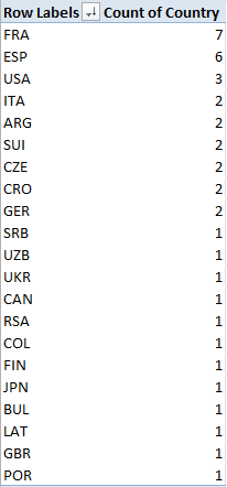
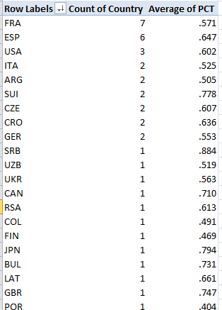
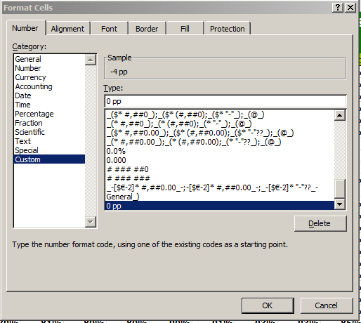
If, for example, you want to reconsider the data in pivot table form, well, go ahead. And when you do you’ll get here:

 re21

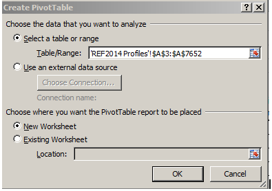
Allow me to suggest that the single-columned range requesting your OK isn’t what you’re looking for – but what’s the request doing there to begin with? Scroll about the sheet until you pull over by the merged cell L6:

re22

And it’s that that unassuming, title-bearing text that’s jamming the table construction, by squatting directly atop the data and stringing itself to the data directly atop it in rows 3 to 5 (that latter row is hidden, and features another bank of apparent, and extraneous, field headers. I can’t quite explain what they’re doing there). Thus the contiguous data set – the warp and woof of pivot tables – starts in row 3, and the pivot table launch process regards it as such; but because its “headers” head column A only, that’s all Excel chooses to work with for starters; hence the curtailed A column range in the screen shot above. The fix of course is simply to delete the title in L6, restoring the data set’s inception to row 8 (note that because L6 is a merged cell, it takes in row 7, too).

Next, in the interests of corroboration, you may very well want to go on to calculate the sub-ratings streaming across each data row. Let’s look at the numbers in row 9, the Outputs for the Allied Health Professions, Dentistry, Nursing, and Pharmacy area at Anglia Ruskin University. The 1-4 ratings (along with unclassified, the rating set aside for work of the most wanting sort) – really field headers – patrol cels L8:O8, and so I’d enter the following in Q9:

=SUMPRODUCT(L9:P9,L$8:P$8)/100

Here the most nifty SUMPRODUCT, a deft function whose Swiss-army-knife utility is very much worth learning (and that goes for me too) multiplies paired values in L8/L9, M8/M9, etc. across the two identified ranges (or arrays, as they’re officially called) and adds all those products, before we divide the whole thing by 100, because the REF’s staff counts need to be expressed anew in percentage terms. The $ signs hold L8:P8 fast; they store the rating values, and because they do, will be brought to all  the 7,500 rows below.

But if you’ve gotten this far you haven’t gotten very far at all, because you’ll be told that Anglia Ruskin’s Health Professions scholarly exertions earned that department a 0, even though THE awards it a 2.92 – and if you don’t believe that, it says so right there on page 41 of its hard copy.

Someone’s wrong, and it’s us – though with an excuse, because the REF spreadsheet has shipped its field headers in label format. 4* isn’t a number, and neither is “unclassified”. Mulitply them, and you get nothing – in our case, literally. Of course the remedy is simple – replace 4* with a 4, and so on, though it should be observed that you can leave “unclassified” alone; after all, multiply a value by 0 or by “unclassified”, and either way you get zero.

In any case, once we get it right you can copy the formula down the Q column and name its field Averages or whatever, and you’re ready to get your pivot tables in gear. But the larger, or at least the prior, question that could be rightfully asked is why the REF did what it did. It’s clear that its data stalwarts are happy to make their handiwork available to folks like us; that’s why they’ve given us a spreadsheet. How then, do we account for the little bumps in the road they’ve raised across our path? There’s nothing secretive or conspiratorial about this, of course, but the very fact that the REF averages of departmental accomplishment just aren’t there leave them to be computed by interested others. And that bit of computation could have been eased with bona fide, quantified ratings in L8:O8, and a repositioned title in L6. Those little touches would have been…excellent.

Set Theory: Tennis Stats, Beneath the Surface

28 Dec

Don’t bother looking; the year-end men’s tennis rankings are in, and I’ve failed to crack the top 100 – or even a few orders of magnitude beyond, if you insist on shining the flashlight on the whole list. I’m searching for a new coach but Ivan Lendl won’t take my calls, and I remain open to suggestions.

But if you need to know the names of the boys in white who did manage to serve-and-volley their ways past yours truly, check out the CoreTennis site’s Association of Tennis Professionals (ATP) listings for men, along with the Women’s Tennis Association standings, too. Here’s the men’s file:

 atp 2014

(You’ll probably want to untie the ribbons on the wrapped text in there and refit the columns, too.)

Now while the players are ranked indeed, the measure by which they’re ordered – the number of matches each contested – doesn’t quite seem to make the point. Are the best players those who simply step onto the court most often? I would think not, at least not invariably, though it makes considerable sense to suppose that players who’ve plied more matches are the ones who’ve likely gotten farther into the tournaments in which they’ve appeared. Or a large match quotient might tell us little more than the player’s determination to slot more tournaments in his diary. In fact, the correlation between a player’s match total and his winning percentage (the PCT field) works out to .681, impressively high to be sure, but not invariable. In any case a click of most of the headers will grant a re-sort of the data by that field instead (and note the pasted, sortable headers preserve their hyperlinks back to the CoreTennis site, and as such will respond to clicks in their cells with a return to their web sources. By creeping into the first link-bearer via the mouse and selecting the all others with a Shift-right arrow, click-free feint, and right-clicking the Remove Hyperlink option, unimpaired, standard cell editing will be enabled anew, however).

But the decision to sort the data by matches played is more editorial than operational, as is the confining of the dataset to a 40-player elite. So if you’re looking for something operational , then, look at the PCT field and its train of leading zeros. One runs into this supererogation rather often, and I don’t quite know why the sheetmeister here couldn’t have served up this custom format:

 tennis1

(Warning: tennis-themed pieces are dangerously pun-provocative. I’m trying to control myself, but no promises.)

Moreover – and this is an operational quibble, and a not entirely fair one here – it seems to me that the analyst, again as opposed to the reader, would be able to shape the data set sans any ranking field at all. And that’s because a pivot table can rank its contributory fields with the Show Values As > Rank Largest to Smallest/Smallest to Largest option as needed. But of course CoreTennis can’t be expected to capitulate to the spreadsheet lobby on this count.

Now about those headers, in particular three of the last four:

 tennis2

The source data don’t read that way, or course – so what’s happening here? Remember that, as with last week’s post, I simply copied-and-posted the rankings to my local spreadsheet (and by the way, appearances to the contrary, the data do not fill an Excel table, in that term’s contemporary sense; they’re nothing but a data set, all snug in their columns and rows), and the recipient cells have chosen to treat the headers as dates. Thus Excel reformats the first of the problem headers, natively headed 6-0 (and totalling the matches the player won six sets to none), into June 1900, the reckoning my US-date-formatted system assigns the expression. You want to see 6-0, though, and perhaps the simplest restorative is to type the Neolithic, text-defining apostrophe into the cell and simply re-enter 6-0, and repeat for the remaining dated cells. Note on the other hand that cell H1 – the one recording the 0-6 header – is, and always was, a texted thing, because if Excel regards the 6 in 6-0 as June, it can’t regard the 0 in 0-6 as anything at all. And when all else fails, the torpid text format jumps right in.

And had CoreTennis asked me, and rest assured they didn’t, I would have reassigned those three-lettered player country designations to a field all their own, and so freeing those data up to some useful pivot tabling. But as those abbreviations share a space with their citizens’ names, we might want to think about a formulaic extraction of the country codes.

And that’s a job for the MID function, a device I recruited in this post to extricate two-digit month identifiers from larger expressions. Here the task is a touch more formidable, because we don’t know exactly where in the respective player/country cells the county codes start. So here’s one – and just one – stab at the problem, working from cell K2 and literally addressing Roger Federer’s info in B2:

=MID(B2,FIND(“(“,B2)+1,3)

Here MID outsources its second argument – the character position at which the extraction is to commence – to FIND, which discovers and enumerates the whereabouts of the open parenthesis/bracket, in turn always one character to the left of the inception of the country code 0, and thus accounting for the +1. The final 3 instructs MID to grab that many characters from the cell, as all the country codes comprise precisely 3 letters.

Once you get that going, copy the formula down the K column (which I’ve field-named Country). Now you can pivot table a country breakout, e.g.

Row Labels: Country

Values: Country

Sorting the numbers from Largest to Smallest I get:

 tennis3

France leads the country representation, and that’s Spain (Espana) counting one less player (the women’s top 40 leads with the USA and Czechoslovakia, with five entries each. You could then slide the PCT field into Values, summarize these by Average, and subject the numbers to the same customizing pictured in the first screen shot up there:

tennis4

(Remember the numbers above average different players’ percentages, and as such don’t weight these for numbers of player matches played. But, those numbers are sufficiently close to accord them weighting parity, and in any event there may be good reason here to treat the individual percentages as equally contributory). Note Serbia’s (SRB) chart-topping .884. That kudo of course belongs to Novak Djokovic, but he’s a universe of exactly one. Needed here: more players to rank. And if you want to see my name in there, needed here: Ivan Lendl.

Let’s REFer to the Research Excellence Data

22 Dec

Compare and contrast, the test-makers like to say, and that alliterative injunction packs a redoubled punch across the Research Excellence Framework (REF) data put together by Research Fortnight, the self-described “leading independent source of news, analysis, funding opportunities and jobs for the academic research community” in the United Kingdom. You can compare the estimated six-year estimated funding prospects for 154 UK universities, driven by a weighted assay of their research standings and Research Fortnight-devised power ranks, and then compare the very handling of those numbers by the data managers at two national publications, the Guardian and the Telegraph here:

http://www.theguardian.com/news/datablog/ng-interactive/2014/dec/18/university-research-excellence-framework-2014-full-rankings

and here:

http://www.telegraph.co.uk/education/universityeducation/11299261/League-tables-the-top-universities-for-research.html

(Transparency check: remember, I teach an Excel class for the Guardian.)


Ok; now do you notice any formatting curiosities in the Guardian’s data capture?

 re1

Why, for example, should the wholly-integered Fortnight Power Ranks splurge to two decimal places, a question that could be even more pointedly posed of the counts in the Number of departments field?  And indeed – why Velcro a second decimal to the RF quality index data, when no meaningful values fill that space?

I’m not sure I can answer those questions, but eager to slake the acquisitive pangs of my hard drive, I clicked the petite Get the data link spaced below the Guardian table, and was taken nowhere. A pair of right clicks atop the table – one, to spark an internet-familiar menu, the other, to stab at the Export to Microsoft Excel option did what it usually does, nothing:

re2


Having vainly fought the good fight, it was time for a shameless resort to Plan C – a drag across the data, and a simpering copy-and-paste of them all into a blank Excel sheet (you may be able to start the copy with a right click > Select all try). But what I saw, apart from the need to unwrap the text from their constricting cells and auto-fit the Research staff column, was nothing if not interesting.

For one thing, those Power Ranks are more than just zero-freighted.  That digital exorbitance is aggrandized by still more, only-now-seen values pulling rightward from their decimal points, and if you like your bewilderment full-blown, take a hard look at those decimals. Each one mirrors the substantive value to its left, e.g., 11.0011, 81.0081, 53.0053, and this curious echo appears to sound across every number in the table in the Excel edition. I don’t presume to know what it means, but it’s there, as is the second decimal point speckling all but six of the ostensible numbers in the Power Rating and most of the other fields : 97.3097.3, 37.8037.8, and the like, an intrusive fillip which, among other things, degrades 147 aspiring Rating numbers into text.

There’s more.  The 2,409 Oxford staff attributed by the Guardian site undergoes a logarithmic leap to 24,092,409 in our spreadsheet, making for an astonishingly favorable faculty-to-student ratio, one bettered only by University College London’s 25,662,566, and that’s in a city numbering a village-small 8,500,000 residents.

What happened here? Again I really don’t know, although doubtless there are folks somewhere out there who have the answer (I read my emails). The revelatory powers of a simple copy-and-paste, through which net-sourced data make their actual, lengthier, suppressed values/text known to the spreadsheet setting, is something I’ve experienced before, and must have something to do with the movement from source data to web page. But in any case, my mystification sends me back to my semi-rhetorical question: do the complications we’ve encountered here matter?

Again, for the reader qua reader they don’t. As it stands and apart from its redundant decimals, the Guardian table presents no particular challenges to legibility, making for a rather straightforward read, once you acquaint yourself with the meaning of its fields. But the problem, of course, besets the analyst, those seekers of new and arresting finds who want to saddle up atop the data and take them for a ride. You can’t do much with 97.3097.3 if you want to count or average it.

That’s not to suggest that the data are beyond repair, but the process could get messy. To bring research staff sizes back to reality, for example, you could divide them, but  staff sizes above 1,000,000 require a denominator of 10,000, even as the smaller others make do with 1,000. And you could perform a Find and Replace for all the data’s decimals by replacing each point with nothing and thus requantifying these entries; but again, dividing these in order to restore their original magnitudes seems to require differently-sized divisors.

On the other hand, you could copy and paste the Telegraph’s rendition (itself a tricky business, as the table needs to be scrolled though; try keeping the left mouse button down and position it just beneath data as you continue to scroll; you may also have to hand-enter the field headers) and go to work. The numbers here are numbers (and by the way, the Power Ratings are calculated by dividing a university’s predicted share of funding by Oxford’s 6.24% percentage).

It’s clear, then, that the Telegraph thought through the data – precisely the same data – differently.  You’ll have to ask them all what they thought – and “them” includes Datawrapper, credited with doing the heavy lifting for the Guardian.

Let me know what they tell you.


Its Byte is Worse Than Its Bark: New York’s Tree Census

15 Dec

I am two with nature, professes Woody Allen, and this New Yorker is only too happy to corroborate his math.  I know nothing about the flora that roots itself in the city’s spaces, and with my gaze locked in perceptual auto-filter, I hardly see them at all. The only branch I’ve noticed lately is the one that belongs to my bank.

In other words, I can’t see the trees for the forest, but they’re there – about 623,000 of them, and the New York City Open Data site’s borough-wide arboreal inventory fills me in on each and every one of them, should I at last decide to make the acquaintance. Look here for the data:

https://data.cityofnewyork.us/browse?q=Street%20Tree%20Census&sortBy=relevance&utf8=%E2%9C%93

The census has pretensions to completeness, and given its address-level molecularity I’d guess it comes pretty close. In the interests of cross-county comparisons (borough equals county) I downloaded and copied-and-pasted the records to a consolidating master workbook, thus harvesting all 600,000 or so trees into one Sequoia-large data set, one that at 60 MB would do severe ecological damage to Word Press’s downloading channel. In other words, you’ll need to consolidate the above link’s offerings on your own.  (Note: the Staten Island data originate in DBF, or dBase mode, but follow the standard File> Open check-in with a specification for dBase Files (*.dbf), and the data will effect its proper spreadsheet mien. Note in addition that Staten Island’s Treepit numbers – referencing a field about which I know absolutely nothing – were minted in label format, and I don’t know why; but I’ve yet to work with them, either, so the matter remains moot, though curious.)

And the meaning of the entries in the set’s fields isn’t entirely forthcoming; preeminent among the recalcitrant is Species, whose coded tree names had me searching for a Boy Scout, at least until stepped on this document in the wilderness:

http://www.nycgovparks.org/sub_your_park/trees_greenstreets/treescount/images/species_list.pdf

Courtesy of none other than New York’s tree census.

After saving it all as a text file and pasting it into a new workbook sheet, feeding the names into a text-to-columns grinder and mashing the columnized names via a concatenating ampersand or two (e.g. =B3&” “&C3&” “&D3&” “&E3), I nailed and glued the whole goopy effluvium into a tottering VLOOKUP table that seems to be standing up to New York’s December gusts and showers. After next inundating the sheet’s next available column (which I titled Species Name) with lookup formulas that exchanged the codes for the full species names, and paved the formulas over with a copy Paste Special > Values hard-coded surface, the deed was done.

Now what? Well, note for starters that the folks of the New York design studio Cloudred  have cultivated an interactive chart of the trees and their species/borough distributions, leaving your character-based correspondent here to wonder about such other tree novella in there as might be learned. So how might the tree census tally broken out by the city’s zip (i.e. postal) codes work? Try running this by or through a pivot table:

Slicer (or Report Filter): BOROUGH

Row Labels: ZIPCODE

Values: ZIPCODE (Count)

Then try Slicing Manhattan, for example, and sorting the results Largest to Smallest. I get, in excerpt:

 trees1

Now here is where some New York-percolated smarts would hand-craft your understanding of the numbers should you want to key tree demographics to zip codes and their constituent neighborhoods (and if you’re in need of percolation, look to this zip code/service-area legend:)

https://www.health.ny.gov/statistics/cancer/registry/appendix/neighborhoods.htm

Heading the count is 10021, coding none other than Manhattan’s fabled Upper East Side, among the country’s poshest districts and 50% greener than silver medalist 10025, right across Central Park in the island’s Upper West Side, itself literally just above third-place 10024, somewhere in the middle reaches of the Upper West Side. The sociologists among you will wonder if class, politics, or the politics of class have committed their invidious inputs to the tree populations, or rather if territorial receptivities to the planting enterprise better explain the variance.  And for the curious, Staten Island –  containing far fewer human New Yorkers than any other borough but second only to Queens in the hardwood department  – can market its 10312 as the New York’s most tree-swarmed zip code, reporting 23,156 of those life forms to the authorities. (Note by the way the 24,000 zip-code-less entries in the data set, though, and I see no enumerations of park-resident trees, clearly an enormous and apparently uncounted cohort. It appears as if our data surveys address-bearing trees alone, unless I’ve got it way wrong.)

And you’ve been asking about New York’s tree diameters, and I hear you. They’re recorded here in what must be inches, and we can kick off with something simple:

Row Labels: BOROUGH

Values: DIAMETER (Average, squeezed to two decimal points. I get

The averages diverge notably, though you’ll need a greener thumb than mine pressing these keys to understand and explain why. Perhaps Manhattan’s penumbrous skyline stunts tree girths, but again you’re hearing that supposition from the wrong person – just ask Woody. If, on the other hand, you try this table out:

Row Labels: Species Name

Column Labels: BOROUGH

Values: DIAMETER (Average)

trees2

You’ll find some inter-borough comparisons across the same species that place the Manhattan diameters on the low side.

A few final points: As could be anticipated with a 623,000-record data set, some distinctly outsized numbers appear to have crept into the park. The 148-32 86th Avenue address in Queens’ Jamaica neighborhood boasts a 2100-inch-diametered  tree, and my Google Maps photo just doesn’t capture it. At 175 or so feet in width, I think it would show up.

The last point: the data with which we’ve been working hold up the back end of what New York Open Data showcases in the first instance as a set of borough tree-positioning maps of the census. Here’s the one for Manhattan:

trees3

Maximum coverage – maximized information? That’s called a rhetorical question. Here’s a couple of mine:

The Bronx

Manhattan

Putting OEDC Asylum Data on the Table

5 Dec

Shopping for spreadsheets? If you’re in the neighborhood, poke through the inventory at the Organization for Economic Co-ordination and Development, acronymized OECD, you’ll be happy to know. We’ve been here before, on July 25 to be exact;  but I told you it’s a large inventory.

In fact there appear to be several points of ingress to the holdings, but here’s one

http://data.oecd.org/

a self-described Public Beta page that enables you to “Find core datasets in the data warehouse and make your own tables and charts in OECD Stat Extracts”, a triflingly ambiguous inducement, appearing as it does to conflate the term “datasets” and the “Database” informing the title atop the quoted passage, but again, that’s a trifle.  More to the point is the availability of the data in either unmediated spreadsheet form, or downloadable as such via an Export button.

In any case one such set, a brief of statistics on asylum seekers to OECD circa 2013, seized the attention of the Guardian’s datablog (note that site’s redesign, and the disappearance of its erstwhile Data link from its home page), and is the one I think I’ve managed to capture here -even as the OECD heads its source page Stacks and flows of immigrants, 2002-2012 and so seems to have made off with a year (I’ve also retitled the workbook, overwriting its long, number-beset native name):

Inflows of Asylum seekers in OECD members and the Russian Federation

A first view of the sheet exposes it in Page Break Preview, a perspective on the data that won’t particularly advantage the analyst, and so you’ll want to make your way back to the standard Normal View. Moreover, the recourse toward the Freeze Panes selection at the columnar intersection of A and B seems puzzlingly needless, as the sheet bares all its numbers and country names immediately. I’d unfreeze the panes right away, even as I continue to wonder about the dictionary form which Microsoft mines its verbs. What would your teacher say about unfreeze? In addition, the missing field header in column A needs to be supplied.

Note, on the other hand, the proper distancing of both the sheet’s title and its yearly grand totals from the body of the data with the expedient of choice, the blank rows. But at the same time recall the OECD’s invitation to its visitors to “Find core datasets…and make your own charts and tables…”.  Again, our sheet assigns its yearly data to one field per year, when in fact all the years and their associated numbers would more profitably be reined into greater, subsuming fields. Not this, then:

oedc1


Butt again, this:

oedc2

(For a straightforward review of the means toward the above transformation over and above what I’ve said about it, look here.)

The companion question, then, is what plans the OECD have for the data once they hand them over to us. True, the workbook’s as-it-stands configuration does happily supports a round of charting, but less certain are the data’s congeniality to making “your own tables”. Once, however, the information fills the pared-parameter shape assumed by the second of the above screen shots, the prospects for this kind of pivot table loom a lot larger:

Row Labels:  Country

Column Labels: Year

Values: Values

Now this facile breakout of the asylum numbers by year is ready to happen, because all the years share the same Year field as an item. Try the above pivot table that when the each and every year occupies a field to itself.

But hold on. When the pontificating is done, my self-assured amelioration cooks up nothing but precisely the worksheet that already presents itself at the point of download:

oedc3

Same numbers, same juxtaposition of fields. So what was my point?

That’s a sweat-inducingly good question. But once all those years and their concomitant data recuse themselves from fields into items you can also treat the values to the % of Row Total styling, and learn, for example, that 30.88% of Turkey’s asylum seekers during the 2002-13 interval made their way to that country in 2013 alone, a clear attestation of the Syrian conflict’s scattering effect upon its populace. Less obvious is Hungary’s 2013 percentage of 37.22 of all the seekers it received across the 12 years, a skew I can’t yet explain.

Now consider this OECD book, counting member populations by their residents’ country of origin:

OEDC Immigration data 2011

Compare that far larger dataset’s field structure with that of the one above, e.g.

oedc4

That’s really more like it, even if the data themselves could stand some clarification (I’d bang out a lookup table that would return country names in full, and the data are available on the OECD site in a PDF for doing so. Is AUS, after all, Austria or Australia?).

And these variously-structured workbooks drag one ore question into the fray: why should some OEDC workbooks be stitched along this, or that, pattern of design – fields as items, or items as fields? I don’t know, that answer; nor do I know if the OEDC has endeavored to think about it.

But I’ll be happy to think about it, folks.  Here’ – I’ve attached my business card.


Eurostat Data: Some Footnotes and NUTs

30 Nov

Sorry to butt in in the middle of breakfast/lunch/dinner (tick one – I’m requesting your location just once, and my intentions are cookie-free), but allow me to ask: if a web site makes its data – the same data – available in both spreadsheet and PDF incarnations, what are we being told? It seems to me that the latter possibility speaks to the former; that is, the shipping of information into a read-only, do-not-touch mode suggests the other shipment is meant to be used.

One man’s opinion; and having so opined, I took my self-satisfied take on the matter to the data depot in the European Union’s Eurostat site, the statistical office for that far-flung association. There’s a lot of stuff in there; climb its tree structure and you’ll come away with all manner of facts and figures and nuts and bolts about member nations, a great deal of which (perhaps even all) clothe themselves in spreadsheet raiment. And again for seekers of alternatives, a good many of these parcels of stuff can come to you in PDF suit-ups too.

And so I shot an arrow into the air, and it came down upon this spreadsheet

Eurostat_Table_guest establishments

(It’s original name isn’t nearly as graceful)

and headed in row 1 “Number of establishments and bed-places by NUTS 2 regions”, that pun-evocative acronym abbreviating Nomenclature of territorial units for statistics (look here for more), a vocabulary for hierarchically tiering EU territories by are.

In fact the downloads offer themselves to us thusly:

 euro1

For starters, at least, I went for the XLS With Footnotes and short description, the workbook I’ve linked above.

Once you’ve auto-fit the columns (and as usual, the spreadsheet author hasn’t ) you’ll understand that rows 1 and 2 have to be pushed away from the data below with your true-blue blank row in between, as does 321, directly beneath the cell that among others names the Batman region (face it – you can’t help but admire my comedic restraint here). Next lower yourself into the data and think about the colons (e.g. row 139), that plant data-not-available markers all over the sheet. True, a replacement zero wouldn’t work here, representing as it would an authentic, quantified data point; but still, the labels are data weeds in a field otherwise marked out for values (and hold on to that thought).

But then there’s column C, and E, and G, and all those other empty corridors elbowing their way between the yearly numbers. Were these vacuities nothing but nothing, that is, airy space-makers between the data, we could simply delete them. But in fact the columns aren’t quite all empty, and have after all received a marching order. Remember my download asked for a workbook with footnotes somewhere in the workbook, even as I couldn’t quite fathom what that ask was going to deliver. It turns out that C, E, and G (I know; sounds like a major chord) and their compatriots have reserved their spaces for those very footnotes. Look for example at S130:S133 and their (u) entries; and if you look in turn back to what should now be row 322, its (u) explication, flagging a datum of low reliability, reads loud and clear.

And those largely but not wholly unattended footnote columns really mean well, because had the (u)s been made to cling to the values they footnote in their several cells, the value would  have regressed to a text standing as a result, and would have repelled their data-purporting charge. Thus the sheet designer has rightly put the footnote-labels in their place – a place at a decisive remove from the numbers to which they’re keyed, in a column all their own. And yet the colons, themselves footnoted in row 322 as well, punctuate the columns of the values, albeit in otherwise unoccupied cells.

But cavils aside, what is the analyst to do with those footnote-spattered columns? How, for example, can a pivot table look past those extraneous, heartily non-contributory soft spots in the data set, and succeed in doing something manageable with the whole potpourri?

I think it can, by doing something exceedingly simple. How about naming the footnote columns? Once named, the columns advertise themselves as bona fide fields, however sparse, which can be then be properly ignored by the pivot tabler who wants to study only the annual numbers in the year fields.

Simple indeed, but putting new fields into play won’t complete the assignment. You’ll still need to do something about the colons, and because they’re sprinkled among the data-toting year columns, that something won’t be our standard sort-them-to-the-bottom-and-jab-in-an-empty-row patch, a nice but futile try here that would continue to leave colons above the bottom of the data by which you sorted in many of the other columns, by which you hadn’t sorted. Better here, then, might be a find and replace, in which the colons could be overwritten by zeros. Those numeric replenishers would at least restore some numeric standing to the cells, and so qualifying the data to run through their quantitative paces, including some grouping activity. Again, however, the zeros won’t be entirely truth-telling, as the NUT in question will be understood to have no guesting places, when in fact we don’t really know if they do or not.

The larger question, then, is what we do with data of the NA kind, however labelled. Another alternative here, then: find the colons and replace with say, the number 1,000,000, sort the numbers ascendingly, and hammer in the blank row right there. That is, a prudent surrender. There isn’t much else you can do with records that don’t know what’s in their fields.

I also feel obliged here to return the discussion to the field-item disquisition I’ve conducted on these pages, and the analytically advisable demotion of the year fields to item status, all rounded up beneath one, grand field.

And the plea to fairness again obliges me to begin to close the circle and track back to Eurostat’s square-one download options. Had I downloaded the data Without footnotes, I would have spread this sheet before me instead (in excerpt):

euro2

And that looks more like it, doesn’t it? But we still have those colons, don’t we?

But please – go back to breakfast/lunch/dinner. And sorry about the coffee spill  – dry cleaning should get it out. Don’t forget to bill me.

Territorial Imperative: The Data Behind the Map

21 Nov

Who was it that said a picture is worth a 1000 cells? I don’t know either, but while you word-search your Bartlett’s I’ll slip out the back door and tip toe to the DataShine site.

That’s where the exceedingly cool and protean map plotted by the University College London’s Oliver O’Brien and his associates shakes its booty of riches at you, the one that fixes in space the data points for all sorts of demographia about the United Kingdom population (sourced by the country’s 2011 census) – ethnicity, religion, modes of transport to work, educational, second homes outside the UK, the whole polymorphous, multi-regressed, information-rife, full whack of sociological goodies.

Just click through the options in the floating Data Chooser

 shine1

And observe the color coded (we might call it conditionally formatted) distributions splash across any one of ten UK cities; let your mouse roll atop the maps’ microscopic OAs, or Output Areas (“…the lowest geographical area at which census estimates are provided”, according to the page linked in this sentence) and watch the Key’s scaled percentages hip hop up and down its rungs (and view the fine-printed OA codes as you roll). All told, it’s one glorious depiction. Or many.

But grab the map, squeeze, and watch it crumple into a million rows and columns.  Shake it hard, and a torrent of spreadsheets showers out of that wad, each one keyed to parameter’s worth of data, each one as prosaic as the chart is brilliant.

For example, if I tune into Data Chooser > Housing > Number of Bedrooms > 3 Bedrooms, and proceed to click Data in the dialog box at the base of the map:

shine2


(and it’s here too where you get to identify the city to be mapped, say London for example’s sake)


This workbook (in excerpt) unpacks before you:

shine3

Leaving aside the perennial column-auto-fit  issue, the sheet names the pertinent OAs, their superordinate Local Authority and region, and in this case, two coded references, QS411EW0005 and QS411EW0005 (base). These count the number of three-bedroom households and all homes (I’m assuming the base denotes homes here, and not residents) respectively, culminating in the OA Percentage  – in a manner of speaking.  The numbers in OA Percentage don’t attest a simple division of the coded data by their base, because they’re integers, an order of magnitude 100 times larger than authentic percentages; and that would at least matter were an analyst to format the values in Percentage terms.

And so on. Any click upon any parameter and its specified value (i.e., 3-bedroom), and a follow-on click Data does much the same. We see then that the Datashine map(s), if you will excuse this bit of reductive sophistry, “really” comprise the additive magic of a legion of homely spreadsheets. Put otherwise, the tables give rise to the tableaus (I’m sorry – I like that).

Of course I’ve stretched the point, and probably until the rubber band has snapped. Of course the maps are hardly “nothing but” their foundational workbooks, but the arrow of dependency between workbook and map is nothing if not striking. The spectacular, emergent cartography of the Datashine maps flowers atop the grittiest topsoil, and indispensably so.

But of course the comparative dimensionalties of map and sheet suggest different functionalities. You can’t simultaneously map, say, all of London’s ethnicities by AO, at least not without resorting to a round of implausible histrionics I can’t even imagine performing. To frame the challenge more universally, I don’t think you can map multiple items of the same parameter at the same time. You could, however, map the numbers of Sikhs who own three-bedroom houses and bicycle to work – i.e. one item each of several parameters – once you generate a sheet that lifts those items, and just those items, from the Ethnicity, home ownership, and mode-of-transportation data sets.

But a spreadsheet could crosstab all ethnicities by any and all AOs, apart from the technical trammels laid upon the data by the 1,000,000+ record limit. Indeed, were it operationally possible to columnize the data for every variable for every census respondent – and given London’s population it isn’t – you could break out any variable by any other one, by pivot tabling them and returning breakouts by every item in any field you choose. But that at-least-conceivable swoop across the data simply can’t be imagined by a map, unless I’m missing something.

Certainly a single mapped data point could capture the variable magnitudes of two fields in tandem. For example, the stirring MIT Senselab viz Trains of Data/Trains in Time viz of French train activity across a day’s worth of traffic batches both punctuality and passenger capacity numbers in each point, by color-coding timeliness and registering capacity by point size:

 shine4

But the Data Shine maps can’t get with that program, because their data points are coterminous with fixed territories – the Output Areas. Resizing the points isn’t an option, not if the map wants to hold its shape beneath each and every parameter hueing atop it.

So what’s the punchline, then? Simple (alright – maybe even too simple): Sometimes you need a great map, and sometimes you need a great spreadsheet. It’s just that you can’t have the former without the latter.

Paris’ Budget Participatif: Voici le Data, Part 2

16 Nov

6,200 discrepancies can get to a guy, particularly the 6,200 uncommonly literate zero-year-olds who seem to have crept past the examiners for the Budget Paticipatif vote and had their pudgy-fingered clicks duly recorded.

OK – that diapered constituency couldn’t have done what we’ve been told they did, but how the misidentifications could be understood makes for one very good question.

Remember first of all that the peculiarly plural character of the Budget vote, in which citizens were perfectly free to vote on up to five projects – militates against a straightforward demographic summary of the actual individuals who took part in the referendum. We’ve seen this problem before, but because the same individuals with the same ids could have, and did, call upon the data one to five times variably weights their presence. And that means, for example, that any intention to learn how many discrete, voting Parisians live in the 18th Arrondissement (district) suffers from an undue complication, because Pierre from the 18th may have voted for 5 projects, even as his neighbor Amelie may have elected to ratify but three. (For a graphically-driven look at individual votes look here.)

That’s one issue, along with those zeros. First, if you peel away the now-blank row 97750 and reunite the zero records with the pack and strike up a pivot table comprising exactly one field:

Row Labels: id

You will have done what Row Labels were designed to do – enumerate unique instances of each id/voter, of which I get 24001. Now roll age into Row Labels, too, sign off on the Tabular form, and stanch its subtotals (these decisions are motivated by Tabular’s collinear effect, which levell super and subordinate labels along the same row. You also don’t really need any Grand Totals here either). The new count: 24028 rows – and that means that 27 voters have something more than dual citizenship – they have dual ages, and I’ve lost the number of my local relativity theorist.

But seriously, folks, that means 27 voters incurred a second age assignment somewhere among their one to five votes. Considered in their numeric relation to all voters, the error-bearers amount to barely, and merely, one-tenth of a percent of the electorate, and statistically speaking that’s not bad. And what that also apparently means is that all the other zero-aged voters – about 1,400, according to my stress- testing of the numbers – received only zeros across all their votes.

And so while the error-trapping yield above is scant, we might as well do something to restore those 27 multi-aged participants to the unitary value they deserve. Start by lifting Age over the great divide and settling it into the Values area, and moving to summarize the numbers therein by Max. That decision puts every voter ID in touch with his/her “largest” age, i.e. it defines the 27 by their non-zero, actual age. Then select the entire pivot table (PivotTable Tools > Options > Actions > Select > Entire PivotTable) and name the whole thing Ages.

Then click back to the source data and in F2, or the free cell hard by the first record and enter

=VLOOKUP(A2, Ages,2,FALSE)

Then copy down F (note: if your computer’s like mine, all that processing take some time). That expression matches each id in the data source with its twin in the pivot table (now operating under that Ages range name); and hence the 27 ids with zeros somewhere among their several records should experience a replacement of  those ciphers with the maximum value associated with those ids – that is, their apparently real age. Then Copy > Paste Special > Values the F results onto the corresponding entries in E (the age field), and delete the VLOOKUPs, their work having been completed. Then sort the data by age, again Largest to Smallest, and the zero-aged cells now debut at row 97792 – a felicitous demotion, as it were. In other words, we’ve refit some of the ages.

Now in fact the row numbers mean we’ve added authentic ages to 42 records, then, even as we earlier counted 27 ids suffering from that zero imputation. The answer – on assumes – is that some of those 27 had more than one zero among their multiple votes. Now you can reinstitute that blank row to send the recalcitrant zero records packing – but the row goes above 97792.

But of course we’re still left with the 455 voters falling, or crawling, somewhere between the ages of one and ten. Are they any more genuine than the zeros? I don’t know, but if you throw a pivot table at the question:

Row Labels: age (grouped in bins of ten years, for example)

Column labels: projets

Values: project (Count)

You’ll see that these petite partisans allotted greatest support to the Rendre la rue aux enfants project (approved, by the way), an idea for cordoning off play streets for the younger set, and the Cultiver dans les Ecoles educational initiative for school-based gardens. A savvy – and self-interested group. The implication, then: perhaps those ages are for real. Just implying, you understand. And as for you, Francois Hollande: keep an eye on them. Don’t say you haven’t been warned.

Paris’ Budget Participatif Vote: Voici le Data, Part 1

6 Nov

Vote early and often, the wags advise, their hard-bitten bromide borne of the storied, dodgy business conducted in certain American electoral districts. But it seems as if some jurisdictions actually promote the one-person-multiple-vote equation, and for the common good besides; witness the recent Paris’ Budget Participatif (for some unaccountable reason the web site is in French), a referendum on budget allocations to a range of projects conducted both online and in hard-copy mode (they used to call those ballots), in the week endpointed by September 24 to October 1 (ok, that’s eight days, but who’s counting?). And among other niceties, each Parisian was duly enfranchised to vote for up to five projects, the numbers from the online segment recorded on the Paris Open Data site and brought to you here:

 Budget participatif

Democracy is a messy business, and by fitting corollary perhaps, the workbook’s 104,000 votes (out of a grand total of 174,090) aren’t completely tidy either (remember that the workbook reports the online votes only). Sort the age field Smallest to Largest and a spray of negative numbers douses the top of the column, and the existential impossibility they portend needs to set aright. But those minus signs are simply errors attaching to the voters’ actual age (as confirmed to me by Paris Open Data); and because they are I’d jump into the unattended cell in F2 and pencil in the ABS function:

=ABS(E2)

Excel tells us that ABS “Returns the absolute value of a number, a number without its sign”, which sounds good enough to me, restoring as it does the putative negative ages to their intended, usable positive state. Copy the ABS down F, follow with a Copy> Paste Value > Values into and down E, and then delete all those ABSes, if that isn’t too ungrateful.

But one repair doesn’t fit all. Sort the ages again, this time by largest to smallest, and take note of the 6,200 or so voters aged zero, all too happy to add their squeaky sonorities to the vox populi. These clear and present mistakes give us literally nothing to go on, and because they do I’d bail out, by scampering to row 97750 and preparing to inlay the trusty blank row that’ll hold those these pretenders at arm’s length from the ranks of the usable. But redirect your glance just a mite upward and view the 19 votes cast by one-year olds, and the 352 more registered by a precocious electorate ranging from two to nine. Remember that Budget Participatif imposed no age limit on its potential constituents, and so apparently nothing could have detained these jejune activists from the process, unless it was past their bedtime. Absent verification of these junior politicos from the powers that be – and I’ve sought it – I’d provisionally aim that blank row right instead above 97374, where the nine-year-olds give way to the tens (again we’re assuming the ages have been sorted highest to lowest). Is that drawling line arbitrary? A bit, but I’m separating those records, not deleting them; if events warrant I’ll be happy to bring them back into the fold.

Have completed those prefatory chores we can buckle up take the data out for a spin. Start with something simple, say a pivot table that breaks turnout figures by the referendum’s eight dates:

Row Labels: date_de_vote

Values: date_de_vote

date_de_vote (again, this time via Show Values As > % of Column Total)

I get:

vote1


(Note: Your machine’s regional time format may trend the row-label chronology differently. My US format pushed 1/10/2014 to the top of the labels for starters, presumably treating October 1 as January 10.By right-clicking the date and selecting Move > Move “1/10/2014” to end, I succeeded in reassigning it to its rightful place.)

What’s noteworthy here is the voter shortfall for September 26 and 27, a Friday and Saturday respectively. Remember these are internet votes, an electoral medium whose greased access route to its virtual polling place should have flattened any and all daily variation in turnout. Not so, apparently; perhaps it was the Parisian fondness for le Weekend that succeeded in distracting the collective attention away from all things political for those couple of days (on the other hand, the participatory peak in the referendum’s final two days may attest a procrastinators’ late dash to their screens).

We can next take an age-graded look at the results by lining up average voter age by project preference, something like

Row Labels: projets

Values: age (by Average, formatted to two decimals, and sorted Largest to Smallest)

age (again, by Count)

 vote2

Don’t, first of all, be flummoxed by the Count of Age heading, which in fact delivers the vote count for each project, and merely grabs onto the age data as a device for aligning the votes with their project (In fact any field could have served the same end and posted identical totals; think about what is, after all, a standard pivot table tack). But I was authentically surprised by what appear to be the meaningful associations between the projects and the average age of their sectaries.

Les Evenements Sur Grand Ecrans (Google-translated as Events on the Big Screen), a (losing) proposal to boom important events to the multitudes on a giant screen in a public space, captivated the youngest average cohort, even as Musees parisiens 3.0, i.e. an digital hoard of the holdings of fourteen city museums and another idea whose time hadn’t come, piqued a demographic more than 6.5 years older. As both failed ideas seem to have belonged to the more-or-less hi-tech species, the dissonance in age between them becomes all the more curious.

But vive la differences, or something like that.

Air Traffic Data: Some Reservations, Part 2

31 Oct

The line between instructive reiteration and a point insufferably belabored may be molecularly slight, but I’ll take my chances with your judgment and go ahead. There are, again, two types of spreadsheets: ones to be perused and read with a passive regard, and ones to be analyzed, and pushed and pulled about for some new, information-gleaning end. The anno.aero data in our collective sights must, as they’re presently organized, answer to the first criterion. After all, the spate of inconsistencies flooding the sheets won’t matter if the reader simply needs to know what’s up with air traffic numbers and move on. Maybe.

I’m equivocating even here, because similar data suited up in different clothes can give pause, even to readers happy to give the data the barest minimum of attention. I’m thinking about the Var. field at the back end of the european-airlines-traffic-trends LF (load factors) sheets, which do nothing more than subtract the previous year’s airline-specific LFs from the ones in the given year’s sheet.

Check out, for example, the 2012 LF sheet’s column P, and its alphabetically apt pp format:

 res1

We learn first of all that Excel happily attends purely textual addenda with its numeric entries, as per the screen shot. Move into Format Cells > Custom, type a 0 in the Type: field, and tack on the text you want. (That 0 is a code representing a numeric entry).  Cells subject to the makeover thus receive any numbers along with their alpha paddings, and with no loss of quantitative value – a very good thing to know, and good for me, too. The question here, though, is what the pp – abbreviating “percentage points”, I think – is doing for or with the numbers. I’d allow that, because the actual numbers in the column simply report an absolute, subtracted percent change in load factor from 2012 to 2011, the designers wanted to stave off the impression that the figures stand for some divided result, e.g., 2012/2011-1, or some sort. That’s a sage clarification on their part, but apart from a coarse rounding off of the values (the number in P4 is closer to .42% than the reported 1%) the numbers are simply hard-coded; that is, they were simply entered, sans formula. Except for the result in P22, that is, which emerges from a

=O22-B22

calculation.

And what deepens my puzzlement, though, is the Var. field in the 2011 sheet:

res2

Those +/- 0 entries are labels, and in view of the fact that real, determinate values could have issued from the data via simple cell subtractions I don’t know why they’re there; and in any case we don’t see these labels in the 2012 sheet. Load Factors for 2013? They’re not there, even though with the contributory data in place, they could have been.

Now for something completely different but problematic: open the anno.aero svid calculator below:

svid-calculator

(Sorry this wasn’t made available sooner.) The sheet sires a kind of cousin metric to standard deviation, measuring the monthly traffic variability in a given airport’s traffic and culminating in the index in D19 (the readings in F19 and H19 work with demo data). Note first of all the hidden E column and its operative formula, e.g.

=((100*D5/(D$17/12))-100)^2


It seems to me that

=AVERAGE(D$5:D$16)

might properly replace the (D$17/12) term, by overwriting the hard-coded 12 value (formulas respond to data-entry contingencies; the number 12 can’t), and I think the expression’s outermost open parenthesis and a corresponding closed one following the 12 could be safely banished.

The calculator asks the user to paste traffic data from one of the sheets drawn from one of the links stowed beneath the calculator (the American traffic link doesn’t work, by the way; you’ll need to divert to the anno.aero database page directly for those data); but note that the data therein are planed (sorry!) horizontally, even as the calculator wants them oriented along the vertical. As such, you’ll need to hurtle through a Copy-Paste Special-Transpose hoop, one that could have been cleared from the process.

But it’s the formula in D20 – the one that returns the textual airline rating – that’s the grabber. It reads:

=IF(D19<$A$24,$D$23,IF(D19<$A$25,$D$24,IF(D19<$A$26,$D$25,IF(D19<$B$27,$D$26, $D$27))))


It’s nesting a series of IF statements, each assessing a value falling somewhere between the numbers in A23:A27. (Note, by the way, the space poking between the $D$26 and $D$27 references at the back end of the formula. I didn’t know you could do that.) Now if you’re wondering why the iterations above, which propose alternative after alternative in the event the number in D19 meets or fails to meet each logical test, couldn’t have been emulated by a garden-variety VLOOKUP formula I share your curiosity, but there’s a reason – sort of.

The reason is supplied by the isolated > sign, nothing but a label all by its lonesome in A27, and in a range otherwise populated by values (those hyphenated constructs, e.g. 0.0 – 1.9 – pull across three different cells; only the 0.0 finds itself in A23). And because that “greater than” is there, VLOOKUP can’t work with it. Thus the sheet designer plumped for the formulaic plan B above.

 res3

And if you doubt me, consider this excerpt from the formula:

IF(D19<$B$27,$D$26, $D$27))))


All the other IFs in there test values in A23:A26, but suddenly we’re testing a value in the B column – B27 – because that’s where the actual, quantifiable, 100 sits – and because that’s where it is, it can’t contribute to the lookup column in A. And that’s why that flurry of IFs jam the formula.

But I’ll continue to allow that a VLOOKUP will work, particularly once you scan back a couple hundred words, and rethink that pp numeric format we reviewed all the way up there. If you click in A27, return to Format Cells > Custom, type >0 (again, the zero is a coded placeholder for a numeric value) and ratify it with OK. Then simply type 100 in A27, and you should see >100, in all its adorned but value-sporting glory. Then enter

=VLOOKUP(D19,A23:D27,4)

 in D20. Now when and if you paste air traffic numbers into D5:D16, you’ll evoke the same textual results evoked by the IF-laden formula (you’ll also note D20’s text-resonant, colored conditional formats).

I like that solution, if I do say so myself. As a matter of fact, I may even email anna.aero about it. And I’ll even accept frequent flyer miles in lieu of my customary fee.