Pounds for Quarters: British Home Sales Stats

29 May

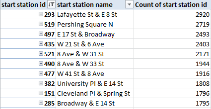
The first rule of data entry: No blank rows. The second: A field without a header is terra incognito. Rule two gets violated here, in the UK-government’s count of the nation’s (that is, England and Wales) property transactions for the first quarter this year (click the 2014 Price Paid Data sheet on the page when you get there).

Exactly why the headers went missing is one of those questions I can’t answer, other than to channel some data-designer’s sense that the names just weren’t necessary, even though they are, and even though field explications are out there, on the web site:

price1

(And for additional enlightenment look here; thanks to the Land Registry’s Roger Petty for the tip.)

Duly enlightened, I beamed another row atop the data and minted these names:
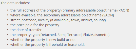
Column

A – Transaction No.

B – Price

C- Transfer Date

D – Postal Code

E – Property Type

F – Old/New (I would have coded these data O,N, not the slightly oblique N,Y)

G – Duration (i.e,  purchase or a rental)

H – Address

I – Secondary Address

J – Street

K – Locality

L – Town/City

M – District

N –   County

The Duration codes abbreviate Freeholder or Leaseholder, the former a permanent mode of ownership, the latter fixed-term (for additional enlightenment here, see this review).

Column O – Record Status – comprises an endless skein of As, and as such should be deleted. In fact, I’d delete H, I, and J as a practical operational tack (street names won’t add much to the narrative), but I’m leaving them be simply for exposition’s sake. (I should add that it seems to me that Column N really names cities and towns, and not the purported County, but I’m holding (here, at least) to the web site’s field-naming sequence).

Now we can proceed, at least after adding that the date data in C are over-formatted, interjecting as they do a constant 12:00:00 AM into every record, to no particular informational purpose. The Short Date format here should say bonne nuit to all those midnights.

Peculiarities aside, the data are nothing if not informative. What about, for starters, a basic price-by-month breakout?

Row Labels – Transfer Date (grouped by Month)

Values – Price (with suitable formatting, including the 1,000s separator, or comma)

price2

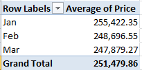
Remember that we’re looking at 145,000 transactions, and so that small pushback in price could be trend-worthy – though that is hardly the last word on the finding. Reintroduce Price to the Values area, this time via Count:

price3

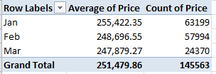
That one’s a head-scratcher. Might the precipitous retraction in March activity owe more to a lag in the data gathering than any real buyer hesitancy? That’s a question for the data gatherers.

And what about price and a property’s old/new standing?

Row Labels: Transfer Date (grouped by Months)

Column Labels: Old/New

Values: Price

price4


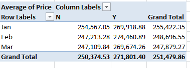
Newer properties (that is, those coded Y; I told you I’d would have alphabetized these differently) are expectably dearer; but the February spike is not as easily foretold. And if you think the February new-property sales totals are statistically scant, re-present the Price data in Count mode (scotching the decimals in the process):

price5

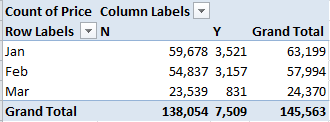
Thus something real is at work, I think.

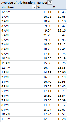
Now this one might be one part learned speculation, nine parts non sequitur, but here goes: What about average sales price by transfer day? Granted, I see no salient reason why transactions should so vary along such lines, but let’s throw caution to the winds. Take over column O (remember I’d deleted its original data inhabitants), name the field Day, and enter in O2

=WEEKDAY(D2)

and as usual, copy down the column (1 is Sunday, by the way). You could then run a Paste > Special > Values through the numbers. Then try

Row Labels: Day

Values: Price (Average)

Price again (Count)

I get

price6

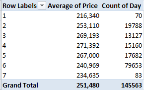
No, I can’t explain Fridays – day number 6. It’s possible some institution-wide protocol stays the processing of files until the work week’s end, but that’s one outsider’s supposition. Nor can I account for the Friday downswing in average price, which is notable and likely not driven by the probabilities. Looking for a story line, anyone?

And for some local color, I thought I’d take a look at London prices alone, lining them up thusly:

Report Filter: County (click Greater London)

Row Labels: District

Values: Price (Average)

Price (Count)

price7

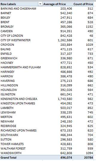
It’s the borough of Kensington and Chelsea – redoubt of oligarchs and other ruling-class sectaries – that leads the pricing parade, but that’s a dog-bites-man truism. No more revelatory is London’s average £496,074 transaction figure, nearly double the overall average. What is interesting, however, is the city’s 20,784 sales during the quarter – 14.3% of the month’s total – when held up to London’s proportion of the England/Wales population – about 14.8%. In other words, the housing market in the capital appears to be no more frenetic, though considerably more pricey, than it is anywhere else – in spite of London’s vaunted economic hegemony.

So what does it mean? This: sell your house in Chelsea, and buy one in Bexley.


New York’s Citi Bike Data, Part 2: The Case of the $5,000 Ride

22 May

You get 45 minutes, you’ll recall, before your free (as it were) Citi Bike ride shifts into overtime and the journey begins to take its toll – literally:

bike1

That + sign requires elaboration, herewith furnished in an email from a Citi Bike staffer:

“Trips that are shorter than 30 minutes are no extra charge. Trips longer than 30 minutes incur overtime fees. After the initial 30 minutes, it’s an additional $4 for the second half hour, $13 for the third half hour, and $12 for every half hour after that. A trip begins when a bike is unlocked and ends when a bike is securely returned to any Citi Bike station.”

Keep those pricing strata in mind. In any case, because our Citi Bike data stopwatches every ride’s duration – in the very first field, in fact – we’re ready to run with that variable (inapt transportational metaphor there – sorry).

But note that the duration data express themselves in seconds – and because minutes is the more negotiable currency here I’ll call upon a simple transformational tool, one I confess to have badly underused.  Enter 60 in any blank cell, and copy it. Select all the tripduration data in column A, and click Home > Paste >  Paste Special…Divide:

bike2

And format to two decimals.

Paste Special Divide smartly substitutes for the traditional paste value routine – i.e., the inserted column, in which values in the source column are formulaically divided by 60 in the new column and pasted back via the Values option. Paste Special Divide here seems faintly circular, with a kind of self-referential division and paste-back slam-banged into the same cell. But it works.

Once done, you could plant a simple AVERAGE in at the underside of column A and learn that the mean Citi Bike trip in February lasted 14.58 minutes, thus jibing with the riders’ purpose-driven riding intentions (that number compares interestingly with Washington DC’s 13.75-minute average for the first quarter of 2014; see those data here). Citi Bikers probably have to get somewhere soon; exercisers and riders in the park don’t start their picnic just 14.58 minutes after they’ve screwed their helmets on.

Now sort the durations in descending order and look for the value 45. Again, that’s the threshold in minutes after which the Citi Bike billing scheme begins to achieve lift-off.  You’ll find that the 45ers and beyond command 2921 rows, or an intelligibly small 1.3% of all the February rides. But look at the first record. It archives the activity of a woman, née 1982, who decoupled her cycle from the South Portland Avenue and Hanson Place dock in the Fort Greene quarter of hippest Brooklyn at 3:52 on February 8, and redeemed her vehicle at the posh Grand Army Plaza and Central Park South station, hard by the Plaza Hotel, at 12:41 on February 17 –12768.47 minutes, or nearly nine days, later.

What went on here? Do we have a case of extreme right-tailed forget fullness, or a grave Citi Bank typo? Or is there a tale to be told about those nine wintry days in February? I for one am clueless, but cluelessness begets its prodigies of speculation; and at the very least I sense a New Yorker short story in there, or a maybe a TV movie. How about Clare Danes for the lead?

I do go on, but there one thing about the cyclist who wasn’t there that we can know for sure. Throw 12768.47 minutes into Citi Bike’s multivariate pricing equation and go figure; and when the lead snaps in the pencil the total charge for our lady in (the) red reads … $5057.88. You’re welcome to check my math, but I get 419.116 half-hours at $12 per, and she was probably charged another 12 bucks for the .116 besides. Does anyone have Clare’s number?

But while you work on that, you can spend a bit more time on the rest of the data, which has lots to offer. For example, how about a pivot table listing of the ten busiest stations from which trips get set in motion? That one’s easy, for starters:

Row Labels: Start Station ID

Values: Start Station ID (Count)

Then right-click in the Row Labels and click Filter > Top 10… and click ok in the resulting dialog box.

The for addition ID slide Start Station Name into Row Labels beneath Start Station ID, and see to it that the report layout is set for Tabular Form, and with all sub and grand totals turned off:

bike3

It helps to be a New Yorker here, but if you aren’t, trust me – all of the above are in Manhattan.

The options keep coming. Try adding trip duration to Values and:

 bike5

Those numbers are seven-figured; riders did nearly 2,000,000 minutes, or almost 32,000 hours’ worth of traveling, from the Lafayette/East 8th embarkation point (even as the Pershing Square station in midtown clocked more time with fewer trips). (Note: if your top 10 Values numbers don’t sort descendingly – as mine didn’t – go here:  right-click in either Row Label field and click Sort > More Sort Options… and observe below:

 bike6

So what about end stations? Barter the parallel start station fields for their end station equivalents and don’t touch the tripduration sum:

bike7

(And you may have to attend to that sort order nicety once more.)

Again, it’s the intersection of Lafayette and East 8th Streets that holds pride of cycling place, and it stands to reason: after all, if one travels from A to B, the prospects are good that a return trip to A bulks large on the itinerary.  Indeed – the start and end Top 10s share nine stations. (And if you want those expand/collapse buttons  to disappear – at least in version 2010 and above – click in the pivot table and proceed to PivotTable Tools > Options > Options in the PivotTable button group and:

bike8

Tick off that first display box.

Again, the analytical possibilities here are quite considerable. How about breaking out average trip durations by both time of day and gender?

Row Labels: starttime (group by Hours)

Column Labels: gender

Values: tripduration (Average)

 bike9

Note that male trips are longest in the midnight hour, a datum that remains to be thought about; and while the trough in women’s durations at 3 and 4am is expectable, the contiguous spikes at 5 and 6 perhaps aren’t. And why are women’s trips (and there were 524 of them) nearly three times longer at 6am than men’s? In fact overall, female trip durations exceed males’, 16.22 minutes to 13.57. (And yes, you’ll collect different average durations if you import endtimes instead.)

There’s quite a bit more to look at in here, but I gotta go; my movie idea is gaining traction, and I mustn’t keep Harvey Weinstein waiting.

He takes my calls, you see. Hey -we went to the same high school.

What’s Up, Dock? New York’s Citi Bike Data, Part 1

15 May

It doesn’t take much to make me happy – a loaf of bread, a jug of wine, and a couple-hundred thousand records worth of data to play with. What else does a guy need?

OK, so I’m low maintenance – but what about that dataset? I’m thinking about the monthly data racked up by Citi Bikes, the quick-ride bicycle rental service sponsored in large measure by Citi Bank, the firm whose name bears a serendipitously close resemblance to that of the service itself (must be another case of monkey-at-the-typewriter; it just happened, I guess).  I downloaded the data for February 2014, the latest (and smallest) workbook on offer, here:

http://www.citibikenyc.com/system-data

The above superlatives aside, it’s still a big file – 224,000 records big – but nothing you can’t handle.

A cousin of sorts to London’s Boris Bike and Paris’ Velib schemes (though that latter, far smaller city has far more biking stations than New York does), Citi Bikes rents the two-wheelers from docking stations 24/7 to denizens needing to get here-to-there with dispatch; it’s a cheaper deal than a cab and, given the New York’s  viscous streets , very possibly faster.

Bear in mind that Citi Bike isn’t citywide. “Station locations are based on population and transit needs, and were selected through a participatory public input process”, its web site lets us know; what it means right now is that its 330 stations teem in the lower half of Manhattan and certain  next-big-thing districts in the west of Brooklyn, (check out its real-time bike-availability map here). As such, one could properly ask if its cycling demographic could be extrapolated to the remainder of the city, much less anywhere else.

In any event, an analysis of the Citi Bike data by Sarah Kaufman of New York University’s Rudin Center for Transportation Policy and Management has something to say about biking and gender, at least among Citi Bikers – namely that far more men – about 68% – lean over the handlebars then women, comparing notably to England’s 73% (see this review, which also points to an upward slope in female cycling in London), even as the Netherlands edges toward parity (Kaufman allows that with wider city coverage of biking services the ratio in New York should flatten as well). In relative terms, the female biking presence looms larger in Brooklyn (see Kaufman’s report).

Now to the workbook, and a few data quality issues. First, 6717 records – about 3% of the whole – bear no birth date and gender information; these absentees belong to a cohort Citi Bike calls Customers – riders who purchase one or seven-day user passes and presumably aren’t duty-bound to complete their dossiers. The remaining 97% or so are Subscribers, who remit an annual membership fee entitling themselves to “free” 45-minute rides, after which overtime charges begin to gnaw at their credit cards. Thus if you want to break out the rides by age and/or gender you may want to sort the empty records to the bottom of the stack, and loosen them from the data set with our tried-and-true empty row technique (but don’t delete the records; you may want to rejoin them for other breakouts. You could also filter these inside a pivot table, but admitting blanks to a table could court grouping problems). There are also 101 rides ostensibly launched by men (yes, all men) born in 1917 or earlier – a spry bunch to be sure. And finally, note that the data track numbers of rides, not the numbers of discrete individuals taking them.

Those qualifications in place, dock your mouse in the gender field and its numeric codes – 1 for male, 2 for female, and 0 for those unknown Customers. Those identities are workable, but for presentation purposes I’d substitute alphas M for 1 and W for 2 via a pair of Find and Replaces, assuming your PC can withstand 224,000 worth of replaces. And there’s no shortage of interesting data combos spearheaded by gender , e.g., this pivot table hour of ride inception by gender:

Row Labels: starttime (Group by Hours only)

Column Labels: gender

Values: gender (Count)

 citi1

Bet you’re itching to know where those 433 riders actually went between 3 and 4 AM; well, the information is in the data set. (And note that female rides in February accounted for only 19% of all journeys, at some substantial remove from Sarah Kaufman’s global 32%).

And to uncover the gender proportions across the above times, click in the Values area and step through PivotTable Tools > Options >Show Values As > % of Row Total:

citi2

Female ridership peaks in midday, and you’re probably unsurprised by its decided underrepresentation at 3 AM.

And then I had a bright idea, an event of sufficient intermittency to leave me no choice but to share it with each and every one of you. The Citi Bank dataset my well be the first I’ve encountered in which each of its records incorporates a pair of latitudes/longitudes – the first fixing the point of ride inception, the second its terminus. And so it seemed to me that if you could plot the distance separating the two latitudes and then the comparable interval for the longitudes, you’d have in effect measured the two perpendicular sides of a right triangle, whereupon the no less tried-and-true Pythagorean theorem could be called off the bench to calculate the distance between start and end stations. Remember a2+b2=c2?

It sounds downright doable, and in fact it is; indeed, I was avid to recount just how and to the inevitable peals of reader appreciation, when Pythagoras tapped me on the shoulder, took me aside, and in his best broken English reminded me that his hypotenuse describes an unrelentingly straight, as-the-crow-flies line, the kind of locus beaming through Manhattan’s rectilinear uproar that only a crow – or a helicopter – could navigate. In reality, though, on-the-ground biking distances could, and probably should, be totalled more unassumingly, by simply adding the latitude-to-latitude and longitude-to-longitude distances – that is, two of the perimeters of that right triangle. Square root? No – more like a square route, then.

Having twisted the dimmer down on my bright idea, let’s try then to pace off the distance of Feburary’s very Citi Bike first ride (sorted chronologically by Citi Bike in row 2), one embarking precisely at midnight from Washington Square East in deepest Greenwich Village, and coming to rest at 12:06:22 at Stanton and Chrystie Streets in the storied Lower East Side.

So what do we have to do? First, understand that lines of latitude are spaced equidistantly up and down the planet (or so the web tells me), with contiguous latitudes subtending about 69.65 miles. Thus, with the start and end latitudes declaring themselves in columns F and J, let’s claim the P column and write in P2

=ABS(J2-F2)*69.65

I get about .571. The ABS function relieves a formula’s result of its sign, such that applying ABS to either 3-7 or 7-3 will return just 4; and since we can’t know when subtracting a ride’s end latitude from  its start will output a negative number (depending on the rider’s direction), the ABS enables us not care about it.

Marking off the distance between any two longitudes is a touch more pause-giving, because these verticals radiate from the poles, the distances between them dilating as they near the equator. After some stops and starts across the web I came up with a New York-specific inter-longitude distance of about 52 miles between degrees. Going with that, let’s creep into the Q column and enter in Q2

=ABS(K2-G2)*52


Here I get around .221. Add .571 and .221, or

=P2+Q2

in the R column and our midnight cowboy seems to have pulled into Stanton and Chrystie Streets around .792 miles after he started (Pythagoras would have gotten around .61 miles, by the way).

Of course we’re approximating (after all, Broadway traces a hypotenuse-like diagonal through much of Manhattan), though I think our guess is pretty sound; but for rigor’s sake I turned to Stephen P. Morse’s cool distance-calculation site, on which users can submit pairs of latitudes and longitudes and learn how far it is from A to B . Working with my original Pythagorean metric and comparing my numbers with Morse’s (who seems to be working with right triangles, too), my numbers reached a 99% agreement with Morse’s; and after playing around with our original New York 52 miles-per-longitude and bumping it down to 49.2 miles I came closer still to Morse’s values. Thus by substituting 49.2 for 52 in the formula above, I would up with a trip of .780 miles.

Whew. In any case, if you’re agreeable to the above you can copy the =P2+Q2 formula in R2 down its column (and name this field) and hasten to pave it all over with a Copy > Paste Special > Values, thus sending 220,000 byte-eating formulas packing. And you could probably delete the P and Q columns, too, dispelling another 440,000 formulas; those data have already played their part.

And now you can do some neat stuff. I told you I was happy; but now it’s time for lunch.

Hey – anyone know where that loaf of bread went?


Marathon Data, Part 3: A Matter of Time(s)

9 May


It’s the marathon we’ve been considering but it’s raised some hurdles en route, even as we seem to have risen above them without skinning our knees. And now that we’ve handcrafted our gender variable –to look back at one of those hurdles – we might as well mix it in a pivot table or two with some other ingredients, and season to taste.

We could, for example, see what we shall see about the distributional relation between gender and age category, as our data understand that latter attribute, e.g.

18-39
40-44
45-49
50-54
55-59
60-64
65-69
70+

You’re wondering – with good reason – about that 18-39 interval and its anomalous 21-year wingspan, its incongruity underlined by runners’ overwhelming representation in that most spacious category. Try, simply

Row Labels: Category
Values: Category (Count; it’s a text field, after all)

3race1


55% of the competitors converge inside the 18-39 bracket, with no drill-downs in sight. To coin a phrase, you can’t always get what you want. And note the invisible count for blanks, because by definition category-less records have no data to count. But what about a gender proportioning of the runners by age?
Steer Gender into Column Labels and swap Gender for Category in the Values area, because the former field is wholly populated, and hence thoroughly countable. Click PivotTable Tools > Options > Show Values As > % of Row Total and:

3race2

I’m moderately surprised. The data limn a near-straight-line association between category and gender (excepting the blanks, an interesting discrepancy); female participation droops with age, and, demographics being what they are I would’ve have supposed quite the opposite. Crudely line-charted, I get

race chart


The story angle’s all yours, journos.
And while we’re at it, what about split differences reckoned by age and gender?
Row Labels: Category
Column Labels: Gender
Values: Split Pct Difference (Average)

3race3


That’s interesting too. Women match their marathon halves more closely than men across the age gamut; and how that might square with women’s relatively slower times is something to be thought through. This one’s for you, sports physiologists.
And for some breakouts driven by runner country? Again, no field devotes itself to nationality alone, but the data are there, packed alongside runners’ first names in the Name field in what appears to be a constant position following the name. As such, we can open a column to the right of name (that’s G in my workbook), dub it Country, and enter in the next row down:

=RIGHT(SUBSTITUTE(F2,”)”,””),3)

And copy down the column. That’s “” and not ” ” grazing the closed parenthesis in there, and it imparts a character of no length, if that’s not too metaphysical. Put otherwise, we’ve effectively deleted the ) character (for a review of SUBSTITUTE, see my May 17 post). The expression above exchanges the closed parenthesis trailing the three-letter country code for that “”, delivering, for example:

Laura J (GBR

And once that reformation is effected a simple RIGHT procedure shaves each entry’s last three characters, and brushes them into the Country field.

That looks good, but in the course of vetting our new country data I tripped over a thimble’s worth of records naming countries that you won’t find anywhere in your atlas. For example, Stuart Richard McDonald (overall place finisher 22182) appears to hail from a country called ard;

3race4

You see what’s happened. A shard from Mr. McDonald’s first names has splintered into the Country field, with GBR joining a country club – that is, the Club field. It’s a data entry misstep, but if to err is human, the repair calls for a formula. I’ll try this rewrite:

=IF(RIGHT(F2,1)=”)”,RIGHT(SUBSTITUTE(F2,”)”,””),3),RIGHT(SUBSTITUTE(H2,”)”,””),3)

That one seems to work. The formula asks if the final character in the F cell data is that closed parenthesis. If it is, proceed with the first expression as we detailed it above. If it isn’t – that is, if the closed parenthesis sealing off the country code has gone missing – look to the H column instead and execute the RIGHT/SUBSTITUTE routine there; and you could finalize the process by putting a Paste Special > Values through its paces to cut back on the byte count. And now you can break out the numbers and names by country, too.

And there’s another data curiosity making a rightful claim on your attention. You may have been drawn to the unrelieved pound signs (or hash marks, to you Britons) obtruding upon the DNS field (don’t be diverted by that field name; the data comprise runner split differentials expressed in time terms), here and there:

3race5

The pound signs won’t be relieved by a column autofit; rather, they hint at a mathematical impossibility of sorts. Because the numbers in effect express chronological time-of-day data, an outlaw consequence of the time format (see last week’s post), negative splits – in which second marathon halves are run more quickly than first –register an inexpressible negative time of day. You can’t have that in this cosmology, and hence the pound signs. If, however, you format the column in standard Number terms, actual usable negative numbers emerge. Just one of those spreadsheet things.

And here’s something else to look at. If you sort the data in the Split Pct Difference row smallest to largest – thus heading the column with the runners whose second halves were comparatively the fastest – the splits get rather interesting, starting with Makaela Alison Papworth, a woman whose 30,579th-place finish belies her first split of 4:00:02, a mere warm-up for a second half of 1;28:38. And if you can’t explain that 63% reduction neither can I. Let’s hope the race officials did.

And then there’s Jason Scotland, he of a first split of 2:45:15 and a second of 1:19:09. And if that sounds dodgy consider that Mr. Scotland, running in this year’s marathon as Scotland-Williams, appears to have smashed that personal best, breaking out times of 2:07:05 and 1:01:42 – the latter hurtling him into world-record territory. But in between – that is, in the 2013 race – he checked in with splits of 2:24:09 and 4:59:45.  Have we reached the limit of the benefit of the doubt, yet?

What do you think, Ms. Papworth?


Marathon Data, Part 2: A Matter of Time(s)

2 May

Our analysis of the London marathon data has proceeded apace, but the next bend in the road will slow our jaunt a trifle. We spent the latter part of last week’s post on a think about runners’ split ratios and how these comport with their race finish, and we found a comfortable if imperfect fit between finish positions with the evenness of runner splits. That is: the higher the finish, the greater the split symmetry. Now we want to try something different: to associate splits with the clocked times of the runners, rather than their finishing positions.

And this project poses a few new problems peculiar to the pivot-tabling enterprise. As with last week’s split/finish position table, we again want to group the runners, but this time by some grouped interval of the measured times. We can start here:

Row Labels: Finish Time

Values: Split Pct Difference (Average; again format Percentage to two decimals)

Enter the problem.  Initiate a Group Selection for Finish Time and click off the Months grouping default. Then tap the tandem of Seconds, Mintues, and Hours (note each of these can be clicked independently of the others – don’t press the Ctrl key as you click). But now what?

race21

That was a semi-rhetorical question, if you’re keeping score; and I’m asking it because once you ratify the above selections you get something like this:

race22


The data have indeed been grouped, after a fashion, but not in fulfillment of the wish I’d harbored for them. Here the results have been organized and broken out by respective units of time, but have not beenbinned by any interval I might want to specify for them, e.g. ten-minute tranches:

2:00-2:10

2:11-2:20

2:21-2:30

And so on. Then note that the Grouping shot above seems to have secluded the By field that typically solicits the user’s interval call, e.g.

 race23

There thus seems to be something about numbers – and remember, at base that’s exactly what they are – formatted in Time terms that rebuffs traditional grouping overtures. I’ll repeat my question, then – now what?

I should add that I’ve taken this general problem up elsewhere, namely on the datadrivenjournalism site, but in any event we want to group runner times in what should assume passably time-resembling appearances. So here’s what I’d do: Type the field heading Times in the first free column (mine is Q; remember that last week we had planted that Split Pct Difference field in the midst of the existing fields) and enter, in Q2:

=ROUND(K2*24,3)

Returning 2.079 (when formatted to three decimals) – and that’s not two hours and eight minutes (We’ll get to ROUND shortly). What it is is 2.079 hours, or in the language of clock time marathon winner Wilson Kapsang’s 2:04:44, or thereabouts.  What we’ve done is simply multiple race times – which again are really numbers reflecting the portion of a 24-hour day taken by any runner – and subjected these to the 24x multiple. Thus three hours – or .125 of a day – will appear here as 3:00. Considered purely numerically, then, Kapsang’s victory quantifies as .087, or 8.7% of a day, which in 24-hour-multiplier terms batches up to 2.079 – a real number, one which can be grouped with all the others. 2.079 – not 2:079.

And what about ROUND, the function that materially rewrites the real (as opposed to formatted) value of the number to which it’s applied? I want it because had the formula plunged ahead without it here, that 2.079 would have exhibited many more decimal points, all of which would in turn displayed in the pivot table (carry out the steps below without the ROUND supplement and you’ll see what I mean).

And once all the backstaging is done we can proceed to this table:

race24

Row Labels: Times (grouped at least here for illustration purposes by .2, or 20% of an hour, or 12 minutes)

Values:  Split Pct Difference (again by Average, formatted in Percentage and two decimals)

I get, in excerpt:

race25


Here too as with last week’s finish position-split difference correlation, split difference averages match up with fleetness of foot.

Now what about that gender workaround to which I pointed last week, a restorative step that would institute a gender field in the source workbook? After a not inconsiderable time (probably more inconsiderable than it should have been) I toughed out something like this:

Custom Sort the data, first by Place Gender and then by Place Overall.

Shoot a new column between B and C, call it Gender, and in what is now C2 enter:

=IF(A2<max(a$2:A3),”M”,”W”)

And copy down the column.

What is the formula attempting to do? First, the two-field sort puts Place Gender finishers in their place, such that both 1s, 2s, etc. stand neatly atop one another. Next, the second sorted field, Place Overall,  proceeds from an assumption: that, for any pair of men and women holding down an equivalent Place Gender – for example, a man and woman finishing in a respective 600th place – the man’s time should be the swifter. That isn’t sexist, just a statistical and empirical likelihood (the first 263 finishers were men), and an assumption that clearly couldn’t be mapped to other sorts of data , e.g., test scores. The absolute reference for A2 in the nested MAX function allows the range to be extended down the column, e.g., A$2:A3, A$2:A4, A$2:A5, etc., thus identifying the maximum overall finish, or slowest time, to that point in the column. And since the maximum at those successive points should – should – be keyed to a female runner, the formula should post Ms and Ws alongside the appropriate names.

I think this works, though be aware that some finish-place numbers appear to have dropped out of the listing, and that a number of runners completed the course with exactly the same time, earning them duplicated finish numbers. But I don’t think those loose ends compromise the results, which I think are pretty good and presage an interesting series of gender-driven breakouts.

Anyway, it seems to me a Part 3 is called for in this discussion, or at least I’m calling for it. Two concluding points, here, then:  This post’s second screen shot, the one portraying the pivot-tabled Hour, Minute, and Second groupings, pictures an odd chronological datum:

See that 2 AM? In fact, the London Marathon workbook’s Half and Finish Time numbers all seem to record themselves in AM terms, and that’s really and clearly not what we want. Wilson Kipsang’s  2:04:44 hardly means to be understood as a middle-of-the-night four minutes after two, even as it is formatted as such. And it turns out that ridding the numbers of their AM/PM tags is a rather sticky wicket. (See, for example, this discussion.) Just be advised.

And the other point is this: click on that 2 AM, for example, and type something – anything – else in its cell. That something else suddenly overwrites the data, a bit of pre-emption that is, if I may be so colloquial, fairly mind-blowing. Try it; whip up a pivot table flowing from any data source and type into a Row Label cell. Your text takes over – and I thought you couldn’t do that, and I can’t explain it, at least not yet.

I need to think about it. Or is this something everyone knew all along?

Marathon Data, Part 1: A Matter of Time(s)

24 Apr

Slow and steady wins the race?  Bromidic license aside, that can’t be true, can it? When I last looked, it was fast that was copping the money and the medals – but it’s the second adjective that might just hold up to scrutiny.

And I’m directing my scrutiny to some marathon data, the inspiration and workbook data flashing from runner/triathlete Peter Whent and his blog post on the 2012 London marathon, which placed the matter before my mind’s eye.  Peter’s concern is with the problem of steadiness, denoted here as the comparative timings of a runner’s first and second halves of the 26-mile race, and with an expressed interest in the number of entrants managing a negative split – that is, a second half run more speedily than the first. His inquiry confirmed the expected – that runners overwhelmingly (about 96%) stepped through their latter 13 miles more haltingly than their former. And the data, which Peter has kindly afforded you and me, is here:

 London2012 marathon results

(Note, by the way, that the second-half splits in Peter’s workbook were returned via a subtractive inference, e.g., the Finish Times minus the (first) Half times.)

All of which points our sneakers toward a corollary question: do split margins covary with overall times? That is – and sight unseen I’d promote the idea – are elite runners more likely to equilibrate their halves than the long-distance hoi polloi? Superior at pacing and strategizing their course, I’d assume that occupants of the world-class stratum would endorse, and act upon, the aerobic virtues of matched halves. Or could it be that first-to-second half ratios – as opposed of course to actual times –might be found to incline toward something like a constant proportion?

Needless to say that’s an empirical question, and given the data we can make some tracks toward an answer.

First, you’ll note that a good many of the 42,000-plus runners pulled up somewhere short of the finish line; you’ll know them by their blank Finish Time cells, and because they have no splits to report we should sort the runners by Finish Time (A to Z or Smallest to Largest, depending on the cell in which you’ve clicked.), thus casting the 6,000 or so non-finishers to the data’s ground floor. Then introduce a blank row between rows 36673 and 36674, thereby striking the uninhabited cells from the active data. Remembering that we want to affiliate split disparities to aggregate time, next squeeze a new column between K (the Finish Time field) and L, name that upstart field something like Split Pct Difference and enter, in what is now L2:

=(J2-I2)/I2

Translation: by subtracting a runner’s second half time from his/her first half and dividing that difference by the first-half time, we can deliver a percent change across the two halves, and in L2 I get

0:07:43

Which is not the kind of number you were expecting. And that surprise has been sprung by a formatting disjunction.

Recall that, as with dates, time entries are nothing but numbers. Thus 12:00, or noon, is really .5, the quantity metering one-half of a day. Look again at 8:00 (am), then, and you get .333333, and so on. But because the Split Pct Difference field has inherited the Time format of the field next-door, Finish Time, we’re faced with seven minutes and 43 seconds – or what is really .54% of a 1440-minute day. And indeed, when we reformat our field into Percent Style and unpack two decimal points for the value in L2, 0.54% resolves before us.

But there’s a bit more neatening up to do. I noticed a handful of #DIV/0! gatecrashers glowering in the Split Pct  cells, their scruffy appearances reflecting the absences of split times in their records. If you sort Split Pct Differences smallest to largest seven dissident records plunge to the bottom, whereupon another blank row, this one interlarded between rows 36666 and 36667, will send them packing.

Now, at last, we can attend to our question. First, we can try this pivot table out:

Row Labels: Place Overall (grouped by say, 1000)

Values: Split Pct Difference (Average, and Number Formatted as Percentage to two decimals)

In excerpt, I get:

 race1

What we find is a fairly persuasive association between runners’ finish position and what could be termed their split discrepancy. The closer to the front, as a rule, the closer the timings of the two halves. Expressed in straightforward correlational terms, e.g.

=CORREL(A2:A36666,L2:L36666)

The association comes to .442 – again fairly pronounced, at least by the lights of social science.

We also need to observe that our necessary analytical confinement to runners who actually completed the marathon imposes a skew of sorts upon the data, and the absence of a forthright gender-discriminating field complicates the relationship as well, but there may be a workaround here that I hope to discuss next week.

We can now lumber toward today’s finish line by adding that the pivot table above expresses the splits/Place Overall connection in ordinal terms; that is, we’ve weighed a runner’s splits against his/her finishing place in the competition. We could alternatively measure splits against grouped actual times, and we hope to do that next week. Just be advised there’s a pivot table-specific issue that needs to be understood and confronted before the data can do what we want them to do. In the meantime, do a few more sprints and break for lunch.

UK Names, 1905: The Reign of William and Mary

10 Apr

Call it Sociology Light, but birth names and their incidence say something about a culture’s here and now, and its theres and thens; and a table of the 100 most prominent names conferred upon newborns in the UK, circa 1905, and lined up with a like array from 2012 must be at least halfway instructive, it seems to me.

The data, broken out by gender and put together by ancestry.co.uk and put in a downloadable place by the Guardian’s DataBlog, are here, too:

 Data on baby names

Once you relieve the boys headers of their wrap-text trammels (and note the odd typeface discrepancies up there as well; and I’d have formatted the Change field in percent style, lest readers think all those negative numbers communicate absolute values. You’ll note in this regard that a Change of -1 suggests a name-occurrence reduction of 100%, but in some cases this rounds off what is in fact something less than that), the names numbers prove downright interesting. Tack a simple sum formula to the base of the No. and Rate columns for both genders and we learn, among other things, that the 100 1905 names contributed 240,289 of all boys’ and 197,042 of all girls’ birth names, that year, compared to 2012’s 96,534 and 56,002 respective aggregates. The Rate sums (that is, the number of times the top-100 names appeared among every 1,000 births) for 1905 stand at a remarkable 508.14 and 431.73, meaning that the boys’ 100, at least, identified more than half of the male babies that year. By decided contrast, the 2012 figures came to 257.86 and 157.6. But then, we’re not comparing like for like.

And that’s because like for like would require us to call in the top 100 names for 2012, a distribution furnished not at all by the data before us. All we have here are the counts for the 2012 births of just those names that cracked the top 100 in 1905. We can, however, download the 2012 names  for both genders here in separate workbooks, on that page’s second and third data links (use the names on Table 6 for both sets; these array the names down a solitary column and exhibit all the birth names bestowed upon at least three children, thus counting off a top 6,200 for boys, and over 7,700 names for girls. We’ll want to access all the names, for reasons I hope to justify shortly.) What these data, however, don’t afford us with is rate data, and only the absolute birth numbers; but as we can see, we should be able to draw the rate inferences nonetheless.

So what do we want to do here? First, copy and paste the 2012 names (all of them, as I’ve advised) in distinct columns for both boys and girls into a new sheet in our workbook, and separate these by at least a few columns. Name the range of names (names only) for boys Boys, and for girls Girls (I’ve let my imagination run riot here). Then return to the original 1905 Boys sheet and divide the number of 2012 names for William in D1 by its rate in G1. The yield – 374.39 – can be adopted as a more-or-less constant, signifying the number of actual name-bearing births in 2012 accounting for 1 out of 1,000 births that year (more or less, because of a rounding off of the rate numbers down the column, I think). In other words, about 374 actual male births in 2012 compute to 1 per 1,000.

Then alongside the most numerous name in the 2012 boys’ range – Harry – divide his 7,168 total by the 374.39 (presumably in the column to the right of the actual birth numbers). I get 19.15 (per 1,000); then copy down the column. Add the outcomes for 1 through 100 and I get 542.23- an even mightier hegemony for the top 100 boy names in 2012 than held for 1905. Move to the Girls range and try the same tack. I’m using a rate constant of 355 here, in the interests of again looking past the variation inflicted by rounding off. Dividing the girls’ names by the 355 and summing the rates, I get 444.83 – again, a heightened share for the 2012 top 100.

And there’s something else we can do – we can go on to figure the 2012 rankings for the 1905 names.

It works like this. First, and I’m sparing you the trial and error, it appears as if all the boys’ and girls’ names in their native Table 6 sheets in the 2012 workbooks have been set upon by an old nemesis – the superfluous space. Because we’ve already copied these names to that separate sheet in the 1905 workbook (to the ranges we’ve called Boys and Girls) apply the TRIM function (see the March 27 post, for example) there to some nearby columns, and Special Pasted > Values atop the original names. Then delete the column bearing the TRIM formulas.

Then do something simple. Cut and paste the 2012 ranking numbers (in the sheet containing the Boys and Girls ranges) to the next free rightward column, which should flank the rate numbers we calculated earlier. That is, you should see something like this for Harry:

 na1

Then scurry back to the original Boys sheet. In the next available column – mine is H – write the following:

=VLOOKUP(B2,Sheet1!B$2:E$6195,4,FALSE)

Where the Boys range in my case holds down B2:E6195 in my Sheet1. Thus we see that William – the boys’ name frontrunner in 1905 – turns up in the 9th position in the Boys range:

 na2

Norman, on the other hand, has plummeted from 26 to 4805 (note that many names in 2012 share the 4805 position; they’re the ones with three babies each). And now you can do the same for the girls (but be prepared for some #N/A messages, these pointing to those 1905 names which no tots in 2012 received, e.g., Gladys.) And there’s something about Mary – number one in 1905, down to 241 107 years later.

So what’s in a name? Not much, perhaps; but names? Squint, and you can see the zeitgeist moving.

Vacation time this coming week – Word Press is a most enlightened employer.


My Little Town: London Real Estate Data

3 Apr

Location, location, location; and no, it’s not the real estate that’s got me waxing bromidic, it’s the spreadsheets, of course, and those recurring second thoughts about how their data are conveyed, and exactly how and where they’re…located.

Recurring, indeed, at least on these WordPressed pages; and apropos that perennial restiveness let us pack up and move to the Average House Prices Borough workbook on offer at the data.london.gov.uk site, and learn a little about that city’s combustible and ever-newsworthy real estate sector, and its no-less-combustible spreadsheet. It’s coming to your neighbourhood here:

 Average-house-prices-borough

The data here clamber about eleven scarily similar sheets, strewing price and sales volume numbers across the 33 London boroughs (they’re counting the interstitial City of London as a borough here). And while the data are readable, are they usable? That is, can you do something with them?

A loaded question, replete with half-full answers, because of course the answer depends. Take, for example, the identically-structured Median and Mean Annual sheets, asking after their receptivity to pivot tabling. My answer: iffy. The sheets, you will note, drape the data in year-per-field mode, e.g.:

 prop1

And that peculiar positioning, as I took some pains to urge upon you in my August 22 and 29, 2013 posts, clogs the pivot tabling enterprise, and so if you want to effect the kind of data transposition I described there (but won’t belabor) here, you’ll need to:

  • Delete the vacant row 2.
  • Consider this: because the restructuring espoused in the August posts trisects the data into Row, Column, and Value fields only (which in turn are cast into a three-legged, or field, Excel Table), and because it is invariably the leftmost field in a data set that resets itself in Row terms, the Area field text data will assimilate into the Column field, even though its borough names are not of a piece with the numeric year data. What you could do, then, is simply delete the not-terribly-meaningful Code field, thus vesting Area – now the leftmost of the fields – with Row status.
  • Earmark only A1:S34 for the pivot table-eligible makeover, that is, just the London borough-identifying rows. The summatory data beneath row 34 communicate different kind of data.

You could do much the same with the Mean Quarterly sheet, but their double-headed fields – Q1, Q2, etc. supervened by the year-referencing 2010, 2011, etc., in the merged cells in row 1, won’t work. Delete row 1 and rewrite the Quarterly heads to a differentiating Q12010, Q2010, and so on. (You’d need to do something similar with the Upper Quartile Quarterly, which for all the world sounds like a scholarly journal. Here, though, you’d have to pad the 1,2,3,4 quarterly headers with the year data instead.)

It’s also occurred to me that once you’ve submitted the data to the above process you could march on and develop pivot-table breakouts along Inner-Outer London lines, as per the aggregated Inner-Outer mentions in the lower reaches of most of the sheets and which won’t appear in the pivot tables we’ve commended above. (For a detailing of the Inner-Outer borough opposition see this piece. There is, by the way, a dispute about where the borough of Newham goes.) So once you’ve forced the data into the Row, Column, Value triumvirate you can then add a fourth field (say, called I/O, and that’s a not a computer throughput allusion) stocked with borough Inner-Outer identifiers.

To head in that direction you first need to hammer together a lookup table, the data for which I’ve carried off from this bit of real estate:

http://www.londoncouncils.gov.uk/londonfacts/londonlocalgovernment/londonboroughs.htm


Camden

I
Greenwich I
Hackney I
Hammersmith and Fulham I
Islington I
Royal Borough of Kensington and Chelsea I
Lambeth I
Lewisham I
Southwark I
Tower Hamlets I
Wandsworth I
Westminster I
City of London I
Barking and Dagenham O
Barnet O
Bexley O
Brent O
Bromley O
Croydon O
Ealing O
Enfield O
Haringey O
Harrow O
Havering O
Hillingdon O
Hounslow O
Kingston upon Thames O
Merton O
Newham O
Redbridge O
Richmond upon Thames O
Sutton O
Waltham Forest O


You’ll then need to edit the borough names here so that they correspond to those in the workbook, e.g., trim Royal Borough of Kensington and Chelsea, and keep an eye on Hammersmith and Fulham. Best practice: copy one instance of each of those two from the Row data into the lookup table.) Copy the table somewhere into the workbook, and call it say, InnerOuter. Then once you’ve put Row, Column, and Value in place, say with the Median Annual data, write this formula in D2 (after naming this new table column I/O):

=VLOOKUP([@Row],innerouter,2,FALSE)

Tables being tables, the formula automatically writes itself down the D column (the [@Row] syntactical bit is how Tables express a cell upon which you’ve clicked, instead of the standard A2, for example. They’re called structured references, and aren’t quite a day at the beach; see a Microsoft discussion here).

Once you fused the data thusly, e.g.:

prop2

(the formatting is basic Table defaulting at work)

You can pivot table this take, for one:

Row Labels: Column

Column Labels: I/O

Values: Value (Average, and formatted as you see here)

 prop3

Remember those are median house prices cross-tabbed by year and Inner/Outer values.

I live in Outer London, by the way. Is that why Outer prices are so much lower?

$5,000,000,000 Worth of Salaries: The Maryland State Worker Data

27 Mar

Transparency, it’s wonderful; but when the sun trains its rays on government data full on, sometimes the red faces you see out there aren’t sunburned, but rather embrowned with embarrassment.

Point your TomTom toward the sovereign state of Maryland somewhere in America’s Mid-Atlantic in order to see what I mean. For some time now, the state has made its employee salary data available to inquiring minds – and by employee name. And that means if your neighbor’s, or friend’s, or cousin’s check has the governor’s name on it, you know exactly how much they make. Will you ever look at them the same way again?

In any event, all that illumination, or incrimination, shines right here, on the Baltimore Sun’s site:

http://data.baltimoresun.com/salaries/state/cy2012/

(Click the “For this data in CSV form, click here.” link.)

The workbook will run roughshod over 12.8 MB of your hard drive, but that’s what 135,000 employee records will do to a file.

In any case, once there, you’ll find the data quality pretty good, but not flawless. For one thing, the first two data rows clearly aren’t fit for purpose; row 3 in particular seems to have played host to some manner of dummy data, as all its cells report some variant of the 123456789 sequence. You need then to delete these mislaid rows, though you probably didn’t need me to tell you as much. I’d also probably delete the A column (field-named orig-sheet) that appears to share sheet-identifying codes with us that can’t imaginably advance our narrative intents.

But once you get past the quotidian but necessary column auto fits, it gets a little more exciting. Interested as I was in Maryland’s salaries for its university employees, I pushed the On button for a pivot table, beginning with something like this:

Filter: organization-name (select the STATE UNIVERSITIES & COLLEGES item)

Row Labels: organization-subtitle

 balt1

What’s wrong with this picture? Hint: We’ve seen it before, and now we’ve seen it again. But before the suspense gets intolerable, I’ll let on: it’s those two entries for Towson University – in plain, apparent violation of the pivot table dictum that field items shipped to the Row Label area can be listed only once. And in fact, the dictum holds; note the discrepant lengths of the Towsons, intimating loudly that some of the data here have been superfluously spaced. And that’s true – and for the quick fix, insert a temporary column in the data alongside the organization-subtitle field, and enter

=TRIM(G2)

(Your reference here would be F2 if you had deleted that A column.) Copy the above expression down the column, copy all these results, click G2, and aim a Paste Special > Values at the cell, thus imprinting the whole column with hard-coded space-lopped data. And then delete the temporary column, which can now be honorably discharged.

And while we’re at it, note the two entries for what is surely the same Frostburg State University both times. These several spellings can be brought into line by selecting the G column, and issuing something on the order of this Find and Replace:

  balt2

 Refresh the pivot table as it stands, and the Row Labels reappear, duly rectified.

And given the workbook’s potpourri of fields there stand to be any number of interesting investigative possibilities in there. For example, why not try to associate salary with what Maryland calls eod, or entry on duty (which I take to mean employee start date; some field headings are elaborated here, though I had to do a site search for the meaning of eod. I’m also not quite sure about Samuel Esposito, eod dated April 21, 1921 – soon to celebrate his 93rd year of service to the state, along with the coterie of staffers with eods dating back to the 50s):

Row Labels: eod

Values: ytd-gross (Average)

(The site observes that “The ‘YTD’ refers to the time specified in the database query by the state, not to the current date.” (quoted from the linked location above). I for one am construing the data, perhaps mistakenly, as the effective yearly totals for calendar 2012. After all, it’s now 2014, and the yearly results should be in by now. But note as well, by the way, the small packet of 15 records bearing 2013 dates, all but one of them time-stamped January. Because some of these report overtime earnings, I’m assuming these are live, actually-compiled data, their post-2012 eod notwithstanding.)

Be that as it may, over 10,000 dates stake the Row Labels area in our table, and so some grouping might the parsimonious thing to do here. But my Group Selection button lets me know I Cannot Group that Selection. Why? Sort the dates and you’ll see why; six of the records date their eod 1900-01-00, a dummy, text placeholder that as a consequence stymies any attempt at grouping (all presumptively grouped data have to be up to the grouping task). I’d take the relatively easy way out here; click among those ersatz dates, sort A to Z (if you click an actual date instead in order to start the sort you’d sort by Oldest to Newest instead), and beam a row insertion between 135722 and 135723, thus casting the stand-in dates away from the data source. Then you can try, after resetting the operative pivot table range to $A$1:$p$135722 (via PivotTable Tools > Options > Change Data Source in the Data button group; again, the P may be lettered differently in your table if you’ve deleted some fields):

Row Labels: eod (group, say by year)

Values: ytd-gross (Average, currency format)

Ytd-gross (Count)

balt3

(That’s an excerpt, of course.) The correlation between year and average salary: -584, which is not insensible; all things being equal, the longer the tenure, that is, the “smaller” the starting year, the higher the earnings (Note: if you essay the correlation by invoking the numbers in the A and B columns of the pivot table itself, that is,

=CORREL(A4:A63,B4:63)

you’ll be slapped with a #DIV/0! message for your troubles. That’s because that even though the dates lining the Row Labels are full-fledged numeric data, they revert to a temporary label standing when they’re shunted to Row Labels. To realize the correlation you’ll have to copy the pivot data elsewhere).

But whatever you do, just remember: the next time you visit Maryland, be nice to the 135,728 red-faced citizens there trying hard to keep a low profile. Don’t let them know what you know.


Left-Handed Complement: A Look at (Some More) Data on Handedness, Pt. 3

20 Mar

OK then; so if the Left Hander Club survey data have to relent at last to the null hypothesis – that left-hander births accumulate in their own time, owing no statistical fealty to the months in which they come to term. But if that be so, it might then behoove us to ask about alternative data sets which might enable us to pose the birth month/handedness question anew.

And I think I’ve found one.. The Sean Lahman baseball database, a free (but he’ll be happy to receive your contribution) downloadable must-have for devotees of the national pastime (and please indulge that Yankee jingoistic blurt) has just the parameters we want on offer, in its master-listing of what purports to be just about every player who ever whacked the dirt off his cleats for a major-league team. It’s here:

 handedness – Lahman data

And the data are large, if not big; close to 18,000 player names and cells packed with the biographical bits a baseball fan hankers for, among these player height, weight, birthplace, and birth month, and two handedness fields – one for the players’ batting orientation, the other for the hand with which they threw, or throw,  a ball.

The Lahman population, of course, is exceedingly specialized, and as such is assuredly skewed. For one thing, all its members are male, a gender constant which in fact probably serves the data well, given our intentions for them. And names here are most obviously not self-selected; neither Sean Lahman nor the players themselves had the minutest foreknowledge about the research interest that brought us to them.

Now there’s that multiple-handedness-fields matter to which I pointed a paragraph ago. The data record what I’m calling the players’ batting orientation in one of the fields, and their throwing hand in the other, and it is throwing that stands as the more primeval or “natural” proclivity. In fact 6.6% of the players for whom the data are available have received the code B in the Bats field, that letter standing for a player who can hit either right or left-handedly, depending in turn on the throwing hand of the pitcher whom they’re currently facing (I’ll short-shrift the technicalities, but it’s easier for a left-handed hitter to contend with a right-handed pitcher and vice versa). It’s clear that these players – known in the trade as switch-hitters – have tutored themselves into this duality, but I can’t think of any player who has wilfully re-schooled his throwing orientation.  Hence, I’d work with the throwing hand data.

But again, let’s not take our eye off the ball. We’re looking toward the Lahman list in order to learn something about handedness and its affinities – if any – with birth month, and it appears to me that its entries, in virtue of their number and the unawareness of its population of our plans for the data – better suits them to the task than those of the Left Handers Club survey. So let’s look.

Try this pivot table:

Row Labels:  birthMonth

Column Labels: throws

Values: throws (Count; the data are textual). Click PivotTable Tools > Show Values As > % of Row Total)

After filtering the 800 or so blank records (a process set in motion by clicking both Filter buttons – the ones alongside the Column Labels and Row Labels legends), I get

 baseball1

And another skew issue implores our attention here. If lefthanders amount to about 10% of the general American population (although ballplayers in the US are increasingly foreigh-born) it’s clear that major-league baseball players, on the other hand (felicitous bit of word play there), are about twice as left-inclined as everyone else. But again, that tilt, incontestable as it is, isn’t quite the issue. Our concern, again, is with inter-month percentages; and the player numbers above, quite apart from their departure from nationwide percentages, don’t appear to rise to the standard levels of significance. That is, we seem to have come face-to-face with the null hypothesis again – and we’ve blinked.

The overrepresentation of lefthanders here seems to be due to the belief – not entirely groundless – that lefthanded hitters are advantaged, in view of the preponderance of right-handed pitchers in the game (though that edge appears to be blunting; see this citation in the Wall Street Journal of my little study of the left-right batter data). But that is a recruitment issue, one that speaks not at all to the birth-month question.

It is noteworthy, if only in a subsidiary sense, that distributions of handedness seem to have demonstrated some longitudinal movement, as per this pivot table:

Row Labels:  birthYear (grouped in intervals of 10 years)

Column Labels: throws

Values: throws (Count)

baseball2

Again, the fairly dogged ascending slope in lefthander percentages owes its shape to influences other than birth month (the apparent fall-back in the 1990-1999 lefthanded numbers may be nothing but an artifact of the smallness of its bin – 106 names).

So if you ask me – though I can’t recall that you did – birth months and left-handedness have next to nothing in common. And I’ll dare to say the same about birth months and right-handedness.