Phone Numbers, Part 2: Toronto 311 Call Data

2 Jan

No analysis of the Toronto 311 call data can press its task without firming its grasp of the meaning of the fields themselves, not all of which can be fairly described as self-evident.

Let’s see.  Calls Offered appears to mean nothing other but calls received, and Calls Answered appears to mean precisely what it says – namely, a count of the calls which 311 operatives actually attended, though this measure does not want for ambiguity (Look here, in particular pages 10 and 11, for some of the definitional issues, along with a battery of critiques of the 311 operation). Exactly why the unanswered calls lurched into the void ain’t, as the song says, exactly clear, particularly in view of the fact that some of these may have been in fact mollified by recorded messages. Again, check the report linked above.) Call Answered %, in any case, simply divides Calls Answered by Calls Offered.

Service Level %, on the other hand, begs for clarification and enlightenment was kindly provided by Open Data’s Keith McDonald, who told me that the field records the “percent of received calls that is answered within the service level goal of 75 seconds”, an understanding that in turn calls for a rumination or two all its own. (Note: I appear to have misapprehended the Service Level %’s formulation, having originally, supposed “that, because the Service Level % often exceeds its companion Calls Answered %, Service Level adopts the less numerous Calls Answered as its denominator, and not Calls Offered.  Thus if anything the Service percentages overstate 311’s responsiveness to its public, by discarding unanswered calls from the fraction. For example, the 100% Service Level boasted on January 2 obviously invokes the 2039 Calls Answered, since another 325 calls on the 2nd were never answered at all. You can’t extol a 100% Service Level for all 2264 calls if some of them simply weren’t responded to, for whatever reason.” However, read Keith McDonald’s comment below.)

Second, note that unlike the Calls Answered %, Service Level % presents itself in percent terms without pointedly identifying its numerator -Calls Answered times Service Level %. If, then, you go on to merely calculate the average of the Service Level percentages as set forth, you run the risk of appointing disproportionate weight to days with relatively few calls. I’d thus open a column between H and I, call it something like Calls Meeting Service Level, and enter in what is now H4:

=G4*E4

and copy it down I, remembering to mint the column in Number format, sans decimals. These quantities can now be properly summed and averaged, etc.., thus honoring their real contribution to any calculated whole.

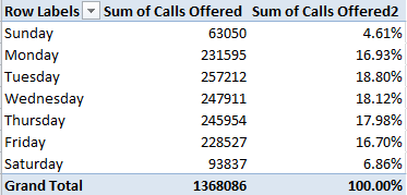
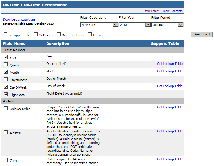
OK – so how about those service levels, say by Day of Week? We could try this:

Row Labels: Day of Week

Values: Calls Answered

Calls Meeting Service Level (both Sum. Note this field likewise requires a decimal-point reduction, because the round-off we executed earlier won’t extend to the pivot table. Remember that in any case these roundings only format the numbers, without transmuting their actual values.

And here we could cultivate a Calculated Field (see my August 22, 2013 post, for example, for some how-tos), called Service Pct or some such:

                       31121

formatted perhaps in Percentage terms to two decimal places:

31122

Not much variation here, the results baring a response consistency of sorts. Even the quieter Saturdays and Sundays cling to the 80% notch on the dial, goading questions about weekend staffing levels and call intake procedures. Indeed – correlating Calls Answered with Service Level %:

=CORREL(F4:F368,H4:H368)

evaluates to an indifferent -.135, or a very small negative association between numbers of calls and response alacrity, per the 311 guidlines.

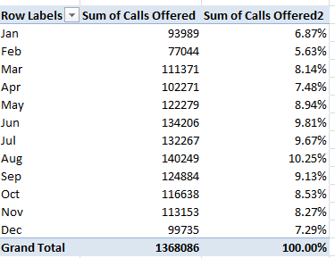
But days of the week are interlaced across the year, after all, and as such might be driven by more potent seasonal currents. If we substitute Date for Day of Week in Row Labels, and group the former by Month:

Here the picture changes. Service percentages associate far more tightly with call volume (operationalized here by Calls Answered), at -.55 (I simply ran a CORREL with the 12 Calls Answered and Service Pct cells above); and that makes rather straightforward sense. More calls to answer, longer response times. And if you add Calls Offered to the above table (Sum, again) and correlate that parameter with Service Pct, you’ll get -.716, a pretty decisive resonance. The more calls in toto, the fewer that penetrate the 75-second transom.

What about Calls Abandoned > 30 seconds? According to Keith McDonald, “Abandoned means caller hung up. In high call waiting periods, customers hear the upfront message and decide to hang up [following a wait of at least 30 seconds, apparently. I’m not sure about callers who gave up sooner].” (Note as well that Calls Abandoned + Calls Answered won’t add up to Calls Offered.) Here Calls Abandoned % builds its percentages atop the Calls Offered denominator, and the abandonment numbers seem to range all over the place.  Time for a more systematic look, e.g:

Row Labels: Date (grouped by Month)

Values: Calls Offered (Sum)

Calls Abandoned > 30 sec (Sum)

31124

Correlation between Calls Offered and Calls Abandoned: a ringing .745. Not surprising, perhaps, but when the numbers jibe with common sense – a less-than-ineluctable state of the data – it’s kind of pleasing. And if you slot in Average Speed of Answer (sec) (summarized by Average):

 31125

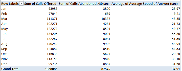
Correlation between that field and Calls Offered: a mighty .881.

Doesn’t a certain existential charm devolve upon confirmations of the obvious?

Phone Numbers, Part 1: Toronto’s 311 Call Data

26 Dec

Sometimes one catches a spreadsheet in mid-construction; that is, the sheet exudes traces of a preparatory, pre-publication primping that has already driven the data some way from their native, unrefined state, before they submit themselves to the reader.

And so it appears to be with the Toronto’s open data site’s resume of 311 calls placed in 2012, that three-digit sequence serving as the number of choice in many cities for their denizens’ non-emergency requests and notifications. For the Toronto spreadsheet, click here:

 Toronto 311 calls

It’s clear that the sheet has undergone a set of pre-publication tweaks, born both of practical need and some grander data-organizational strategy. For one thing, the calls are merely totalled by day, even though Toronto surely owns the details to each and every one of the calls. On the other hand, an Excel sheet’s 1,048,576 rows simply aren’t fit for the purpose of engaging with the 1,390,412 entreaties put to 311 in 2012, and in any event the data were originally tacked onto in a far-smaller-capacity Google doc sheet. And it was obviously decided in turn that an alternative data vehicle, e. g., a dedicated database, would rather be misapplied here (note: there are other, larger, 311 worksheets on the Toronto site, but these nevertheless report only a fraction of all calls; see, for example, this page).

Note too the sheet’s Day of Week and Weekday fields, both worthy parameters, to be sure. The minimalist in me would have renounced these fields, with the understanding that these data could have been user derived anyway (the former via the WEEKDAY function, for example); but that’s a churlish quibble because Toronto decided to do the work for us, and the fields serve us well. But either way, the data do indeed seem to have been subjected to a prior think-through.

Now before one moves to actually do something with the data – and there are in fact interesting things to be done – we need to perform some supplementary tweaks of our own, starting with the standard column autofit. And because column A contains exactly one data-freighted cell – A1 and its misshapen text-wrapped title – and because as a result that column will feature by default in any pivot table – I’d simply delete the column. And if you sort the Date field from Oldest to Newest you’ll discover that the last six records pull us through the first six days of 2013; and because they do I’d shoot a row between 368 and 369, thus dismissing the 2013s from the dataset.

Then you can start to do what you do best. For a first consideration, try simply breaking out all calls by the Weekday/Weekend binary:

Row Labels: Weekday/Weekend

Values: Calls Offered (Sum)

Calls Offered (again, this time by Show Values as % of Column Total):

3111


(Note that the dataset bears no record for January 1, 2012; and 2012 was a 366-day year. And note in addition the 1,368,086 call total has shed a few smidgens from the 1,390,412 figure adduced earlier; that’s because we’ve brushed away the 2013 days.)

I don’t know about you, but I’d call that interesting.  Left to “chance”, weekend calls would be expected to comprise 2/7ths, or about 28.6% of all 311 calls, but the actual weekend slice grabs a far slimmer apportionment. Perhaps fewer operators are standing by on those two days, or perhaps the good citizens of Toronto have decided en masse against troubling their city with their less-then-emergency inquiries away from normal business hours, though 311 maintains a 24/7 ubiquity.  Consider this question your extra-credit homework assignment.

Now exchange Day of Week for Weekday/Weekend in the table. I get:

3112


This bit of clarifying nuance exposes Sunday’s mere 4.61% of all calls, and also points up Tuesday’s modal call accumulation. Note as well the slow but vivid Tuesday-Friday diminution.

What about some seasonality? Substitute Date for Day of Week, grouping by Month:

3113


 Again, the variation is substantial, with February callers the least vociferous, even controlling for that 29-day month. It’s clear that demand crested during the summer and troughed in winter, even in spite of the snow-fomented complications likely to beset a Canadian city (again, review the 311 home page for a taxonomy of complaint types.) But then again, Toronto, unlike say, London, is snow-ready.

A last look for now. Reinstate Weekend/Weekday into the Row Label area, empty Values, and roll in Average Talk Time (sec) (Summarized by Average, and formatted to say, two decimal points):

3114

We see that, for what it’s worth, weekend calls took up notably less of 311’s time, about 23 seconds less, or about 10.5%; and those seconds add up across the workday. What explains the differential?  Do weekend calls, perhaps concomitant with their sparsity, recount simpler, or at least more easily describable, complaints or requests? That’s a good question, if I do say so myself, and an answer would require a species of per-call data that hasn’t found their way into our spreadsheet.

Be that as it may, I hope to say more in part 2. In the meantime, let me put you on hold.

Air Time, Part 2: Scheduling US Domestic Flight Data

19 Dec

And now for a study in contrasts. If last week’s UK Home Office flight records submitted their data to a partial lockdown, i.e., by apparently boarding up their flight destination data, the data before us now – combed from the US Research and Innovative Technology Administration Bureau of Transportation Statistics (RITA) – suffers from no such recalcitrance.

IF anything, the RITA holdings, linked here, fires a barrage of too much information at the searcher, if that kind of excess is even possible or undesirable. The RITA interface presents itself in copious checklist form, enfranchising the searcher to pick and choose data fields of interest, as per this excerpt:

air21


Again, be advised that the capture above is rather fractional; there’s far more there in there, although you’re likely decide against many of the downloadable fields, e.g. the long block of Diverted Airport Information parameters. On the other hand, as they used to say about the New York Times, it’s nice to know it’s all there.

For illustration’s sake I drafted what I took to serve as a useful assortment of fields describing domestic arrivals and departures to and from New York state airports for the October, 2013, the last month for which data are available (note:  it appears as if international flight data should likewise avail here, as per the myriad checkbox possibilities above, e.g. OriginWac or Origin Airport, World Area Code, but I haven’t been able to actually call them up. I’ve emailed RITA about this). You can find it here, in its 3.87 MB glory:

 NY Flight Data Oct 2013

My field selection comprises:

DAY_OF_WEEK (expressed in numerical terms;  1= Monday)

FLIGHT_DATE (that is, Flight)

ORIGIN (originating airport)

ORIGIN_CITY_NAME

ORIGIN_STATE_ABR

DEST (destination airport, that is)

DEST_CITY_NAME

DEST_STATE_ABR

DEP_TIME (Departure)

DEP_DELAY (expressed in minutes; a negative value denotes an early departure)

ARR_TIME

ARR_DELAY (again, a numeric rendering; negative values attest early arrivals)

ACTUAL_ELAPSED_TIME (in minutes)

DISTANCE (between airports, in miles)

(Note that because I’ve initially filtered the data for October, 2013, there’s no need to actually interject those fields into the download).

Of course, with all those other boxes you can customize and re-customize your investigations to your heart’s content, and handy lookup tables explicate the content of many fields whose data are guised in coded terms.

Once the fields are readied (and you’ll also need to perform a column autofit here), plenty of questions beg to be asked and answered. Consider, for example, a simple, initial pivot-table query of flight frequency by day of week:

Row Labels: DAY_Of_WEEK

Values:  DAY_OF_WEEK (Count)

DAY_OF_WEEK (Count again, this time as PivotTable Tools > Options > Show Values as % of Column Total via the Calculations button group)

I get

air22


Noteworthy day-of-week variation obtains, as we see, with Tuesdays and Wednesdays more or less equivalently busy, and with Mondays at their heels. I would have expected far denser, weekend-presaging Friday flight activity, on the other hand, but that just goes to show you what I know.

And how about some Arrival/Departure State distributions, e.g.,

Row Labels: ORIGIN_STATE_ABR

Values: ORIGIN_STATE_ABR (Count, of necessity)

I get (in excerpt):

air23

Of the 48,433 flights tracked in our data set 24,904, or 51.4%, emanated from New York, a wholly predictable fraction – I think. If you next run these fields through a table:

Row Labels: DEST_STATE_ABR

Values: DEST_STATE_ABR (again, Count)

Here New York state reports itself as a destination 24,905 times, or 51.5% of all arrivals. Remember of course that all the flights among the data either took off or touched down in New York – but because some flights embarked from and landed in New York, the state’s departure/arrival numbers aren’t quite reciprocal. Indeed, if you throw DEST_STATE_ABR in the Report Filter area and filter for NY and leave the ORIGIN_STATE_ABR data in place as per the above shot, you’ll learn that 1,416 of all flights both began and ended in the Empire State (that’s New York).  Call me the ingénue, but I’m (perhaps bewilderingly) struck by the near-identical New York arrival-departure numbers for each state as well. Does it follow, after all, that all these comings and goings would necessarily equilibrate? Well, perhaps it does – assuming, for example, every New York-Cincinnati flight need be followed by a return in the opposite direction. It may be that scheduling and maintenance imperatives require all those paired backs and forths. After all, if the plane has to get back to New York, it might as well carry some passengers on the way.

Here’s but one more table to think about:

Row Labels: DISTANCE (grouped by an interval of say, 250 miles)

Values:  ARR_DELAY (Average)

air24

Recall that negative values bespeak earliness; witness, then, the broad correlation between lengths of flights and their timeliness (though 419 of the 48,433 flights report no Arrival Delay data at all). The longer the trip, as a most general rule, the earlier the arrival. No, that wasn’t my default surmise, although training a finer lens on the 48,015 ARR_DELAY-divulging flights via the CORREL function:

=CORREL(M2:M48015,O2:O48015)

(where ARR_DELAY is posted to the M column and DISTANCE holds down O)

delivers a mere .054 relationship (note, for example, that only 43 flights lock into the 4844-5093 tranche, and over 80% of all flights comprise 1,600 or fewer miles; the table results thus above don’t proportion the respective inputs of the groupings.)

In any case, know that even if you confine any additional downloads to just the fields installed above, many more findings nevertheless should slake your curiosity –and even if you’re pleased to study New York data alone. You can, after all, drill back to many years and individual months for New York or any other state. And you don’t even have to latch your seat belt.

Air Time, Part 1: UK Home Office Flight Data

12 Dec

I seem to have gotten on a vehicular jag of late – first bicycles, then cars, and now jets, more particularly ones that deliver functionaries at the UK Home office on their appointed, and perhaps sometimes, disappointed, rounds, rowed and columned here (for 2011):

 Home_Office_Air_Travel_Data_2011

The spreadsheet is perhaps admirably straightforward. I was preparing to dismiss the Departure field in column C for its at-first-blush redundant character, appearing to roll nothing but “UK” entries across its cells, but in fact 79 entries in the field offer up something other than UK, e.g., EEA (the European Economic Area, an organizational composite enrolling European Union and European Trade Association members), and Non EEA embarkation points.

And therein is promoted a measure of mystery. The data’s departure and arrival points are drawn in the most general terms, and one could properly wonder if that manner of indefiniteness means to divert the reader from exactly where the Home Office has been taking itself. That could be, but an enterprising journo could perform a bit of triangulation by correlating departure date, airline, and flight fares in order to educate a guess about the airports associated with those departures and/or destinations, and all with information unambiguously and publically there on the workbook. Nothing treasonous there – I think. But if I’m wrong about that, I need to finalize that reservation at the Ecuadorian embassy.

Be that as it may, taxpayers may want to know how fares fare, and those totals are most easily pivot tabled, broken out first by say, month:

Row Labels: Departure_2011

Values:  Paid Fare (format as you wish)

Paid Fare (again, this time Count). You should see:

air1

Considerable inter-month variation obtains; how that squares with the rhythms and syncopations of policy-making remains to be considered. Note that March hands in the dearest expense report, but trip count honors go to November, at 1128, or 37.6 a day. Those disparities put Marchs’s per-trip average at £260.41, and that for the eleventh month at £144.10 (I couldn’t output the averages via a calculated field, but I’m still thinking about why not and how the why the might be articulated), begging more than a few questions in turn. For one – rather than having traveled farther distances on average, is it possible that March’s passengers were more likely to have taken off from a seat in one of the upper classes?

That question is easily answered:

Row Labels: Departure_2011

Column Labels: Ticket_Class_Description

Values:  Ticket_Class_Description (PivotTable Tools >  Options > Show Values As > % of Row Total)

Click On for Columns Only among the Grand Totals option in the Design> Layout button group.

 air2

March Business Class flights blurt well above the 7.48% per-month average (that average, by the way, proportions all business class to all flights), but cannot explain the better part of that month’s elevated fare-per-trip. But try swapping Paid _Fare for Ticket_class_description in the Values area (by Average):

air3

That adds a jot of definitiveness to the query. March’s Business Class-ruling £993.28, far higher up the axis than any other month save Aprii, appears to account for its dilated overall fare average. Note in addition the very substantial January-May Business Class averages and the commensurate fall-offs, timed with June.

If we next substitute Destination for Ticket_class_description (and all those underscore-connected field names suggest a data inception pointing back to an application other than Excel), work with the Count operation in the Values field and show the values as % of Row Total (turning off Grand Totals for rows if necessary):

air4

It’s easy to be struck by the Home Office’s near-absolute moratorium on non-UK-destined flights after May. Indeed, no such sorties toward EEA nations streaked down any runway after that month. Of course I can’t explain the EEA front-loading in 2011; It would prohibitively difficult to point to an Office strategic deliberation to fly to only certain venues, and only then; one would think the commanding political exigencies would goad the flight patterns instead, if there is a “pattern”. We’ll need to pass this one over to you, Mr. and Ms. Journo.

We can begin to prepare for landing here by breaking out flights by airline, one of the parameters that again might hint at actual flight destinations:

Row Labels: Supplier_Name

Values:  Paid_Fare (Count)

Paid_Fare (Sum)

(In excerpt:)

 air5


55 airlines figure in the manifest, and these data require a bit of study as well. Note the unsurprising hegemony of the British-based British Airways and Flybe (along with BMI and BMI Baby, neither currently trading, as they say here).  Again, exactly how these plot against destinations might take a bit of reflection, or more than a bit.

So fasten your seat belt.

Tickets to Ride: New York Parking Violations

28 Nov

If you will agree that the polar vehicular opposite of last week’s lithe, green, bipedal, needs-are-few bicycle is nothing but the lumbering, profligate, fume-shrugging car, then deciding to point that contraption at Manhattan’s viscous streets must stand in turn as the quintessence of the automotive idea gone wrong.  Driving and spewing through that storied island is just another way of saying you can’t get there from here, and one wrong move – i.e,. damming an intersection, or executing a pull-over into any one of the island’s uncountable slew of forbidden territories can cost you big time – up to $115, and know, for example, that a New York-perpetrated “Failure of an intercity bus to properly display the operator’s name, address and telephone number” (to quote the city’s rule book; see this compendium of no-nos and their budgetary consequences) will  rifle $515 from some company’s petty cash drawer.  Hope they remembered to ask for a receipt.

It thus seemed to me that a log of actual New York parking delicts committed to spreadsheet form might bare a sociological insight or two; and by hailing a cab to the New York open data site (we’ve been there before, on April 18 and 25) and its ledger of violations, I found the data to be had.

Of which there is no shortage. It appears that because the violation summaries are released monthly as a the November data as of now are few, with the actual shortfall pushing back to October 29, the point in time from which the available data become atomically small. I thus placed an order for violation data bracketed by the two-week endpoints of October 15 and 28, seeing to it that each day of the week would be represented twice.

And yes, they’re a lot of data. If you’re downloading along with me, that sound you hear is your hard drive crying Ouch. 107 megabytes if you’re counting, but if you want to line up October 15 through the 28th click the small dark blue Filter button in the view’s upper right and click the eventuating Add a New Filter Condition button until you reach Issue Date is. Next click the second small down arrow, click “is between”

park1

and then identify October 15 and 28 in the contiguous date fields.  Then click away from the dates to enable them to process, and next click the lighter blue Export button and CSV beneath the Download As heading. The data should head into a spreadsheet, but you can do some household chores while you wait. (Of course you could ask for fewer days.)

Fourteen days, 346,687 violations – close to 25,000 tickets a day. Do the math and the bucks start to get get pretty big. As a percentage of all drivers the ratio of apparent malfeasance is perhaps low (about 250,000 people drive to work into Manhattan daily, and the city’s George Washington Bridge puts its macadam under the wheels of about 275,000 vehicles each weekday; and four other bridges support over 100,000 cars, these numbers drawn from this Robert Wagner Graduate School (New York University) review of the Manhattan daytime population), and it is difficult to know from here how many citations are disputed, but the absolute numbers are large either way. This simple pivot table, then, breaks out violations by each of the 14 days:

Row labels: Issue Date

Values: Issue Date (again, by Count)

I get

park2

The 20th and 27th were Sundays, and note the pronounced decrement in Saturday infractions (the 19th and 26th) as well. For a more straightforward by-day aggregation, delete all the data in column A (summons number, a field you’re not likely to use), title the fledging field Day, write in A2

=WEEKDAY(E2)

and copy all the way down. This pivot table, then

Row Labels: Day

Values: Issue Date (Count)

Issue Date (PivotTable Tools > Options > Show Values As > % of Column Total)

yields:

park3

The 1, of course, proxies Sunday.  No, I can’t tell you why day 4, Wednesday, seems to fall significantly below its weekday fellows, but it does. There’s a story line for you.

Now if you’re wondering about Manhattan’s violation share – a crude but indicative index of that borough’s slice of New York’s traffic whole, try

Row Labels: Violation County

Values: Violation County (Count, of necessity; the data are textual)

Violation County (again by % of Column Total):

park4

The County legend, for you out-of-towners:

Bx – Bronx

K – Kings, or Brooklyn

NY – Manhattan

Q – Queens

R – Richmond, or Staten Island.

Those surprise-fee results must yet be thought through nevertheless. People use their cars all across the city without necessarily aiming them toward a workplace, of course, and so in order to make greater sense of the totals an understanding of all traffic accumulations would have to put in place. Indeed – utterly motionless cars get nailed, too.

And what about the kind of cars likely to magnetize tickets to their windshield, operationalized here by the Plate Type field? The table is easy:

Row Labels: Plate Type

Values: Plate Type (Count)

You’ll learn that 244,471 citations, about 70.5% of the (allegedly) offending cars, were fired off to the PAS type, clearly passenger vehicles, with 76,557 more, about 22.8%, leveled at COMs, doubtless commercial vehicles (and if I’ve read these clarifications with all due understanding it appears as if both private cars and taxis qualify as PAS).

Those expectable figures  account for about 93% of the ticket writers’ literary output, but the remaining 7 or so percent comprise all sorts of abbreviations about which I’m clueless, e.g,

park5

While we can assume the 999s serve as stand-ins for some data entry snarl, I remain unenlightened about the other codes, and that’s an issue of sorts. Absent some sort of clarifying directory, we’re left to guess about the meanings of the abridgements above. In any case, the data pull up short of comparative certainty, because as with last week’s bicycle data we need to know how the ticket data squares with the ratios of passenger, commercial, etc., cars actually rolling atop the city’s roads. In short, we need denominators before the next our analytical step treads across the data.

The same caution stakes the Registration State breakout:

Row Labels: Registration State

Values: Registration State (Count)

Of course New York license registrants dominate the count – exactly 264,300, or 76% of the accused multitude, with New Jersey contributing a predictably second-place 36,987. But apart from the data-empty 99s, I see 62 rows worth of registrations – and when I last looked I counted but 50 united states. While it’s clear that PR means Puerto Rico, I’m not about the other eleven entries, some of which probably represent Canadian domains, e.g., BC/British Columbia). Again, we need more background information, as we do for the Vehicle Color field, in which we need to disentangle WHITE and WH, for example (although you’re asking why it’s worth associating vehicle color with ticket vulnerability, that’s a fair question. But who knows what correlations await?).

Lots of fields and violations, and lots of possibilities. And unlike so many of New York’s parking spaces, you can hold your spot in the data from 10:00 to 3:00.

UK Bicycle Accidents: Safety First?

21 Nov

For all the wrong reasons, news about London bicycling has lately and repeatedly boldfaced the city’s headlines. A spate of fatalities on the city’s roads – six in the past two weeks – has compelled a re-ask of questions about rider safety and a gathered to it a clutch of variously satisfactory answers, including London’s Mayor Boris Johnson’s own question: if cyclist carelessness might in some way be contributory.

In fact the tragic toll urges a need for perspective upon the investigator. London’s 14 cycle deaths matches the 2013 total, but interpretations hinge on both an appreciation of the statistics of small numbers, however dreadful, and rider volume, one review of which is posted here.

Those background understandings need be imported into the equation and kept there before any analysis of the UK-wide incident data for 2012, compiled by the country’s Department of Transportation and delivered by and interactively mapped in the Guardian, can move ahead. Its Excel equivalent is here:

 UK cycling incidents

The data are hearteningly fit for manipulation (all the dates are dates, for example), if imperfectly so. Some here-and-there sprucing would appear to be in order, including

  • A turning off of the global Wrap Text effect that seems to have fanned through each and every cell in the workbook
  • A columnar autofit on behalf of field-header visibility
  • An recommended delete of the Casualty Type field, each cell of which billets the word Cyclist, and hence affords no differentiation
  • Another discretionary dismissal of the redundant Long lat field, whose values have been practicably broken out in the two columns to its left
  • As the Casualty No. field codes the Casualty Severity data to its immediate left (1 for Slight, 2 for Serious, and 3 for Fatal), it too could be deemed redundant, and likewise dispensable. Averaging the codes into a severity index of sorts would deputize the numbers with an authority of the most arguable kind. What would a severity average of 2.5 mean?
  • The field reference to Northing, “The difference in latitude between two positions as a result of movement to the north” (to quote thefreedictionary.com), could probably could be ignored, if not exiled from the sheet, along with its perpendicular companion Easting. Latitudes and longitudes would better serve any data mapping enterprise.

Once these bumps have been smoothed, you should be able to undam an outpouring of pivot tables, again provided these submit themselves to the necessary qualifications, i.e., information about the numbers of riders of any and all vehicles on the road at the pertinent times and places. And as such, these tables can only travel the first leg of the investigative journey.

Let’s start in any case with a gender breakout across the UK:

Row Labels: Sex of Casuality

Column Labels: Casuality Severity

Values:  Casuality Severity (by Count, of necessity; these are textual data). With a bit of formatting, I get

cy1

 Then shift to PivotTable Tools > Options > Show Values As > % of Column Total (and add PivotTables Tools > Design > Grand Totals (Layout button group) > On for Rows Only here. We don’t need horizontal 100%s here):

cy2

The hugely dilated gender incident divide – plainly redolent of a far greater male bicycle ridership – yet widens with accident severity.  Even granting a congenital disparity, women comprise a notably smaller proportion of fatal incidents, cueing a deeper look as a consequence. Do women ride fewer aggregate miles per trip, or navigate safer roads, or ride with greater care?

What about gender crosstabbed with time of day? Because the gender categories are binary and readability is sharpened by running times down a column and not across, where the fields could bleed off the screen, drag Sex of Casualty to Column Labels and drag off Casualty Severity.  Slip Time into Row Labels, and group its data by Hours (and only Hours). Maintain % of Column Total as well. I get

cy3

Note the disproportion of women populating both the 8AM and 9AM tranches (keep in mind the percentages above are reading downwards; the 11.68% stands as the percent of all female incidents), the likely rush-hour peak. Again, the table fires questions it can’t answer by itself. Are women riders relatively more likely to take to the roads for work destinations than at other times? Are they somehow more vulnerable to High Goods Vehicles (HGVs), implicated in numerous incidents?

But that last interrogative is a something of a London question. To see how the data present themselves for that city alone, drag Police Force into Report Filter, click its filter down arrow, tick Select Multiple Items, and check both City of London (that financial center/city-within-the-city indeed  maintains its own law enforcers) and Metropolitan Police, the London constabulary:

cy4

Both genders exhibit higher incident proportions at the 8AM mark than the UK as a whole, but again the female percentages skew the 8 and 9AM slots.

How about day of the week? Start over again, and start simply:

Row Labels: Day of the Week

Values:  Casualty Severity (again, Count):

cy5

Remember these are UK-wide data. Not surprisingly, weekend days record far fewer incidents, an expectable consequence of a presumed tail-off of car/truck (or lorry) traffic during that phase of the daily round. On the other hand, we can’t tell from the above how many recreational riders predominate on Saturdays and Sundays, and how their numbers impact the cycle-car/truck ratio. And in any case the numbers are very similar for London only.

And what of prevailing speed limits at the point of incident, a hotly controverted issue (see www.20splentyforus.org.uk  )? Considered nation-wide:

Row Labels:  Speed limit

Values: Casualty Severity (Count)

cy6

Again, of course, the data need to be reconciled to the numbers of streets upholding the respective limits, and the extent to which these are pedaled through.  In fact, recalculate the above by % of Row Total and:

cy7

The percent of fatal incidents of all 30-mph events actually falls beneath the figure for accidents at 20mph (though of course the numbers are fortunately small).

Lots to think about. We need more deep background, to be sure – but if you’re looking for Square 1, here’s a good place to start.

Notes From the wunderground, Part 3: Matters of Degree

14 Nov

Having homespun the spin button that’ll pump sequenced values to cell O1, we now need to consider that map – really a picture, and as such nothing like the organically-bred images we detailed in our  October 25, November 1 (both 2012) and July 11, 2013 posts.   We want in some way to plot the daily temperature readings for calendar 2012 for New York, Chicago, Dallas, and Los Angeles on the map, each according with every click of the spin button that moves us through that 366-day span. Our final installment in the wunderground trilogy, then, endeavors to follow through.

The first thing we need to do then, is  stake four VLOOKUP formulas on the Map sheet (I’ve recruited cells O11 through O14 toward that end, simply in the interests of choosing somewhere; it goes without saying you can stake your cellular territories wherever you wish). Each formula should return that day’s mean temperature, per the city it looks up. In this connection I’ve range-named that pivot table we nailed together (see the previous posts) Temps (by clicking PivotTable Tools > Option tab > Select > Select Entire PivotTable in the Actions button group you can indeed select the entire table for naming) and I’ve dubbed O1 Date (remember that it’s perfectly legal and patriotic to assign a range name to one cell). Thus in O11 I can write

=VLOOKUP(Date,Temps,2)

thereby looking up the temperature for Chicago for whatever date presently populates Date/O1 (it’s the Chicago data that happens to line column 2 in the pivot-table that’s serving as our lookup table). Copy that expression down three more rows and edit the primordial 2 to read 3, 4, and 5, respectively in order to capture the temp data for the four cities. And in the service of clarity enter Chicago, Dallas, Los Angeles, and New York in N11:N14. Then click the spin button up arrow and observe the daily movement in temperature flitting across the cities, exactly what we want. (Important note: if you wish, you can always supersede the current entry in O1 – our Cell Link – by simply typing a value into that cell; but that override won’t annul the operation of the spin button, whose normal operation can be kick-started anew at any time by simply clicking the button again.)

If that’s all working we can now tug the city data to their respective positions on the map, by picturing the cells with the camera tool, which I first pulled out of the box and screwed into my Quick Access Toolbar  in my December 6, 2012 post.:

                       blog31

For the sake of the example, let’s snap composite shots of the city temps and their trailing names. Select N11:O11, click the camera tool, and sail that slender black cursor over where you believe Chicago to be on the map and click:

blog32

That’s Lake Michigan pointing down at Chicago.

Now it seems to me that Chicago in the photo (look – if we’re using the camera tool, let’s keep the metaphor going) is distanced unappealingly from the 6, and so the imperatives of space management call for a right alignment of the city names in N11:N14 and a mirrored left orientation to the temperatures in O11:14. You could also narrow the O column to further tighten the temperature half of the shot, remembering that the camera tool replicates the appearance of the captured cells in all their regards; trim a column width, for example, and the column remains trimmed in the camera output. (And that the contents of the Cell link in O1 and the formula in O2 may suffer a loss of visibility as a result isn’t calamitous. We’re not principally interested in displaying them in their host cells.) Then point your camera at N12:O12, N13:O13, and N14:O14 and snap away.

Next grab the nearest atlas (it probably has a URL these days), match the city locations to our map, and drag each pic to its terrestrial niche, e.g.

blog33

And now let’s wend our way back to something resembling square one. Our greater intent again is to click through 2012, so to speak, with the spin button, and so nest each day’s temperature in its camera shot – and to orient ourselves in time you could, for example, insert a shape on the map or its environs, select it and then enter =O2, format O2 as a Long Date and center it in the shape (making sure the shape has been selected), thus captioning the map:

blog34

And if you want you can conditionally format the temperature values in O11:O14, too. They’ll show up in the camera shots. And don’t get scared by those 13 degrees in LA – remember, that’s centigrade.

—————–

Another postrscript, keeping with the above sentence. If you want to translate Centigrade readings into all-American Farenheit, try the little-used but worthy CONVERT function, which mediates all sorts of competing measures of the same sort of phenomenon, e.g. temperature. Check it out – it’s rather easy.

Notes From the wunderground, Part 2: Taking a Spin Through the Data

7 Nov

As we have begun to see, the broad, deep data from wunderground.com can be whip up both intra and inter-city takes on their numbers. We could, for example, download weather information from multiple locales, mash them into a unitary spreadsheet, and go on to write a comparative, day-by-day history of temperatures and other parameters.

For example, and as per last week’s go-round, I filched the 2012 data for New York, Los Angeles, Chicago, and Dallas, and heaped them into one consolidated sheet, while remembering to pack an additional column named City stamping the respective city names alongside each record. It’s all there for you, with a map about which more needs to be said, right here:

 four city temps

I then shook the mix into a pivot table:

Row Labels: EST (really, the date field)

Column Labels: City

Values: Mean TemperatureC  (C for Centigrade)

All of which begins to look something like this:

            wu21

(Note: there appear to be no New York temperature data for January 29 and 30).

All rather workmanlike and unspectacular, but we can nevertheless point the table in a new direction – aiming it toward a makeshift mapping of the temperatures, spiced with a pinch of interactivity seasoned by a bracing condiment called the spin box.

The resizable spin box:

wu22

sits on a branch of the family tree sprouting in the Controls button group, itself planted in the Developer tab – a band of buttons you may or may not presently be bowed neatly on your ribbon. If Developer is in fact among the missing, and it very well might, you can give it its screen debut by clicking File tab > Options > Customize Ribbon and ticking the Developer box and OK:

wu23

Once that work is done you can click Insert > Control button group > Spin Button (Form Control), and size the object as you wish.

But aesthetics aside, what does the spin button do? Here’s what: clicking the button rings up a value in a specified cell (called the cell link); each subsequent click boosts or depresses that value (depending on the directional arrow clicked) by a user-defined increment/decrement).

If that’s sounding irritatingly abstract, bear with me and picture this simple example. Imagine a roster of test scores, each test-taker referenced by an ID number:

wu24

Clicking a spin button repeatedly will install a number from 1 to 4 in a chosen cell (the cell link), any value of which can be funneled into a lookup formula, for example, that can return a student’s name and/or test score (e.g., the 2 could be looked up to yield either Ted or 81, depending on how the formula is written). The larger definitional point is that successive clicks of the button spin-cycle through a span of sequenced numbers, each one of which can be put to some formulaic or other use somewhere else on the spreadsheet. Our intention here: to have our button spin through all 366 days of 2012, enabling us to flash each day’s city-specific mean temperature in each of four designated cells, one per city. And once that manner of data capture is realized, we want to properly locate and pin each of the city temps on that map via a “camera shot” of the cells (see the December 6 and 13 posts).

So what do we do first? Let’s introduce, and review the mechanics, of the spin button. Click somewhere in the Map sheet and as per the preliminaries above click Developer tab > Insert in the Controls button group > Spin Button (Form Control). Drag the slender black indicator to a desired button size. Next, right-click the button and select Format Control. You’ll see

wu25

Five fields beg our attention (note that Page Change, an option peculiar to the spin button’s first cousin the scroll bar, is deactivated here). Current value identifies a user-elected number designated to appear by default in the cell link, that is, the cell in which the cycled-through values will register; and so while we’re at it, then, I’ll enter (or click on) O1 in the Cell link field. Again, what we want to eventually see in there is a serial, clicked-through numeric representation of the dates January 1, 2012 through December 31, 2012, each one of which is to be plowed into a VLOOKUP in order to deliver that day’s temperature for each of the four cities – and here’s where it gets interesting.  I’ve said it before, and I’m saying it again – dates are numbers, and as the numeric value of January 1, 2012 is 40909, we might as well start the spin sequence right there, and so think about entering 40909 in the Current Value field. But there’s a problem – as intimated in the above shot, the spin button will not entertain values beyond 30000. In other words, you can’t enter 40909 in Current Value – it simply won’t compute.

So I’m going to enter 909 in the Current Value field instead (and again, that value will seat itself into cell O1, the Cell Link) – and why? Because 909 is precisely 40000 less than 40909; and because it is, I’m going to enter

=O1+40000

in O2. That cell of course yields 40909, the numeric twin of January 1, 2012 (intelligibility might be aided by imposing a Date format on O2); and it’s O2 that’s going to supply us with usable date values, the values with which we really want to work – trust me.

But we’re still in the spin button dialog box. For Minimum value again enter 909, and for Maximum value try 1274 – or 909+365, which, when merged with 40000, gives us nothing but December 31, 2012, the final date in our chronology. And leave Incremental change at 1.

And what this all means is this, once you click OK: Each click of the spin button up arrow will plug an increment of 1 into the default 909 in cell O1. O2 will in turn plump each and every increment up by 40000, thus realizing a date value between January 1, 2012 and the end of that year in that cell. Start clicking and you should see what I mean.

Got that? But don’t worry – it’s all downhill from here. And we haven’t gotten to that map yet.

 ————————————————–

An addendum to last week’s post, in which I noted that the precipitation data for Manchester seemed to have been stuck on zero:  A contact from wunderground.com, a gentleman named William, offered that the reporting weather station whence the numbers came “might not be recording precipitation events”, going on to say that entering Manchester at wunderground.com’s home page and clicking Select Station in the following page might blip an alternative local station onto the radar in which precipitation was measured.   There was such a station, in nearby Urmston, which marked precipitation for all of 2012 but for but the last two weeks of 2011. Total output, so to speak, for 2012: 158.13 centimeters.

Notes from the wunderground, Part 1: It Looks Like Rain

31 Oct

In-jokes are for the in crowd, and if you’re out, you’ll click uncomprehendingly past the wunderground.com’s very name, wilfully cute shorthand for Weather Underground, and its in-plain-sight harkening to the 60s radical group by that very name.

They’re based in San Francisco, you see, where such allusions are knowingly received; but history aside, wunderground.com backlogs all kinds of information about things meteorological, and that doesn’t sound too subversive, does it? Call me a naïf, then, but I’m not mine-sweeping the data for clandestine, coded hints to the cadre; I’m prepared to believe it’s actual weather data you’re looking at.

And among many other confidences into which wunderground will take you is historical data for a great multitude of localities, and that’s good news for spreadsheet pattern spotters. Start by going here:

www.wunderground.com/history

Type in a place name, click submit, and follow by clicking the Custom tab, whereupon you can enter from/to date endpoints (N.B. – these can be no more than 400 days apart; if you want two years of weather history, then, you’ll need to issue two Custom requests and airlift the results into one sheet, one set atop the other). Click the one of the two Comma Delimited File links at the base of the results (no; I can’t explain the need for two).The data appear in a new window in bare CSV form, and must be copied, pasted and then subjected to a painless Text to Columns routine (the separator, here: comma. Remember as well to delete the presumptive header row from the second paste, (see the January 17 post for review) shimmed smack dab in the middle of all the pasted data, if you’ve called up two years of records).

I thought I’d try out two years’ worth of data (for 2011 and 2012) on the city of Manchester, UK, whose stereotypical rep for precipitation promotes its rain to a veritable near-tourist attraction. After booking two Custom reservations for the city (Jan 1-Dec 31, 2011, Jan 1- Dec 31, 2012, in line with the 400-day request limit), I nailed this pivot table together :

Row Labels: Events

Values: Events (Count, of necessity; the data are textual)

It’s in the Events field that you’ll find confirmation or grounds for pooh-poohing the Mancunian (trust me – that’s the adjective, Word’s redline notwithstanding) repute for showers-by-the-hours. I get

wun1


I see a few problems here darting between the drops. I’ve ordered 731 days of weather from wunderground (remember, 2012 was a leap year), and I’ve come away with only 520 of them. That’s what happens when 211 blanks dilute the data, and we need to ask who invited these nullities to the party. An unpopulated Events cell could communicate one of two very different things: simple data truancy, i.e., a bit of AWOL information about the day, or rather a merely quiet day – that is, one in which no recordable “event” happened in Manchester. The difference is most material; dividing 401 rain days by 520 usable days, or by 731 of them instead clearly matters; and given the profuse but unsystematic distribution of the blanks I’d opt for the latter take, that is, that the blank-bearing days were simply deemed uneventful.

And if I’m right that means we need to fill the blanks with some substantive, cell-resident indicator, so that each blank turns into something count-worthy. Here, I’d simply select the Events column and run a find and replace, entering nothing at all in the Find field and the word None in Replace. Refresh the pivot table, and 211 Nones take their place at last among the data. Now jigger Values to Show Values As > % of Column Total and:

wuun2


Going to Manchester? Bring your umbrella. A run-through of similarly time-framed data for London – no slouch in the rain department, itself – ran up a rain quotient of 47.81%.

Next problem.  Manchester’s Precipitationmm field (the mm presumably abbreviates millimeters) serves up an unrelieved medley of zeros, one for each and every day, among the data, and that can’t be right (the London data does carry this information, by way of contrast). That’s a clear data imperfection, in need of follow-up (I’ve awaiting an e-mail reply from wunderground on the two problems).

The third problem is data-conceptual. In fact, the data in the screen shot above spreads its rain-classificatory umbrella atop more than 54.86% of Manchester’s days; after all, if a day is reckoned in Fog-Rain-Snow terms, then among other things, it rained. We thus may want to assimilate all rain-experiencing days into one metric, and we can achieve that end by bounding into the first free column (it should be X), heading it Rain and entering, in what should be X2:

=IF(ISERR(FIND(“Rain”,V2)),”None”,”Rain”)


In other words: If the nested FIND (see the  June 6  post) fails to hit upon the “Rain” in the specified cell and incurs an error message as a result, deliver the word “None” into the cell. Otherwise, i.e., the character string Rain is flagged, post Rain to said address. Copy down the column, and pivot table thusly:

Row Labels: Rain

Values: Rain (Again, Count and % of Column).

I get, then:

wun3


Make that an umbrella and a raincoat. The comparable figure for London, circa 2011-12: 52.05%. Paris? 43.23%. Er, Honolulu? 45.69%. Surprised at that last number? Me too.  So is the Manchester Chamber of Commerce. Pleasantly.

Je M’Appelle Abbott: Comparing Paris and New York Name Data, Part 2

24 Oct

Now that our data infrastructure has been firmed and its component fields, including the ones forged to our specifications, have been welded into place, we can begin to think about how this all might be put to good analytical use. As observed last week, each field is fetchingly substantive and groomed to contribute to the business of learning about New York-Paris naming practices. And had New York allowed its data to stretch across multiple years, over and above its monadic 2009, another field for our delectation would’ve sweetened the mix.

But let’s work with what we have. Your data right now should track somewhere along these (grid)lines:

 nyp1

And that refinished data set cues a return to the question with which I closed out last week’s post. While our intent of course is to frame a series of comparisons between New York and Parisian names, the numbers as they stand simply don’t directly support any like-for-like valuations, simply because the New York data comprises 2.7 more births (as opposed to actual names – a point over which we need to loll a bit later) that those in the French capital. One could, one supposes, multiply each Paris record by the 2.7 differential and as such normalize their numbers, after a fashion; but force-feeding the data with that kind of virtual numeric parity would mar the presentation prohibitively, I think. Reminding readers that the New York birth totals emblazon the actual numbers, and at the same time begging their imaginative indulgence over the Paris figures throws too many balls in the air – particularly when the 2.7 multiplier sprays decimal points all through the Paris totals. Do we really want a reader to know that 869.4 Louises were born to Paris mothers in 2009? Some rhetorical questions were meant to be answered – and the answer to this one is: No.

What we can do, of course, is proportion the data, by fractioning say, the ratio of A-initialed names to the respective New York-Paris wholes. This too, normalizes the data, but after a different fashion. For example, we could try out this pivot table:

Row Labels: Initial

Column Labels: City

Values: Initial (again, by Count, and % of Column total)

Report Filter: Gender

I get:

 nyp2

(N.B. One need only click the % of Column Total here option once. The NY and Paris values are exactly that – plural items or values in the selfsame City field; the two cities don’t stand alone as discrete fields.)

There are comparative differences in there (i.e., the J and M initials), but quite a few distributional resemblances, too. And if you’re wondering about the absolute numbers conducing toward these results, throw Initial into the Values area again and comply with the default Count operation:

 nyp3

And of course, all of the above could be filtered for gender, whose field is peopled by a data curiosity. Some of the Paris names have been spooked by the X factor – that letter having stolen into their Gender fields, presumably in virtue of some documentary/administrative complication. There are but five such names, however – Noha, Felicite, Keziah, Jessy, and Alexy, all of which are sufficiently indeterminate to beg the question of how gender is registered by the French.

Now we need to amplify an issue to which we earlier devoted a parenthetical aside. The name data before us can in fact be addressed in two modes: First, as a collocation of names, each considered a solitary, once-occurrent datum – the tack we’ve taken until now – or rather, as the sum of all the names borne by the babies born in 2009, a very different conceptual and numeric understanding. Thus by substituting the Number for the Initial field in the Values area for the above pivot table (and remaining here with the default Sum operation), you’ll realize this breakout:

 nyp4

(Yes, feel free to rename the fields if you want to.)The numbers now are much larger, naturally, but by-and-large they jibe with the Initial Count data, and that’s probably none too surprising. And of course all of the above could be filtered by gender, once we look past the five Xs. Thus we see, for example, that a remarkable 19.26% of all New York males received a name beginning with J, even as that letter starts off but 5.16% of the girl names.

Now substitute Length for Number, summarize by average, and format to say, two decimal places (here you need only recruit Length once for the Values area):

nyp5

The variation is not stupendous, and overall New York names average 5.84 characters to Paris’ 5.78 – a virtual draw (note again, however, that these averages treat the names as one-time iterations, that is, as per the first method we described above. Resorting to the Plan B, in which the aggregate length for all names of all babies (i.e., name Number times Length, all totaled and broken out by each city, and divided by the Number total for each city) I wind up with a 5.89-5.69 New York Paris average name-length split. For the record, you can bring those results about via these expressions:

=SUMIF(D2:D2834,”NY”,G2:G2834)/SUMIF(D2:D2834,”NY”,B2:B2834)

=SUMIF(D2:G2834,”Paris”,G2:G2834)/SUMIF(D2:D2834,”Paris”,B2:B2834)

(Begging forgiveness, a detailing of the workings of the above with take us a digression too far here.  But See, for example, this discussion: http://www.techonthenet.com/excel/formulas/sumif.php)

One additional finding that I, for one, attended with some surprise emerged from a simple question about the names shared by New York and Paris, i.e., how many names appear in both cities’ birth rosters? The answer can be pivot tabled thusly:

Row Labels: Name

Values: Name (Count)

And sorted descendingly by the Values column.

What interests us here, put simply, is the number of names evaluating to a count of 2 – meaning of course that these are the ones which find their way into the birth data of both cities. My pivot table counts 2360 individual names, of which only 446 – or about 18.9% – occurred to parents in both cities. I would have thought that the selection overlap, as it were, for these two Western countries would have canopied far more names. Anthropologists, I sense a post-doc opportunity in the making.

But these data also blow the whistle on two data quirks. A number of Paris names, e.g. Kevin, Sekou – appear twice in the original Open Data Paris download, and in association with the same gender (doubles dot the New Yorks data, too, but these are gender parsed). By the lights of pivot table protocols these redundant mentions are merely flesh wounds, because squeezing repeated instances of the same item into one, and only one, row or column label appearance is precisely what pivot tables are cut out to do. Still, the duplicated names – which were first brought to my attention by a student – are worth asking, or at least wondering about.

The other quirk is even quirkier. When I ran the above names-shared pivot table, its upper tier read as follows:

nyp6

Now, pivot tables should immediately sort Row and Column Label entries; but the first four labels above clearly aren’t defaulting.  I’ll admit to a thick, initial measure of puzzlement over these out-of-sorts entries, until the light bulb shined a few watts on me. Apart from qualifying as bona fide baby names, Jan, April, June, and April happen to populate Excel’s custom sort lists of the months and their three-lettered abbreviations (see File > Options > Advanced > the Edit Custom Lists button). As such, they’re indeed earmarked to rise to the top of any sort, at least by default (and note that the four month/names sort themselves in chronological order). But if you want the members of this quartet to assume their conventionally sorted place, initiate the pivot table via Insert > Pivot Table, and immediately thereafter click PivotTable Tools > PivotTable button group > Options > the Totals & Filters tab, and deselect Use Custom Lists when sorting.

But alright, mes amis; you’ve worked hard enough today – I’ll spring for the croissants.