Je M’appelle Abbott: Comparing Paris and New York Birth-Name Data, Part 1

17 Oct

There are spreadsheets with problems, if I may be so judgmental, and then there are spreadsheets with meta-problems. I see a hand back there requesting clarification.

It’s like this: much of the expository thrust of this blog has dedicated itself to the former sorts of problems – issues of data quality, and formulaic remedies to other issues. But sometimes even a perfectly sound agglomeration of data begins to act up, when it’s asked to live peaceably with another batch of otherwise perfectly sound data.

It happens. It happens when you want, or need, to – and I use this verb with some hesitation – consolidate two kindred but not –quite-identical sheets into a larger totality (and let’s leave Excel’s Consolidate feature out of this). The meta-problem, then is reconciliation,

And it isn’t as abstruse as it sounds. A case in point: the birth-name data compiled by the municipalities of New York and Paris. There may be any number of piquant sociolinguistic conclusions to be learned from these data, but the data aren’t quite yet fit for the cross-cultural comparative aims we intend for them.

For one thing, the New York data comprises two gender-distributed workbooks; the Paris sheet is of a piece, assigning instead a defining field for gender (as do the New York data, by the way, perhaps redundantly):

 Liste des prénoms 2004-2012(1)

2009_Popular_Birth_Names__Female_

2009_Popular_Birth_Names__Male_

The task, or tasks, then, that prefigure any subsequent analysis: to normalize the data so that they read the same way all the way down, and play on, or with, the same fields.

At least these steps aren’t particularly sequence-dependent.  First, then, we need to understand that even as the Paris data report birth names from 2004-2012, the New York names avail only for 2009, thus tapering the comparison range to but one year – and as such, the Paris year of birth field (annee) doesn’t spur the narrative, and so you want to disassociate the 2009 names from their companion data, which can’t be compared across the two cities. I can think of several ways to make this happen; perhaps the trouble-freest would have you auto-filter the 2009 names, whereupon you’d copy them to a new sheet – and why not a sheet in the same Paris workbook?  I can then simply delete the annee column, because again, all the names with which we want to work, after all, bear the 2009 provenance.

Next, given that the Paris sheet abbreviates gender (or sexe – the field headings are French, of course) I’d turn to the New York sheets and run a find and replace through their gender data, replacing Female and Male with their respective initials. (I’m not bothered by the all-capped New York names, though a restoration of these is just a PROPER function away. =PROPER(B2) on the Female birth name sheet, for example, will restyle ISABELLA into Isabella.).

I’d then copy-paste all the New York gender identifications into the next available Sexe cell into this new sheet (I’ll rename the field Gender), and follow through with a parallel copy-paste of the New York names, taking pains of course to line up each name with its gender. I’d also ignore the New York Rank data; these are nowhere to be found among the French names, and we can order all the data from both countries in a pivot table in any case. And of course you also have to copy the New York name counts to our sheet-in-the-making, again seeing to it that each number is properly affiliated with its name. And while we’re at it, I can rename prenoms Name, and nombre Number (if you parle Anglais).

Now our working fields – Name, Number, and Gender – need be staked to a fourth one, one that differentiates the pair of cities whose names we want to compare. Thus we can type City in Row 1 of the next free column, Enter Paris in what for me at least is D2, and copy it all the way to row 1127, or whichever cell on your sheet stores the last French name. Then enter NY one row down and copy to your last New York name, which for me tucks itself into row 2834. (You can tell where the New York names start; they’re the ones puffed up in capitals.)

All this to-and-froing means the sheet under construction looks something like this (depending on how or if you’ve sorted the data in any way), in its upper reaches:

nyparis1

And irrepressible lad that I am, it seems to me that a minting of two additional fields could usefully inform the data. Because we might want to learn something about inter-city first-initial naming preferences, we can call the next available column Initial and enter in what is for me E2:

=LEFT(A2,1)

And of course copy all the way down.

We might also be concerned to do some trendspotting about name lengths. If so, move on to column F, name it Length, and type in F2:

=LEN(A2)

and copy accordingly.

Now our reconditioned sheet – an admirably lean composite, all of whose fields are eminently usable and worth a breakout or two – looks good to go.

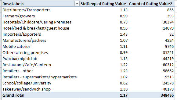
But before we go, there are a couple of yellow lights at which we need to pause. Note that the New York data calls for a name-reporting minimum of ten births; that is, a given name must identify at least ten recipients before it achieves a listing. The corresponding qualification for the Paris list is five (though the Open Paris website seems to draw the line at six). These floors, even as they’re pitched at different elevations, cache an unknown census of births and names. It’s not inconceivable that a notably large number of babies inherited a notably large numbers of names, each of which was conferred upon a few babies each. That missing cohort isn’t accounted for here.

The other yellow light flashes a bit more brightly. New York is far larger city than Paris, and so divulges far more reported births – 86,021 to the City of Light’s 31,809, to be exact.  How that disparity can be reconciled needs to be thought about. So let’s start thinking.

Spending Time on Parliamentary Expenses: Part 3

10 Oct

Submit a report for £23,000,000 worth of expenses for that business trip and it’s safe to say your boss’ll want you to account for each and every pence of it. For Britons – the putative bosses of their members of Parliament – that accounting is putatively here, at

http://parliamentary-standards.org.uk/DataDownloads.aspx (click the 2012-13 link; again, at 40 MB the file would crumble WordPress’ cookies were I to thrust it upon my blog).

(Note before we size up the data that a far larger sheet, at http://parliamentary-standards.org.uk/ (click the tiny here link), historicizes £98,000,000 worth of outlays. That number also drops salaries into the equation, while our sheet considers expense requests only, but dates each request.)

It should also be added by way of extended preamble that these numbers may have found their way to parliamentary-standards as a species of after-the-fact restitution for the 2009 expense scandal that agitated Parliament (and the voters) and which was, as they say, in all the papers. (For a defense of current expensing practices see this apologia.)

The file is rather ready-to-go, I must say, though you could slice the Year, field in column A off the grid, as it contains nothing but the redundant 12/13 entry. (If however, you were to copy-and-paste the 2011-12 expense data available from the same web venue onto our sheet here – not a bad idea – you’d want to retain the field, in order to disambiguate the two years’ data).

Now that you’ve jammed 187,000 records into your PC’s medulla we can pivot table away, beginning with the most obvious datum: the expense amounts claimed by each MP:

Row Labels: MP’s Name

Values: Amount Claimed (Sum)

Format as you wish. You could then move to sort these, although I’d gather that Alistair Carmichael might vote against that rearrangement. Mr. Carmichael, a Liberal Democrat MP from Orkney and Shetland in Scotland, expensed his way to the first position, requesting – and receiving – £82,949.70. By no means does that sum suggest any manner of malfeasance, however, and indeed, Mr. Carmichael’s peregrinations to and from his home base at the tip of Scotland – about as far away from Westminster as an MP can get – might have served to have engorge his travel costs. (Jim Dowd, the current expense league leader for the first two months of fiscal 2012-13, is hunched down at number 524 for 2012-13.)

And because the factotums in the Cameron-Clegg administration likewise play the MP role – an elision of powers you won’t find in the States – their expense requests, including those of Messrs. Cameron and Clegg themselves, are out there for all to see.  Mr. Cameron entreated an austere £6,923.50 during the 2012-13 year, but Mr. Clegg’s £37,672.52 actually brushed past the MP average of £36,043. Labour’s opposition leader Ed Milliband asked for a prudent £26,320.07, even as erstwhile Chancellor of the Exchequer Alexander Darling, about whom expense questions had been raised, filed for £47,381.48, good for 155th place out of the 654 MPs. On the other hand, there’s Michael Fallon (himself implicated in the above expenses controversy), who for 2012-13, at least, checked in with exactly £38.74 worth of requests, these for two stationery purchases. One overarching investigative leitmotif, then, might simply concern itself with the immense variation in expense sums, quite apart from any question of impropriety.

You could then undertake to compare aggregate expense requests by MP to their average request size, by recalling Amount Claim to the Values area a second time and Summarizing now by Average. Assuming your pivot table data kick off at row 4, you could then correlate the two Amount columns thusly:

=CORREL(B4:B657,C4657)

The result:  -10003, or by standard statistical lights, no correlation.

Now tighten the thread, by swinging Category into the Report Filter field and ticking Travel. In part, I get:

parl31

Again, Mr. Carmichael heads the class, commending a larger research charge, then: to correlate MP distances from London with their travel claims. Throw Journey Type into Column Labels in the above table, and the breakout identifies over £17,000 for Between London & Constituency travel, for Carmichael, along with over £7,000 for Within Constituency Travel and another £19,000-plus earmarked for what’s termed Non-London MP-to/from London travel, explained again to me by Frank Oppong to denote the aerial comings and goings of other-than-London-resident MPs to the capitol.

If you then replant Category into Column Labels you get something like this:

parl32

Now if you want a dash of seasonality, try for starters:

Row Labels: Date (grouped by month)

Values: Amount Claimed

parl33

One might thus want to give some pause to the May claims, which may – may – attest early-fiscal-year jumpstarting. Indeed – if you regroup Date by Quarter alone:

 parl34

The May (and April) inputs bulges Quarter 2 unmistakably.

As does my stomach. I had a big lunch today – and it’s reimbursable. But don’t worry, watchdogs – it was all strictly private sector.

Spending Time on Parliamentary Expenses: Part 2

3 Oct

If the data don’t make sense, ask yourself if you’ve had too much coffee – or not enough. Then look again, and ask yourself this time if it’s the beholder, or the beheld.

Because sometimes it isn’t the caffeine. Case in point, I think: my post a fortnight or so ago on UK Parliamentary data and the curious findings attaching thereunto. I reported then, for example, on the  intermittently text/numeric statuses of the dates notched in the expenses parliament 2013-2014 workbook, and the most curious piling of expense requests in both the fourth month and the fourth day of months, e.g.,

parl3

I concluded my post with suitable notes of bewilderment about these calendrical conundrums, and asked for some time to think about these, which you kindly granted.

And in the course of my review it occurred to me that a second look of the data might be in point, the better to persuade myself that my puzzlement was neither hallucinatory nor caffeinated, nor flat-out mistaken.. I thus downloaded the expenses parliament workbook (now somehow called DataDownload_2013.csv) anew from the selfsame www.parliamentary-standards.org.uk site

 Data download

and conducted the selfsame

=COUNT(B2:B10582)

operation at the base of the Date field in column B I had performed on the column two weeks ago (and yes, the perspicacious among you will recall that the range stopped at B10581 then). That earlier COUNT aggregated to 5132; but the second take above yielded 10581, a proof that the dates – all of the dates – have now assumed their rightful numeric standing.

Something clearly had changed in the intervening two weeks, disquieting the quality controllers at Parliamentary Standards and urging a rethink of the data upon them, with an ensuing rectification. I don’t presume to know what happened, and won’t dare to assume my previous post had anything to with it.

But musings aside, if you pry open a new column to the immediate right of Dates, call it Day and enter

=DAY(B2)

in what is now C2 and copy it down the column (you can turn off the decimals if you wish and you may have to reformat both this and the Month field into numeric, as opposed to date, status), we can redirect the data to a rudimentary but telling pivot table:

Row Labels: Day

Values: Day (Count)

I get (in part):

parl21

That’s starting to look more like it; the 4ths portion of the whole seems none too egregious. Revise the Values (Count) to Show Values As > % of Column Total and:

parl22

the request-by-day-of-month distribution begins to normalize, though even now no 31st day of any month is represented.

That all looks better; but now admit another new column between Day and Claim No., name it Month and enter in D2:

=MONTH(B2)

and copy all the way down. Start scrolling until you begin to get the idea. There’s nothing but 4s and 5s in there, a set of frequencies too improbable to let stand without a jot of scrutiny.

Or so I thought, until I was enlightened by an unnervingly obvious truth. Your vexed correspondent pointed an email to Parliamentary Standards, whose representative Frank Oppong got right back to me with a decisive clarification. He pointed out that the 2013-14 data as we have them delineate expensing only through May of this year (with the fiscal year kicking off in April), adding that the June and July installments should be put into place next month. (Nevertheless, my questions about the original sheet’s date character appear to remain in point.)

Indeed – if you download the 2012-2013 expense data in their 40MB plenitude, you’ll be heartened to find all the months and days (including all those 31sts) accounted for, and in perfect numeric shape.

But before I dismiss the class, and given the understanding that the 2013-14 sheet presently encases but two months of data, try this pivot table nonetheless:

Row Labels:  MP’s Name

Values: MP’s Name (Count)

Amount Claimed (Sum)

Sort the results first by Count of MP’s Name and none other than Peter Bone, a Conservative from Wellingborough, a town pitched 70 miles to the north of London, ascends to the top with 94 expense requests, mostly for vehicle outlays (the MP roster of names, by the way, includes many notables, among these the actress-cum-politician Glenda Jackson and of course David Cameron, who lodged only five requests. Then again, he probably doesn’t have to issue expense requests. His coalition partner Nick Clegg filed ten.) On the other hand, 18 MPs registered exactly one request.

Then sort that table by Amount Claimed and Mr. Bone slinks back to number 149, giving way to Jim Dowd, a  Labourite from London whose constituents will be pleased, or at least interested, to find their man soaring to the first position, with £19,294.43 in requisitions for the first two months of fiscal 2013-14.

In sum: the 2013-14 data are as they stand are qualitatively serviceable, but simply have yet to ingather the expense filings accumulated in the recent past (the post-May interim). I should have known. When the elephant is in the room, after all, be sure at least not to let it step on your foot.  So let me tack on a Part 3, in the interests of seeing how 187,000 full-year 2012-13 expense requests break out and justify themselves to Mr. and Ms. Taxpayer.

And apropos all the talk here about mistakes on either side of the screen, the European Spreadsheet Risks Interest Group (EuSpRIG) spends a good deal of its time on the matter of spreadsheet errors (often ones committed somewhere at the high end), and conducts an annual conference highlighting its work. You may want to check it out.

Spending Time on Parliamentary Expenses: Part 1

18 Sep

Transparency, it’s wonderful – when it’s transparent. In fact, however, if that informational property is openly put in place but compromised at the same time by data that suffers from its own brand of opacity, then you have a problem – at least an analytical, if not political one.

Put more…transparently, it means that if the information so freely disclosed isn’t technically sound, the view gets dimmed, all the good-government intentions notwithstanding.

Case in point: the UK parliamentary expense data recounted by the Guardian  and sourced in the first instance on the Independent Parliamentary Standards Authority web site(click the Data Downloads link), and these workbooks in particular (some field names are defined and explained here):

AnnualisedExpenseData_12_13

expenses parliament 2013-14

UK taxpayers – a coterie which seems to include yours truly – will be happy to audit the trail of requisitions upon which their elected officials have tread, and a good deal of the evidence is here. The question that could be asked is about their quality.

Turning first to the AnnualisedExpenseData (British spelling, note) sheet, you won’t need me to duly note the gathering of MP (Member of Parliament) Names into one cell, and sorted by first name. One might be pleased to leave that reversal of the conventional data wisdom alone, but if in fact you insist on a by-the-book, second name sort ordering you’ll have to think about it. If you reach for the Text to Columns tool and plan on parsing the MP names by their space separator (see the   post) remember that you’ll need to clear out two blank columns here to the right of the original field, because text-to-columns data reassignments overwrite existing information in contiguous columns and you need two additional columns here because three MPs have three names each, a lovely complication that could be relieved by a rather enormous formula we haven’t the space to describe here. The realpolitik alternative, apart from relenting to the current names arrangement? Here’s one:

  1. Insert a column between columns A and B. Call it Last Name.
  2. Copy the contents of A to what is now column B.
  3. Select the names in the B column (B2:B65) and conduct the following Find and Replace:

Find: *[space]

Replace: leave blank

That device should deposit a precipitate of last names only in B. The Find-Replace seeks out all initial text up to, and including, the first space (the asterisk signifyies a wild-card search term), and replaces these with absolutely nothing. The remainder – last names only. Now feel free to sort by column B.

Now launch a fast scan of all the monetary data. If your antennae are pitching and yawing you’ve tuned into the right frequency, because all the numbers have been aligned left, the hallmark gauge of a text format. But we’re in luck. If you enter

=COUNT(D2:D658)

In cell D659 and copy the expression across all the number-bearing columns (ignore the results’ current format) you’ll get 657 every time, authenticating the numeric status of all these entries. Whew. You may still want to realign all these expense figures right, though, after which you could start to think about what one could make of them (an absence of MP party affiliations impairs the analytical prospects here, to be sure).

The second sheet – expense parliament 2013-14 – should prove more forthcoming, as it specifies, categorizes, and dates each expense item, thus conducing toward some interesting aggregations. You could, for example, splash out this pivot table:

Row Labels: Expense Type

Values: Amount Claimed (try sum and/or average, formatted to two decimals and with commas, or the 1000 separator, as Excel insists on calling it)

Amount Claimed (count)

(The below shot excerpts the whole.)

                     parl1

(You may note by the way that the Status column declares 10576 of the 10580 expense requests were paid in full).

In any case, once you’ve autofit the columns you could delete the Year column, containing as it does the undifferentiated 13_14 indication. But apart from another instance of first -name-first rendering of MP names another, familiar spectre haunts the data as well, one before which of which I need to issue a mea culpa of sorts. You may recall that my August 15 post on the massive UK food-inspection data decried the apparent fact that all dates featuring a day number greater than 12 presented themselves as text. I was somehow, and largely, wrong about that, in large measure because my grizzled laptop was set to the American date protocol, even as the data are expressed in European month-first syntax.

If you enter

=COUNT(B2:B10581)

in cell B10582, assuming it’s your B column that’s storing the date data, you’ll return 5132. Remember that COUNT only ticks cells containing numeric data, and as such it appears as if half the cells in B are something other than numeric – namely, text. Yet if you make way for a new column, say between B and C, call it Month and enter in C2

=MONTH(B2)

and copy it all the way down, you’ll discover that the month is realized for each and every B entry – as if each and every one of these were duly quantified, and not all of them really are, as our previous COUNT demonstrated. Moreover, the dates can’t be grouped, befitting data at least some of whose records are text-stamped.

I can’t authoritatively explain this inconsistency – namely why half the dates in B are reckoned as text (the Number Format field in the Number button group call them General, imputing them clear textual characteristics), and yet yield actual months when subject to the above unction. Suggestions, anyone? (See also my March 7 post for an account of a similar issue.)

But in any case, because the numbers do seem to work, more or less, you can easily push through a pivot table such as this one:

Row Labels: Month

Values: Amount Claimed (sum, formatted to two decimal points and a comma):

parl2

Hmmm. So anarchic is the monthly variation in expense claims that my primeval uncertainty about the date data churns anew – particularly after essaying this pivot table:

Row Labels: Month

Values: Month (count)

parl3

Half the expense claims were apparently filed in April, the month in which the British tax year culminates. In addition, if you substitute DAY for MONTH in the C column (and rename the field correspondingly) and run this table through the machinery:

Row Labels: Day

Values: Day (count)

You’ll see

parl4

That is, a massive lopsiding toward the 4th and 5th days of the month – and absolutely no expenses claimed on the 31st of any month, besides.

Are these overwhelming monthly and daily skews some quaint British quirk of parliamentary scheduling? I doubt it, but let me ask my wife – she’s British. Be that as it may, maybe we have some kind of story here, or maybe we have nothing at all. In the meantime, I’m on holiday next week– but I need to think about all this. Move to adjourn.

Stop and Think About the Stop and Frisk Data: Part 2

12 Sep

Please indulge your correspondent in a bit of analytical back-track, kinda sorta.  Last week’s post on the New York Police’s stop-and-frisk data, circa 2011, called our collective attention to the data curiosities in their midst, e.g, 8-foot, 999-pound suspects plunging their size 52s into the city’s sidewalks; and apart from one unstoppable question, namely, how these superhumans could be made to fit into a squad car, I guessed that these outsized numbers denoted data entry errors or lacunae, and as such I moved to detach all the records estimating suspects’ weights at 400 pounds or more.

Now that maneuver makes perfect sense, provided that you’ve nominated suspect weight your variable of analytical choice. But at the same time, it’s most likely that the height/weight exaggerations pollute the entries of actual stops-and-frisks; and as such you’d probably do well to readmit these dodgy records into the data fold by deleting the interposing row I fitted in last week – unless again, you’re interested in sizing up suspect weights. But on the other hand, the lapses uncovered to date (along with any blank cells in there, and there are) may augur still others; in other words, remain vigilant.

In any case and once you’ve seen to it that the time parameters I described in part 1 are duly columned, you can move on to consider your pivot table options, comprising nothing if not a dense buzz of possibilities. The most obvious, in view of the putative racial skewing of stops-and-frisks, is the tabling of race itself, simply executed:

Row Labels: Race

Values: Race (by Count)

Race again (by % of Row)

(again, it’s perfectly legal to impose the same field twice upon the same pivot table. The field is in effect breaking itself out).

Sieving the blanks via the Row Label filter button (and you know you’re dealing with a large set of data when 22,000 blank records amount to merely 3% of the whole), I get

 stops1

Of course, you’ve already taken note of a problem here – the fact that race is numerically, not textually, coded. However, the New York Civil Liberty Union’s informative codebook deciphers the numbers:

1-Black

2-Black Hispanic

3-White Hispanic

4-White

5-Asian/Pacific Islander

6-American Indian/Native Alaskan


(While we’re at it, New York’s five boroughs receive these codes:

1-Manhattan

2-Brooklyn

3-Bronx

4-Queens

5-Staten Island )


The disparities are thus perfectly clear here, although these naturally await interpretation (see, for example this account. Note as well that the spotlight was trained on the stop-and-frisk issue during much of New York mayoral primary campaign, the votes for which were conducted two days ago).

But another potentially instructive breakout, namely stops-and-frisks by police precinct, suffers from some shortfall in quality control. Precinct numbers are keyed to their respective boroughs here:

http://www.nyc.gov/html/nypd/html/home/precincts.shtml

But run this pivot table:

Row Labels: Borough

Pct

Values: Pct (count)


And you’ll find a number of misassociations – though again, these contribute but an infinitesimal proportion of the whole – about 80 in toto. You’d have to wade through the data in order to correlate borough to precinct perfectly, though the fruits of that labor might not justify the exertions.

For another provocative read, try

Row Labels: arstmade (abbreviation for: was an arrest made? A code 0 represents no, a 1 yes)

Values: arstmade (count, % of column total):

stops2

We’re presented here with what are in effect nested proportions. African-Americans and Hispanics are a good deal more likely to be stopped and frisked, as we saw above, but once detained are less likely to be arrested than whites (code 4), – a metric that appears to comport with the racism thesis: that is, that police are relatively more likely to have less substantive cause to stop an African American or Hispanic citizen when they do.

If you then break the data out by age, say

Row Labels: Age (grouped in tranches of 5 years)

Values: Age (count)

You’ll find not shockingly that the 15-19, 20-24, and 25-29 cohorts account for about 63% of all stops and frisks, though taxpayers will want to know why the police also pulled over 13 320-to-324 year-olds. Data check, please.

And if it’s seasonality you want, try tabling the data by month, e.g.

Row Labels: Month (remember we introduced this field to the data)

Values: Month (count)

Month again (count, % of Column Total)

stops3


We see March was the busiest month, August the idlest, and I’m not sure why; the differential of over two absolute percentage points between the two is considerable and doubtless significant given the size of the data (with no blanks here, by the way; every record in the data set is dated).  After all, a 28-day February (remember, this is 2011) projects a chance-driven 7.67% of all stops; but it checks in at 8.88%, the third-most confrontational month. And the first six months of 2011 total 52.82% of all stops and frisks, the latter six 47.18%. Let the criminologists pause and reflect.

But given the welter of available fields, many more findings await. Just stop and frisk the data first.

Stop and Think about the Stop and Frisk Data, Part 1

3 Sep

Big data is a relative term, I’d allow. Redolent of prodigious, recondite servers and command-central cowboys programming their way through all that digital effluvia, big data could nevertheless be made to implode into spreadsheet dimension, comprising something like the 685,000 records overrunning the New York Police Department’s ledger of stop-and-frisk encounters for 2011. That workbook, a gorilla far too mammoth to be reposed in WordPress’s holding area, can be hauled up here:

http://www.tableausoftware.com/public/blog/2013/08/data-data-everywhere-2081

And you thought my 348,000 food ratings worth of data (August 14 and 21 posts) was big.

But once you’ve succeeded in finding a place in your creaking RAM for all those rows and columns – if you’ve succeeded – the analytical prospects massed within should justify the exertion. Stop-and-frisk searches of citizens who have, rightly or wrongly, been placed under on-the-fly suspicions of the potential for wrongdoing, are cause for perennial controversy in the States (see, for example this recent New Yorker piece), what with allegations that young African-American men are a good deal more likely to be placed under this sort of improvised scrutiny than everyone else; and so the data – which are, among other parameters, coded by race – are likely to beam some light on the matter.

But again, you need to get the workbook on your screen first. Truth to be told, I was surprised my proletarian, workaday laptop and its demotic 4-gigabyte  stash of RAM was up to the task, but it was, eventually, though you can probably wash your car during the time the file takes from call-up to appearance if your machine is similarly outfitted. When the smoke cleared following my first access, I found myself mano y mano with 232 MB worth of spreadsheet; but by liquidating columns that seemed unintelligible or less-than-serviceable, I managed to squeeze 129 MB worth of air out of the workbook – after which my RAM was able to exhale, at last.

And after which I was able to move from file to data management, where there was work to be done too. While many of the fields and their contents appeared self-evident and important, e.g., suspect height, ages, and weights – a few thousand or so weight readings seemed improbably, or impossibly large. Over 700 records featured suspect weights of 400 pounds of more, including a fearsome class of over 500 999-pounders – these, one assumes, data-entry proxies for no information. It’s hard to know where to draw the line here – there are 400-pound folks out there, after all – but there is where I drew it and introduced a blank row immediately before that number first appears, after having sorted by the weight field (it should be added that other parameters associated with these individuals – age, for example – seemed perfectly plausible). By the same token, it’s hard to know what to make of the detainees listed at 36 inches tall; it’s not inconceivable these were children, but some pause need be given here and at the other end of the ruler as well, at which 90-plus inch suspects have likewise apparently been sighted. And I remain clueless about the 20 one-year-olds who seem to have been subjected to police scrutiny.

Those issues matter, to be sure, but two other fields call for a more thoroughgoing think-through. Datestop and timestop, respectively, denoting the date and time at which a putative suspect was stopped, both exhibit the barest, unqualified numerical form e.g.:

stop1

(Pct, by the way, stands for police precinct.) That first date stop means to report December 7, 2011 (remember these are US-formatted data); its associated time purports to evaluate to 19:24. But that date is, in its present incarnation, nothing but 12,072,011, and its time merely 1,924. Any intention to group or otherwise understand the data in the spirit in which they were clearly intended needs to be anticipated by a tweak or two.

Turning to the dates, we can entitle ourselves to a breezy disregard of each record’s final four digits, because the spreadsheet devotes itself to 2011 data – and a result those digits teach us nothing we didn’t already know. It seems to me the simplest expedient here is to isolate month and day outcomes in independent columns, rather than jump through some formulaic ring of fire culminating in a wholly transfigured, actual date. I’d inset a column, then, between B and C, call it Month, and enter in C2:

=VALUE(IF(LEN(B2)=8,LEFT(B2,2),LEFT(B2,1)))

This expression looks at the number in B2, inquiring after its length – which should comprise either 7 or 8 digits, either/or because the data don’t sport trailing month zeros. If the length is 8, the formula simply captures two month-signifying digits from the value’s left; otherwise, it dusts off but one. Couching the expression in VALUE prepares the result for numerical grouping, in the event you want to so treat the data (the implication clued here then is that, absent the application of VALUE, the results will assume textual form).

Then add a column between what is now C and E, dub it Day, and enter in D2:

=VALUE(LEFT(RIGHT(B2,6),2))

 That careening between LEFT and RIGHT seems a little dizzying, but it works like this: We can infer, through an inspection of a sample of values, that, in contradistinction to months, every day does present two digits, including a trailing zero when necessary. Since we know that the six rightmost digits in every entry contain day and year information, we can carry away the two leftmost digits of those six, and that’s what the formula endeavors to do, that is: take the six rightmost digits from each cell value and from these uncouple the leftmost two. Again, VALUE quantifies the result.

The Time variable jams a stickier wicket into the turf, though, because of time’s 24-hour, 60-minute nomenclature. A stop-and-frisk-recorded time of 2055, for example, is simply not re-readable as 20:55, and the variable lengths of the time expressions here – two to four characters – throws another pylon into the road (54 in the data, for example, presumably means 00:54, and 140, 1:40). To make some usable sense of the data, I’d set these suggestions forth:

Clear out a column between E and G, head it Hour, and in F2 write

=VALUE(IF(LEN(E2)=2,0,IF(LEN(E2)=3,LEFT(E2,1),LEFT(E2,2))))

Welcome to a nested IF statement, and note the syntax therein, which declares the following: if the time reading in E2 amounts to three characters, then return a 0 in the formula cell, because again, a two-digit number must register a time in the midnight (00) hour. If, on the other hand, the cell offers three characters, grab its first digit (denoting hours 1 through 9). If neither condition is satisfied, that is if in effect the cell comprises four characters, then pinch two characters from the cell’s left. Note that the last-cited condition appears solo, not joined to an IF; that’s because it serves as a default, fall-back consequence when no other condition is met.

And if you need minute data, force another column, this one between what is presently F and G, call is Minute, and enter in G1:

=RIGHT(F2,2)

 That’s all. We can afford the simplicity here because all the time data cells seem always to devote their right two characters to minute data (understanding, of course, that some cells consist of only two characters).

One last point for now – I told you it’s a big file; don’t try to save it too often, unless you have another car to wash.

Toiling with, and in, the Fields: Restructuring the Data, Part 2

29 Aug

If I may grab back the baton bearing the idea with which I had begun my sprint last week, you’ll recall I’d sung the praises of a certain manner of data organization, namely this:

cons1

Rather than this:

cons2

(And yes, as Andrew Marratt commented last week, you can indeed do the work espoused here with Google/Open Refine (for a lucid tutorial on the data-righting process Refine calls transposing, see this post). Whether Refine does the deed identically, or more speedily or fluently is something one could talk about, but the option is in place. But for the sake of continuity we’ll honor the generic, delightfully retro Alt-D, P protocol. )

In any case, what ALT-D, P does among other things is trade in on the ambiguity between a field and a field item, by demoting the test subject fields with which we had started above to item status in a single, superordinate field, and you’ll recall as well that the routine’s dénouement comprised a double-click of the resulting pivot table’s Grand Total cell, which at last recombined the data into the recommended arrangement. And if you’re wondering about alternatives, guide our data through a standard pivot table (that is, sans ALT-D, P) and click Grand Total there; all you’ll do is replicate the data layout with which you started. And the larger is point looms: if here you want the pivot table to look like this

cons3

you’d be bidden to tug the subject fields into the Values area, and not Column Labels:

cons4

Because again, each subject continues holds to its field status; and if you do try and assign the subjects to Columns – something you might reflexively try –the subjects won’t line up alongside one another; rather, they’ll nest in precisely the superordinate-subordinate hierarchy that the Column/Row Labels areas always promote – and again, if that sounds impenetrably techie, try it, and you should see what I mean.  But pile all the subjects into the same field, and now your pivot table assumes your wished-for state:

cons5

And that’s what Alt-D, P does. It consolidates multiple data sets by strapping all the data into three generic Row, Column, and Values fields, perhaps in part because it has to be prepared to deal with variously-headed fields across the data sets.  Consolidate two data sets, each comprising three fields with incomparable names (and that’s something you can do here) and you’re left to pack them all into three consolidated fields – sporting six names. Three fields, six possible names – do the math. In the interests of decision-making, then, Excel fires three fields in the crucible, and names them, with all due practicality, Row, Column, and Values. Well, it beats Moe, Larry, and Curly.

But that’s all deep background, and if something’s been lost in the translation you can prevail nevertheless. The fact is that we’re not consolidating data sets here; we’re exploiting Alt-D, P for its three-column, data-digestible, revamping potential, and by way of another exercise we can return to the very scene of our original exposition – that very NPP file (which I’ve modified in the interests of pedagogical simplicity, by expurgating those fields that could be easily derived in a pivot table) about which I mused on September 28:

NPP_FPDB_PopulationbyGender take two

Remember that we want to single-columnize all those year/gender fields, the better to pivot table them (for all those reasons we’ve detailed above). Feed the data through the Alt-D, P process we stepped through in part 1, and you should be brought here (in excerpt below):

cons6

(My inclination here, and one you may not share, would be to entertain the TableTools > Convert to Range (in the Tools button group) possibility, so as to step over those nasty table-specific formulas – and you could also rename the field headings).

Now even as we’ve succeeded in reforming the data we’d almost surely want to break the Column data into the standard year and gender variables, a prospect that necessitates another, albeit more garden-variety chore. We need to in effect to split the Column data above into yearly and gender apportionments, and so I’d head the right-adjoining column Year and write, immediately below (assuming it all starts in row 1):

=LEFT(B2,4)

And copy down. As for the gender variable, I’d hop into the next column, call it gender, and write in E2:

=IF(RIGHT(B2,6)=”Female”,”W”,”M)

That is: if the cell’s 6 rightmost characters yield the term Female, register a W in the cell, and if the condition isn’t met, post an M therein. Copy down and you’re done. (You could also optionally impose a Copy > Paste Special > Values treatment upon these columns, and simply delete the Column column.)

Now you’ve granted yourself three substantive breakout variables – State (again, primevally called Row), Year, and Gender, for your pivot table delectation.

Toiling in, and with, the Fields: Restructuring the Data, Part 1

22 Aug

No entomologist am I, but if you have a bee in your bonnet it seems to me you take the hat off – that is, you do something about it. The bee buzzing in and around my haberdashery? You’ve heard it from me before, and now you’re going to hear it again – it’s that curious relation between fields and the items furrowing the fields, or put otherwise, parameters and their values.

Past exposition notwithstanding, the matter could stand a bit of review, although the archivists among you could reopen my September 28, 2012 blog as well for a quick reread. In any case, consider these demo data (and don’t inquire after the all-over-the-place student test scores – they were randomly generated):

con1

To click along with me, download the above data here:

Student grades by subject

Not much to controvert here, you’d allow. But in fact the field status accorded each and every academic subject strikes a blow against spreadsheet efficiency, and for this reason: plow the data into a pivot table, and if you want to calculate a student’s test average, for example, you’ll need to plant each subject into a calculated field – and that’s a bigger-than-necessary, click-happy deal. And ask yourself how this would play were you forced to roll your eyeballs across 50 such fields instead of our half-dozen. Moreover, if you wanted to shift the mathematical operation – say, move from an average to a maximum – you’d either have to edit the calculated field, or calculate a new one.

Restructure the data, however, into something that starts like this

con2

Wherein each subject presents itself as a value in the same, unitary field, and that pivot-tabled average enables itself thusly and simply:

Row Labels: Name

Values: Score (Average)

But yet one could reasonably opine that all that analytical elegance comes with a price, charged to the data entry department. After all, the student/test score matrix comprises 70 cells worth of data (absent the header entries) – ten student names keyed to six scores per. My “improvement”, on the other hand, enjoins the user to enter 180 cells – six test subjects and their associated scores, each wired in turn to a student name. That’s a lot of elbow grease, and merely to lubricate the wheels of a pivot table; and in fact that’s a point well taken, one we need to keep in mind; but just the same, I’ll stand by the idea that the greater analytical good is served by lining the data up in the manner I recommend above. And anyway, if the data are already dubiously arrayed, we want to know what pains we’d need to take in order to overturn that fait accompli, and if those pains are worth it. The question, in other words: what would we have to do in order to get the data as pictured in the first screen shot to look like the data pictured in the second, short of simply re-entering them     ?

Here’s how (understand that we’re just reciting the instructions here, and want to reserve the explanations for another time. You can also read this boffo tip first-hand here, where I came upon it):

  • First, click anywhere among the data.
  • Then click Alt-D and follow by tapping P, thereby blowing the doorknob off one of the great clandestine, closeted, latter-day Excel options, the PivotTable and Pivot Chart Wizard (as the caption attending Alt-D whispers to us, the Alt-D keystroke tandem bores through the time tunnel back to older Excel command sequences).
  • Tick Multiple consolidation ranges, even if our intentions here remain consolidation-free.
  • Click Next and tick “I will create the page fields” (though it appears you can get away here with “Create a single page field for me”, too), an alternative that time-stamps the command’s antiquity. “Page”, after all, is the terminological forebear of “Report Filter”.
  • Select the range of student/test score data and click Add.
  • Click Finish. You should see

con3

a pivot table, its default grand totals set to sum, but don’t worry about that. Now here’s your homework assignment: Look right, at the PivotTable field list:

con4

How many fields do you count? I get three – but remember, we started the table-making process with seven, the student names and their six subjects. Think about it.

No­w double click the grand, grand total – in our case, the value 3812. You’ll see (in part):

con5

And that’s exactly what we want: all the data are columned in the way we want them, with all the test subjects redefined as items, all lowered beneath the same field, and in a real table besides. And now you can do

Row Labels: Student

Values: Value (Average)

And so on. But there’s more to say about all this.

(Note; Many thanks to commenter Andrew Marritt for apprising me about Google (now Open) Refine’s ALT-D, P data-reorienting equivalent. Hope to say more about this in the next post, too.)

348,346 Food Reviews: Part 2

15 Aug

I wound up last week’s instalment with a measured augury about the promise all those 348,000 records held for the spreadsheet-minded, a fair appraisal to be sure, but one in need of an equally-sized codicil for ballast. Tuck a few hundred thousand lines of data beneath a slight, dull complement of fields, after all, and you’re not going to push the narrative terribly far. In fact, a plurality of fields probably trumps a towering stockpile of records, if you had to choose between those conditions, particularly if your analytical weapon of choice is the pivot table. More fields mean more permutations, and more possible, arresting takes on the data.

But back to the 348,000, and those dodgy takeaway/sandwich shop ratings diffused among them. In the interests of alternative accountings for those scores (some of which were put forward last week), it could be wondered if some skew in the inspection dates, rather than the doubtful sanitation of the eateries themselves, might be dogging the takeaway numbers.

And that interrogative takes us to the Rating Date field (you’ll want to autofit the workbook columns here, but you’ve probably made that move already), wherein you’ll be reintroduced to an old nemesis. It seems, again, that a great many of the dates here are formatted as text, a predicament that’s betokened by the intermittent left-right alignments marking the data:

rating1

To verify the surmise, streak down to the foot of the Rating Date column and enter:

=COUNT(D2:D384347)

(The above assumes of course that your dates inform the D column.)

COUNT, remember, only validates numeric entries in the range’s cells, and I get 132,421 of these. Put otherwise, about 215,000 of the rating dates are nothing but text, and as such remain resistant to the sorts of mathematical manipulations you’ll want to ply. I can’t explain this disparity, but there it is; and so in order to rehabilitate that contrary multitude here’s what I’d do, granting that alternative takes on the matter might be available.

Earmark the next three available columns Day, Month, and Year, and enter in J2:

=IF(ISTEXT(D2),VALUE(LEFT(D2,2)),DAY(D2))

To explain: You need an IF statement in order to customize respective solutions for cells bearing either text or numeric entries. The expression above asks if the item in E2 qualifies as text (that’s what IFTEXT does); if it is, then the formula chips off E2’s first two characters and runs them through VALUE, thus minting the result with quantitative standing. But if the condition isn’t met – that is, if the entry is already numeric (and remember that authentic dates are numbers) – then the expression returns the day of the month from the cell.

All of which raises two questions, one merely strategic, the other considerably more formidable. The first asks simply if you even want to bother with day-of-month data at all, as you may deem these too detailed for profitable scrutiny. The second points to the fact that none of those  130,000 genuine dates exhibit a number greater than 12 anywhere, bidding us to hesitate about their provenance. While it’s clear that the text-rendered data affect a European cast, e.g. 31/12/2012 (and of course the food ratings are British), that finding can’t be asserted with equivalent confidence about the 130,000.

In any event, assuming for the sake of exposition that all the dates, incipient or otherwise, have been habiltated in European garb, let’s move to the Month possibility, the data for which are centered in the date expressions. And indeed – because month data penetrate the interior of each record, neither the services of LEFT nor RIGHT can be required here (at least not directly). So I’ve written

=IF(ISTEXT(D2),VALUE(MID(D2,4,2)),MONTH(D2))

 So what’s this one about? Again, we need to test the expression for its text status. If that be the case, we need to yank the month numbers from the heart of the entry via the MID function (see my September 13 post), then quantifying it with VALUE. (We can neatly specify 4 as a constant MID start number, by the way, because it appears as if all text-dates possess 10 characters, and so we know that the month identity announces its double-digited presence hard by the first front slash).

As for the Year field, try

=IF(ISTEXT(D2),VALUE(RIGHT(D2,4)),YEAR(D2))

 And of course all these get copied down the respective columns.

Again, the permutations abound from here on, but you could start with a pivot table that goes something like this:

Row Labels: Year

Values:  Business Type (Count)

Business Type (Count, Show Value as % of Column Total)

Rating Value (Average, formatted to two decimals)

Report Filter: start with Takeaway/sandwich shop

I get

rating2

Hmmm. It’s still looking bad for the takeways, but nevertheless some association between recency of inspection and scores appears to obtain, particularly for the last two inspection years, when about 80% of the establishments were last reviewed. Try filtering for other business types, and you’ll note a systematic decrement in ratings starting with 2012 (though the School/college/university cohort seems to be holding the fort, more or less) – but however you slice it, you’ll find the takeaways consigned to a rear table.

On second thought, then, maybe I’ll eat at home tonight.

348,346 Food Reviews: Part 1

8 Aug

If there’s one thing a spreadsheet nerd hankers for and uploads into his daydreams it’s a big fat data set, with scads of records and juicy fields just ripe for pivot-tabling and pattern-spotting  and…

…Ok – so have your worst suspicions about me been confirmed? Your right to your opinion is Constitutionally assured, but I’m pressing on with commendable good cheer. Slings and arrows aside, you can cram your RAM with this monster of a file put into place by the UK Food Standards Agency and warehoused by the Guardian at:

http://www.theguardian.com/news/datablog/interactive/2013/jul/26/food-outlets-hygiene-interactive-map-uk

Too big for WordPress, the workbook, crated in a Google Doc box but available to Excel users via a CSV download, is yours by clicking the above page’s Get the data link.

And once the file – the cryptically named ABC-FSA-csv-2 – has overrun  50,000 or so sectors or two on your hard drive, you’ll be treated to the 348,346 – count ’em, 348,346 – ratings of what might, as the Guardian’s  prelude to the data suggests, amounts to every food-concerned concern in the country (save Scotland, which as usual does its own inspection thing), with the exceptions of “childminders [baby sitters], newsagents, chemist shops or visitor centres selling tins of biscuits [cookies to some of us]”. (Note that this file may or may not anthologize all those local authority food establishment ratings on which I reported in the March 7 post. The establishment counts here don’t necessarily line up with the numbers carried by those individual reports, for what it’s worth. Note in addition that the CSV download captures but one of the several sheets the original document comprises, but it’s the sheet we want.)

A file this studpendous could stand some economizing, namely, a skimming off of those fields not likely to figure in your analyses. I’d delete the Source Url, Address Line1, and Local Authority websites parameters; web links will almost surely bring nothing of substance to the table, pun intended, and a vast brief of establishment addresses portend little more than a monumental collection of idiosyncrasies – particularly when the data offer up zip codes to be gathered and grouped far more profitably. I’ve retained both Local Authority Code and Local Authority Name, however, though that error on the side of inclusiveness could be contested, I suppose.)

Curtailments completed we could begin to uncork a series of pivot tables, e.g.:

Row Labels: Business Type

Values: Rating Value (Average, formatted here to two decimals) (Note: establishments are weighed on a 1-to-5 scale; larger numbers signal higher ratings.)

Rating Value again: Count

346a

Note the disconcertingly low average for takeaway/sandwich shop (will you ever look at that ham and cheese the same way again?), bookended with the hearteningly salubrious 4.62 accorded Hospital/Childcare/Caring Premises, and the School/college/university’s  head-of-the-class 4.72.

If, however, you right-click the Average field and step into PivotTable Tools Options > Summarize Values By > More Options > StdDevP , you’ll see

346b

The relatively steep standard deviation for takeaways points to a decided multifariousness among their scores, so perhaps there’s hope for your joint of choice (remember that you can always apply the redoubtable find and replace to hunt down your favorite UK haunt; for a terse distinction between StdDevP and StdDev look here.)

And those scores could be artifactual besides; that is, some intervening, backgrounded, strings-pulling variable could really be accounting for the numbers, e.g. regional or time-of-inspection bias (and some evidence for the latter is recounted in my March 7 post). The follow-on pivot break-out possibilities are plenteous, and here’s but one, a sweep of the data that asks after the UK’s storied north-south economic/cultural divide:

Row Labels: Latitude (grouped by say, .5. You’ll also want to filter the (blank) output here.

Values: Rating Value (Average, formatted to two decimals)

Rating Value again (Count)

Report Filter: Takeaway/sandwich shop:

 346c

(I’ve sorted the grouped latitudes from highest to lowest, or, given the text-formatted character of the grouped latitudes, Z to A, to reflect the UK’s largely north-to-south gestalt. Note too that over 20,000 records have absconded with their latitudes and longitudes, but even that that formidable blank spot accounts for fewer than 6% of all records). Some areal variation does obtain above, and we can note that London features in the 51.459876-51.959876 swath, the lowest-evaluated geographical band. The correlation between average rating and numbers of businesses counted per grouping:  -.787, a result the Statwing web site pronounces Clearly Significant. Is there something about the urban tableau that depresses quality of service?

By way of a cross-check, if we filter for the highest-rated, School/college/university category, we see:

 346d

Again the London-centric tranche bottoms out, vying with the southernmost 49.95 rung for lowest rating average. The Rating/number of establishment correlation here comes to -.53, an association Statwing finds Not quite significant; nevertheless, the site considers sample size (that is the eleven latitude  cases), without reckoning with the size of each rather considerable per-case business count.

In any case, more possibilities beckon. Hope to plumb some more next time.