Dial 111 for NHS Data

1 Aug

“Call 111 when it’s less urgent than 999”, Britons are advised, sloganeering the National Health Service’s plea for self-determined, telephonic patient triage of the not-quite-emergency cases that are routed through the  number.  Confounded by a buzz of organizational and operational issues, 111 has yet to find its stride in the NHS space, but disagreeable realities notwithstanding, the Service has delivered nine worksheets worth of data on its work to the Guardian’s DataBlog. It’s here, in Excel mode:

 NHS 111 Full data

Lots of stuff there and because there is, and because the field names stamped atop NHS 111’s myriad columns understate the larger narrative sheathing the data, the workbook could do with a supplementary, textual legend (see the Guardian piece paired with the data). Put another, many of the field names are hard to understand. But granting that preliminary caveat, let’s steal a few looks at the spreadsheet, qua spreadsheet.

With respect to the All Sites sheet, there is the matter of all those blank rows streaking through the data, a classic bugaboo which nevertheless may or may not grant us cause to cavil. Because it appears as if the data are not of a piece – that is, they mean to disseminate a range of disparate truths about the 111 clientele in discrete sections – those rows are perhaps acceptably and merely punctuational, simply marking off bundles of stand-alone stats from one another:

              1111

In other words, All Sites doesn’t comprise the standard-issue data set of uniformly-fielded records, but rather an assortment of mini-disclosures inhabiting isolated spaces down and across. Worksheets such as these make me nervous – too many moving parts grinding in different directions telling too many different tales; but that’s what it is, and as such I don’t think the data there can be taken much further. Don’t even think about pivot tabling any or all of that, for example. And the captions in the B column need clarificatory work too, in my layman’s estimation (note the “more detailed description” footnote in A126, but I’m not sure where the “About MDS” page is to be found).

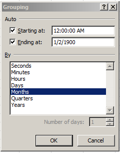
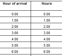
And there’s something else on All Sites that’s tugging at your pants (or trouser, if you’re reading this in the UK) leg in search of attention. Look, for example, at the time data visited upon rows 39, 85, and 89 (and elsewhere in the workbook). You’re seeing patient waiting times that’ve been dressed up –wrongly – in time-of-day formats (note: I have apprised the Guardian about this issue, and the format has since been remedied).

That 12:04:13 AM wants to report 4:13, but because it’s been customized to effect the h:mm:ss AM/PM format, what are in fact duration data present themselves as clock time. What All Sites really wants to do is confer this format

mm:ss

upon the cells, thus repackaging the data in minutes and seconds alone.

Moving right along, drop your cell pointer on D50 in the Providers-YTData sheet, and observe the value 3738.0018 beckoning in the Formula Bar. A curious entry, as it endeavors to count the number of survey respondents declaring themselves Very Satisfied with the 111 Experience – and statistical bromides aside, that .0018 needs to be explained, along with the other fractional demographics studding the D column. Perhaps these residua spring from formulaic results, though I can’t explain why these totals need issue from a calculated source in the first place. (The workbook in general is remarkably formula-free.)  In any event, I’d deem it proper to ask after these decimals.

Turning to Category A Calls, you’ll note the Year field data fused into merged cells, whose neat presentational effect nevertheless stanches their analytical utility (and these are text, besides). These vertical headers can’t be joined up to any particular record, and anyway the date data in Month do furnish usable per-record year data (yes; they’re actual dates).  And you’ll find the same merge effect in all the sheets to the right of Category A Calls.

We could also cite another oft-perpetrated data entry misstep in Category A – The yearly totals that have taken their place among the bona fide per-month data records. We’ve discussed this complication before; the point is that you can’t really work with total-row data, because summing or pivot tabling them has the effect of totalling all the contributory numbers twice. If the NHS asked me – and I can confirm that they haven’t – I’d unmerge the year cells, or more profitably, go ahead and delete the field – along with those totals records.

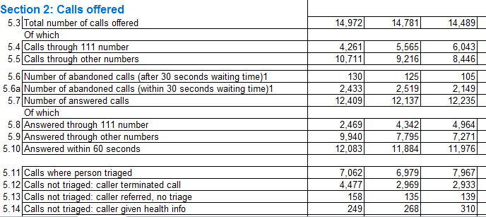
One more rumination, this one peculiar to the Calls closed without transport sheet: It appears as if the numbers in the “Number of calls resolved by telephone advice” and the “All emergency calls that receive a face-to-face response from the ambulance service” fields should yield the “All emergency calls that receive a telephone or face-to-face response from the ambulance service” figures for each record (are these fields starting to sound alike?) – but they don’t, not quite; and these discrepancies need to be explained, too.

Explanations, anyone?

A Footnote to the Adjunct Files

17 Jul

You doubtless recall (I’m kidding – trust me) my post of September 21, the one in which I simpered in abject capitulation to the data gauntlet flung my way by Josh Boldt’s adjunct instructor, crowd-sourced Google-doc spreadsheet, the one in which Professor Boldt sought to enshrine the salaries, courseload and other incriminating particulars about the part-timer’s no less abject vocational lot. It was a good idea, as I remember it, but one beleaguered by data inconsistencies and text entries that simply couldn’t be taken further.

But I come with good news. It probably checked into its server some while ago, but only the other day did I come upon

http://adjunct.chronicle.com/about/

 a Chronicles of Higher Education annex that’s shed the spreadsheet persona to be sure , donning instead a multi-filtered, search-engined data base , e.g:

 adj1

It’s pretty easy to get around, and its findings could spur a few second thoughts about any back-door entry into the life of the mind.

I’m taking absolutely no credit for this new improved rollout, nor should I, but I would allow that my September 21 critique marked some manner of anticipation of the upgrade. The current site announces:

This site, which is intended to pull together that [adjunct] information and make it publicly available, represents the evolution of a simple spreadsheet created in 2012 by Joshua Boldt, a composition instructor in Athens, Ga.

The eye catcher is “evolution of a simple spreadsheet”, an obeisance to the data-managing difficulties subverting that formative sheet. What the Chronicles take brings to the table – perhaps literally – is a standardized, more-or-less forced-choice set of questions put to respondents, promoting in turn a more orderly codification and aggregation of the data (click this link to see what I mean). Bleat all you want about the McDonaldization of the world, but sometimes a salubrious drop-down menu delivers the goods – with or without the pickles.

Note: I’m taking the following week off in New York for a family celebration. Hope to get back to you shortly.

Aides de Memoire: The Paris War Commemorative Plaques, Part 2

11 Jul

Our previous post on the Paris war commemorative plaques levelled its scrutiny at Feuille, or Sheet 3, in part on the grounds that its data were the more serviceable. That’s true, and bids us in turn to ask why we might then even bother crossing over to Feuille 4.

Indeed – Sheet 3 seems a good deal more ramshackle than its frère, having incurred an utterly empty column C driving through the data for starters. Consider as well the absent titles for A and B, the undigested French characters, the unchecked deployment of the Wrap Text feature (e.g column B), and Sheet 3 is something less than a thing to behold. Dommage.

But sheet 3 has a selling point – those rows of latitudes and longitudes that locate the plaques in the Paris space and can eventually empower a cartographic scatter of the data.

But these numbers need work too. We’ve met up with the issue before (e.g., January 17) – those incriminating green markers padding the cells’ upper-left corners, auguring the Number Stored as Text caution. Again, by selecting the respective data and jabbing at the Convert to Number option (a routine that froze my file for a couple of minutes, by the way) you’ll set all those cowering numbers free. You’ll also want to delete the C column, insert a blank row between 1 and 2 in order to ostracise the (original source)paris-plaques.fr caption from the actual data (of course  you could simply delete it instead), and proceed to title columns A and B (I’ll try Names and Address respectively).

Next, you’ll want to again strike any duplicate records from the data, as per last week’s post, thereby skimming 32 redundancies from the deck. But there’s yet more winnowing to do. If you sort the data Largest to Smallest by the latitude field, nine zero-latitude records will shake to the bottom of the mix, along with a clearly misreported lat and long for the plaque at 4, place Rio de Janeiro 75008 Paris. Beaming a blank row between 1180 and 1181 will shuck these ten from the viable data. But don’t leave that button group just yet. Now sort by Smallest to Largest on the longitude field and you’ll jam six records with suspect longs (starting with 3.827, a reading which can’t be Paris-sighted. Remember that a degree of longitude extends east-west about 60 miles, depending on its north-south position). Insert another blank row between 1174 and 1175 and sort Longitude again, this time by Largest to Smallest, and an impossible  number , -75.753 (somewhere in the States), plops to the foot of the data. Time, then, for another blank row.

Now we can move to “map” the data, by pinning them to their coordinates via the pivot-table mechanism I described in the October 25 and November 1 posts. Again, by lining the table with Latitudes and Longitudes we’ve literally framed the bordering coordinates of the map, against which the lat-long intersections of every plaque can be plotted. Try

Row labels: Latitude (group by .003)

Column labels: Longitude (group by .003)

Values: Address (by Count, of necessity; labels can only be counted)

That .003 degree-grouping setting seeks to mediate a set of proper gathering spaces in the pivot table among the lats and longs; too large a number will subsume too many plaques beneath but a few intersections in the “map”, while a tinier grouping value will flood the table with a pattern-exploding spray of points. Play around with different values in the Group by field and you’ll see what I mean. (Note: for a discussion of grouping alternatives see my post at datadrivenjournalism.net.)

Moreover, you’ll want to sculpt the cells’ heights and widths in order to square their perimeters, the better to equalize the north-south and east-west dimensions the map means to capture. I’ve found that a column width of 2 bound to a row height of 15 (I know that doesn’t sound symmetrical, but check it out) seems to work; of course your screen display and/or resolution might support a 4/30 or 6/45 split, but again you may need to experiment with absolute values and ratios. And in the interests of maximizing screen visibility, you may very well want to pump the 100% zoom default down to say, 70% or lower.

You could also hide the lat/long row and column borders, but not before making sure that the row label-latitudes are sorted from highest to lowest, reflecting their real-world thrust. By corollary, the columnar longitudes require a Smallest to Largest sort, because Paris’ east-of-Greenwich situation pulls its longitudes upwards from east to west.

And you can paint various conditional formats atop the map (again you can review the October 25 and November 1 post), culminating in something like this:

            plaques1

I could go on, but I suspect that latte beckons.

Aides de Memoire: The Paris War Commemorative Plaques, Part 1

4 Jul

Edward Snowden might beg to disagree, but it seems to be open season for open data. Fasten the name of your favorite city or country to that term, toss it into Google, and odds are you’ll be brought face-to-screen with a site showcasing scads of info about said venue. Indeed – this US government-compiled site:

http://www.data.gov/opendatasites

will link you to over 280 city, state, and national vaults of information (though we’ll leave the altogether reasonable question as to how open is “open” to Mr. Snowden).

One of those link-bearers is none other than Paris, whose site

http://opendata.paris.fr/opendata/jsp/site/Portal.jsp

is not to be confused with that city’s transportation-specific RATP pages, the object of two May posts.

The good news is that a great many of the opendata.paris datasets come to you in spreadsheet form. (The bad news, depending on your linguistic chops, is that the site is in French.)

And it was in the course of an initial foray across the site that this sheet made a claim on my attention, which I have re-presented in Excel form:

http://opendata.paris.fr/explore/dataset/plaques_commemoratives_1939-1945/?tab=table

Its name, Plaques Commemoratives de la Seconde Guerre Mondiale – Commemorative Plaques from the Second World War – presages its story, told by the 1200 plaques riveted into Paris addresses at which something dreadful happened. 347 of the plaques, for example – more than 28% of the total -bear this inscription:

Eleves de ces ecoles morts en déportation parce que nés juifs

Rough translation: The students in these schools were deported, and died, because they were born Jewish.

The psycho-historical impulsion driving the installation of the plaques, veneered atop France’s equivocal behavior during the war, is for another post (see this one for a bit of deep background); but whatever the accounting, the plaques are there.

And analyzing them takes a bit of work. The workbook comprises three sheets (Feuilles in French), one of which lists but 48 plaques and halts somewhere in the 2nd Arrondissement, or district (of which there are 20 in Paris). The other two apparently register 1219 plaques, but the sheets are not identical, though it very much appears as if they could have alloyed into one without experiencing any loss of telling information. One sheet, number 3, is the cleaner of the two, matching addresses to each of the plaques along with its arrondissement and remaining faithful to the French character set; but number 4 affects the supplementary virtue of citing address latitudes and longitudes.

Starting with sheet 3, and assuming we want to ultimately subject the data to a round of pivot table breakouts, by say, arrondissement, we need to insert a row above 2, thereby detaching data artisan Martin Maginier’s Twitter handle in A1 from the records. Next, select all the data and turn off the Wrap Text effect glowing in the Home tab > Alignment button group (the addresses have been duplexed into tiers within their cells in the B column, an Excel loss-in-translation from the spreadsheet’s native Google Doc platform).

Now because I also have reason to believe that some of the 1219 records are duplicative (a suspicion promoted by apparent discrepancies in the Sheet 4 rendition of the data), we’d be advised to roll the data through the Remove Duplicates utility (Data tab > Remove Duplicates in the Data Tools tab, after clicking anywhere in the data), having in mind to tick the “My data has headers” box en route, because if you don’t Remove Duplicates will present itself thusly:

 paris1

Absent My data has headers, Excel assumes in our case that the uppermost row is nothing but another record, and hence vulnerable to excision once Remove Duplicates starts removing. That’s because the first row exhibits the selfsame formatting as all the other data, i.e., bare, frill-free text. Clicking My data has headers, then, instructs Excel about the special character of that first row, its appearance notwithstanding, and properly seats its field names in the dialog box:

paris2

Had the header row been distinctively formatted at the outset – even by the mere imposition of a boldface, for example – Excel would have ticked My data has headers without prompting.

Now the key to Remove Duplicates is to appreciate which fields need be inspected for trouble-causing, as opposed to perfectly well-intended, duplications. For example – if you tick Arrondissement alone, you know what’ll happen – about 1190 records will be carted away, because each of the 20 arrondissement names are all but sure to appear recurrently in that field. In our case, then, we’re best off probing for duplicate records that exhibit equivalent data in all their fields – because those one are surely superfluous.

And once we actually get around to clicking OK, Excel broadcasts an immediate prompt, announcing the offloading of 13 duplicate records.

Now we can begin to do something about the Arrondissement field, its contents freighted by those “…ème ARRONDISSEMENT” qualifiers that, in my view, distend the records unprofitably. It seems to me that a simple 2 in a cell would serve the analysis every bit as well as 2ème ARRONDISSEMENT; the question is how to pare the excess text.

In fact there are a couple of ways to realize that end. The fleetest, but perhaps heaviest-handed, tack is to jet through a find and replace routine:

  • Copy say, any entry for 2ème ARRONDISSEMENT among the data.
  • Turn on Find and Replace and paste the above into the Find field (yes, you can paste here)
  • Delete the number 2, because we want to conduct a generic Find across the all arrondissement data, all of which display the above suffix.
  • Leave Replace with blank and click Replace All.
  • Then type or copy 1er ARRONDISSEMENT in the Find field, because we need to contend with that “er” following the 1.
  • Delete the1, leave Replace with blank, and click Replace All.

It sounds longer than it takes, and once completed you’re left with a column of freshly shorn digits.

But if you’re interested, a couple of formulaic alternatives could also be put to the task. Here’s one: Name column E Arrond or something like it and enter in E3:

 =IF(LEN(D3)=20,LEFT(D3,2),LEFT(D3,1))

To interpret: only double-figured Arrondissement data exhibit a length of 20 characters (trust me; I’ve checked). Thus the formula above stipulates that two characters be wrenched from the left of any such expression – even as any other-lengthened entry will be made to surrender but one – that is, one digit.

Either way, once the arrondissements are relieved of their textual fetters (for the sake of the exposition I’ll go with Plan A, the Find and Replace), you can blueprint a simple but noteworthy pivot table (you may need to un-Wrap the text of the field headers here, too):

Row Labels: Arrondissement

Values: Arrondissement (Count)

paris3

 Keep in mind that numerically-consecutive arrondissements aren’t necessarily adjacent in space; the 13th is at some considerable remove from the 12th, for example.

And I hope to have more la semaine prochaine.

NHS Hourly Data: Changing Times, Part 2

27 Jun

Allow me to refresh your memory. When we last eyed each other across our respective devices  I closed our tete-a-tete with a bit of a pivot table cliffhanger, although I can’t say I’ve seen any of you inching towards the edge of your seat in melodramatic thrall. But cheap production values notwithstanding, the problem was this: our attempt to group the NHS hourly data into tranches of three hours met with what appears to be a you-can’t-there-from-here rut in the road: the apparent fact that Excel’s grouping resource won’t extend its functionality to time-formatted values , e.g:

nh1


(In fact units of time can be grouped, however, after a limited fashion. For example, these times – 8:17, 8:31, and 8:54 – will submit to a manner of grouping, all massing beneath the 8:00 rubric. But grouping times across discrete hourly readings – for example, collecting 9:17, 10:12, and 11:32 into a 9:00-12:00 bin – appears to be a non-starter, though I am happy to be corrected should I be missing something.)  What to do, then?

Here’s a tack that seems to tread the path of least resistance. Insert a column to the immediate right of the Hour of arrival column in A, call it say, Hour, suit it up in Number format, and enter in what is now B4:

=A4*24

That elementary operation multiplies the time value in A4 – in this case, 0 – by the 24 that casts the hour numbers onto firmer ground. But a zero result doesn’t really capture the point, and so copying the formula down B and considering the workings of B5 – which yields 1.00 – should serve to explain more definitively.

Remember that hour data are expressed as fractions of a 24-hour day. Thus the actual numeric persona of the 1:00:00 AM in A5 is .0417, or 1/24th of 1 – a whole day.  09:00:00 AM, by way of continued example, is ultimately nothing but .375, or 3/8th of a day, and so on. Multiply .375 by 24 and you get…9, a solid numeric stand-in for that .375; but because the 9 is a standard number, it can be grouped as such.

Thus copying our formula down B delivers a set of illusory but valuable numeric equivalents to time data, e.g.:

nh6


Note the B-columned data are decimal-pointed, although that formatting nicety won’t matter once the numbers are mashed into group mode – because you can’t format grouped data.

In any case, dust off a pivot table and drag Hours into the Row Labels area. Point and shoot at Group Selection, and say hello to the By option:

nh2


Enter 3 therein and you get:

nh3


Houston, we have a grouping. Now you can swing some yearly patient data into the Values area, e.g. along with some presentable formatting:

nh4


(You don’t need decimals here; we’re dealing with actual patient aggregates, not averages.)

And if you’re feeling adventurous, you could append another new column to the right of the 2012-13 data (via a column insertion; don’t occupy the existing blank column, because it separates the absolute patient data from the percent data on their right, and you don’t want to join the two), call it Projected 2012-13, and enter in I4:

=H4*(12/11)

Because the 2012-13 numbers convey eleven months’ worth of data, the above formula projects another month atop the patent totals as they stand.  That’s a straight, linear per-month projection, one which might not wholly comport with a finer 12-month extrapolation, but it’s a stab in the right direction.

Now about the puzzlement at which I hinted last week, portrayed here:

nh1

I’m wondering about that 1/1/1900 default glimmering in the Ending at: grouping field – even as the Hours option has been ticked. 1/1/1900 isn’t an hour, of course, but it is the very first date fronting Excel’s date sequence, and it has the value of…1. And the Starting at: entry of 12:00:00 AM is translated into standard numeric language as…1. As intimated earlier, time-formatted data tops out numerically at 1, the limiting case-value that recapitulates a day’s entire span (bear in mind that the number 0 also stands for 12:00 AM, as it bookends the other side of a single day, if that doesn’t pose a puzzlement in its own right). Given all that, I’m thus conjecturing that the 1/1/1900 discrepancy simply substitutes for a second 12:00:00 AM, because had that latter rendering of the number 1 settled into the Ending at: field, you’d be viewing identical data twins in the two fields – and that might puzzle users all the more. As a result, I’m thinking that 1/1/1900 supplies a different data look for the sake of presentational, but not substantive difference.

But I’m happy to be corrected about this one, too.

NHS Hourly Data: Changing Times, Part 1

20 Jun

Given the indispensability of its remit, the UK’s National Health Service can’t help but make news, whether it wants to not. Nothing about the Service is low-profile – be it budgetary conundrums, misgivings about the fluctuating quality of its care, debates about reorganization, or charges of cover-ups – there’s always something there

And so it is with NHS data, made available here, and more specifically in a recent Guardian entry on the demographics of visitors to NHS Accident and Emergency (A&E) departments, coming to you in Excel form here:

0Episode Statistics for Admitted Patient Care, Outpatients and Accident and Emergency Data – April 2012 to February 2013

Let’s direct our collective scrutiny to the Figure 3 tab, an hourly breakout of A&E patient arrival times extended across six consecutive yearly tranches (you’ll want to ask why the respective column headers comprise hyphenated year references, e.g. 2011-12, and I’m not sure of the answer and the yearly endpoints they mark. Moreover, the attendant Guardian story adds that the 2012-13 data encompass but 11 months). You’ll note in addition a second set of supplementary columns, these computing the percent of all visits by hour, and thus read down the columns.

In any event, the spreadsheet appears to have done most of work for us, intelligibly lining up the visits with their hourly points in time and culminating in a set of annual totals (row 28) that demonstrate the spike in A&E visits across the report span (again, recall that the 2012-13 numbers record only 11 months’ worth of data). But we could add a measure of value to the data by grouping the hours into larger, aggregated bins – set, say, to three-hour intervals, and seeing how the totals play out there.

Our first, necessary tweak toward that end is to install a blank row above those total data in row 28, thus excommunicating the totals from the remainder of the data set. We’ve discussed this matter before; leaving the totals in place and batching them into a pivot table would have the effect of counting and/or adding the same numbers twice, and that’s very bad form (and I also don’t’ quite appreciate the need to have merged cells A29:F29 in order to store that Source: caption. Text can happily splurge across empty column unimpaired, but that’s a separate and ultimately minor matter.)

But there’s something else amiss with the data that begs our attention, and that must be set aright. Remember first of all that time (and date) data are really, once the makeup is peeled off, prettified numbers, and it turns out that some of the hours posted to the A column are nothing but text. If you’re skeptical, enter

=COUNT(A4:A27)

in the now-blank A28; you’ll get 16. COUNT, it will be recalled, counts only those cells bearing numbers – and we’re working with 24 hours, and thus pulling up eight numbers short. Click each cell in the A4:A27 range, and you’ll be told that some of them have been vested with the General, as opposed to the Time format, and while a General-formatted entry could be numeric, these Generals aren’t. Moreover, the very first hourly posting – 00:00, or midnight – is one of those text pretenders, and so any copy-down-the-column procedure can’t start there, because doing so will inflict a non-numeric format all the way down. So what I’d do is copy the contents of A5 – a bona fide time entry – and copy it to A4. That operation does two things: it delivers the authentic Time format to A4, along with an actual time value – 1:00 AM. You need both, because simply reformatting A4 won’t metamorphose 00:00 into a number. The 1:00 AM replaces our obdurate text at last, after which you can simply delete the 1: and dust off an actual, quantifiable 00:00 AM.

That remedy applied, we can select A4 and A5, grab the fill handle and copy down the column, braking at A27. Now all the hourly representations have been duly quantified, spaced one real hour apart. (Note: again, don’t think we’ve just bulged each adjacent hour by an increment of “one”. In fact the operative additive is here .041666, or 1/24 of a day. Thus 8:00 AM “really” possesses the numeric evaluation of .3333.)

Now back to that grouping scheme. We’re aiming to consolidate the 24 hourly records into eight bins of three hours, and to tray these into the Row Labels area of a pivot table, e.g.

Hours
0:00-3:00
3:00-6:00
6:00-9:00

And so on.</p>
We’ve done this before. Stoke a pivot table, and drag Hour of Arrival into the aforesaid Row Labels:

hour1

Nothing you haven’t seen before. Click PivotTable Tools > Options > Group Selection, deselect Months, and click Hours:

hour2

You may not realize it yet, but now we have a problem (and I’m not hinting at the 1/1/1900 end date supplied by the grouping defaults above; let’s hold off on that one for now).
And here it is. If you group a set of numbers under standard-issue grouping auspices, you’re asked to name a grouping interval by which the numbers can be bundled, in the By field e.g.:

hour3

But no such capability avails in the Grouping dialog box, if it’s oriented to time data. True; times are numbers, but once they’re conceived in chronological terms the dialog box changes, along with its possibilities. There appears to be no prospect for imposing a grouping interval upon time data.
Of course you could reformat the above hours into their native numerical character and propose to group them:

hour4

But do so and you’ll merely group the numbers as you see them above, stemming any recourse to the hourly motif (the 0.125 in the By field, by the way, references the desired three-hour grouping interval. .125=one-eighth of a day).
And I know what you’re thinking: group the numbers as you see them above, and then reformat them into their hourly guises. Good idea, but it won’t work: once a grouping has been effected, the data reverts to text and is no longer subject to numerical adjustments. After all, a grouped entity such as

60-70

sports that nettling hyphen, which augurs text status – and that’s that. So what to do?
I’m working on it.

Notes on the Oxbridge Admissions Data: The Ins and Outs of Who’s In and Out

12 Jun

The recent Guardian map and report on the divergent fates of the Oxford and Cambridge university applications filed by young English and Welsh hopefuls calls for an analytical perspective – or two – before the picture it frames begins to cohere.

The report draws its plotline atop the fabled, notorious North-South divide that runs through so many intra-national comparisons of the UK’s welfare, the right side of the hyphen its privileged half, and London perhaps the more privileged still; and the Guardian makes much of the South’s (or the Southeast’s, to pinch the coordinates) imperial edge in seats claimed by its students at the two institutions. The data to that effect can be viewed here, in a riff on the Guardian’s source spreadsheet:

Cambridge and Oxford applications table

Note that in the finest tradition of digital journalism (assuming it has a tradition) I’ve insinuated a Region parameter into the mix, thus hold out one more data-grouping opportunity for the pivot tablers in your midst.

The Guardian piece calls our attention to the considerable, invidious admissions successes of London and near-London districts. i.e.:

“A single London borough – Barnet – alone had 130 offers of Oxbridge places from 408 applications last year. That equates to 46 applications and 15 offers for every 1,000 16 to 17-year-olds in the borough, according to the latest census figures. Meanwhile, Dudley in the West Midlands – with a similar-sized age cohort – had just 61 applicants and 13 offers, or seven applications and 1.58 offers per thousand.”

And so on, and it’s true; in absolute terms, the Southeast rules (ok , ok – I live in Barnet, but I’m an innocent bystander; I haven’t applied anywhere lately, went to school in the States besides, and don’t have a single A-level to my name). But here’s where you need to envision those perspectives. It’s when you look at the rates of application acceptance by district and region that the numbers begin to speak differently, albeit arguably.

For one thing, a simple descending sort of the Success rate-offers as % of applications field positions Surrey – the largest absolute contributor of incoming Oxbridgers – as merely the 44th most effective gatherer of university places.

In the interests of follow-through, try this pivot table:
Row Labels: Region
Values: Applications (Sum)
Offers (Sum)
Success rate – offers as % of applications (Average, with appropriate formatting). I get

ox3

With the exception of Wales and perhaps North West England, whose rates lag perceptibly but haven’t contracted into outlier status, most regions enjoy a rough, remarkable success-rate equivalence, with no conspicuous edge devolving upon London, for example. On the other hand, of course, the absolute numbers read differently. London comprises about 14% of the jointly-totalled population of England and Wales (remember – England is a country in the United Kingdom, not the country itself), but contributes 23.35% of the Oxbridge applications, and 23.3% of the above acceptances, itself a notable near-equivalence. Does London’s advantage attest a recruitment bias, covert or concerted, or de facto – perpetrated by the two elite schools, or rather some complex, region-specific swirl of self-selection decisions bedeviling applicants?

A cynic would ask if Oxbridge is perfectly happy to admit applicants across the UK in like proportions, so long as the absolute numbers of entry-gainers skew toward the “right” kind of student, but that sounds like a conspiratorial reach, I’d allow. On the contrary – absent a wiretap of admission office phones, one could make a case for a determined equilibration of the rates (note: we’ve figured a simple average here, that is, an average of the acceptance averages which likewise characterizes that 25.45% Grand Total. An aggregate average, in which all region acceptances are divided by all region applicants, would necessitate a calculated field – but I’ve done that, and the results aren’t that different).

Note in addition that even the acceptance rates across London’s districts range hugely, from Camden’s 39.8% (76 out of 191 applications) to Havering’s 14% (8 out of 57). I would also call attention to the Guardian’s avowal that

“Three London local authorities – Richmond upon Thames, Kensington and Chelsea, and the City of London – sent more than 25 students to Oxbridge per 1,000 16 to 17-year-olds in 2012, compared with an average of just over 2.5 students per 1,000 for England and Wales as a whole.”

But after tossing out the above three districts, I still get a number closer to 3.6.

(Moreover, the Guardian finds that “Several local authorities sent less than one student per 1,000 young people, with Anglesey, Flintshire and Middlesbrough having the lowest acceptance rates.” My sort puts Middlesbrough at number 158 out of the 171 districts.)

In any case, we could also go on to correlate Applications per 1,000 16-17 year olds with Success rate, in the interests of learning if high-application districts enjoy an admissions edge:

=CORREL(F2:F172,H2:H172)

Result: .199

That association, according to the Statwing web site, is statistically significant but clearly not overwhelming, and leaves a great deal of the variance to be explained. Thus there does appear to be some admissions benefit redounding to application-intensive districts, even after controlling for population size – some, at least.
While we’re at it there’s also another puzzle you may want to run through your local admissions counselor. Head the I column Student Acceptances, enter in I2:

=E2/D2

and copy down the column, formatting accordingly. This modest fraction calculates the districts’ percentage of successful Oxbridge applicants who actually accepted their school’s offer, and the numbers range surprisingly widely. 38 of the 172 districts sport a candidate acceptance rate of 100%, but why 8 of the 22 designees from Manchester – 36.4% – decided against attending an Oxbridge institution remains to be explained, along with Durham’s 10 recalcitrants out of 34 (29.41%).

So where do the numbers leave us? The answer depends on your perspective. (See also the piece by Oxford admissions director Mike Nicholson.) There are those big Southeast Oxbridge admission numbers, countered by the comparable rates of acceptance across the UK. And with competing takes on the matter comes the ancient conundrum of point-of-intercession: is the grand vision of educational parity properly realized very early on in the timeline, in the form of equalized and or compensatory learning opportunities, or at the point-of-sale, so to speak – that time of year when universities alternately lift and shutter their gates to the mass of aspirants huddled on the other side. And given the cachet attaching to a ticket Oxford and Cambridge, the gatekeeping is fateful indeed.

On the other hand, might not a healthful iconoclasm be served by wondering if you have to go to Oxbridge, or even have to want to go there? After all, I didn’t, and don’t – and I live in Barnet.

Big Data, Big Numbers: Putting the Long in Longitudes

6 Jun

Face it: unless you’re an astrophysicist or a currency exchanger of epochal venality you’ve never had to add, subtract, or otherwise crunch a number that had to be cranked to 14 decimal points.

Until now. But it’s a data viz, map-happy, GIS-driven world out there, with latitude and longitude data dilating spreadsheet columns all across the net with DNA-sequence prolixity – and it’s your job to deal with them. Case in point:  the directory of New York’s sidewalk cafés compiled here, and dredged from the New York City Open Data site:

 sidewalk cafe

There’s over a thousand spots served up here for your dining, sipping and passing-scene-watching pleasure, named, addressed, zip coded, and square-foot calculated besides. And so before we get to those nasty coordinates you may want to put some of these other fields through their paces, e.g., this simple pivot table:

Row labels: Address Zip Code

Values: Address Zip Code (count)

Simple indeed, but in order to make sense of the results you need to learn a bit about New York three-digit zip code prefixes, which reference these boroughs:

100,101,102 – Manhattan

103 – Staten Island

104 – The Bronx

112 – Brooklyn

113,114,116 – Queens

Sort the data by the Count of Address Zip Code field and you discover that the 18 café-richest codes all spread their awnings atop Manhattan streets:

side1

That best-in-show 10014 stands for the West Village neighborhood, a staging area for the putatively hip, followed at some remove by its opposite number of sorts, the 10003 of the East Village. It isn’t until you get to zip code 19 – 11103, signalling the heavily Greek district of Astoria, Queens – that you bump up against a non-Manhattan quarter, with its 18 cafés. In fact, 769 of the 1008 sidewalk establishments get their mail delivered somewhere on the island.

Now leave the table in place and drag Sidewalk Café Type to the Column Labels area. You should see (in excerpted form):

side2

And so on. It turns out that 147, or 14.6%, of all cafés meet the Enclosed standard, officially set forth as a café “contained within a one-story structure constructed predominantly of light materials such as glass, slow-burning plastic, or lightweight metal.” In other words, if you want to catch some rays you’ll have to seat yourself somewhere among the other 85.6%.

But you want to know about those lats and longs, the better to dot your latest mapping viz. The problem is that these coordinates are beaded to those larger text expressions peopling the Location 1 field., eg.:

2 35 STREET
NEW YORK, NY 10001
(40.74910326346623, -73.98413829733063)

(The expressions are curiously formatted, perhaps having been culled from a word-processed file that lined up its text with manual line breaks.)

As a result, we need to spring the lats and longs from each such entry and plant them into cells all their own. This sort of assignment is typically entrusted to the Text to Columns feature (my January 17, post, for example), but that alternative won’t work here, in part because Text to Columns plumbs the data for a fixed set of identifiable column separators; and as we’ll see, that possibility eludes us here. But yes, there is a plan B.

To start, we’ll enter the headers Lat and Long respectively in M1 and N1. And in M2, we’ll write:

=MID(L2,FIND(“(“,L2)+1,7)

 I see the board lighting up with requests for clarification, so here goes.

In fact, I introduced MID in the September 25 post, although context is everything and a second look is surely in order. MID, in contradistinction to LEFT and RIGHT, extracts a specified number of characters from the interior of a cell, and works as per this syntax:

=MID(text ,start number, number of characters)

(Where “text” can be either an actual expression or a cell reference.) Our problem is in identifying the start number of the latitudes entrapped in the expressions in the L column. What we can know is that each latitude proceeds from the immediate right of the open parenthesis (or bracket, if you’re reading this in the UK). The problem, of course, is that the parentheses debut at different locations in each entry – and that’s where FIND comes in.

Unlike MID, which captures and returns an actual textual result, FIND turns up the position of the first instance of a specified text. Thus this formulation:

=FIND(“h”,”sunshine”)

returns 5, the sequence position of the letter h. That means that our FIND nested into the larger MID expression – thus casting itself into the role of MID’s start number argument – seeks the positional appearance of the character “(” plus 1, because we’re seeking the latitude number abutting that parenthesis at its right, and not the parenthesis itself. We’re assuming of course (rightly, I think) that each and every entry in the L column in fact has an open parenthesis, and that constant empowers the formula we want to ultimately copy down the M, or Lat, column.

As for the 7, that value tells the formula how many characters to strip from the original L-column-based expression. The first three of those would be something like 40., the rounded-off latitude degree peculiar to these New York cafés, and the remaining 4 characters report the first four decimal points of the lat, e.g. 40.7491.

But once your formula is composed, you may decide that your mapping program isn’t wholly satisfied by a four-decimal latitude coordinate. That value may ground each location too finely, particularly if you’re mapping through a pivot table (October 25 and November 1 posts); and if that be the case you can brace the expressions with the ROUND enhancement, e.g.

=ROUND(MID(L2,FIND(“(“,L2)+1,7),2)

That would get you 40.75, for example.

And as for the longitudes, we need to pinpoint the appearance of the minus sign, which, unlike the parenthesis above, is integral to the longitude value (because longitudes west of the Greenwich UK, zero-degree launch point are assigned negative numbers), and as such requires us to cast off the +1 visiting our latitude expressions. Thus we’d enter in N2:

=ROUND(MID(L2,FIND(“-“,L2),7),2)

Assuming you’re content with that two-decimal point round-off.  Then copy down the column.

But if you want to play with varying decimal round-offs, you could designate a cell, eg. P1, enter the 2 there, and emend your formula:

 =ROUND(MID(L2,FIND(“-“,L2),10),$P$1)

That rewrite would free you to enter any substitute value in P1, say, 1 or 3 or whatever, and realize assorted precisions, e.g., 40.7, or 40.749.

But It’s coffee break time, my treat. Let’s meet at a café somewhere in 10014, your choice. You have 88 options.

OFSTED Data: Inspecting the Inspections

30 May

We’ll score its acronym somewhere between Satisfactory (2) and Requires Improvement (3), but OFSTED – the UK’s Office for Standards in Education, Children’s Services and Skills – lifts a massive, watchful umbrella over the nation’s schools, by adjudging the quality of each and every institution across the Kingdom with regularized, internet-available  inspections and recommendations for improvement.

OK – it should have been called something like OFSTEDCSS, but that handle is impossible to pronounce and would have to be rated Inadequate (4), and an educational agency mustn’t have that. In any event, OFSTED makes a great deal of its inspection data available to the likes of you and me in spreadsheet form, including this workbook, the sweetly-titled

 06_1303_Most_Recent_31_Dec_2012_(Provisional)

which unrolls inspection outcomes for over 21,000 UK schools, breaking the data out by school type, local educational authority, and parliamentary constituency, in addition to the ratings themselves and hyperlinks to the school reports brocading column A.

In fact, the workbook leaves me slightly guilt-ridden, because its structural blueprint and data worthiness are, apart from a trifling mandate to auto-fit its columns, rather robust, hushing the litany of complaints I was about to intone over the whole thing. But leaving my neurosis aside, with 21,000+ records and some tasty parameters you can get right to work angling the data this way and that, because there are some interesting things out there to be learned.

The first thing you need to know about the school scores registered in columns O through T is what the numbers actually mean, and don’t mean; and thanks to a kindly OFSTED e-mail responder I have been properly edified. The score options comprise:

1-      Outstanding

2-      Good

3-      Requires Improvement

4-      Inadequate

9-      Key Stage not inspected

And these mean, among other things, that that you have to suppress those 9s from any and all numeric operations, because they’re not meant to behave like values; these can be permanently deposed by simply selecting columns P through R (the other score columns are free of 9s) aiming a Find and Replace at the data, i.e., Find 9 and Replace with nothing (you’ll note that the column Q-placed data, How well do learner [sic] achieve?, is overrun with 9s.)

And once you’ve deloused those contaminants from the numbers, you can start to play with the data seriously. Here are but a few possibilities.

It has been noted that a recent bracing of inspection standards has dampened aggregate school evaluations. We can toss that suggestion into a pivot table and see what we shall see, e.g.:

Row Labels: Inspection end date (group selection by years)

Values: Overall effectiveness: how good is the school (by Average, with desired formatting)

Overall effectiveness (again, this time organized by Count)

I get:

      a1

That’s pretty suggestive indeed. Overall effectiveness scores have indeed successively faltered (remember that lower scores attest weaker performance) – and the sample is pretty large, too. But note the 173 schools that were last inspected in 2006, all of which received the maximum 1 – and that, at first blush, is a most emphatic skew. But that anomaly –and indeed perhaps the entire score trajectory – may be at least in part explained by this Wikipedia entry:

Schools rated Outstanding or Good might not be inspected again for five years, while schools judged less favorably were inspected more frequently, and might receive little or no notice of inspection visits.

In other words, the apparent correlation between strength of school and recency of last inspection may have something, but by no means everything, to do with the general decrement in scores.

And just as the data feature an Inspection End Date, they likewise report a start date. In fact the great majority of schools received their going-over in either one or two days, but it might be proper to wonder if that one-day disparity in any way comports with evaluations. To find out, you can interject a column between L and M, call it Inspection Days, and…but I know what you’re thinking. What if an inspection team convenes at a school on a Friday and continues its survey on Monday? Subtracting Inspection Start Date from Inspection End Date will thus yield an unambiguously wrong 3 (once the results have been treated to the standard Number format, that is). That’s surely what will happen, but Excel has anticipated that conceptual snarl and dusted off an alternative – the NETWORKDAYS function, which looks like this:

=NETWORKDAYS(start date,end date)

NETWORKDAYS proceeds to only count the weekdays spread between the start and end dates, along with the start and end dates themselves. (NETWORKDAYS should be read Net workdays, not Network days, by the way.) Thus you can enter

=NETWORKDAYS(K2,L2)

in what is now M2, format to Number, zap the decimals, and copy down the column.

Then drag your fields accordingly:

Row Labels: Inspection Days

Overall effectiveness, etc.: (Average, with formatting)

Overall effectiveness, etc., again: by Count

You should see:

 ted2

Interesting.  Ignore the outliers and observe the substantial rating differential between schools subject to one and two-day inspections. Of course that evaluational margin needs to be interpreted with all due care, but one could reasonably speculate that many schools deemed outstanding were so convincingly first-class that the inspectors decided to dispense with a second look.

On the other hand, try this variation:

Row Labels: Inspection End Date (grouped again by years)

Values: Inspection Days (Average)

Inspection Days (Standard Deviation; you can access this option via PivotTable Tools > Summarize Values As > More Options > StdDev):

 ted3

We see here that nearly all the 2010 and 2011 inspections spanned two days, irrespective of school rating. Our analysis then is, as with most “sociological” phenomena, multivariate. Does that pronouncement sound like an explanatory cop-out? Sure it does, but give me a tenure-bearing position at your favorite university and I’ll see what I can do with it.

But anyway, there’s a glut of data permutations waiting to be loosed from the OFSTED warehouse. Give it a go; you’ll find it most…educational.

Pulling Out All the Stops, Part 2: NY City Subway Data

23 May

Back down into that storied hole in the ground. Now that we’ve counted the lines intersecting each stop each we need only to drum up a title for the curiously truant header in what is now the K column (call it say, Pct Change); then we can hand the data over to some simple but instructive pivot tables, along with a few other preliminary jottings. (By the way – the data  from which our analysis proceeds originates here.)

First among the latter might be an elementary lines-per-stop fraction, or the total of all lines per stop – 731 – divided by the number of recorded subway stops, or 421. That comes to 1.73 lines per stop, a reading that, by way of comparative example, powers it past Paris’ 1.34. Does that make the New York system the nimbler of the two, opening a sluice of option-richer travel flows from point to point? I don’t know about that, and I’d refer the matter instead to a statistician and/or urban planner. Remember that New York is by far the physically larger city, and you’d have to leave the service-optimization algorithm to the regression analysts.

You might also want to sort the data by 2012 rank (or the 2012 ridership field), serving up an unsurprising but substantive demonstration of Manhattan’s hegemony. Ranks 1 through 11 are arrogated by the island’s stops, preeminent among these Times Square, the nexus of 11 – count ’em, 11 – different lines. It isn’t until you lower yourself to rank 12 that you come face-to-face with a non-Manhattan venue – Main Street, the teeming Queens terminus of the Number 7 line, a stop to which I’ve wended my way many times (New York subway lines are either numbered or lettered, by the way, a legacy of the scheme’s multi-system prehistory).

But note that Main Street is also the busiest stop through which only one line runs, triggering an obvious pivot-table poser: how does station ridership covary with the number of lines tracking through its platforms? It stands to reason of course that, all things being equal, stations housing more lines will absorb the great rider population; but an average riders-per-number-of –lines station index might tell a different story.

And in order to tell it we need to crack open a pivot table and sow a calculated field (see my September 6 post for the mechanics) therein, one which divides aggregate rider totals (and remember we’re navigating rider-per-weekday data)  by each lines-per-station total. For example: in order to figure the average for stations harboring three lines, we need establish this fraction:

All riders for stations with three lines/(Number of three-line stations*3)

That’s a relatively simple but not-entirely-intuitive bit of division, but with a few seconds’ rumination you’ll be able to see what it’s doing. We can call the calculated field say, Riders Per Number of Lines, and write it thusly (assuming we’re working with the 2012 rider numbers):

subw1

And in sum, the pivot table comprises:

Row Labels: Lines per Stop

Values: Riders Per Number of Lines; and for good measure why not throw in

Lines per Stop (Count)

You should end up with something like this (once the standard formatting’s been implemented):

subw2

Among other things, we see that 237, or 56% of New York’s stations, feature but one line. But note that these carry strikingly more riders-per-line than those stations entrusted with two lines.

Now this finding is quite something apart from the average number of all riders per line, broken out by number of lines-per-station, though if you haven’t had your coffee yet the two sound equivalent:

Row Labels: Lines per Stop

Values: 2012 (Average)

subw3

But what about individual stations and their 2012 per-line ridership? Just cut back to the source data and title the next available column Riders per Line and enter, in row 2:

=I2/C2

That is, divide the 2012 station ridership by its number of lines. The top 10 (I’ve hidden a few columns for screen shot purposes):

 lines

Main Street again – by a rout, and note that positions one through five record stations equipped with but one line. Times Square? By this reckoning, it recedes to a diffident 22nd place.

And what about rider and station activity by borough? Shaped by the appropriate formatting, how about

Row Labels: Borough

Values: Station (Count)

Lines per Stop (Average)

2012 (Sum)

2012 (Sum) (Show Values as % of Column Total):

borough

(Remember, by the way that the field headings above can be renamed by clicking the pertinent field cell and entering something new. The source data headings hold to their original names, though.)

Note, for example, that Brooklyn, the city’s most populous borough, likewise enjoys the highest station count; but Queens, the penultimate borough whose residential cohort exceeds Manhattan’s by 600,000, appears to have been shortchanged – although again, station construction could not have expectably geared itself to latter-day demographic ebbs and flows. And Manhattan – the cynosure of so much of the city’s activity – checks in with the system’s highest line-per-station average.

Note as well that 55% of the subway’s daily ridership passes through a Manhattan-sited turnstile, a proportion that makes a good deal of sense. Since it’s reasonable to suppose that the great bulk of Bronx, Brooklyn, and Queens weekday users head to work in Manhattan, their return trip of necessity starts in the latter borough. Thus the Manhattan/other-borough totals could be expected to offset each other, and they do within reason, once they’re qualified by the obvious supplementary fact that many Manhattan dwellers work in their home borough, too. And all those Manhattan-based tourists could be expected to skew the ratios too.

OK – one last table, formatted to two decimals with the Grand Total turned off:

Row Labels: Borough

Values: 2012 Rank (Average)

subw5

Those are borough-wide, station rider-total ranking averages. And they’re just what you expected to see, no?