Pulling Out All the Stops: NY City Subway Data, Part 1

17 May

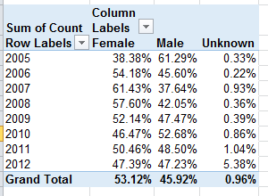
Thematic continuity must be served, and so before we push this transit conceit to the breaking point we may as well redirect our squinty, subterranean gaze from Paris way east to New York’s subway system, 468 stops worth of data yearning to be crunched.
One such collection, amassed (and don’t you dare say “curated”; I’m circulating a petition calling for a six-month embargo on the term, and I know I can count on your support) by New York’s Metropolitan Transportation Association, counts weekday average daily ridership figures for the each of the system’s stops through the years 2007 and 2012, but presents a couple of preparatory challenges to the spreadsheet adept en route. Here it is:

subway

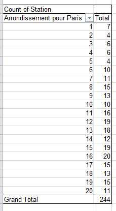
The stops are columned beneath the city borough name in which they’re positioned (four boroughs in this case; Staten Island has no subways), and those names are problematic; they occupy rows otherwise properly devoted to actual records, and their Otherness compromises the data. In short, borough name rows need to be deleted – at least eventually.
At the same time, however, you might well want to break out rider data along the borough parameter, and so you’ll want to interpolate a new column recording that identifier to the left of the sheet, by shoehorning what is to become the new A column to the left of the current one, calling it Borough, and entering the appropriate borough alongside the station name. There are a couple of ways of executing that task; a swift, formulaic strategy is to simply enter The Bronx in what is now A2, and enter in A3:

=IF(COUNT(C2)=0,B3,A2)

What exactly is this formula doing? It’s premised on the notion that any cell in what was the original A column that houses a borough name records no other data across its associated columns, or as operationalized more specifically in the above expression, there’s nothing in the C column. If that be the case, then the entry in B is returned – that is, the borough name. If the condition isn’t satisfied – that is, if the relevant C cell does contain some value – the cell references the contents immediately above it – the current borough name in force. Thus only when a new borough name appears down the B column does the formula introduce a correspondingly new name. Then run the results through a copy> paste values routine, and then delete rows 2, 71, 229, and 348 – the ones containing the borough names.

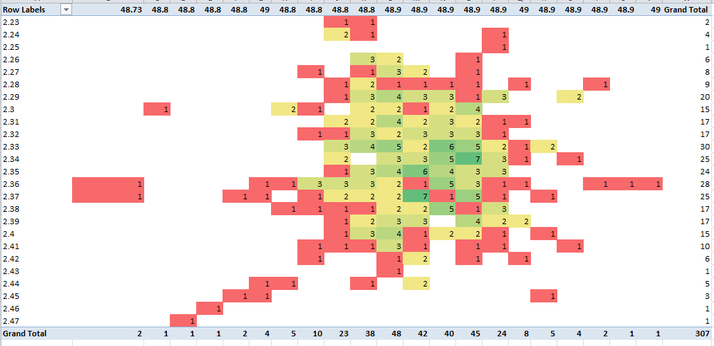
Now there’s another formulaic nicety out there angling for our attention. You’ll recall in last week’s post how the Paris Metro workbook parsed its multi-line stops, plugging each line into a discrete column:

sub1

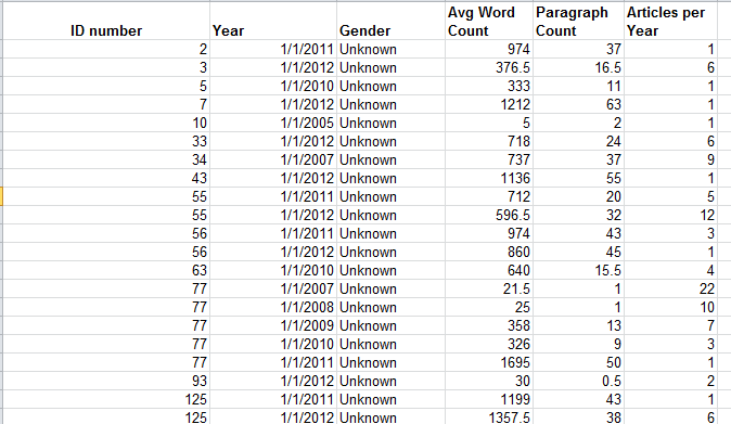
You’ll recall in turn the round of hoop-jumping through which we pranced in order to be able to develop a count of the shared lines per stop. But the New York data are different, appearing to code each line-per stop with the textual proxy “icon”, and in the very cell in which the station name is cited:

sub2

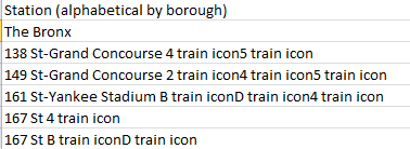
To picture how “icon” is transmuted into its graphical, literally iconic state, note this shot from the publication in which the stops listing appears:

sub3

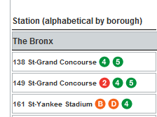
Getting back to our spreadsheet proper, our interest then is in some way assembling a similar lines-per-stop total – by somehow counting the number of times in which the word “icon” figures in each stop record. We see, for example, that the 149 St-Grand Concourse entry features “icon” three times, befitting the three lines sharing that stop.
How do we do this? We do it by commissioning the little-used but trenchant SUBSTITUTE function. SUBSTITUTE finds every instance of a text expression within a cell and by default substitutes whatever replacement suits your fancy. Thus, for example, if cell A3 contains

It’s raining outside. When it’s raining I get wet.

And I want to substitute every instance of “raining” with “pouring”, I’d write, in another cell:

=SUBSTITUTE(A3,”raining”,”pouring”)

In our case, we want to:
1. Substitute every instance of the word “icon” with “iconx”.
2. Subtract the length of that result from the length of the original station expression. Thus if the word icon appears twice in a cell, thus signifying two subway lines boring through the stop, substituting every “icon” with “iconx” will found a new expression that’s two characters longer than the original – attesting to two lines.
Try it. Introduce a new column between the current B and C, head it Lines per Stop, and enter in what is now C2 (remember we’d deleted the original row 2, the one containing the Bronx borough name):
=LEN(SUBSTITUTE(B2,”icon”,”iconx”))-LEN(B2)

You should realize the value 2, because the first station entry, 138 St-Grand Concourse, discloses two instances of the work “icon”. (Note: SUBSTITUTE defaults to case sensitivity; if you want to substitute the letter x for each instance of the letter i in the phrase “I like to swim”, in A3, the capital I will stand firm. In our case, however, all instances of “icon” are case-identical, and so facilitate the substitution. If you do want to override case sensitivity you need tack the UPPER function onto SUBSTITUTE, thus forcing case parity: =SUBSTITUTE(UPPER(A3),”I”,”X”). UPPER imposes that case on all characters in a cell. Of course, that will ratchet all cell text into the upper case.)

Then copy the above down the C column. And once that mission is accomplished, you can shift into data analysis mode.

Between the Lignes, Part 2: More Paris RATP Data

9 May

Hebdomadaire (aka weekly ticket) in hand, let us resume our beneath-the-surface survey of the Paris métro, and some of the data riches secreted therein.

Let’s go back here:

2011_trafic_annuel revised


That is, to the RATP’s compendium of the traffic careering through its arrets, or stops (I’ve jiggered the sheet here in order to grease the analytical wheels), in which there’s more to learn.

For example – the Seine dices Paris into its storied, asymmetrical banks, the Left and Right, with six of the city’s arrondissements or districts mapping onto the Left, and it might be instructive to break out the distribution of metro stations and traffic along the Left-Right parameter.

Of course, you have to know which arrondissements go where, but you’ll have to trust me on this. Starting in cell Q1 I’ve entered the following data set:

bank1

I’ve named the range Bank. In cell N3 title an imminent field Bank, and follow up with this formula in N4:

=VLOOKUP(L4,Bank,2)

to of course be copied down the column.

Next, try this pivot table:

Row Labels: Bank

Values: Station (necessarily defaults to Count)

Trafic (stay with Sum)

Trafic (Average)

 bank2

That’s noteworthy; 30% of Paris’ arrondissements wash up onto the Left Bank, and so if we click in the Station values field and plug into the PivotTable Tools > Options > Show Values As > % of Column Total sequence and do the same for the first Trafic field we see:

bank3

30% of the arrondissements, and 30.33% of the stations – a neat, or serendipitous, bit of urban planning, along with the roughly commensurate 26.62% of recorded rider entries into the system. On the other hand, the Left Bank contributes about 41% of Paris’ aggregate area, but about 33% of the city’s residential population –the latter figure sizing up well, though the advent of the métro obviously long predated latter-day demographic realities.

What about station distributions by arrondissements? That one’s pretty easy:

Row Labels: Arrondissement pour Paris

Values: Station (Count)

bank4


 For a slightly subtler, but easily formulated, metric, we could also track (no pun intended) overall station total by arrondissement – that is, all stops cross-totalled by all lines:

Row Labels: Arrondissments pour Paris

Values: Count of Stations (Sum)

bank5


Thus while 15 physical stops dig deep beneath the 8th arrondissement – one of Paris’ poshest (think: Champs d’Elysses) – when all the transfer possibilities are reckoned, 27 line stops all told share those 15.

If you’re looking for more Paris data, drill into the ratp arret graphique workbook:

 ratp_arret_graphique


This sheet inventories and pinpoints 12,000 Paris’ transit stops, variously served by metro, RER, and most predominantly, the city’s buses. Because the data are all compacted into the A column, you’ll need to aim the Text to Columns feature at them (see my October 11 and 18 posts), retaining the Delimiter default and identifying the # as delimiter by entering it in the Other field. You’ll then have to name the fledgling fields.

There are a number of things to be done with these data, and here’s just one, a harkening to the faux spreadsheet maps I described in my World-as-Spreadsheet posts of October 25 and November 1.

Say we want to quickly map Paris’ métro arrets. Because the system’s records have already been felicitously pushed to the top of the data, insert a blank row between 308 and 309. Then name the H column Longitude (or something like it, so long as it differentiates itself from the label topping the longitude values in B), and call I Latitude (again, distinguishing it from the latitudes in C). Then in H2 enter

=ROUND(B2,2)

Thus broadening longitude precisions to 2 decimal points. Copy the formula to I2, and copy the results down the respective columns. Stoke a pivot table:

Row Labels: the new Longitude field (that is, the one exhibiting the rounded values)

Column Labels: the new Latitude field

Values:  Location, defaulting to Count (in fact other fields can play the same role, something you may want to think about.)

Then for demo purposes click anywhere in the Values area and spray a conditional format at the data, taking pains to click the All Cells showing “Count of Location” values for “Longitude” and “Latitude”, and the 3-color scale option:

bank6

Note the near-bell curve clustering of stops in the numerical centers of both latitudes and longitudes.

And that, mes amis, is Paris – sort of.

Reading Between the Lignes: Paris Métro Data, Part 1

2 May

Scratch a data viz and you can bet the house you’ll uncover a spreadsheet, chilling compliantly beneath. Yeah, a spreadsheet – the primeval, character-freighted, yet indispensable ground atop which the viz’s figure raises its superstructural prodigies – is happy to play silent partner to the graphical histrionics emoting above. And that’s fine. But training your gaze worshipfully at the viz means turning your head from the elephant stalking the room – the prosaic, but inarguable, truth that spreadsheets can do things that data vizzes can’t.

True, that avowal is by turns self-serving, near-Luddite, and determinedly misses the point that vizzes can do things spreadsheets can’; and in the interests of cross-platform amity I’ll plead guilty to all of the above. Using what you use depends on what you want to say.

Still, let us not undersell the spreadsheet’s value in the data-communicative process. Even a homely sort says something about the numbers (or text) that data maps can’t – although a chart admittedly could, once you get past the inescapable necessity to sort the data first.

It’s apples vs. oranges, to be sure, but consider Métropolitain.io (requires Google Chrome), a viz-driven site picturing the hurly-burly of the Paris Métro, e.g.:

     ratp1

I assume the distributed intensities of light scale passenger activity either to or from the selected station, in this case Gare du Nord, Paris’ busiest, but I’m not sure. I suppose that’s my way of saying I don’t quite understand the viz (which to be fair, has a number of parts – check it out). But Métropolitain’s blog kindly points to the spreadsheet from which the viz springs.

That’s the RATP (Regie Autonome des Transports Parisiens), or Paris transit authority, site. Click the XLS link and you’re there.

The data are heaped into two tiers worth of sorts, the first ranking stops on the Paris Métro by rider traffic, that is, entries into the respective stations (these are obviously official, and hence deeply understated, totals. Fare-beating is so pandemic across the RATP that some evaders contribute to an insurance pool that indemnifies their fines when and if they’re detained. See this piece to learn more).  The second sort arrays traffic on the RER, the system that connects Paris’ suburbs to the city.

As for the sheet field headings for those of you who ne parlez pas francais, Rang is rank, Réseau means network more or less, Ligne de correspondances denotes the train line numbers/letters associated with each stop; multiple entries signify line transfer options at the stop. Ville is city, and Arrondissement pour Paris refers to the city’s districts, 20 all told.

In order to get the data to do what you want you’ll need to do some fine-tuning first. For one thing, the Cluny La Sorbonne stop on row 197 should say Paris in its Ville field, and its arrondissement should read 6 (note the customized numeric format at work here; typing the 6 yields 06).

Next, the field headings need a bit of refurbishing; by selecting B3:L3, turning Wrap Text off and conducting an auto column fit, you’ll restore those misshapen headings to wholeness. Then perhaps more importantly, click F3 and turn Merge and Center off; five newly-independent columns reappear, each in need of a heading. In the interests of keeping it simple, you can name them Line (or Ligne)1, Line2, and so on. (note: auto-fill works here; if you enter Line1, click back on that cell and drag its fill handle across the next four columns, Line2, etc. enumerate themselves) .

But these columns harbour another curiosity, recondite and untoward. A great many of the cells dotting the G4:J370 range – the last stop, so to speak, takes the data to row 370 – remain ostensibly empty, for the simple reason that only a very few stops serve as the nexus of five lines.  But the RATP, or whoever it was who framed the spreadsheet, chose to fill every deservedly blank cell with the number zero, and conditionally formatted each one of these to affect the color white:

ratp2

(That’s the actual color white tincturing the Format field up there.) But why does any of this matter? It matters if, for example, you want to correlate stations’ traffic by the number of lines making tracks through them; and if you’re planning on running a simple COUNT for each station, those zeros are no less countable than any other, actual line number holding down a cell. Thus right now, every station will number five lines – and that’s not right at all.

There is, one could intelligibly assume, a standard remedy awaiting its call-up – selecting the relevant range, triggering a Find and Replace, finding all the zeros, and replacing it with nothing. Sounds intelligible to me, but it won’t work – because foraging for zeros will also capture, and zap, the zeros in the ones column of the number 10 – and there is a line 10 on the RATP.

But there is a Plan B – a bit step-intensive and short on elegance, but it works:

  • Select columns G through H (you needn’t bother with column F; all its cells are filled with actual line numbers) and
  • Find 10 and Replace with some extreme, frivolous value, say 555 (whatever the selection, make sure it’s shorn of zeros).
  • Find 0 and Replace with nothing
  • Find 555 and Replace with 10.
  • Then name column M Line Count, and write

=COUNTA(F4:J4) in M2, and copy down the M column.

That appears to be the shortest distance between two points here. You need COUNTA because some stations, e.g., 3bis, are text entries, and COUNT only treats those cells storing values (Note: this problem can be more neatly tied and bowed with an array formula, but we haven’t the column inches to describe those here.).

Now we can go about correlating Paris Métro passenger traffic by the number of lines streaming through each station. We can try this pivot table:

Row Labels: Line Count

Values: Line Count (Count)

Traffic (Average)

Report Filter: Réseau (Métro)

Ville: Paris

Those filters confine our scrutiny to Métro stops roped inside Paris’ city limits. We need both, because some Métro stops penetrate the city’s suburbs, and because many RER stops brake into Paris proper. I get:

ratp3

Unsurprising, perhaps, but interesting. The more stops, the more traffic, though if you divide average traffic by number of lines the traffic average steps up with each additional line.

But there’s more you can do with the data, even without ramping them up into the vizosphere; hope to say more la prochaine fois.

New York Data Mine, Part 2: The Grafitti Files

25 Apr

Do you believe the words of the prophets are written on the subway walls? That’s what the song said; but the Talmud says nowadays prophecy is given to fools and children, so the authorial judgement is yours.

In any case, we’re talking graffiti, the in-your-face, on-your-property genre that urban incumbents either adore or abhor. For devotees, it’s nothing less than a beauteous cultural template, Lascaux in spray paint; for antagonists, nothing more than vandalism under cover of night, daubed in attitude-laden hues of faux hipness.

And it’s the partisans from the latter camp who vent their pique at all that unwanted art to New York’s designated pique-collector, its Department of Sanitation, who’ve passed the grumbling over in turn to the New York Open Data site, via this spreadsheet:

 grafitti

The sheet bundles graffiti complaints for the year period bounded by September 2010 and August 2011, 13,000-plus strong, and touch off one obvious question for the research-minded, for starters: do the data describe any significant variation, when broken out by the city’s boroughs (or counties)?

For example: after completing the usual sheet housework (i.e., auto-fitting the columns) we could pivot table the boroughs’ ratios of closed to open complaints:

Row Labels: Borough

Column Labels: Status

Values:  Status (Count), shown as % of Row Total (and you’d probably want to display grand totals for columns only; each borough’s status breakout must come to 100%).

I get:

    gra1

Interesting, I think. The data disclose considerable headroom between Manhattan’s close rate and those of the other boroughs. Surprising? Maybe not; I would allow that a belief in a Manhattan service-delivery bias has circulated among other New Yorkers for some time, perhaps most memorably during the throes of the 1969 snowfalls, when Queens residents excoriated then-Mayor John Lindsay for his slowness to clear that borough’s streets. The obvious remit here is to explain the disparity – or attempt to learn if the Manhattan margin is perhaps better laid to some artifactual, measurement-driven issue instead. (By the way, I don’t have a handle on the few Pending complaints, particularly their closing dates. If they’re pending, how were they closed?)

What does that mean? It could mean, for example, that Manhattan’s superior open/close times might have more to do with a relative dearth of graffiti reports there than any favoured-treatment status the borough might enjoy. No; that doesn’t sound right, but the data should stand in nicely for our guesswork. Just yank Status from its Column Label setting, then click in the Values area and return to the Show Values As button and select No Calculation (that is, we’re here simply breaking out, or counting, the number of complaints by borough, irrespective of complaint status):

gra2

So much for that conjecture. Given its massive daytime population, Manhattan unsurprisingly leads the complaint parade (though fewer than 20% of all New York residents actually live there).

Ok – so if Manhattan is indeed New York’s pet, would it stand to reason that its complaints are closed more swiftly than the ones logged in the other boroughs?  It might, and in order to make that determination we need a new field and a formula, one that simply subtracts Created Dates from Closed Dates (after we’ve satisfied ourselves that the data lining those columns are in fact all dates, and not the text-formatted imposters we’ve encountered in previous posts; running a couple of COUNT functions beneath the entries should validate the data types, bearing in mind in turn that a good many of the Closed Dates cells are vacant. Sorting by that column at one point will enable you to perform a COUNT that gathers all its occupied cells into the expression. And remember that dates are really sequenced numbers, baselined to January 1, 1900).

Let’s see…where was I? Call column L something like Day Span and enter, in L2:

=I2-F2

(You’ll note the large, unsightly spate of negative numbers streaming down the column, flowing necessarily from the absence of close dates for the open complaints. These don’t matter for our current purposes, but under other analytical circumstances they might, and might have to be dealt with differently.) Then haul those data into a pivot table (and if you’re working with an existing table remember to bring the L column into the operative range via PivotTable Tools > Options > Change Data Source):

Row Labels: Borough

Values:  Day Span (Average) Format decimals as you wish.

Report Filter: Status (select Closed)

gra3

That’s interesting too. The Manhattan average closing day span falls very much in the middle of the pack – again, even as its overall close rate pulls away from the other boroughs. And that qualifies as a bit of a puzzlement. If, after all, Manhattan complaints were somehow easier to resolve, it should reasonably follow that these would be brought to closure more swiftly. But in fact Bronx and Brooklyn complaints take less time to close out, and only the Queens numbers careen into outlier status.

The answer – or at least what I take as the answer – lies in the points across the September 2010-August 2011 year at which the complaints were registered, and from which borough. If it could be demonstrated that Manhattan complaints tended toward a calendrical front-loading – that is, if more of them were issued earlier in the year rather than later – it might be sensibly inferred that, all other things being equal, more of these would be closed as a result.

Remember that our data extend only so far as August, 2011, and tell us nothing about the disposition of calls remaining open at that cut-off. Presumably by now the great preponderance of these will have been closed – but we can’t know that from the information in our hands. Thus many of the later complaints among our data appear as open – even as, for all we know, they were eventually closed with comparable timeliness. The bottom line, then, is that the earlier the complaint the more likely for it is to be closed, and if Manhattan complaints could be shown to predominate in the early going (for whatever reason), they’d evince the higher close rate.

To check this all out, try this pivot table:

Row Labels: Borough

Column Labels: Created Date (which I’ve then grouped via 180 Days, thus splitting the chronology here more or less in two)

Values: Status (Count)

 gra4

That looks confirmatory. Again, and for reasons that call for a round of deeper looks, Manhattan complaints were lodged disproportionately in the first half of the reporting period – and that seems to be one of those measurement artifacts about which I spoke earlier. If I’m right, then no Manhattan bias – rather, a superior close rate born of a set of disparately-timed borough complaints.

Hope you’ve been writing all this down. If not, there’s a nice big wall over there…

I’m in a New York Data Mine: Excerpts from the Open Data site, Part 1

18 Apr

Big Apple, big data. That sentence fragment comes to you straight from New York’s Open Data site at

https://nycopendata.socrata.com/

an eccentrically, wondrously miscellaneous trove of information whose contents have little else in common apart from their source city. A good many of Open Data’s (continually updated) holdings make themselves available in de facto spreadsheet form; click any of the dataset icons dotting your search results (the search field beckons in the column stationed at the left of the screen shot), proceed to click the resulting Export button, and finally fire away at the XLSX format option in the Download area (though you can get away with CSV, too).

nyc1a

There’s a lot to look at here, but in the interests of starting somewhere I’ve dusted off the SAT (College Board) 2010 School Level Results dataset and stamped it into the spreadsheet here:

SAT__College_Board__2010_School_Level_Results

SATs, for the worldwide readership, are optional preparatory exams plied by the college-bound American high schoolers, the results directed to applicants’ university choices. Tripartite in construction, each section ranges in score from 200 to 800, and presently comprises Mathematics, Critical Reading, and Writing units. The SAT has been impugned by critics who charge cultural biases lace the exams, and some institutions have struck it from their student-acceptance formulae.
Still, the SAT is out there and continues to impact hundreds of thousands of life chances; as a result right or wrong the 2010 results have something reportable to say.

Once you’ll called up the worksheet you’ll want to put the wrench to a few of the nuts and bolts in there that need tightening, e.g., auto-fitting the B column the better to bare its school names, and sorting the data by say, the C column (by Smallest to Largest) in order to consign score-less schools to the lowest reaches of the data, and then expatriating them from the usable numbers by aiming a blank row between 387 and 388 (and I can’t yet explain why 74, or 16% of the schools, report no scores). You’ll next likely want to introduce a Totals column in G, simply summing the three school SAT scores populating columns D through F (and ignore any “Formula Omits Adjacent Cells” advisory if you see it).

And once those deeds are done you’ll then need to understand the selection bias of sorts that prefigures these data. Our spreadsheet considers New York’s public schools only (that term to be understood in the American sense), spread within the domain of the New York City Board of Education; the data look not at all at the substantial fraction of the city’s children enrolled across its broad panoply of private schools. It is fair to assume that students in that latter cohort come home at night to higher-income families (at least overall), with the attendant educational advantages (see for example, http://admissionsusa.com/messageboard/2011/02/23/do-private-schools-guarantee-higher-sat-scores/ ).

Put all those ducks in their rows and the obvious next step suggests itself – a descending sort of the test data in our TOTALS field. Go ahead and the list tops out with these schools:

nyc5

And here’s where it pays to be a New Yorker. Natives will recognize familiar, storied names among the high fliers, including Stuyvesant, the Bronx High School of Science, Brooklyn Tech, and Townsend Harris, special-entry schools that proffer what Wikipedia calls accelerated academics to talented young city dwellers. The 735 average Mathematics score boasted by Stuyvesant’s crew is no mean feat, after all.

But now what? Get past that sort, and the data don’t seem particularly inspiring. But – and again, a New York provenance helps here – that six-character DBN field secretes a hidden nugget of data, in position three, to be exact. That alpha codes the borough, or county, in which the schools find themselves, to wit:

K Kings
M Manhattan
Q Queens
R Richmond
X The Bronx

(Kings is the official name of Brooklyn; Richmond is the by-the-book listing for Staten Island.)
And once we associate each school with its borough we should be able to aggregate SAT scores by their geographical identifier.

To start, enter the above data in a range of your choosing (I’ve gone with N1:O5) and name it say, Borough, enter the field name Borough in H1, and slip down to H2 and write:

=VLOOKUP(MID(A2,3,1),Borough,2)

(I’ve described MID in my September 13 post; a first cousin of LEFT or RIGHT, it plucks characters from the interior of a text expression.)

Then copy that result down the H column.

Now you can light up a pivot table, for starters:

Row Labels: Borough
Values: Totals (Summarized by Values and formatted to say, two decimal points)

nyc3

County honors go to Richmond or Staten Island, with a population of around 470,000, by far New York’s smallest, but the borough piling the city’s highest median (but not mean) income. The hierarchy of results stacked above correlate pretty strongly with borough income averages, but Manhattan jabs a sore thumb at the data; with a surpassing mean household income of about $120,000, common-sense points us to the expectation that Manhattan schools’ SATs would rule – and perhaps they do. Remember – we’re confining ourselves to public school scores, and as such haven’t factored in all those rich kids haunting Manhattan’s Upper East and West sides, the ones whose parents pay the big bucks to those posh, well-resourced schools. That issue is a matter for an additional, different set of data.

One more data morsel: as the SAT is optional, one might – might – project a thumpingly positive correlation between the number of test-taking students in a school and its average SAT score. That is, greater student interest in higher education, bigger SAT scores. The correlation between number of SAT-takers and scores:

=CORREL(C2:C387,G2:387)

evaluates to .495 – palpable by social-scientific standards, but one still leaving much of the variance to be explained. A truer measure would begin by first learning the proportion of all school enrolees opting for the SATs, and only then dropping the numbers into the correlation.

In any case, that’s just a taste from the Open Data menu. Hope to serve up something else next time.

@abbottkatz

U Need to Check Out the UCAS Data

11 Apr

It was Fitzgerald, I think, who observed that the British are different from you and me – or something like that. Indeed – if the collective “me” denotes Americans, and the differences singularize the British higher-educational system, he was right.

Here in the UK – and very much unlike the States – nearly all university admissions seekers (and don’t synonymize “university” and “college” here; “college” throws a loose cordon around a vast skein of pre-university preparatory institutions) place their credentials before the Universities and Colleges Admission Service or UCAS, the central, one-stop shop for applications to degree granters across the country (undergraduates can’t apply to Oxford and Cambridge in the same year, by the way, if those venues hold down the top rows on your wish list).

Concomitant with its charge, UCAS makes a good deal of its yearly data available in spreadsheet form at

http://www.ucas.com/about_us/stat_services/stats_online/annual_datasets_to_download/

and also happens to evangelize pivot tables to its site visitors. One if its workbooks – the memorably-named inter_v2_12.xls – provides a good case in point:

inter_v2_12

What enriches these data is their complement of six substantive fields, and the very large number of telling pivot tabling possibilities it encourages as a result. Yet the field names themselves could stand a measure of explication – at least to foreigners, whose demographic includes your correspondent. To me, Found Deg Choices, the heading posted atop column H, for example, signified some manner of discovery of degree types by applicants; but in fact it denotes Foundation Degree Choices, a sort of pre-university credential that can be routed towards an eventual B.A. Wouldn’t “Found.” have gone some way toward relieving the ambiguity?

By the same token, I was clueless about HND. Click the International link sidling that data category on the UCAS dataset page referenced above and you’re faced with a legend of field names:

ucas1

Not much help to the clueless there, though you’ll note the Region of Domicile elaboration of what on the actual workbook is called Domicile (in the A column). Thus it took a bit of foraging until edification came; HND stands for Higher National Diploma, an attainment described by one education board as

“A vocational qualification, usually studied full-time, but can be studied part-time. It is roughly equivalent to the first two years of a three year degree level study” (click here for the details, and here for a listing of program/course types).

I should add that my British-born wife immediately recognized HND – but then, she’s British.

And note that the legend cleaves the workbook’s fields into two camps – Variables and Data (witness that red line describing the boundary between columns F and G), an intelligible but idiosyncratic bit of apportioning that means to fence off qualitative, grouping variables from those numeric values meant to be grouped. The problem of course is that pivot tables can literally count those Variables, and so treat them as data, too.

But returning to those six fields or variables, i.e. (Region of) Domicile (a superset of the next field), Applicant Country, Institution Country, Subject Group, Sex, and Age – we must acknowledge that, according to my tyro math, hundreds of pivot table permutations are there for the conjuring; and with nearly 19,000 records to work with, there has to be something interesting in there, and at statistically significant levels (NB: the application numbers reported herein tabulate the aggregated school choices expressed by applicants, and not the discrete individuals who’ve submitted their names for consideration. UK applicants may apply to up to five institutions; the totals here thus far exceed the finite totals of actual students. Accepts, however, identify real, determinate students only. Thanks to Hannah at UCAS for the clarification.)

For example: by breaking out the subject preferences inventoried by this pivot table:

Row Labels: JACS3 Subject Group
Domicile

Column Labels: Gender

Values: Deg Choices (as per Show Values As > % of Row Total) and
(Sum of) Deg Choices (Degree Choices stands as by far the largest institution type to which students apply)

a most interesting set of cross-cultural breakouts obtain. Then drag Domicile away, and slip Applicant Country into the Report Filter area. You’ll find, for example, that 62.7% of American applications to the Medicine and Dentistry subject were filed by women, as were 74.97% to the Biological Sciences. Turn to Engineering and Computer Sciences, however, and the respective numbers retract to 29.82% and 22.28%. These disparities appear more-or-less worldwide, even characterizing equalitarian Scandanavian countries. (100% of the 167 Norwegian applications to Group D – Veterinary Science, Agriculture, and related subjects – emanated from women. Note in addition that Applicant Country resolutely breaks out UK residents by country – that is, England, Scotland, Wales, and Northern Ireland).

Or try another simple but revealing table:

Row Labels: Institution country (that is, the UK country in which the desired school is located)

Values: (Sum of) Deg Choices

Report Filter: Applicant country.

We see that English-resident applications to English institutions totalled 95.55% of the whole – no surprise there. But French applications to Scottish schools, on the other hand, amounted to 22.90% of all submissions; the Scotland-bound figure for American applications reads 22.66%.

And that’s just a taste. You may also want to download spreadsheets from the Institution/Age area, in which the data break out age into eleven gradations, a far finer grain than our workbook’s merely binary 20 and under and 21 and over.
In short, there’s lots of stuff in there, and with all those variables and fields maybe something revelatory. Data journalism indeed!

Quality of Life, Quality of Data: the Rightmove Survey

4 Apr

It actually snowed here today in the UK’s 104th least desirable area – and that’s out of only 110. In virtue of the city’s lopsided topology, we’re known as Northwest London (check a map to see what I mean), and the local chamber of commerce – assuming we have a chamber of commerce – isn’t press-releasing any puffery about our invidious relegation, but you’re getting it here.

“It”, is a compendium of 12 self-reported indices of perceived well-being drawn from more than 38,000 UK respondents by the Rightmove property site, in turn cobbled into spreadsheet mode by the Guardian. Here it is:

 Right Move_ Happy at Home Data

In combination, the results have been made to resolve into what Rightmove calls its Happy at Home Index (HAHI). To quote Rightmove’s larger report on the findings:

Rightmove’s index uses 12 distinct factors to measure how the British public feels about where they live, covering feelings towards     our ‘property’ (the physical attributes of where we live), our ‘home’ (emotional attachment to where live) and our community (social attachment to the town or city).

All of these seem to have connived to consign my ‘hood to the 104 seeding, but I’m prepared to rise above the ignominy and vouchsafe this analysis to the greater journalistic calling.

But enough about me. (Before we turn to the spreadsheet, by the way, it should be cautioned that Rightmove doesn’t detail its sample-gathering process, and so that technical but essential constituent of the deep background has to be taken up elsewhere.)

Now on to the sheet. First, it isn’t an easy read. Each of the dozen survey indicators slots in two columns, one citing each locality’s national rank on that parameter, the other divulging a normalized HAHI score wrapped around an average score of 100. The effect approximates a copy and paste routine gone amok, aggravated by a broken record of identical HAHI score/National ranking headers, that latter fillip a significant spreadsheet impairment. We’ve seen this before; you don’t want to sound the changes on data with redundant field names. We’d thus need to submit the headers to a fitting field-name rewrite, something like Investment HAHI Score, Investment National Ranking, and so on across the columns (note that if you don’t bother, Excel will improvise field name qualifiers, e.g., HAHI score, HAHI score2, HAHI score3, etc. But you don’t want that).

Next, note the enumeration of the national rankings themselves, each encumbered by the appropriate st, nd,rd, or th suffix. We can’t abide these qualifiers, at least not if we want to direct any quantifying look at the data. We’ve seen this before, too; the data bear a textual veneer that needs be scraped away. But the job is easily done; click anywhere in the data and follow that selection up with Ctrl-A (which first only selects a contiguously populated cell region, by the way; it’s a second Ctrl-A that’ll select the entire sheet). Then touch off a Ctrl-H, and in the resulting Find and Replace window enter st, nd, rd, and th successively in the Find field, in each case omitting any Replace suggestion. Click Replace All for each of the four entries, and all the rankings recover their primeval numeric character.

On the other hand, by confining one’s analysis to the numeric stores already in force, one can establish the town/city pecking order without having to bother with the above transformation. Note that Rightmove associates an average town/city with that baseline aggregate score of 100. That three-digit midpoint has been subject to a rounding off, however.  Sort the data by the Overall HAHI field in the E column and then add all the HAHI score fields for each town/city, and you’ll see, for example, that the towns/cities receiving 100 in fact evaluate to somewhat different HAHI aggregates. (Note: if you carry out these sums before you perform the prior, text-to-value find and replace described above you can enter a simple, =SUM(E3:AC3) etc., formula in the AD column (which I’m simply calling Totals), because that expression ignores any text data visiting the range. Execute the formula after you’ve rejuvenated the text data, however, and you’ll need to write something like =SUM(F3,H3,J3,…), thus marshalling the HAHI scores only.)

Once you’ve developed these numbers you could conscript them into this pivot table:

Row Labels: Town/City

Values: Totals

Click in the Values area and click PivotTable Tools > Options > Show Values As (in the Calculations button group) > Rank Largest to Smallest. You could then introduce Totals into the Values area a second time as it stands (in default Sum mode), and you’ll get (in excerpted form):

house1

These are rankings all our own, which interestingly enough don’t correlate perfectly with Rightmove’s; look at our data, and look at theirs (and if you’re hankering for a homework assignment, pivot-table the intraregional rankings without making resort to the Regional HAHI data in column D).

Indeed – those towns/cities scoring precisely 100 distribute their aggregate HAHIs totals across a gamut extending from 1192 to 1205; and Watford, checking in with a beneath-the-curve 99, also scores an aggregate 1192.

With the totals in place you can lower them into a pivot table, broken out by the region names in column A, and then sorted:

house2

Hold on while I check the map to see where East Anglia is.

Note, by the way, Greater London’s worst-in-show score – a metric compiled, remember, by Londoners’ responses (two exceptions:  the tony London borough of Kingston upon Thames along with Bromley, aggregating to the 6th and 9th overall places, respectively according to Rightmove). Note as well the next-to-last position thrust upon Scotland, an odd statistical dig at the general high repute it owns for social services provision and the like (yep, Scotland is a country all its own in the United Kingdom, as is England).

In the meantime, I’m continuing to exhibit admirable equanimity over my home turf’s 104. And my wife is positively exultant; before coming to NorthWest London she lived in Ilford, way over in the city’s east side – and that neighborhood came in at 107.

Out of Office Message

24 Mar

It’s vacation time – don’t try to stop me. Hope to be back around April 4. A bientot.

LA Story: The Date Thing, Again, and My Low-Grade Eureka Moment

21 Mar

Here’s what I was looking for:

http://spreadsheets.latimes.com/

Fire away at the target above and you’ll drop yourself onto the spreadsheet page of the Los Angeles Times’ Data Desk, a rough left-coast equivalent of the Guardian’s Data Blog. I’d been getting myself lost en route to the page, vainly shambling across the Desk’s missing links and the smudged latitudes of the Times’ site map, until I decided to take the back door via surreptitious Google ingress.

Once you’ve at last arrived, a link-bearing catalogue of the Desk’s spreadsheets unrolls down the page. Click any one and its “spreadsheet” offers itself onscreen in tabular form (that Search field filters the records by search item):

la1


If you want to realize the data in genuine spreadsheet, save-worthy mode, click the upper-right-cornered XLS link or right-click atop the data and select Export to Microsoft Excel, a hoary option which actually works on these sheets.

The sheets are nothing if not variably forthcoming. You’re viewing the airport sheet above in its entirety, and another one, Smartphone Stats, comprises exactly three records – one each for the iPhone 5, iPhone 4s, and the Galaxy S III. Others, however, such as Kern County Pensions – an enumeration of 1900-plus county workers and their retirement settlement/final year salary data, give the investigator a good deal more to work with.

In any case, and recusing myself from any facile searches for cross-cultural truths, I’d allow that the Guardian exhibits the greater amity to the spreadsheet medium than the Data Desk, the former’s data-quality issues notwithstanding. Far more of the Data Blog holdings assume a spreadsheet identity, though I’m not terribly sure why.

But let’s put the anthropology on hold and turn to a Data Desk sheet, Unlimited outside money, brought to you in proper spreadsheet mode here:

 Unlimited outside money


The data break out contributions to various Los Angeles electoral contests by what the Times calls “outside groups”, entities not beholden to spending thresholds. The 449 records tell their story in straightforward parameters including a date field, and so grouping the money by say, month of disbursement, might tell a tale worth reading about. There’s just one problem, and we’ve encountered it before: the dates aren’t dates. Right now they’re nothing but text, and they need to be overhauled into numeric fighting shape if you want them to play a group, or any other quantitative role.

I’ve discussed the text-date problem before, both in my September 13 post here and a companions piece of sorts on the datadrivenjournalism.net site; but like Tolstoy’s unhappy families, every date hobbled by its formatting trammels is different, and calls for a slightly different resolution – and this time I had a hunch. The dates, in their three-lettered month abbreviations, look pretty close to authentic, value-laden data – save that intrusive period (full stop if you’re reading this in the UK). Acting on that self-confided tip, I hit on this idea: why not try a Find and Replace, searching for the “.” and replacing it with…nothing?

Give it a go. Select the D column and click Ctrl-H (or Home tab > Find and Select in the Editing button    
group > Replace) and enter:

la2

There’s that dot in the Find what field, and nothing more. Click Replace All and…

Voila and check it out:

la3


Real dates, real grouping.

And while we’re at it, an additional word about this grouping business. You may have already wondered about the absence of a Weeks handle in the grouping window:

la4


There’s a reason why that option goes missing – because if one elects to group data by say years and their concomitant months an additional weeks breakout is no longer possible, because any given week may pull its days across two months, eg. January 28-February 3, and Excel won’t know where to position that seven-day stretch. Instead, the Days option – which, when selected, excludes the other units from the imminent grouping – can by plied, into seven days or any other span:

la5


And that’s a wrap (bit of LA talk, you understand).


Spring Cleaning the Data: The Global Voices Spreadsheet

14 Mar

Those in search of a handle – albeit a slightly slipperly one, perhaps – on the current representation of women in the journalistic arts can turn to a Guardian-authored spreadsheet on the matter drawing upon data afforded by the Open Data Tracker, an open source service underwritten by the Knight Foundation.

The spreadsheet, available in Excel adaptation here:

GenderTracker_ Global Voices Gender Balance Case Study – Data

breaks down numbers on story authorship by gender, the intents of its respective worksheets abstracted in the Introduction sheet.  The data source? The archives of the Global Voices blog, which builds “an international community of bloggers who report on blogs and citizen media from around the world.” (And thanks to Open Gender Tracker principal Irene Ros for clarifying this. Open Gender teamed with the Guardian to gather and structure the data.)

But before we place the data under our sheet-by-sheet consideration, a bit of necessary prolegomenon begs our attention. It should go without saying that, because the blog posts are presumably volunteered, and hence by definition self-selected, the data cannot broach the incipient, larger question: whether women have been, or continue to be, treated with invidious regard across the journalistic marketplace. Our take here is on the spreadsheet qua spreadsheet; hearing the larger socio-political messages would require a different set of ears, and probably a research grant.

Gender Counts by Year – The sheet simply parses authored article aggregates by gender and year.  The Total column imposes a set of curious redundancies upon the data, though, citing each year’s aggregate three times – once each for Female, Male and gender Unknown. A pivot table would have communicated the point a good deal more presentably:

gender1

And once in place, the data could be rephrased in percentage terms:

gender2

We see the gender proportions charting a wavy course across the eight-year term, with female contributions nevertheless enjoying a clear authorial margin. To be explained, however, is the bump in gender-indeterminate bylines for 2012. And remember that the above tables tabulate article volume, not the totals of actual, discrete women and men who contributed pieces. Calculating that latter metric would entail a round of hoop-jumping that might better be reserved for another post, but those data appear to have been registered in summary form in the Articles_Author Split sheet.

Author Data – Some additional curiosities here, its byline-gender attributions masked behind a 32-character code, which I am taking be randomized. I am privy neither to the mechanics nor the strategy justifying the code, but it seems to me that a simple numeric assignment to each author would have done the same work, unless the report generators feared that a simple, relatively memorable integer would come to be associated with a particular author and hence his/her gender. If that be the case, a lookup table in which each byline code could have been associated with a conventional number, to be assigned to the author identities solely as we see them here in the spreadsheet, would have neatened the data. Thus the sheet before us could have been reconditioned into this kind of tableau:

gender3

even as Open Gender Tracker would have retained the original IDs.

Moreover, we should ask why the Year field submits month and date specifics (always the first of the month) into the expressions, when all we really need here is the year reference.

I’m also not terribly sure what the Paragraph Count field brings to the exposition.

Articles_Author Split –Again,  I’m not entirely certain what “high level” (which perhaps could have been hyphenated) means, though I’m assuming that the workbook wants us to know that the numbers summarize overall totals, foreswearing any data drill-down. Be that as it may, the numbers would have profited from a percentage reformat:

gender4

Number of Articles Per Author – I’m drinking too much coffee, because I had to think at least twice about this one. What it’s trying to do, simply enough, is break out authors by gender and their output, in decidedly uneven tranches. (I’m prepared to be corrected, but so far as I know this kind of breakout is not pivot table-capable,by the way, because its Group Selection feature insists upon equally-sized groups. The FREQUENCY function, something we haven’t discussed in this blog, will accommodate such lopsided distributions.) Again, note the redundant Total column (see Gender Counts by Year above). It’s hard to take this sheet any farther, in part because we aren’t told how many articles populate each of the tranches but rather only the number of authors, graded here by output and gender.

Number of Articles per Author, Full Posts That’s the tab’s entire, original, Google-doc-dubbed name, clipped on our sheet by Excel’s 31-character tab-name limit. I’m not sure what’s normalized about the data in that eponymous column, comprising as it does a straight calculation of gender proportion by tranche. Again, the percentage format here would be welcome, and that redundant total column makes a reappearance. The second collation of data embarking from the H column reports the same data but attired in a more reader-friendly layout, one that emulates the pivot table, cross-tabular, conceit. Note by the way the right-aligned 3 in the Group data; that’s because that digit is an actual number, even as the dash-splayed other groups assume Text format. (23-1189 is text; =23-1189 is a bit of subtraction).

Category Summary – Again, the Percentage format would streamline the Percentage data. But note that the reiterated Categories don’t inflict the same sort of superfluity upon the data we witnessed in the other sheets, because the repeated entries here are text, and such are needed to identify the associated percentages. The other, quantitative excesses identified in earlier sheets are redundant because they could have been derived mathematically and made to appear once each.

So there you have it, the data all tidied up in most fetching array. Who says men don’t do housework?