Spreadsheets can’t do everything, but don’t sell them short; there’s plenty a spreadsheet can teach us about the National Basketball Association shot data garnered by Kaggle right here, even though the data have already been vetted with some due diligence by the appropriately five-to-a-side team of Michael Arthur, Caleb Johnson, Aimun Khan, Nimay Kumar, and Reid Wyde in this look, shaking and baking on the Medium web site. The authors learned much from the sheet and its 128,000 records of player j’s, hooks, and jams, with particular reference to the vaunted, if mythical, hot hand – the perceived, stepped-up likelihood that any given shot finding nothing but net will somehow inspire the next one to make the same discovery.
That’s something we can look at, too, along with a number of other analytical scenarios we can fold into our playbook.
But first a few words about the data, which, as the above-linked piece allows, were in fact accumulated for the 2014-15 season (owing to availability issues for subsequent years). In addition, the 30 NBA teams play an 82-game season, or an aggregate of 1230 unique contests; yet the dataset’s GAME_ID field carries 904 game identifiers, affirming a shortfall of about one-quarter of all the games that actually took the floor. I can’t account for the fractional representation, but those are the data we have. You may also want to think, and do something, about the GAME_CLOCK field, whose times mistakenly offer themselves in hour/minute format when they really mean minutes and seconds. The first entry, expressed as 1:09 AM, really wants to archive one minute and nine seconds, and so if you want to work with these data you may need to reach for a recalibration (remember that each quarter in the NBA extends for 12 minutes), which could entail breaking open a new temporary column alongside GAME_CLOCK, subjecting it to the mm:ss Custom format, and entering in what is now I2:
=H2/60
Because of course an hour comprises 60 minutes, dividing what are the hourly totals in GAME_CLOCK (ignore the AM suffix) by 60 miniaturizes the values to minute/second magnitudes. Once you copy the formula down I you can copy those outcomes back to GAME_CLOCK via the Paste > Values protocol and send column I back to the bench – and make sure GAME_CLOCK assumes the mm:ss Custom format, too.
That conversion having been plied, we can proceed to and get past the time-honored column auto-fit exercise and then begin to run-and-gun some actual questions at the data, including variations on the themes drawn by the Medium study. One such question asks about league shooting percentages, varied by what the authors term “areas of the [playing] floor”, a slightly misinforming alias for what are in fact distances from the basket, whose data in feet register themselves in the SHOT_DIST field. In fact a given distance can be fixed at any number of positions on a semi-circumference on the floor, e.g. the foul line or another point nearer the floor perimeter, even as both are plotted 15 feet from the backboard, for example. Two different “areas”, then, same distance. In any case, we could ask if shooting percentages push downwards with increased distance from the hoop. Common sense of course suggests they do, but proof awaits.
And here the Medium study performs something of a personnel substitution, by turning to a new dataset for the shot-distance data (which again were gathered from the 2014-15 season) – even as it seems to me that those data could have been derived from the Kaggle workbook via its SHOT_DIST field. (In addition, the NBA data linked in this paragraph offer data for the entire 2014-15 season, disrupting a precise like-for-like comparison of our data which again report the numbers for but three-quarters of the year).
I can think of two or three means toward a shot percentage-by distance set of answers, the first cooking up a messy stew of FREQUENCY and COUNTIFS formulas, the second a relatively more elegant pivot table that necessitates an important tweak just the same.
Remember we’re interested in correlating shooting percentages with distance from the basket, and as such we could try
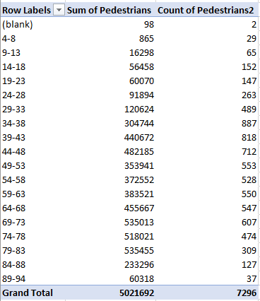
Rows: SHOT_DIST (grouped by units of 5 feet)
Values: FGM (stands for Field Goals Made, Sum)
FGM (again, this time Count)
We want Count for that second invocation of FGM, because a counting of all the elements in the field- the 1’s for shots made and the 0’s for those missed – delivers the total of all shots attempted.
I get:

Note first of all the presentational imprecision besetting the row labels, by which the upper number in each bin is reprised in the lower value for the bin that follows. The numerical actuality imputes the accurate reading to the lower value, e.g. the first bin really tops out at 4.9 feet, and all truly five-foot shots contribute to the second bin. Remember, though, that you can hand-modify the labels, in the service of clarification, for example:
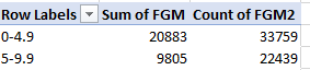
(Note also that the grouping by 5 really builds bins comprising six values, e.g. 0 through 5.)
But aesthetics aside, we still need to calculate the respective shooting percentages binned by those grouped distances – a simple mathematical proposition by itself, asking us merely to divide field goals made by field goals attempted. That intention sounds like a call for a calculated formula that could look something like this:

But guess what – as Excel savant Debra Dalgleish reminds me, calculated fields work exclusively with summed fields; try sneaking a COUNT in there and that nice try will be rejected.
A second suggestion, this one external to the pivot table proper, would be to compose a simple formula alongside the pivot table, e.g. =B4/C4 for the first bin, and copy it down, each formula sidling its bin. That’ll work, but if you regroup the data by a new interval, say 10 feet, the pivot table’s now-fewer rows will kick up a clutch of #DIV/0! errors that cling to the now-existent bins.
But this next alternative seems to work, even if it’s redolent of a kludge: make room for a new column in the dataset (say alongside FGM in S), call it something like ShotsAttempted, enter a 1 in S2, and copy that meek value down the column. What’s this curious maneuver doing? Glad you asked. It enables this calculated field:
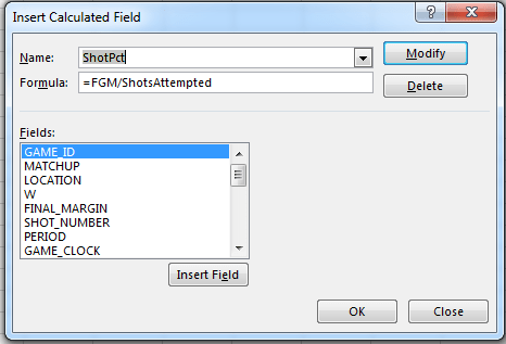
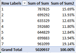
ShotsAttempted’s endless litany of 1’s will be summed, and will divide themselves into the FGM values and break out by SHOT_DIST in Row Labels. Format appropriately (I tried a Custom format keyed to the .000 motif) and you’ll get something like this:

(Note that the Values area need only consist of the calculated field results.)
Of course the surpassingly high field goal percentage for shots in the 0-5 feet range won’t surprise (a zero-foot shot is presumably a dunk or a layup); what’s at least slightly surprising is that once shooters move out beyond five feet, the percentages sink markedly, in part at least a function of the more assiduous defense applied to the shooters out there. After all, if you’re positioned to dunk the ball you’ve already lost the man assigned to guard you (I cannot speak first-hand, you understand). Indeed – the aggregate shooting percentage for shots equaling or exceeding five feet is .393.
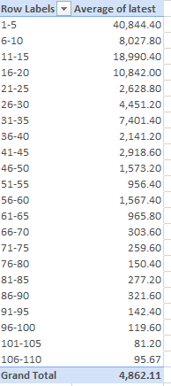
And once you’ve made your way this far into the analysis you can select the pivot table, copy it, and perform a Paste > Values nearby, thus establishing a fixed individual player baseline. Then draw up a Slicer earmarking the player_name field, and you can check out your favorite hoopster’s percentages by distance, e.g.
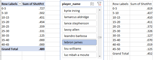
Moral of the story: don’t let Lebron get too close to the basket – nudge him out past 25 feet. At least that’s what I try to do with him.