The Trump Tweets, Take Two: 3100 x 140

12 May

The presumptive candidate is on a roll. You have a right not to take Donald Trump seriously, but if you’re an American his name is going to be coming to a polling place near you just the same, and you’re going to have to deal with him – yea or nea.

And given Trump’s new, nearly-officialized standing as the Republican nominee for President (yes – of the United States), the time is right to take a second, updated look at the man’s tweets, the short-form vehicle of which he seems most fond. After all, a recent New York Times article called Twitter the medium that often serves Trump as his “preferred attack megaphone”; perhaps then, we’d do well to listen closely to the noise.

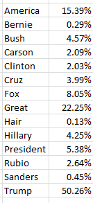
In the course of our first Trump-tweet review not three months ago we counted the popularity of these search terms among his immediately previous 3100 or so messages, marking the span between August 25, 2015 and February 11 of this year:

tweet1

Of course the objects of some of those references have receded into past tense, but in the interests of continuity and comparison I directed my attention, and $7.80 from my wallet, to the trusty twdocs site, which happily served up a download of Mr. Trump’s last 3111 tweets (these excludes retweets), these as of the afternoon of May 10 (my time). I then proceeded to subject the above terms to a second breakout of the later tweet complement. (I’m erring on the side of neurosis, by the way, and assuming twdocs won’t like me relaying my dataset to you. This may require a DIY download on your part, then; after all, isn’t cutting-edge election coverage worth $7.80?

Keep in mind that in the interim between February 11 – the latest date of the previous batch – and May 10, Trump has transmitted new 1131 tweets, and so for starters I reproduced the =COUNTIF(tweets, “*”&A3&”*”) formula I described in this post and put it to those 1131, and found:

tweet2

There have been some changes. Note the pullback in tweets referencing [Jeb] Bush, the erstwhile candidate, along with a relative spike in allusions to Ted Cruz and Marco Rubio, both of whom absented themselves from contention some while ago – developments that might be better appreciated by a timelining of the data, which we hope to build a bit later.

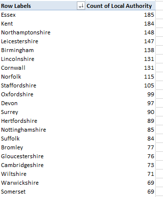
Of course other newsmakers have gotten themselves into Trump’s sights, including House Speaker Paul Ryan and Elizabeth Warren, the Democratic senator from Massachusetts who’s fired a few tweets of her own at the irrepressible tycoon. Yet, Trump had tweeted at these targets but five times each as of May 10, though the Warren total has since been padded; Trump also seems to think her first name is Goofy. On the other hand, the appellation “crooked Hillary Clinton” finds its way into nine mini-dispatches. “Lyin’ Ted Cruz” makes 17 appearances, along with two “Lying Ted Cruz” call-outs; but the nothing-if-not-grateful Trump expresses a “thank you” in 206 of his post-February 11 tweets, or 18.21% of them all.

Now as suggested above we might want to add a bit of chronology to the look, say in the form of a matrix that associates search-term appearances with months (and here I’m widening the look to all 3111 tweets); and while this kind of two-variable breakout sounds like a made-for-pivot tables series, this time it isn’t. A pivot table won’t work here because the search terms won’t behave like obedient items in a superordinate field. Even if we enfranchise a new Search Term field and roll it into the twdocs data set there’s no plausible way in which to populate its rows, because a COUNTIF-driven search for terms will scant the fact that some tweets contain multiple words in which we might be interested – and how are we going to usefully provide for these in one cell? It’s an improbable prospect, one that all but mandates a Plan B.

And a Plan B could look something like this: because the data in this case happen to bridge the October 2015-May 2016 space, I can authorize a new worksheet instead and enter, say in B4, the word May. If I enter April in B5 I can drag on the diminutive fill handle and drag down until I reach October (we see that Excel’s built-it months custom list lets you drag backwards in time). I’ll next enter the corresponding month number down A4:A11 and call the two-columned range Month:

tweet3

I’ll then return to the data set, insinuate a new column between A and B, call it Monthno., and enter in what is now B7 (Twdocs has instated the field headers in row 6):

=MONTH(A7)

And that simple instruction works because somewhere in the past three months Twdocs has engineered a most welcome overhaul of its created_at field, and its discouragingly inconvenient text entries, which looked like these:

tweet4

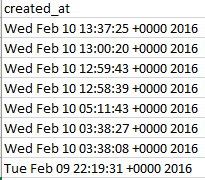
You’ll recall the gauntlet of hoops through which I had to hurtle in order to make some quantitative sense out of the above. But now the newly-capitalized Created_At looks like this:

tweet5

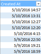
And those data, you’ll assuredly be pleased to know, are real, I-kid-you-not, certifiably crunchable dates and times (and the unvarying entries in the User Created At field portrays the date and time at which Trump enrolled in Twitter, by the way).

In any case, once that MONTH expression gets copied down its column, I can return to the Month range and stream some search terms across row 3, something like this:

tweet6

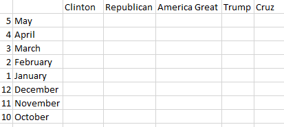
Now all we need are some data, so here goes. I’ve named the tweet content field in the data set, in what is now C7:C3117, Tweets, and in C4 I’ve entered:

=COUNTIFS(Tweets,”*”&C$3&”*”,monthno,$A4)

With its multi-criteria reach, COUNTIFS grabs a month from column A and search term from row 3 realizing a tally of 10 tweets featuring the name Clinton in May. Copy the above expression across the matrix (and the $ signs appear to be properly inserted), and I get:

tweet7

(Remember that the October data count begins on the 25th of that month, and the May numbers run through the 10th..You could also hide the month-number column if the presentation calls for it). Note the decisive decline in Trump references, of all things, and the precipitous contraction of Cruz-bearing tweets as well, synchronized perhaps with the latter’s folding of his tent.

Of course the matrix possesses none of the field-swapping nimbleness of a pivot table, but its formulas will auto-calculate, should the user swap search terms in row 3; and nothing prevents anyone from adding search terms across the row, once the formulas are copied into the new columns that’ll stretch the matrix as a result.

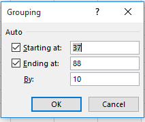
But that doesn’t mean that pivot tables couldn’t be aimed at other questions. A simple formulation could break out Trump tweets by month:

Row Labels: Created_At (grouped by Months and Years)

Values: Created_At (Count).

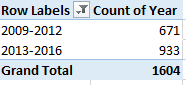
For the data I have, I get

tweet8

Here we see that the monthly aggregates have quite discernibly shrunk, with the May pro-rated projection just about equalling the April count. I’m not sure what accounts for that development, and one wonders if Trump himself is attuned to the decline. You’ll have to ask him.

One other point: As offered in a previous Trump post, I’m nearly certain that the times in Created_At reflect my Greenwich Mean clock, and not the Trump-specific time of his transmissions. For example: a Tweet advertising Trump’s appearance on the The O’Reilly Factor television show “this evening at 8 pm” is dated 22:26.

Considered in the abstract, that discrepancy could be relieved, by subtracting an hour differential – say 5/24 – from the date/times registered in the Created_At field. For example, this date/time:

3/19/2016 16:14

Possesses the numerical equivalent 42448.68 (just reformat the value and see), representing the number of days elapsed between the above and January 1, 1900, with the .68 denoting the percent of that day elapsed. Thus a reformatted

=42448.6-5/24

yields

3/19/2016 11:14

The problem is that we can’t know the time zone in which Trump found himself for any given tweet; and as such, 5/24 might be subtracting the wrong fraction. Tweet from California, after all, and I need 8/24, – or at least I do from this latitude.

Elusive chap, this Mr. Trump, no?

Crime and City Size: Big Data, Small Associations

4 May

A literal page out of Harvard’s Shorenstein Center on Media, Politics and Public Policy, the journalistsresource.org site makes instruction, compendia, and illustrative data available to its readers, one of which spreadsheets crime data for the first six months of 2013 for the 269 American cities exceeding 100,000 inhabitants:

Data-analysis-with-crime-statistics-20131 copy

(As usual, you should consult the fine print on the Notes tab that qualifies some of the data.) The sheet – really in effect a practice file with live information – and its accompanying textual exposition presses a concern with the statistical significance of per-1,000 violent crime rates compared across the cities, operationalized on the sheet by a city’s totalled murder, rape, robbery, and aggravated assault figures (summed in column 0) multiplied by 1,000 (column P). (Note, by the way, the blank Aggravated Assault cell for Phoenix and the missing rape figure for Chicago; both omissions are accounted for by footnotes numbered in the City_notes field.) The rates are set atop a denominator furnished by Oakland, California, the city evaluating to the highest rate and compiled in column R; the resulting %less numbers (the formula could have alternatively written =(P$2-P3)/P$2 in cell R3, for example) forge the comparisons, of which you’ll find the statistical synopsis in N272:P279 that in turn feeds much of the discussion on the web page.

Still, there may be some additional things to say about the data. For one you may well want to draw that %less field into a pivot table – but because it’s been ferried to the other side of a blank column (presumably because it was appended to the sheet by the article’s authors, Leighton Walter Kille and John Wihbey , who don’t direct their readers to the pivot table option in the piece) you’ll need to send the column – the blank one, that is – packing, thereby readdressing the %less data to the Q column. Moreover, the %less entry currently in R2 is, and is not, a header, having been lowered one row beneath the other headers. One assumes, then, that the %less means to shore up the tautological comparison of Oakland’s data with themselves by refusing to quantify what would after all yield a zero, were the city’s figures subjected to its own denominator. But a) the field still needs a header, after all, and b) a zero in R2 would better serve the field than a textual caption that stands in the way of any attempt to group its numbers, because you can’t group a field that’s been infested by even a single cell’s worth of text – at least not in a pivot table. And then we could at last call the field %less – in cell Q1.

And once those deeds are done I’d run the field through a very standard Copy > Paste Values routine, but not in the interests of slimming the byte count by replacing 269 formulas with their hard-coded yields. Rather, the pasted values will preserve the citys’ percentage relations to Oakland- because, if, for example, we were to leave the formulas as they’re written in place and sort the data by say, the Population1 field largest to smallest, New York’s ascendency to row 2 would instate its per1000 value in the P2 references in all the %Less formulas, that replacement denominator completely rewriting the rate comparisons as a consequence. Sort New York to the top of the data set, then, and Flint, the city whose violent crime rate stands only .58% lower than Oakland’s, now returns a -248.71% figure –a violent crime rate about three-and-a-half times greater than New York’s pre-emptory baseline (remember that a -100% differential attests a value that’s twice as numerous as the value to which it’s compared). You’ll note by the way that the bullet-pointed citation of Philadelphia and Houston near the close of the web-page discussion does describe a sort by population, but doesn’t reckon with the problem we’ve just flagged.

You’ll also note a small but meaningful typo in cell A2 of the Histogram sheet that charts the cities’ per1000 frequencies in intervals (or bins) of 1. It’s clear that the FREQUENCY function – one of Excel’s off-the-shelf array formulas – has been put to the task, though all evidence of its formulaic operation has been cleared from the sheet. (Note the unattended bins column in T3:T10 that was likely bound to now-gone FREQUENCY formulas in U3:U10.) FREQUENCY’s user-defined bins/intervals gather values that fall beneath each threshold, a functional reality that the >=1 label misrepresents.
For example – with FREQUENCY, a crime rate of 1.8 would attach itself to the 2 bin in U4 on the data set worksheet, and by extension the 49 stationed among the histogram data:

data1

Should have been labelled <=1. In fact, the actual frequencies were almost surely calculated in the main sheet in T3:U10, and were simply transcribed anew into the Histogram data. (For a pretty intelligible how-to on FREQUENCY, look here. Take particular care to read the NOTE that concludes the discussion.)

But apart from or in addition to rate frequencies, one might want to learn something about the relation of city size to the violent crime rate. A simple first pass at the question would attempt to tie size and rates via CORRELATION:

=CORREL(E2:E270,P2:P270)

I get an association of .113, bespeaking a small, but not overwhelming, positive relation between a city’s population and its violent crime (remember that the ViolentC metric composites four crime types).

And while we’re correlating, it might be worth eliciting the relationship between city size and crimes against property, those infractions counted in columns J through N (for a distinction between the US-legal understanding of robbery and burglary look here). The former assumes the victim is present and has been subjected to some assault or threat). We can take over column R, name it propper1000, and enter, in R2:

=SUM(J2:N2)/E2*1000

Then copy down R (but note that the arson figures for nine cities are missing). We could then write, somewhere:

=CORREL(E2:E270,R2:R270)

The resulting -.011 registers an even less persuasive association than that realized by city size and violent crime. That is, larger cities seem to be no more provocative of property crimes then smaller ones, common perceptions notwithstanding.

Maybe there’s a byline or two in there.

English School Academies: A Data Examination

21 Apr

To be an American is to be clueless about cricket. That’s a given, but my cross-cultural obtuseness extends to the British educational system too, whose program I just can’t get with.

Ok, so I’ve just dangled a preposition, but I told you – I’m confused. For one thing, when I hear the word “course”, I’m thinking of a three-credit offering in which you get to sit in the back of the lecture hall and text for 50 minutes. But over here a course is the whole shebang – the three (no, not four) year university stint keyed to one, and only one, subject (no majors here, either).  Colleges here aren’t degree-granting institutions – they’re sort of post-high-school vocational trainers, so if you want a degree you go to university.  The public schools are private, and you don’t proctor exams, you invigilate them. And anyway, they call it “programme”.

You’re getting the idea. And that’s why all this talk nowadays about English school academies and the government’s espousal thereof has me thinking dreamy, intelligible thoughts about baseball instead. But I think it goes something like this: academies are schools that have formally freed themselves from the financial aegis of local governing authorities, rather receiving their monies instead from the national government and as such need not hew to the UK’s national syllabus (you don’t get that in the States either). Still, they’re subject to inspections by the government’s Ofsted agency (we’ve written about them before), and proponents say that by vesting more control in on-site head teachers and snapping the link to the national curriculum the learning experience will be better served. Naysayers contend that the academy idea (to which the government states all schools in England must commit by 2022) will in effect privatize a sector, with large, profit-making providers biting off more than they can chew (for a straightforward resume of the pros and cons see this piece).

Either way, there are spreadsheets out there that will teach you more about the academy experience than any American can, including this workbook enrolled here on the data.gov.uk site:

The Open_Academies sheet (which the Cover_sheet tab generically calls Sheet 1) catalogues, and with impressive recency, the 5,272 academies in force in England (and that identity attaches to the UK country called England, and not Wales, Scotland, or Northern Ireland). But if you plan on pivot tabling some of the data in it you’ll first need to put some space between header row 6 and the caption text sitting atop it in 5.

Among other things, the book defines what it calls an academy route (column M), its two alternatives denoting a Converter or Sponsored status. The former references schools that in effect opted for academy status on their own, while member of the latter cohort were bidden, by what Wikipedia terms a “government intervention strategy”, to submit themselves to the guiding organizational hand of a government-ratified sponsor (you’ll want to read the notes above the data for some edification here).

And once you’ve attended to the row 5-6 necessity, the data seem more-or-less ready to go. You could start by simply breaking out academy numbers by local authority via a pivot table, and sorting these from Largest to Smallest:

Row Labels: Local Authority

Values: Local Authority

Once sorted, I get this in excerpt:

acad1

It’s Essex and Kent, two local authorities close to London, that lead the academy pack. Next maneuver Academy Route into Column Labels and treat the Values to the % of Row Totals makeover (and turn off Grand Totals). You’ll pick up considerable variation in the Converter-Sponsored ratios across the authorities.

You may also want to learn something about average wait time between academies’ application submissions and their approval/opening date, with the understanding that not every school need formally apply (again, check out the notes topping the sheet. Note as well that every opening is dated on the first of a month).  But because many of the schools feature no application date and rather represent that absence with an asterisk, things start to get slightly messy. In fact, however, we’ve broached this issue and one workaround before, and just a few posts ago, with an array formula that averaged paired values, when in fact the values are there to be paired, of course. The problem peculiar to these data is the asterisks in the Application Date field; subtract an asterisk from a value and you get an error message that undermines the formula. But run a find-and-replace along these well-intended lines:

acad2

launched in the hopes of substituting nothing (i.e., a numeric value of zero) for the asterisks, and discover that it won’t work – because the asterisk behaves like a wild card at the data, and thus the find-and-replace above will replace every selected cell with nothing. What you want, then, is this:

acad3

(Thanks to this thread for the tip.) Here, the tilde orders Excel to treat the asterisks as a character to be searched in its own right, and not as a surrogate for any and all characters.

Once you’ve supplanted the asterisks among the application dates, this array formula awaits:

{=AVERAGE(IF(E8:E5279+F8:F5279>F8:F5279,F8:F5279-E8:E5279))}

I get 222.65 days – the average wait time for an academy application to secure its approval. Again, remember that this formula really reprises the expression we detailed in the April 6 post.

And because I suspect the academization process might encourage a touch of school rebranding, here’s another array formula – a considerably simpler one, you’ll be pleased to hear – that counts the number of schools that underwent a name change when they won academy status:

{=SUM(IF(C9:C5279<>L9:L5279,1))}

The formula compares pairs of values in the C (Academy Name) with those in the L (Predecessor School Name(s) ) columns. If the entries are disparate, the comparison assigns a 1 to that outcome, whereupon the 1’s are summed, yielding 2599. That is, a bit less than half the schools came away with a new name after having earned academy status.

And now I’m thinking about opening my own academy – The Expat Institute for the Study of Cricket and Other Conundrums.

My branding expert is cool to the idea.

The Speed Museum’s Recruitment Matrix: Exhibiting Now

14 Apr

When a New York Times story sports a headline with the word “spreadsheet” in its banner, it’s nothing less than man bites dog, I tell you; and so when that electrifying, once-in-an-eon comet streaked across my disbelieving screen…well, I just had to read on.

And so I did. True enough, the text beneath reported the diversity-driven recruitment strivings of the Speed Art Museum in Louisville, Kentucky spearheaded by its director Ghislain d’Humières. In that connection the museum has fashioned a spreadsheet-driven matrix for check-listing board of governor and trustees candidates; and a couple of emails later the museum kindly dispatched the sheet to me, and thus to you, here:

 Speed Matrix (1)

(Needless to say, candidate names have been displaced from their niches in the E and F columns.) I should that the accompanying note authored by museum Executive Assistant Lauren Baldwin allows that “Many of you have asked if we can share the matrix…”, a numerical aside that surprised me. I suspect that demand emanates chiefly from museum officials interested in how the Speed paddles across its application pool, and not from spreadsheet fanciers like your correspondent.

Be that as it may, I was given more than a little pause by a first sighting of the sheet, particularly the wide berth of white spread to the left of the A column. How, I wondered, does white space get behind the sheet’s leftmost edge – until I at last understood that the workbook opens to us in Print Layout view; click View > Normal in the Workbook Views button group and convention is restored. As for the precipitously-angled headers in row 1, they’ve been subject to the Format > Cells > Alignment treatment:

 Speed1

You’ll also perhaps note that cells E1:AR1 have been told to wrap their text, even as that instruction really only impacts E1:F1.

Moving along with matters presentational, the category headings atop the sheet – e.g., AGE, ETHNICITY, GENDER, are text-bearing shapes that have simply superimpose themselves upon the cells beneath them. One assumes in addition that the burgundy header color codes in M1, N1, AJ1, and AK1 communicate some special standing imputed to those fields, but my conjecture has to wind down right there. And the extension of the all-borders cell motif to row 1048576 seems to overstate the case. I’m also not sure what the OLE_LINKS range name ascribed to F94 is presently doing.

But what is the workbook meaning to teach us about these board of governor candidates? The matrix appears to simply record a 1 for any attribute an aspirant possesses, continue to leave any inapplicable qualities blank; but if you think that the follow-up intent, then, is to simply add the candidate numbers and compile a highest-total-wins table I’m not so sure. The answer depends in part on the plans the Museum have for the data.

For one thing, you’d be right to be struck by the absence of SUM calculations in the empty AS columns that would or could have drummed up a candidate’s aggregate score, and by the presence of SUMs in row 70 that realize column field totals (e.g., numbers of women and Hispanic Americans in the pool. Row 106 sums a second bracket of applicants, those placing themselves in consideration for board of trustee positions. Row 107 sum the columns in their entirety). So what are the 1’s doing?

For one thing, every position seeker must receive a 1 somewhere among each of the demographically basic parameters of Age, Ethnicity, and Gender, and so that ineluctably constant sum of 3 could be disregarded. At the same time, however, that very constancy does the vetting process no harm – again, because everyone scores 3. But if the Speed Museum wants to differentiate the attractiveness of men and women, for example (legal considerations aside), the undifferentiated gender 1 teaches the Museum nothing – be you an M or a W, you get one point either way.

That’s one issue. But I’m also bothered by the fission of gender codes in columns P and Q into Female and Male, a data-organizational issue we’ve taken up many times previously. Had Mr. d’Humières asked me – and he most assuredly didn’t – I’d have made room for M and W in the same, unitary Gender field, the better to pivot table the distribution of the two items. And I’d have done the same for ethnicity, e.g.

 Speed2

And as for Age, I don’t see why its four fields couldn’t have likewise been concentrated into but one, and ready to receive a candidate’s actual age. Why not enter 37 instead of a 1 beneath Age 36 to 50? Better pivot tabling awaits.

A different suggestion, this too decidedly unsolicited. The fields could be weighted, in the event some of them are deemed more contributory to hiring decisions than others. A new row could be jammed between the current rows 1 and 2 and, assuming we cling to the sheet’s existing field structure, we could assign a weighted value to each of the matrix fields in what is now G2:AR2 (and we’ll call that range Weight).

For example – if the Museum is in fact keen to amplify women’s board representation a 3 could be socked into P2 in the Female field of the Weight range, even as Q2 – the men’s parameter – could inherit a 1. In other words, enter the generic 1 in the Female candidate’s field and she gets 3 points. That device sounds politically crude, and while an organization might not want to commit that sort of maldistribution to document form, it’ll work operationally. By the same token, a 1 in a particular candidate’s Philanthropist field (in column AG) might evaluate to a 5 in AG1, with other relatively more or less desirable qualities weighted accordingly.

Each candidate’s score would then be entrusted to a SUMPRODUCT tabulation. Thus the candidate in row 3 would be portrayed in AS3 (the next available column) in these terms:

=SUMPRODUCT(G3:AG3,Weight)

Copy the formula down AS and each candidate’s field evaluation is multiplied by that field’s weighted score in row 2 (the weight range), and then totaled (of course the blank candidate cells multiply the respective Weight cells by 0). That’s what SUMPRODUCT does (yes, it’s an array formula, albeit an off-the-shelf one), promoting a finer-grained portrait of each hopeful.

But remain with the matrix as it stands now and the sheet doesn’t do that much heavy lifting for the decision makers, because they’ll still need to winnow candidates with the same number of 1’s. But of course, that may be precisely what the decision makers want to do.

Either way, I’ll suggest another field for the Experience area – how about Spreadsheet Guy?


Presidential Appointments: Confirming the Data

6 Apr

As of this writing 2633 days have elapsed since Barack Obama at last received the go-ahead to bring about the change he thought we needed, and toward that end he’s proposed 1607 appointments to his administration, or one every 1.64 days.

That’s a lot of change, and some bright young things are doing a whole lot of background checks besides. And if you want to see if someone has snuck your name into the nomination pool you can make sure by downloading and vetting the

https://open.whitehouse.gov/dataset/The-White-House-Nominations-Appointments-New-/nmc8-q2uj

workbook sourced in the https://open.whitehouse.gov/ site, a none-too vast holding area for 27 datasets that’ll doubtless, eventually, have more to offer.

But what the appointment data has to offer is pretty interesting all by itself, once you’ve instituted the change you need – namely an autofit of the columns. For one obvious but enlightening take, we could pivot table a count of nominations by agency (note that nominations among the data run through March 3 of this year):

Row Labels: Agency Name
Values: Agency Name

Sort the results, and you’ll learn that more than 22% of the appointments were earmarked for the Federal Judiciary:

app1

Dotting that roster are the two Obama Supreme Court nominees, Elena Kagan and Sonia Sotomayor (but not current nominee Merrick Garland).

And an equally unassuming table:

Row Labels: Name
Values: Name (Sort these highest to lowest)

will shuffle those 1607 into 1542 actual individuals, 56 of whom were thus nominated at least twice. The most peripatetic, current Secretary of Treasury Jacob Lew, turns up in the data set five times, though four of the mentions, for United States Governor (not to be misconstrued for the elected head of one of US’ fifty states) appear to have been simultaneous.

As for the timing of appointments, a simple consideration of the numbers by year should tell us something about the pace of nomination activity, along with perhaps the trajectory of position availability:

Row Labels: Nomination Date (the three blanks could be filtered)
Values: Nomination Date (grouped by Years)

(Note: Excel 2016 – which I’m currently using – will automatically group these data by Months, Quarters, and Years, whether you want it to or not. Clicking the ungroup button will return the data to the old default, by which each date staking the field will be uniquely cited.)

I get

app2

Even given its rough distributional curve the numbers nevertheless skew indisputably across the second half of Obama’s tenure, that yet-to-be-completed interval accounting for more than 58% of all of the president’s appointments. Explanations, anyone? Again, those ups and downs may merely transcribe a record of as-needed, emerging position vacancies, but that one’s a call for the pundits, or maybe the statisticians. (And don’t ask me to explain why Excel saw fit to discharge its Show Values As button from its PivotTable Tools > Analyze ribbon. A space-saver? Not a time saver. Show Values As is available on the shortcut menu that a right-click atop the data will summon, though.)

And if you were thinking of grouping the years above into 2009-2012/2013-2016 shares, start rethinking. Clicking the standard pivot-tabling Group Selection option yields, not unexpectedly:

app3

(Again, Excel 2016 defaults to that triple-parameter selection.)

What’s missing of course is the By field that makes itself available to conventional number grouping, e.g.:

app4

Work with dates, however, and you don’t seem to able to get to that screen shot from here. The simplest (though not necessary the only) way out: Entitle the free, adjacent column J Year and enter in J2:

=YEAR(E2)

Copy down J and four digits’ worth of years resolve into their cells. But those yearly representations – 2009, 2010, etc. – are not bearers of the date-formatted quantities you may think they are. Format 2009 in date mode, for example, and what you get is January 7, 1905 – because that date stands 2009 days away from Excel’s date baseline January 1, 1900, the point of embarkation against which all subsequent dates are counted. January 1, 2009, on the other hand, is the number-formatted 39814 – its distance in days from the baseline. Bottom line, then: the YEAR function returns a useful number – but one that doesn’t return the year in its real, sequential space.

In any case, once the stand-in dates take their place in the J column you can move to this pivot table:

Row Labels: Year (Filter the 1900, signifying blank cells. Group thusly, overwriting the 1900 in the Starting at field to 2009:

app5

Values: Year

I get

app6

That’s what I was looking for.

And given the data’s bookended Nomination Date and Confirmation Vote fields, we should be able to say something about the average wait time between a nominee’s submission and disposition, once we acknowledge the latter field’s 179 blank cells (one assumes at least some of these denote pending candidacies – and you can get 179 by trying =COUNTIF(G2:G1608,””) ). Of course the AVERAGE function ignores blanks, and so these ciphers won’t impact the calculation.

The by-the-book answer to our wait-time question would have us mark out a new field in K, call it something like Vote Wait in Days, and enter in K2

=IF(COUNT(E2,G2)=2,G2-E2,””)

 While one could entertain alternative logical tests, this one above upon me first. The expression asks in effect if both a record’s Nomination Date and Confirmation Vote fields are filled; if so, a simple subtraction of the earlier from the later date follows. If not, the cell receives nothing (and yes, it would be possible to simply omit the if false condition entirely from the formula, whereby any cell’s failure of the logical test would return the Boolean FALSE in the cell; but remember I’m trying to go by the book).

Copy that expression down K, and simply write, somewhere,

=AVERAGE(K2:K1608)

And you should realize an average nominee wait time of 143.35 days. You could then arrange this pivot table:

Row Labels: Agency Name
Values: Vote Wait in Days (Average)

Among other things you’ll meet up with ten agencies whose blank cells have inflicted a #DIV/0! alert upon their breakout, but if you sort the averages Highest to Lowest you’ll restore some visual order to table; and by doing so you’ll observe considerable variation in the wait times, while granting that the agency numbers can be very small.

But I had another idea – to devise an array formula, a one-celled power expression that would yield that same 143.35. Now because array formulas often model themselves after the syntax of the standard, record-by-record expressions such as we composed above, I originally advanced this follow-on:

=AVERAGE(IF(COUNT(E2:E1608,G2:G1608)=2,G2:G1608-E2:E1608))

In fact this formula looks a good deal like the record-specific

=IF(COUNT(E2,G2)=2,G2-E2,””)

That we drew up above, a formula that worked. Here in the array context all the counts and subtractions operate on ranges, or arrays, but these are placed in the same relation as in the earlier conventional formula, with the AVERAGE function bracing the whole thing.

But my array formula didn’t work, (apparently) because this segment

COUNT(E2:E1608,G2:G1608)

subverts the array dynamic between the E and the G arrays, by dint of the trifling comma that seems to have split the two apart. That sabotaging detail dragged me to a Plan B:

 {=AVERAGE(IF(E2:E1608+G2:G1608>E2:E1608,G2:G1608-E2:E1608))}

This one works, and it works by restoring an operational relationship between E2:E1608 and G2:1608, one that satisfies the array formula’s peculiar processing needs. The formula in effect asks to average the wait times of rows in which its summed E and G entries exceed the entry in E – another way of asking if there’s anything in G.

It works, and I’m floating my name for that open Ambassador to Redmond position.

Ebola, After the Fact: Liberia Survey Data

30 Mar

You’ve probably haven’t terribly much about Ebola lately, and that is all to the good. The disease’s disappearance from the headlines has everything to do with the extraordinary, near-total defeat of the African scourge, a triumph leaving the fifth estate with nothing to report.

But data about Ebola remain on hand, notably on the Humanitarian Data Exchange (HDX) site, a venue to which we’ve turned in the past for information about the epidemic when the situation was considerably more parlous. One of the holdings of epidemiological note comprises a spreadsheet-driven compendium of survey data elicited from respondents in the Liberian capital of Monrovia between December 2014 and January 2015:

ebola-data-public

With 75 fields the data set is decidedly multi-variate, and you’ll want to turn to this clarification of its fields for some deep background:

ebola_survey_public

You’ll also probably want to autofit the sheet’s columns and delete the empty SURVEY_INFO field in A, its heading serving in effect to merely title the actual survey. And in fact the BACKGROUND name in F appears to do nothing more than partition two phases of the survey’s questionnaire from each other, corresponding to the darkened row 4 in the Survey sheet. Indeed – that color code of sorts on the survey sheet references similarly blank phase-separator fields in columns P, AJ, AX, and BR; as such they could all be escorted away from the data set.

But I said could, not must; and that’s because, data lacunae notwithstanding, none of these fields do any appreciable harm to the data set and its pivot tabling prospects. It suffices for a field to merely declare its heading, even as its cells beneath remain closed to entry. Type a heading and you have a field. The fields are purposeless, to be sure, but a pivot tabler need simply exercise his/her discretionary powers to ignore them.

And once you’ve finalized that design decision you can move on to some more conventional and substantive considerations. I’m generally a pushover for date/time fields whose contents are truly dates and times, and the cell holdings in the esdate parameter in the B column qualify, in each and every of its 1572 rows. But the informational gain in drilling down or grouping interview dates and times is uncertain; what, for example, might we learn from the available fact that more interviews were conducted between 11 and 12 in the morning than during any other hourly stretch? Not a great deal, I suspect.

But there are of course other findings to be found. A simple pivot table assay of gender:

Row Labels: Gender (filter the 10 blanks)

Values: Gender (% of Column Total)

Tells us that 55.38% of respondents were women, a disproportion that raises the usual sampling questions (some of which are considered by HDX here. The Liberian sex ratio verges on 1-to-1, by the way; see this page).

Then direct the religion field to Column Labels (and turn off Grand Totals for columns. Note the percentages read down the columns):

survey1

Why male Muslims predominate among that faith’s sub-sample presents itself as a question – a good question – that I can’t answer, though the absolute Muslim total – 153 – is overwhelmed by the precisely 1,400 Christian respondents (the Other field comprises 9 respondents).

You also may want to do some thinking about the ehowget field, once you understand what it’s saying. Its associated survey question asks respondents to identify the ways in which they believe Ebola could be contracted – but It doesn’t assume the respondent had incurred Ebola, as I had originally supposed. Put that clarification in place and we see 126 causal permutations, along with 25 Others and 144 Don’t knows. (Code 3 appears truncated among the data, and reads in full Body fluids of infected person. And code 6 has lost the e in “surface”.) Because so many of the replies cite multiple causes, the data scan less than tidily; but even if we were to number the permutation proxies 1 through 126 in the interests of brevity, that retouching would be presentational, and not substantive; those numbers would remain incomparably nominal.

What could perhaps be brought to these data is a count of the number of times each causal attribution appears among the responses, e.g., the frequency with which “6-Contact with infected surface” is alleged as at least partially contributory. Here good old COUNTIF can be pulled off the shelf and put into useful service.

First, I named the ehowget range in Q2:Q1573 causes, and then settled into a blank cell, say BZ1. Here I’d enter 1- , the reference for the Vomiting symptom, including the hyphen in order to ward off any other 1 that might, for whatever reason, have found its way elsewhere in the cell. I’d then enter, in CA1:

=COUNTIF(cause,”*”&BZ1&”*”)/COUNTA(cause)

We’ve been here before, and not so long ago, where I explained the workings of the above expression. The divisor realizes the proportion of all responses featuring coded symptom 1, 34.92%. I then entered 2-, 3-, etc. down BZ and copied the formula accordingly down CA. I get:

survey1a

We see that codes 3 and 5, bodily fluids of infected person and touching dead bodies respectively, were most widely held by respondents to be implicated in Ebola transmission, at least in part. Code 7, Mother breastfeeding her child (that phrase also truncated in the data set) received the fewest attributions. Now one could go ahead and apply the same formulaic treatment to the next field, esignsymptom in R – that is, as detailed in A17 of the survey workbook, How can you know that someone has Ebola?

But take heart – it’s all past tense.

Canadian Bilingualism Data: Comme si, comme ca

16 Mar

They’ve opened their data in Canada, too, right here; and with many of the holdings committed to XLS/CSV mode you’ll have plenty to do if your investigative interests take to you to the northerly latitudes (but don’t be fooled by my facile directional allusions; here in London we’re hundreds of miles closer to the Arctic circle than Montreal).

In the course of a preliminary poke through the site’s shelves your trusty mystery shopper slid this item into his bag (not to worry – I paid for it):

English-French bilingualisms by different geographies

a census of French, English, and French/English speakers in that officially multi-lingual part of the world. (And you may want to think about the workbook title.)

The workbook exhibits a number of organizational curiosities, some of which we’ve seen before, more or less; but however familiar, they beg our attention.

First note the bipartite headings overlooking the data set’s fields, spurious tandems clearly forced upon the data by Canada’s determinedly bilingual stance; but politics aside, the stacked pairs cause problems for the data. You can’t have two field headings in two rows; the lower of the two will be treated as a record, for filtering, sorting, and pivot tabling. Couldn’t a unified heading have been agreed upon, e.g. nom géographique, anglais/geographic name, English for column A (and you’ll note the apparently misspelled “georaphie” in columns C and D)? Whatever the strategy, one of those rows needs to be deleted.

Now observe columns A and B, and follow with an additional look at C and D. It appears as if these twosomes comprise the same information, albeit in translation. That is, B furnishes a French rendition of the corresponding data in A, and nothing more – and D does the same for C. Again, politics have trumped design considerations here, because the data are overwhelmingly identical across the fields; indeed, scan the twinned cells in A and B and you’ll discover that only 37 of the location names are spelled disparately across the two languages – and that’s out of 4982 records.

And how do I know that, by the way? I’ve been so informed by the simple, neglected, and nifty Row Differences feature housed in the Go To dialog box, just an F5 away. Select columns A and B, tap F5, click the Special… button, and tick Row Differences:

Canada1

That swift routine selects all the rows in which the A and B data don’t agree.
But at least these excesses perpetrate no substantive injury upon the data – because, for example, any pivot tabling of the records need simply call upon the fields expressed in your desired language, and just as simply ignore the others. Nevertheless, mark the all-but-redundant fields as one of those organizational curiosities.

But the next curiosity is injurious indeed, and is visited upon the selfsame fields above. The data set has inflicted a massive, repeated double count of the numbers, by recurrently conflating concentric territorial levels among the records. That is, by insisting on aggregating the data by different geopolitical strata – all in the same data set – the same numbers get counted over and over as a consequence, and we can’t really have that, can we?

For example, the totals associated with very first data row – identifying Canada nationwide – post a collection of what are in effect grand totals, broken out into the various lingual distributions. Thus the census reports that 28,360,245 Canadians all told speak English – but of course that very number is variously subdivided among the subsequent records. As a matter of fact, if you simply sum the values in the L (speakers of English or French) field, the total – a nice round 283,695,000 – rather enormously overstates Canada’s demographics, and by a factor of about eight. And the problem is bewilderingly compounded by row 315, which nearly precisely duplicates the data in that first row.

But a reasonably satisfactory way to sift the jurisdictional apples from the oranges is at hand. By initiating a pivot table and swinging the georaphie [sic] type, English field (I’m working with the English field titles) into a Slicer and ticking, by way of illustration, Canadian Heritage region, and loading the Values area with speakers of French and speakers of English, you’ll get

canada2

The resulting breakout captures the true respective populations, because we’ve confined the analysis to just one of those geopolitical levels. Click province this time in the Slicer and you should see

canada3

Note the equivalent grand totals. Again, by cordoning ourselves into only one demo-stratum we’ve again isolated the proper national figures (although note that that clicking the census metropolitan area item cedes smaller numbers, presumably because those data devote themselves to larger Canadian urban areas only and not all localities in the country).

A few other clarifications need be issued. First, don’t be confused by the relation between the speakers of English, speakers of French, and speakers of English or French fields. The first two don’t add up to the third because the intervening field, English-French bilinguals, counts Canadians whose proficiency is also enumerated in by the speakers of English or French. Thus, for example, this formula:

=I3+J3-K3

should return the value in the L column.

But if you’re looking for a full-bodied denominator that would allow you to figure the percent of English or French speakers as a fraction of the all denizens populating each row you need to add the respective L and M values, the latter field subsuming Canadians who speak neither English nor French. The problem – though granted, a far smaller one than the multi-strata cohort complication we described above – attaches to the more than 3,000 hyphens jamming the far left of scads of cells in the M column. These may signify NA, data-not-available counts, but very well might, given the smallness of the row populations, simply stand for zero. Either way, a simple find and replace should palliate the problem – once you realize that the actual entries in the relevant cells are [space]-[space][space][space]. Nail that down, name column N All, enter

=L3+M3

in N3, and you would appear to be in business. You could then advance to a series of pivot table aggregates by this or that level, e.g.

Slicer: georaphie type, english (select say, province)

Row Labels: geographic name, english

Values: speakers of English

All

And in order to develop a province English-speaking aggregate, try this calculated field (which I’ve called Engsp):

Canada4

I get

Canada5

Note the smallness of the Quebec proportion. C’est tout.

Now does that make me a speaker of English and French?

Indianapolis Police Complaints: Doing Justice to the Data

9 Mar

Seekers after news about open data – and some of the data themselves – would do well to unstrap their backpacks at the OpenData-Aha site, a digest about what’s up in this multifarious, crackling, unbounded domain (transparency check: the OpenData-Aha has cited Spreadsheet Journalism).

Follow some of the Aha story links and the odds are highly encouraging that you’ll find yourself inside some governmental entity’s spreadsheet, e.g., the record of civilian complaints lodged against members of the Indianapolis, Indiana police force dating from July 2012 through September of last year:

Indianapolis citizen complaints

(You’ll note that the 2012 data describes incidents for July of that year only, and the 2013 complement features six, non-contiguous months of the year, for whatever reason).

The sheet, developed under the aegis of the law-enforcement data developer Project Comport, is informatively paired with a field-defining legend that should anticipate some of your questions about what the records are trying to tell us; but you’ll still need to perform a measure of house cleaning in order to neaten the dataset, e.g. the traditional column autofitting. And again – because we’ve seen this before – you may well want to cleanse the occuredDate (sic) entries of their superfluous times, all of which report midnight (the standard Short Date format dropping down from the Number Format menu in the Home ribbon would work to eradicate these). You’ll also have to contend with missing data here and there, but absent a compelling need-to-know submission to the Indianapolis police those blanks won’t go away (or at least not really, but read on). I also can’t account for the wholly unattended census tract field, which, pun unashamedly intended, remains unpopulated.

In addition, you’ll need to inspect some of the spokes in umbrella field categories such as district, which Project Comport understands as “…the District…or Branch, [my emphasis] such as Homicide or Robbery, that the officer was assigned to at the time of the incident”. Thus that field seems to subsume both locational and organizational demarcations, begging the question of how certain coding determinations in the field were finalized. For example – a complaint directed at the Covert Investigations section nevertheless and necessarily has a geographical referent – the contested event happened somewhere. By the same token, the “shift” field departs from chronology when it numbers the Crash Investigations Section among its items. We should be slightly bothered by the apples/oranges conflations here.

But a far broader conceptual concern need be confronted too, though we’ve met up with something like it in a previous post. Each complaint receives a 32-character id – but in a great many cases the complaint comprises multiple sub-complaints. Complaint 453f6ca045a7b7ea292cb3daebe83e7d, for example, evinces 12 individuated grievances filed by a 22-year-old black male against four different officers. Do we regard these multiple remonstrances in unitary or aggregated terms? In fact, the data register 407 different complaint ids among their 1,004 records, these pressing their allegations toward the 378 unique police officers represented in the officer identifier field. How are all these to be counted?

After all – if a particular officer is implicated in three offenses in the same incident, how does that plurality factor into any pivot-tabled summary? On the other hand, if the same officer is charged with the selfsame three delicts, but instead on three discrete occasions – and as such incurs three incident ids – how should that batch of events be reckoned in turn?

Of course it would be perfectly legal to try and play it both ways – to treat the data as they stand in their default, quasi-redundant id reportage for some analytical purposes, and at the same time to isolate a parameter in order to consider its entries singly.

For example – if we wanted to learn something about the demographics of officers against whom the complaints were preferred we could click anywhere in the data and conduct a Data > Remove Duplicates winnowing of the records, ticking only the last, officerIdentifier field. Go ahead, and those 378 officer records will have been pared from the source data set (I’d immediately run a Save As routine here, the better to preserve the slimmed set in a new workbook and thus leave the original data intact).

You could then try out this initial pivot table:

Row Labels: officerRace

Values: officerRace (% of Column Total; filter the four blank records; by definition they can’t help us. We also don’t need the Grand Total, and I’ve retitled the Values field name):

I get:

ind1

Of course, those proportions are like a stick with one end, absent comparative data of the general racial makeup of the Indianapolis police force. But those data do appear to be available, by clicking the Download Officer Demographic Information for the IMPD link here. Those police force percentages read thusly:

ind4

The black-white officer ratio is nearly and remarkably identical to the complaint breakouts, intimating that white officers are no more likely to be complained about (although you may want to complain about my dangled preposition).

Or by extension, one could run another Remove Duplicates at the original data, this time by checking incident id (and assuming that only one citizen is enumerated per id, a premise that appears to hold) in the interests of learning more about the age and racial identifications of complainants. But that intention is slightly weakened by the smallish but real possibility that some individuals had levelled more than one complaint; if that be the case, our duplicate removal might nevertheless count some persons multiple times. That’s because unlike the officer identifiers, each of which clearly point to a unique officer, incident ids distinguish unique events, and not the persons embroiled in them.
In any event, if we proceed with the above Remove Duplicates and indulge the assumption that each complaint id associates itself with a unique Indianapolis resident, we could try:

Row Labels: residentRace

Values: residentRace (% of Column Total; again, conceal the blanks and the Grand Total).

I get:

ind2

Yes, you’ve caught that superfluously-spaced White entry (the second one, totaling one record); again, you need to direct a find and replace at the delinquent datum, finding White[space] and replacing with White. One also has a right to wonder about the large Unknown bin, a proper matter for further investigation.

In any event, map the above numbers to Indianapolis’ black-resident proportion of around 28% (another source puts the number at around 24.5%) and we see the maldistribution is real but not quite overwhelming; not shocking, but surely notable.
Still, a look at all 1,004 incident records, irrespective of the doubling up of incident id, could develop other useful conclusions. After all, each of the 1,004 sub-complaints require some or other legal disposition (as identified in the “finding” field ; again, the Project Comport field legend explicates the four finding possibilities).

Now in this case, however, the blanks stand in a different relation to the empty cells in other fields. These signify complaints on which a ruling has yet to be issued, and as such might well merit counting. I’d thus select I2:I1005 (remember we’re working with all the records this time) and spin through a find and replace, finding the blank cells and replacing them with say, “Pending”.

Then a simple pivot table awaits:

Row Labels: finding

Values: finding (% of Column Total, no Grand Total)

I get:

ind5

Note only 10.56% of all complaints were sustained, resulting in a definitive incrimination of an officer, though a Not Sustained judgment does require a reporting of the officer’s name to what is called the Indianapolis department’s Early Warning System.

Lots of bouncing back, them, between data sets. But I’m not complaining.

London Bus Injury Data: Be Careful

1 Mar

The real-time, tweet-borne reportage filed by New York Times’ reporter Lucas Petersen on his ride on a Megabus that went aflame somewhere between Chicago and Milwaukee got me to thinking about bus incidents in general, and the data that might impart a quantified perspective on such events.

In an interview after the fact Petersen allowed that he couldn’t find terribly much information on the matter, and truth to be told neither could I – with the conspicuous exception of London’s Transport for London site, which makes a series of quarterly-compiled spreadsheets on bus accidents in its jurisdiction available. After copying-and-pasting the most detailed dataset from each of last year’s quarters into a solitary, all-year sheet and custom sorting the records by Date of Incident and then by Route and Operator, I’ve stored it here:

TFL bus incident data 2015

With 5715 injuries, or more than 15 per day – 14 of which were fatal – the numbers are substantial, though of course  I don’t know how they compare with those of other systems.

Turning to the data, note the set’s slightly ambiguous tile, recording incidents “…which required hospital attendance and treated on scene…” I would assume that “and” meant “or”, in view of the “Injuries treated on scene” item featuring in the Injury Result Description field and the attending explanation thereof posted in the Introduction tab.

But there are larger analytical concerns, apart from your interest in autofitting the columns and wondering why the text in the Injury Result Description field is variably sized. Note that the data on each accident victim receive a record all their own, they should. But at the same that necessary individuation drills the data down too far, de-coupling injuries which may have been incurred in the same accident – something an investigator might very well want to learn. For example, it’s entirely possible – even probable – that the two injuries detailed in rows 14 and 15, on route 11 in the borough of Westminster, were sustained in the same incident. But that surmise, however plausible, should not have been entrusted to any third party; had an incident ID been assigned to each incident instead, all ambiguity would have been allayed, enabling an accurate incident, in addition to injury, count as well.

On the other hand all the dates populating the Date of Incident appear in effect to have been rounded to the first of every reporting month, thus grouping the data there with undue coarseness. I would assume that actual incident dates are available somewhere, and I’m not sure why these would have been denied from the source worksheets. A correlation of incident counts by day of week would afford a standard, but instructive, chronology-driven finding; but it isn’t available here.

We could also ask about the very substantial number – about 32% – of victims whose sex is unidentified. One would have thought that so prominent and relatively unambiguous an attribute would have found its way into nearly every record, and I can’t explain why in, nearly a third of the cases, it didn’t.

Moreover the Victims Age field offers categorical, not numeric, entries, and again I’m not sure why. Apparently no accident site protocol here insists that investigators develop such information, though attending hospitals almost surely would have it.

In any case, and shortcomings granted, some simple but useful pivot tables are there to be set, e.g.

Row Labels: Victims Age

Values: Victims Age (% of Column Total)

I get:

transport1

Speaking ideally, the considerable Unknown population would need to be (somehow) plumbed for any skew that would demand that we not ignore it. Put otherwise, if it could be demonstrated that the demographics of the Unknowns emulate those of the knowns we would be able to subject them to a measure of disregard. But by definition, we can’t.

We could also try this:

Row Labels: Victim Casualty Category

Values: Victim Casualty Category (% of Column Total; and you don’t need a Grand Total)

I get:

transport2

(Note the rewritten Values title. Remember you can simply type in the Labels areas.)

You’ve noted the apparently redundant “Cyclist”; but again, Row Labels enumerate their items uniquely. In fact, the more populous of the two Cyclist entries is trailed by a superfluous space. The simple remedy, again: Run a find and replace down the Victim Casualty Category field, finding Cyclist[space] and replacing with Cyclist.

We see the great bulk of victims are passengers, their predominance prompting a corollary concern with victim category and Incident Event Type. Drag that field into Column Labels and:

b

No, I don’t know how either Activity Incident Event or Safety Critical Failure are defined, but passengers account for 96.22% of all slips/trips/falls – presumably in the course of getting on or off a bus, though anyone who’s ridden the London system knows that its double-deckers can lurch and bolt like bucking broncos in mid-journey, too. Pedestrians – 7.89% of all victims – account for 29.74% of collision victims, a not particularly surprising fraction. Nor, one supposes, is the 61 of 121 assaults directed at drivers, whose aggregate injury percentage stands at only 6.23%.

And for another simple metric we could break out incidents by London borough:

Row Labels: Borough

Values: Borough (again, % of Column Total)

In excerpt I get:

transport4

Westminster’s clear accident margin suggests, but only suggests, that the teeming borough simply supports more bus routes, but pull Victim Casualty Category into Column Labels and you’ll also learn that 10.42% of all pedestrian injuries were Westminster-sited, suggesting in turn that the foot traffic there is profuse (and again, I’m not sure about the None London Borough item).

All of which conduces toward this recommendation – watch where you’re going – on and off the bus.

The Trump Tweets Part 2: 140 Characters in Search of a Candidate

22 Feb


Having looked some technical issues in the eye in last week’s post and not having blinked, we can begin to consider exactly what it is that Mr. Trump is tweeting about. We’ve already explored the means for running key-word searches across tweets, by calling upon the COUNTIF function and playing a few wild card indicators along the way. Thus if we’re looking for instances of the word “president” down, say, A1:A100, we’d enter

=COUNTIF(A1:A100,”*”&”president”&”*”)

And that expression should realize that count. Note that what Excel reads as *president* is conveyed in the cell by textual elements that are concatenated (though of course you could enter a cell reference to the word “president”).

Once understood, you could enter a collection of key words down a column with accompanying COUNTIFs (and here I don’t mean COUNTIFS, a separate function). For starters I entered these in a blank sheet:

tr1

I then named the range of tweets tweets, and copied the inaugural COUNTIF formulas (pun not intended), each of which divided the results by COUNTA(tweets) so as to facilitate percentage readings, and formatted appropriately. In other words, the formulas look something like this:

=COUNTIF(tweets,”*”&A3&”*”)/COUNTA(tweets)

I got these results:

tr2

Mr. Trump likes to tweet his name, apparently, though a comparative check of self-references by the other candidates would have to be conducted as well in order to determine if Trump’s self-preoccupation is singular.

But there’s a problem in those data, nesting in the two cells counting tweets themed around Hillary Clinton. A COUNTIF searching for Hillary will pick that name up in tweets in which that surname appears in isolation, as well as cells that display Hillary Clinton. But if I likewise trigger a COUNTIF for instances of Clinton alone, that tally will likewise count the tweets bearing Hillary Clinton. If, then, I’m scanning three tweets for the names Hillary and Clinton, my combined COUNTIFs will total…four, even as I’m looking at but three tweets all told.

The problem, then, is a double-count, a species of numeric redundancy perfectly capable of derricking mounds of discredit upon your data. There are in fact 164 discrete Trump tweets in my data set that report the name(s) Hillary and/or Clinton; but throw a COUNTIF at Hillary and another one at Clinton, and the total burgeons to 195.

The double-count issue is known, and is taken up by Mike Girvin in his “Ctrl-Shift-Enter: Mastering Array Formulas”, one of the few books dedicating itself to that fearsome feature, in pages 158-159, for you exegetes. But the data and formulaic circumstances he describes here don’t seem to map themselves fitly to ours, and I’ve yet to arrive at what I would extol as an ideal, elegant take on the problem. What I do have – and this works, given the particulars of our count search – is this, assuming I’ve entered the terms Hillary, Clinton, and Hillary Clinton in cells: A1:A3:

=COUNTIF(tweets,”*”&A1&”*”)+COUNTIF(tweets,”*”&A2&”*”)-COUNTIF(tweets(“*”&A3&”*”)*2

In fact the expression is relatively simple; it counts all tweets bearing the term Hillary, adding those to all featuring Clinton, and proceeds to subtract all the instances of Hillary Clinton – because these have been already recognized by the first two COUNTIFs. And as a result the 6.28% Hillary/Clinton tweet aggregate registered above reduces to 5.28%.

Now don’t be fooled, as I was, at least momentarily. You might suppose that because those 31 Hillary Clintons contributed their citations to both the Hillary and Clinton counts you might have to subtract that confounding influence twice. But you don’t, because again we’re inventorying every Trump tweet in which some definitive reference to Hillary Clinton appears, and we want to count each such tweet once. Now since the COUNTIF for Hillary indeed tapped all the Hillary Clinton tweets as well, that latter entry’s numeric contribution has duly noted. But because the COUNTIF for Clinton conscripts all the Hillary Clintons as well, we have to counter this second counting with the subtraction that informs the above formula.

The reason I’m not thrilled with my patchwork solution – which again, after all, works – is because if, for example, other nominal references to Hillary Clinton – e.g., Rodham (her family name), HRod or Gert – walked their way into the tweets in multiple tandems, say Hillary Rodham or HRod Clinton, these two would likewise have to be mustered into any COUNTIF formulation, so as to swerve around the double-count bugaboo crouching in the bushes. An ideal formula, it seems to me, would entertain a series of OR statements that would progressively rule out a second counting of any cell that had already fulfilled a prior OR stipulation. My expression, on the other hand, counts the tweets range three times. But I haven’t attained that stated ideal yet – though maybe you will.

Another point. The previous post wondered if the times recorded on my dataset comported with those in which Trump actually dispatched his tweets – presumably on the East Coast of the States – or mine, in London, the GMT starting point. I put this question to TWDocs last week – unavailingly thus far – but it now seems clear that the times in my set reflect my clock’s position, not that of the tweeter. One tweet in excerpt describes the irrepressible candidate cavorting “Backstage with @jimmyfallon before opening skit – great fun!” Time stamp: 3:57:47 AM, surely by Trump’s reckoning five hours earlier. Given this thoroughgoing discrepancy, then, it might be a good idea to restore the times at which the tweets were actually composed to the data.

Since all the times in my data (and remember the we had drawn up an independent Time field in the previous post) are clocked exactly five hours ahead of Trump’s one would think that each formula in the Date field could be treated to a decrement of five hours or 5/24, the fraction of a day spanned by five hours, e.g. =VALUE(MID(A19,12,8)-5/24. That codicil usually – but doesn’t always – work, because subtracting 5/24 from times falling between 12:00 and 5:00 AM takes us – here goes – to the other side of midnight, and while those ensuing negative numbers might work for an Einsteinian, they won’t compute here. What we need, then, is something like this, understanding that various routes could be steered here. Neatness might be served by this approach: open a new column bestride Time and enter in what is now D4:

=IF(C4<5/24,C4+19/24,C4-5/24)

I know – everything looks the same in there, but the expression is asking if the time in the partner C (Date) field is sometime earlier than 5:00 AM. If so, the formula adds 19 hours, via a kind of back door to the proper time. After all, add 19 hours to 3:00 AM and you get 10:00 PM, which also happens to be five hours before 3:00 AM, of course (and here we’re interested in times exclusively, not the date on which it was registered). All other times receive the five-hour reduction, after which a copy-down the column followed by a Copy > Paste > Values to the Date field would be in order; now you can delete the D column.

That all seems to work. But of course the Trump campaign is now unfurling its tents in Nevada for the next primary go. Do I need to start thinking about 7/24?