The thing about formatting a cell value is that it’s never wrong – or at least, rather, never “wrong”. Those quotes point to an irony of sorts, of course, meaning to reaffirm the powerless effect of formatting touches upon the data they re-present. That is, enter 23712 in cell A6. retouch it into $23,712.00, 2.37E+04, or Tuesday, December 01, 1964, and you’re still left with nothing but 23712. Write =A6*2 somewhere and you get 47424 – no matter how that value is guised onscreen.
But a format that fails to comport with its data setting can seem like Donald Trump delivering a keynote address to a Mensa conference – that is, unthinkably inappropriate. Baseball aficionados don’t want to be told that Babe Ruth hit Saturday, December 14, 1901 home runs, after all, when they’re expecting to see 714 – and not even 714.00.
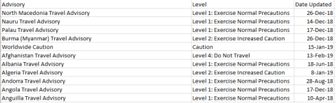
Thus data appearances matter, of course, even as they don’t change anything, as it were. And for a case in point in how they do and don’t matter, pedal over to the Velopace site, an address devoted to a showcasing of that company’s adroitness at timing sporting events with all due, competition-demanding precision. By way of exemplification Velopace has archived the results of a raft of races at which it’s been called upon to time, including the 2018 LVRC National Championships Race A, a contest bearing the aegis of the UK’s League of Veteran Cyclists. Those results come right at you in spreadsheet form here:
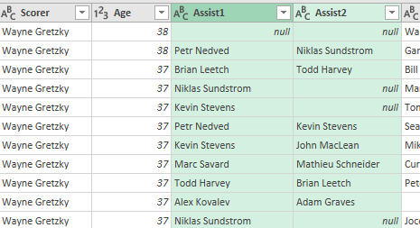
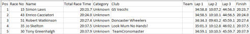
Apart from the usual obeisance to column auto-fitting, the data make a few interesting claims on our scrutiny. Consider, for example, the timings for the first five finishers, lined up in the spreadsheet:
Then turn to the same quintet in the source web-site iteration:

First, note that the four Lap readings (the Finish parameter incorporates the times for the fourth lap) are cumulative; that is, Lap 2 joins its time to that of Lap 1, and so on. Note in addition that the Total Race Time field seems to merely reiterate the Finish time result, and as such could be deemed organizationally redundant, and perhaps a touch confusing.
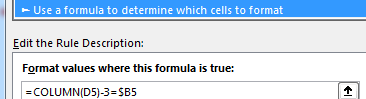
But it’s the spreadsheet version’s formatting may force you to pull off the road for that jolt of Red Bull. Here, for starters, the timings have been rounded off to tenths of a second, in contradistinction to the web-versioned drill-down to thousandths – if nothing else, supporting testimony to Velopace’s skill at clocking exactitude. Now while that fine touch makes sense, Lap 2’s time for race victor Simon Laws in cell I2 reads 10:07.2. A click on that cell bares its formula-bar content of 1:10:07 AM – that is, Laws’ aggregated two-lap time, and expressed in the web version as 01:10.07.180. We need to ask first of all about the missing hour reference in the spreadsheet time in I2, which appears to you and me as 10-plus minutes. Remain in I2 and right-click Format Cells and you’ll be brought here:
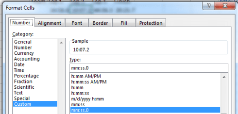
That customized format excludes the hour parameter, and so should properly read something like:
hh:mm:ss.0
Getting there asks you to click the bar immediately beneath the Type: caption and add hh: to the expression:
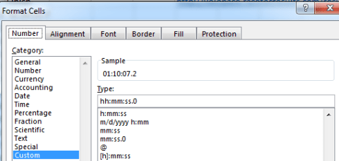
The hour is thereby returned to view (note the sample above, returning the newly-formatted, actual time value in I2), and a mass application of the Format Painter will transmit the tweak to all the times recorded across the spreadsheet, including the sub-hour entries for lap 1, which will be fronted by two leading zeros. The 0 following the decimal point above instates a code that regulates the number of in-view decimals visiting the cell; thus h:mm:ss.000 will replicate Laws’ 01:10:07.180.
But the first question that need be directed at the data is why the above repairs had to be performed at all. Indeed, and by way of curious corroboration, two other race results I downloaded from the Velopace site in which cyclist times pushed past the hour threshold were likewise truncated, but It would be a reach of no small arm’s length to surmise that the spreadsheet architects had built the shortcoming into their designs. Could it be then that the peculiarly clipped formats facing us owe something to some shard of HTML code that went wrong? I don’t know, but after downloading the LVRC file in both CSV and Excel modes (the latter dragging along with it some additional formatting curiosities), I found the hours missing either way.
Now for one more formatting peccadillo, this one far more generic: enter any duration, say 2:23, and the cell in which you’ve posted it will report 2:23 AM, as if you’ve decided to record a time of day, e.g. 23 minutes after 2 in the morning (yes; type 15:36 anywhere and you’ll trigger a PM). I do not know how to eradicate the AM, though Excel is smart enough not to default it into view, consigning it to formula-bar visibility only. Indeed, if you want to see the AM in-cell, you’ll need to tick a custom format in order to make that happen.
But the quirks keep coming. If, for example, you enter 52:14 – that is, a time that bursts through the 24-hour threshold – Excel will faithfully replicate what you’ve typed in its cell (in actuality 52:14:00), but will at the same time deliver
1/2/1900 4:14 AM
to the formula bar. That is, once a time entry exceeds a day’s worth of duration, Excel begins to implement day-of-the-year data as well, commencing with the spreadsheet-standard January 1, 1900 baseline. But as you’ve likely observed, that inception point doesn’t quite start there. After all, once the dates are triggered by postings in excess of 24 hours, one might offer that 52:14 should take us to January 3, 1900 – the first 48 hours therein pacing off January 1 and 2, with the 4:14 remainder tipping us into the morning of the 3rd.
But we see that the expression doesn’t behave that way. It seems as if the first 24 of the above 52 hours devote themselves to an hourly reading alone, only after which the days begin to count off as well. Thus it seems that Excel parses 52:14 into an inaugural, day-less 24 hours – and only then does the 28:14 remainder kick off from January 1, 1900.
But still, format 52:14 as a number instead and the expression returns 2.18 – that is, the passage of 2.18 days – or 4:14 on January 3, 1900.
Because even when formatting looks wrong, it’s always right. Now why don’t they say that about my plaid tie and polka dot shirt?